This the multi-page printable view of this section. Click here to print.
Reports
- 1: Investigating the Classification of Breast Cancer Subtypes using KMeans
- 2: Project: Detection of Autism Spectrum Disorder with a Facial Image using Artificial Intelligence
- 3: Project: Analyzing the Advantages and Disadvantages of Artificial Intelligence for Breast Cancer Detection in Women
- 4: Increasing Cervical Cancer Risk Analysis
- 5: Cyber Attacks Detection Using AI Algorithms
- 6: Report: Dentronics: Classifying Dental Implant Systems by using Automated Deep Learning
- 7:
- 8: Report: Aquatic Animals Classification Using AI
- 9: Project: Hand Tracking with AI
- 10: Review: Handwriting Recognition Using AI
- 11: Project: Analyzing Hashimoto disease causes, symptoms and cases improvements using Topic Modeling
- 12: Project: Classification of Hyperspectral Images
- 13: Project: Detecting Multiple Sclerosis Symptoms using AI
- 14: Report: AI in Orthodontics
- 15: Time Series Analysis of Blockchain-Based Cryptocurrency Price Changes
- 16: Analysis of Covid-19 Vaccination Rates in Different Races
- 17: Aquatic Toxicity Analysis with the aid of Autonomous Surface Vehicle (ASV)
- 18: How Big Data has Affected Statistics in Baseball
- 19: Predictive Model For Pitches Thrown By Major League Baseball Pitchers
- 20: Big Data Analytics in the National Basketball Association
- 21: Big Data in E-Commerce
- 22: Big Data Analytics in Brazilian E-Commerce
- 23: Rank Forecasting in Car Racing
- 24: Change of Internet Capabilities Throughout the World
- 25: Project: Chat Bots in Customer Service
- 26: COVID-19 Analysis
- 27: Analyzing the Relationship of Cryptocurrencies with Foriegn Exchange Rates and Global Stock Market Indices
- 28: Project: Deep Learning in Drug Discovery
- 29: Big Data Application in E-commerce
- 30: Residential Power Usage Prediction
- 31: Big Data Applications in the Gaming Industry
- 32: Project: Forecasting Natural Gas Demand/Supply
- 33: Big Data on Gesture Recognition and Machine Learning
- 34: Big Data in the Healthcare Industry
- 35: Analysis of Various Machine Learning Classification Techniques in Detecting Heart Disease
- 36: Predicting Hotel Reservation Cancellation Rates
- 37: Analysis of Future of Buffalo Breeds and Milk Production Growth in India
- 38: Music Mood Classification
- 39: Does Modern Day Music Lack Uniqueness Compared to Music before the 21st Century
- 40: NBA Performance and Injury
- 41: NFL Regular Season Skilled Position Player Performance as a Predictor of Playoff Appearance Overtime
- 42: Project: Training A Vehicle Using Camera Feed from Vehicle Simulation
- 43: Project: Structural Protein Sequences Classification
- 44: How Big Data Can Eliminate Racial Bias and Structural Discrimination
- 45: Online Store Customer Revenue Prediction
- 46: Sentiment Analysis and Visualization using a US-election dataset for the 2020 Election
- 47: Estimating Soil Moisture Content Using Weather Data
- 48: Big Data in Sports Game Predictions and How It is Used in Sports Gambling
- 49: Analyzing LSTM Performance on Predicting the Stock Market for Multiple Time Steps
- 50: Stock Price Reactions to Earnings Announcements
- 51: Project: Stock level prediction
- 52: Review of Text-to-Voice Synthesis Technologies
- 53: Analysis of Financial Markets based on President Trump's Tweets
- 54: Trending Youtube Videos Analysis
- 55: Review of the Use of Wearables in Personalized Medicine
- 56: Project: Identifying Agricultural Weeds with CNN
- 57: Detect and classify pathologies in chest X-rays using PyTorch library
- 58:
- 59:
- 60:
- 61:
- 62:
- 63:
- 64:
- 65:
- 66:
- 67:
- 68:
- 69:
- 70:
- 71:
- 72:
- 73:
- 74:
- 75:
- 76:
- 77:
- 78:
- 79:
- 80:
- 81:
- 82:
- 83:
- 84:
- 85:
- 86:
- 87:
- 88:
- 89:
- 90:
- 91:
- 92:
- 93:
- 94:
- 95:
- 96:
- 97:
- 98:
- 99:
- 100:
- 101:
- 102:
- 103:
- 104:
- 105:
- 106:
- 107:
- 108:
- 109:
- 110:
- 111:
- 112:
- 113:
- 114:
- 115:
- 116:
- 117:
- 118:
- 119:
- 120:
- 121:
- 122:
- 123:
- 124:
- 125:
- 126:
- 127:
- 128:
- 129:
- 130:
- 131:
- 132:
- 133:
- 134:
- 135:
- 136:
- 137:
- 138:
- 139:
- 140:
- 141:
- 142:
- 143:
- 144:
- 145:
- 146:
- 147:
- 148:
- 149:
- 150:
- 151:
1 - Investigating the Classification of Breast Cancer Subtypes using KMeans
![]()
![]() Status: draft, Type: Project
Status: draft, Type: Project
Kehinde Ezekiel, su21-reu-362, Edit
Abstract
Breast cancer is an heterogenous disease that is characterized by abnormal growth of the cells in the breast region[^1]. There are four major molecular subtypes of breast cancer. This classification was based on a 50-gene signature profiling test called PAM50. Each molecular subtype has a specific morphology and treatment plan. Early diagnosis and detection of possible cancerous cells usually increase survival chances and provide a better approach for treatment and management. Different tools like ultrasound, thermography, mammography utilize approaches like image processing and artificial intelligence to screen and detect breast cancer. Artificial Intelligence (AI) involves the simulation of human intelligence in machines and can be used for learning or to solve problems. A major subset of AI is Machine Learning which involves training a piece of software (called model) to makwe useful predictions using dataset.
In this project, a machine learning algorithm, KMeans, was implemented to design and analyze a proteomic dataset into clusters using its proteins identifiers. These protein identifiers were associated with the PAM50genes that was used to originally classify breast cancer into four molecular subtypes. The project revealed that further studies can be done to investigate the relationship between the data points in each cluster with the biological properties of the molecular subtypes which could lead to newer discoveries and developmeny of new therapies, effective treatment plan and management of the disease. It also suggests that several machine learning algorithms can be leveraged upon to address healthcare issues like breast cancer and other diseases which are characterized by subtypes.
Contents
Keywords: AI, cancer, breast, algorithms, machine learning, healthcare, subtypes, classification.
1. Introduction
Breast cancer is the most common cancer, and also the primary cause of mortality due to cancer in females around the World. It is an heterogenous disease that is characterized by the abnormal growth of cells in the breast region1. Early diagnosis and detection of possible cancerous cells in the breast usually increase survival chances and provide a better approach for treatment and management. Treatment and management often depend on the stage of cancer, the subtype, the tumor size, location and many other factors. During the last 20 years, four major intrinsic molecular subtypes for breast cancer- luminal A, luminal B, HER2-enriched and Basal-like have been identified, classified and intensively studied. Each subtype has its distinct morphologies and clinical treatment. The classification is based on gene expression profiling, specificaly defined by mRNA expression of 50 genes (also known as, PAM50 Genes). This test is known as the PAM50 test. The accurate grouping of breast cancer into its relevant subtypes can improve accurate treatment-decision making2. The PAM50 test is now known as the Prosigna Breast Cancer Prognostic Gene Signature Assay 50 (known as Prosigna) and it analyzes the activity of certain genes in early-stage, hormone-receptor-positive breast cancer3. This classification is based on the mRNA expression and the activity of 50 genes and it aims to estimate the risk of distant reccurrence of breast cancer. Since the assay was based on mRNA expression, this project suggested that a classification based on the final product of mRNA, that is protein, can be implemented to investigate its role in the classifictaion of molecular breast cancer subtypes. As a result, the project was focused on the use of a proteomic dataset which contained published iTRAQ proteome profiling of 77 breast cancer samples and expression values for the proteins of each sample.
Most times, breast cancer is diagnosed and detected through a combination of different approaches such as imaging (e.g. mammogram and ultrasound), physical examination by a radiologist and biopsy. Biopsy is used to confirm the breast cancer symptoms. However, research has shown that radiologists can miss up to 30% of breast cancer tissues during detection4. This gap has brought about the introduction of Computer aided Diagnosis (CAD) systems can help detect abnormalities in an efficient manner. CAD is a technology that includes utilizing the concept of artificial intelligence(AI) and medical image processing to find abnormal signs in the human body5. Machine Learning is a subset of AI and it has several algorithms that can be used to build a model to perform a specific task or to predict a pattern. KMeans is one of such algorithm.
Building a model using machine learning involves selecting and preparing the appropriate dataset, identifying the accurate machine learnning algorithm to use, training the algorithm on the data to build a model, validating the resulting model’s performance on testing data and using the model on a new data6. In this project, KMeans was the algorithm used in this project, the datasets were prepared through several procedures like filtering, merging. KMeans clustering method was used to investigate the classification of the molecular subtypes. Its efficacy is often tested by a silhouette score. A silhouette score shows how similar an object is to its own cluster and it ranges from -1 to 1 where a high values indicates that an object is well matched to its own cluster. A homogeneity score determines if a cluster should only contain samples that belong to a particular class. It ranges from a value between 0 to 1 with low values indicating a low homogeneity.
The project investigated the efficient number of clusters that could be generated for the proteome dataset which would consequetly provide an optimal classification of the protein expression values for the breast cancer samples. The proteins that were used in the KMeans analysis were the proteins that were associated with the PAM50 genes. The result of the project could provide insights to medical scientists and researchers to identify any interelatedness between the original classification of breast cancer molecular subtypes.
2. Datasets
Datasets are eseential in drawing conclusion. In the diagnosis, detection and classification of breast cancecr, datasets have been essential to draw conclusion by identifying patterns. These datasets range from imaging datasets to clinical datasets, proteomic datasets etc. Large amounts of data have been collected due to new technological and computational advances like the use of websites like NCBI, equipments like Electroencephalogram (EEG) which record clinical information. Medical researchers leverage these datasets to make useful health care decisions that affect a region, gender or the world. The need for accuracy and reproducibilty has led to the use of machine learning as an important tool for drawing conclusions.
Machine Learning involves training a piece of software, also known as model, to idnetify patterns from a dataset and make useful predictions. There are several factors to be considered when using datasets. One of such is data privacy. Recently, measures have been taken to ensure that the privacy of data. Some of these measures include, replacing codes for patients name, using documents and mobile applications that ask for permission from patients before using their data. Recently, the World Health Organization (WHO) made her report on AI and provided priniples that ensure that AI works for all. On of such is that the designer of AI technologies should satisfy regulatory requirements for safety, accuracy and efficacy for well-defined use cases or indications. Measures of quality control in practice and quality improvement in the use of AI must be available7. Building a model using machine learning involves selecting and preparing the appropriate dataset, identifying the accurate machine learnning algorithm to use, training the algorithm on the data to build a model, validating the resulting model’s performance on testing data and using the model on a new data6. In this project, KMEans was the algorithm used in this project, the datasets were prepared through several procedures like filtering, merging.
3. The KMeans Approach
KMeans clustering is an unsupervised machine learning algorithm that makes inferences from datasets without referring to a known outcome. It aims to identify underlying patterns in a dataset by looking for a fixed number of clusters, (known as k). The required number of clusters is chosen by the person building the model. KMeans was used in this project to classify the protein IDs (or RefSeq_IDs) into clusters. Each cluster was designed to be associated with related protein IDs.
Three datasets were used for the algorithm. The first and main dataset was a proteomic dataset. It contained published iTRAQ proteome profiling of 77 breast cancer samples generated by the Clinical Proteomic Tumor Analysis Consortium (NCI/NIH). Each sample contained expression values for ~12000 proteins, with missing values present when a given protein could not be quantified in a given sample. The variables in the dataset included the RefSeq_accession_number(also known as RefSeq protein ID), “the gene_symbol” (which was unique to each gene), “the gene_name” (which was the full name of the gene). The remaining columns were the log2 iTRAQ ratios for each of the 77 samples while the last three columns are from healthy individuals.
The second dataset was a PAM50 dataset. It contained the list of genes and proteins used in the PAM50 classification system. The variables include the RefSeqProteinID which matched the Protein IDs(or RefSeq_IDs) in the main proteome dataset.
The third dataset was a clinical data of about 105 clinical breast cancer samples. 77 of the breast cancer samples were the samples in the first dataset. The excluded samples were as a result of protein degradation8. The variables in the dataset are: ‘Complete TCGA ID', ‘Gender’, ‘Age at Initial Pathologic Diagnosis’, ‘ER Status’, ‘PR Status’, ‘HER2 Final Status’, ‘Tumor’, ‘Tumor–T1 Coded’, ‘Node’, ‘Node-Coded’, ‘Metastasis’, ‘Metastasis-Coded’, ‘AJCC Stage’, ‘Converted Stage’, ‘Survival Data Form’, ‘Vital Status’, ‘Days to Date of Last Contact’, ‘Days to date of Death’, ‘OS event’, ‘OS Time’, ‘PAM50 mRNA’, ‘SigClust Unsupervised mRNA’, ‘SigClust Intrinsic mRNA’, ‘miRNA Clusters’, ‘methylation Clusters’, ‘RPPA Clusters’, ‘CN Clusters’, ‘Integrated Clusters (with PAM50)’, ‘Integrated Clusters (no exp)’, ‘Integrated Clusters (unsup exp).’
During the preparation of the datasets for KMeans analysis, unused columns like “gene_name” and “gene_symbol” were removed in the first dataset. The first and third dataset were merged together. Prior to merging, the variable ‘Complete TCGA ID’ in the third dataset was found to be the same as the TCGAs in the first dataset. The Complete TCGA ID refered to a breast cancer patient, some patients were found in both datasets. The TCGA ID in the first dataset was renamed to match with the TCGA of the third dataset, thereby giving the same syntax. The first dataset was also transposed as a row and its gene expression as the columns. These processes were done in order to merge both dataset efficiently.
After merging, the “PAM5O RNA” variable from the second dataset was selected to join the merged dataset. This single dataset was named “pam50data”. It contained all the variables that were needed for KMeans Analysis which included the genes that were used for the PAM50 classification (only 43 were available in the dataset), the complete TCGA ID of each 80 patient, and their molecular tumor type. Missing values in the dataset were imputed using SimpleImputer. Then, KMeans clustering was performed. The metrics were tested with cluster numbers of 3, 4, 5, 20 and 79. The bigger numbers (20 and 79) were tested just for comparison. Further details on the codes written can be found in 9. Also, 10 and 11 were kernels that provided insights for the written code.
5. Results and Images
Several codes were written to determine the best number of clusters for the model. The effectiveness of a cluster is often measured by scores such as silhouette score, homogeneity score and adjusted rand score.
The silhouette score for a cluster of 3, 4, and 5, 8, 20 and 79 were 0.143, 0.1393, 0.1193, 0.50968, 0.0872, 0.012 while the homogenenity scores were 0.4635, 0.4749, 0.1193, 0.5617, 0.6519 and 1.0 respectively. The homogeneity score for 79 is 1.0 since the algorithm can assign all the points into sepearate clusters. However, it is not efficient for the dataset we used. A cluster of 3 works best since the silhouette score is high and the homogeneity score jumps ~2-fold.
Figures 1 and 2 show the results of the visualization of the clusters of 3 and 4.

Figure 1: The classification of Breast Cancer Moleecular Subtypes using KMeans Clustering. (k=3). Each data point represnt the expression value for the genes that were used for clustering.

Figure 2: The classification of Breast Cancer Moleecular Subtypes using KMeans Clustering. (k=4). Each data point represnt the expression value for the genes that were used for clustering.
6. Benchmark
This program was executed on a Google Colab server and the entire runtime took 1.012 seconds Table 1 lists the amount of time taken to loop for n_components. The n_components is gotten from the code and it refers to the features of the dataset.
| Name | Status | Time(s) |
|---|---|---|
| parallel 1 | ok | 0.647 |
| parallel 3 | ok | 0.936 |
| parallel 5 | ok | 0.952 |
| parallel 7 | ok | 0.943 |
| parallel 9 | ok | 1.002 |
| parallel 11 | ok | 0.991 |
| parallel 13 | ok | 0.958 |
| parallel 15 | ok | 1.012 |
Benchmark: The table shows the parallel process time take the for loop for n_components.
7. Conclusion
The results of the KMeans analysis showed that three clusters provided an optimal result for the classification using a proteomic dataset. A cluster of 3 provided a balanced silhouette and homogeneity score. This predict that some interrelatedness could exist between the original PAM50 subtype classfication, since the result of classifying a protein dataset using a machine learning algorithm identified a cluster of 3 as one with the optimal result. Also, future research could be done by using other machine learning algorithms, possibly a supervised learning algotithm, to identify the correlation between the clusters and the four molecular subtypes. This model can be improved on and if proven to show that there truly exist a relationship between the four molecular subtypes, more research could be done to identify the factors that contribure to the interelatedness. This would lead medical scientists and researchers to work on better innovative methods that will aid the treatment and management of breast cancer.
8. Acknowledgments
This projected was immensely supported by Dr. Gregor von Laszewski. Also, a big appreciation to the REU Instructors (Carlos Theran, Yohn Jairo and Victor Adankai) for their contribution, support, teachings and advice. Also, gratitude to my colleagues who helped me out; Jacques Fleischer, David Umanzor and Sheimy Paz Serpa. gratitude to my colleagues. Lastly, appreciation to Dr. Byron Greene, the Florida A&M University, the Indiana University and Bethune Cookman University for providing a platform to be able to learn new things and embark on new projects.
9. References
-
Akram, Muhammad et al. “Awareness and current knowledge of breast cancer.” Biological research vol. 50,1 33. 2 Oct. 2017, doi:10.1186/s40659-017-0140-9 ↩︎
-
Wallden, Brett et al. “Development and verification of the PAM50-based Prosigna breast cancer gene signature assay.” BMC medical genomics vol. 8 54. 22 Aug. 2015, doi:10.1186/s12920-015-0129-6 ↩︎
-
Breast Cancer.org Prosigna Breast Cancer Prognostic Gene Signature Assay. https://www.breastcancer.org/symptoms/testing/types/prosigna ↩︎
-
L. Hussain, W. Aziz, S. Saeed, S. Rathore and M. Rafique, “Automated Breast Cancer Detection Using Machine Learning Techniques by Extracting Different Feature Extracting Strategies,” 2018 17th IEEE International Conference On Trust, Security And Privacy In Computing And Communications/ 12th IEEE International Conference On Big Data Science And Engineering (TrustCom/BigDataSE), 2018, pp. 327-331, doi: 10.1109/TrustCom/BigDataSE.2018.00057. ↩︎
-
Halalli, Bhagirathi et al. “Computer Aided Diagnosis - Medical Image Analysis Techniques.” 20 Dec. 2017, doi: 10.5772/intechopen.69792 ↩︎
-
Salod, Zakia, and Yashik Singh. “Comparison of the performance of machine learning algorithms in breast cancer screening and detection: A protocol.” Journal of public health research vol. 8,3 1677. 4 Dec. 2019, doi:10.4081/jphr.2019.1677Articles ↩︎
-
WHO, WHO issues first global report on Artificial Intelligence (AI) in health and six guiding principles for its design and use. https://www.who.int/news/item/28-06-2021-who-issues-first-global-report-on-ai-in-health-and-six-guiding-principles-for-its-design-and-use ↩︎
-
Mertins, Philipp et al. “Proteogenomics connects somatic mutations to signalling in breast cancer.” Nature vol. 534,7605 (2016): 55-62. doi:10.1038/nature18003 ↩︎
-
Kehinde Ezekiel, Project Code, https://github.com/cybertraining-dsc/su21-reu-362/blob/main/project/code/final_breastcancerproject.ipynb ↩︎
-
Kaggle_breast_cancer_proteomes «https://pastebin.com/A0Wj41DP> ↩︎
-
Proteomes_clustering_analysis https://www.kaggle.com/shashwatwork/proteomes-clustering-analysis ↩︎
2 - Project: Detection of Autism Spectrum Disorder with a Facial Image using Artificial Intelligence
![]()
![]() Status: final: Project
Status: final: Project
Myra Saunders, su21-reu-378, Edit
- Utilized CNN Code: autism_classification.ipynb
Abstract
This project uses artificial intelligence to explore the possibility of using a facial image analysis to detect Autism in children. Early detection and diagnosis of Autism, along with treatment, is needed to minimize some of the difficulties that people with Autism encounter. Autism is usually diagnosed by a specialist through various Autism screening methods. This can be an expensive and complex process. Many children that display signs of Autism go undiagnosed because there families lack the expenses needed to pay for Autism screening and diagnosing. The development of a potential inexpensive, but accurate way to detect Autism in children is necessary for low-income families. In this project, a Convolutional Neural Network (CNN) is utilized, along with a dataset obtained from Kaggle. This dataset consists of collected images of male and female, autistic and non-autistic children between the ages of two to fourteen years old. These images are used to train and test the CNN model. When one of the images are received by the model and importance is assigned to various features in the image, an output variable (autistic or non-autistic) is received.
Contents
Keywords: Autism Spectrum Disorder, Detection, Artificial Intelligence, Deep Learning, Convolutional Neural Network.
1. Introduction
Autism Spectrum Disorder (ASD) is a broad range of lifelong developmental and neurological disorders that usually appear during early childhood. Autism affects the brain and can cause challenges with speech and nonverbal communication, repetitive behaviors, and social skills. Autism Spectrum Disorder can occur in all socioeconomic, ethnic, and racial groups, and can usually be detected and diagnosed from the age of three years old and up. As of June 2021, the World Health Organization has estimated that one in 160 children have an Autism Spectrum Disorder worldwide1. Early detection of Autism, along with treatment, is crucial to minimize some of the difficulties and symptoms that people with Autism face2. Symptoms of Autism Spectrum Disorder are normally identified based on psychological criteria3. Specialists use techniques such as behaivoral observation reports, questionaires, and a review of the child’s cognitive ability to detect and diagose Autism in children.
Many researchers believe that there is a correlation between facial morphology and Autism Spectrum Disorder, and that people with Autism have distinct facial features that can be used to detect their Autism Spectrum Disorder4. Human faces encode important markers that can be used to detect Autism Spectrum Disorder by analyzing facial features, eye contact,facial movements, and more5. Scientists found that children diagnosed with Autism share common facial feature distinctions from children who are not diagnosed with Autism6. Some of these facial features are wide-set eyes, short middle region of the face, and a broad upper face. Figure 1 provides an example of the facial feature differences between a child with Autism and a child without.
.png)
Figure 1: Image of Child with Autism (left) and Child with no Autism (right)7.
Due to the distinct features of Autistic individuals, we believe that it is necessary to explore the possiblities of using a facial analysis to detect Autism in children, using Artificial Intelligence (AI). Many researchers have attempted to explore the possibility of using various novel algorithms to detect and diagnose children, adolescents, and adults with Autism2. Previous research has been done to determine if Autism Spectrum Disorder can be detected in children by analyzing a facial image7. The author of this research collected approximately 1500 facial images of children with Autism from websites and Facebook pages associated with Autism. The facial images of non-autistic children were randomly downloaded from online and cropped.The author aimed to provide a first level screening for autism diagnosis, whereby parents could submit an image of their child and in return recieve a probability of the potential of Autism, without cost.
To contribute to this previous research7, this project will propose a model that can be used to detect the presence of Autism in children based on a facial image analysis. A deep learning algorithm will be used to develop an inexpensive, accurate, and effective method to detect Autism in children. This project implements and utilizes a Convolutional Neural Network (CNN) classifier to explore the possibility of using a facial image analysis to detect Autism in children, with an accuracy of 95% or higher. Most of the coding used for this CNN model was obtained from the Kaggle dataset and was done by Fran Valuch8. We made changes to some parts of this code, which will be discussed further in this project. The goal of this project is not to diagnose Autism, but to explore the possibility of detecting Autism at its early stage, using a facial image analysis.
2. Related Work
Previous work exists on the use of artificial intelligence to detect Autism in children using a facial image. Most of this previous work used the Autism kaggle dataset7, which was also used for this project. One study utilized MobileNet followed by two dense layers in order to perform deep learning on the dataset6. MobileNet was used because of its ability to compute outputs much faster, as it can reduce both computation and model size. The first layer was dedicated to distribution, and allowed customisation of weights to input into the second dense layer. The second dense layer allowed for classification. The architecture of this algorithm is shown below in Figure 2.

Figure 2: Algorithm Architecture using MobileNet6.
Training of this model completed after fifteen epochs, which resulted in a test accuracy of 94.64%. In this project we utilize a classic Convolutional Neural Network model using tensorflow. This will be done in hopes of obtaining a test accuracy of 95% or higher.
3. Dataset
The dataset used for this project was obtained from Kaggle7. This dataset contained approximately 1500 facial images of children with Autism that were obtained from websites and Facebook pages associated with Autism. The facial images of non-autistic children were randomly downloaded from online. The pictures obtained were not of the best quality or consistency with respect to the facial alignment. Therefore, the author developed a python program to automatically crop the images to include only the extent possible for a facial image. These images consist of male and female children that are of different races and range from around ages two to fourteen.
This project uses version 12 of this dataset, which is the latest version. The dataset consists of three directories labled test, train, and valid, along with a CSV file. The training set is labeled as train, and consists of ‘Autistic’ and ‘Non-Autistic’ subdirectories. These subdirectories contain 1269 images of autistic and 1269 images of non-autistic children respectively. The validation set located in the valid directory are separated into ‘Autistic’ and ‘Non-autistic’ subdirectories. These subdirectories also contain 100 images of autistic and 100 images of non-autistic children respectively. The testing set located in the test directory is divided into 100 images of autistic children and 100 images of non-autistic children. All of the images provided in this dataset are in 224 X 224 X 3, jpg format. Table 1 provides a summary of the content in the dataset.
Table 1: Summary Table of Dataset.

4. Proposed Methodology
Convolutional Neural Network (CNN)
This project utilizes a Convolution Neural Network (CNN) to develop a program that can be used to detect the presence of Autism in children from a facial image analysis. If successful this program can be used an inexpensive method to detect Autism in children at its early stages. We believed that a CNN model would be the best way create this program because of its little dependence on preprocessing data. A Convolutional Neural Network was also used becuase of its ability to take in an image and assign importance to, and identify diferent objects within the image. CNN also has very high accuracy when dealing with image recognition. The dataset used contains 1269 training images that were used to train and test this Convolution Neural Network model. The architecture of this model can be seen in Figure 3.

Figure 3: Architecture of utilized Convolutional Neural Network Model.
5. Results
The results of this project is estimated by affectability and accuracy by utilizing the Confusion Matrix CNN. The results also rely on how correct and precise the model was trained. This model was created to explore the possibility of detecting Autism in children at its early stage, using a facial image analysis. A Convolutional Neural Network classifier was used to create this model. For this CNN model we utilized max pooling and Rectified Linear Unit (ReLU), with two epochs. This resulted in an accuracy of 71%. These results can be seen below in Figure 4. Figure 5 displays some of the images that were classified and labeled correctly (right) and the others that were labeled incorrectly (left).
.png)
Figure 4: Results after Execution.
validation loss: 57% - validation accuracy: 68% - training loss: 55% - training accuracy: 71%

Figure 5: Correct Labels and Incorrect Labels.
6. Benchmark
Figure 6 shows the Confusion Matrix of the Convolutional Neural Network model used in this project. The Confusion Matrix displays a summary of the model’s predicted results after its attempt to classify each image as either autistic or non-autistic. Out of the 200 images, 159 of the images were labled correctly and 41 of the images were labled incorrectly.

Figure 6: Confusion Matrix of the Convolutional Neural Network model.
Cloudmesh-common9 was used to create a Stopwatch module, that was used to measure and study the training and testing time of the model. Table 2 shows the cloudmesh benchmark output.
Table 2: Cloudmesh Benchmark
| Name | Status | Time | Sum | Start | tag | msg | Node | User | OS | Version |
|---|---|---|---|---|---|---|---|---|---|---|
| Train | ok | 3745.28 | 3745.28 | 2021-08-10 16:08:57 | dab8db0489cd | collab | Linux | #1 SMP Sat Jun 5 09:50:34 PDT 2021 | ||
| Test | ok | 2.088 | 2.088 | 2021-08-10 17:43:09 | dab8db0489cd | collab | Linux | #1 SMP Sat Jun 5 09:50:34 PDT 2021 |
7. Conclusions and Future Work
Autism Spectrum Disorder is a broad range of lifelong developmental and neurological disorders that is considered one of the most growing disorders in children. The World Health Organization has estimated that one in 160 children have an Autism Spectrum Disorder worldwide1. Techniques that are used by specialists to detect autism can be time consuming and inconvenient for some families. Considering these factors, finding effective and essential ways to detect Autism in children is a neccesity. The aim of this project was to create a model that would analyze facial images of children, and in return determine if the child is Autistic or not. This was done in hopes of receiving 95% accuracy or higher. After executing the model we received an accuracy of 71%.
As shown in the results section above, some of the pictures that were initially labeled as Autistic, were labeled incorrectly after running the model. This low accuracy rate could be improved if the CNN model is combined with other algorithms such as transfer learning and VGG-19. This low accuracy could also be improved by using a dataset that includes a wider variety and larger amount of images. We could also ensure that images in the dataset includes children that are of a wider age range. These improvements could possibly increase our chances of obtaining an accuracy of 95% or higher. When this model is improved and an accuracy of atleast 95% is achieved, furture work can be done to create a model that can be used for Autistic individuals outside of the dataset age range (2 - 14 years old).
8. Acknowledgments
The author of this project would like to express a vote of thanks to Yohn Jairo, Carlos Theran, and Dr. Gregor von Laszewski for their encouragement and guidance throughout this project. A special vote of thanks also goes to Florida A&M University for funding this wonderful research program. The completion of this project could not have been possible without their support.
9. References
-
World Health Organization. 2021. Autism spectrum disorders, [Online resource] https://www.who.int/news-room/fact-sheets/detail/autism-spectrum-disorders ↩︎
-
Raj, S., and Masood, S., 2020. Analysis and Detection of Autism Spectrum Disorder Using Machine Learning Techniques, [Online resource https://reader.elsevier.com/reader/sd/pii/S1877050920308656?token=D9747D2397E831563D1F58D80697D9016C30AAC6074638AA926D06E86426CE4CBF7932313AD5C3504440AFE0112F3868&originRegion=us-east-1&originCreation=20210704171932 ↩︎
-
Khodatars, M., Shoeibi, A., Ghassemi, N., Jafari, M., Khadem, A., Sadeghi, D., Moridian, P., Hussain, S., Alizadehsani, R., Zare, A., Khosravi, A., Nahavandi, S., Acharya, U. R., and Berk, M., 2020. Deep Learning for Neuroimaging-based Diagnosis and Rehabilitation of Autism Spectrum Disorder: A Review. [Online resource] https://arxiv.org/pdf/2007.01285.pdf ↩︎
-
Musser, M., 2020. Detecting Autism Spectrum Disorder in Children using Computer Vision, Adapting facial recognition models to detect Autism Spectrum Disorder. [Online resource] https://towardsdatascience.com/detecting-autism-spectrum-disorder-in-children-with-computer-vision-8abd7fc9b40a ↩︎
-
Akter, T., Ali, M. H., Khan, I., Satu, S., Uddin, Jamal., Alyami, S. A., Ali, S., Azad, A., and Moni, M. A., 2021. Improved Transfer-Learning-Based Facial Recognition Framework to Detect Autistic Children at an Early Stage. [Online resource] https://www.mdpi.com/2076-3425/11/6/734 ↩︎
-
Beary, M., Hadsell, A., Messersmith, R., Hosseini, M., 2020. Diagnosis of Autism in Children using Facial Analysis and Deep Learning. [Online resource] https://arxiv.org/ftp/arxiv/papers/2008/2008.02890.pdf ↩︎
-
Piosenka, G., 2020. Detect Autism from a facial image. [Online resource] https://www.kaggle.com/gpiosenka/autistic-children-data-set-traintestvalidate?select=autism.csv ↩︎
-
Valuch, F., 2021. Easy Autism Detection with TF.[Online resource] https://www.kaggle.com/franvaluch/easy-autism-detection-with-tf/comments ↩︎
-
Gregor von Laszewski, Cloudmesh StopWatch and Benchmark - Cloudmesh-Common, [GitHub] https://github.com/cloudmesh/cloudmesh-common ↩︎
3 - Project: Analyzing the Advantages and Disadvantages of Artificial Intelligence for Breast Cancer Detection in Women
![]()
![]() Status: draft, Type: Project
Status: draft, Type: Project
RonDaisja Dunn, su21-reu-377, Edit
Abstract
The AI system is improving its diagnostic accuracy by significantly decreasing unnecessary biopsies. AI’s algorithms for workflow improvement and outcome analyses are advancing. Although artificial intelligence can be beneficial to detecting and diagnosing breast cancer, there are some limitations to its techniques. The possibility of insufficient quality, quantity or appropriateness is possible. When compared to other imaging modalities, breast ultrasound screening offers numerous benefits, including a cheaper cost, the absence of ionizing radiation, and the ability to examine pictures in real time. Despite these benefits, reading breast ultrasound is a difficult process. Different characteristics, such as lesion size, shape, margin, echogenicity, posterior acoustic signals, and orientation, are used by radiologists to assess US pictures, which vary substantially across individuals. The development of AI systems for the automated detection of breast cancer using Ultrasound Screening pictures has been aided by recent breakthroughs in deep learning.
Contents
Keywords: project, reu, breast cancer, Artificial Intelligence, diagnosis detection, women, early detection, advantages, disadvantages
1. Introduction
The leading cause of cancer death in women worldwide is breast cancer. This deadly form of cancer has impacted many women across the globe. Specifically, African American women have been the most negatively impacted. Their death rates due to breast cancer have surpassed all other ethnicities. Serial screening is an essential part in detecting Breast cancer. Detecting the early stages of this disease and decreasing mortality rates is most effective by utilizing serial screening. Some women detect that they could have breast cancer by discovering a painless lump in their breast. Other women began to detect that there may be a problem due to annual and bi-annual breast screenings. Screening in younger women is not likely, because breast cancer is most likely to be detected in older women. Women from the age 55 to 69 are likely to be diagnosed with breast cancer. Women who frequently participate in receiving mammograms reduce the chance of breast cancer mortality.
Artificial Intelligence is the branch of computer science dedicated to the development of computer algorithms to accomplish tasks traditionally associated with human intelligence, such as the ability to learn and solve problems. This branch of computer science coincides with diagnosing breast cancer in individuals because of the use of radiology. Radiological images can be quantitated and can inform and train some algorithms. There are many terms that relate to Artificial Intelligence such as artificial neural networks (ANNs), machine and deep learning (ML, DL). These techniques complete duties in healthcare, including radiology. Machine learning interprets pixel data and patterns from mammograms. Benign or malignant features for inputs are defined by microcalcifications. Deep learning is effective in breast imaging, where it can identify several features such as edges, textures, and lines. More intricate features such as organs, shapes, and lesions can also be detected. Neural networks algorithms are used for image feature extractions that cannot be detected beyond human recognition.
A computer system that can perform complicated data analysis and picture recognition tasks is known as artificial intelligence (AI). Both massive processing power and the application of deep learning techniques made this possible, and are increasingly being used in the medical field. Mammograms are the x-rays used to detect breast cancer in women. Early detection is important to reduce deaths, because that is when the cancer is most treatable. Screenings have presented a 15%-35% false report in screened women. Errors and the ability to view the cancer from the human eye are the reasons for the false reports. Artificial Intelligence offers many advantages when detecting breast cancer. These advantages include less false reports, fewer cases missed because the AI program does not get tired and it reduces the effort of reading thousands of mammograms.
2. Methods From Literature Review
The goal was to emphasize the present data in terms of test accuracy and clinical utility results, as well as any gaps in the evidence. Women are screened by getting photos taken of each breast from different views. Two readers are assigned to interpret the photographs in a sequential order. Each reader decides whether the photograph is normal or whether a woman should be recalled for further examination. Arbitration is used when there is a disagreement. If a woman is recalled, she will be offered extra testing to see if she has cancer.
Another goal is to detect cancer at an earlier stage during screening so that therapy can be more successful. Some malignancies found during screening, on the other hand, might never have given the woman symptoms. Overdiagnosis is a term used to describe a situation in which a person has caused harm to another person during their lifetime. As a result, overtreatment (unnecessary treatment) occurs. Since some malignancies are overlooked during screening, the women are misled.
The methods in diagnostic procedures vary between radiologists and Artificial Intelligence networks. In a breast ultrasound exam, radiologists look for abnormal abnormalities in each image, while AI networks analyze each image in an exam that is processed separately using a ResNet-18 model, and a saliency map is generated, identifying the most essential sections. With radiologists, the focus is on photos with abnormal lesions and with AI networks the image is given an attention score based on its relative value. To make a final diagnosis, radiologists consider signals in all photos, and AI computes final predictions for benign and malignant results by combining information from all photos using an attention technique.
3. Results From Literature Review
Using pathology data, each breast in an exam was given a label indicating the presence of cancer. Image-guided biopsy or surgical excision were used to collect tissues for pathological tests. The AI system was shown to perform comparably to board-certified breast radiologists in the reader study subgroup. In this reader research, the AI system detected tumors with the same sensitivity as radiologists, but with greater specificity, a higher PPV, and a lower biopsy rate. Furthermore, the AI system outperformed all ten radiologists in terms of AUROC and AUPRC. This pattern was replicated in the subgroup study, which revealed that the algorithm could correctly interpret Ultrasound Screening examinations that radiologists considered challenging.

Figure 1: Analysis of saliency maps on a qualitative level- This figure displays the sagittal and transverse views of the lesion (left) and the AI’s saliency maps indicating the anticipated sites of benign (center) and malignant (right) findings in each of the six instances (a-f) from the reader study.
4. Datasets
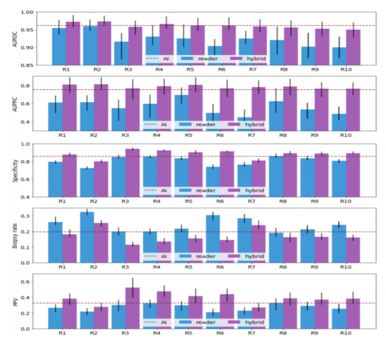
Figure 2: The probabilistic forecasts of each hybrid model were randomly divided to fit the reader’s sensitivity. The dichotomization of the AI’s predictions matches the sensitivity of the average radiologists. Readers' AUROC, AUPRC, specificity, and PPV improve as a result of the collaboration between AI and readers, whereas biopsy rates decrease.
5. Conclusion
There are some benefits of AI help with mammogram screenings. The reduction in treatment expenses is one of the advantages of screening. Treatment for people who are diagnosed sooner is less invasive and expensive, which may lessen patient anxiety and improve their prognosis. One or all human readers could be replaced by AI. AI may be used to pre-screen photos, with only the most aggressive ones being reviewed by humans. AI could be employed as a reader aid, with the human reader relying on the AI system for guidance during the reading process.
However, there is also fear that AI could discover changes that would never hurt women. Because the adoption of AI systems will alter the current screening program, it’s crucial to determine how accurate AI is in breast screening clinical practice before making any changes. It’s uncertain how effective AI is at detecting breast cancer in different sorts of women or in different groups of women (for example different ethnic groups). AI could significantly minimize staff workload, as well as the proportion of cancers overlooked during screening, and the amount of women who are asked to return for more tests despite the fact that they do not have cancer. According to the findings of the reader survey, such teamwork between AI systems and radiologists increases diagnosis accuracy and decreases false positive biopsies for all 10 radiologists. This research indicated that integrating the Artificial intelligence system’s predictions enhanced the performance of all readers.
6. Acknowledgments
Thank you to the extremely intellectual, informative, patient and courteous instructors of the Research Experience for Undergraduates Program.
- Carlos Theran, REU Instructor
- Yohn Jairo Parra, REU Instructor
- Gregor von Laszewski, REU Instructor
- Victor Adankai, Graduate Student
- REU Peers
- Florida Agricultural and Mechanical University
7. References
- Coleman C. Early Detection and Screening for Breast Cancer. Semin Oncol Nurs. 2017 May;33(2):141-155. doi: 10.1016/j.soncn.2017.02.009. Epub 2017 Mar 29. PMID: 28365057
- Freeman, K., Geppert, J., Stinton, C., Todkill, D., Johnson, S., Clarke, A., & Taylor-Phillips, S. (2021, May 10). Use of Artificial Intelligence for Image Analysis in Breast Cancer Screening. https://assets.publishing.service.gov.uk/government/uploads/system/uploads/attachment_data/file/987021/AI_in_BSP_Rapid_review_consultation_2021.pdf
- Li, J., Zhou, Z., Dong, J., Fu, Y., Li, Y., Luan, Z., & Peng, X. (2021). Predicting breast cancer 5-year survival using machine learning: A systematic review. PloS one, 16(4), e0250370.
- Mendelsonm, Ellen B., Artificial Intelligence in Breast Imaging: Potentials and Limitations. American Journal of Roentgenology 2019 212:2, 293-299
- Seely, J. M., & Alhassan, T. (2018). Screening for breast cancer in 2018-what should we be doing today?. Current oncology (Toronto, Ont.), 25(Suppl 1), S115–S124.
- Shamout, F. E., Shen, A., Witowski, J., Oliver, J., & Geras, K. (2021, June 24). Improving Breast Cancer Detection in Ultrasound Imaging Using AI. NVIDIA Developer Blog. https://developer.nvidia.com/blog/improving-breast-cancer-detection-in-ultrasound-imaging-using-ai/
4 - Increasing Cervical Cancer Risk Analysis
![]()
![]() Status: draft, Type: Project
Status: draft, Type: Project
Theresa Jean-Baptistee, su21-reu-369, Edit
Abstract
Cervical Cancer is an increasing matter that is affecting various women across the nation, in this project we will be analyzing risk factors that are producing higher chances of this cancer. In order to analyize these risk factors a machine learning technique is implemented to help us understand the leading factors of cervical cancer.
Contents
Keywords: Cervical, Cancer, Diseases, Data, conditions
1. Introduction
Cervical cancer is a disease that is increasing in various women nationwide. It occurs within the cells of the cervix (can be seen in stage 1 of the image below). This cancer is the fourth leading cancer, where there are about 52,800 cases found each year, predominantly being in lower developed countries. Cervical cancer occurs most commonly in women who are within their 50’s and who has symptoms such as watery and bloody discharge, bleeding, and painful intercourse. Two other common causes can be an early start on sexual activity and multiple partners. The most common way to determine if one may be affected by this disease is through a pap smear. When witnessed early it, can allow a better chance of results and treatment.
Cervical cancer is so important for the future of reproduction, being the cause of a successful or unsuccessful birth with completions like premature a child. The cervix help keeps the fetus stable within the uterus during this cycle, towards the end of development, it softens and dilates for the birth of a child. If diagnosed with this cancer, a miracle would be needed to conceive a child after having treatment. Most treatments begin with a biopsy removing affected areas of cervical tissue. As it continues, to spread radiotherapy might be recommended to treat the cancer where may affect the womb. lastly, one may need to have a hysterectomy which is the removal of the womb.
In this paper, we will study the exact cause and risk factors that may place someone in this position. If spotted early it wouldn’t affect someone’s dream chance of conceiving or affect their reproductive parts. Using various data sets we will study the way everything may alignes in causes and machine leaning would be the primary technique to used interpretate the relation between variables and risk factor on cervical cancer.

Model

2. DataSets
The Data sets obatained shows the primary risk factors that affect women ages 15 and above. The few factors that sticked out the most were age, start of sexual activity, tabacoo intake, and IUD. The age and start of sexual activity maybe primary factor because a person is more liable to catch an STD and get this diease from mutiple parnters never really knowing what the other person may be doing outside of the encounterment. Tabcoo intake causes an affect making a person by weaking the immune system and making somone more septable to the disease. The IUD has the highest number on the data set being a primary factor that may put a person at risk, this device aids the prevention of pregency by thickneing the mucos of the cervix that could later cause infection or make your more spetiable to them.
IUD Visulaization

Tabacoo Visulization Affect On Cervixs

Correlation of Age and Start Of sexual activity

3. Other People Works
The research of others work has made a huge imapact to this project starting from data to important knowledge needed to conduct the project. With the various research sites, we were able to witness what the affects various day to day activtie affect women long term. The Cervical Cancer Diagnosis Using a Chicken Swarm Optimization Based Machine Learning Method, was a big aid throught the project explaing the stages of cervical cancer, ways it can be treated, and the affects it may cause. With the data that was used from UCI Machine Learning, we were able to find efficent correlation into the data, helping the implented machine learning algorithm for the classification task.
4. Explantion of Confusion Matrix
The confusion matrix generated by multilayer perceptron can be explained as the perdicted summary results from the data obtained. Zero is when no cervical cancer is witnessed, one is when cervical cancer is seen. A hundrend and sixty-two is the highest number of this disease seen on the chart and the lowest number being winessed is two and eight being quiet of a jump.
5. Benchmark

6. Conclusion
In conclusion it can be found as women partake in their first sexual activity and continue they are more at risk. 162 is a dramatic number not necessarily being affected by age and 0 is only seen when a person does not partake in it. In the future I hope to keep furthering my Knowledge on Cervical Cancer, hopefully coming up with a realistic method to cure this disease where one can continue to live their life with as a human being.
7. Acknowledgments
The author would like to thank Yohn, Carlos, Gregor, Victor, and Jacques for all of their Help. Thank you!
8. References
5 - Cyber Attacks Detection Using AI Algorithms
![]()
![]() Status: draft, Type: Project
Status: draft, Type: Project
Victor Adankai, su21-reu-365, Edit
Abstract
Here comes a short abstract of the project that summarizes what it is about
Contents
Keywords: AI, ML, DL, Cybersecurity, Cyber Attacks.
1. Introduction
- Find literature about AI and Cyber Attacks on IoT Devices Dectection.
- Analyze the literature and explain how AI for Cyber Attacks on IOT Devices Detection are beneficial.
Types of Cyber Attacks
- Denial of service (DoS) Attack:
- Remote to Local Attack:
- Probing:
- User to Root Attack:
- Adversarial Attacks:
- Poisoning Attack:
- Evasion Attack:
- Integrity Attack:
- Malware Attack:
- Phising Attack:
- Zero Day Attack:
- Sinkhole Attack:
- Causative Attack:
Examples of AI Algorithms for Cyber Attacks Detection
- Convolutional Neural Network (CNN)
- Autoencoder (AE)
- Deep Belief Network (DBN)
- Recurrent Neural Network (RNN)
- Generative Adversal Network (GAN)
- Deep Reinforcement Learning (DIL)
2. Datasets
- Finding data sets in IoT Devices Cyber Attacks.
- Can any of the data sets be used in AI?
- What are the challenges with IoT Devices Cyber Attacks data set? Privacy, HIPPA, Size, Avalibility
- Datasets can be huge and GitHub has limited space. Only very small datasets should be stored in GitHub.
However, if the data is publicly available you program must contain a download function instead that you customize.
Write it using pythons
request. You will get point deductions if you check-in data sets that are large and do not use the download function.
3. Using Images
- Place a cool image into projects images in my directory
- Correct the following link, replace the fa number with my su number and thne chart of png.
- If the image has been copied, you must use a reference such as shown in the Figure 1 caption.

Figure 1: Images can be included in the report, but if they are copied you must cite them 1.
4. Benchmark
Your project must include a benchmark. The easiest is to use cloudmesh-common [^2]
5. Conclusion
A convincing but not fake conclusion should summarize what the conclusion of the project is.
6. Acknowledgments
- Gregor von Laszewski
- Yohn Jairo Bautista
- Carlos Theran
7. References
-
Gregor von Laszewski, Cloudmesh StopWatch and Benchmark from the Cloudmesh Common Library, [GitHub] https://github.com/cloudmesh/cloudmesh-common ↩︎
6 - Report: Dentronics: Classifying Dental Implant Systems by using Automated Deep Learning
![]()
![]() Status: final, Type: Project
Status: final, Type: Project
Jamyla Young, su21-reu-376, Edit
Abstract
Artificial intelligence is a branch of computer science that focuses on building and programming machines to think like humans and mimic their actions. The proper concept definition of this term cannot be achieved simply by applying a mathematical, engineering, or logical approach but requires an approach that is linked to a deep cognitive scientific inquiry. The use of machine-based learning is constantly evolving the dental and medical field to assist with medical decision making process.In addition to diagnosis of visually confirmed dental caries and impacted teeth, studies applying machine learning based on artificial neural networks to dental treatment through analysis of dental magnetic resonance imaging, computed tomography, and cephalometric radiography are actively underway, and some visible results are emerging at a rapid pace for commercialization.
Contents
Keywords: Dental implants, Deep Learning, Prosthodontics, Implant classificiation, Artificial Intelligence, Neural Networks.
1. Introduction
Dental implants are ribbed oral protheses typically made up of biocompatible titanium to replace the missing root(s) of an absent tooth. These dental protheses are used to support the jaw bone to prevent deterioration due to an absent root1. This is referred to as bone resorption which can result to facial malformation as well as reduced oral function such as biting and chewing. These devices are composed of three elements that imitates a natural tooth function and structure.The implant which are typically ribbed and threaded to promote stability while integrating within the bone tissue. The osseointegration process usually takes 6-8 months to rebuild the bone to support the implant. An implant abutment is fixed on top of the implant to act as a base for prosthetic devices 2. Prefabricated abutments are manufactured in many shapes, sizes and angles depending on the location of the implant and the types of prothesis that will be attached. Dental abutments support a range of prothetic devices such as dental crowns, bridges, and dentures 3.
Osseointegrated dental implants depend on various factors that affect the anchorage of the implant to the bone tissue. Successful surgical anchoring techniques can contribute to long term success of implant stability. Primary stability plays a role 2 week postoperatively by achieving mechanical retention of the implant. It helps establish a mechanical microenvironment for gradual bone healing, or osseointegration-This is secondary implant stability. Bone type, implant length, implant and diameter influences primary and secondary implant stability. Implant length can range from 6mm to 20mm; however, the most common lengths are between 8mm to 15mm. Many studies suggest that implant length contribute to decreasing bone stress and increasing implant stability. Bone stress can occur at both the cortical and cancellous part of the bone. Increasing implant length will decrease stress in the cancellous part of the bone while increasing the implant diameter can decrease stress in the cortical part of the bone4. Bone type can promote positive bone stimulation around an implant improving the overall function. There are four different types: Type I, Type II, Type III, and Type IV. Type I is the most dense of them which provides more cortical anchorage but has limited vascularity. Type II is the best for osseointegration because it provides good cortical anchorage and has better vascularity than type I. Type III and IV have a thin layer of cortical bone which decrease the success rate of primary stability5.
Implant stability can be measured using the Implant Stability Quotient (ISQ) as an indirect indicator to determine the time frame for implant loading and prognostic indicator for implant failure 4. This can be measured by resonance frequency analysis (RFA) immediately after the implant has been placed. Resonance frequency analysis is the measurement in which a device vibrates in response to frequencies in the range of 5-15 kHz. The peak amplitude of the response is then encoded into the implant stability quotient (ISQ). The clinical range of ISQ is from 55-80. High stability is >70 ISQ while medium stability is between 60-69 ISQ. Low stability is <60 ISQ6.
There are over 2000 types of dental implant systems (DIS) that differs in diameter, length, shape, coating, and surface material properties. These devices have more than a 90% long termed survival rate which ranges more than 10 years. Inevitably, biological and mechanical complications such as fractures, low implant stability, and screw loosening can occur. Therefore, identifying the correct Dental Implant System is essential to repair or replace the existing system. Methods and techniques that enables clear identification is insufficient 7.
Artificial intelligence is a branch of computer science that focuses on building and programming machines to think like humans and mimic their actions. A deep convolutional neural network (DCNN) is a brach of artificial intelligence that applies multiple layers of nonlinear processing units for feature extraction, transformation, and classification of high dimensional datasets. Deep convolutional neural networks are commonly used to identify patterns in images and videos. The structure typically consist of four types of layers: convolution, pooling, activation, and fully connected. These neural networks use images as an input to train a classifier which employs a mathematical operation called a convolution. Deep neural networks have been successfully applied in the dental field and demonstrated advantages in terms of diagnosis and prognosis. Using automated deep convolutional neural networks is highly efficient in classifying different dental implant systems compared to most dental professionals7.
2. Data sets
Researchers at Daejon Dental Hospital used automated deep convolutional neural networks to evaluate the efficacy of its ability to classify dental implant systems and compare the performance with dental professionals using radiographic images.
11,980 raw panoramic and periapical radiographic images of dental implant systems were collected. these images were then randomly divided into 2 groups: 9584 (80%) images were selected for the training dataset and the remaining 2396 (20%) images were used as the testing dataset.
2.1 Dental implant classification
Dental implant systems were classified into six different types with a diameter of 3.3-5.0mm and a length of 7-13mm.
- Astra OsseoSpeed TX (Dentsply IH AB, Molndal, Sweden), with a diameter of 4.5–5.0 mm and a length of 9–13 mm;
- Implantium (Dentium, Seoul, Korea), with a diameter of 3.6–5.0 mm and a length of 8–12 mm;
- Superline (Dentium, Seoul, Korea), with a diameter of 3.6–5.0 mm and a length of 8–12 mm;
- TSIII (Osstem, Seoul, Korea), with a diameter of 3.5–5.0 mm and a length of 7–13 mm;
- SLActive BL (Institut Straumann AG, Basel, Switzerland), with a diameter of 3.3–4.8 mm and a length of 8–12 mm;
- SLActive BLT (Institut Straumann AG, Basel, Switzerland), with a diameter of 3.3–4.8 mm and a length of 8–12 mm.
2.2 Deep Convulutional Neural Network
Using Neuro-T to automatically select the model and optimize hyper-parameter. During training and inference, the automated DCNN automatically creates effective deep learning models and searches the optimal hyperparameters. An Adam optimizer with L2 regularization was used for transfer learning. The batch size was set to 432, and the automated DCNN architecture consisted of 18 layers with no dropout.

Figure 1: Overview of an automated deep convolutional neural network 7.
3. Results
For the evaluation, the following statistical parameters were taken into account: receiver operating characteristic (ROC) curve, area under the ROC curve (AUC), 95% confidence intervals (CIs), standard error (SE), Youden index (sensitivity + specificity − 1), sensitivity, and specificity, which were calculated using Neuro-T and R statistical software . Delong’s method was used to compare the AUCs generated from the test dataset, and the significance level was set at p < 0.05.
The accuracy of the automated DCNN abased on the AUC, Youden index, sensitivity, and specificity for the 2,396 panoramic and periapical radiographic images were 0.954(95% CI = 0.933–0.970, SE = 0.011), 0.808, 0.955, and 0.853, respectively. Using only panoramic radiographic images (n = 1429), the automated DCNN achieved an AUC of 0.929 (95% CI = 0.904–0.949, SE = 0.018, Youden index = 0804, sensitivity = 0.922, and specificity = 0.882), while the corresponding value using only periapical radiographic images (n = 967) achieved an AUC of 0.961 (95% CI = 0.941–0.976, SE = 0.009, Youden index = 0.802, sensitivity = 0.955, and specificity = 0.846). There were no significant differences in accuracy among the three ROC curves.

Figure 2: The accuracy of the automated DCNN for the test dataset did not show a significant difference among the three ROC three ROC curves based on DeLong’s method 7.
The Straumann SLActive BLT implant system has a relatively large tapered shape compared to other types of DISs. Thus, the automated DCNN (AUC = 0.981, 95% CI = 0.949–0.996). However, for the Dentium Superline and Osstem TSIII implant systems that do not have conspicuous characteristic elements with a tapered shape, the automated DCNN classified correctly with an AUC of 0.903 (95% CI = 0.850–0.967) and 0.937 (95% CI = 0.890–0.967)

Figure 3 (a-f): Performance of the automated DCNN and comparison with dental professionals for classification of six types of DIS 7
4. Conclusion
Nonetheless, this study has certain limitations. Although six types of DISs were selected from three different dental hospitals and categorized as a dataset, the training dataset was still insufficient for clinical practice. Therefore, it is necessary to build a high-quality and large-scale dataset containing different types of DISs. If time and cost are not limited, the automated DCNN can be continuously trained and optimized for improved accuracy. Additionally, the automated DCNN regulates the entire process, including appropriate model selection and optimized hyper-parameter adjustment. The automated DCNN can help clinical dental practitioners to classify various types of DISs based on dental radiographic images. Nevertheless, further studies are necessary to determine the efficacy and feasibility of applying the automated DCNN in clinical practice.
5. Acknowledgments
-
Carlos Theran, REU Instructor
-
Yohn Jairo Parra, REU Instructor
-
Gregor von Laszewski, REU Instructor
-
Victor Adankai, Graduate Student
-
Jacques Fleischer, REU peer
-
Florida Agricultural and Mechanical University
6. References
[^3] Gregor von Laszewski, Cloudmesh StopWatch and Benchmark from the Cloudmesh Common Library, [GitHub https://github.com/cloudmesh/cloudmesh-common
-
Karras, Spiro, Look at the structure of dental implants.(2020, September 2). https://www.drkarras.com/a-look-at-the-structure-of-dental-implants/ ↩︎
-
Ghidrai, G. (n.d.). Dental implant abutment. Stomatologia pe intelesul tuturor. https://www.infodentis.com/dental-implants/abutment.php ↩︎
-
Bataineh, A. B., & Al-Dakes, A. M. (2017, January 1). The influence of length of implant on primary stability: An in vitro study using resonance frequency analysis. Journal of clinical and experimental dentistry. https://www.ncbi.nlm.nih.gov/pmc/articles/PMC5268121/ ↩︎
-
Huang, H., G, Wu., & E, Hunziker. (2020). The clinical significance of implant Stability QUOTIENT (ISQ) MEASUREMENTS: A literature review. Journal of oral biology and craniofacial research. https://www.ncbi.nlm.nih.gov/pmc/articles/PMC7494467/ ↩︎
-
Li, J., Yin, X., Huang, L., Mouraret, S., Brunski, J. B., Cordova, L., Salmon, B., & Helms, J. A. (2017, July). Relationships among Bone QUALITY, IMPLANT Osseointegration, and WNT SIGNALING. Journal of dental research https://www.ncbi.nlm.nih.gov/pmc/articles/PMC5480808/ ↩︎
-
Möhlhenrich, S. C., Heussen, N., Modabber, A., Bock, A., Hölzle, F., Wilmes, B., Danesh, G., & Szalma, J. (2020, July 24). Influence of bone density, screw size and surgical procedure on orthodontic mini-implant placement – part b: Implant stability. International Journal of Oral and Maxillofacial Surgery. https://www.sciencedirect.com/science/article/abs/pii/S0901502720302496 ↩︎
-
Lee JH, Kim YT, Lee JB, Jeong SN. A Performance Comparison between Automated Deep Learning and Dental Professionals in Classification of Dental Implant Systems from Dental Imaging: A Multi-Center Study. Diagnostics (Basel). 2020 Nov 7;10(11):910. doi: 10.3390/diagnostics10110910. PMID: 33171758; PMCID: PMC7694989. ↩︎
7 -
Fix the links: and than remove this line
![]()
![]() Status: draft, Type: Project
Status: draft, Type: Project
Fix the links: and than remove this line
Gregor von Laszewski, hid-example, Edit
Abstract
Here comes a short abstract of the project that summarizes what it is about
Contents
Keywords: tensorflow, example.
1. Introduction
Do not include this tip in your document:
Tip: Please note that an up to date version of these instructions is available at
Here comes a convincing introduction to the problem
2. Report Format
The report is written in (hugo) markdown and not commonmark. As such some features are not visible in GitHub. You can set up hugo on your local computer if you want to see how it renders or commit and wait 10 minutes once your report is bound into cybertraining.
To set up the report, you must first replace the word hid-example in this example report with your hid. the hid will look something like sp21-599-111`
It is to be noted that markdown works best if you include an empty line before and after each context change. Thus the following is wrong:
# This is My Headline
This author does ignore proper markdown while not using empty lines between context changes
1. This is because this author ignors all best practices
Instead, this should be
# This is My Headline

We do not ignore proper markdown while using empty lines between context changes

1. This is because we encourage best practices to cause issues.
2.1. GitHub Actions
When going to GitHub Actions you will see a report is autmatically generated with some help on improving your markdown. We will not review any document that does not pass this check.
2.2. PAst Copy from Word or other Editors is a Disaster!
We recommend that you sue a proper that is integrated with GitHub or you use the commandline tools. We may include comments into your document that you will have to fix, If you juys past copy you will
- Not learn how to use GitHub properly and we deduct points
- Overwrite our coments that you than may miss and may result in point deductions as you have not addressed them.
2.3. Report or Project
You have two choices for the final project.
- Project, That is a final report that includes code.
- Report, that is a final project without code.
YOu will be including the type of the project as a prefix to your title, as well as in the Type tag at the beginning of your project.
3. Using Images
Figure 1: Images can be included in the report, but if they are copied you must cite them 1.
4. Using itemized lists only where needed
Remember this is not a powerpoint presentation, but a report so we recommend
- Use itemized or enumeration lists sparingly
- When using bulleted lists use * and not -
5. Datasets
Datasets can be huge and GitHub has limited space. Only very small datasets should be stored in GitHub.
However, if the data is publicly available you program must contain a download function instead that you customize.
Write it using pythons request. You will get point deductions if you check-in data sets that are large and do not use
the download function.
6. Benchmark
Your project must include a benchmark. The easiest is to use cloudmesh-common 2
6. Conclusion
A convincing but not fake conclusion should summarize what the conclusion of the project is.
8. Acknowledgments
Please add acknowledgments to all that contributed or helped on this project.
9. References
Your report must include at least 6 references. Please use customary academic citation and not just URLs. As we will at one point automatically change the references from superscript to square brackets it is best to introduce a space before the first square bracket.
-
Use of energy explained - Energy use in homes, [Online resource] https://www.eia.gov/energyexplained/use-of-energy/electricity-use-in-homes.php ↩︎
-
Gregor von Laszewski, Cloudmesh StopWatch and Benchmark from the Cloudmesh Common Library, [GitHub] https://github.com/cloudmesh/cloudmesh-common ↩︎
8 - Report: Aquatic Animals Classification Using AI
![]()
![]() Status: final, Type: Report
Status: final, Type: Report
Timia Williams, su21-reu-370, Edit
Abstract
Marine animals play an important role in the ecosystem. “Aquatic animals play an important role in nutrient cycles because they store a large proportion of ecosystem nutrients in their tissues, transport nutrients farther than other aquatic animals and excrete nutrients in dissolved forms that are readily available to primary producers” (Vanni MJ 1) Fish images are captured by scuba divers, tourist, or underwater submarines. different angles of fishes image can be very difficult to get because of the constant movement of the fish. In addition to getting the right angles, the images of marine animals are usually low-quality because of the water. Underwater cameras that is required for a good quality image can be expensive. Using AI could potentially increase the marine population by the help of classification by testing the usage of machine learning using the images obtained from the aquarium combined with advanced technology. We collect 164 fish images data from Georgia acquarium to look at the different movements.
Contents
Keywords: tensorflow, example.
1. Introduction
It can be challenging to obtain a large number of different complex species in a single aquatic environment. Traditionally, it would take marine biologists years to collect the data and successfully classify the type of species obtained [1]. Scientist says that more than 90 percent of the ocean’s species are still undiscovered, with some estimating that there are anywhere between a few hundred thousand and a few million more to be discovered" (National Geographic Society). Currently, scientists know of around 226,000 ocean species. Now and days, Artificial intelligence and machine learning has been used for detection and classification in images. In this project, We will propose to use machine learning techniques to analyze the images obtained from the Georgia Aquarium to identify legal and illegal fishing.
2. Machine learning in fish species.
Aquatic ecologists often count animals to keep up the population count of providing critical conservation and management. Since the creation of underwater cameras and other recording equipment, underwater devices have allowed scientists to safely and efficiently classify fishes images without the disadvantages of manually entering data, ultimately saving lots of time, labor, and money. The use of machine learning to automate image processing has its benefits but has rarely been adopted in aquatic studies. With using efforts to use deep learning methods, the classification of specific species could potentially increase. In fact, there is a study done in Australia’s ocean waters that classification of fish through deep learning was more efficient that manual human classification. In the study to test the abundance of different species, “The computer’s performance in determining abundance was 7.1% better than human marine experts and 13.4% better than citizen scientists in single image test datasets, and 1.5 and 7.8% higher in video datasets, respectively” (Campbell, M. D.). This remarkably explain that using machiene learning in marine animals is a better method than a manually classifying Aquatic animals Not only is it good for classification, it will be used to answer broader questions such as population count, the location of species, its abundance, and how it appears to be thriving. Since Machine learning and deep learning are often defined as one, both learning methods will be used to analyze the images and find patterns on my data.
3. Datasets
We used two datasets in my project. The first dataset includes the pictures that I took at the Georgia Acquarium. That dataset was used for testing. The second dataset used was a fish dataset from kaggle which contains 9 different seafood types (Black Sea Sprat, Gilt-Head Bream, Hourse Mackerel, Red Mullet, Red Sea Bream, Sea Bass, Shrimp, Striped Red Mullet, Trout). For each type, there are 1000 augmented images and their pair-wise augmented ground truths.
The link to access the Kaggle dataset is https://www.kaggle.com/crowww/a-large-scale-fish-dataset
3.1. Sample of Images of Personal Dataset


Left to right: Banded Archerfish, Lionfish, and Red Piranha
Figure 1: These images are samples of my personal data which is made up of images of fishes taken at the Georgia Acquarium.
3.2. Sample of Images from Large Scale Fish Dataset

4. Conclusion
Deep learning methods provide a faster, cheaper, and more accurate alternative to manual data analysis methods currently used to monitor and assess animal abundance and have much to offer the field of aquatic ecology. We was able to create a model to prove that we can use AI to efficiently detect and classify marine animals.
5. Acknowledgments
Special thanks to these people that helped me with this paper: Gregor von Laszewski Yohn Jairo Carlos Theran Jacques Fleischer Victor Adankai
6. References
9 - Project: Hand Tracking with AI
![]()
![]() Status: draft, Type: Project
Status: draft, Type: Project
David Umanzor, su21-reu-364, Edit
Abstract
In this project, we study the ability of an AI to recognize letters from the American Sign Language (ASL) alphabet. We use a Convolutional Neural Network and apply it to a dataset of hands in different positionings showing the letters ‘a’, ‘b’, and ‘c’ in ASL. The proposed CNN model receives an ASL image and recognizes the feature of the image, generating the predicted letter.
Contents
Keywords: ai, object recognition, image processing, computer vision, american sign language.
1. Introduction
Object detection and feature selection are essential tasks in computer vision and have been approached from various perspectives over the past few decades 1. The brain uses object recognition to solve an inverse problem: one where (surface properties, shapes, and arrangements of objects) need to be inferred from the perceived outcome of the image formation process 2. Visual object recognition as a neural substrate in humans was revealed by neuropsychological studies. There are specific brain regions that cause object recognition, yet we still do not understand how the brain achieves this remarkable behavior 3. Human beings rely and rapidly recognize objects despite considerable retinal image transformations arising from changes in lighting, image size, position, and viewing angle 3.
A gesture is a form of nonverbal communication done with positions and movements of the hand, arms, body parts, hand shapes, movements of the lips or face 4. One of the key differences of hand gestures is that they allow communication over a long distance 5. American Sign Language (ASL) is a formal language that has the same lingual properties as oral languages commonly used by deaf people to communicate [6]. ASL typically is formed by the finger, hand, and arm positioning and can contain static and dynamic movement or a combination of both to communicate words and meanings to another 6. Communication with other people can be challenging because people are not typically willing to learn sign language 6.
In this paper, we consider the problem of detecting and understanding American Sign Language. We test CNN’s ability to recognize the ASL alphabet. As advancements in technology increase, there are more improvements to 2D methods of hand detection. Commonly these methods are visual-based, using color, shape, and edge to detect and recognize the hand 7. There are issues to these technologies like inconsistent lighting conditions, non-hand color similarity, and varying viewpoints that can decrease the model’s ability to recognize the hand and its positioning. We use a Convolutional Neural Network to create the model and detect different letters of American Sign Language.
2. Data Sets
In this research we use two sources of datasets, the first is from kaggle which it was already prepared but we needed more. The second is self made dataset by take images in good lighting against a white wall, it was then cropped to 400x400 pixels focused on the hand. The program then sets the images to grayscale as the color is not needed for this research. Finally, the images are reduced to 50x50 resolution for the AI to use for training.

Figure 1: Dataset of hands doing different alphabet letters in ASL 5.
3. Documentation

Figure 2: The Convolutional Neural Network (CNN) model.
This model shows the CNN model that we used to train the AI. The CNN takes pictures and breaks them down into smaller segments called features. It is trained to find patterns and features over the images allowing the CNN to predict an ‘a’, ‘b’, or ‘c’ upon the given ASL image with high accuracy. A CNN uses a convolution operation that filters every possible position the feature it collected can be matched to and attempts to find where it fits in 8. This process is repeated and becomes the convolution layer or in the image depicted as Conv2d + Relu. The ReLU stands for the rectified linear unit and is used as an activation function for the CNN 9.
-
[] What is a Relu operation? ReLU operation is a rectified linear unit and is used as an activation function for the CNN, we use a Leaky ReLU in our model because it is easy to use to train the model quickly and it has a small tolerance for negatives values unlike the normal ReLU fuction. paperswithcode.com/method/leaky-relu add figure of a leaky ReLU
-
[] What is a Conv2d? Conv2d is a 2D Convolution layer meant for a images as it uses height and width. They build a filter across the image by recognizing the similarities of the image
-
[] What is a BashNormalization operation? Batch Normalization is a process that standardizes the updates as the Convolutional process sets weights and as the neural network goes through each layer the procedure keeps adjusting to a target that never stays the same, requiring more epochs and and reduces the time it takes to train a deep learning neural network. :Reference 12:
-
[] what is Maxpooling operation? Maximum pooling is an operation the gathers the biggest number in each collection of each feature map. This provides a way to avoid over-fitting
-
[] what is Fully Connected?
-
[] what is Softmax operation?
4. Methodology
In this research, we built the model using a convolution neural network (CNN) to create an AI that can recognize ASL letters (‘a’, ‘b’, and ‘c’), using a collection of 282 images. The Dataset contains 94 images for each letter to train the AI’s CNN. This can be expanded to allow an AI to recognize letters, words, and any expression that can be made using a still image of the hands. A CNN fits this perfectly as we can use its ability to assign importance to segments of an image and tell the difference from one another using weights and biases. With the proper training, it is able to learn and identify these characteristics [9].
5. Benchmark

Figure 3: The Confusion Matrix of the finished CNN model.
The Confusion Matrix shows the results of the model after being tested on its ability to recognize each letter, in the image it shows that the AI had a difficult time recognizing the difference between an ‘a’ and ‘c’ only getting 6% of the images labelled as ‘c’ correct.
6. Conclusion
We build a model to recognize an ASL given an image and predict the corresponding letter using a convolutional neural network. The model provides a means of 66% accuracy in classifying the ASL among the three classes ‘a’, ‘b’, and ‘c’. From the given results, the letters ‘a’ and ‘c’ became the most difficult for the CNN to differentiate from each other, as shown in the confusion matrix in figure 3. We suggest that the low accuracy rate is based on similar appearing grayscale of the letters ‘a’ and ‘c’ and the lack of a larger dataset for the AI to learn from. We determine that using a larger dataset of the entire alphabet and increasing the number of examples of each letter to train the AI could improve the results.
We found that the low accuracy can be increased by improving the resolution of the image giving the program more features to go off of in its computing to recognize the image, going from model 1 at 50 x 50 pixels to model 2 at 80 x 80 pixels there was an increase from 66% to 76% in accuracy, this in theory should improve as the resolution of the image increases from 100x 100 to 200x 200 and at the best the image’s resolution would be left at the original size off 400 x 400. This is accuracy increase would be because as the resolution drops the program has less information and some of the important landmarks of the hand are lost due to the resolution of the image.
- Correct formatting and grammar
Future studies using a larger dataset can be applied to more complex methods than just singular letters but words from the ASL language to recreate a text to speech software based around ASL hand positioning.
7. Acknowledgments
We thank Carlos Theran (Florida A & M University) for advising, guidance, and resources used in the research; We thank Yohn Jairo (Florida A & M University) for guidance and aid on the research report; We thank Gregor von Laszewki (Florida A & M University) for advice and commenting on the code and report; We thank the Polk State LSAMP Program for aid in obtaining this opportunity. We thank Florida A & M University for funding this research.
8. References
-
Pan, T.-Y., Zhang, C., Li, Y., Hu, H., Xuan, D., Changpinyo, S., Gong, B., & Chao, W.-L. (2021, July 5). On Model Calibration for Long-Tailed Object Detection and Instance Segmentation. arXiv.org. https://arxiv.org/abs/2107.02170. ↩︎
-
Wardle, S. G., & Baker, C. (2020). Recent advances in understanding object recognition in the human brain: Deep neural networks, temporal dynamics, and context. F1000Research. F1000 Research Ltd. https://doi.org/10.12688/f1000research.22296.1 ↩︎
-
Wardle, S. G., & Baker, C. (2020). Recent advances in understanding object recognition in the human brain: Deep neural networks, temporal dynamics, and context. F1000Research. F1000 Research Ltd. https://doi.org/10.12688/f1000research.22296.1 ↩︎
-
Dabre, K., & Dholay, S. (2014). Machine learning model for sign language interpretation using webcam images. 2014 International Conference on Circuits, Systems, Communication and Information Technology Applications (CSCITA), 317-321. https://ieeexplore.ieee.org/document/6839279 ↩︎
-
tecperson, Sign Language MNIST Drop-In Replacement for MNIST for Hand Gesture Recognition Tasks, [Kaggle] https://www.kaggle.com/datamunge/sign-language-mnist ↩︎
-
A. Rahagiyanto, A. Basuki, R. Sigit, A. Anwar and M. Zikky, “Hand Gesture Classification for Sign Language Using Artificial Neural Network,” 2017 21st International Computer Science and Engineering Conference (ICSEC), 2017, pp. 1-5, <doi: 10.1109/ICSEC.2017.8443898> ↩︎
-
Jiayi Wang, Franziska Mueller, Florian Bernard, Suzanne Sorli, Oleksandr Sotnychenko, Neng Qian, Miguel A. Otaduy, Dan Casas, and Christian Theobalt. 2020. RGB2Hands: real-time tracking of 3D hand interactions from monocular RGB video. ACM Trans. Graph. 39, 6, Article 218 (December 2020), 16 pages. https://doi.org/10.1145/3414685.3417852 ↩︎
-
Rohrer, B. (2016, August 18). How do Convolutional Neural Networks work? Library for end-to-end machine learning. https://e2eml.school/how_convolutional_neural_networks_work.html ↩︎
-
Patel, K. (2020, October 18). Convolution neural networks - a beginner’s Guide. Towards Data Science. https://towardsdatascience.com/convolution-neural-networks-a-beginners-guide-implementing-a-mnist-hand-written-digit-8aa60330d022 ↩︎
10 - Review: Handwriting Recognition Using AI
![]()
![]() Status: final, Type: Report
Status: final, Type: Report
Mikahla Reeves, su21-reu-366, Edit
Abstract
The first thing that comes to numerous minds when they hear Handwriting Recognition is simply computers identifying handwriting, and that is correct. Handwriting Recognition is the ability of a computer to interpret handwritten input received from different sources. In the artificial intelligence world, handwriting recognition has become a very established area. Over the years, there have been many developments and applications made in this field. In this new age, Handwriting Recognition technologies can be used for the conversion of handwritten and/or printed text to speech for the blind, language translation, and for any field that requires handwritten reports to be converted to digital forms instantly.
This study investigates two of the approaches taken by researchers/developers to convert handwritten information to digital forms using (AI) Artificial Intelligence. These two deep learning approaches are the (CNN) Convolutional Neural Network and (LSTM) Long Short Term Memory. The CNN takes advantage of the spatial correlation in data, while LSTM makes predictions based on sequences of data.
Contents
Keywords: handwriting recognition, optical character recognition, deep learning.
1. Introduction
Perhaps one of the most monumental things in this modern-day is how our devices can behave like brains. Our various devices can call mom, play our favorite song, and answer our questions by just a simple utterance of Siri or Alexa. These things are all possible because of what we call artificial intelligence. Artificial intelligence is a part of computer science that involves learning, problem-solving, and replication of human intelligence. When we hear of artificial intelligence, we often hear of machine learning as well. The reason for this is because machine learning also involves the use of human intelligence. Machine learning is the process of a program or system getting more capable over time 1. One example of machine learning at work is Netflix. Netflix is a streaming service that allows users to watch a variety of tv shows and movies, and it also falls under the category of a recommendation engine. Recommendation engines/applications like Netflix do not need to be explicitly programmed. However, their algorithms mine the data, identify patterns, and then the applications can make recommendations.
Now, what is handwriting recognition? Handwriting Recognition is a branch of (OCR) Optical Character Recognition. It is a technology that receives handwritten information from paper, images, and other items and interprets them into digital text in real-time 2. Handwriting recognition is a well-established area in the field of image processing. Over the last few years, developers have created handwriting recognition technology to convert written postal codes, addresses, math questions, essays, and many more types of written information into digital forms, thus making life easier for businesses and individuals. However, the development of handwriting recognition technology has been quite challenging.
One of the main challenges of handwriting recognition is accuracy, or in other words, the variability in data. There is a wide variety of handwriting styles, both good and bad, thus making it harder for developers to provide enough samples of what a specific character/integer looks like 3. In handwriting recognition, the computer has to translate the handwriting into a format that it understands, and this is where Optical Character Recognition becomes useful. In OCR, the computer focuses on a character, compares it to characters in its database, then identifies what the letters are and fundamentally what the words are. Also, this is why deep learning algorithms like Convolutional Neural Networks and Long Short Term Memory exist. This study will highlight the impact each algorithm has on the development of handwriting recognition.
2. Convolutional Neural Network Model

Figure 1: Architecture of CNN for feature extraction 4
In this model, the input image passes through two convolutional layers, two sub-sample layers, and a linear SVM (Support Vector Machine) that allows for the output which is a class prediction. This class prediction leads to the editable text file.
Class prediction is a supervised learning method where the algorithm learns from samples with known class membership (training set) and establishes a prediction rule to classify new samples (test set). This method can be used, for instance, to predict cancer types using genomic expression profiling 5.
3. Long Short Term Memory Model

Figure 2: Overview of the CNN-RNN hybrid network architecture 6
This model has a spacial transformer network, residual convolutional blocks, bidirectional LSTMs and the CTC loss (Connectionist Temporal Classification loss) which are all the processes the input worded image has to pass through before the output which is a label sequence.
Sequence labeling is a typical NLP task which assigns a class or label to each token in a given input sequence 7.
4. Handwriting Recognition using CNN

Figure 3: Flowchart of handwriting character recognition on form document using CNN 4
In the study, former developers created a system to recognize the handwriting characters on form document automatically and convert it into editable text. The system consists of four stages: get ROI (Region of Interest), pre-processing, segmentation and classification. In the getting ROI stage, according to the specified coordinates, the ROI is cropped. Next, each ROI goes through pre-processing. The pre-processing consists of bounding box removal using the eccentricity criteria, median filter, and bare open. The output image of the pre-processing stage will be segmented using the Connected Component Labeling (CCL) method. It aims to get an individual character4.
5. Conclusion
In this study, we learned how to use synthetic data, domain-specific image normalization, and augmentation - to train an LSTM architecture6. Additionally, we learned how a CNN is a powerful feature extraction method when applied to extract the feature of the handwritten characters and linear SVM using L1 loss function and L2 regularization used as end classifier4.
For future research, we can focus on improving the CNN model to be able to better process information from images to create digital text.
6. Acknowledgments
This paper would not have been possible without the exceptional support of Gregor von Laszewski, Carlos Theran, Yohn Jairo. Their constant guidance, enthusiasm, knowledge and encouragement have been a huge motivation to keep going and to complete this work. Thank you to Jacques Fleicher, for always making himself available to answer questions. Finally, thank you to Byron Greene and the Florida A&M University for providing this great opportunity for undergraduate students to do research.
7. References
-
Brown, S., 2021. Machine learning, explained | MIT Sloan. [online] MIT Sloan. Available at: https://mitsloan.mit.edu/ideas-made-to-matter/machine-learning-explained. ↩︎
-
Handwriting Recognition in 2021: In-depth Guide. (n.d.). https://research.aimultiple.com/handwriting-recognition ↩︎
-
ThinkAutomation. 2021. Why is handwriting recognition so difficult for AI? - ThinkAutomation. [online] Available at: https://www.thinkautomation.com/bots-and-ai/why-is-handwriting-recognition-so-difficult-for-ai/. ↩︎
-
Darmatasia, and Mohamad Ivan Fanany. 2017. “Handwriting Recognition on Form Document Using Convolutional Neural Network and Support Vector Machines (CNN-SVM).” In 2017 5th International Conference on Information and Communication Technology (ICoIC7), 1–6. ↩︎
-
“Class Prediction (Predict Parameter Value).” NEBC: NERC Environmental Bioinformatics Centre. Silicon Genetics, 2002. http://nebc.nerc.ac.uk/courses/GeneSpring/GS_Mar2006/Class%20Prediction.pdf ↩︎
-
K. Dutta, P. Krishnan, M. Mathew and C. V. Jawahar, “Improving CNN-RNN Hybrid Networks for Handwriting Recognition,” 2018 16th International Conference on Frontiers in Handwriting Recognition (ICFHR), 2018, pp. 80-85, doi: 10.1109/ICFHR-2018.2018.00023. ↩︎
-
Jacob. “Deep Text Representation for Sequence Labeling.” Medium. Mosaix, August 15, 2019. https://medium.com/mosaix/deep-text-representation-for-sequence-labeling-2f2e605ed9d ↩︎
11 - Project: Analyzing Hashimoto disease causes, symptoms and cases improvements using Topic Modeling
![]()
![]()
Status: final, Type: Project
Sheimy Paz, su21-reu-372, Edit
Abstract
This project proposes a new view of Hashimoto’s disorder, its association with other pathologies, possible causes, symptoms, diets, and recommendations. The intention is to explore the association of Hashimoto disorder with disease like h pylori bacteria, inappropriate diet, environmental factors, and genetic factors. To achieve this, we are going to utilize AI in particular topic modeling which is a technic used to process large collection of data to identifying topics. Topic modeling is a text-mining tool that help to correlate words with topics making the research process easy and organized with the purpose to get a better understanding of the disorder and the relationship that this has with other health issues hoping to find clear information about the causes and effect that can have on the human body. The dataset was collected from silo breaker software, which contains information about news, reports, tweets, and blogs. The program will organize our findings highlighting key words related to symptoms, causes, cures, anything that can apport clarification to the disorder.
Contents
Keywords: Thyroid disease, Hashimoto, H Pylori, Implants, Food Sensitivity, Diary sensitivity, Healthy Diets, Exercise, topic modeling, text mining, BERT model.
1. Introduction
Hashimoto thyroiditis is an organ-specific autoimmune disorder. its symptoms were first described 1912 but the disease was not recognized until 1957. Hashimoto is an autoimmune disorder that destroys thyroid cells and is antibody-mediated 1. In a female-to-men radio at least 10:4 women are more often affected than men. The diagnostic is often called between the ages of 30 to 50 years 2. Pathologically speaking, Hashimoto stimulates the formation of antithyroid antibodies that attack the thyroid tissue, causing progressive fibrosis. Hashimoto is believe to be the concequence of a combination of mutated genes and eviromental factors3. The disorder is difficult to diagnose since in the early course of the disease the patients may or may not exhibit symptoms or laboratory findings of hyperthyroidism, it may show normal values because the destruction of the gland cells may be intermittent 1. Clinical and epidemiological studies suggest worldwide that the most common cause of hypothyroidism is an inadequate dietary intake of iodine.
Due to the arduous labor to identify this disorder a Machine Learning algorithm based on prediction would help to identify Hashimoto in early stages as well as any other health issues related to it 4. This will be helpful for patients that would be able to get the correct treatment in an early stage of the illness avoiding future complications. This research algorithm was mainly intended to find patient testimonies of improvements, completed healed cases, early symptoms, trigger factors or any useful information about the disorder.
Hashimoto autoimmune diseases have been linked to the infection caused by H pylori bacteria. H pylori is until the date the most common chronic bacterial infection, affecting half of the world’s population and is known for the presence of Caga antigens which are virulent strains that have been found in organ and non-organ specific autoimmune diseases 23. Another important trigger of Hashimoto disorder is the inadequate modern diet patterns and the environmental factors that are closely related to it 4. For instance, western diet consumption is an essential factor that trigs the disorder since this food is highly preserved and predominate the consumption of artificial flavors and sugars which have dramatically increase in the past years, adding to it the use of chemicals and insecticides in the fruits and vegetables and the massive introduction of hormones for meat production, all this can be the cause of the rise of autoimmune diseases 5.
We utilize deep learning BERT model to train our dataset. BERT is a superior performer Bidirectional Encoder, which superimposes 12 or 24 layers of multiheaded attention in a Transformer 1. Bert stands for Bidirectional(read from left to right and vice versa with the purpose of an accurate understanding of the meaning of each word in a sentence or document) Encoder Representations from Transformers(the used of transformers and bidirectional models allows the learning of contextual relations between words). Notice that BERT uses two training strategies MLM and NSP.
Masked Lenguage Model (MLM) process is made by masking around 15% of token making the model predict the meaning or value of each of the masked words. In technical word it requires 3 steps Adding a classification layer on top of the encoder output, Multiplying the output vectors by the embedding matrix, transforming them into the vocabulary dimension. And lastly calculating the probability of each word in the vocabulary with SoftMax. Here we can see an image of the process 6.
MLM Bert Figure: “Masked Language Model Figure Example” 6.
Next Sentence Prediction (NSP) process is based in sentence prediction. The model obtains pair of sentences as inputs, and it is train to predict which is the second sentence in the pair. In The training process 50% of the input sentences are in fact first and second sentence and in the other 50% the second sentences are random sentences used for training purposes. The model is able to distinguish if the second sentence is connected to the first sentence by a 3-step process. An CLS (the reserved token to represent the start of sequence) is inserted at the beginning of the first sentence while the SEP (separate segments or sentence) is inserted at the end of each sentence. And embedding indicating sentence A or B is added to each token, and lastly a positional embedding is added to each token to indicate its position in the sequence like is shown on the image 6.
NSP Bert Figure: “Next Sentence Prediction Figure Example” 6.
By the trained model Parameter learning we obtains the word embeddings of the input sentence or input sentence pair in the unsupervised learning framework proceeds by solving the following two tasks: Masked Language Model and Next Sentence Prediction.
We try to use Bert model in the small dataset Hashimoto without any success because the BERT model was overfitting the data points. We use LDA model to train the Hashimoto dataset which allow us to find topic probabilities that we compare with the thyroiditis dataset that was trained with the BERT model-framework.
We used Natural Language Toolkit (NLTK) which is a module that uses the process of splitting sentences from paragraph, split words, recognizing the meaning of those words, to highlighting the main subjects, with the purpose to help to understand the meaning of the document 7. For instance, in our NLTK model we used two data sets Hashimoto and thyroiditis and we were able to identify the top 30 topics connected to these disorders. From the information collected we were able to identify general information like association of the disorder with other health issues. The impact of Hashimoto patient with covid19, long term consequences of untreated Hashimoto, recommendation for advance cases, and diet suggestion for improvement. The used of Natural Language tool kit made a precise and less time consuming research process.
2. Summary Tables
We can observe in this table the differences between this two similar disorders that are frequently misunderstood.
Summary Table 1: “Differences Between Hashimoto’s Thyroiditis and Grave’s Disease” 8.
Summary Table 2: “Hashimoto’s thyroiditis is associated with other important disorders” 8.
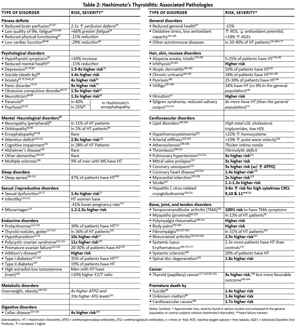
Summary Table 3: “Overview of the main dietary recommendations for patients with Hashimoto” 8.
3. Datasets
Silobreaker software was used to obtain scientific information related to the Hashimoto disease coming from different sources such as journals, proceedings, tweets, and news. Our date consists in the fallowing feature: ID, cluster Id, Description, publication date, Source URL, publisher. And the purpose is to analyze the preform of the proposed approach to discover the hiding semantic structures related with Hashimoto and thyroiditis the description from the gather data is used to study the frequency of Hashimoto and thyroiditis appears in the documents and detecting words and phrases patterns within them to automatically clustering work groups.
The dataset was obtained from Silobreaker database which is a commercial database. We got access through Florida A&M University who provided me the right to query the data. the link for the silobreaker information is [Here] (https://www.silobreaker.com/) 9.
This data was preprocessed dropping the columns ‘Id’, ‘ClusterId’, ‘Language’, ‘LastUpdated’,‘CreatedDate’,‘FirstReported’. Also, stop words and punctuation were removed, we convert to lower case all the titles.
The dataset already query can be download in my personal drive [Here](https://drive.google.com/drive/u/0/folders/1Omtnn5e-yH3bbhW0-5fIbLgi8SEyfYBP.
4. Results
The following figures were creating with the help of libraries like gensim. Gensim stands for Generate similar and is an unsupervised library wide used for topic modeling and natural language processing based on modern statistical machine learning 10. it can handle large text collections of data and can preforms task like corpora, building document, word vectors and topic identification, which is one of the technics we used here, and we can observe it in some of the images. Each figure is described and explains the method we used to created it along with the relationship of the key word or major topic to the Hashimoto disorder.
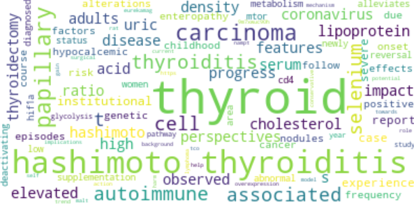
Figure 1: “Example of a Word Cloud Object”
On Figure 1 we observed an example of a word cloud object and represent the difference words found in our dataset and the size of the words means the frequency of the given words in the document. Meaning that the size of the words is proportional to the frequency of its used.
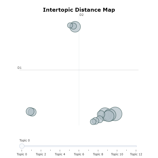
Figure 2: “Example of a Intertopic Distance Map”
Figure 2 shows an Intertopic Distance Map which is a two-dimensional space filled with circles representing the proportional number of words that belongs to each topic making the distance to each other represent the relation between the topics, meaning that topics that are closer together have more words in common. For instance, in topic 1 we observed word like hypothyroidism, Morgan, symptoms after a small search we were able to find that Morgan is a well-known writer that presented thyroiditis symptoms after giving birth which is something that happen to some women’s and then recover after a couple of months, however this increments the risk of developing the syndrome later in their lives 11. On topic 4 we see words like food, levothyroxine, liothyronine, selenium and dietary. the relationship between these words is symptom control, symptoms relive, some natural remedies and supplements 1213.
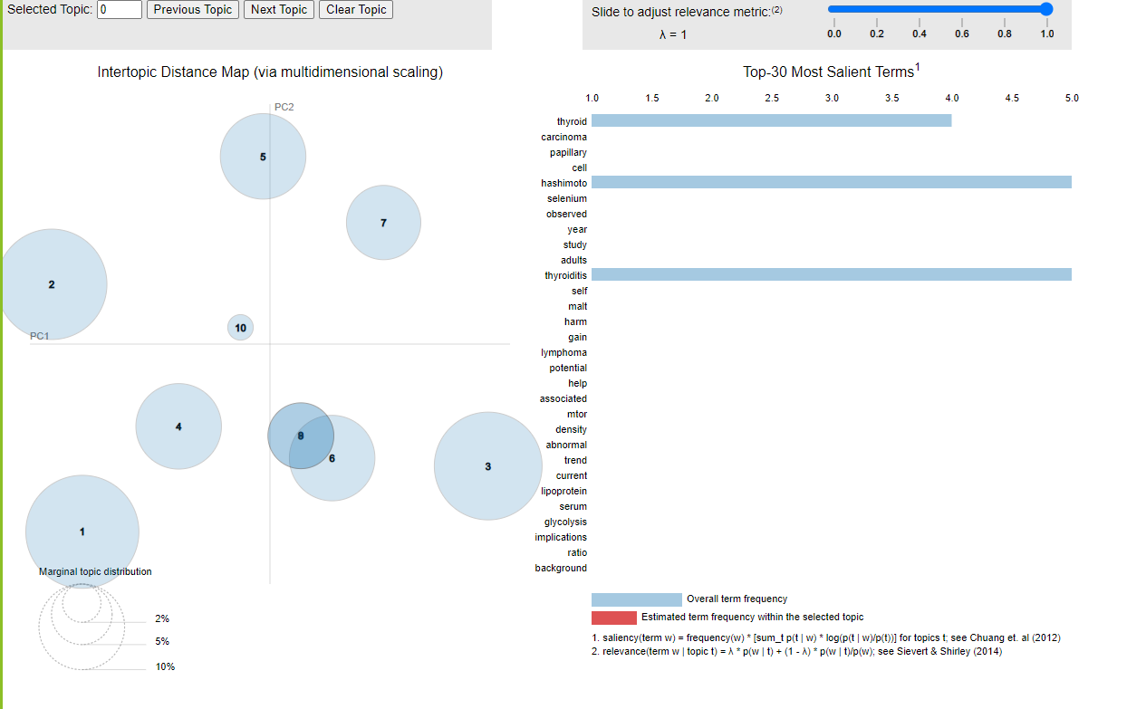
Figure 3: “Top 30 major Topics”
On figure 3 we observed a bar chart that shows 30 major terms. The bars indicate the total frequency of the term across the entire corpus. The size of the bubble measures the importance of the topics, relative to the data. for example, for visualization purposes we used the first topic that include Hashimoto, thyroiditis, and selenium. Saliency is a measure of how much the term talks about the topic. And in terms of findings is important to mentions the relationship between Hashimoto thyroiditis and selenium. Selenium is a suplement recomended for patients with this disorder that have shown a reduction on antibody levels 13.
Figure 4: “Example of Hierarchical Clustering chart”
On figure 4 we can see that the dendrograms have been created joining points 4 with 9, 0 with 2, 1 with 6, and 12 with 13. The vertical height of the dendrogram shows the Euclidean distances between points. It is easy to see that Euclidean distance between points 12 and 13 is greater than the distance between point 4 and 9. This is because the algorithm is clustering by similarity, differences, and frequency of words. We observed in the dark green dendrogram topic 7,3,4,9 which are all related to an advance stage of the disorder. we can find the information about certain treatments, causes of the disorder, level of damage at certain stages. On the reds dendrograms we observe topics 0,2,1,6 which are closely related to diagnosis, early symptoms and procedures used for the diagnosis of the disorder.
Figure 5: “Exaple of Similarity Matrix Chart”
On figure 5 we can see a similarity matrix chart, the graph is build based on similarity reached from the volume of topic and association by document, therefore the graph show groups of documents that are cluster together based on similarities. in this case the blue square is an indication of a strong similarity, and the green and light green is an indication of different topics. for instance, we are able to derive as a conclusion that carcinoma cancer, carcinoma therapy, lymph papillary metastasis and hypothyroidism are closely related. in facts they are advance stages of the disorder. E.g. Carcinoma therapy is a type of treatment that can be used for this disorder 14.
Figure 6: “Example of Term Score Decline Per Topic Chart”
On figure 6 we observed TF-IDF which is an interesting technic used on machine learning that have the ability to give weight to those words that are not frequent in the document but can carry important information. In this example we can see how topic 12, covid19 pandemic patients is the at the top of the chart and then start declining when the rank term increase. The science behind this behave is explain by the TF-IDF which is term frequency - Inverse document frequency. Therefore, covid 19 was a relative new disease, and we do not expect to have a high frequency used in the document. In this case we were able to find information about Hashimoto patients and covid19 which it seems not to causes any extreme symptoms for patient with this disorder others than the ones expected from a healthy person in other words Hashimoto patients have the same risk of a healthy person 15.
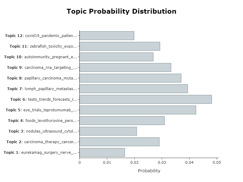
Figure 7: “Example of Topic Probability chart”
On figure 7 we see a probability distribution chart based on each topic frequency and its relationship with the main topic: Hashimoto thyroiditis causes or cure. We can see that topic 12 is the least frequent or least related since most of its content is about covid19. Then we have topic 11 zebrafish which is related to the investigation of the disorder but most of its content is about the research made on zebrafish and how had help researchers to understand thyroid diseases in other no mammals’ animals, but is not closely related to the major point of this project, however, is an interesting research which have provide useful information about thyroiditis 16.
Figure 8: “Example of a Topic Word Score Chart”
On figure 8 we have Topic Word Scores chart that provides a deep understanding of large corpus of texts trough topic extraction. for instance, the data used in this project provide 5 fundamental topics from 0 to 4. Essentially each topic provided closely related words with deep information about the disorder itself, treatments, diagnosis, and symptoms. E.g. in topic number 4 we find a specific word “eye” which it does not seem to have a close relationship with Hashimoto thyroiditis but in facts is related to one of the early symptoms that the human body experiment most likely when is still undiagnosed [16]. In the same topic we also find the word teprotumumab which is an eye relieve medication recommended from doctors to relive the symptoms, in other word is not the cure but it helps 17.
5. Hashimoto Findings
As we can see our findings are wide in aspects of causes which is one of the main keys, because if we know the cause of something most likely we will be able to avoid it. However, this disorder is considered relative knew and have been around for some decades only, but it is necessary to point out the relation of diseases with the environment. Environmental changes are a fact and are affecting us every day even when we don’t notice it. We have seen an exponential increase of Hashimoto cases in the last five decades, and at the same time the last five decades have been potentially related to climate change, high levels of pollution, less fertile soils, increased use of pesticides on food, etc. It would be a good idea to think about our environment and how to help it heal since it will bring benefits for all of us18.
Table Summary: “Finding summary on causes, descriptions and recommendations.”
| Possible Causes | Description | Recomendations |
|---|---|---|
| Genetic predispositions | Genetically linked | Manage stress |
| Dietary errors | Imbalance of iodine intake | Balance is key |
| Nutritional deficiencies | not enough veggies, vitamins and minerals | eat more veggies |
| Hormone deficiencies | lover levels of vit D | Enough sleep, Take some sun light |
| Viral, bacterial, yeast, and parasitic infections. | H pylori, Bad guts microbes | food hygiene |
| Enviromental Factors | Pollution, Pesticides used etc. | Human footprint on environment |
Possible causes
Genetic predispositions, Dietary errors, Nutritional deficiencies, Hormone deficiencies, Viral, bacterial, yeast, and parasitic infections 8.
Hashimoto Trigger Food
Some Food that can trigger Hashimoto are gluten, dairy, some type of grains, eggs, nuts or nightshades, sugar, sweeteners, sweet fruits, including honey, agave, maple syrup, and coconut sugar and high-glycemic fruits like watermelon, mango, pineapple, grapes, canned and dried fruits. Vegetable oil, specially hydrogenated oils, ad trans-fat. Patient with this disorder may experience symptoms of fatigue, rashes, joint pain, digestive issues, headaches, anxiety, and depression after eating some of these foods 19.
Hashimoto recommended Diets
The recommended foods are healthy fats like coconut, avocado, and olive oil, ghee, grass-fed and organic meat, wild fish, healthy fats, fermented foods like coconut yogurt, kombucha, fermented cucumbers and pickle ginger, and plenty of vegetable like Asparagus, spinach, lettuce, broccoli, beets, cauliflower, carrots, celery, artichokes, garlic, onions 19.
Environmental causes of Hashimoto
There have been an increase in the number of Hashimoto cases in the United States since 1950s. These is one of the reason research explain that Hashimoto disorder can be closely related to environmental causes since the rapid increase of cases can not only be related to family gens as it takes at least two generations to acquire and transfer gen mutation. Adding to this that for generation thru history human have been fitting microorganisms than enter our body but for the past centuries our environment has become very hygienic consequently our immune system suddeling was left without aggressors therefore humane start developing more allergies and autoimmune diseases. Another important factor is the balance of iodine intake because too much is as dangerous for people with genetic Hashimoto predisposition but too littler can be also dangerous for patients with the disorder to reduce goiter which is the enlargement of the thyroid glands 18.
It is still not enough research to state that low vitamin D levels are a cause or a consequence of the Hashimoto disorder, but it is a fact that most patients with this disorder have low levels of vitamin D this insufficient this is closely related to insufficient sun exposure 18.
The exposure to certain synthetic pesticide. An important fact is that 9 out of 12 pesticides are dangerous and persistent pollutants 18.
Symptoms of Hashimoto’s
Some of the symptoms are fatigue and sluggishness, sensitivity to cold, constipation, pale and dry skin, dry eyes, puffy face, brittle nails, hair loss, enlargement of the tongue, unexplained weight gain, muscle aches, tenderness and stiffness, joint pain and stiffness, muscle weakness, excessive or prolonged menstrual bleeding, depression, memory lapses, Another symptom reported by some patients was ablation, some patient described as an acceleration of the heart rhythm 20.
Complications
Tissue damage, Abnormal look of the thyroid gland (figure 2), goiter, Heart problems, mental health issues, myxedema, birth defects 20, Nodule (figure 4 Similarity Matrix topic 3), and High antibody level. It is important to mention an association between high levels of thyroid autoantibodies and the increased of mood disorders, thyroid autoimmunity disease, celiac disease, panic disorder and major depressive disorder 8.
Recomendations
Healthy diets, exercising, selenium supplementation [8], healthy sun exposure at an adequate time, getting enough sleep is primordial for the human body, in special for the metabolism regulation and the creation of normal hormones that the human body needs, 8 lowering stress levels by physical exercise is a good idea, exercise like yoga and reiki are valuable because it also exercise you brain with meditation which is a great stress reliever.
6. Benchmark
We used benchmark to perform the process time to get topics frequency in parallel using google colab with run type: GPU and TPU. We can observe that TPU machines take less time to classify topic 1. Tensor Processor Unit (TPU) is designed to run cutting-edge machine learning models with AI services on Google Cloud 21
Benchmark Topics Frequency:
| parallel Topic | Status | Time | processor |
|---|---|---|---|
| 164 1_cancer_follicular_carcinoma_autoimmune | ok | 0.53 | GPU |
| 190 1_cancer_follicular_carcinoma_autoimmune | ok | 0.002 | TPU |
7. Conclusion
As expected, we were able to derive helpful information of the Hashimoto thyroiditis disorder. we attempted to summarize our findings concerning Hashimoto thyroiditis in aspects of causes, symptoms, recommended diets and supplements and used medication.
Our findings highlight the great potential of the model we used. certainly, topic modeling method was a precise idea for the optimization of the research process. We also used various features of genism, which allows to manipulate data texts on NPL projects. The use of clustering technics was very useful to label our findings on the large datasets. Each used graph provided useful details and key words that later help us to review each important topic in a faster manner and develop the research project with accurate results.
8. Acknowledgments
Gregor von Laszewski
Yohn J Parra
Carlos Theran
9. References
-
BERT: Pre-training of Deep Bidirectional Transformers for Language Understanding, [Online resource] https://arxiv.org/abs/1810.04805 ↩︎
-
Helicobacter pylori infection in women with Hashimoto thyroiditis, [Online resource] https://www.ncbi.nlm.nih.gov/pmc/articles/PMC5265752/ ↩︎
-
I. Voloshyna, V.I Krivenko, V.G Deynega, M.A Voloshyn, Autoimmune thyrod disease related to helicobacterer pylori contamination, [Online resource] https://www.endocrine-abstracts.org/ea/0041/eposters/ea0041gp213_eposter.pdf ↩︎
-
How your diet can trigger Hashimoto’s, [Online resource] https://www.boostthyroid.com/blog/2019/4/5/how-your-diet-can-trigger-hashimotos ↩︎
-
Hypothyroidism in Context: Where We’ve Been and Where We’re Going, [Online resource] https://www.ncbi.nlm.nih.gov/pmc/articles/PMC6822815/ ↩︎
-
BERT Explained: State of the art language model for NLP https://towardsdatascience.com/bert-explained-state-of-the-art-language-model-for-nlp-f8b21a9b6270 ↩︎
-
Pavan Sanagapati, Knowledge Graph & NLP Tutorial-(BERT,spaCy,NLTK), [Online resource] https://www.kaggle.com/pavansanagapati/knowledge-graph-nlp-tutorial-bert-spacy-nltk ↩︎
-
Hashimoto’s Thyroiditis, A Common Disorder in Women: How to Treat It, [Online resource] https://www.townsendletter.com/article/441-hashimotos-thyroiditis-common-disorder-in-women/ ↩︎
-
Silobreaker: Intelligent platform for the data era https://www.silobreaker.com ↩︎
-
Gensim Tutorial – A Complete Beginners Guide, [Onile resource] https://www.machinelearningplus.com/nlp/gensim-tutorial/ ↩︎
-
Julia Haskins, Thyroid Conditions Raise the Risk of Pregnancy Complications, [Online resource] https://www.healthline.com/health-news/children-thyroid-conditions-raise-pregnancy-risks-052913 ↩︎
-
How your diet can trigger Hashimoto’s, [Online resource] https://www.boostthyroid.com/blog/2019/4/5/how-your-diet-can-trigger-hashimotos ↩︎
-
Selenium Supplementation for Hashimoto’s Thyroiditis, [Online resource] https://www.ncbi.nlm.nih.gov/pmc/articles/PMC4005265/ ↩︎
-
Thyroid Cancer Treatment, [Online resource] https://www.cancer.gov/types/thyroid/patient/thyroid-treatment-pdq ↩︎
-
Hashimoto’s Disease And Coronavirus (COVID-19), [Online resource] https://www.palomahealth.com/learn/coronavirus-and-hashimotos-disease ↩︎
-
How zebrafish research has helped in understanding thyroid diseases, [Online resource] https://www.ncbi.nlm.nih.gov/pmc/articles/PMC5730863/ ↩︎
-
Teprotumumab for the Treatment of Active Thyroid Eye Disease, [Online resource] https://www.nejm.org/doi/full/10.1056/nejmoa1910434 ↩︎
-
11 environmental triggers of Hashimoto’s, [Online research] https://www.boostthyroid.com/blog/11-environmental-triggers-of-hashimotos ↩︎
-
Hashimoto’s low thyroid autoimmune, [Online research] https://www.redriverhealthandwellness.com/diet-hashimotos-hypothyroidism/ ↩︎
-
Hashimoto’s disease, [Online research] https://www.mayoclinic.org/diseases-conditions/hashimotos-disease/symptoms-causes/syc-20351855 ↩︎
-
TPU: Tensor Processor Unit https://cloud.google.com/tpu ↩︎
12 - Project: Classification of Hyperspectral Images
![]()
![]() Status: draft, Type: Project
Status: draft, Type: Project
Carlos Theran, su21-reu-360, Edit
Abstract
?? Here comes a short abstract of the project that summarizes what it is about
Contents
Keywords: tensorflow, example.
1. Introduction
Do not include this tip in your document:
Tip: Please note that an up to date version of these instructions is available at
Here comes a convincing introduction to the problem
2. Report Format
The report is written in (hugo) markdown and not commonmark. As such some features are not visible in GitHub. You can set up hugo on your local computer if you want to see how it renders or commit and wait 10 minutes once your report is bound into cybertraining.
To set up the report, you must first replace the word hid-example in this example report with your hid. the hid will look something like sp21-599-111`
It is to be noted that markdown works best if you include an empty line before and after each context change. Thus the following is wrong:
# This is My Headline
This author does ignore proper markdown while not using empty lines between context changes
1. This is because this author ignors all best practices
Instead, this should be
# This is My Headline

We do not ignore proper markdown while using empty lines between context changes

1. This is because we encourage best practices to cause issues.
2.1. GitHub Actions
When going to GitHub Actions you will see a report is autmatically generated with some help on improving your markdown. We will not review any document that does not pass this check.
2.2. PAst Copy from Word or other Editors is a Disaster!
We recommend that you sue a proper that is integrated with GitHub or you use the commandline tools. We may include comments into your document that you will have to fix, If you juys past copy you will
- Not learn how to use GitHub properly and we deduct points
- Overwrite our coments that you than may miss and may result in point deductions as you have not addressed them.
2.3. Report or Project
You have two choices for the final project.
- Project, That is a final report that includes code.
- Report, that is a final project without code.
YOu will be including the type of the project as a prefix to your title, as well as in the Type tag at the beginning of your project.
3. Using Images
Figure 1: Images can be included in the report, but if they are copied you must cite them 1.
4. Using itemized lists only where needed
Remember this is not a powerpoint presentation, but a report so we recommend
- Use itemized or enumeration lists sparingly
- When using bulleted lists use * and not -
5. Datasets
Datasets can be huge and GitHub has limited space. Only very small datasets should be stored in GitHub.
However, if the data is publicly available you program must contain a download function instead that you customize.
Write it using pythons request. You will get point deductions if you check-in data sets that are large and do not use
the download function.
6. Benchmark
Your project must include a benchmark. The easiest is to use cloudmesh-common 2
6. Conclusion
A convincing but not fake conclusion should summarize what the conclusion of the project is.
8. Acknowledgments
Please add acknowledgments to all that contributed or helped on this project.
9. References
Your report must include at least 6 references. Please use customary academic citation and not just URLs. As we will at one point automatically change the references from superscript to square brackets it is best to introduce a space before the first square bracket.
-
Use of energy explained - Energy use in homes, [Online resource] https://www.eia.gov/energyexplained/use-of-energy/electricity-use-in-homes.php ↩︎
-
Gregor von Laszewski, Cloudmesh StopWatch and Benchmark from the Cloudmesh Common Library, [GitHub] https://github.com/cloudmesh/cloudmesh-common ↩︎
13 - Project: Detecting Multiple Sclerosis Symptoms using AI
![]()
![]() Status: draft, Type: Project
Status: draft, Type: Project
Raeven Hatcher, su21-reu-371, Edit
Abstract
Multiple sclerosis (M.S.) is a chronic central nervous system disease that potentially affects the brain, spinal cord, and optic nerves in the eyes. People that suffer from M.S had their immune system attacks the myelin (protective sheath) that covers nerve fibers, resulting in communication problems between the brain and the body. The cause of M.S. is unknown; however, researchers believe that genetic and environmental factors play a role in those affected. Symptoms differ significantly from person to person due to varying nerves involved. The most common symptoms include tremors, numbness or weakness in limbs, vision loss, blurry vision, double vision, slurred speech, fatigue, dizziness, involuntary movement, and muscle paralysis. There is currently no cure for Multiple sclerosis and treatment focuses on slowing the progression of the disease and managing symptoms.
There is no proven way to predict how an individual with M.S will progress certainly. However, researchers established four phenotypes that will assist in identifying those who are more inclined to have disease progression and help aid in more effective treatment targeting. In this experiment, Artificial Intelligence (AI) will be applied by ascertaining what causes these different phenotypes and which phenotype is at most risk for disease progression using a Magnetic Resonance Scan.
Contents
Keywords: tensorflow, example.
1. Introduction
MS or Multiple sclerosis is a potentially disabling autoimmune disease that can damage the brain, spinal cord, and optic nerves located in the eyes. It is the most common progressive neurological disability that affects adolescents. The immune system attacks the central nervous system in this disease, specifically myelin (sheth that covers and protects nerve fibers), oligodendrocytes (myelin-producing cells), and the nerve fibers located under myelin. Myelin enables nerves to send and receive electrical signals swiftly and effectively. The myelin sheath becomes scarred from being attacked. These attacks make the myelin sheath inflamed in little patches, observable on an MRI scan. These little inflamed patches potentially disrupt messages moving along the nerves, which ultimately lead to the symptoms of Multiple sclerosis. If these attacks happen frequently, permanent damage can occur to the involved nerve. Because Multiple sclerosis affects the central nervous system, which control all of the actions carried out in the body, symptoms can affect any part of the body and vary. The most common symptoms of this progressive disease include muscle weakness, pins and needle sensation, electrical shock sensation, loss of bladder control, muscle spasms, tremors, double or blurred vision, partial or total vision loss, to name a few. Researchers are not sure what causes Multiple sclerosis but believe those between the ages of 20 and 40, women, smoke, are exposed to certain infections, have a vitamin D and B12 deficiency, and related to someone affected by this disease are more susceptible.
It can be difficult to diagnose MS due to the symptoms usually being vague or very similar to other conditions. There is no single test to diagnose it positively. However, doctors can choose a neurological examination, MRI scan, evoked potential test, lumbar puncture, or a blood test to diagnose a patient properly. Currently, clinical practices divide MS into four phenotypes: clinically isolated syndrome (CIS), relapsing-remitting MS (RRMS), primary-progressive MS (PPMS), and secondary progressive MS (SPMS). Two factors define these phenotypes; disease activity (evidenced by relapses or new activity on MRI scan) and progression of disability. Phenotypes are routinely used in clinical trials to choose patients and conduct treatment plans.
New technologies, such as artificial intelligence and machine learning, help assess multidimensional data to recognize groups with similar features. When implemented in apparent abnormalities on MRI scans, these new technologies have assured promising results in classifying patients who share similar pathobiological mechanisms rather than the typical clinical features.
Researchers at UCL work with the Artificial intelligence (AI) tool SuStain (Subtype and Stage Inference) to ask whether AI can find Multiple sclerosis subtypes that follow a particular pattern on brain images? The results uncovered three data-driven MS subtypes defined by pathological abnormalities seen on brain images (Skylar). The three data-driven MS subtypes are cortex-led, normal-appearing WM-led, Lesion-led. Cortex-led MS is characterized by early tissue shrinkage (atrophy) in the outer layer of the brain. Normal-appearing WM-led is identified by irregular diffused tissue located in the middle of the brain. Lastly, a lesion-led subtype is characterized by early extension accumulation of brain damage areas that lead to severe atrophy in numerous brain regions. All three of these subtypes correlate to the earliest abnormalities observed on an MRI scan within each pattern.
In this experiment, researchers utilized the SuStain tool to capture MRI scans of 6,332 patients. The unsupervised SuStain taught itself and identified those three patterns that were previously undiscovered.
3. Using Images
 The above image shows the MRI-based subtypes. The color shades range from blue to pink, representing the probability of abnormality mild to severe, respectively. (Eshaghi)

4. Datasets
MRI brain scans of 6,322 MS patients. look if you can find figures descrbing the data.
5. Benchmark
Your project must include a benchmark. The easiest is to use cloudmesh-common.
6. Conclusion
A vital barrier in distinguishing subtypes in Multiple sclerosis is to stitch observations together from cross-sectional or longitudinal studies. Grouping individuals based wholly on their MRI scan is ineffective because patients belonging to the same subgroup could show ranging abnormalities as the disease progresses and would appear different. SuStaIn, Subtype and Staging Inference, a newly developed unsupervised machine learning algorithm aids in uncovering data-driven disease subtypes that have distinct temporal progression patterns. “The ability to disentangle temporal and phenotypic heterogeneity makes SuStain different from other unsupervised learning or clustering algorithms” (Eshaghi). SuStaIn identifies subtypes given the data, defined by a particular pattern of variation in a set of features, such as MRI abnormalities. Once the SuStain subtypes and their MRI trajectories are adequately identified, the disease model can conclude how approximately a patient, whose MRI is unseen, belongs to each of the three subtypes and stages.
A total of 9,390 patients participated in this research study. Six thousand three hundred twenty-two patients were utilized in training, and 3,068 patients were used for the validation dataset. Patient characteristics such as sex, age, disease duration, and expanded disability status scale (EDSS) were similar between the training and validation dataset. There were 18 MRI features measured, 13 of those differed dramatically from those between the MS training dataset and control group and were maintained in the SustaIn model. Three subtypes, with very distinct patterns, were identified in the training dataset and validated in the validation dataset. The early abnormalities noticed by SuStain helped define the three subtypes: cortex-led, normal-appearing white matter-led, and lesion-led.
There was a statistically significant difference in the rate of the disease progression between the subtypes in the training dataset and validation datasets. The lesion-led subtype held a 30% higher risk of developing 24-week confirmed disability progression (CDP) than the cortex-led subtype in the training dataset. The lesion-led validation dataset had a 32% higher risk of confirmed disability progression than the cortex-led subtype. No other differences in the advancement of disability between subtypes were noted. When SuStaIn was applied to the training and validation dataset, it was pointed out that there were differences in the risk of disability progression between SuStaIn stages.
Each MRI-based subtype had a different response to treatment, comparing those on treatment and those on placebo. The lesion-led subtype showed a remarkable response to the treatment. Patients on the lesion-led active treatment subtype showed a significantly slower worsening of EDSS than those on the placebo. No differences in the rate of EDSS were observed in those on the placebo compared to active treatment in the NAWM-led and cortex-led subtypes.
When SuStain was applied to a large set of Multiple sclerosis scans, it identified three subtypes. Researchers found out the patient’s baseline subtype and stage were associated with an increased risk of disease progression. Combining clinical information with the MRI-based three subtypes increased the predictive accuracy of just using the MRI scan information alone. The patterns of MRI abnormality in these subtypes provide perspicacity into disease mechanisms, and, alongside clinical phenotypes, they may aid the stratification of patients for future studies.
7. Acknowledgments
The author likes to thank Gregor von Laszewski, Yohn Jairo, and Carlos Theran.
8. References
[^6] What Is MS? National Multiple Sclerosis Society. (n.d.). https://www.nationalmssociety.org/What-is-MS.
14 - Report: AI in Orthodontics
![]()
![]() Status: final, Type: Report
Status: final, Type: Report
Whitney McNair, su21-reu-363, Edit
Abstract
In this effort we are analyzing X-ray images in AI and identifying cavitites
Contents
Keywords: ai, orthodontics, x-rays.
1. Introduction
Dental field technology capability has increased over the past 25 years, and has helped reduce time, cost, medical errors, and dependence on human expertise. Intelligence in orthodontics can learn, build, remember, understand and recognize designs from techniques used in correcting the teeth like retainers. Dental field can create alternatives, adapt to change and explore experiences with sub-groups of patients. AI has taken part of the dental field by accurately and efficiently processing the best data from treatments. For smart use of Health Data, machine learning and artificial intelligence are expected to promote further development of the digital revolution in (dental) medicine, like x-rays, using algorithms to simulate human cognition in the analysis of complex data. The performance is better, the higher the degree of repetitive pattern and the larger the amount of accessible data1.
2. Data Sets
We found a dataset on a kaggle website that is about dental images. The data was collected by Mr. Parth Chokhra. The name of the dataset is Dental Images of kjbjl. The dataset did not have metadata and an explanation of how they collected the data. The data set supports how x-rays of teeth in dentistry becomes artificial intelligence. The Dental Images of kjbjl dataset was used in AI already using autoencoders. Autoencoders are an freely artificial neural network (located in the nervous system) that learns how to accurately encode data and reconstruct the data back from the reduced encoded depiction to a representation that is closes to the original. For some challenges with Orthodontics data sets with privacy, size, avalibility were surprisingly hard to find than we thought.
3. Figures
Below we observed actual dental x-rays. These dental x-rays images below came from Parth Chorkhra on kaggle.com 2. The images are patient x-rays taken by Parth in his dental imagery data set. In the images we can see the caps and nerves of the teeth. Using these x-rays, we may can also find cavities if there are some. We can also identify other issues with patients teeth by taking and using x-rays.

Figure 1: First x-ray

Figure 2: Second x-ray

Figure 3: Third x-ray
4. Example of a AI algorighm in Orthodontics
On a separate kaggle website, we found a code for DENTAL PANORAMIC KNN 1. The kaggle site shows dental codes taken place in Orthodontics.
5. Benchmark
Here is an algorithm/code from one of the researchers we found. are using to study the performance of their algorithms or code.
Lateral and frontal facial images of patients who visited the Orthodontic department (352 patients) were employed as the training and evaluation data. An experienced orthodontist examined all the facial images for each patient and identified as many clinically used facial traits during the orthodontic diagnosis process as possible (e.g., deviation of the lips, deviation of the mouth, asymmetry of the face, concave profile, upper lip retrusion, presence of scars). A sample patient’s image, a list of sample assessments (i.e., labels), and the multi-label data used in the work by Murata et al. are shown in Figure 4.

Figure 4: Sample patient’s image and a list of sample assessments (i.e., labels) including the region of interest, evaluation, etc. In a previous study by Murata et al., they employed labels representing only the facial part (mouth, chin, and whole face), distorted direction (right and left), and its severity (severe, mild, no deviation).
6. Conclusion
Artificial intelligence is rapidly expanding into multiple facets of society. Orthodontics may be one of the fastest branches of dentistry to adapt AI for three reasons. First, patient encounters during treatment generate many types of data. Second, the standardization in the field of dentistry is low compared to other areas of healthcare. A range of valid treatment options exists for any given case. Using AI and large datasets (that include diagnostic results, treatments, and outcomes), one can now measure the effectiveness of different treatment modalities given very specific clinical findings and conditions. Third, orthodontics is largely practiced by independent dentists in their own clinics. Despite the promise of AI, the volume of orthodontic research in this field is relatively low. Further, the clinical accuracy of AI must be improved with an increased number and variety of cases. Before AI can take on a more important role in making diagnostic recommendations, the volume and quality of research data will need to increase1.
7. Acknowledgments
Dr. Gregor von Laszewski, Carlos and Yohn guided me throughout this process.
8. References
-
Hasnitadita. (2021, July 10). DENTAL panoramic knn. Kaggle. https://www.kaggle.com/hasnitadita/dental-panoramic-knn ↩︎
-
Chokhra, P. (2020, June 29). Medical image dataset. Kaggle. https://www.kaggle.com/parthplc/medical-image-dataset ↩︎
15 - Time Series Analysis of Blockchain-Based Cryptocurrency Price Changes
![]()
![]() Status: final, Type: Project
Status: final, Type: Project
Jacques Fleischer, su21-reu-361, Edit
Abstract
This project applies neural networks and Artificial Intelligence (AI) to historical records of high-risk cryptocurrency coins to train a prediction model that guesses their price. The code in this project contains Jupyter notebooks, one of which outputs a timeseries graph of any cryptocurrency price once a csv file of the historical data is inputted into the program. Another Jupyter notebook trains an LSTM, or a long short-term memory model, to predict a cryptocurrency’s closing price. The LSTM is fed the close price, which is the price that the currency has at the end of the day, so it can learn from those values. The notebook creates two sets: a training set and a test set to assess the accuracy of the results.
The data is then normalized using manual min-max scaling so that the model does not experience any bias; this also enhances the performance of the model. Then, the model is trained using three layers— an LSTM, dropout, and dense layer—minimizing the loss through 50 epochs of training; from this training, a recurrent neural network (RNN) is produced and fitted to the training set. Additionally, a graph of the loss over each epoch is produced, with the loss minimizing over time. Finally, the notebook plots a line graph of the actual currency price in red and the predicted price in blue. The process is then repeated for several more cryptocurrencies to compare prediction models. The parameters for the LSTM, such as number of epochs and batch size, are tweaked to try and minimize the root mean square error.
Contents
Keywords: cryptocurrency, investing, business, blockchain.
1. Introduction
Blockchain is an open, distributed ledger which records transactions of cryptocurrency. Systems in blockchain are decentralized, which means that these transactions are shared and distributed among all participants on the blockchain for maximum accountability. Furthermore, this new blockchain technology is becoming an increasingly popular alternative to mainstream transactions through traditional banks3. These transactions utilize blockchain-based cryptocurrency, which is a popular investment of today’s age, particularly in Bitcoin. However, the U.S. Securities and Exchange Commission warns that high-risk accompanies these investments4.
Artificial Intelligence (AI) can be used to predict the prices' behavior to avoid cryptocurrency coins' severe volatility that can scare away possible investors5. AI and blockchain technology make an ideal partnership in data science; the insights generated from the former and the secure environment ensured by the latter create a goldmine for valuable information. For example, an up-and-coming innovation is the automatic trading of digital investment assets by AI, which will hugely outperform trading conducted by humans6. This innovation would not be possible without the construction of a program which can pinpoint the most ideal time to buy and sell. Similarly, AI is applied in this experiment to predict the future price of cryptocurrencies on a number of different blockchains, including the Electro-Optical System and Ethereum.
Long short-term memory (LSTM) is a neural network (form of AI) which ingests information and processes data using a gradient-based learning algorithm7. This creates an algorithm that improves with additional parameters; the algorithm learns as it ingests. LSTM neural networks will be employed to analyze pre-existing price data so that the model can attempt to generate the future price in varying timetables, such as ten days, several months, or a year from the last date. This project will provide as a boon for insights into investments with potentially great returns. These findings can contribute to a positive cycle of attracting investors to a coin, which results in a price increase, which repeats. The main objective is to provide insights for investors on an up-and-coming product: cryptocurrency.
2. Datasets
This project utilizes yfinance, a Python module which downloads the historical prices of a cryptocurrency from the first day of its inception to whichever day the program is executed. For example, the Yahoo Finance page for EOS-USD is the source for Figure 18. Figure 1 shows the historical data on a line graph when the program receives “EOS-USD” as an input.

Figure 1: Line graph of EOS price from 1 July 2017 to 22 July 2021. Generated using yfinance-lstm.ipynb2 located in project/code, utilizing price data from Yahoo Finance8.
3. Architecture

Figure 2: The process of producing LSTM timeseries based on cryptocurrency price.
This program undergoes the four main phases outlined in Figure 2: retrieving data from Yahoo Finance8, isolating the Close prices (the price the cryptocurrency has at the end of each day), training the LSTM to predict Close prices, and plotting the prediction model, respectively.
4. Implementation
Initially, this project was meant to scrape prices using the BeautifulSoup Python module; however, slight changes in a financial page’s website caused the code to break. Alternatively, Kaggle offered historical datasets of cryptocurrency, but they were not up to date. Thus, the final method of retrieving data is from Yahoo Finance through the yfinance Python module, which returns the coins' price from the day to its inception to the present day.
The code is inspired from Towards Data Science articles by Serafeim Loukas9 and Viraf10, who explore using LSTM to predict stock timeseries. This program contains adjustments and changes to their code so that cryptocurrency is analyzed instead. This project opts to use LSTM (long short-term memory) to predict the price because it has a memory capacity, which is ideal for a timeseries data set analysis such as cryptocurrency price over time. LSTM can remember historical patterns and use them to inform further predictions; it can also selectively choose which datapoints to use and which to disregard for the model11. For example, this experiment’s code isolates only the close values to predict them and nothing else.
Firstly, the code asks the user for the ticker of the cryptocurrency that is to be predicted, such as EOS-USD or BTC-USD. A complete list of acceptable inputs is under the Symbol column at https://finance.yahoo.com/cryptocurrencies but theoretically, the program should be able to analyze traditional stocks as well as cryptocurrency.
Then, the program downloads the historical data for the corresponding coin through the yfinance Python module. The data must go through normalization for simplicity and optimization of the model. Next, the Close data (the price that the currency has at the end of the day, everyday since the coin’s inception) is split into two sets: a training set and a test set, which are further split into their own respective x and y sets to guide the model through training.
The training model is run through a layer of long short-term memory, as well as a dropout layer to prevent overfitting and a dense layer to give the model a memory capacity. Figure 3 showcases the setup of the LSTM layer.

Figure 3: Visual depiction of one layer of long short-term memory12
After training through 50 epochs, the program generated Figure 4, a line graph of the prediction model. Unless otherwise specified, the following figures use the EOS-USD data set from July 1st, 2017 to July 26th, 2021. Note that only the last 200 days are predicted so that the model can analyze the preexisting data prior to the 200 days for training purposes.

Figure 4: EOS-USD price overlayed with the latest 200 days predicted by LSTM

Figure 5: Zoomed-in graph (same as Figure 4 but scaled x and y-axis for readability)
During training, the number of epochs can affect the model loss. According to the following figures 6 and 7, the loss starts to minimize around the 30th epoch of training. The greater the number of epochs, the sharper and more accurate the prediction becomes, but it does not vastly improve after around the 30th epoch.

Figure 6: Line graph of model loss over the number of epochs the prediction model completed using EOS-USD data set

Figure 7: Effect of EOS-USD prediction model based on number of epochs completed
The epochs can also affect the Mean Squared Error, which details how close the prediction line is to the true Close values in United States Dollars (USD). As demonstrated in Table 1, more epochs lessens the Mean Squared Error (but the change becomes negligible after 25 epochs).
Table 1: Number of epochs compared with Mean Squared Error; all tests were run with EOS-USD as input. The Mean Squared Error is rounded to the nearest thousandth.
| Epochs | Mean Squared Error |
|---|---|
| 5 | 0.924 USD |
| 15 | 0.558 USD |
| 25 | 0.478 USD |
| 50 | 0.485 USD |
| 100 | 0.490 USD |
Lastly, cryptocurrencies other than EOS such as Dogecoin, Ethereum, and Bitcoin can be analyzed as well. Figure 8 demonstrates the prediction models generated for these cryptocurrencies.

Figure 8: EOS, Dogecoin, Ethereum, and Bitcoin prediction models
Dogecoin presents a model that does not account well for the sharp rises, likely because the training period encompasses a period of relative inactivity (no high changes in price).
5. Benchmark
The benchmark is run within yfinance-lstm.ipynb located in project/code2. The program ran on a 64-bit Windows 10 Home Edition (21H1) computer with a Ryzen 5 3600 processor (3.6 GHz). It also has dual-channel 16 GB RAM clocked at 3200 MHz and a GTX 1660 Ventus XS OC graphics card. Table 2 lists these specifications as well as the allocated computer memory during runtime and module versions. Table 3 shows that the amount of time it takes to train the 50 epochs for the LSTM is around 15 seconds, while the entire program execution takes around 16 seconds. A StopWatch module was used from the package cloudmesh-common13 to precisely measure the training time.
Table 2: First half of cloudmesh benchmark output, which details the specifications and status of the computer at the time of program execution
| Attribute | Value |
|---|---|
| cpu_cores | 6 |
| cpu_count | 12 |
| cpu_threads | 12 |
| frequency | scpufreq(current=3600.0, min=0.0, max=3600.0) |
| mem.available | 7.1 GiB |
| mem.free | 7.1 GiB |
| mem.percent | 55.3 % |
| mem.total | 16.0 GiB |
| mem.used | 8.8 GiB |
| platform.version | (‘10’, ‘10.0.19043’, ‘SP0’, ‘Multiprocessor Free’) |
| python | 3.9.5 (tags/v3.9.5:0a7dcbd, May 3 2021, 17:27:52) [MSC v.1928 64 bit (AMD64)] |
| python.pip | 21.1.3 |
| python.version | 3.9.5 |
| sys.platform | win32 |
| uname.machine | AMD64 |
| uname.processor | AMD64 Family 23 Model 113 Stepping 0, AuthenticAMD |
| uname.release | 10 |
| uname.system | Windows |
| uname.version | 10.0.19043 |
Table 3: Second half of cloudmesh benchmark output, which reports the execution time of training, overall program, and prediction
| Name | Time | Sum | Start | OS | Version |
|---|---|---|---|---|---|
| Overall time | 16.589 s | 35.273 s | 2021-07-26 18:39:57 | Windows | (‘10’, ‘10.0.19043’, ‘SP0’, ‘Multiprocessor Free’) |
| Training time | 15.186 s | 30.986 s | 2021-07-26 18:39:58 | Windows | (‘10’, ‘10.0.19043’, ‘SP0’, ‘Multiprocessor Free’) |
| Prediction time | 0.227 s | 0.474 s | 2021-07-26 18:40:13 | Windows | (‘10’, ‘10.0.19043’, ‘SP0’, ‘Multiprocessor Free’) |
6. Conclusion
At first glance, the results look promising as the predictions have minimal deviation from the true values. However, upon closer look, the values lag by one day, which is a sign that they are only viewing the previous day and mimicking those values. Furthermore, the model cannot go several days or years into the future because there is no data to run on, such as opening price or volume. The experiment is further confounded by the nature of stock prices: they follow random walk theory, which means that the nature in which they move follows a random walk: the changes in price do not necessarily happen as a result of previous changes. Thus, this nature of stocks contradicts the very architecture of this experiment because long short-term memory assumes that the values have an effect on one another.
For future research, a program can scrape tweets from influencers' Twitter pages so that a model can guess whether public discussion of a cryptocurrency is favorable or unfavorable (and whether the price will increase as a result).
7. Acknowledgments
Thank you to Dr. Gregor von Laszewski, Dr. Yohn Jairo Parra Bautista, and Dr. Carlos Theran for their invaluable guidance. Furthermore, thank you to Florida A&M University for graciously funding this scientific excursion and Miami Dade College School of Science for this research opportunity.
8. References
-
Jacques Fleischer, README.md Install Documentation, [GitHub] https://github.com/cybertraining-dsc/su21-reu-361/blob/main/project/code/README.md ↩︎
-
Jacques Fleischer, yfinance-lstm.ipynb Jupyter Notebook, [GitHub] https://github.com/cybertraining-dsc/su21-reu-361/blob/main/project/code/yfinance-lstm.ipynb ↩︎
-
Marco Iansiti and Karim R. Lakhani, The Truth About Blockchain, [Online resource] https://hbr.org/2017/01/the-truth-about-blockchain ↩︎
-
Lori Schock, Thinking About Buying the Latest New Cryptocurrency or Token?, [Online resource] https://www.investor.gov/additional-resources/spotlight/directors-take/thinking-about-buying-latest-new-cryptocurrency-or ↩︎
-
Jeremy Swinfen Green, Understanding cryptocurrency market fluctuations, [Online resource] https://www.telegraph.co.uk/business/business-reporter/cryptocurrency-market-fluctuations/ ↩︎
-
Raj Shroff, When Blockchain Meets Artificial Intelligence. [Online resource] https://medium.com/swlh/when-blockchain-meets-artificial-intelligence-e448968d0482 ↩︎
-
Sepp Hochreiter and Jürgen Schmidhuber, Long Short-Term Memory, [Online resource] https://www.bioinf.jku.at/publications/older/2604.pdf ↩︎
-
Yahoo Finance, EOS USD (EOS-USD), [Online resource] https://finance.yahoo.com/quote/EOS-USD/history?p=EOS-USD ↩︎
-
Serafeim Loukas, Time-Series Forecasting: Predicting Stock Prices Using An LSTM Model, [Online resource] https://towardsdatascience.com/lstm-time-series-forecasting-predicting-stock-prices-using-an-lstm-model-6223e9644a2f ↩︎
-
Viraf, How (NOT) To Predict Stock Prices With LSTMs, [Online resource] https://towardsdatascience.com/how-not-to-predict-stock-prices-with-lstms-a51f564ccbca ↩︎
-
Derk Zomer, Using machine learning to predict future bitcoin prices, [Online resource] https://towardsdatascience.com/using-machine-learning-to-predict-future-bitcoin-prices-6637e7bfa58f ↩︎
-
Christopher Olah, Understanding LSTM Networks, [Online resource] https://colah.github.io/posts/2015-08-Understanding-LSTMs/ ↩︎
-
Gregor von Laszewski, Cloudmesh StopWatch and Benchmark from the Cloudmesh Common Library, [GitHub] https://github.com/cloudmesh/cloudmesh-common ↩︎
16 - Analysis of Covid-19 Vaccination Rates in Different Races
![]()
![]() Status: draft, Type: Project
Status: draft, Type: Project
Ololade Latinwo, su21-reu-375, Edit
Abstract
With the ready availability of COVID-19 vaccinations, it is concerning that a suprising large portion of the U.S. population still refuses to recieve one. In order to control the spread of the pandemic and possibly even erradicate it completely, it is integral that the United States vaccinate as much of the population as possible. Not only does this require ensuring that everyone who wishes to be vaccinated recieves a vaccine, it also requires that those who are unwilling to recieve the vaccine are persuaded to take it. The goal of this report is to analyze the demographics of those who are hesitant to recieve the vaccine and find the reasoning behind their decision. This will make it easier to properly persuade them to recieve the vaccine and aid in raising the United States' vaccination rates.
Contents
Keywords: tensorflow, example.
1. Introduction
It has been shown by several economic and health institutions that rates COVID-19 in the United States have been among the highest in the world. Estimates show that about 10 million people have been infected and over a quarter of a million have died in the U.S. by the end of November 2020 1. Fortunately, several pharmaceutical companies such as Pfizer, Moderna, and Johnson & Johnson have managed to create a vaccine by the end of 2020, with several million Americans being given the vaccine by early March. Interestingly, it appears that despite the ready availability of vaccines, a sizeable portion of the population has no intention of receiving either their second does or either dose at all. Voluntarily receiving the COVID-19 vaccine is integral to putting the pandemic to an end, so it is important to explore which demographics are hesitant to receive their vaccine and explore their reasons for doing so. In this project, the variables that will be examined are age, sex, race, education level, location within the United States, and political affiliation.
2. Data Sets
The first of these larger data sets are the results from a study done in the Journal of Community of Health done by Jagdish Khubchandani, Sushil Sharma, James H. Price, Michael J. Wiblishauser, Manoj Sharma, and Fern J. Webb. In this study, participants of a variety of backgrounds were given a questionnaire regarding whether or not they were likely or unlikely to receive the COVID vaccine. The variables included in the study and explored in this project are sex, age group, race, education level, regional location, and political affiliation. The raw data for this study is not available, however, the study has published the results as percentages. The second and third data sets are two maps of the United States that are provided by the CDC and illustrate the estimated rates of vaccine hesitancy and vaccination progress. Additionally, the United States Census Bureau provided a breakdown of vaccine hesitancy and progress by certain variables, of which age, sex, race and ethnicity, and education level are explored in this project. Like the study done by the Journal of Community Health, the raw data is not available, but percentages are available for each variable.
2.1 COVID-19 Vaccination Hesitancy in all 50 States by County

Figure 1: An image of the United States illustrating the percentage of adults who are hesitant to recieve a vaccine for COVID-192.
2.2 Vaccination Rates by Demographic


Figures 2a-d: Images of vaccine hesitancy rates by certain demographics 2.
2.3 COVID-19 Vaccination Rates in all 50 States

Figure 3: An image of the United States illustrating the percentage of adults who have recieved at least one dose of the COVID-19 vaccine3.
2.4 Vaccination Rates in all 50 States


Figures 4a-d: Images of vaccine hesitancy rates by certain demographics
2.5 Results of the Study Done by the Journal of Community Health


Figure 5a-c: Relevant results for the explored variables from a study in vaccine hesitancy rates done by the Journal of Community Health
3. Results
3.1 Race
In the study done by the Journal of Community Health, Black Americans are shown to have the highest rate of vaccine hesitancy at 34% with White Americans not very far behind at 22%1. Additionally, Asian Americans have the lowest rate of hesitancy at 11%1. Similar results can be seen in the data provided by the US Census Bureau, with Black and White Americans having the highest two vaccination hesitancy rates, however they are shown to be very close, at 10.6% and 11.9%, respectively4. In Addition, Asian Americans are once again shown to have the lowest vaccination rates at as low as 2.3%4. This information correlates with the data provided by the US Census Bureau, which shows that Black Americans have the lowest rate of vaccination at 72.7% and Asian Americans have the highest rate of vaccination of 94.1%4.
3.2 Sex
In the study done by the Journal of Community Health, men and women are shown to have very similar rates of vaccine hesitancy at 22% for both groups1. This can also be seen in the data provided by the US Census Bureau with women having a hesitancy rate of 10.3% and men having a barely higher rate of 11.3%4. This goes along well with the vaccination rates provided by the US Census Bureau, which shows that men and women have vaccination rates of 81.4% and 80.5%4.
3.3 Age
The age ranges for both studies are grouped slightly differently, yet, interestingly enough, both data sets show two completely different age groups having the highest rate of hesitancy. In the Journal of Community Health study, the 41-60-year-old group is shown to have the highest rate at 24%1. Yet, in the US Census Bureau’s data, ages 25-39 have the highest hesitancy rate at 15.9%4. Because it has a much larger sample size, it is safer to assume that the US Census Bureaus data is more correct in this case. However, both data sets show that seniors have the lowest hesitancy rates, which makes sense as this age group has the highest vaccination rate of 93%4.
3.4 Education Level
Once again, the education levels are grouped slightly differently with the US Census Bureau not taking account for those with a Master’s degree above and the Journal of Community Health grouping together those who have a high school education and those who have not completed high school. However, unlike the previous variable, very similar results are yielded despite the difference. In both studies, those who had a high school education or below had the highest hesitancy rate at 31% in the Journal of Community Health study and 15.7% for those who have less than a high school education and 13.8% for those who have one in the data provided by the US Census Bureau14. This correlates with the vaccination rate data as those who have a high school education or less have the two lowest vaccination rates of 74.3% and 70.9%, respectively4.
3.5 Location
The Journal of Community Health is the only data set that assigns specific percentages to the hesitancy rates to regions of the United States with the Northeast having the highest hesitancy rate of 25%, followed very closely by the West and South at 24% and 23%, respectively1. This leaves the Midwest with the lowest hesitancy rate of 18%1. This is partially reflected by the data displayed in the map of the United States that illustrates the rates of hesitancy made by the Census Bureau, which shows that the rates of vaccine hesitancy are slightly higher in the Northeast, West, and Midwest, with the lowest hesitancy rate in the South2. Once again, due to the much larger sample size, it is safer to assume that the Census Bureau is more correct.
3.6 Political Affiliation
This variable is only seen in the Journal of Community Health study. It shows that vaccine hesitancy is highest in Republicans at 29% and lowest in Democrats at 16%.
4. Conclusion
After analyzing the data, a person’s sex appears to have no influence regarding a person’s willingness to recieve a COVID vaccine. However, the other variables looked at during this study appear to have an influence. One’s level of education appears to have great influence over their willingness to take the vaccine. This makes sense as those who are less educated are less likely to understand the significance of vaccinations and how they protect the U.S. population and may also be more vulnerable to false information about the vaccine as they may not have the skills to deduce whether a source is reliable or not. Additionally, the data shows that younger adults are less likely to recieve the vaccine. This is possibly due to the common misconception that young people are not adversely affected by the virus and as a result the vaccine is not necessary, which could be why , according to the US Census Bureau, 34.9% of those who are hesitant to take the vaccine don’t believe that they need it4. One’s political affiliation had a great influence on whether or not someone would be receptive to the vaccine as there is a 13% difference between the hesitancy rates in Republicans and Democrats1. This is very interesting considering that the region with the greatest Republican presence, the South, has the lowest hesitancy rate while the rest of the regions, which have a smaller Republican presence, have the highest hesitancy rates 32. Race is also a significant variable, with Black Americans having the lowest vaccination rates and among the highest vaccination hesitancy rates. This could be due to a number of overlapping factors, such as level of education and past historical events. For example, a majority of Black Americans only have a high school diploma, while a relatively small amount of them have a Bachelor’s Degree and as we’ve seen before, those with a lower level of education are more likely to be hesitant about taking the vaccine5. Additionally, Black Americans have a fairly long history of being used as medical guinea pigs, with the most infamous example being the Tuskeegee syphillis study, which would understandably result in some aversion to new vaccinations from the community6.
After analyzing this data, it is very apparent that, in order to persuade more Americans to take it, that a significant amount of time and effort be put towards having easily accesible education to the real facts about the COVID vaccine, especially in poorer areas where there people are more likely to have lower levels of education. Additionally, to reduce vaccine hesitancy amongst Republicans, we must stop politicizing the vaccine as well as the severity of COVID-19 and frame the pandemic as a bipartisan matter of public health. Regarding the high vaccination hesitancy amongst Black Americans, there are no short-term fixes as a significant portion of the community has not forgotten about the several transgressions that the United States has committed against them, however, the sooner the United States manages to regain the trust of the Black community, the closer we come to ending this pandemic.
6. Acknowledgments
Special thanks to Yohn J Parra, Carlos Theran, and Gregor Lasweski for supporting this project.
7. References
-
Khubchandani, J., Sharma, S., Price, J.H. et al. COVID-19 Vaccination Hesitancy in the United States: A Rapid National Assessment. J Community Health 46, 270–277 (2021). https://doi.org/10.1007/s10900-020-00958-x ↩︎
-
Estimates of vaccine hesitancy for COVID-19 Center for Disease Control and Prevention https://data.cdc.gov/stories/s/Vaccine-Hesitancy-for-COVID-19/cnd2-a6zw ↩︎
-
Party Affiliation by Region Pew Research Center https://www.pewforum.org/religious-landscape-study/compare/party-affiliation/by/region/-trend ↩︎
-
Household Pulse Survey COVID-19 Vaccination Tracker United States Census Bureau https://www.census.gov/library/visualizations/interactive/household-pulse-survey-covid-19-vaccination-tracker.html ↩︎
-
Black High School Attainment Nearly on Par With National Average United States Census Bureau https://www.census.gov/library/stories/2020/06/black-high-school-attainment-nearly-on-par-with-national-average.html ↩︎
-
Washington, Harriet A. Medical Apartheid: The Dark History of Medical Experimentation on Black Americans from Colonial Times to the Present https://www.jstor.org/stable/25610054?seq=1#metadata_info_tab_contents ↩︎
17 - Aquatic Toxicity Analysis with the aid of Autonomous Surface Vehicle (ASV)
![]()
![]() Status: final, Type: Project
Status: final, Type: Project
Saptarshi Sinha, fa20-523-312, Edit
Abstract
With the passage of time, human activities have created and contributed much to the aggrandizing problems of various forms of environmental pollution. Massive amounts of industrial effluents and agricultural waste wash-offs, that often comprise pesticides and other forms of agricultural chemicals, find their way to fresh water bodies, to lakes, and eventually to the oceanic systems. Such events start producing a gradual increase in the toxicity levels of marine ecosystems thereby perturbing the natural balance of such water-bodies. In this endeavor, an attempt will be made to analyze the various water quality metrics (viz. temperature, pH, dissolved-oxygen level, and conductivity) that are measured with the help of autonomous surface vehicles (ASV). The collected data will undergo big data analysis tasks so as to find the general trend of values for the water quality of the given region. These obtained values will then be compared with sample water quality values obtained from neighboring sources of water for ascertaining if these sample values exhibit aberration from the established values that were found earlier from the big data analysis tasks for water-quality standards. In the event, the sample data popints significantly deviate from the standard values established earlier, it can then be successfully concluded that the aquatic system in question, from which the water sample was sourced from, has been degraded and may no longer be utilized for any form of human usage, such as being used for drinking water purposes.
Contents
Keywords: toxicology, pollution, autonomous systems, surface vehicle, sensors, arduino, water quality, data analysis, environment, big data, ecosystem
1. Introduction
When it comes to revolutionizing our qualities of life and improving standards, there is not another branch of science and technology that has made more impact than the myriad technological capabilities offered by the areas of Artificial Intelligence (AI) and its sub-fields involving Computer Vision, Robotics, Machine Learning, Deep Learning, Reinforcement Learning, etc. It should be borne in mind that AI was developed to allow machines/computer processors to work in the same way as the human brain works and which could make intelligent decisions at every conscious level. It was meant to help with tasks for rendering scientific applications more smarter and efficient. There are many tasks that can be performed in a far more dexterous fashion by employing smart-machines and algorithms than by involving human beings. But even more importantly, AI has also been designed to perform tasks that cannot be successfully completed by employing human beings. This could either be due to the prolonged boredom of the task itself, or a task that involves hazardous environments that cannot sustain life-forms for a long time. Some examples in this regard would involve exploring deep mines or volcanic trenches for mineral deposits, exploring the vast expanse of the universe and heavenly bodies, etc. And this is where the concept employing AI/Robotics based technology fits in perfectly for aquatic monitoring and oceanographical surveillance based applications.
Toxicity analysis of ecologically vulnerable water-bodies, or any other marine ecosystem for that matter, could give us a treasure trove of information regarding biodiversity, mineral deposits, unknown biophysical phenomenon, but most importantly, it could also provide meaningful and scientific information related to the degradation of the ecosystem itself. In this research endeavor, an attempt will be made to utilize aquatic Autonomous Surface Vehicle (ASV) that will be deployed in marine ecosystems and which can continue collecting data for a prolonged period of time. Such vehicles are typically embedded with different kinds of electronic sensors, that are capable of measuring physical quantities such as temperature, pH, specific conductance, dissolved oxygen level, etc. The data collected by such a system can either be over a period of time (temporal data), or it could cover a vast aquatic geographical region (spatial data). This is the procedure by which environmental organizations record and store massive amounts of data that can be analyzed to obtain useful information about the particular water body in question. Such analytical work will provide us with statistical results that can then be compared with existing sample values so as to decipher whether the water source, from where the sample was obtained, manifests normal trend of values or shows large deviations from established trends that can signify an anomaly or biodegradation of the ecosystem. The datasets used in this endeavor are provided publicly by environmental organizations in the United States, such as the US Geological Survey (USGS). While the primary goal involves conducting big data analysis tasks for the databases so as to obtain useful statistical results, a secondary goal in this project involves finding out the extent to which a particular sample of water, obtained from a specific source of water, deviates from the normal trend of values. The extent of such deviations can then give us an indication about the status of the aquatic degradation of the ecosystem in question. The data analysis framework will be made as robust as possible and in this effort, we will work with data values that are spread over multiple years and not just focused on a single year.
2. Background Research and Previous Work
After reviewing the necessary background literature and previous work that has been done in this field, it can be stated that most of such endeavors focused majorly on environmental data collection with the help of sensors attached to a navigational buoy in a particular location of a water-body. Such works did not involve any significant data analysis framework and focused on particular niche areas. For instance, a particular research effort involved deploying a surface vehicle that collected data from large swaths of geographical areas in various water bodies but concentrated primarily on different algorithms employed for vehicular navigation and their relative success rates 1. Other research attempts focussed on even more niche areas such as study of the migration pattern exhibited by zooplanktons upon natural and aritifical irradiance 2, and detection and monitoring of marine fauna 3. Although these are interesting projects and can provide us with novel information about various aspects of biological and aquatic research, such research attempts neither focused much on the data analysis portion for multiple sensory inputs (viz. temperature, pH, specific conductance, and dissolved oxygen level, which are the four most important water quality parameters) nor did they involve an intricate procedure to compare the data with sample observations so as to arrive at a suitable conclusion regarding the extent of environmental degradation of a particular water body.
As mentioned in the previous section, this research endeavor will exhaustively focus not just on the working principles and deployment of surface vehicles to collect data, but it will also involve employing deeper study towards the subject of big-data analysis of both the current data of the system in question and the past data obtained for the same aquatic profile. In this way, it would be possible to learn more about the toxicological aspects of the ecosystem in question and which can then be also applied to neighboring regions.
3. Choice of Data-sets
Upon exploring a wide array of available datasets, the following two data repositories were given consideration to get the required water quality based data over a particular period of time and for a particular geographical region:
After going through the sample data values than can be visualized from the respective websites of USGS and EPA, the USGS datasets were chosen over the EPA datasets. This is mainly because the USGS datasets are more commensurate with the research goal of this endeavor, especially since it contains a huge array of databases that focuses on the four most important water quality data which are - temperature, pH, specific conductance, and dissolved oxygen level. Some previous work was conducted on similar USGS datasets by a particular research team 6. However, such work was drastically different in nature, when compared with this research attempt, since its emphasis was on a very broad perspective so as to create an overview of how to use and visualize the data from the USGS water quality portal. Besides, such work emphasizes on characterizing the seasonal variation of lake water clarity in different regions throughout the continental US, something that is very deviant from what would be addressed in this particular article which majorly involves studying environmental degradation and aquatic toxicology from the context of big data analytical tasks.
To address the questions involving existence of multiple data-sets and motivation of using multiple data-sets, we must keep in mind that the very nature of this study is based on historical trends of the nature of water-quality in a particular region from the past and to this effect, emphasis has been given to use data values from the past years as well in addition to the current year. The geographical location for this analysis was chosen to be the East Fork Whitewater River that is located at Richmond, IN (USA). The years that have been chosen in this case are 2017, 2018, 2019, and 2020. For all these years, focus would be placed on the same time-period, that spans from November 1 to November 14, for all these years so as to establish consistency and high fidelity across the borad. Having multiple data-sets in this way will help us in achieving robust data-analytical results. It would also ensure that too much focus is not given on outlier cases, that may be relevant to just a particular time and day on a given year, or an aberration in the data that may only have surfaced due to an unknown underlying phenomenon or some form of cataclysmic event from the past. Using multiple datasets would help to get a resultant data structure that is more likely to converge towards an approximate level of historical thresholds and which can then be used to find out how a current sample data-point deviates from such established trends of previous patterns.
4. Methodology
4.1 Hardware Component
Although this project focuses more on the data analysis portion than mechanical details, some information relating to the design and working principle of ASVs is provided herewith.The rough outline of an autonomous surface vehicle (ASV) in question has been perceived in Autodesk Fusion 360, which is a software package that helps creating and printing three-dimensional custom designs. A preliminary model has been designed in this software and after printing, it can be interfaced with the appropriate sensors in question. The system can be driven by an Arduino-Uno based microcontroller or even a Raspberry Pi based microprocessor, and it can comprise different types of environmental sensors that helps with collecting and offloading data to remote servers/machines. Some of these sensors can be purchased commercially from the vendor, “Atlas Scientific” 7. For instance, the following sensors can be used with an ASV to measure the four most important water quality parameters involving temperature, pH, dissolved oxygen level, and specific conductance values:
- PT-1000 Temperature sensor kit 7
- Potential of Hydrogen (pH) sensor kit 7
- Dissolved Oxygen (DO) sensor kit 7
- Conductivity K 1.0 sensor kit 7
A very rudimentary framework of such a system has been realized in the Autodesk Fusion 360 software architecture as shown below. A two-hull framework is usually more helpful than a single hull based design since the former would help with stability issues especially while navigating through choppy waters. Figure 1 shows the design in the form of a very simplistic platform but which definitely lays down the foundation for a more complex structure for an ASV system.

Figure 1: Nascent framework of an ASV system in Fusion 360
With the chassis framework out of the way, a careful analysis could be conducted towards the other successful components of such a vehicle so as to complete the entire build process for a fully functional prototype ASV. In essence, an ASV can be thought of being composed of certain key sub-elements. From a broad perspective, they comprise the hardware makeup, a suitable propulsion system, a sensing system, a communication system, and an appropriate source of onboard power source. The hardware makeup being out of the way, the other aspects can now be elaborated as follows:
Propulsion System: Primarily, the two major possibilities for propulsion systems in an ASV involve using either a single servo motor with an assortment of rudders and propellers for appropriate steering, or using two separate servo motors, one of which will drive the left-hand side of the system and the other would drive the right-hand side. The second arrangement is preferred in many scenarios as it provides with better maneuverability and control of the system as a whole. For instance, to move forward in a rectilinear fashion, both the motors would be given the same level of power. Whereas for steering the system in a particular direction, one of the motors would be assigned a lower power level than the other, thereby enabling the system to curve inwards on the side which has the motor with a lower power level. Of course, there will always be perturbations and natural disturbances that will deter the system from making these correct path changes. For this reason, a Proportional-Integral-Derivative (PID) controlled response could be augmented with the locomotion algorithms.
Sensing System: An ASV can have as many sensors as possible (dependent upon physical and electrical constraints of microcontroller/microprocessor) but for a study like this, an arrangement involving four different sensors needs to be integrated in the ASV which measures the four principle water quality parameters. This way, when the entire ASV system is deployed in an aquatic environment, it will be able to simultaneously provide readings for all four water-quality parameters in this case. Precisely, these water-quality parameters would be temperature, potential of hydrogen (pH), dissolved oxygen level, and specific conductance value. It should be noted in this perspective that it is possible to include even more sensors in this ASV system. However, the reason why it is generally not helpful to go beyond a certain number of sensors is primarily because of two reasons. Firstly, these parameters are important to most toxicological analysis studies 1, and the readings provided by such a sensory system could be considered as a foundation which could provide future directions (including adding more sensors, if needed). Secondly, we should also keep in mind that the hardware system has certain constraints. In this scenario, it involves a sensory shield (that can be integrated with a microcontroller or microprocessor) which can be used for incorporating multiple sensors. But it also has a maximum of four ports for four different sensors only. Though it is possible to add multiple layers of shield on top of the others (thereby raising the capability of integrating the number of sensors to eight or even more), it leads to unnecessary bandwidth issues, memory depletion possibilities, along with an increased demand of higher power supply. These issues will especially be more consequential if we are dealing with a microcontroller that has very limited memory and power, unlike a microprocessor. Hence, the decision to stick with only a certain number of sensors is really an important one.
Communication System: This is possibly the most important part of the ASV system as we need to device a technique to offload the data that is collected by the vehicle back to a remote computer/server that would likely be located at a considerable distance away from the ASV. There are different options that can be considered in this regard for establishing a proper communicative functionality between the ASV and the remote computer. Some options that are typically considered involve Bluetooth, IR signals, RF signals, GPS-based system, satellite communication, etc. There are both pros and cons when it comes to using any of these different communication systems for the ASV. However, the most important metric in this case involves the maximum range the communication system could span over. Obviously, some of the options (viz. Bluetooth) would not be possible in this regard as they have a very limited communication range. Some others (viz. satellite communication systems) have a very high range but are nevertheless not feasible for small-scale research endeavors as they require too much onboard processing power to even carry out their most basic operations. Hence, a balanced approach is normally followed in these scenarios and a GPS/RF-based system is often found to be a reliable candidate for carrying out the proposed tasks of an ASV.
Power Source: Finally, we certainly need an onboard processing power system that can provide the required amount of power to all the functional entities housed in the ASV system. The characteristic of such a desired power source would be that it would not require frequent charging and can sustain proper ASV operations for at least five to six hours. Additionally, the weight of the power source should also not be too clumsy that might put the stability of the entire ASV system in jeopardy. It must have a suitable weight, and should also come in an appropriate shape and size such that the weight of the entire power module is evenly distributed over a large area, thereby further reinforcing the stability of the system.
4.2 Software Component
With the help of the collected data from ASVs, the datasets of USGS are then prepared which meticulously tabulates all the readings from the different water sensors of the ASV. Such tabular data is made public for research and other educational purposes. In this endeavor, such datasets will be analyzed to decipher the median convergent values of the water body for the four different parameters that have been measured (i.e. temperature, pH, dissolved oxygen level, and specific conductance). The results of this data analysis task will manifest the water quality parametric values and standards for the particular aquatic ecosystem. Such a result will then be used to find out if a different water sample value sourced from a particular region deviates by a large proportion from the established standards which was obtained after analyzing the historical data from USGS for a regional source of water. The USGS website makes it easier to find data from a nearby geographical region by making it possible to enter the desired location prior to searching for water quality data in their huge databases. In this way, one can also use these databases to figure out if the water quality parameters of the particular ecological system varies wildly from a neighboring system that has almost the same geographical and ecological attributes.
The establishment of the degree of variance of the sample data from the normal standards will be carried out by deciphering the number of water quality paramteric values that are aberrant in nature. For instance, a sample value with only an aberrant pH value could be classified as “Critical Category 1” whereas, a sample value with aberrant values for pH, temperature, and specific conductance would be classified as “Critical Category 3”. The aberrant nature of a particular parameter is postulated by enumerating how far the values are away from the established median data, which was obtained from the past/historical datasets. This will involve centroid-based calculations for the k-means algorithm (discussed in the next section). Such aberrant nature of a particular water quality paramteric value can also be figured out by using the context of standard deviations and quartile ranges. For instance, if the current data resides in the second quartile, it can be demarcated as being more or less consistent with previously established values. However, if it resides in the first or third quartile then it might be that the particular ecosystem has aberrant aspects, which would then need to be investigated for possible effects of outside pollutants (viz. industrial effluents, agricultural wash-off, etc.), or presence of harmful invasive species that might be altering the delicate natural balance of the ecosystem in question.
The software logic is located at this link 8. It has been created using the aid of Google Colaboratory platform, or simply Colab 9. The code has been appropriately commented and documented in such a way that it can be easily reproduced. Important instructions and vital information about different aspects of the code have been properly written down wherever necessary. The coding framework helps in corroborating the inferences and conclusions made by this research attempt, and which are described in detail in the subsequent sections. The major steps that have been followed in establishing the software logic for this big-data analytical task are discussed below.
4.2.1 Data Pre-processing
Meta-data: As with any other instance of big data, the data obtained from the USGS website is rife with many unnecessary information. Most of these information relate to meta-data for the particular database and it also contains detailed logistical information such as location information, units used for measurement, contact information, etc. Fortunately, all these information have been bunched up nicely at the beginning of the database and they were conveniently filtered out by skipping the first thirty-four (34) rows while reading the corresponding comma separated value (csv) files.
Extraction of required water-quality parameters (Temperature, Specific Conductance, pH, Dissolved Oxygen): After filtering out the meta-data, it is very essential to focus only on the relevant portion of the database which contains the required information that is needed for the data analysis tasks. In this case, if we observe carefully, we will notice that not all the columns contain the required information relating to water-quality parameters. Some of them include information such as date, time, system’s unit, etc. Since these will not be required for our analysis task, we extract only those columns that contain information relating to the four primary water-quality parameters. Figure 2 displays the layout of the USGS dataset files containing all the extraneous information that are deemed unnecessary for the big data analysis task.

Figure 2: Sample Database file obtained from the USGS water-quality database for the year 2017
4.2.2 Attributes of the preliminary data
Seasonal Consistency: The preliminary data, that was pre-processed and extracted, was plotted to visualize the basic results. The data pertains to a particular duration of time in a specific seasonal time of the year, more importantly that spans the first two weeks of November for all the four years. This has been done to maintain consistency of results across the platform and to create as much as a robust framework as possible that can have high fidelity.
Data-points as x-axis: Additionally, it should be kept in mind that the data has already been time-stamped rigorously. More precisely, the databases that are uploaded to the USGS website have data tabulated in them that are arranged in a chronological manner. As a result, having the x-axis refer to actual data-points means the same if we had the x-axis refer to time instead. These plotted results have been provided in the next section.
Visualization of trends: The preliminary plotting of the data helps us to visualize the overall trends of the variation of the four important water-quality parameters. This gives an approximate idea regarding what we should normally expect from the water-quality data, the approximate maximum and minimum range of values, and it further helps in detecting any kind of outlier situations that might arise either due to the presence of artifacts, or nuisance environmental variables.
4.2.3 Unsupervised learning: K-means clustering analysis (“Safe” & “Unsafe” Centroid calculation)
General Clustering Analysis: The concept behind any clustering based approach involves an unsupervised learning mechanism. This means that the dataset traditionally does not come labelled and the task in hand is to find patterns within the data-set based on suitable metrics. These patterns help delineate the different clusters and classify the data by assigning them to one of these clusters. This process is usually carried out by measuring the euclidean distance of each point from the “centroids” of every cluster. The resultant clusters are created in such a way that the distance within the points in a particular cluster are minimized as much as possible whereas, the corresponding distance between points from different clusters are maximized. Figure 3 summarizes this concept of clustering technique.

Figure 3: Concept of Clustering analysis adopted as an unsupervised learning process 10
K-means Classification: Centroid Calculation: The algorithm for this step first starts with selecting a random centroid value to start with to begin the iteration process. In order to be rigorous in this regard, the initial points for centroid values were chosen to be one standard deviation away from the median values for the four water-quality parameters. More importantly, two initial centroid values were chosen that would result in two clusters, one belonging to the safe water-standard cluster and the other belonging to the unsafe category. For the safe centroid value, the point chosen was such that it was one standard deviation lower than the median values for the temperature and specific conductance parameters, whereas it was one standard deviation higher than the median values for the pH and disolved oxygen level parameters. This logic was reversed in case of the unsafe centroid starting value. The intuition behind this approach comes from the fact that a lower temperature and specific conductance value means lower degree of exothermic reactions and lower amount dissolved salts which are typically the traits of unpolluted water sources, and which also have higher pH value (that is, less acidic) and higher level of dissolved oxygen. Hence, the initial centroid value for the “safe” category was chosen in this way. For the unsafe cateory, the metrics were simply reversed.
Iteration process: The next steps for the centroid calculation involves creating an iteration process which will keep updating and perfecting the centroid values upon every execution of the iteration. In this case, the condition for ending the iteration involved either exceeding fifty iterations or reaching the ideal situation where the new centroid value equals the previous centroid value. In the later case, it can be mentioned that the centroid calculation has converged to a specific ideal value. Fortunately, in the case of this project, it was possible to arrive at this convergence of centroid values with not too many iteration steps. The details of this process has been explained in the coding framework with appropriate comments.
Assigning of Clusters: At the end of the iteration step, we end up with the final centroid values for the safe and unsafe category. With the help of these values, we calculate the euclidean distance for every points and assign them to appropriate clusters to which they are closest to. In this way, we complete the unsupervised algorithm of clustering process for any unlabelled data that is provided to us. In this particular endeavor, we assign the value “0” for a predicted cluster indicating a safe set of water-quality values for a given point, and a value of “1” for an unsafe set of water-quality values for a given point. Figure 4 summarizes this idea behind the K-means clustering method that chiefly works as an unsupervised learning algorithm.

Figure 4: Concept of Clustering analysis adopted as an unsupervised learning process 11
4.2.4 Display of results & analysis of any given sample values set
In the final step, we display all the results and relevant plots for this big-data analysis task. Additionally, based on the labelled data and predicted classes for safe and unsafe water-quality standards, it will now be possible to find whether an arbitrary set of data values, that represent water-quality data for a particular region, would be classified as safe or unsafe as per this technique. This has also been shown in the results section.
5. Inference
5.1 Analysis of extracted data and statistical information
The first preliminary set of results were analyzed to get a general idea of how the water quality paramters vary for the system in question. For the purposes of data visualization, the processed data (viewed as a data-frame in python) was first analyzed to understand the four primary water-quality parameters that are being worked upon. The data-frames for the big data sets are shown below, along with the corresponding statistical information that were evalauted for such attributes. Figure 5 shows the preliminary results that were obtained for the data visualization and statistical processing tasks.

Figure 5: Displaying results of data visualization and statistical information for the water-quality parameters
In the above set of results, it should be worthwhile to note that temperature is measured in the celsius scale, specific conductance is measured in microsiemens per centimeter at 25 degree celsius, pH is measured in the usual standard range (between 0-14), and the level of dissolved oxygen is measured in milligrams per liter.
Next, the content of the dataset, after it is processed in the software architecture, is plotted. It displays the alteration of the values (expressed in scatter plots) of the four main water-quality parameters (viz. Temperature, Specific Conductance, pH, and Dissolved Oxygen) over the period of time that starts from November 1 to November 14 for the four years involving 2017, 2018, 2019, and 2020.
Figure 6 displays the scatter plot data for the “temperature” attribute in the year 2017.

Figure 6: Scatter plot for the water-quality parameter involving “Temperature” (2017)
Figure 7 displays the scatter plot data for the “specific conductance” attribute in the year 2017.

Figure 7: Scatter plot for the water-quality parameter involving “Specific Conductance” (2017)
Figure 8 displays the scatter plot data for the “pH” attribute in the year 2017.

Figure 8: Scatter plot for the water-quality parameter involving “pH” (2017)
Figure 9 displays the scatter plot data for the “dissolved oxygen” attribute in the year 2017.

Figure 9: Scatter plot for the water-quality parameter involving “Dissolved Oxygen” (2017)
Figure 10 displays the scatter plot data for the “temperature” attribute in the year 2018.

Figure 10: Scatter plot for the water-quality parameter involving “Temperature” (2018)
Figure 11 displays the scatter plot data for the “specific conductance” attribute in the year 2018.

Figure 11: Scatter plot for the water-quality parameter involving “Specific Conductance” (2018)
Figure 12 displays the scatter plot data for the “pH” attribute in the year 2018.

Figure 12: Scatter plot for the water-quality parameter involving “pH” (2018)
Figure 13 displays the scatter plot data for the “dissolved oxygen” attribute in the year 2018.

Figure 13: Scatter plot for the water-quality parameter involving “Dissolved Oxygen” (2018)
Figure 14 displays the scatter plot data for the “temperature” attribute in the year 2019.

Figure 14: Scatter plot for the water-quality parameter involving “Temperature” (2019)
Figure 15 displays the scatter plot data for the “specific conductance” attribute in the year 2019.

Figure 15: Scatter plot for the water-quality parameter involving “Specific Conductance” (2019)
Figure 16 displays the scatter plot data for the “pH” attribute in the year 2019.

Figure 16: Scatter plot for the water-quality parameter involving “pH” (2019)
Figure 17 displays the scatter plot data for the “dissolved oxygen” attribute in the year 2019.

Figure 17: Scatter plot for the water-quality parameter involving “Dissolved Oxygen” (2019)
Figure 18 displays the scatter plot data for the “temperature” attribute in the year 2020.

Figure 18: Scatter plot for the water-quality parameter involving “Temperature” (2020)
Figure 19 displays the scatter plot data for the “specific conductance” attribute in the year 2020.

Figure 19: Scatter plot for the water-quality parameter involving “Specific Conductance” (2020)
Figure 20 displays the scatter plot data for the “pH” attribute in the year 2020.

Figure 20: Scatter plot for the water-quality parameter involving “pH” (2020)
Figure 21 displays the scatter plot data for the “dissolved oxygen” attribute in the year 2020.

Figure 21: Scatter plot for the water-quality parameter involving “Dissolved Oxygen” (2020)
5.2 Centroids & Predicted Classes/Clusters
Figure 22 shows the final centroid values for the safe and unsafe water-quality standards for the year 2017. Furthermore, Figure 23 shows the predicted classes for the safe and unsafe clusters, which were calculated based on the results of the centroid values, for the same year of 2017.

Figure 22: Safe and unsafe centroid values for the year 2017.

Figure 23: Predicted classes for safe (“0”) and unsafe (“1”) clusters for the year 2017.
5.3 Heatmaps for the years - 2017, 2018, 2019, and 2020
For the all the four years, heatmaps were plotted to get more information about the trend of the data. Chiefly, the heatmaps give us an empirical form of ideology relating to the degree of correlation between the different water-quality parameters in this data analysis task.
Figure 24 visualizes the heat-map and shows the relationships between the various aquatic parameters for the year of 2017.

Figure 24: Heatmap for the water-quality parameters (Year - 2017)
Figure 25 visualizes the heat-map and shows the relationships between the various aquatic parameters for the year of 2018.

Figure 25: Heatmap for the water-quality parameters (Year - 2018)
Figure 26 visualizes the heat-map and shows the relationships between the various aquatic parameters for the year of 2019.

Figure 26: Heatmap for the water-quality parameters (Year - 2019)
Figure 27 visualizes the heat-map and shows the relationships between the various aquatic parameters for the year of 2020.

Figure 27: Heatmap for the water-quality parameters (Year - 2020)
5.4 Analysis of sample set of values
In this portion, we test the unsupervised learning mechanism on actual sample sets of water-quality values. For this purpose, we feed the sample values to the coding framework and based on the centroids calculated for the past four years, it is able to identify whether the given water sample belong in the safe or unsafe category. Further, if it belongs in the unsafe category, the system can further inform us the degree of criticality of the water-quality degradation. This is carried out by evaluating how many water quality parametric values are beyond the normal range. Based on this analysis, a critical nature is then displayed as an output result. As an example, a critical category of “2” would signify two of the water-quality parameters were beyond the normal range of values, while the others were normal. Needless to say, higher is the critical category level, the more degraded the water source is.
Figure 28 displays the results obtained for specific sample values of water quality parameters.

Figure 28: Analysis of water sample values by ascertaining the degree of degradation based on critical level
5.5 Benchmark information
Finally, the benchmark analysis results are shown below for the respective tasks carried out by the coding platform. Some important facts that should be kept in mind in this regard are as follows:
- The benchmark analysis was carried out using the cloudmesh benchmark procedure in Python (executed in Google Colab).
- A sleep-time of “5” was selected as the standard for the benchmark analysis and it has been adopted consistently for all the other benchmark calculations.
- The time values for the different benchmark results were not rounded off in this case as it was both important and interesting to know the minute differences between the different kinds of tasks that were carried out in this regard. It should be noted that the final benchmark value is exceptionally high since this step involves the part where the human user inputs the sample values for ascertaining the safety standard for a water source.
Figure 29 shows the benchmark results that were obtained for specific sections in the coding framework.

Figure 29: Benchmark results for all the tasks that were carried out for this big data analysis task using Google Colab
6. Conclusion
This research endeavor implements a big data analysis framework for analyzing toxicity of aquatic systems. It is an attempt where hardware and software meet together to give reliable results, and on the basis of which we are able to design an elaborate mechanism that can analyze other sample water sources and provide decisions regarding its degradation. Although the endeavor carried out in this example might not involve a plethora of high-end applications or intricate logic frameworks, it still provides a very decent foundational approach for carrying out toxicological analysis for water sources. Most importantly, it should be noted that the results obtained for sample values correspond to what we would normally expect for polluted and non-polluted sources of water. For instance, it was found that water sources with high values of specific conductance were categorized in the “unsafe” category which is to be expected since a high conductance value typically signifies the presence of dissolved salts and ions in the water source, which normally indicates that effluents or agricultural run-off might have made its way to the water source. Additionally, it was also found out that water samples with high values of dissolved oxygen levels were categorized in the “safe” category which is certainly true based on biological postulates.
Of course, a more diverse array of data coupled with more scientific and enhanced ASV systems would have probably provided us with even better results. But as indicated earlier, this research endeavor provides a pragmatic foundational approach to conducting this kind of big data analytical work. We can build up on the logic presented in this endeavor to come up with even more advanced and robust version of toxicological analysis tasks.
7. Acknowledgements
The author would like to thank Dr. Geoffrey Fox, Dr. Gregor von Laszewski, and the associate instructors in the FA20-BL-ENGR-E534-11530: Big Data Applications course (offered in the Fall 2020 semester at Indiana University, Bloomington) for their continued assistance and suggestions with regard to exploring this idea and also for their aid with preparing the various drafts of this article.
8. References
-
Valada A., Velagapudi P., Kannan B., Tomaszewski C., Kantor G., Scerri P. (2014) Development of a Low Cost Multi-Robot Autonomous Marine Surface Platform. In: Yoshida K., Tadokoro S. (eds) Field and Service Robotics. Springer Tracts in Advanced Robotics, vol 92. Springer, Berlin, Heidelberg. https://doi.org/10.1007/978-3-642-40686-7_43 ↩︎
-
M. Ludvigsen, J. Berge, M. Geoffroy, J. H. Cohen, P. R. De La Torre, S. M. Nornes, H. Singh, A. J. Sørensen, M. Daase, G. Johnsen, Use of an Autonomous Surface Vehicle reveals small-scale diel vertical migrations of zooplankton and susceptibility to light pollution under low solar irradiance. Sci. Adv. 4, eaap9887 (2018). https://advances.sciencemag.org/content/4/1/eaap9887/tab-pdf ↩︎
-
Verfuss U., et al., (2019, March). A review of unmanned vehicles for the detection and monitoring of marine fauna. Marine Pollution Bulletin, Volume 140, Pages 17-29. Retrieved from https://doi.org/10.1016/j.marpolbul.2019.01.009 ↩︎
-
USGS Water Quality Data, Accessed: Nov. 2020, https://waterdata.usgs.gov/nwis/qw ↩︎
-
EPA Water Quality Data, Accessed Nov. 2020, https://www.epa.gov/waterdata/water-quality-data-download ↩︎
-
Read, E. K., Carr, L., De Cicco, L., Dugan, H. A., Hanson, P. C., Hart, J. A., Kreft, J., Read, J. S., and Winslow, L. A. (2017), Water quality data for national‐scale aquatic research: The Water Quality Portal, Water Resour. Res., 53, 1735– 1745, doi:10.1002/2016WR019993. https://agupubs.onlinelibrary.wiley.com/doi/epdf/10.1002/2016WR019993 ↩︎
-
Atlas Scientific team. Atlas Scientific Environmental Robotics. Retrieved from https://atlas-scientific.com/ ↩︎
-
Sinha, Saptarshi. (2020) A Big-data analysis framework for Toxicological Study. Retrieved from https://github.com/cybertraining-dsc/fa20-523-312/blob/main/project/code/toxicologyASV.ipynb ↩︎
-
Google Colaboratory team. Google Colaboratory. Retrieved from https://colab.research.google.com/ ↩︎
-
Tan, Steinback, Kumar (2004, April). Introduction to Data Mining, Lecture Notes for Chapter 8, Page 2. Accessed: Nov. 2020, https://www-users.cs.umn.edu/~kumar001/dmbook/dmslides/chap8_basic_cluster_analysis.pdf ↩︎
-
Alan J. (2019, November). K-means: A Complete Introduction. Retrieved from https://towardsdatascience.com/k-means-a-complete-introduction-1702af9cd8c ↩︎
18 - How Big Data has Affected Statistics in Baseball
![]()
![]() Status: final, Type: report
Status: final, Type: report
Holden Hunt, holdhunt@iu.edu, fa20-523-328, Edit
Abstract
The purpose of this report is to highlight how the inception of big data in baseball has changed the way baseball is played and how it affects the choices managers make before, during, and after a game. It was found that big data analytics can allow baseball teams to make more sound and intelligent decisions when making calls during games and signing contracts with free agent and rookie players. The significance of this project and what was found was that teams that adopt the moneyball mentality would be able to perform at much higher levels than before with a much lower budget than other teams. The main conclusion from the report was that the use of data analytics in baseball is a fairly new idea, but if implemented on a larger scale than only a couple of teams, it could greatly change the way baseball is played from a managerial standpoint.
Contents
Keywords: sports, data analysis, baseball, performance
1. Introduction
Whenever people talk about sports, they will always talk about some kind of statistic to show that their team is performing well, or certain player(s) are playing incredibly well. This is due to the fact that statistics has become extremely important in sports, especially in rating an entity’s performance. While essentially every sport has adopted statistics to quantify performance, baseball is the most well-known sport to use it, due to the obscene number of stats that are tracked for each player and team, as well as the sport that uses stats the most in how they play the game. The MLB publishes about 85 different statistics for individual players, including the stats tracked of the teams, there is likely to be about double the amount if tracked statistics for the sport of baseball. The way that all the statistics are calculated, is, of course, by analyzing big data found from the players and teams. This report will mainly talk about the history of big data and data analytics in baseball, what the data is tracking, what we can learn from the data, and how the data is used.
2. Dataset
The dataset that will be analyzed in this report will be the Lahmen Sabermetrics dataset. This dataset is a large dataset curated by Sean Lahmen, which contains baseball data starting from the year 1871, which is when the Major League Baseball association was founded 1. The dataset contains data for many different types of statistics, including batting stats, fielding stats, pitching stats, awards stats, player salaries, and games they played in. The data for this dataset has statistics from the last season that occurred (2020 season), but the data that could be accessed for this report is from 1871-2015. I plan to use this dataset for discussing later how the data in sets like this is used for statistical analysis in baseball and how teams can use this to their advantage.
3. Background
The concept of baseball has been a sport that has existed for centuries, but the actual sport called baseball started in early to mid 1800s. Baseball became popularized in the United States in the 1850s, where a baseball craze hit the New York area, and baseball quickly was named a national pastime. The first professional baseball team was the Cincinnati Red Stockings, which was established in 1869, and the first professional league was established in 1871, and was called the National Association of Professional Base Ball Players. This league only lasted a few years and was replaced by a more formally structured league called the National League in 1876, and the American League was established in 1901 from the Western League. A vast majority of the modern rules of baseball were in place by 1893, and the last major change was instituted in 1901 where foul balls are counted as strikes. The World Series was inaugurated in the fall of 1903, where the champion of the National League would play against the champion of the American League. During this time, there were many problems with the league, such as strikes due to poor and unequal pay and the discrimination of African Americans. The era in the time of the early 1900s was the first era of baseball, and the second era of baseball started in the 1920s where a plethora of changes to the game caused the sport to move from more of a pitcher’s game to a hitter’s game, which was emphasized by the success of the first power hitter in professional baseball, Babe Ruth. In the 1960s, baseball was losing revenue due to the rising popularity of football, the league had to make changes to combat this drop in revenue and popularity. The changes lead to the salaries of the players getting increased and also an increase in attendance to games, which means increased revenue 2.
Big data is able to be used in baseball through the use of statistics, which has become a major part in how the sport is played. The use of statistics in baseball has become known as sabermetrics, which can be used by teams to make calls for the game based on numbers. The idea of using sabermetrics started from the book called Moneyball. The book was published in 2003, and was about the Oakland Athletics baseball team and how they were able to use sabermetric analysis to compete on equal grounds with teams that had much more money and good players than the A’s team 3. This book has had a major impact on the way baseball is played today for several teams. For example, teams like the New York Yankees, the St. Louis Cardinals, and the Boston Red Sox have hired full-time sabermetric analysts in attempts to gain an edge over other teams by using these sabermetrics to influence their decisions. Also, the Tampa Bay Rays were able to make the moneyball idea a reality by making it to the 2020 World Series with a much lower budget team and using lots of sabermetrics in their decision-making 3. This moneyball strategy is not the perfect strategy however, because the Rays lost the World Series, and the turning point for their loss could be pointed to a decision they made based on what the analytics said they should do, which ended up being the wrong choice, which lost them a crucial game in the series.
4. Big Data in Baseball
The data that is being analyzed for the statistics in baseball are datasets similar to the one this report is looking into, the Lahmen Sabermetrics dataset. Since this dataset contains a vast amount of data for each player and many different tables containing many different kinds of data, many kinds of statistics are able to be tracked for each player. With this large amount of statistics, teams are able to look to numbers and analytics in order to make the best decision on the actions to make during a game. Teams can also use analytic technology to predict the performance of a player based on their previous accomplishments and comparing that to similar players and situations in the past 4.
This kind of analysis can be used to gauge the potential performance of a free-agent or rookie player, as well as deciding what player should be in the starting lineup for the upcoming game(s). Since these sabermetric analyses are able to predict the performance of a player in the coming years, they are able to tell if a contract made by a team is likely to not be a smart deal since they tend to make long-term deals for lots of money, even though it is likely that the player will not continue to perform at the same level they are currently at for the entirety of their contract. This is normally due to the inability to play at an incredibly high level consistently for a long period of time and regression of performance from age, which is shown to start occuring at around 32 years old 4. This simply means that large contracts have a trend of being a large loss of money in the long run shown from analysis of similar types of contracts in the past. This kind of analysis also allows for a players ranking to be deciding by more areas than before. For example, a player’s offensive capabilities can be shown by looking at more categories than the amount of home runs hit and batting average, they can also look at baserunning skill, slugging percentage, and overall baseball intelligence. This ability of looking at a player’s overall capabilities in a more analytical manner allows teams to not throw all their budget into one or two top prospected players, but can spread their money across several talented players to have a good and balanced team. Another reason why deciding to not spend lots of money on a long contract for a top prospected player is that the analysis shows that players have started to have shorter lengths of time where they are able to perform at their best, even though other sports have seen the opposite in recent years . However, young players have been performing at a much higher level in recent years and they have had younger players moving from the minor to the major league much faster than before 4.
The data that is presented in the Lahman Sabermetrics database and other similar databases is able to allow analysts to compare data and statistics of one team with any/every other team with relative ease and in an easy to understand way. For example, the comparative analysis Figure 1 below shows that the payroll of teams and their winning percentage, analysts are able to learn that the New York Yankees have a much higher payroll than all other teams and they have a very good win rate, but there are other teams that do have very high payrolls and have the same good rate rate. Also, Figure 1 shows that there are other teams that have higher payrolls than average, but have a very bad win rate compared to all other teams, including teams that have a much lower payroll 5. This kind of analysis shows us that spending lots of money does not guarantee a strong season, which can strengthen the idea of the moneyball strategy coined earlier where teams attempt to waste less money by spreading budgets across several players other than spending most of the budget on only one or two players.
Figure 1: Comparative Analysis of Payroll to Win Percentage 5

This is only one way that the Lahman Sabermetrics dataset can be used, but there are many more ways this data can be used to make league wide analyses and compare a certain team to others. This can be used by teams to possibly learn what they might be doing wrong if they feel as though they should be performing better.
5. Conclusion
This report discusses the history of baseball and how big data analytics came to be prevalent in the sport, as well as how big data is used in baseball and what can be learned from the use of it so far. Big data is able to be used to make decisions that could greatly benefit a team from saving money on a contract with a player to making a choice during a game. Big data analytics use in baseball is a fairly new occurrence, but due to the advantages a team can gain from using analytics, it is likely that use of it will increase soon in the future.
6. Acknowledgements
The author would like to thank Dr. Gregor Von Laszewski, Dr. Geoffrey Fox, and the associate instructors in the FA20-BL-ENGR-E534-11530: Big Data Applications course (offered in the Fall 2020 semester at Indiana University, Bloomington) for their continued assistance and suggestions with regard to exploring this idea and also for their aid with preparing the various drafts of this article.
7. References
-
Lahman, Sean. “Lahman’s Baseball Database - Dataset by Bgadoci.” Data.world, 5 Oct. 2016. https://data.world/bgadoci/lahmans-baseball-database ↩︎
-
Wikipedia. “History of Baseball.” Wikipedia, Wikimedia Foundation, 27 Oct. 2020. https://en.wikipedia.org/wiki/History_of_baseball ↩︎
-
Wikipedia. “Moneyball.” Wikipedia, Wikimedia Foundation, 28 Oct. 2020. https://en.wikipedia.org/wiki/Moneyball ↩︎
-
Wharton University of Pennsylvania. “Analytics in Baseball: How More Data Is Changing the Game.” Knowledge@Wharton, 21 Feb. 2019. https://knowledge.wharton.upenn.edu/article/analytics-in-baseball/ ↩︎
-
Tibau, Marcelo. “Exploratory data analysis and baseball.” Exploratory Data Analysis and Baseball, 3 Jan. 2017. https://rstudio-pubs-static.s3.amazonaws.com/239462_de94dc54e71f45718aa3a03fc0bcd432.html ↩︎
19 - Predictive Model For Pitches Thrown By Major League Baseball Pitchers
![]()
![]() Status: final, Type: report
Status: final, Type: report
Bryce Wieczorek, fa20-523-343, Edit
Abstract
The topic of this review is how big data analysis is used in a predictive model for classifying what pitches are going to be thrown next. Baseball is a pitcher’s game, as they can control the tempo. Pitchers have to decide what type of pitch they want to throw to the batter based on how their statistics compare to that of the batters. They need to know what the batter struggles to hit against, and where in the strike zone they struggle the most.
With the introduction of technology into sports, data scientists are sliding headfirst into Major League Baseball. And with the introduction of Statcast in 2015, The MLB has been looking at different ways to use technology in the game. In 2020 alone, the MLB introduce several different types of technologies to keep the fans engaged with the games while not being able to attend them [^3]. In this paper, we will be exploring a predictive model to determine pitches thrown by each pitcher in the MLB. We will be reviewing several predictive models to understand how this can be done with the use of big data.
Contents
Keywords: Pitch type, release speed, release spin, baseball, pitchers, MLB
1. Introduction
Big data is everywhere and has been used in sports for years. Especially in Major League Baseball, where big data has been analyzed for various things. For example, in the movie Moneyball (which is based on true events), the general manager of the Oakland A’s uses analytics to find players that will win them games that other teams overlook. They used many different statistics; batting average, batting average with runners on base, fielding percentage, etc., to find these players. Not only do teams use big data to find the right players for them, but the MLB also uses it for their Statcast technology. Statcast was implemented in 2015 and is an automated tool that analyzes data to deliver accurate statistics in real time 1. This technology tracks many different aspects of the game, including many different pitching statistics.
The pitching statistics that are recording is actually through the PITCHf/x system 2. This system was implemented nine years before Statcast. The system is made up of three cameras that are located throughout the stadium that measure the speed, spin, and trajectory of the baseball as it is thrown. Statcast adopted this technology as the MLB was looking at ways to track more than just pitching statistics.
And while there is a lot of data about pitching, we will only be focusing on release speed, release spin, pitch type, and the pitcher for our model. And while there is a lot of data about these different pitches and the pitchers, it can still be difficult to predict exactly what type of pitch is thrown according to the pitcher. For instance, the difference between different types of fastballs, a four-seam and two-seam, can be different by less than a mile per hour and forty rotations per minute (as thrown by Aaron Nola of the Philadelphia Phillies). In our model that we try to create, we are use these variables, along with the last three pitches thrown for each pitch type, to try to predict what pitch was just thrown.
2. Background and Previous Work
Baseball players are always looking for a way to have an edge over their opponents. Whether that is through training, recovery, use of supplements, and by watching film or statistics to find what your opponent’s struggle with.
There are several existing models that have been made to predict pitch type. We plan on examining them to determine how this can be done. We are looking for a general blueprint of which multiple models have used and/or have followed. This also allowed us to see what type of datasets would best be used for an analysis of this sort.
2.1 Harvard College Model
The first prediction model we studied was done through Harvard University 3. This prediction model was very complex and explored many different types of analysis. They first investigated doing a binary classification model. However, they ultimately decided against this because the label of pitches did not accurately represent what they actual were. This led them into multi-class predictive models in which they used. The other types of analysis were boosted trees, classification trees, random forests, linear discriminant analysis, and vector machines. The main point of this report was to see if they could replicate previous work done, but they ultimately failed at each one. This resulted to them in trying to determine if one can correctly predict pitch type selection. There research showed that machine learning cannot correctly predict pitch type due to the many different aspects that need to be analyzed. They hoped that their work could be used as a reference for future work done.
We found this article to be very useful in our work since it stands as a reference for future work. We found this to be helpful in our review of predictive models for pitch types due to the different models they tried to replicate.
2.2 North Carolina State University Model
The prediction model created by North Carolina State University 4 was created to predict the next pitch that was going to be thrown. Their model compared old data to the current live data of a game, they are using many different types of data to predict the next type of pitch. They used a very large database that consisted of 287 MLB pitchers who had an average of 81 different pitch features (pitch type, ball rotation, speed, etc.). They are trying to determine if the next pitch will be a fastball or an off-speed pitch. Like the previously mentioned model, this model is also using trees to give a classification output. The parent node is the first type of pitch thrown, which then leads to if the pitch was a strike or a ball, then it uses this information and compares it to their dataset to predict the next set of nodes.
We found this to be very useful for our review since their model worked correctly and it used current data from the game. With Statcast today, we find this to be very important since all of this information is recorded and logged as each pitch is thrown.
3. Dataset
Major League Baseball first started using Statcast in 2015, after a successful trial run in 2014. Statcast 1 provided the MLB with a way to collect and analyze huge amounts of data in real time. Some of the data it collects, which is used in many different models, includes the pitcher’s name, pitch type, release spin, release speed, and the amount of times each pitch was thrown.
Since we do not need all the data Statcast collects, we found a dataset with the datatypes listed above 5. We chose this dataset because it contains a significant amount of data that can be used for a prediction model. The dataset contains a lot of information about not only the pitchers, but about the batters. The database shows what each batter has done against every type of pitch they have faced, whether they hit the ball, fouled it, swung and missed, etc. We felt as if this data is very important as well since coaches and pitchers will want to know how the batter reacts to different pitches and the different locations of each pitch. This would be a vital part to any pitch prediction model as coaches signal to the pitchers what types of pitches to throw according the strengths and weaknesses of the batters.
4. Search and Analysis
After conducting our background research, we determined that in order to build an accurate model to predict which pitch was just thrown, you would need to use a similarity analysis tool model with classification trees. This model allows us to take old data and compare it to the live data of the pitch. By comparing the live data to the older data, it will give the most accurate results due to how the players are playing during that game. A batter may struggle with a certain type of pitch that day and not another.
The similarity analysis tool model would best be used to find instances of the batter in certain pitch counts. For instance, this tool would analyze the different amount of times the batter has faced a count 1 – 2 (1 ball and two strikes), and then find what pitch they saw next and what the outcome was. This information would then be filtered to see what pitch will have the best outcome for the pitcher, it would tell them what pitch to throw and where to throw it. This is where the classification trees would then be used. The trees would classify the recommended pitches to throw and their location to the types of pitches that they throw.
5. Limitations
There are several limitations to predictive models for pitch types 6. The biggest is pitch classification itself. Pitchers ultimately pick what types of pitches they throw and as some pitches behave like others, different pitchers can classify the same pitch type as something else. For example, the traditional curve ball and a knuckle curve react the same. Other classification challenges that can be faced can be related to how the pitcher is playing. As the game goes on, pitcher’s velocities traditionally decrease due to their arms tiring, this could result in misidentification between different types of fastballs. The last limitation that could affect the pitch classification could be the PITCHf/x system malfunctioning or interference with the system.
6. Conclusion
This report discusses the use of predictive model in baseball and how they can be used to predict the next pitch thrown. By reviewing previous models down by Harvard 3 and by North Carolina State University 4, we determined that the best way to build a predictive model would be by using a similarity analysis tool model with classification trees. With the Carolina State University’s successful model, we also concluded that there were limitations to it, as different pitchers classify their pitches differently and telling different pitches apart due to the similar behaviors. The use of predictive models in baseball could change the game as it gives the pitchers an advantage over the batters. We hope that this report can show how big analytics can affect the game of baseball.
7. Acknowledgements
The author would like to thank Dr. Gregor Von Laszewski, Dr. Geoffrey Fox, and the associate instructors in the FA20-BL-ENGR-E534-11530: Big Data Applications course (offered in the Fall 2020 semester at Indiana University, Bloomington) for their continued assistance and suggestions with regard to exploring this idea and also for their aid with preparing the various drafts of this article.
8 References
-
[2020. About Statcast. MLB Advanced Media. http://m.mlb.com/glossary/statcast ↩︎
-
Nathan, Alan M. Tracking Baseballs Using Video Technology: The PITCHf/x, HITf/x, and FIELDf/x Systems. http://baseball.physics.illinois.edu/pitchtracker.html ↩︎
-
Plunkett, Ryan. 2019. Pitch Type Prediction in Major League Baseball. Bachelor’s thesis, Harvard College. https://dash.harvard.edu/handle/1/37364634 ↩︎
-
Sidle, Glenn. 2017. Using Multi-Class Classification Methods to Predict Baseball Pitch Types. North Carolina State University. https://projects.ncsu.edu/crsc/reports/ftp/pdf/crsc-tr17-10.pdf ↩︎
-
Schale, Paul. 2020. MLB Pitch Data 2015-2018. Kaggle https://www.kaggle.com/pschale/mlb-pitch-data-20152018 ↩︎
-
Sharpe, Sam. 2020. MLB Pitch Classification. Medium. https://technology.mlblogs.com/mlb-pitch-classification-64a1e32ee079 ↩︎
20 - Big Data Analytics in the National Basketball Association
![]()
![]() Status: final, Type: Report
Status: final, Type: Report
Igue Khaleel, fa20-523-317, Edit
Abstract
The National Basketball Association and the deciding factors in understanding how the game should be played in terms of coaching styles, positions of players, and understanding the efficiencies of shooting certain shots is something that is prevalent in why analytics is used. Analytics is a topic space within basketball that has been growing and emerging as something that can make a big difference in the outcomes of gameplay. With the small analytic departments that have been incorporated within teams, results have already started coming in with the teams that use the analytics showing more advantages and dominance over opponents who don’t. We will analyze positions on the court of players and how big data and analytics can further take those positions and their game statistics and transform them into useful strategies against opponents.
Contents
Keywords: basketball, sports, team, analytics , statistics, positions
1. Introduction
The National Basketball Association was first created in the year of 1946 with the name of BAA (Basketball Association of America). However, in 1949 the name was changed to the NBA with a total of 17 teams1. As time progressed the league started picking up steam and more and more teams began to join and it wasn’t until the 90’s that we see the total amount of NBA teams be produced.This league consists of professional basketball players from both national and international spaces of the world. As there are 16 roster spots per team and 32 teams in total, only the very most athletic, skillfull, and colossal individuals are chosen to represent this league. Now, knowing the special skillsets of individual players, the founder of basketball, James Naismith, created positions to maximize these individual players for team success. On the court there are 5 positions : point guard, shooting guard, small forward, power forward, and center1.
1.1 Point Guard
Starting with the point guard, generally these individuals are the smallest players on the court with an average height around 6'2 tall. With what these player lack in height they make up for in skillset in terms of quickness, passing, agility, ball handling, and natural shooting ability. Point guards are generally looked at to be the floor general of the team and take up the job of setting up the coach’s gameplan and teamates.
1.2 Shooting Guard
The shooting guard is a generally a slightly taller player than the point guard and like the name suggests they are generally the player known for their indiviualisitc shooting prowess whehter if it is beyond the 3 point line or in the mid-range. Shooting guards are known to be positioned in the perimeter(outside the arc) as a partner to the point guard. On occasion, the role of the shooting guard is expanded in the case that the point guard is pressured so the role may be for the shooting guard to be better at defense or a player that can help in the playmaking duties of the point guard.
1.3 Small Forward
The small forward is where things change in terms of roles when comparing to the guards of that were previously mentioned above. They can be considered hybrids in the sense that they can both operate on the perimeter like guards and can go down low like power forwards and centers which will be discussed later. Noramlly with wings(another name for small forward) with an average height around 6'7, there are a plethora of responsibilites in order to be considered effective. The reason for this is because generally speaking, small forwards are the most athletic player on the court. They basically have most the agility and ball handling of guards and most of the physicallity and power of power forwards/centers. Understandibly, there are tasked with big defensive assignments and are usually looked at to be a decent to above-average producer on offense.
1.4 Power Forward
The power forward position is where the physicallity of players matters more. Generally these players are around 6'9 to 6'11 and are heavier than most players. Becuase of this they give up speed and shooting which is why they operate around the free throw line and basket. They are looked at to protect the interior with the center from smaller players and small forwards driving in the lane to the basket.
1.5 Center
The center is considered mostly the point guard of the defense of the team. They are generally the anchor that protects the rim primarily and takes up defensive assignemtns and calls. Without a competent center, a team can see their defense take a hit. Along with defense, centers are good options to go to when the team has offensive lulls since the easiest shot to make in the nba is a hook shot or layup and the center operates 3 feet from the basket. Centers generally range from 6'11 to as high as 7'6 in height. On rare occasions you can see 6'9 to 6'10 centers take the court and that is generally because of play-style or above-average defense.
2. Era of Analytics
The National Basketball Association continues to not only grow in the sense of continued personnel but an increase of cap(cash flow) amongst teams as well. Within the scope of this prosperous cap situation that the NBA has accumulated over the years through merchandising, tickets, and tv deals, teams have found flexibility in the ability to create the optimal situation for whatever version of basketball the General Manager sees fit for the vision of the team. In terms of better understanding how this can be accomplished it is best to understand what spurred this action of finding styles to lead to the best team success.
That particular action is players such as Stephen Curry, a 6-3 NBA point guard, that led to the change in utilizing analytics. The year Steph Curry broke through as an MVP, his team; the Golden State Warriors broke the former Chicago Bulls record of 72-9. This in big part was due to Steph Curry breaking the 3pt record as well as Golden State adopting the small ball philosophy. This particular year gave birth to the era of analytics because of how dominate those two approaches were.
3.1 The Houston Rockets
This has then inspired teams to introduce analytics departments to measure ways to beat the game and exploit mismatches in defensive schemes and height within players. An example of a team that spearheaded this change in strategy is the Houston Rockets. Their GM(General Manager) Daryl Morey was a MIT graduate who advocated for a team that primarily shoots three point shots as their main forte2. The science behind this concept was that 33% shooting from the three point line measure to 50% from the two point line respectively. This was in the works in the year of 2017 just two years removed from Steph Curry’s three point dominance in his MVP season. In terms of numbers representing the change, the 2018 Houston Rockets attempted approximately 82% of their shot attempts around the three point line and the restricted area(the circle around ~5 feet in diameter surrounding the rim)2. The next best team in that department was eleven percent down at 71% in terms of attempts. In this year, the Rockets won their conference at a record of 65 wins - 17 losses as well as break the NBA record in three pointers attemted and made.
3.2 Tools
In order to evaluate these players and acquire the data necessary for analyization, the NBA partnered with a company name STATS to provide the necessary tools for data collection. STATS worked with the NBA by installing six cameras in each basketball arena in order to, “track player and referee movements at 25 frames per second to get the most analytical data for teams and the NBA to analyze3.” This is very effective in terms of showing the play-by-play moves of players in a system as well as even how referees move. With players, these tools can serve as a chess board where the coach is able to watch pieces move and can determine where certain positions could be optimized to its maximum efficiency. This allows for film sessions to be more productive and helpful for players to better see where they fit and even improve in. In terms of referees, throughout sports it is known that referees have cost some games due to missed calls or questionable decisions. This technology can help in terms of understanding: 1) how a specific referee calls certain fouls and 2) if there seems to be a number count of fouls depending on what team the referee is reffing historically. Understanding both the tendencies of players and refs alike gives coaching staffs a direction to go in when preparing for opponents on a game-by-game basis3.
3.3 Draft Philosophy
Another facet of the game that is likewise impacted by the tools and techniques described in 3.2 is the NBA draft. The NBA draft consists a total of 60 players selected in two rounds combined. The general consensus before this analytics era was to choose the best player avaible most of the time. Teams back then usually drafted big men(e.g. forwards and centers) because it was considered a safe pick and known to help your team better in more areas. As time passed, we’ve seen a shift to more guards that are drafted instead to fit the narrative the analytics presents to teams regarding the best path to success. For example, earlier Stephen Curry was mentioned to be one of the foundational reasons that the analytics movement was largely adapted. The year Curry got drafted, the #1 pick in the draft was Blake Griffin who at the time was considered the best Power Forward in the draft while Curry was drafted at 8th overall and even James Harden of the Houston Rockets was drafted 3rd4. As we fast forward to 2020, both Curry and Harden are looked at as the two best players from their draft class with Curry revolutionizing the three point shot and Harden being the ultimate analytics player with his ability to manipulate the defense and draw free throws from fouls like no player has ever done. As years passed, there has been a shift in drafting players with the mindset of that particular players' potential over fit in the sense that teams look for the best available player that fits the teams system the most efficiently4. An example is the upcoming 2020 NBA draft where there is a question of who will become the #1 and 2 pick respectively. The Golden State Warriors have the 2nd pick in the draft because of a year of injuries for all of their star players. So, they typically aren’t looking for a player like most losing teams are doing in the draft. In the eyes of many scouts, some view a player like Lamelo Ball, a 6'7 point guard as the best player or at least second best and others see players like Anthony Edwards(SG), James Wiseman(C) and Deni Advija(SG) as potentially better fits and safer picks. However, for the warriors rumors over social media from notable sources have shown that they aren’t interested in drafting Lamelo Ball as he is a point guard and they have Steph Curry already. They instead prefer to choose a Small Forward or Center that can help their defensive potential and style of play. Years ago, that may not have been the case as the best player available would usually come off the board and the team would figure it out after that. Thus, this shows how analytics has not only persuaded teams to change their play styles and system but also the players that come with it whether they are veterans or incoming rookies.
4. Background Work and Advanced Analytics in Basketball
Considering how the impacts of how implemented analytics has aided the NBA atmosphere as mentioned above, we look to learn technologies and work that help bring this about. This begins with camera systems that have been implemented by a company named SportVU who’ve helped bring about change in NBA arenas since 2013 that track player and basketball movement across the arenas5. This system goes further in the analysis of collecting data in the context of individual player statistics being captured as well as their positioning on the court and speed in particular instances.
Thus by capturing the basic statistics such as points, assists, rebounds, steals and blocks. Analytical tools such as Player Efficiency Ratings and Defensive Metrics were better used to analyze players and their individualistic impacts on the basketball court. The impacts of these analytical/computational metrics are represented in many organizations abilities to understand the scope of player’s salaries and positioning on the court, who to draft, and helps sports analyst on TV shows such as FS1 and ESPN to easily break down the game of Basketball.
This is where algorithims come to play as an algorithim needs a dataset from which it can train itself and develop statistical patterns to help in predictive analysis and representation for coaches and teams to utilize respectively. An example of this is show through students named Panna Felsen and Lucy from the University of California Berkely, who are developing a software name Bhostgusters that helped analyze the body positions of players and further the response and movements of a team to certain plays run by the opposition5. The end goal of this for coaches to be able to draw up a play on a tablet and see potential conflicts, results, and how opponents may counteract that particular play.
Other technologies that are being developed and implemented are things like, CourtVision, which is technology that shows the statistics of a player making a shot based on that players' past statistics and position on the court. As the player is moving through the court the numbers change to reflect his efficiency on certain areas on the court based on this. As stated by Marcus Woo, the author of this article, these technologies aren’t meant to replace the systems in place but instead are there the help in efficiency and effectiveness5.
5. Algorithims associated with NBA
When it comes to the variety of algorithims used in the National Basketball Association, we will be analyzing the range of algorithims discussed through articles and papers on google scholar. We looked at a total of five algorithims that were commonolu shown to be used of the most searches when it came to predictive and learning analysis within NBA analytics departements and outside agencies. The algorithims as presented are: K-means, Artificial Neural Networks, Linear Regression, Logistic Regression, and Support Vector Machines6. Linear Progression was by far the most written on topic within the five algorithims listed above with a total of 11,000 searches. It is followed by the Support Vector Machines with 5,240, Logistic Regression with 4,500, Artificial Neural Networks with 4,300, and K-Means with 1,590 search results(*all results via google scholar search bar).
5.1 K-Means
The first algorithim we’ll look at is K-Means which is classified as generally the “clustering algorithim” which takes the form of initializing a single point of k or the mean and organizing the data towards that particular mean6. This is then repeated over and over until the appropriate results are found and compiled. Now as National Basketball Association statistics are inserted this can be used to cluster players together than fit the criteria on certain outcomes of points, rebounds, assists, and blocks.
5.2 Linear Regression
Linear Regression, which is very commonly used in machine learning is very effective as a predictor tool. It works by forming “regression coefficients” that stems from pitting together independent variables which help in predictions within a game6. So, throught the input and output variables taht are presented predictive measurements can be performed to highlight potential productivety. An example is the “Box-Plus-Minus”. This was created to show a basketball player’s overall court production and effect through their statistics, what position they play on the court and the wins and losses that team incurs because of this7. This was built through linear regression and shows through charts based on statistics how productive a player is or potentially can be given the system and oppurtunities.
5.3 Logistic Regression
Similarly to Linear Regression, Logistic Regression shares a lot of features in terms of the formula used for prediction except it utilizes a sigmoid as opposed to a linear function when performing calculations. Weight values are the main form of predictions in whatever form of scenario or situation in which that analyst wants to produce6. An example of this is shown through a logistical regression analysis performed by Oklahoma State University on clutch and non-clutch shots by players in the National Basketball Association. The premise of this is taking the data of an individual player based on their shooting percentages in spots on the floor relative to the distance of the defender on them and using that to figure out the potential of a player making a shot in the clutch(universally known as the last two minutes in a close game)8. This then shows how a predictive algorithm can be utilized not only based on solely percentages and efficiencies but also with the inclusion of situation on a basketball floor.
5.4 Support Vector Machines
Support Vector Machines are considered to be a very formidable tool when it comes to measuring classification issues. This modeled machine creates a decision-making tree that helps in the predictions of basketball games and thus can help coaches form strategies and gameplans around what the model predicts can happen. Additional advantages that come with this tool is its ability to operate in high dimensions, the ability to identify kernels, and its memory efficiency9. The minor issue with this machine is the lack of rule generation but as it is more of an emerging tool overtime this is something that is relatively fixable10. The advantages
5.5 Artificial Neural Networks
With Artificial Neural Networks the use of the Multi-Layer Perceptron is prevalent and it is highlighted by the vertices of a group in correlation to input varables and comes out with the output9. This tool according the Beckler is also considered to be, “an adaptive system that changes its structure based on external and internal information flows during the network training phase”6. With this, the Artificial Neural Network is considered to be one of the most accurate predictive tools when it comes to basketball and can predict patterns as more data is inputed9.
6. Conclusion
As time progresses, we will continue to see the use of analytics as well as the expanision of analytics departments in not only the National Basketball Association but other professional sports as well. The impacts of analytics have been highlighted through recent years as mentioned above with the change to styles of play, and the way coaches approach gameplans before each respective game is played. As Adam Silver, the commissioner of the National Basketball Association stated, “Analytics have become front and center with precisely when players are rested, how many minutes they get, who they’re matched up against11.” Through this, Silver explains not only to technical aspect of basketball that analytics supports but the physical aspect which can aid in preventing things like player injuries and rest. Understandibly, this highlights how analytics can help the league now and in the future; especially when more sophisticated machine learning tools and algorithims are produced for this purpose.
7. Acknowledgment
The author would like to thank Dr. Gregor von Laszewski, Dr. Geoffrey Fox, and the associate instructors in the FA20-BL-ENGR-E534-11530: Big Data Applications course (offered in the Fall 2020 semester at Indiana University, Bloomington) for their continued assistance and suggestions with regard to exploring this idea and also for their aid with preparing the various drafts of this article.
8. References
-
Online, N., 2020. NBA History. [online] Nbahoopsonline.com. Available at: https://nbahoopsonline.com/History/#:~:text=The%20NBA%20began%20life%20as,start%20of%20the%20next%20season. [ Accessed 20 October 2020]. ↩︎
-
Editor, M., 2020. How NBA Analytics Is Changing Basketball | Merrimack College. [online] Merrimack College Data Science Degrees. Available at: https://onlinedsa.merrimack.edu/nba-analytics-changing-basketball/ [Accessed 16 November 2020]. ↩︎
-
N. M. Abbas, “NBA Data Analytics: Changing the Game,” Medium, 21-Aug-2019. [Online]. Available: https://towardsdatascience.com/nba-data-analytics-changing-the-game-a9ad59d1f116. [Accessed: 17-Nov-2020]. ↩︎
-
C. Ford, “NBA Draft 2009,” ESPN. [Online]. Available: http://www.espn.com/nba/draft2009/index?topId=4279081. [Accessed: 17-Nov-2020]. ↩︎
-
M. Woo, “Artificial Intelligence in NBA Basketball,” Inside Science, 21-Dec-2018. [Online]. Available: https://insidescience.org/news/artificial-intelligence-nba-basketball. [Accessed: 07-Dec-2020]. ↩︎
-
M. Beckler and M. Papamichael, “NBA Oracle,” 10701 Report, 2008. [Online]. Available: https://www.mbeckler.org/coursework/2008-2009/10701_report.pdf. [Accessed: 06-Dec-2020]. ↩︎
-
R. Anderson, “NBA Data Analysis Using Python & Machine Learning,” Medium, 02-Sep-2020. [Online]. Available: https://randerson112358.medium.com/nba-data-analysis-exploration-9293f311e0e8. [Accessed: 07-Dec-2020]. ↩︎
-
J. P. Hwang, “Learn linear regression using scikit-learn and NBA data: Data science with sports,” Medium, 18-Sep-2020. [Online]. Available: https://towardsdatascience.com/learn-linear-regression-using-scikit-learn-and-nba-data-data-science-with-sports-9908b0f6a031. [Accessed: 07-Dec-2020]. ↩︎
-
J. Perricone, I. Shaw, and W. Swie¸chowicz, “Predicting Results for Professional Basketball Using NBA API Data,” Stanford.edu, 2016. [Online]. Available: http://cs229.stanford.edu/proj2016/report/PerriconeShawSwiechowicz-PredictingResultsforProfessionalBasketballUsingNBAAPIData.pdf. [Accessed: 06-Dec-2020]. ↩︎
-
A. P. B. N. Barakat, J. H. F. L. Breiman, M. T. R. Burbidge, K.-S. S. T. Chen, J. L. R. WW. Cooper, V. N. V. C. Cortes, E. F. M. Hall, J. Holland, R. C. E. J. Kennedy, K. J. Kim, K. H. T. K. Kirchner, J. S. S. P. Kvan, A. C. W. BL. Lee, B. B. D. Martens, J. Mercer, J. K. B. Min, O. B. K. Muata, J. S. L. IS. Oh, P. M. M. M. Pal, J. R. Quinlan, F. P.-C. FJR. Ruiz, W. H. C. JY. Shih, H. M. E. I.-D. MBA. Snousy, P. V. E. Štrumbelj, L. C. FEH. Tay, V. V. S. S. Tripathi, G. Valentini, V. N. Vapnik, G. D. N. Vlastakis, J. N. Wang, E. Y. K. A. Widodo, C. F. H. TA. Zak, and J. S. J. Zhou, “Analyzing basketball games by a support vector machines with decision tree model,” Neural Computing and Applications, 01-Jan-1970. [Online]. Available: https://link.springer.com/article/10.1007/s00521-016-2321-9. [Accessed: 07-Dec-2020]. ↩︎
-
2017 A. S. M. N. A. Jun 01, “The NBA’s Adam Silver: How Analytics Is Transforming Basketball,” Knowledge@Wharton. [Online]. Available: https://knowledge.wharton.upenn.edu/article/nbas-adam-silver-analytics-transforming-basketball/. [Accessed: 07-Dec-2020]. ↩︎
21 - Big Data in E-Commerce
![]()
![]() Status: final, Type: Report
Status: final, Type: Report
Wanru Li, fa20-523-329, Edit
Abstract
The topic of my report is big data in e-commerce. E-commerce is a big part of todays society. During the shopping online, the recommend commodities are fitter and fitter for my liking and willingness to buy. This is the merit of big data. Big data use my purchase history and browsing history to analyze my liking and recommend the goods for me.
In our everyday lives, e-commerce is now a critical element. It redefines trading practices worldwide. Over the years the growth of eCommerce has been profound. As we move forward, we are learning how to grow eCommerce in this era and how to run an eCommerce company. The dominant mode of trading was brick-and-mortar until the rise of eCommerce. Brick and mortar firms have at least one physical location in supermarket stores. Goods must be bought and sold by active and physical contacts between the buyer and the seller. Brick and mortar trading continues, but eCommerce is increasingly replacing. Many brick and mortar retailers in an evolutionary manner turn themselves into eCommerce stores. This includes an online presence and bringing key company practices online.
The eCommerce market is increasingly developing as the Internet becomes more available in various areas of the world. Traditional retail companies are migrating to the eCommerce space. Expand their appeal to customers and remain competitive as well. It is clear that the eCommerce shops provide great experiences for customers. An improved flexibility of the Internet, faster purchases, plenty of goods and customized deals, the lack of physical presence restrictions and interaction make it attractive for customers to buy online. E-commerce has many advantages for you, whether you are a company or a customer. Learn all about powering eCommerce sites such as Shopify and Big Commerce online shops.
Contents
Keywords: e-commerce, big data, data analysis
1. Introduction
E-commerce is already changed by big data a lot. As we can see in the lecture slides, the retail store was closed rapidly in the past three years. It can be seen that e-commerce has begun to take shape and has been accepted by customers. E-commerce can make shopping more convenient for customers, and enable companies to better discover current trends and customers' favorite categories for better development.
For customers, they can find the item they want easier than find it in a retail store. Maybe the customer doesn’t know what he wants, doesn’t know his brand, only knows its style, but that’s enough to search for the item on e-commerce. There are also some e-commerce services that offer photo search, which makes shopping easier. Shopping in e-commerce usually keeps a record of the purchase. In this way, you don’t have to go to a retail store to buy some products repeatedly. Instead, you can directly find the products in the record and place orders, which saves a lot of time.
For companies, there are more changes. They can analyze customers preferences and purchasing power based on their browsing data, shopping cart data, and purchasing data. Large enough to predict the future business trend, small enough to better see the customer’s evaluation of the product.
E-commerce companies have access to a lot of data, which makes it easy for them to analyze product trends and customer preferences. As talent says, “Retail websites track the number of clicks per page, the average number of products people add to their shopping carts before checking out, and the average length of time between a homepage visit and a purchase. If customers are signed up for a rewards or subscription program, companies can analyze demographic, age, style, size, and socioeconomic information. Predictive analytics can help companies develop new strategies to prevent shopping cart abandonment, lessen time to purchase, and cater to budding trends. Likewise, e-commerce companies use this data to accurately predict inventory needs with changes in seasonality or the economy” 1. There is an example of the Lenovo, to enhance the customer experience and stand out from the competition, Lenovo needs to understand customers' needs, preferences, and purchasing behaviors. By collecting data sets from various touchpoints, Lenovo USES real-time predictive analytics to improve customer experience and increase revenue per retail segment by 11 percent 1.
Meeting customer needs is not just an immediate problem. E-commerce depends on having the right inventory in the future. Big data can help the company to be prepared for the emerging trend, in the slow or potential prosperity and development of the year, or around major activity plan marketing activities. E-commerce companies will compile large data sets. By evaluating the data of a few years ago, electronics retailers can plan accordingly inventory, inventory to predict peak, simplify the overall business operations, and predict demand. E-commerce sites, for example, can do it in the shopping rush hour in social media significantly depreciate sales promotion, to eliminate redundant products. In order to optimize pricing decisions, e-commerce sites can also provide a special discount. Through big data analysis and machine learning, learn when to offer discounts, how long they should last, and what discount prices are offered more accurately (para 8).
E-commerce is bound to dominate the retail market in the future because it can help retailers better analyze and predict future trends, which retailers cannot resist. At the same time, e-commerce provides better ways for customers to shop. With better analysis, retail companies will be able to provide better service to customers, so e-commerce will be more and more accepted and popular in the future.
2. Background Research and Previous Work
As Artur Olechowski wrote, “According to the IDC, the digital universe of data will grow by 61% to reach a smashing 175 zettabytes worldwide by 2025. There’s no denying that a large chunk of the digital world belongs to e-commerce, which takes advantage of customer social media activity, web browser history, geolocation, and data about abandoned online shopping carts. Most e-commerce businesses are able to collect and process data at scale today. Many of them leverage data analytics to understand their customers’ purchasing behaviors, follow the changing market trends, gain insights that allow them to become more proactive, deliver more personalized experiences to customers. The global Big Data in the e-commerce industry is expected to grow at a CAGR of 13.27% between 2019 and 2028. But what exactly is Big Data? And how can e-commerce businesses capture this powerful technology trend to their advantage? In this article, we take a closer look at the key trends in the usage of Big Data technologies by e-commerce companies and offer you some tips to help you get started in this game-changing field” 2.
The most common and widely used application of big data is in e-commerce. Nowadays, the application of big data in e-commerce is relatively mature. As Artur Olechowski wrote, “As businesses scale up, they also collect an increasing amount of data. They need to get interested in data and its processing; this is just inevitable. That’s why a data-driven e-commerce company should regularly measure and improve upon: shopper analysis, customer service personalization, customer experience, the security of online payment processing, targeted advertising” 2.
There are also some disadvantages of the big data, or to say more need to do after getting the data. Artur Olechowski wrote, “Understand the problem of security — Big Data tools gather a lot of data about every single customer who visits your site. This is a lot of sensitive information. If your security is compromised, you could lose your reputation. That’s why before adopting the data technology, make sure to hire a cybersecurity expert to keep all of your data private and secure”2 . Security is always a big problem with big data. This is one of the components will be analyzed in my report. He also wrote, “Lack of analytics will become a bigger problem — Big Data is all about gathering information, but to make use of it, your system should also be able to process it. High-quality Big Data solutions can do that and then visualize insights in a simple manner. That’s how you can make this valuable information useful to everyone, from managers to customer service reps” 2. The analysis is also an important part of the big data. Only collecting data cannot help e-commerce anything. Security and analytics will be talked about in my report.
3. Choice of Data-sets
QUARTERLY RETAIL E-COMMERCE SALES 2 nd QUARTER 2020:https://www.census.gov/retail/mrts/www/data/pdf/ec_current.pdf
For the dataset, the source website provided in the project requirements will be used, if there needs more information, data and information on the web will be searched for. As a result of recent COVID-19 incidents, many organizations work in a small capacity or have entirely ceased activities. The Census Bureau has tracked and analyzed the response and data quality in this manner.
Monthly Retail Trade from Census will be analyzed. The Census Bureau of the Department of Commerce today reported that the forecast of U.S. retail e-commerce revenue for the second quarter of 2020 adjusted for seasonal fluctuations, but not for price adjustments, was $211.5 billion, a rise of 31.8 per cent (plus or minus 1.2 per cent) from the first quarter of 2020. Total retail revenues were projected at $1,311.0 billion for the second quarter of 2020, a decline of 3.9 percent (plus or minus 0.4 percent) from the first quarter of 2020. The e-commerce forecast for the second quarter of 2020 increased (para1).
Retail e-commerce sales are estimated from the same sample used for the Monthly Retail Trade Survey (MRTS) to estimate preliminary and final U.S. retail sales. Advance U.S. online transactions are calculated from a subsample of the MRTS survey that is not of appropriate magnitude to calculate improvements in retail e-commerce transactions.
A stratified basic random sampling procedure is used to pick approximately 10,800 retailers, except food services, whose transactions are then weighted and benchmarked to reflect the entire universe of over two million retailers. The MRTS sample is focused on probability and represents all employer firms engaged in retail activities as described in the North American Industry Classification System (NAICS). Coverage covers all vendors whether or not they are active in e-commerce. Internet travel agents, financial brokers and distributors, and ticket sales companies are not listed as retail and are not included with either the gross retail or retail e‐commerce sales figures. Non employees are reflected in the projections by benchmarking of previous annual survey estimates that contain non employer revenue based on administrative data. E-commerce revenues are included in the gross monthly sales figures.
The MRTS sample is revised on a continuous basis to account for new retail employees (including those selling over the Internet), company deaths and other shifts in the retail business environment. Firms are asked to report e-commerce revenue on a monthly basis separately. For each month of the year, data for non-responsive sampling units shall be calculated from reacting sampling units falling under the same class of sector and sales size segment or on the basis of the company’s historical results. Responding firms account for approximately 67% of the e-commerce sales estimate and approximately 72% of the U.S. retail sales estimate for any quarter.
Estimates are obtained by summing the weighted sales (either reported or charged) for each month of the quarter. The monthly figures are benchmarked against previous annual survey estimates. Quartal projections are determined summing up the monthly benchmarked figures. The forecast for the last quarter is a provisional forecast. The calculation is also open to revision. Data consumers who make their own projections using data from this study can only apply to the Census Bureau as the source of input data.
This article publishes forecasts optimized for seasonal variation and variations in holiday and trade days, but not for adjustments in rates. As feedback for the X‐13ARIMA‐SEATS programme, we have used the updated figures of quarterly figures of e-commerce revenue for the fourth quarter 1999 up to the present quarter. For revenue, we estimated the quarterly adjusted figures for each year with an additional modified monthly revenue forecast. Seasonal estimate adjustment is an approximation based on current and previous experiences.
The estimates containing sample errors and non-sample errors in this article are based on a survey.
The difference between the prediction and the results of the full population listing under the same sample conditions is the sampling error. This mistake happens when a national poll only tests a sub-set of the total population. Estimated sampling variance measurements are standard errors and variance coefficients, as stated in Table 2 of this article.
4. Search and Analysis
This year the pandemic accelerated growth in ecommerce in the US, with online revenues projected to hit just 2022. The top 10 ecommerce retailers will strengthen their hold on the retail market with our Q3 American retail prediction.
This year, revenues of US eCommerce are projected to hit $794.50 billion, up 32.4% annually. This is even more than the 18.0% predicted in our Q2, since customers are now ignoring shops and opting to buy online in the wake of the pandemic.
In “US Ecommerce Growth Jumps to More than 30%, Accelerating Online Shopping Shift by Nearly 2 Years”, it says, “‘We’ve seen ecommerce accelerate in ways that didn’t seem possible last spring, given the extent of the economic crisis,’ said Andrew Lipsman, eMarketer principal analyst at Insider Intelligence. ‘While much of the shift has been led by essential categories like grocery, there has been surprising strength in discretionary categories like consumer electronics and home furnishings that benefited from pandemic-driven lifestyle needs’” 3.
This year, ecommerce revenues are projected to hit 14.4 percent and 19.2 percent of all US retail spending by 2024. Without purchases of petrol and cars, ecommerce penetration leaps to 20.6% (classes sold almost entirely offline).
In “US Ecommerce Growth Jumps to More than 30%, Accelerating Online Shopping Shift by Nearly 2 Years”, it writes, “‘There will be some lasting impacts from the pandemic that will fundamentally change how people shop,’ said Cindy Liu, eMarketer senior forecasting analyst at Insider Intelligence. ‘For one, many stores, particularly department stores, may close permanently. Secondly, we believe consumer shopping behaviors will permanently change. Many consumers have either shopped online for the first time or shopped in new categories (i.e., groceries). Both the increase in new users and frequency of purchasing will have a lasting impact on retail’” 3.
Online commerce will be so high that this year, at $4,711 trillion, this will more than compensate for the 3,2 percent fall in brick and mortar expenses. Complete US retail revenue will also remain relatively flat.
5. Conclusion
More users are benefiting from the majority of online resources, including eCommerce, as internet penetration and connectivity improve. In everyday life e-commerce has become a mainstream, with fundamental advantages. The e-commerce market is projected to reverse double digit growth in net accounts from anywhere around the world. However, e-commerce can expand enormously as digital payment options are growing in these areas. About 22% of the world’s stores are now online. By 2021, e-Commerce online revenues are projected to hit $5 trillion.
Fru Kerik says, “The most popular eCommerce businesses worldwide are Amazon, Alibaba, eBay, and Walmart. These eCommerce giants have redefined the retail industry irrespective of location. They accumulate revenues that exceed billions of dollars yearly. As internet accessibility increases, these estimates would skyrocket. At the time of this writing, Amazon is present in 58 countries, Alibaba in 15, Walmart in 27, MercadoLibre in 18” 4.
E-Commerce firms have also contributed to the rise of e-Commerce through methodological findings. E-Commerce firms follow customer expectations and make important discoveries about the business-to-consumer model. These insights are then incorporated in market models, ensuring smooth future revenue increase globally.
6. References
-
“7 Ways Big Data Will Change E-Commerce Business In 2019 | Talend”. Talend Real-Time Open Source Data Integration Software, 2020. https://www.talend.com/resources/big-data-ecommerce/ ↩︎
-
Olechowski, Artur. “Big Data in E-Commerce: Key Trends and Tips for Beginners: Codete Blog.” Codete Blog - We Share Knowledge for IT Professionals, CODETE, 8 Sept 2020. https://codete.com/blog/big-data-in-ecommerce/ ↩︎
-
“US Ecommerce Growth Jumps to More than 30%, Accelerating Online Shopping Shift by Nearly 2 Years.” EMarketer, 12 Oct. 2020. https://www.emarketer.com/content/us-ecommerce-growth-jumps-more-than-30-accelerating-online-shopping-shift-by-nearly-2-years ↩︎
-
Kerick, Fru. “The Growth of Ecommerce.” Medium, The Startup, 1 Jan. 2020. https://medium.com/swlh/the-growth-of-ecommerce-2220cf2851f3#:~:text=What%20Exactly%20is%20E%2Dcommerce,%2C%20apparel%2C%20software%2C%20furniture ↩︎
22 - Big Data Analytics in Brazilian E-Commerce
![]()
![]() Status: final, Type: Project
Status: final, Type: Project
Oluwatobi Bolarin, bolarint@iu.edu, fa20-523-330, Edit
Abstract
As the world begins to utilize online service and stores at greater capacity it becomes a greater priority to increase the efficiency of the various processes that are required for online stores to work effectively. By analyzing the data the comes from online purchases, a better understanding can be formed about what is needed and where as well as the quantity. This data should also allow for us to better predict what orders will be needed at future times so shortages can be avoided.
Contents
Keywords: economics, Brazil, money, shipping, Amazon, density
1. Introduction
Brazil has the largest E-commerce market in Latin America. “It has been estimated that the country accounts for over one third of the region’s ecommerce market”1. However, the growth of the potential e-commerce giant has problems that could potentially stunt its long-term growth. The concentration of this effort is to determine the areas the money is spent; however, this topic should expand to other countries and nations to determine locations to stores specific products. After amazon, this can be applied to many online stores or stores that have so form of digital commerce. Due to the nature of spending, this method could also be used to determine what regions of a country are in need of what items when the residents are in poverty. The amount of money that is spent can also be a strong indicator about what trends are possible and what type of goods people are willing to spend their income on. Part of the reason why this is important is due is combating shortages. The COVID pandemic showed that working global supply chains to their maximum at all times isn’t just a bad idea, it is detrimental to the citizens of their respective countries and by extension the world. Supply chains that are constantly working to their maximum capacity lives no room for emergency supplies that could be utilized in live saving applications. Examples would be masks, hospital beds, protective equipment, etc.
2. Background Research and Previous Work
The study of economics is understanding the best way how to deal with scarcity. Earning a bachelor’s degree in economics didn’t feel satisfying enough due to my love for technology. Determine how resources are allocated is one of the most important decision that can be made in our modern world regardless of our region, race, occupations, or economical class.
Working in restaurants for 7 years working through undergrad the opportunity to learn numerous social and management skills. However, there would always be never ending problems present thing themselves through the day. One of the most painful ones would consistently be the fact that we would run out of things. Surplus were hardly considered acceptable and when there was a shortage the workers would pay the price. This would be understandable in places that just opened for less than a year, however in restaurants that had been in business for a while it was inexcusable. People can reason that, it was a busy day so we didn’t know that it would sell out, that a product went bad that wasn’t counted before, or someone made an ordering error. However, none of those excuses are valid in a place that has been running for a while because they should have an estimate about how much they should be growing and how much extra product they should by to ensure the fact that they don’t run out.
This is a similar issue that supply chains around the world had, except, with one problem you would have to deal with numerous angry customers and the other it was a matter of lives. This matter should increase the emphasis that we should have more relax supply chains in our world then over-worked ones. It seems that it is in worlds best interest that we start formatting our data in a more readable way for ever one to see a understand so we can do a better job of managing where we place our resources. Constantly determining what is being done well and what needs to be working on and improved. This analysis will attempt to better illustrate a better picture to determine more practical ways to increase e-commerce growth in Brazil and possible by extension this method can be superimposed on other regions of the world.
3. Choice of Data-sets
After exploring a vast amount of data available, it was best to choose the following two datasets in order to analyze Amazon sales data in brazil to get an unbiased look at what sells on average.
The four datasets that will speficialy be using in this file will be the “olist_customers_dataset.csv”, “olist_order_items_dataset.csv”, “olist_orders_dataset.csv”, and “olist_products_dataset.csv”. Both of the datasets are needed for this project because to obtain the location data from customers the zip code of the customer is needed for the olist_customers_dataset.csv dataset and the name of the order and specifically the category that it is in is held in the olist_order_items_dataset.csv dataset. For this project work is done with a dataset of 100,000 that has various amazon orders ranging from basic items to more expensive and complex things. The only limiter is what was being sold on amazon at that point in time. The data set size is only 120.3 MB and markdown will be used to show the findings and the method got to them.

Figure 1: Database Map2
The data that is used can be derived from the database map using in figure 1. The data in each data set that is necessary for this project would be the olist_customers_dataset.csv for what location the customer got their goods delivered to. This can be done with both the city that they live in and the zip code. Both should be used to see if there is going to be a notable difference between what people in entire cities will order verses specific zip codes. Then the order can be found in olist_orders_dataset.csv by matching the customer ID in the dataset olist_customers_dataset.csv. After the specific order is found we can find the specific item that was bought with the dataset olist_order_items_dataset.csv. The chain completed by using the product ID from the olist_order_items_dataset.csv and matching it with the product ID in the olist_products_dataset.csv.
The reason why it needs to be done this way is because the information that is necessary to answer the question is too vast if people are to deal with specific items so it would be more important and helpful if we found the category of items that is necessary instead. In the end, this project deals with four different datasets in the same database that helps us connect the location of where the order is needed and being sent to the type of object that is bought.
4. Methodology
To correctly articulate the scope of what the dataset is measuring and the region that it is as well as when the data was collected for the project. It is also needed to come up with a viable solution for any (if there is) missing data that exists in the data set. Looking into ways that that the different data sheets interact with one another to find any patterns or factors that could exist that aren't otherwise easily seen is needed as well.
To determine the product categories that were sold in each region it is mandator that the relevant data frames were merged together through panda. When that is done it is optional to remove the data that isn’t necessary. The reason it is a necessity to merge the data sets together is because the way that it is currently organized is not helpful to the analysis that is trying to be done. The olist_order_customer_dataset contains only information about the customer ordering the objects. The Customer Dataset has no information on the item that they ordered or what. The only relative data that it has for this analysis is the Zip Code of the consumer, the City of the consumer and the State of the consumer. With all of this information we can make any size analysis base on an area as small as people in the same Zip Code to be people as large as a region by putting together multiple cities together. This concept can be utilized with any area data, so it is helpful here as well. However, the customer_id is needed to link the olist_order_customer_dataset with the olist_orders_dataset.
Although the olist_orders_dataset doesn’t have any information that directly makes it important for this analysis it does have the order_id that is linked to customer_id. Thus, the Order that the Customer made can be linked back to the customer and from the customer the location that it was ordered to. Then with the order_id, we can link the olist_order_items_dataset. Interesting things can be determined from this information.
For example, we can determine the average freight_value for any area in our data size regardless of how big. It can also be used compare that to other areas or regions to determine how much each large shipment of items should be ensured by. The same thing can also be done with the price and that can help determine economic status, although without knowing the specific type of item this type of analysis may not be accurate and, by extension, not beneficial. However, if any really meaningful analysis that will come out of this the olist_products_data set is a one of the most important sets of data that we need for this analysis. To that end, the product_id from olist_order_items_dataset needs to be linked with the product_id in the olist_products_dataset. With that the area that the products go to are linked with what the products are.
By linking the products_id to the olist_products_dataset an analysis can be done with about specific product information and the region that it is going to. The most important for this analysis, however, would be the product_category_name. This is important because the product category that is ordered can now be linked with the region that it is going to. Down to an area as small as a zip code. Ultimately, this could potential help determine how much what should be store and where to best help the customers and increase 2-day completion rates without over burdening the work force any more then necessary. From this large data frame, it can now be determining what type of products are ordered this most in what regions. If this information is utilized correctly and efficiently it can greatly reduce the stress of a supply chain. By increase the supply chain’s efficiency without increasing the load we can create slack that will be able to minimize the stress a supply chain suffers when demand is higher than usual for any reason.
5. Analysis

Figure 2: First set of preliminary data showing zicode density
For figure 2, this is a histogram of the various zip codes in Brazil. The problem with this chart is the fact that it doesn’t really tell you much. It doesn’t properly illustrate the density each area nor do a good job of showing exactly how many orders were made in each area. All this graph could show is the number of customers that reside in each area, but it doesn’t do that well either. What would have worked better for this would have been to first of all understand the fact that there is a lot of data that should have been broken up from the beginning. The main problem with this graph, as well as many others in the series, is the fact that it is trying to show a lot with far too little. The problem would be “solved” in a sense if, instead of showing all of the zip codes, only finding the zip codes in a part of Brazil. That would enable people to be able to see multiple different useful graphs. One graph could be made to show the number of customers per region and then a few others could be regional showing the Zip codes, states, and/or cities for each region. This would produce graphs that could inform the reader more about how many customers are living in each area.

Figure 3: Shows Heat map of all the data
Figure 3 is a heatmap showing all of the data. This type of graph really doesn’t make sense with the parameters that it was set with. It would have been more helpful to show, like in figure 2, the relationship between the areas and the amount of people that were in the areas. It would also be good to use it for the visualization of areas and the number of products for each area as well as how much is made revenue in each area. The problem with the current format is the fact that it is trying to incorporate strings as well as various numbers that just make all the data harder to understand.

Figure 4: Shows Sales per State
Figure 4 is a histogram that shows the number of sales for each state in Brazil. Although this graph is an improvement in terms of relying relevant information it doesn’t do a good enough job. Because this graph is a histogram and not a bar graph it doesn’t show the number of sales in individual states, but rather shows the sales numbers of groups of states. The reason why that isn’t optimal is because it gives the illusion of a trend by helping viewers assume that the states group together are group for a reason, when the only reason is for the groupings is the number of sales that is in each area not the area that the products were delivered.

Figure 5: Histogram for different products in Brazil
Figure 5 also has similar problems in terms of visualization. One problem is the fact that it mimics at lot of the problems that figure 4 had, like how things are group. However, the second problem is the worst one; the fact that the labels can’t be read. The reason why this occurs is due to the large amount of data that includes 73 different categories of products as well the fact that the graph is also a histogram. This problem is a slightly more complex on to fix just because of the amount of data, no matter how it would be addressed it would be too large. The most beneficial method would be to show the top 6 products and one more bar of the remainder of the sections and that may be able to better demonstrate the different levels of products in a more impactful way. Couple with this would be a list that shows the amount for all the categories as well as the percent that the categories fill.

Figure 6: Histogram for products sold In SP State.
Figure 6 has similar problems to Figure 4 and 5 however, it would show more information if than the others because the scope is much smaller. One of the most glaring problems is the exact same as figure 5, which is having too much on the X-axis. The majority of the problems can be fixed by reducing the scope of that data that we are trying to look at as well as not visualizing big sets and just listing them out in an organized fashion.
6. Conclusion
E-Commerce will only continue to grow world around the world, not just in Brazil and the United States. With the constant exponential growth and possibility for expansions being able to identity and eventually predict when and where warehouse should be places as well as where they should be place will help not only in day-to-day functions but in times of duress. The analysis and methods done had good intentions but did not achieve the desired result.
The problems with the methodology and the analysis are the fact that the scope of the data that each graph was trying to visualize was just far too large and not organized inherently to accommodate the smaller scopes of data that was needed in order to perform a helpful analysis that could bring anything meaningful to observe. This in itself is a lesson about how to handle big data.
With accurate and precise data analysis it can be said that we can improve the logistical capability of all shipping company and companies that ship things. With improve logistics most items can be move more efficiently and consistently to customers with items that are order frequently. With the extra efficiency, if allocated correctly, could be used as a preemptive measure to allow for emergency supplies to always be able to be distributed on the supply chain regardless of the circumstance.
7. Acknowledgements
The author would like to thank Dr. Gregor Von Laszewski, Dr. Geoffrey Fox, and the associate instructors in the FA20-BL-ENGR-E534-11530: Big Data Applications course (offered in the Fall 2020 semester at Indiana University, Bloomington) for their continued assistance and suggestions with regard to exploring this idea and also for their aid with preparing the various drafts of this article.
8. References
23 - Rank Forecasting in Car Racing
Rank Forecasting in Car Racing
![]()
![]() Status: final, Type: Project
Status: final, Type: Project
- Jiayu Li, fa20-523-349
- Edit
Abstract
The IndyCar Series is the premier level of open-wheel racing in North America. Computing System and Data analytics is critical to the game, both in improving the performance of the team to make it faster and in helping the race control to make it safer. IndyCar ranking prediction is a practical application of time series problems. We will use the LSTM model to analyze the state of the car, and then predict the future ranking of the car. Rank forecasting in car racing is a challenging problem, which is featured with highly complex global dependency among the cars, with uncertainty resulted from existing exogenous factors, and as a sparse data problem. Existing methods, including statistical models, machine learning regression models, and several state-of-the-art deep forecasting models all perform not well on this problem. In this project, we apply deep learning methods to racing telemetry data. And compare deep learning with traditional statistical methods (SVM, XGBoost).
Contents
Keywords: Time series forecasting, deep learning.
1. Introduction
Indy500 is the premier event of the IndyCar series1. Each year, 33 cars compete on a 2.5-mile oval track for 200 laps. The track is split into several sections or timeline. E.g., SF/SFP indicate the start and finish line on the track or on the pit lane, respectively. A local communication network broadcasts race information to all the teams, following a general data exchange protocol. We aim to predict the leading car in the future through telemetry data generated in real time during the race. Given a prediction step t_p, and a time point t_0 in the game, we predict the following two events:
- Whether the currently leading car continue to lead at time t_0 + t_p.
- Which car is the leading car at time t_0 + t_p.
2. Background Research and Previous Work
In many real-world applications, data is captured over the course of time, constituting a Time-Series. Time-Series often contain temporal dependencies that cause two otherwise identical points of time to belong to different classes or predict different behavior. This characteristic generally increases the difficulty of analysing them. The traditional statistical learning model (Naive Bayes, SVM, Simple Neural Networks) is difficult to deal with the problem of time series prediction, since the model is unable to understand the time-series dependence of data. Traditional time series prediction models such as autoregressive integrated moving average (ARIMA) can only deal with linear time series with certain periodicity. The anomaly events and human strategies in the racing competition make these methods no longer applicable. Therefore, time series prediction models (RNN, GRU, LSTM, etc.) based on deep learning are more suitable for solving such problems. Previous racing prediction attempts such as 2345 could not make real-time predictions because the data they used was based on Lap, that is, new data would only be generated when the car passed a specific position. And we will try to use high-frequency telemetry data to make predictions.
This article is different from 5 in at least three points:
- The resolution of the data is different. This article uses telemetry data. The telemetry data generates 7 to 8 data points per second. After preprocessing, we sample the data to 1 data point per second. The data used in 5 is based on “Lap”, that is, the new data will only be recorded when the car passes the starting point.
- The prediction model is different. This article uses LSTM for prediction, while 5 uses DeepAR-based models for prediction.
- The definition of ranking is different. What this article predicts is: Given a certain time t, predict which car will lead at t+tp. And the output of 5 is: predict the rank of each car to complete the nth lap. One is to predict the position of the car in space at a given time; the other is to give a spatial position (usually the starting point of the track), and then predict the time for the car to pass that position.
3. Choice of Data-sets
There are two main sources of data: One is the game record from 2013 to 2019. The other is telemetry data for 2017 and 2018.
The race record only includes the time spent in each section and does not include the precise location of every two cars at a certain point in time. Telemetry data is a high-resolution data, each car will produce about 7 records per second, we use telemetry data to estimate the position of each car at any time. In order to expand the training data set, we used interpolation to convert ordinary race records into a time series of car positions. If we assume that the speed of the car within each section does not change, then the position of the car at time T can be calculated as follows: LapDistance(T) \approx L \frac{T-T_1}{T_2 - T_1} . T_1 and T_2 are the start and end time of the current section. L=2.5 miles is the length of the section.
Table 1 : Indy 500 data sets
Structure of the log file
The Multi-Loop Protocol is designed to deliver specific dynamic and static data that is set up and produced by the INDYCAR timing system. This is accomplished by serially streaming data that is broken down into different record sets. This information includes but is not limited to the following:
- Completed lap results
- Time line passing or crossing results
- Completed section results
- Current run or session information
- Flag information
- Track set up information including segment definitions
- Competitor information
- Announcement information
The INDYCAR MLP is based on the AMB Multi-Loop Protocol version 1.3. This document contains the INDYCAR formats for specific fields not defined in the AMB document.
Record Description:
Every record starts with a header and ends with a CR/LF. Inside the record, the fields are separated by a “broken bar” symbol 0xA6 (not to be confused with the pipe symbol 0x7C). The length of a record is not defined and can therefore be more than 256 characters. The data specific to each record Command is contained between the header and CR/LF.
Figure 1 : Indy 500 track map
4. Methodology
Data preprocessing
There are two main sources of data: One is the game record from 2013 to 2019. The other is telemetry data for 2017 and 2018.
The race record only includes the time spent in each section and does not include the precise location of every two cars at a certain point in time. Telemetry data is a high-resolution data, each car will produce about 7 records per second, we use telemetry data to estimate the position of each car at any time. In order to expand the training data set, we used interpolation to convert ordinary race records into a time series of car positions. If we assume that the speed of the car within each section does not change, then the position of the car at time T can be calculated as follows: LapDistance(T) \approx L \frac{T-T_1}{T_2 - T_1} . T_1 and T_2 are the start and end time of the current section. L=2.5 miles is the length of the section.
The preprocessing mainly includes 3 operations.
- Stream data interpolation. In order to expand the training data set, we used interpolation to convert ordinary race records into a time series of car positions.
- Data normalization, scale the input data to the range of -1 to 1.
- Data sorting. Due to the symmetry of the input data, that is, any data exchanged between two cars can still get a legal data set. Therefore, a model with more parameters is required to learn this symmetry. In order to avoid unnecessary complexity, we sort the data according to the position of the car. That is, the data of the current leading car is placed in the first column, the data of the currently ranked second car is placed in the second column, and so on. This helps to compress the model and improve performance.
Feature selection
The future ranking of a car is mainly affected by two factors: One is its current position: the car that is currently leading has a greater probability of being ahead in the future; the other is the time of the last pit stop: because the fuel tank of each car is limited, Entering pit stop, the possibility of it leading in the future will be reduced.
Therefore, we choose the following characteristics to predict ranking:
- The current position of each car (Lap and Lap Distance)
- Time of the last Pit Stop of each car
Time series prediction problems are a difficult type of predictive modeling problem. Unlike regression predictive modeling, time series also adds the complexity of a sequence dependence among the input variables. A powerful type of neural network designed to handle sequence dependence is called recurrent neural networks. The Long Short-Term Memory network or LSTM network is a type of recurrent neural network used in deep learning because very large architectures can be successfully trained.
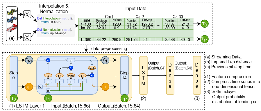
Figure 2 : Work flow and model structure
5. Inference
Table shows the experimental results, which verify our hypothesis that the time series prediction model based on deep learning obtained the highest accuracy. Although the LSTM model achieves the highest accuracy, its advantages are not as obvious as RankNet. This is because the telemetry data of racing cars is non-public, and the data available for training are limited.
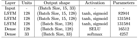
Table 2 : LSTM model parameters
According to the experimental results in Table 6, we draw the following conclusions:
- The LSTM model has higher accuracy in time series forecasting.
- Limited by the size of the training data set (only the telemetry data for 2 games is available), the accuracy improvement obtained by LSTM is not as obvious as RankNet.
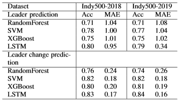
Table 3 : Model accuracy comparison
6. Conclusion
The prediction problem of racing cars has the characteristics of non-linearity, non-periodicity, randomness, and timing dependence. The traditional statistical learning model (Naive Bayes, SVM, Simple Neural Networks) is difficult to deal with the problem of time series prediction, since the model is unable to understand the time-series dependence of data. Traditional time series prediction models such as ARMA / ARIMA can only deal with linear time series with certain periodicity. The anomaly events and human strategies in the racing competition make these methods no longer applicable. Therefore, time series prediction models (RNN, GRU, LSTM, etc.) based on deep learning are more suitable for solving such problems.
7. Acknowledgements
The author would like to thank Dr. Gregor Von Laszewski, Dr. Geoffrey Fox, and the associate instructors in the FA20-BL-ENGR-E534-11530: Big Data Applications course (offered in the Fall 2020 semester at Indiana University, Bloomington) for their continued assistance and suggestions with regard to exploring this idea and also for their aid with preparing the various drafts of this article.
8. References
-
IndyCar Dataset. https://racetools.com/logfiles/IndyCar/. visited on 04/15/2020 ↩︎
-
M4 Competition. https://forecasters.org/resources/time-series-data/m4-competition/. ↩︎
-
C. L. W. Choo. Real-time decision making in motorsports: analytics forimproving professional car race strategy, PhD Thesis, MassachusettsInstitute of Technology, 2015. ↩︎
-
T. Tulabandhula.Interactions between learning and decision making.PhD Thesis, Massachusetts Institute of Technology, 2014. ↩︎
-
Peng B, Li J, Akkas S, Wang F, Araki T, Yoshiyuki O, Qiu J. Rank Position Forecasting in Car Racing. arXiv preprint https://arxiv.org/abs/2010.01707/. ↩︎
24 - Change of Internet Capabilities Throughout the World
![]()
![]() Status: final, Type: Report
Status: final, Type: Report
Matthew Cummings, fa20-523-334, Edit
Abstract
In 2050 the United Nations is projecting that 90% of the world will have access to the internet. With the recent pandemic and the shift to most things being online we see how desperate people need internet to be able to do everyday tasks. The internet is a valuable utility and more people are getting access to it every day. We also are seeing more data is being sent over the internet with more than 24,000 Gigabytes being uploaded and processed per second across the entire internet. In this report we look at the progression of the internet and how it has changed over the years.
Contents
Keywords: internet, internet development, progression of internet, population, data analysis, big data, government
1. Introduction
Everyday people throughout the world connect to the internet with speeds never before seen. The internet has not always been this way and for some countries they are still not at the same speeds. The internet started out to be a slow connection of one computer to the other with large machines helping pass the data. This quickly changed to become a vast network of computers all connected to one another and using packet processing systems to transport data. With the internet seen as a new and important technology governments and companies soon started their own development of networks and expansions. These expansions and networks would be the ground work for what we call the internet today.
With the United Nations projecting that 90% of the entire population will have internet in 2050 and currently only 50% of the entire population 1 this work will look at how we started this movement and in what areas we need to improve on. Currently about 87% of American’s have access to the internet and use it daily while other countries like Chad only have 6.7% of their population using the internet. This can is from the vast resources America used to expand their networks and create the ideal internet connection that other countries strive to have. While other underdeveloped countries are trying to catchup and build their own infrastructure in the modern age, first world countries, like America, are expanding their networks to be better and more reliable. Figure 1 shows the current status of the percentage of the population in each country that has internet. Dark blue color is the best with greater than 70% of their population having internet access while the lighter blue is countries whose population is less than 18%.

Figure 1: Shows the current percentage of the world’s population that has/uses internet within each country 1.
2. Background and Current Works
In 1965 Thomas Merrill and Lawrence G. Roberts started the first ever wide-area computer network ever built. The internet first started out as huge machines that were sizes of small houses that were only capable of transferring small amounts of data or packets as they soon invented. The internet at the time was not even called internet but the Advanced Research Projects Agency Network (ARPANET). This Network backed by the U.S. Department Of Defense used node-to-node communication to send a messages. The first test was a simple test of sending the message of LOGIN from one computer to the other. It crashed after LO was sent. Following this devastating start improvements were made with the capabilities of that these computers could perform. With data now being sent throughout the network researchers needed to develop a standard on how packets should be sent. This is when the transmission control protocol and internet protocol (TCP/IP) was invented. It was soon adopted into the APARTNET in 1983 and became the standard on how computers should send and process data 2. TCP/IP is how packets are sent all over the internet. This system uses the packet-switched network where information is broken into packets and sent to different routers, the IP section of the system, and following the packets it was then put back together on the receiving end and resembled into what it was originally, TCP 3.
When the internet was developed there was many different communities and the growth of these communities brought problems. There was no one group or organization that organized these groups and all these communities were on different platforms and areas. This is when the Internet Activities Board (IAB) and Tim Berners-Lee from MIT came together to develop the World Wide Web (WWW) and its primary community of World Wide Web Consortium (W3C). W3C is now the primary group who make protocols and standards for the WWW. This group is still actively watching and helping the WWW to make sure it is growing steadily and supported throughout the internet 2.
3. Dataset
To compare countries internet usage and how many people in each country use the internet two datasets will be used. These datasets will look at the percentage of the population that has internet access 4 and the percentage of the population that use smartphones 5 as that is another way people can access the internet. Once the data has been analyzed we looked at why the data is like this and how the data has changed to the way it is now.
4. Data Within Internet
The internet has progressed largely from not being able to send a simple message like LOGIN from one computer to another to being able to process terabytes of data. We are now seeing 24,000 gigabytes per second being passed and uploaded throughout the internet 6. To give perspective on this 1 gigabyte can hold up to 341 average sized digital pictures, or one megabyte is equal to 873 plain text pages and there are 1000 megabytes in 1 gigabyte. That is 873,000 pages of plain text per gigabyte and the internet is sending and uploading about 24,000 gigabytes per second, that is 24,952,000,000 pages of plain text pages being sent over the internet. This large quantity of data and information is passed throughout the internet every second and usually without any hiccups or data issues. This data and information has not always been here 7. Most of it is relatively new with 90% of most data on the internet being created post 2016. This data is still growing and will continue to grow. With more than 4.4 billion people on the internet all these users are pumping more data and this data is being passed around other users. With 7.5 billion people on earth almost 60% of people on earth are using the internet and are contributing to the amount of data on it. This change has not been a slow change but an explosion of change and new users. In 2014 there was only 2.4 billion users on the internet. Within 5 years we see a growth of 2 billion users and with that we see an ever increasing amount of data being sent and uploaded 6. Some of this data is being stored and used throughout the world every day and we have companies like Google, Facebook, Amazon, and Microsoft who store this data. Between them it is estimated that they store 1.2 million terabytes of internet data. Just looking at these 4 companies we see the magnitude of the data that is being stored and kept throughout the internet and each day these numbers grow 6. To give some perspective on how large that data storage is 1 Terabyte is 1000 gigabytes of data. Cisco even estimates that there has been over 1 zettabyte of data created and uploaded on the internet in 2016, zettabyte is 1000 exabytes an exabyte is 1000 petabytes and a petabyte is 1000 terabytes 8. That is a lot of data and information being sent and passed throughout the internet. It is also estimated that in 2018 we have reached 18 zettabytes. We see the growth of this data being passed throughout the internet in 2 years from being 1 zettabyte to being 18. This growth will not stop or slow down but continue to expand and grow as it is being predicted to be about 175 zettabytes within the year 2025. That is enough information to store on DVDs that can circle the earth 222 times 8. Now this data is not all being stored but just uploaded or sent to other users. With an overwhelmingly number of this data coming from the social media companies and posts people are sending to each other. We are also seeing the growth within searches with Google getting over 3.5 Billion searches every day. We will see how this data came to be and how the internet slowly took over the world.
4.1 Data Analysis of Internet Change
Using the datasets 4 we can analyze how this transition took place throughout the world and how the internet progressed. Looking at 2017 data we see that all first world countries have more than 70% of their population using the internet but other countries are still struggling. Looking at the progression of the internet we see that America started off the strongest and most explosive growth out of all countries and has maintain that growth while other countries and continents have fallen behind. We will look at how the internet started so strong in America and how it has teetered in other parts of the world.
5. America’s Internet History
Looking at the 1990’s data we see that America is at .79% of the population having internet while the entire world as a whole is less than .0495%. The only countries who are close to America is Norway, Canada, Sweden, Finland, and Australia. These countries populations are all less than American’s percentage with Norway the closest at .7%. Figure 2 shows these percentages and how drastic these differences are with some countries having 0% of their entire population having access to the internet 4. How is America and these five countries populations have so many more users using the internet compared to the rest of the world?

Figure 2: This figure shows the 1990’s current population % of people accessing the internet 1.
5.1 America’s Population Data
With the WWW being developed and deployed within America it makes sense that America would be the first country to expand their internet and have a larger portion of their population using the internet over the rest of the world. The dramatic difference of America having .79% of their population over the worlds .0495%, America was able to drastically take advantage of their early start and develop it to their needs. When looking at the world’s population with internet compared to America’s, American population with internet accounts for more than half of the world’s population with internet, with America’s population being 250 million in 1990’s and .79% of their population having internet that means 1.975 million people had internet in America while only 2.614 million globally had internet 4. America at the time was a leader in the world on internet and it is interesting how it got there.
5.2 How America Started the Network and Government Help
With the development of APARTNET within the United States the Government saw the opportunity to help expand it within its own country. The U.S. Government helped the expansion of the internet by financing contracts and building satellite sites across the world to gain access to the internet. These sites where built mostly in military bases across the world and helped countries tap into the internet without the huge cost of infrastructure . The Department of Defense (DOD) also saw an opportunity in the new Internet with their creation of MILNET. MILNET connected numerous military compounds and their computers to the United States main hub. These connections used the APARTNET but were able to disconnect and use its own network if it became compromised. These connections made it able for the internet to spread to different countries since the United States military is set up in so many countries and have bases all over the world. Most of these connections were prioritized in the United States allied countries like Norway, Australia, Canada, and EU hence why these countries have a large population using their internet in 1990, Figure 2. All the infrastructure was already set up because of the military bases and the satellites the United States built for it. These countries took advantage of it and connected their people to the internet for the fraction of the cost 9.
5.3 National Science Foundation Involvement
The internet also progressed quickly to these countries and throughout the United States population because of the use of super computers which helped the connections and speed of the internet. The Reagan administration saw an important need to develop these super computers that could broaden the connection and networks of the computers. National Science Foundation (NSF) had a super computer already on their network but with the help of the administration they were able to expand that network to all internet users. The new network that NSF developed was the NSFNET. This network connected academic users to the super computer and those computers to other computers. Creating this intertwined network that was all able to use the speed and power of a super computer. It expanded the speed to be 1.5 megabits per second and would replace the APARTNET network which only could handle 50 kilobytes per second. Because of NSFNET we saw an explosion of growth within the internet with it growing over 10% each month in 1990. This is why United States had so many more users than any other country because they were able to use this faster and better network. NSF saw the need to expand elsewhere and used the NSFNET to start connecting the world globally. Using the pre-installed infrastructure of the old Satellite internet they were able to connect countries that already had internet with ease. This is why the American allies were able to have so many of their own population on the internet when comparing it to the world 9.
5.4 Present Geographical Challenges for Spread of Internet Within America
One of the largest challenges with the spread of the internet in the United States is how vast the country is. With a size of 4 million miles^2 it was a challenge to reach everyone within the United States with internet. With an also ever increasing size of rural living more people are living outside of cities were it can be harder to get internet. About 3% of American’s living in urban areas lack access to broadband but comparing that to the rural we see that 35% the population lack it. That is 20 million American’s that do not have access to high speed broadband or internet because of where they live. The reason for why rural users lack the broadband capabilities is that the cost to run high speed internet to those areas is too much and the high speeds cannot reach that far from the hubs 10. When comparing these rural areas to urban areas we also see that urban areas almost always have more than three options for broadband while rural areas can be limited. Based on Figure 3 we see that all of the urban centers have access to these high speed broadbands and have options for what type of company they want. While rural areas struggle to have more than 2. .12% of rural areas have 0 access to any company that give broadband while only .01% of urban areas have 0 11. To help the spread of internet to these rural areas the Government has decided to help again. Recently the Government has signed in the Broadband Data Act which will help identify the rural areas that need help and how they can fix the issues at hand. Congress has also packaged in 100 million to help this digital divide and try and better the situation. This process was expedited because of the recent pandemic and how desperate people are to get on the internet 12.


Figure 3: This image shows the broadband capabilities throughout the nation. The legend below the picture depicts what each color means. We see from this chart that all urban areas have more than 12 high speed broadband providers will rural areas mostly have 1-2 options. This is the challenge for rural America when they are stuck with one option and that option can sometimes not even provide the fastest internet and will also be expensive 11.
5.5 Summary of America’s Internet
Without the direct involvement of the United States Government the internet would have had a slower progression than the one we are seeing today. Without the military and the NSF the internet would not have been the same and could have looked a lot different. We would not have had the same widespread start without all the military bases having all the required infrastructure for the internet and we would not have had the required needs for the internet because of the vast contracts that the military supplied. This is how America was able to be so far ahead of the rest of the World and why the American allies were able to also build up their own infrastructure and take advantage of the infrastructure supplied by America. We also would have had a lot slower internet if it was not for America and the connection of the super computers on the networks.
6. Africa’s Struggles to get Continent Wide Internet
Looking at the data within Data World Bank we can see the vast change within countries. Some countries populations double how many people are using the internet each year. One region to look at specifically is Africa. Africa did not have each country within it have internet until 2000. That is 20 years after the start and development of the internet. When looking at the entire population of Africa only 16.18% of the them had internet access or used internet access. Comparing this America’s 43.1% and Canada’s 51.3% we see a huge disparity here. We also see that the Average population that uses internet in Africa being .385%. This is dramatically low but given that Africa is an underdeveloped country and has had lots of struggles makes sense.
6.1 How did Africa get their Internet?
It started very early with Africa getting the first computer in 1980’s. This computer started how their network would work and how they would setup their own infrastructure. Most of the universities in Africa were the ones who lead the new technology age for Africa. These universities became the hotspots for computing and the internet. Africa also got some major help from the Internet Society 13. The Internet Society is a nonprofit organization that helps people connect to the internet and can help countries setup their own networks 2. In 1993 the Internet Society held a large workshop that helped a lot of underdeveloped countries connect to the internet and teach them all how to supply their population with this critical utility. Each following year the workshop hosted a new event which grew in size and over 447 citizens attended it who were from African Countries. This helped bring the discussion how Africa can setup their network and get their people the vital resources they need 13. Africa has also gotten help from other countries to help develop their infrastructure and get their internet systems going. On major help was America’s USAID LELAND initiative which supplied Africa 15$ million to help develop their infrastructure. This agreement made it possible for African countries to develop primary connections to their own networks from USA’s high speed network. With this deal that started in 1996 and ended in 2001 we see a large spike in the populations and countries who finally have access to internet 14. With the help of this resource Africa was able to start developing their own network organization for all of Africa called AfriNIC. AfriNic is similar to America’s IAB were they help to make sure the networks are open to everyone within Africa and that if there are issues they are solved. Africa began to develop into the modern age of the internet with this and started to catch up to others 13.
6.2 Africa’s Geographical Problems
Africa’s geography is causing similar problems to their internet distribution just like America’s. Africa is a ginormous continent with an area of 11.73 million miles^2. With that much land it can be hard to cover this entire continent with internet and provide people in rural areas with internet. About one third of the population is out of reach of all mobile broadband reach and can not get access to any internet. To cover this land Africa needs to invest an more infrastructure to cover this land with 250,000 base stations and 250,000 kilometers of fiber. Africa’s population is spread out throughout the whole country, based on Figure 4 we see all the connections and networks throughout Africa there are. It is estimated that 45% of African’s are to far away from any fiber network to connect to the internet. These areas with no networks or infrastructure are areas with low populations and not hotspots or major cities. This problem might not be solved for a while as companies will focus on hotspots rather than helping people in need to access the internet. One of the more recent developments that might help Africa is the SpaceX Satellite internet 15. This can help them as they wont need the vast infrastructure to create the network and the connection will be able to reach all over the continent. Africa’s geography limits people connection based on where they live and if they are near the water to connect the submerged connections. With more investment and new inventions we could see this geographical challenge tackled within 20 years.

Figure 4: Seeing the hotspots throughout the continent and where the internet access is shows the disparity of rural vs urban living. Hotspots of populations are targeted more for internet connection as it makes sense for companies financially to target those areas. This creates a large divide for areas inside the continent who do not have networks or any chance of connecting to the networks. This figure shows how this disparity is present within Africa.
6.3 Current Trends and Future for Africa
Looking at the recent data for World Data Bank we see that African countries have been having a comeback with the amount of people using the internet. Currently Africa has seen a large spike in people using the internet. This can be because of all these programs that have helped start its program but it is can also be from two-thirds of the population having phones that can connect to the internet. Africa still has a problem with less than 50% of its entire population having access to internet and a computer. There are still a lot of struggling countries like Niger that only have 5.3% of it is population that use and connect to the internet. Within this day and age having access to the internet is almost critical to survive and be a part of the world. With only 5.3% of their population having internet they are still struggling to have access for everyone. Comparing this to current America with 83% of the population having internet Africa is still far behind the curve of first world countries. This lack of internet has created an opportunity of some people to help or take advantage of Africa’s lack of infrastructure. China’s Company Huawei has agreed to build the first ever 5G network within Africa. This network will help the current population of phone users to connect to higher speeds and see a great increase in use of the internet. American countries Vanu and Parallel have also been tackling this issue with new network plans and innovative ideas to help Africa’s internet networks expand to the vast region. With a projected $160 Billion annual cost to develop and maintain a country wide infrastructure a lot of people believe they need more than just companies to help them 4. With no more help from outside countries it looks grim for Africa’s continued growth within the internet unless more companies come try to develop their own system and networks. Looking at Figures 5 we see how African countries have had a much slower progression towards internet when compared to other countries, Figure 6 shows America’s progression. Figure 7 also depicts the current status of Africa and how most countries within Africa are still below 18% of their population using internet within the current day and age.

Figure 5: Seeing these countries all mostly below 50% while major countries are over 70%-80% depicts how far behind Africa is within the internet. We can also see the change and growth of the internet within these countries and compare it to other countries. Comparing it to America’s growth they are nowhere near as explosive or close to being the current rate of America’s internet growth 1.

Figure 6: America’s growth within the internet 1.

Figure 7: This is the current status of Africa’s internet population percentage. Notice that most countries within Africa are less than 18% while the world population % is greater than 50%. This depicts how far behind Africa is with building their infrastructure 1.
6.4 Summary of Africa’s Internet
With less help from outside countries Africa is almost on their own with decided how they should improve their Internet Capabilities. Companies are see this as an opportunity to develop and use their own technologies to help Africa with their issues. These companies will develop a new network to try and get the entire country connected and online. This could be a problem were Africa is not entirely in control of their internet and data but with no outside help from any other countries they might have to take the best options available and go with these companies. With the help of Internet Society and AfriNET Africa has already started developing programs and networks to connect the country but with the infrastructure cost being too high they still need help. These organizations could help maintain oversite within this work and make sure Africa does not get taken advantage of. As the world progresses to complete internet involvement Africa is still far behind the rest.
7. Conclusion
After viewing the data and analyzing trends the team saw the large differences between countries with who had an early start within the area of internet development and those countries who are far behind. Analyzing the reason behind this we see that countries who had access to the internet early and were able to take advantage of their early start were able to have a much larger population percentage than the countries who did now. We also see that some countries would get help from outside countries but when those contracts expired they were left out to dry. Seeing America and the vast amount of allies it had in 1990’s-2000’s with their population with access to internet quadrupling those in less developed countries is staggering but when looking behind the data and the reason why we see that some countries are just not as equally equipped and don’t have the infrastructure to compete with other countries networks. With 90% of the population being projected to have access to the internet it will be interesting to see the change in these areas. As we get closed to that 90% it will be these less developed countries who will make staggering changes within their percentage of population compared to the other developed countries.
7.1 Limitations
With only one large dataset that had all the population sizes and percentages it can be difficult to check the accuracy of the data within the set. The datasets also contained a numerous amount of null data and/or incomplete data for a vast majority of countries. This hindered the ability to further look at the correct trends and analysis of the dataset. With also having not a vast knowledge of data analysis within data the team was not able to analyze the datasets for the planned project.
7.2 Future Work
The team will continue to analyze these datasets and build their own programs to look see the different trends within these areas and countries. The team wants to keep working on the reason why they trends are happening and how these trends started. It is important to understand the reason behind the data and factors that lead to these data points. As the team progresses through the dataset, the team will continue to understand the factors and reasons within the data.
8. Acknowledgements
The author would like to thank Dr. Gregor von Laszewski, Dr. Geoffrey Fox, and the associate instructors in the FA20-BL-ENGR-E534-11530: Big Data Applications course (offered in the Fall 2020 semester at Indiana University, Bloomington) for their continued assistance and suggestions with regard to exploring this idea and also for their aid with preparing the various drafts of this article.
9. References
-
Figures used from The Data World Bank. W. Bank, “Individuals using the Internet (% of population),” Data, 2017. [Online]. Available: https://data.worldbank.org/indicator/IT.NET.USER.ZS?most_recent_value_desc=true. [Accessed: 07-Oct-2020]. ↩︎
-
B. Leiner, V. Cerf, D. Clark, R. Kahn, L. Kleinrock, D. Lynch, J. Postel, L. Roberts, and S. Wolff, “Brief History of the Internet,” Internet Society, 14-Aug-1997. [Online]. Available: https://www.internetsociety.org/internet/history-internet/brief-history-internet/. [Accessed: 07-Nov-2020]. ↩︎
-
B. Company, “TCP/IP,” Encyclopædia Britannica, 2018. [Online]. Available: https://www.britannica.com/technology/TCP-IP. [Accessed: 15-Nov-2020]. ↩︎
-
W. Bank, “Individuals using the Internet (% of population),” Data, 2017. [Online]. Available: https://data.worldbank.org/indicator/IT.NET.USER.ZS?most_recent_value_desc=true. [Accessed: 07-Oct-2020]. ↩︎
-
W. Bank, “Mobile cellular subscriptions (per 100 people),” Data, 2017. [Online]. Available: https://data.worldbank.org/indicator/IT.CEL.SETS.P2?most_recent_value_desc=true. [Accessed: 07-Oct-2020]. ↩︎
-
J. Schultz, “How Much Data is Created on the Internet Each Day?,” Micro Focus Blog, 08-Jun-2019. [Online]. Available: https://blog.microfocus.com/how-much-data-is-created-on-the-internet-each-day/. [Accessed: 07-Nov-2020]. ↩︎
-
R. Company, “Byte Size Infographic: Visualising data,” redcentric, 03-Feb-2020. [Online]. Available: https://www.redcentricplc.com/resources/byte-size-infographic/. [Accessed: 13-Nov-2020]. ↩︎
-
B. Marr, “How Much Data Is There In the World?,” Bernard Marr, 2020. [Online]. Available: https://www.bernardmarr.com/default.asp?contentID=1846. [Accessed: 07-Nov-2020]. ↩︎
-
R. E. Kahn, Revolution in the U.S. information infrastructure. Washington, D.C., DC: National Academy Press, 1995. Chapter The Role Of Government in the Evolution of the Internet [Accessed: 12-Nov-2020]. ↩︎
-
C. B. S. News, “The digital divide between rural and urban America’s access to internet,” CBS News, 04-Aug-2017. [Online]. Available: https://www.cbsnews.com/news/rural-areas-internet-access-dawsonville-georgia/. [Accessed: 07-Dec-2020]. ↩︎
-
FCC, “Fixed Broadband Deployment”, FCC, 2020 [online]. Available: https://broadbandmap.fcc.gov/#/area-summary?version=dec2019&type=nation&geoid=0&tech=acfosw&speed=25_3&vlat=39.40549184229633&vlon=-99.73724455499007&vzoom=2.987482657657667 [Accessed: 07-Dec-2020]. Map layer based on FCC Form 477 ↩︎
-
B. A. R. Association, “Expanding Broadband Access to Rural Communities,” American Bar Association, 2020. [Online]. Available: https://www.americanbar.org/advocacy/governmental_legislative_work/publications/washingtonletter/march-washington-letter-2020/broadband-032020/. [Accessed: 07-Dec-2020]. ↩︎
-
Afrinic Organization, “A Short History of the Internet in Africa (1980-2000),” AFRINIC BLOG, 26-Sep-2016. [Online]. Available: https://afrinic.net/blog/153-a-short-history-of-the-internet-in-africa-1980-2000. [Accessed: 05-Dec-2020]. ↩︎
-
I. Society , “History of the Internet in Africa,” Internet Society, 04-Aug-2020. [Online]. Available: https://www.internetsociety.org/internet/history-of-the-internet-in-africa/. [Accessed: 05-Dec-2020]. ↩︎
-
R. Fukui, C. J. Arderne, and T. Kelly, “Africa’s connectivity gap: Can a map tell the story?,” World Bank Blogs, 07-Nov-2019. [Online]. Available: https://blogs.worldbank.org/digital-development/africas-connectivity-gap-can-map-tell-story. [Accessed: 08-Dec-2020]. ↩︎
25 - Project: Chat Bots in Customer Service
![]()
![]() Status: final , Type: Project
Status: final , Type: Project
Anna Everett, sp21-599-355, Edit
Abstract
Automated customer service is a rising phenomon for buisnesses with an online presence. As customer service bots advance in complication of problems they can handle one concern about the altered customer experiece is how the information is conveyed. Using customer support data tweets on twitter this project runs sentiment analysis on it customer tweets and then train a convolutional neural network to examine if conversation tone can be detected early in the conversation.
Contents
-
Introduction
-
Procedure
- The Dataset
- Simplifying the dataset
-
The Algorithm
- Sentiment Analysis Overview and Implementation
- Convolutional Neural Networks (CNN)
- Spliting Up the Data
-
Training the Model
-
Conclusion
-
References
Keywords: AI, chat bots, tone, nlp, twitter, customer service.
1. Introduction
Please not ethat an up to date version of these instructions is available at
Some studies report that customers prefer live chat for their customer sevice interactions1. Currently, most issues are simple enough that they can be resolved by a bot; and over 70% of companies are already using or have plans to use some form of software for automation. Existing Ai’s in use are limited to simple and common enough questions and or problems that allow for generalizable communication. As AI technology develops and allows it to handle more complicated problems the communication methods will also have to evolve.
 Fig 1: Customer Support Preferences 1
An article by Forbes “AI Stats News: 86% Of Consumers Prefer Humans To Chatbots”, states that only 30% of consumers beleve that an AI would be better at solving their problem than a human agent 2. Human agents are usually prefered becuase humans are able to personalize converstaions to the indiviual customer. On the other hand, automated software allows for 24/7 assistance if needed, the scale of how many customers a bot would be able to handle is considered larger and more efficient in comparision to what humans can handle, and a significant amount of questions are simple enough to be handled by a bot 3.
 Fig 2: Support Satisfaction Image source
To get the best out of both versions of service, this project uses natural language processing to analyze social media customer service conversations. This is then run through a convolutional neural network to predict if tone can be determined early in the converstaion.
2. Procedure
2.1 The Dataset
The dataset comes from the public dataset compilation website, kaggle, and can be found at Kaggle Dataset. This dataset was chosen due to twitter support’s informal nature that is expected to come with quicker and more automated customer interactions.
The content of the data consists of over 2.5 million tweets from both customer and various companies that have twitter account representation. Each row of data consists of: the unique tweet id, an anonymized id of the author, if the tweet was sent directly to a company, date and time sent, the content of the tweet, the ids of any tweets that responded to this tweet if any, and the id of the tweet that this was sent in response to if any.
2.2 Simplifying the Dataset
The raw dataset is large and contins unncessery information that isn’t needed for this porpose. In order to trim the dataset only the first 650 samples are taken.
Next, since the project goal is to predict customer sentiment any tweet and related data sent by a company is removed. Luckily, companies author id’s don’t get anonymized and therefore we can filter those out by removing any data associated with an author id that contains letters. For speed and simplicity these author id are only checked for vowels.
3. The Algorithm
3.1 Sentiment Analysis Overview and Implementation
Sentiment analysis is the process of taking in natrual language text and determining if it has a positive or negative sentiment 4. This process is useful for when doing market research and tracking attitudes towards a particualar company. In a similar fashion this project uses sentiment analysis to determine the text sentiment of the customer initially with their first inquiery and also the sentiment of their side of the conversation as a whole.
The goal of analyzing both the first and general tone of the text is to determine if a general correlation between them can be found.
The main library used for the sentiment analysis of the data was “nltk” and its subpackage “SentimentIntensityAnalyzer”
 Fig 3: Customer Sentiment Distribution
As can be seen in the Fig 3 the distribution of the sentiment values are generally on a normal distribution. Looking at the binary classifications of both the first and average sentiment distribution it can be seen that while the majority can be classified as positive, 1, there’s still a significant amount that are classified as negative, 0.
3.2 Convolutional Neural Networks (CNN)
While convolutional Neural Networks are traditionally used for image processing. Some articles suggest that CNN’s also work well for Natural Language Processing. Traditionally, convolutional neural networks are networks that apply filters over a dataset of pixels and process the pixel as well as those that surrounds it. Typically this is used for images as pictured below in Fig 4, for filtering and edge detecting for identifying objects.
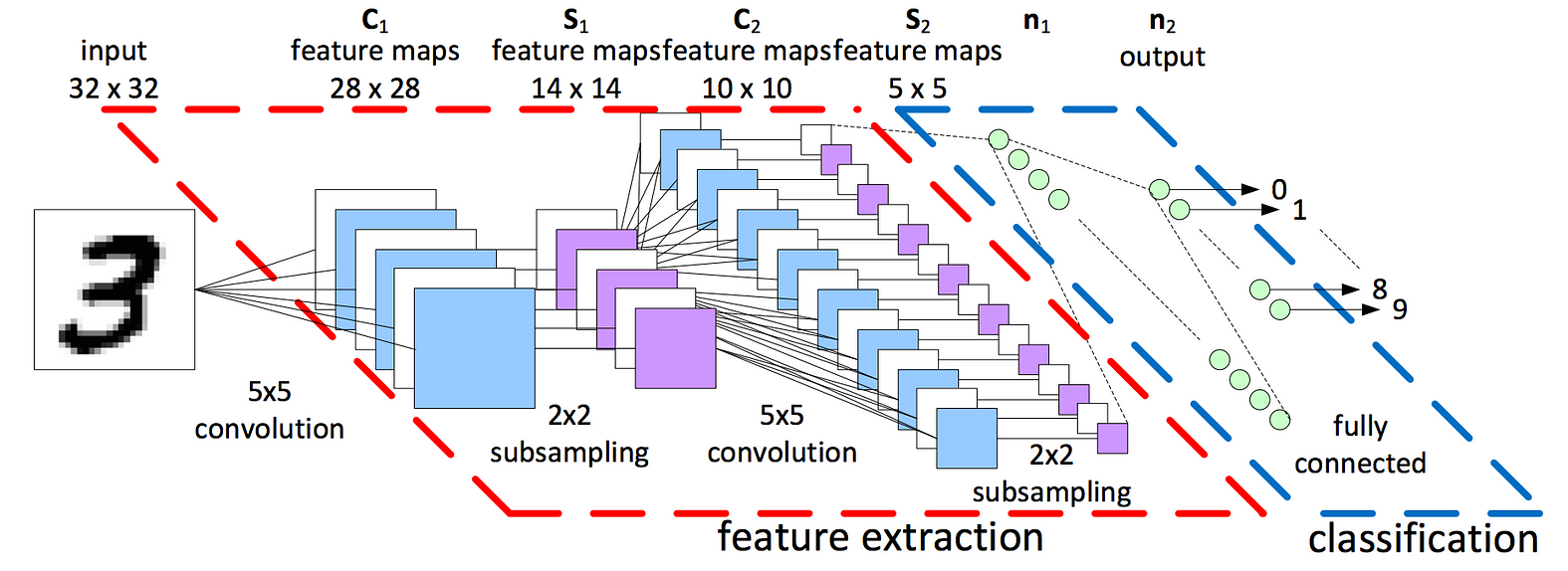 Fig 4: Image convolution Image source
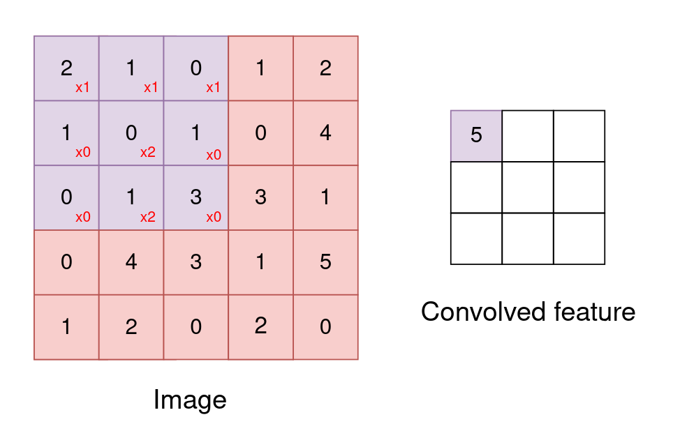 Fig 5: Convolution Visual Image source
CNN’s also work well for natrual language processing. Thinking about the english language, meaning and tone of a scentence or text is caused by the relation of words, rather than each word on its own. NLP through CNNs work in a similar fashion to how it processes images but instead of pixels its encoded words that are being convolved.
As can be seen by Fig 6, this project used a multi-layered CNN: beginning with an embedding layer, alternating keras 1 dimension convolution and max pooling layers, a keras dropout layer with a rate of 0.2 to prevent overfitting of the model5 and a keras dense layer that implements the activation function into the output 5.
 Fig 6: CNN Model
3.3 Splitting Up the Data
In order for the data to be suitable to be run through the CNN the input features must be reshaped into a 2-D array. Afterwards the data was split up using the “sklearn.model_selection” package “train_test_split” with the features being input as the encoded tweets and the lables being input as the general classification sentiment.
4. Training the Model
The model was trained using the training text and training sentiment, because of the small samples used a batch size of 50 was input and run for 10 epochs.
5. Conclusion
In conclusion, while sentiment prediction of customer tweets were not able to be executed there is still useful information found to aid in future attempts. In dealing with the informal raw twitter data ad performing a non-binary sentiment analysis allowed for visualization of the true spread of what can be expected when anticipating dealing with customers, especially in an informal setting such as social media. This project also brought to light the theorectial versatility of convolutional neural networks, though not further examined in this project. Using the model model fit as an indication, there is reasonable evidence that the first inquiry will be enough to predict and take proactive measures in future customer service chat bots. Future execution of this project should include altering the data pre-processing technique and using a larger set of samples from the dataset.
6. References
-
Super Office, [online resource] https://www.superoffice.com/blog/live-chat-statistics/ ↩︎
-
Forbes, [online resource] https://www.forbes.com/sites/gilpress/2019/10/02/ai-stats-news-86-of-consumers-prefer-to-interact-with-a-human-agent-rather-than-a-chatbot/?sh=5f5d91422d3b ↩︎
-
Acuire, [online resource] https://acquire.io/blog/chatbot-vs-live-chat/ ↩︎
-
Monkey learn, [online resource] https://monkeylearn.com/sentiment-analysis/ ↩︎
-
Keras, [online documentation] https://keras.io/api/layers/regularization_layers/dropout/ ↩︎
26 - COVID-19 Analysis
COVID-19 Analysis
![]()
![]() Status: final approved, Type: Project
Status: final approved, Type: Project
Hany Boles, fa20-523-342, Edit
Abstract
By the end of 2019, healthcare across the world started to see a new type of Flu and they called it Coronavirus or Covid-19. This new type of Flu developed across the world and it appeared there is no one treatment could be used to treat it yet, scientists found different treatments that apply to different age ranges. In this project, We will try to work on comparison analysis between USA and China on number of new cases and new deaths and trying to find factors played big roles in this spread.
Contents
Keywords: Corona Virus, Covid 19, Health
1. Introduction
While the world is ready to start 2020 we heard about a new type of the Flu that it appears to be started in China and from there it went to the entire world. It appeared to affect all ages but its severity did depend on other factors that related to age, health conditions if the patient is a smoker or not?
This new disease attacked aggressively the respiratory system for the patient and then all the human body causing death. The recovery from this disease appeared to vary from area to area across the globe, Also the death percentage as well was and still vary from area to area. and then we decided to perform the analysis on weather temperature from one side and the covid 19 new cases and new death on the other side to see if the weather temperature plays a role or not with it.
2. Data-Sets
After observing many datasets 1 2 3 to get a better understanding if there are common factors in the areas that have the larger number of new Covid 19 cases, we decided to proceed with the dataset provided by the World Health Organization 1 because this dateset is being updated on a daily basis and has the most accurate data. Currently it appears that we are getting a second wave of coronavirus and so we will try to get the most recent data. We were able to use Webscraping to get the data we need from the World Health Organization website which is updated daily.
For the weather datasets, we looked at several datasets 4 5 6 and we decided to use the data provided by visualcrossing website 4. This website helped us in getting the data we need which is daily average temperatures in the United States of America and China. We started to collect the data from 1/3/2020.
2.1 Preparing COVID 19 Data-Set
We started to work on Covid 19 dataset and we found that it is better to use webscraping to gather the dataset so every time we run the python script, we will get the most recent data and then we opened the CSV file and added it to a dataframe.

Figure 1: Downloading the Covid 19 dataset.
We then filtered only on United States of America so we can get all data belong to United States of America.

Figure 2: Capturing only USA data
Then we made 2 seperate graphs to depict the number of new cases and the number of new deaths in the USA throughout 2020 as shown below.

Figure 3: USA New Covid 19 cases and new deaths.

Figure 4: Capturing China data.
We also made 2 seperate graphs to depict the number of new cases and the number of new deaths in China throughout 2020 as shown below.

Figure 5: China New Covid 19 cases and new deaths
2.2 preparing Weather Data-Set
For the weather temperature dataset, we cleaned all the un-needed data from the csv file we received from Visualcrossing website 4, then we merged the temperature column with the csv file we prepared for the covid 19, so now we have one file per country that contains Date, Temperature, New cases, new deaths.
3. Methodology
We utilized the Indiana University system to process the collected data as it will need a strong system to process it. Also, we utilized Python, matplotlib for visualization purposes, and Jupyter notebook as programming software and platform.
4. Processing the Data
We started to process the final dataset we prepared and we examined the data for any correlation between the temperature and new cases for the United States of America and we found that there is no correlation there.

Figure 6: USA Dataset after merging the data.

Figure 7: Correlation between the temperature and the new covid 19 cases for the United States of America.
Then we also processed the data for China and got the same results as the United States of America. We then looked at the analysis and in the case of the United States of America we found there is a correlation between the new covid cases and the current (cumulative) cases. On the contrary, for China we found no correlation between the new Covid cases and the current (cumulative) cases.

Figure 8: Heat map depicting the correlations between new cases, cumulative cases, new deaths, and cumulative deaths, respectively for the United States of America.

Figure 9: Correlation between the new covid 19 cases and the current cases for China.

Figure 10: Heat map depicting the correlations between new cases, cumulative cases, new deaths, and cumulative deaths, respectively for China.
We started to observe more data from another country so we chose the United Kingdom, and we found a correlation between the new covid 19 cases and the current (cumulative) cases.

Figure 11: Correlation between the new covid 19 cases and the current cases for the United Kingdom.

Figure 12: Heat map depicting the correlations between new cases, cumulative cases, new deaths, and cumulative deaths, respectively for the United Kingdom.
5. Conclusion and Future Work
After processing all the data gathered in search of a correlation between the weather, more specifically temperature, and the number of new cases in both China and the United States of America, the results clearly indicate that the number of new cases and temperature are uncorrelated. Nonetheless, the results suggest that there is a strong positive correlation (correlation coefficient > 0.8) between the number of new cases and the cumulative number of current cases in United states of America and United Kingdom. Hence, it appears that, in the absence of other mitigating factors, the number of the new cases will increase as long as the cumulative number of current cases keeps increasing.
While the new covid 19 cases and the current cases at China are uncorrelated, this might be due to false reporting or due to different factors are being used at China to reduce the number of the new cases.
Given the more recent developments pertaining to the discovery and distribution of vaccines it is suggested that the model be modified to include the number of vaccinations administered. The objective in this case will be to discover any correlation between the number of new cases and both the number of the current cases as well as the number of vaccinations being given across at least the United Sates. Depending on the outcome it maybe possible to determine how effective the vaccines are and maybe predict, if possible, if ever the number of cases will diminish to zero.
6. Acknowledgements
The author would like to thank Dr. Geoffrey Fox, Dr. Gregor von Laszewski, and the associate instructors in the FA20-BL-ENGR-E534-11530: Big Data Applications course (offered in the Fall 2020 semester at Indiana University, Bloomington) for their assistance, suggestions, and aid provided during working on this project.
7. References
-
Covid19.who.int. 2020. [online] Available at: https://covid19.who.int/table [Accessed 19 December 2020]. ↩︎
-
Datatopics.worldbank.org. 2020. Understanding The Coronavirus (COVID-19) Pandemic Through Data | Universal Health Coverage Data | World Bank. [online] Available at: http://datatopics.worldbank.org/universal-health-coverage/coronavirus/ [Accessed 19 December 2020]. ↩︎
-
Kaggle.com. 2020. COVID-19 Open Research Dataset Challenge (CORD-19). [online] Available at: https://www.kaggle.com/allen-institute-for-ai/CORD-19-research-challenge [Accessed 19 December 2020]. ↩︎
-
Visualcrossing.com. 2020. Weather Data Services | Visual Crossing. [online] Available at: https://www.visualcrossing.com/weather/weather-data-services#/editDataDefinition [Accessed 19 December 2020]. ↩︎
-
The Weather Channel. 2020. National And Local Weather Radar, Daily Forecast, Hurricane And Information From The Weather Channel And Weather.Com. [online] Available at: https://weather.com/ [Accessed 22 December 2020]. ↩︎
-
Climate.gov. 2020. Dataset Gallery | NOAA Climate.Gov. [online] Available at: https://www.climate.gov/maps-data/datasets/formats/csv/variables/precipitation [Accessed 22 December 2020]. ↩︎
27 - Analyzing the Relationship of Cryptocurrencies with Foriegn Exchange Rates and Global Stock Market Indices
![]()
![]() Status: final, Type: Project
Status: final, Type: Project
-
Krish Hemant Mhatre
Abstract
The project involves analyzing the relationships of various cryptocurrencies with Foreign Exchange Rates and Stock Market Indices. Apart from analyzing the relationships, the objective of the project is also to estimate the trend of the cryptocurrencies based on Foreign Exchange Rates and Stock Market Indices. We will be using historical data of 6 different cryptocurrencies, 25 Stock Market Indices and 22 Foreign Exchange Rates for this project. The project will use various machine learning tools for analysis. The project also uses a fully connected deep neural network for prediction and estimation. Apart from analysis and prediction of prices of cryptocurrencies, the project also involves building its own database and giving access to the database using a prototype API. The historical data and recent predictions can be accessed through the public API.
Contents
Keywords: cryptocurrency, stocks, foreign exchange rates.
1. Introduction
The latest type of investment in the finance world and one of the latest global medium of exchange is Cryptocurrency. The total market capitalizations of all cryptocurrencies added up to $237.1 Billion as of 20191, making it one of the fastest growing industries in the world. Cryptocurrency systems do not require a central authority as its state is maintained through distributed consensus2. Therefore, determining the factors affecting the prices of cryptocurrencies becomes extremely difficult. There are several factors affecting the prices of cryptocurrency like transaction cost, reward system, hash rate, coins circulation, forks, popularity of cryptomarket, speculations, stock markets, exchange rates, gold price, interest rate, legalization and restriction3. This project involves studying and analysing the relationships of various cryptocurrencies with Foreign Exchange Rates and Stock Market Indices. Furthermore, the project also involves predicting the cryptocurrency price based on stock market indices and foreign exchange rates of the previous day. The project also involves development of a public API to access the database of the historical data and the predictions.
2. Resources
Table 2.1: Resources
| No. | Name | Version | Type | Notes |
|---|---|---|---|---|
| 1. | Python | 3.6.9 | Programming language | Python is a high-level interpreted programming language. |
| 2. | MongoDB | 4.4.2 | Database | MongoDB is a NoSQL Database program that uses JSON-like documents. |
| 3. | Heroku | 0.1.4 | Cloud Platform | Heroku is a cloud platform used for deploying applications. It uses a Git server to handle application repositories. |
| 4. | Gunicorn | 20.0.4 | Server Gateway Interface | Gunicorn is a python web server gateway interface . It is mainly used in the project for running python applications on Heroku. |
| 5. | Tensorflow | 2.3.1 | Python Library | Tensorflow is an open-source machine learning library. It is mainly used in the project for training models and predicting results. |
| 6. | Keras | 2.4.3 | Python Library | Keras is an open-source python library used for interfacing with artificial neural networks. It is an interface for the Tensorflow library. |
| 7. | Scikit-Learn | 0.22.2 | Python Library | Scikit-learn is an open-source machine learning library featuring various algorithms for classification, regression and clustering problems. |
| 8. | Numpy | 1.16.0 | Python Library | Numpy is a python library used for handling and performing various operations on large multi-dimensional arrays. |
| 9. | Scipy | 1.5.4 | Python Library | Scipy is a python library used for scientific and technical computing. It is not directly used in the project but serves as a dependency for tensorflow. |
| 10. | Pandas | 1.1.4 | Python Library | Pandas is a python library used mainly for large scale data manipulation and analysis. |
| 11. | Matplotlib | 3.2.2 | Python Library | Matplotlib is a python library used for graphing and plotting. |
| 12. | Pickle | 1.0.2 | Python Library | Pickle-mixin is a python library used for saving and loading python variables. |
| 13. | Pymongo | 3.11.2 | Python Library | Pymongo is a python library containing tools for working with MongoDB. |
| 14. | Flask | 1.1.2 | Python Library | Flask is a micro web framework for python. It is used in the project for creating the API. |
| 15. | Datetime | 4.3 | Python Library | Datetime is a python library used for handling dates as date objects. |
| 16. | Pytz | 2020.4 | Python Library | Pytz is a python library used for accurate timezone calculations. |
| 17 | Yahoo Financials | 1.6 | Python Library | Yahoo Financials is an unofficial python library used for extracting data from Yahoo Finance website by web scraping. |
| 18 | Dns Python | 2.0.0 | Python Library | DNS python is a necessary dependency of Pymongo. |
3. Dataset
The project builds its own dataset by extracting the data from Yahoo Finance website using Yahoo Financial python library 4. The data includes cryptocurrency prices, stock market indices and foreign exchange rates from September 30 2015 to December 5 2020. The project uses historical data of 6 cryptocurrencies - Bitcoin (BTC), Ethereum (ETH), Dash (DASH), Litecoin (LTC), Monero (XMR) and Ripple (XRP), 25 stock market indices - S&P 500 (USA), Dow 30 (USA), NASDAQ (USA), Russell 2000 (USA), S&P/TSX (Canada), IBOVESPA (Brazil), IPC MEXICO (Mexico), Nikkei 225 (Japan), HANG SENG INDEX (Hong Kong), SSE (China), Shenzhen Component (China), TSEC (Taiwan), KOSPI (South Korea), STI (Singapore), Jakarta Composite Index (Indonesia), FTSE Bursa Malaysia KLCI (Malaysia), S&P/ASX 200 (Australia), S&P/NZX 50 (New Zealand), S&P BSE (India), FTSE 100 (UK), DAX (Germany), CAC 40 (France), ESTX 50 (Europe), EURONEXT 100 (Europe), BEL 20 (Belgium), and 22 foreign exchange rates - Australian Dollar, Euro, New Zealand Dollar, British Pound, Brazilian Real, Canadian Dollar, Chinese Yuan, Hong Kong Dollar, Indian Rupee, Korean Won, Mexican Peso, South African Rand, Singapore Dollar, Danish Krone, Japanese Yen, Malaysian Ringgit, Norwegian Krone, Swedish Krona, Sri Lankan Rupee, Swiss Franc, New Taiwan Dollar, Thai Baht. This data is, then, posted to MongoDB Database. The three databases are created for each of the data types - Cryptocurrency prices, Stock Market Indices and Foreign Exchange Rates. The three databases each contain one collection for every currency, index and rate respectively. These collections have a uniform structure containing 6 columns - “id”, “formatted_date”, “low”, “high”, “open” and “close”. The tickers used to extract data from Yahoo Finance 4 are stated in Figure 3.1.

Figure 3.1: Ticker Information
The data is, then, preprocessed to get only one column per date (“close” price) and to add missing information by replicating previous day’s values, which is used to make a large dataset including the prices of all indices and rates for all the dates within the given range. This data is saved in a different MongoDB Database and collection, both, called nn_data. This collection has 54 columns containing closing prices for each cryptocurrency price, stock market index and foreign exchange rate and the date. The rows represent different dates.
One additional database is also created - Predictions - which contain the predictions of cryptocurrency prices for each day and it’s true value. The collection has 13 columns containing a date column and 2 columns for each cryptocurrency (prediction value and true value). New rows are inserted everyday for all collections except the “nn_data” collection. Figure 3.2 represents the overview of the MongoDB Cluster. Figure 3.3 shows the structure of the nn_data collection.

Figure 3.2: MongoDB Cluster Overview

Figure 3.3: Short Structure of NN_data Collection
4. Analysis
4.1 Principal Component Analysis
Principal Component Analysis uses Singular Value Decomposition (SVD) for dimensionality reduction, exploratory data analysis and making predictive models. PCA helps understand a linear relationship in the data5. In this project, PCA is used for the preliminary analysis to find a pattern between the target and the features. Here we have tried to make some observations by performing PCA on various cryptocurrencies with stocks and forex data. In this analysis, we reduced the dimension of the dataset to 3D, represented in Figure 4.1. The first and second dimension is on x-axis and y-axis respectively whereas the third dimension is used in the color. On observing the scatter plots in Figure 4.1, we can clearly see the patterns formed by various relationships. Therefore, it can be stated that the target and features are related in some way based on the principal component analysis.

Figure 4.1: Principal Component Analysis
4.2 TSNE Analysis
T-Distributed Stochastic Neighbour Embedding is mainly used for non-linear dimensionality reduction. TSNE uses local relationships between points to create a low-dimensional mapping. TSNE uses Gaussian distribution to create a probability distribution. In this project, TSNE is used to analyze non-linear relationships between cryptocurrencies and the features (stock indices and forex rates), which were not visible in the principal component analysis. It can be observed in Figure 4.2, that there are visible patterns in the data i.e. same colored data points are in some pattern, proving a non linear relationship. The t-SNE plots in Figure 4.2 are not like the typical t-SNE plots i.e. they do not have any clusters. This might be because of the size of the dataset.

Figure 4.2: t-SNE Analysis
4.3 Weighted Features Analysis
Layers of neural networks have weights assigned to each feature column. These weights are updated continuously while training. Analyzing the weights of the model which is trained for this project, can give us a picture of the important features. To perform such an analysis, the top five feature weights are noted for each layer. The number of times a feature is present in the top five of a layer, is also noted. This is represented in Figure 4.3, where we can observe that the New Zealand Dollar and the Canadian Dollar are repeated most number of times in the top five weights of layers.

Figure 4.3: No. of repetitions in top five weights
The relationships of these two features - New Zealand Dollar and Canadian Dollar with various cryptocurrencies are, then, analyzed in Figure 4.4 and Figure 4.5. It can be observed that Bitcoin has a direct relationship with these rates. Bitcoin can be observed to increase with an increase in NZD to USD rate and an increase in CAD to USD rate. For the rest of the cryptocurrencies, we can observe that they tend to rise when the NZD to USD rate and the CAD to USD rate are stable and tend to fall when the rates move towards either of the extremes.

Figure 4.4: Relationship of NZD with Cryptocurrencies

Figure 4.5: Relationship of CAD with Cryptocurrencies
5. Neural Network
5.1 Data Preprocessing
The first step to build a neural network for predicting cryptocurrency prices, is to clean the data. In this step, data from the “NN_data” collection is imported. Two scalers are used to normalize the data, one for feature columns and other for the target columns. For this purpose, “StandardScaler” from Scikit-learn library is used. These scalers are made to fit with the data and then saved to a file using pickle-mixin, in order to use it later for predictions. These scalers are then used to normalize the data using mean and standard deviation. This normalized data is shuffled and split into a training set and a test set. This procedure is done by using the “train_test_split()” function from the Scikit-learn library. The data is split into 94:6 ratio for training and testing respectively. The final data is split into four - X_train, X_test, y_train and y_test and is ready for training the neural network model.
5.2 Model
For the purpose of predicting the prices of cryptocurrency based on previous day’s stock indices and forex rates, the project uses a fully connected neural network. The solution to this problem could have been perceived in different ways like making it a classification problem by predicting rise or fall in price or by making it a regression problem by either predicting the actual price or by predicting the growth. After trying all these ways of solution, it was concluded that predicting the price regression problem was the best option.
The final model comprises three layers - one input layer, one hidden layer and one output layer. The first layer uses 8 units with an input dimension of (None, 47) and uses Rectified Linear Unit (ReLU) as its activation function, and He Normal as its kernel initializer. The second layer which is a hidden layer uses 2670 hidden units with Rectified Linear Unit (ReLU) Activation function. ReLU is used because of its faster and effective training in regression models. The third layer which is the output layer has 6 units, one each for predicting 6 cryptocurrencies. The output layer uses linear activation function.
The overview of the final model can be seen in Figure 5.2. The predictions using the un-trained model can be seen in Figure 5.3, where we can observe the initialization of weights.

Figure 5.2: Model Overview

Figure 5.3: Visualization of Initial Weights
5.3 Training
The neural network model is compiled before training. The model is compiled using Adam optimizer with a default learning rate of 0.001. The model uses Mean Squared Error as its loss function in order to reduce the error and give a close approximation of the cryptocurrency prices. Mean squared error is also used as a metric to visualize the performance of the model.
The model is, then, trained by using X_train and y_train, as mentioned above, for 5000 epochs and by splitting the dataset for validation (20% for validation). The performance of the training of the final model for first 2500 epochs can be observed in Figure 5.4.

Figure 5.4: Final Model Training
This particular model was chosen because of its low validation mean squared error as compared to the performance of other models. Figure 5.5 represents the performance of a similar fully connected model with Random Normal as its initializer instead of He Normal. Figure 5.6 represents the performance of a Convolutional Neural Network. This model was trained with a much lower mean squared error but had a higher validation mean squared error and was therefore dropped.

Figure 5.5: Performance of Fully Connected with Random Normal

Figure 5.6: Performance of Convolutional Neural Network
5.4 Prediction
After training, the model is stored in a .h5 file, which can be used to make predictions. For making predictions, the project preprocesses the data provided which needs to be of the input dimension of the model i.e. of shape (1, 47). Both the scalers which were saved earlier in the preprocessing stage are loaded again using pickle-mixin. The feature scaler is used to transform the new data to normalized data. This normalized data of the given dimension is then used to predict the prices for six cryptocurrencies. Since regression models do not show accuracy directly, it can be measured manually by rounding off the predicted values and the corresponding true values to the decimal place of one or two and then getting the difference between the two and comparing it to a preset threshold. If the values are rounded off to one decimal place and the threshold is set to 0.05 on the normalized predictions, the accuracy of the prediction is approximately 88% and if the values are rounded off to two decimal places, the accuracy is approximately 62%. The predictions of the test data and the corresponding true values for Bitcoin can be observed in Figure 5.7, where similarities can be observed. Prediction for a new date for the prices of all six cryptocurrencies and its true values can be observed in Figure 5.8. Figure 5.9 also displays the actual result of this project as it can be observed that the predictions and the true values have similar trend with a low margin of error.

Figure 5.7: Prediction vs. True

Figure 5.8: Prediction vs. True for one day’s test data

Figure 5.9: Prediction vs. True for all cryptocurrencies
6. Deployment
6.1 Daily Update
The database is supposed to be updated daily using a web-app deployed on Heroku. Heroku is a cloud platform used for deploying web-apps of various languages and also uses a Git-server for repositories 6. This daily update web-app is triggered daily at 07.30 AM UTC i.e 2.00 AM EST. The web-app extracts the data for the previous day and updates all the collections. The new data is then preprocessed by using the saved feature normalizer. This normalized data is used to get predictions for the prices of cryptocurrencies for the day that just started. The web-app then gets the true values of the cryptocurrency prices for the previous day and updates the predictions collection using this data for future comparison. The web-app is currently deployed on Heroku and is triggered daily using Heroku Scheduler. The web-app is entirely coded in Python.
6.2 REST Service
The data from the MongoDB databases can be accessed using a public RESTful API. The API is developed using Flask-Python. The API usage is given below.
URL - https://crypto-project-api.herokuapp.com/
/get_data/single/market/index/date
Type - GET
Sample Request -
https://crypto-project-api.herokuapp.com/get_data/single/crypto/bitcoin/2020-12-05
Sample Respose -
{
  "data":
  [
    {
      "close":19154.23046875,
      "date":"2020-12-05",
      "high":19160.44921875,
      "low":18590.193359375,
      "open":18698.384765625
    }
  ],
  "status":"Success"
}
/get_data/multiple/market/index/start_date/end_date
Type - GET
Sample Request -
https://crypto-project-api.herokuapp.com/get_data/multiple/crypto/bitcoin/2020-12-02/2020-12-05
Sample Respose -
{
  "data":
  [
    {
      "close":"19201.091796875",
      "date":"2020-12-02",
      "high":"19308.330078125",
      "low":"18347.71875",
      "open":"18801.744140625"
    },
    {
      "close":"19371.041015625",
      "date":"2020-12-03",
      "high":"19430.89453125",
      "low":"18937.4296875",
      "open":"18949.251953125"
    },
    {
      "close":19154.23046875,
      "date":"2020-12-05",
      "high":19160.44921875,
      "low":18590.193359375,
      "open":18698.384765625
    }
  ],
  "status":"Success"
}
/get_predictions/date
Type - GET
Sample Request -
https://crypto-project-api.herokuapp.com/get_predictions/2020-12-05
Sample Respose -
{
  "data":
    [
      {
        "bitcoin":"16204.04",
        "dash":"24.148237",
        "date":"2020-12-05",
        "ethereum":"503.43005",
        "litecoin":"66.6938",
        "monero":"120.718414",
        "ripple":"0.55850273"
      }
    ],
  "status":"Success"
}
7. Conclusion
After analyzing the historical data of Stock Market Indices, Foreign Exchange Rates and Cryptocurrency Prices, it can be concluded that there does exist a non-linear relationship between the three. It can also be concluded that cryptocurrency prices can be predicted and its trend can be estimated using Stock Indices and Forex Rates. There is still a large scope of improvement in reducing the mean squared error. The project can further improve the neural network model for better predictions. In the end, it is safe to conclude that the indicators of international politics like Stock Market Indices and Forex Exchange Rates are factors affecting the prices of cryptocurrency.
8. Acknowledgement
Krish Hemant Mhatre would like to thank Indiana University and Luddy School of Informatics, Computing and Engineering for providing me with the opportunity to work on this project. He would also like to thank Dr. Geoffrey C. Fox, Dr. Gregor von Laszewski and the Assistant Instructors of ENGR-E-534 Big Data Analytics and Applications for their constant guidance and support.
References
-
Szmigiera, M. “Cryptocurrency Market Value 2013-2019.” Statista, 20 Jan. 2020, https://www.statista.com/statistics/730876/cryptocurrency-maket-value. ↩︎
-
Lansky, Jan. “Possible State Approaches to Cryptocurrencies.” Journal of Systems Integration, University of Finance and Administration in Prague Czech Republic, http://www.si-journal.org/index.php/JSI/article/view/335. ↩︎
-
Sovbetov, Yhlas. “Factors Influencing Cryptocurrency Prices: Evidence from Bitcoin, Ethereum, Dash, Litcoin, and Monero.” Journal of Economics and Financial Analysis, London School of Commerce, 26 Feb. 2018, https://papers.ssrn.com/sol3/papers.cfm?abstract_id=3125347. ↩︎
-
Sanders, Connor. “YahooFinancials.” PyPI, JECSand, 22 Oct. 2017, https://pypi.org/project/yahoofinancials/. ↩︎
-
Jaadi, Zakaria. “A Step-by-Step Explanation of Principal Component Analysis.” Built In, https://builtin.com/data-science/step-step-explanation-principal-component-analysis. ↩︎
-
“What Is Heroku.” Heroku, https://www.heroku.com/what. ↩︎
28 - Project: Deep Learning in Drug Discovery
![]()
![]() Status: final, Type: Project
Status: final, Type: Project
Anesu Chaora, sp21-599-359, Edit
Abstract
Machine learning has been a mainstay in drug discovery for decades. Artificial neural networks have been used in computational approaches to drug discovery since the 1990s [^1]. Under traditional approaches, emphasis in drug discovery was placed on understanding chemical molecular fingerprints, in order to predict biological activity. More recently however, deep learning approaches have been adopted instead of computational methods. This paper outlines work conducted in predicting drug molecular activity, using deep learning approaches.
Contents
Keywords: Deep Learning, drug discovery.
1. Introduction
1.1. De novo molecular design
Deep learning (DL) is finding uses in developing novel chemical structures. Methods that employ variational autoencoders (VAE) have been used to generate new chemical structures. Approaches have involved encoding input string molecule structures, then reparametrizing the underlying latent variables, before searching for viable solutions in the latent space by using methods such as Bayesian optimizations. The results are then decoded back into simplified molecular-input line-entry system (SMILES) notation, for recovery of molecular descriptors. Variations to this method involve using generative adversarial networks (GAN)s, as subnetworks in the architecture, to generate the new chemical structures 1.
Other approaches for developing new chemical structures involve recurrent neural networks (RNN), to generate new valid SMILES strings, after training the RNNs on copious quantities of known SMILES datasets. The RNNs use probability distributions learned from training sets, to generate new strings that correspond to molecular structures 2. Variations to this approach incorporate reinforcement learning to reward models for new chemical structures, while punishing them for undesirable results 3.
1.2. Bioactivity prediction
Computational methods have been used in drug development for decades 4. The emergence of high-throughput screening (HTS), in which automated equipment is used to conduct large assays of scientific experiments on molecular compounds in parallel, has resulted in generation of enormous amounts of data that require processing. Quantitative structure activity relationship (QSAR) models for predicting the biological activity responses to physiochemical properties of predictor chemicals, extensively use machine learning models like support vector machines (SVM) and random decision forests (RF) for processing 1, 5.
While deep learning (DL) approaches have an advantage over single-layer machine learning methods, when predicting biological activity responses to properties of predictor chemicals, they have only recently been used for this 1. The need to interpret how predictions are made through computationally oriented drug discovery, is seen - in part - as a factor to why DL approaches have not been adopted as quickly in this area 6. However, because DL models can learn complex non-linear data patterns, using their multiple hidden layers to capture patterns in data, they are better suited for processing complex life sciences data, than other machine learning approaches 6.
Their applications have included profiling tumors at molecular level and predicting drug responses, based on pharmacological and biological molecular structures, functions, and dynamics. This is attributed to their ability to handle high dimensionality in data features, making them appealing for use in predicting drug response 5.
For example, deep neural networks were used in models that won NIH’s Toxi21 Challenge 7 on using chemical structure data only to predict compounds of concern to human health 8. DL models were also found to perform better than standard RF models 9 in predicting the biological activities of molecular compounds in the Merck Molecular Activity Challenge on Kaggle 10. Details of the challenge follow.
2. Related Work
2.1. Merck Molecular Activity Challenge on Kaggle
A challenge to identify the best statistical techniques for predicting molecular activity was issued by Merck & Co Pharmaceutical, through Kaggle in October of 2012. The stated goal of the challenge was to ‘help develop safe and effective medicines by predicting molecular activity’ for effects that were both on and off target 10.
2.2. The Dataset
A dataset was provided for the challenge 10. It consisted of 15 molecular activity datasets. Each dataset contained rows corresponding to assays of biological activity for chemical compounds. The datasets were subdivided into training and test set files. The training and test dataset split was done by dates of testing 10, with test set dates consisting of assays conducted after the training set assays.
The training set files each had a column with molecular descriptors that were formulated from chemical molecular structures. A second column in the files contained numeric values, corresponding to raw activity measures. These were not normalized, and indicated measures in different units.
The remainder of the columns in each training dataset file indicated disguised substructures of molecules. Values in each row, under the substructure (atom pair and donor-acceptor pair) codes, corresponded to the frequencies at which each of the substructures appeared in each compound. Figure 1 shows part of the head row for one of the training dataset files, and the first records in the file.
 Figure 1: Head Row of 1 of 15 Training Dataset files
The test dataset files were similar (Figure 2) to the training files, except they did not include the column for activity measures. The challenge presented was to predict the activity measures for the test dataset.
 Figure 2: Head Row of 1 of 15 Test Dataset files
2.3. A Deep Learning Algorithm
The entry that won the Merck Molecular Activity Challenge on Kaggle used an ensemble of methods that included a fully connected neural network as the main contributor to the high accuracy in predicting molecular activity 9. Evaluations of predictions for molecular activity for the test set assays were then determined using the mean of the correlation coefficient (R2) of the 15 data sets. Sample code in R was provided for evaluating the correlation coefficient. The code, and formula for R2 are appended in Appendix 1.
An approach of employing convolutional networks on substructures of molecules, to concentrate learning on localized features, while reducing the number of parameters in the overall network, was also proposed in literature on improving molecular activity predictions. This methodology of identifying molecular substructures as graph convolutions, prior to further processing, was discussed by authors 11, 12.
In line with the above research, an ensemble of networks for predicting molecular activity was planned for this project, using the Merck dataset, and hyperparameter configurations found optimal by the cited authors. Recognized optimal activation functions, for different neural network types and prediction types 13, were also earmarked for use on the project.
3. Project Implementation
Implementation details for the project were as follows:
3.1. Tools and Environment
The Python programming language (version 3.7.10) was used on Google Colab (https://colab.research.google.com).
A subscription account to the service was employed, for access to more RAM (High-RAM runtime shape) during development, although the free standard subscription will suffice for the version of code included in this repository.
Google Colab GPU hardware accelerators were used in the runtime configuration.
Prerequisites for the code included packages from Cloudmesh, for benchmarking performance, and from Kaggle, for API access to related data.
Keras libraries were used for implementing the molecular activity prediction model.
3.2. Implementation Overview
This project’s implementation of a molecular activity prediction model consisted of a fully connected neural network. The network used the Adam 14 optimization algorithm, at a learning rate of 0.001 and beta_1 calibration of 0.5. Mean Squared Error (MSE) was used for the loss function, and R-Squared 15 for the metric. Batch sizes were set at 128. These parameter choices were selected by referencing the choices of other prior investigators 16.
The network was trained on the 15 datasets separately, by iterating through the storage location containing preprocessed data, and sampling the data into training, evaluation and prediction datasets - before running the training. The evaluation and prediction steps, for each dataset, where also executed during the iteration of each molecular activity dataset. Running the processing in this way was necessitated by the fact that the 15 datasets each had different feature set columns, corresponding to different molecular substructures. As such, they could not be readily processed through a single dataframe.
An additional compounding factor was that the data was missing the molecular activity results (actual readings) associated with the dataset provided for testing. These were not available through Kaggle as the original competition withheld these from contestants, reserving them as a means for evaluating the accuracy of the models submitted. In the absence of this data, for validating the results of this project, the available training data was split into samples that were then used for the exercise. The training of the fully connected network was allocated 80% of the data, while the testing/evaluation of the model was allocated 10% of the data. The remaining data (10%) was used for evaluating predictions.
3.3. Benchmarks
Benchmarks captured during code execution, using cloudmesh-common 7, were as follows:
-
The data download process from Kaggle, through the Kaggle data API, took 29 seconds.
-
Data preprocessing scripts took 8 minutes and 56 seconds to render the data ready for training and evaluation. Preprocessing of data included iterating through the issued datasets separately, since each file contained different combinations of feature columns (molecular substructures).
-
The model training, evaluation and prediction step took 7 minutes and 45 seconds.
3.4. Findings
The square of the correlation coefficient (R^2) values obtained (coefficient of determination) 17 during training and evaluation were considerably low (< 0.1). A value of one (1) would indicate a goodness of fit for the model that implies that the model is completely on target with predicting accurate outcomes (molecular activity) from the independent variables (substructures/feature sets). Such a model would thus fully account for the predictions, given a set of substructures as inputs. A value of zero (0) would indicate a total lack of correlation between the input feature values and the predicted outputs. As such, it would imply that there is a lot of unexplained variance in the outputs of the model. The square of the correlation coefficient values obtained for this model (<0.1) therefore imply that it either did not learn enough, or other unexplained (by the model) variance caused unreliable predictions.
4. Discussion
An overwhelming proportion of the data elements provided through the datasets were zeros (0)s, indicating that no frequencies of the molecular substructures/features were present in the molecules represented by particular rows of data elements. This disproportionate representation of absent molecular substructure frequencies, versus the significantly lower instances where there were frequencies appears to have had an effect of dampening the learning of the fully connected neural network.
This supports approaches that advocated for the use of convolutional neural networks 11, 12 as auxiliary components to help focus learning on pertinent substructures. While the planning phase of this project had incorporated inclusion of such, the investigator ran out of time to implement an ensemble network that would include the suggestions.
Apart from employing convolutions, other preprocessing approaches for rescaling, and normalizing, the data features and activations 16 could have helped the learning, and subsequently the predictions made. This reinforces the fact that deep learning models, as is true of other machine learning approaches, rely deeply on the quality and preparation of data fed into them.
5. Conclusion
Deep learning is a very powerful new approach to solving many machine learning problems, including some that have eluded solutions till now. While deep learning models offer robust and sophisticated ways of learning patterns in data, they are still only half the story. The quality and appropriate preparation of the data fed into models is equally important when seeking to have meaningful results.
6. Acknowledgments
Acknowledgements go to Dr. Geoffrey Fox for his excellent guidance on ways to think about deep learning approaches, and for his instructorship of the course ‘ENG-E599: AI-First Engineering’, for which this project is a deliverable. Acknowledgements also go to Dr. Gregor von Laszewski for his astute tips and recommendations on technical matters, and on coding and documention etiquette.
7. Appendix
Square of the Correlation Coefficient (R2) Formula:

Sample R2 Code in the R Programming Language:
Rsquared <- function(x,y) {
  # Returns R-squared.
  # R2 = \frac{[\sum_i(x_i-\bar x)(y_i-\bar y)]^2}{\sum_i(x_i-\bar x)^2 \sum_j(y_j-\bar y)^2}
  # Arugments: x = solution activities
  #            y = predicted activities
  if ( length(x) != length(y) ) {
    warning("Input vectors must be same length!")
  }
  else {
    avx <- mean(x)
    avy <- mean(y)
    num <- sum( (x-avx)*(y-avy) )
    num <- num*num
    denom <- sum( (x-avx)*(x-avx) ) * sum( (y-avy)*(y-avy) )
    return(num/denom)
  }
}
References
-
Hongming Chen, O. E. (2018). The rise of deep learning in drug discovery. Elsevier. ↩︎
-
Marwin H. S. Segler, T. K. (2018). Generating Focused Molecule Libraries for Drug Discovery with Recurrent Neural Networks. America Chemical Society. ↩︎
-
N Jaques, S. G. (2017). Sequence Tutor: Conservative Fine-Tuning of Sequence Generation Models with KL-control. Proceedings of the 34th International Conference on Machine Learning, PMLR (pp. 1645-1654). MLResearchPress. ↩︎
-
Gregory Sliwoski, S. K. (2014). Computational Methods in Drug Discovery. Pharmacol Rev, 334 - 395. ↩︎
-
Delora Baptista, P. G. (2020). Deep learning for drug response prediction in cancer. Briefings in Bioinformatics, 22, 2021, 360–379. ↩︎
-
Erik Gawehn, J. A. (2016). Deep Learning in Drug Discovery. Molecular Informatics, 3 - 14. ↩︎
-
National Institute of Health. (2014, November 14). Tox21 Data Challenge 2014. Retrieved from [tripod.nih.gov:] https://tripod.nih.gov/tox21/challenge/ ↩︎
-
Andreas Mayr, G. K. (2016). Deeptox: Toxicity Prediction using Deep Learning. Frontiers in Environmental Science. ↩︎
-
Junshui Ma, R. P. (2015). Deep Neural Nets as a Method for Quantitative Structure-Activity Relationships. Journal of Chemical Information and Modeling, 263-274. ↩︎
-
Kaggle. (n.d.). Merck Molecular Activity Challenge. Retrieved from [Kaggle.com:] https://www.kaggle.com/c/MerckActivity ↩︎
-
Kearnes, S., McCloskey, K., Berndl, M., Pande, V., & Riley, P. (2016). Molecular graph convolutions: moving beyond fingerprints. Switzerland: Springer International Publishing . ↩︎
-
Mikael Henaff, J. B. (2015). Deep Convolutional Networks on Graph-Structured Data. ↩︎
-
Bronlee, J. (2021, January 22). How to Choose an Activation Function for Deep Learning. Retrieved from [https://machinelearningmastery.com:] https://machinelearningmastery.com/choose-an-activation-function-for-deep-learning/ ↩︎
-
Keras. (2021). Adam. Retrieved from [https://keras.io:] https://keras.io/api/optimizers/adam/ ↩︎
-
Keras. (2021). Regression Metrics. Retrieved from [https://keras.io:] https://keras.io/api/metrics/regression_metrics/ ↩︎
-
RuwanT (2017, May 16). Merk. Retrieved from [https://github.com:] https://github.com/RuwanT/merck/blob/master/README.md ↩︎
-
Wikipedia (2021). Coefficient of Determination. Retrieved from [https://wikipedia.org:] https://en.wikipedia.org/wiki/Coefficient_of_determination ↩︎
29 - Big Data Application in E-commerce
![]()
![]() Status: final, Type: Project
Status: final, Type: Project
Tao Liu, fa20-523-339, Edit
Abstract
As a result of the last twenty year’s Internet development globally, the E-commerce industry is getting stronger and stronger. While customers enjoyed their convenient online purchase environment, E-commerce sees the potential for the data and information customers left during their online shopping process. One fundamental usage for this information is to perform a Recommendation Strategy to give customers potential products they would also like to purchase. This report will build a User-Based Collaborative Filtering strategy to provide customer recommendation products based on the database of previous customer purchase records. This report will start with an overview of the background and explain the dataset it chose Amazon Review Data. After that, each step for the code and step made in a corresponding file Big_tata_Application_in_E_commense.ipynb will be illustrated, and the User-Based Collaborative Filtering strategy will be presented step by step.
Contents
Keywords: recommendation strategy,user-based, collaborative filtering, business, big data, E-commerce, customer behavior
1. Introduction
Big data have many applications in scientific research and business, from those in the hardware perspective like Higgs Discovery to the software perspective like E-commence. However, with the passage of time, online shopping and E-commerce have become one of the most popular events for citizens' lives and society. Millions of goods are now sold online the customers all over the world. With the 5G technology’s implementation, this trend is now inevitable. These activities will create millions of data about customer’s behaviors like how they value products, how they purchase or sell the products, and how they review the goods purchased would have a tremendous contribution for corporations to analyze. These data can not only help convince the current strategies of E-commerce on the right track, but a potential way to see which step E-commerce can make up for attracting more customers to buy the goods. At the same time, these data can also be implemented as a way for recommendation strategies for E-commerce. It will help customers find the next products they like in a short period by implementing machine learning technology on Big Data. The corporations also can enjoy the increase of sales and attractions by recommendation strategies. A better recommendation strategy on E-commerce is now the new trend for massive data scientists and researchers’ target. Therefore, this field is now one of the most popular research areas in the data science fields.
In this final project, An User-Based Collaborative Filtering Strategy will be implemented to get a taste of the recommendation strategy based on Customer’s Gift card purchase records and the item they also viewed and bought. The algorithm’s logic is the following: A used record indicates that customer who bought product A and also view/buy products B&C. When a new customer comes and shows his interest in B&C, product A would be recommended. This logic is addressed based on the daily-experience of customer behaviors on their E-commerce experience.
2. Background
Recommendation Strategy is a quite popular research area in recent years with a strong real-world influence. It is largely used in E-commerce platforms like Taobao, Amazon, etc. Therefore, It is obvious that there are plenty of recommendation strategies have been done. Though every E-commerce recommendation algorithm may be different from each other, the most popular technique for recommendation systems is called Collaborative Filtering. It is a technique that can filter out items that a user might like based on reactions by similar users. During this technique, the memory-based method is considered in this report since it uses a dataset to calculate the prediction using statistical techniques. This strategy will be able to fulfill in the local environment with a proper dataset. There are two kinds of memory-based methods available in the market: User-Based Collaborative Filtering, Item-Based Collaborative Filtering 1. This project will only focus on the User-Based Collaborative Filtering Strategy since Item-Based Collaborative Filtering requires a customer review rate for evaluation. The customer review rate for evaluation is not in the dataset available in the market. Therefore, Item-Based Collaborative Filtering unlikely to be implemented, and the User-Based Collaborative Filtering Strategy is considered.
3. Choice of Data-sets
The dataset for this study is called Amazon Review Data 2. Particularly, since the dataset is now reached billions of amount, the subcategory gift card will be used as an example since the overall customer record is 1547 and the amount of data retrieved is currently in the right amount of training. This fact can help to perform User-Based Collaborative Filtering in a controlled timeline.
4. Data Preprocessing and cleaning
The first step will be data collection and data cleaning. The raw data-set is imported directly from data-set contributors' online storage meta_Gift_Cards.json.gz 3 to Google Colab notebook. The raw database retrieved directly from the website will be shown in Table 1.
| Attribute | Description | Example |
|---|---|---|
| category | The category of the record | ["Gift Cards", “Gift Cards”]\ |
| tech1 | tech relate to it | "" |
| description | The description of the product | “Gift card for the purchase of goods…” |
| fit | fit for its record | "" |
| title | title for the product | “Serendipity 3 $100.00 Gift Card” |
| also_buy | the product also bought | ["B005ESMEBQ"]\ |
| image | image of the gift card | "" |
| tech2 | tech relate to it | "" |
| brand | brand of the product | “Amazon” |
| feature | feature of the product | “Amazon.com Gift cards never expire” |
| rank | rank of the product | "" |
| also_view | the product also view | ["BT00DC6QU4"]\ |
| details | detail for the product | “3.4 x 2.1 inches ; 1.44 ounces” |
| main_cat | main category of the product | “Grocery” |
| similar_item | similar_item of the product | "" |
| date | date of the product assigned | "" |
| price | price of the product | "" |
| asin | product asin code | “B001BKEWF2” |
Table 1: The description for the dataset
Since the attributes category, main_cat are the same for the whole dataset, they will not be valid training labels. The attributes tech1, fit, tech2, rank, similar_item, date, price have no/ extremely less filled in. That made them also invalid for being training labels. The attributes image, description and feature is unique per item and hard to find the similarity in numeric purpose and then hard to be used as labels. Therefore, only attributes also_buy, also_view, asin are trained as attributes and labels in this algorithm. Figure 1 is a shortcut for the raw database.
THE RAW DATABASE
The size of DATABASE : 1547
                                                      0
0     {"category": ["Gift Cards", "Gift Cards"], "te...
1     {"category": ["Gift Cards", "Gift Cards"], "te...
2     {"category": ["Gift Cards", "Gift Cards"], "te...
3     {"category": ["Gift Cards", "Gift Cards"], "te...
4     {"category": ["Gift Cards", "Gift Cards"], "te...
...                                                 ...
1542  {"category": ["Gift Cards", "Gift Cards"], "te...
1543  {"category": ["Gift Cards", "Gift Cards"], "te...
1544  {"category": ["Gift Cards", "Gift Cards"], "te...
1545  {"category": ["Gift Cards", "Gift Cards"], "te...
1546  {"category": ["Gift Cards", "Gift Cards"], "te...

[1547 rows x 1 columns]
Figure 1: The raw database
For the training purpose, all asins that appeared in the dataset, either from also_buy & also_view list or * asin*, have to be reformatted from alphabet character to numeric character. For example, the original label for a particular item may be called **B001BKEWF2**. It will now be reformatted to a numeric number as 0. In that case, it can be a better fit-in the next step training method and easy to track. This step will be essential since it will help the also_view and also_buy dataset to be reformatted and make sure they are reformed in the track without overlapping each other. Therefore, a reformat_asin function is called for reformatting all the asins in the dataset and is performed as a dictionary. A shortcut for the *Asin Dictionary* is shown in **Figure 2**.
The 4561  Lines of Reformatted ASIN reference dictionary as following.
{'B001BKEWF2': 0, 'B001GXRQW0': 1, 'B001H53QE4': 2, 'B001H53QEO': 3, 'B001KMWN2K': 4, 'B001M1UVQO': 5,
 'B001M1UVZA': 6, 'B001M5GKHE': 7, 'B002BSHDJK': 8, 'B002DN7XS4': 9, 'B002H9RN0C': 10, 'B002MS7BPA': 11,
 'B002NZXF9S': 12, 'B002O018DM': 13, 'B002O0536U': 14, 'B002OOBESC': 15, 'B002PY04EG': 16, 'B002QFXC7U': 17,
 'B002QTM0Y2': 18, 'B002QTPZUI': 19, 'B002SC9DRO': 20, 'B002UKLD7M': 21, 'B002VFYGC0': 22, 'B002VG4AR0': 23,
 'B002VG4BRO': 24, 'B002W8YL6W': 25, 'B002XNLC04': 26, 'B002XNOVDE': 27, 'B002YEWXZ0': 28, 'B002YEWXMI': 29,
 'B003755QI6': 30, 'B003CMYYGY': 31, 'B003NALDC8': 32, 'B003XNIBTS': 33, 'B003ZYIKDM': 34, 'B00414Y7Y6': 35,
 'B0046IIHMK': 36, 'B004BVCHDC': 37, 'B004CG61UQ': 38, 'B004CZRZKW': 39, 'B004D01QJ2': 40, 'B004KNWWPE': 41,
 'B004KNWWP4': 42, 'B004KNWWR2': 43, 'B004KNWWRC': 44, 'B004KNWWT0': 45, 'B004KNWWRW': 46, 'B004KNWWQ8': 47,
 'B004KNWWNG': 48, 'B004KNWWPO': 49, 'B004KNWWXQ': 50, 'B004KNWWUE': 51, 'B004KNWWYU': 52, 'B004KNWWWC': 53,
 'B004KNWX3A': 54, 'B004KNWX1W': 55, 'B004KNWWZE': 56, 'B004KNWWSQ': 57, 'B004KNWX4Y': 58, 'B004KNWX12': 59,
 'B004KNWX3U': 60, 'B004KNWX62': 61, 'B004KNWX2Q': 62, 'B004KNWX6C': 63...}
Figure 2: The ASIN dictionary
Then the data contained in the each record’s attributes: also_view & also_buy will be reformated as Figure 3 and Figure 4. Figure 3 is about the also_view item in reformatted numeric numbers based on each item customer purchased. Figure 4 is about the also_buy item in reformatted numeric numbers based on each item customer purchased.
also_view List: The first 10 lines
Item  0 :  []
Item  1 :  [2000, 2001, 2002, 2003, 2004, 2005, 2006, 2007, 2008, 2009, 2010, 2011, 2012,
            2013, 2014, 2015, 2016, 2017, 2018, 2019, 2020, 2021, 2022, 2023, 2024, 2025]
Item  2 :  [2026, 2027, 2028, 2029, 2030, 2031, 2032, 2033, 2034, 2035, 922, 2036, 283,
            2037, 2038, 2001, 2000, 2013, 2039, 2040, 2007, 2041, 2042, 2009, 1233, 2043,
            2014, 234, 2044, 2012, 2005, 2045, 2046, 2002, 2047, 378, 2048, 1382, 2008,
            2004, 2011, 2049, 2050, 2051, 2052, 2003, 2053, 2054, 2018, 2055, 2056]
Item  3 :  []
Item  4 :  []
Item  5 :  []
Item  6 :  []
Item  7 :  []
Item  8 :  []
Item  9 :  []
Item  10 :  [2057, 2058, 2059]
Figure 3: The also_view list
also_buy List: The first 20 lines
Item  0 :  []
Item  1 :  []
Item  2 :  [2026, 2028, 2027, 2049, 1382, 2037, 2012, 2023]
Item  3 :  []
Item  4 :  []
Item  5 :  []
Item  6 :  []
Item  7 :  []
Item  8 :  [4224, 4225, 4226, 4227, 4228, 4229, 4230, 4231, 4232, 4233,
            4234, 4235, 4236, 4237, 4238, 4239, 4240, 4241, 4242, 4243,
            4244, 4245, 4246, 4247, 4248, 4249, 4250, 4251, 4252]
Item  9 :  []
Item  10 :  []
Figure 4: The also_buy list
While the also_buy list and also_view list is addressed. It is also important to know how many times a particular item appeared in other items' also view list and also buy list. These dictionaries will help to calculate the recommendation rate later. Figure 5 and Figure 6 is an example for how many times item 2000 appeared in other item’s also_view and also_buy lists.
also_view dictionary: use Item 2000 as an example
Item  2000 :  [1, 2, 11, 12, 51, 60, 63, 65, 66, 67, 85, 86, 90, 94, 99, 100, 101, 103, 107, 108, 113, 116, 123, 126, 127, 129, 130, 141, 142, 143, 145, 146, 147, 148, 194, 199, 200, 204, 217, 221, 225, 229, 230, 231, 232, 233, 234, 235, 251, 253, 254, 260, 264, 268, 269, 270, 271, 280, 284, 285, 286, 287, 288, 294, 295, 296, 298, 299, 305, 306, 307, 308, 309, 313, 319, 327, 328, 338, 339, 344, 346, 348, 355, 356, 360, 371, 372, 377, 380, 389, 394, 406, 407, 410, 415, 440, 456, 469, 480, 490, 494, 495, 496, 502, 505, 509, 511, 512, 514, 517, 519, 520, 527, 530, 548, 591, 595, 600, 608, 609, 621, 631, 633, 670, 671, 672, 673, 675, 681, 689, 691, 695, 697, 707, 708, 709, 719, 783, 792, 793, 796, 797, 801, 803, 804, 807, 810, 816, 817, 818, 819, 836, 840, 842, 856, 892, 902, 913, 914, 917, 921, 955, 968, 972, 974, 975, 979, 981, 990, 991, 997, 998, 999, 1000, 1001, 1003, 1005, 1006, 1007, 1010, 1011, 1014, 1015, 1017, 1018, 1023, 1024, 1026, 1027, 1028, 1031, 1032, 1035, 1037, 1038, 1039, 1040, 1042, 1043, 1050, 1069, 1070, 1084, 1114, 1115, 1116, 1117, 1119, 1143, 1153, 1171, 1175, 1192, 1197, 1198, 1199, 1200, 1201, 1202, 1203, 1204, 1205, 1207, 1208, 1213, 1217, 1218, 1220, 1222, 1233, 1236, 1238, 1242, 1244, 1245, 1246, 1249, 1251, 1258, 1268, 1270, 1280, 1285, 1289, 1290, 1292, 1295, 1315, 1318, 1319, 1324, 1328, 1330, 1333, 1336, 1341, 1345, 1346, 1347, 1348, 1352, 1359, 1361, 1365, 1366, 1373, 1378, 1384, 1389, 1394, 1395, 1396, 1403, 1405, 1406, 1407, 1414, 1415, 1417, 1418, 1419, 1420, 1423, 1424, 1426, 1427, 1430, 1431, 1432, 1433, 1434, 1437, 1443, 1453, 1454, 1455, 1457, 1458, 1462, 1463, 1464, 1467, 1468, 1469, 1470, 1472, 1474, 1475, 1477, 1478, 1480, 1481, 1482, 1486, 1488, 1492, 1496, 1497, 1498, 1499, 1500, 1501, 1504, 1505, 1506, 1508, 1509, 1512, 1513, 1514, 1515, 1523, 1530, 1533, 1537, 1539, 1546]
Figure 5: The also_view dictionary
also_buy dictionary: use Item 2000 as an example
Item  2000 :  [217, 231, 235, 236, 277, 284, 285, 286, 287, 306, 307, 308, 327,
               359, 476, 482, 505, 583, 609, 719, 891, 922, 963, 1065, 1328, 1359,
               1384, 1399, 1482, 1483, 1490, 1496, 1497, 1499, 1509, 1512, 1540]
Figure 6: The also_buy dictionary
5. Recommendation Rate and Similarity Calculation
While all the dictionaries and attributes-label relationship are prepared in Part4, the recommendation rate calculation is addressed in this part. There are two types of similarity methods in this algorithm: Cosine Similarity and Euclidean Distance Similarity that perform the similarity calculation. Before calculating the similarity, the first step would be phrasing the recommendation rate for each item to another item. The Figure 8 is a shortcut for the recommendation rate matrix. It will use the logic in Figure 7.
for item in the asin list:
  for asin in the also_view dictionary:
    if asin is founded in also_view dictionary[item] list:
        score for this item increase 2
    each item in the also_view_dict[asin]'s score will be also increase 2
  for asin in the also_view dictionary:
    if asin is founded in also_view dictionary[item] list:
        score for this item increase 10
    each item in the also_view_dict[asin]'s score will be also increase 10
for other scores which is currently 0, assigned the average value for it
return the overall matrix for the further step
Figure 7: The sudocode for giving the recommendation rate for the likelyhood of the next purchase item based the current purchase
Item  0 :  [0.0, 0.0, 0.0, 0.0, 0.0, 0.0, 0.0, 0.0, 0.0, 0.0, 0.0, 0.0, 0.0, 0.0, 0.0, 0.0, 0.0, 0.0, 0.0, 0.0 ...]
Item  1 :  [13.0, 52, 28, 13.0, 13.0, 13.0, 13.0, 13.0, 13.0, 13.0, 13.0, 2, 2, 13.0, 13.0, 13.0, 13.0, 13.0, 13.0, 13.0 ...]
Item  2 :  [29.5, 28, 182, 29.5, 29.5, 29.5, 29.5, 29.5, 29.5, 29.5, 29.5, 4, 2, 29.5, 29.5, 29.5, 29.5, 29.5, 29.5, 29.5 ...]
Item  3 :  [0.0, 0.0, 0.0, 0.0, 0.0, 0.0, 0.0, 0.0, 0.0, 0.0, 0.0, 0.0, 0.0, 0.0, 0.0, 0.0, 0.0, 0.0, 0.0, 0.0 ...]
Item  4 :  [0.0, 0.0, 0.0, 0.0, 0.0, 0.0, 0.0, 0.0, 0.0, 0.0, 0.0, 0.0, 0.0, 0.0, 0.0, 0.0, 0.0, 0.0, 0.0, 0.0 ...]
Item  5 :  [0.0, 0.0, 0.0, 0.0, 0.0, 0.0, 0.0, 0.0, 0.0, 0.0, 0.0, 0.0, 0.0, 0.0, 0.0, 0.0, 0.0, 0.0, 0.0, 0.0 ...]
Item  6 :  [0.0, 0.0, 0.0, 0.0, 0.0, 0.0, 0.0, 0.0, 0.0, 0.0, 0.0, 0.0, 0.0, 0.0, 0.0, 0.0, 0.0, 0.0, 0.0, 0.0 ...]
Item  7 :  [0.0, 0.0, 0.0, 0.0, 0.0, 0.0, 0.0, 0.0, 0.0, 0.0, 0.0, 0.0, 0.0, 0.0, 0.0, 0.0, 0.0, 0.0, 0.0, 0.0 ...]
Item  8 :  [14.5, 14.5, 14.5, 14.5, 14.5, 14.5, 14.5, 14.5, 290, 14.5, 14.5, 14.5, 14.5, 14.5, 14.5, 14.5, 14.5, 14.5, 14.5, 14.5 ...]
Item  9 :  [0.0, 0.0, 0.0, 0.0, 0.0, 0.0, 0.0, 0.0, 0.0, 0.0, 0.0, 0.0, 0.0, 0.0, 0.0, 0.0, 0.0, 0.0, 0.0, 0.0 ...]
Item  10 :  [1.5, 1.5, 1.5, 1.5, 1.5, 1.5, 1.5, 1.5, 1.5, 1.5, 6, 1.5, 1.5, 1.5, 1.5, 1.5, 1.5, 1.5, 1.5, 1.5 ...]
Figure 8: The shortcut for recommenation rate matrix
The first similarity method implemented is Cosine Similarity 4. It will use the cosine of the angle between vectors(see Figure 9) to address the similarity between different items. By implementing this method with sklearn.metrics.pairwise package, it will rephrase the whole recommendation similarity as table 2.

Figure 9: The cosine similarity
| item | 0 | 1. | 2 | 3 | 4 | 5 | 6 | 7. | 8. | …1547 |
|---|---|---|---|---|---|---|---|---|---|---|
| 0 | 0. | 0. | 0. | 0. | 0. | 0. | 0. | 0. | 0. | … |
| 1 | 0. | 0. | 0.928569 | 0. | 0. | 0. | 0. | 0. | 0.873242 | … |
| 2 | 0. | 0. | 0.928569 | 0. | 0. | 0. | 0. | 0. | 0. | … |
table 2: The shortcut for using consine similarity to address the recommendation result
The second similarity method implemented is Euclidean Distance Similarity5. It will use Euclidean Distance to calculate the distance between each items as a way to calculate similarity (see Figure 10). By implementing this method with scipy.spatial.distance_matrix package, it will rephrase the whole recommendation similarity. Figure 11 is an example with the item 1.

Figure 10 The Euclidean Distance calculation
Item  1 :  [1005.70671669    0.         1370.09142031 1005.70671669 1005.70671669
 1005.70671669 1005.70671669 1005.70671669  710.89169358 1005.70671669
  905.23339532  862.88933242  971.0745337  1005.70671669 1005.70671669
 1005.70671669 1005.70671669 1005.70671669 1005.70671669 1005.70671669...]
Figure 11: The Euclidean Distance similarity example of item 1
6. Accuracy
The accuracy for the consine_similarity and euclidean distance similarity with the number of items already purchased is shown as Figure 12. Here the blue line represented the cosine similarity, and the red line represented the euclidean distance similarity. As presented, the more item joined as purchased, the less likely both similarity algorithms accurately locate the next item the customer may want to purchase next. However, overall the consine_similarity performed better accuracy compared to Euclidean Distance similarity. In Figure 13, both accurate number and both wrong number is addressed. Both wrong numbers changed dramatically after more already-purchased items joined. This fact convinces the prior statement: this algorithm works better when the given object is 1 but can’t handle many purchased item.

Figure 12: The Cosine similarity and Euclidean Distance Accuracy Comparison

Figure 13: The bothright and bothwrong accuracy comparison
7. Benchmark
The Benchmark for each step for the project is stated in Figure 14 The overall Time spent is affordable. The accuracy calculation part(57s) and the Euclidean Distance algorithm implementation(74s) have taken the majority of time for the running. The Accuracy time consumed would be considered proper since it will randomly assign one to ten items and perform recommendation items based on it. The time spent is necessary and should be considered normal. The Euclidean Distance algorithm would be considered making sense since it is trying to perform the difference in two 1547X1547 matrixs.
| Name | Status | Time |
|---|---|---|
| Data Online Downloading Process | ok | 1.028 |
| Raw Database | ok | 0.529 |
| Database Reformatting process | ok | 0.587 |
| Recommendation Rate Calculation | ok | 1.197 |
| Consine_Similarity | ok | 0.835 |
| Euclidean distance | ok | 73.895 |
| Recommendation strategy showcase-Cosine_Similarity | ok | 0.003 |
| Recommendation strategy showcase-Euclidean distance | ok | 0.004 |
| Accuracy | ok | 57.119 |
| Showcase-Cosine_Similarity | ok | 0.003 |
| Showcase-Euclidean distance | ok | 0.003 |
Figure 14: Benchmark
The time comparison for Cosine Similarity and Euclidean Distance Time Comparison is addressed in Figure 15 As stated, the euclidean distance algorithm has taken much more time than cosine similarity. Therefore, the cosine similarity should be considered as efficient in these two similarities.

Figure 15: The Cosine Similarity and Euclidean Distance Time Comparison
8. Conclusion
This project Big_tata_Application_in_E_commense.ipynb 6 is attempted to get a taste of the recommendation strategy based on User-Based Collaborative Filtering. Based on this attemption, the two similarity methods: Cosine Similarity and Euclidean Distance are addressed. After analyzing accuracy and time consumption for each method, Cosine Similarity performed better in both the accuracy and implementation time. Therefore the cosine similarity method is recommended to use in the recommendation algorithm strategies. This project should be aware of Limitations. Since the rating attribute is missing in the dataset, the recommendation rate was assigned by the author. Therefore, in real-world implementation, both methods' accuracy can be expected to be higher than in this project. Besides, the cross-section recommendation strategies are not implemented. This project is only focused on the gift card section recommendations. With the multiple aspects of goods customer purchases addressed, both methods' accuracy can also be expected to be higher.
9. Acknowledgements
The author would like to thank Dr. Gregor Von Laszewski, Dr. Geoffrey Fox, and the associate instructors in the FA20-BL-ENGR-E534-11530: Big Data Applications course (offered in the Fall 2020 semester at Indiana University, Bloomington) for their continued assistance and suggestions with regard to exploring this idea and also for their aid with preparing the various drafts of this article.
10. References
-
Build a Recommendation Engine With Collaborative Filtering. Ajitsaria, A. 2020 https://realpython.com/build-recommendation-engine-collaborative-filtering/ ↩︎
-
Justifying recommendations using distantly-labeled reviews and fined-grained aspects. Jianmo Ni, Jiacheng Li, Julian McAuley. Empirical Methods in Natural Language Processing (EMNLP), 2019 http://jmcauley.ucsd.edu/data/amazon/ ↩︎
-
meta_Gift_Cards.json.gz http://deepyeti.ucsd.edu/jianmo/amazon/metaFiles/meta_Gift_Cards.json.gz ↩︎
-
Recommendation Systems : User-based Collaborative Filtering using N Nearest Neighbors. Ashay Pathak. 2019 https://medium.com/sfu-cspmp/recommendation-systems-user-based-collaborative-filtering-using-n-nearest-neighbors-bf7361dc24e0 ↩︎
-
Similarity and Distance Metrics for Data Science and Machine Learning. Gonzalo Ferreiro Volpi. 2019 https://medium.com/dataseries/similarity-and-distance-metrics-for-data-science-and-machine-learning-e5121b3956f8 ↩︎
-
Big_tata_Application_in_E_commense.ipynb https://github.com/cybertraining-dsc/fa20-523-339/raw/main/project/Big_tata_Application_in_E_commense.ipynb ↩︎
30 - Residential Power Usage Prediction
![]()
![]() Status: final, Type: Project
Status: final, Type: Project
Siny P. Raphel, fa20-523-314, Edit
Abstract
We are living in a technology-driven world. Innovations make human life easier. As science advances, the usage of electrical and electronic gadgets are leaping. This leads to the shoot up of power consumption. Weather plays an important role in power usage. Even the outbreak of Covid-19 has impacted daily power utilization. Similarly, many factors influence the use of electricity-driven appliances at homes. Monitoring these factors and consolidating them will result in a humungous amount of data. But analyzing this data will help to keep track of power consumption. This system provides a prediction of usage of electric power at residences in the future and will enable people to plan ahead of time and not be surprised by the monthly electricity bill.
Contents
Keywords: power usage, big data, regression
1. Introduction
Electricity is an inevitable part of our day-to-day life. The residential power sector consumes about one-fifth of the total energy in the U.S. economy1. Most of the appliances in a household use electricity for its working. The usage of electricity in a residence depends on the standard of living of the country, weather conditions, family size, type of residence, etc2. Most of the houses in the USA are equipped with lightings and refrigerators using electric power. The usage of air conditioners is also increasing. From Figure 1, we can see that the top three categories for energy consumption are air conditioning, space heating, water heating as of 2015.
Figure 1: Residential electricity consumption by end use, 20153.
Climate change is one of the biggest challenges in our current time. As a result, temperatures are rising. Therefore, to analyze energy consumption, understanding weather variations are critical4. As the temperature rises, the use of air conditioners is also rising. As shown in Figure 1, air conditioning is the primary source of power consumption in households. The weather change has also resulted in a drop in temperatures and variation in humidity. These results in secondary power consumers.
Even though weather plays an important role in power usage, factors like household income, age of the residents, family type, etc also influence consumption. During the holidays' many people tend to spend time outside which reduces power utilization at their homes. Similarly, during the weekend, since most people have work off, the appliances will be frequently consumed compared to weekdays when they go to work. Our world is currently facing an epidemic. Most of the countries had months of lockdown periods. Schools and many workplaces were closed. People were not allowed to go out and so they were stuck in their homes. As a result, power expending reduced drastically everywhere other than residences. But during the lockdown period, the energy consumption of residences spiked.
Most of the electric service providers like Duke, Dominion provide customers their consumption data so that customers are aware of their usages. Some providers give predictions on their future usages so that they are prepared.
2. Reason to choose this dataset
There were many datasets on residential power usage analysis in Kaggle itself. But most of them were three or four years old. This dataset has the recent data of power consumptions together with weather data of each day. Since the pandemic hit the world in 2019-2020, the availability of recent data is considered to be significant for the analysis.
This dataset is chosen because,
- It has the latest power usage data - till August 2020.
- It has marked covid lockdown, vacations, weekdays and weekends which is a challenge for the prediction.
3. Datasets
This project is based on the dataset, Residential Power Usage 3 years data in Kaggle datasets5. The dataset contains data of hourly power consumption of a 2 storied house in Houston, Texas from 01-06-2016 to August 2020 and also weather conditions of each day like temperatures, humidity wind etc of that area. Each day is marked whether it is a weekday, weekend, vacation or COVID-19 lockdown.
The project is intending to build a model to predict the future power consumption of a house with similar environments from the available data. Python6 is used for the development and since the expected output is a continuous variable, linear regression is considered for the baseline model. Later the performance of the base model is compared to one or two other models like tuned linear regression, gradient boosting, Light Gbm, or random forest.
Data is spread across two csv files.
- power_usage_2016_to_2020.csv
This file depicts the hourly electricity usage of the house for three years, from 2016 to 2020. It contains basic details like startdate with hour, the value of power consumption in kwh, day of the week and notes. It has 4 features and 35953 instances.

Figure 2: First five rows of power_usage_2016_to_2020 data
Figure 2 provides a snapshot of the first few rows of the data. Day of the week is an integer value with 0 being Monday. The column notes layout details like whether that day was weekend, weekday, covid lockdown or vacation, as shown in Figure 3.

Figure 3: Details in notes column
- weather_2016_2020_daily.csv
The second file or the weather file imparts the weather conditions of that particular area on each day. It has 19 features and 1553 instances. Figure 4 is the snapshot of the first few rows and columns of this file.

Figure 4: First few rows of weather_2016_2020_daily data
Each feature in this data has different units and the units of the features are given in Table 1.
Table 1: Feature units
| Feature names | Units |
|---|---|
| Temperature | F deg |
| Dew Point | F deg |
| Humidity | %age |
| Wind | mph |
| Pressure | Hg |
| Precipitation | inch |
Weather file has additional features like date and day of the date.
4. Data preprocessing
The data has to be preprocessed before modelling for predictions.
4.1 Data download and load
The data in this project is directly downloaded from Kaggle. The downloaded file is then unzipped and loaded to two dataframes using python codes. For more detailed explanation and codes for download and load of data, see python code Download datasets and Load datasets sections.
4.2 Data descriptive analysis
The data loaded has to be analyzed properly before it can be preprocessed. An analysis is made on the existence of missing values, the range of each feature, etc. On analysis, it is determined that there are no missing values and the date format in both tables is different. The StartDate feature of the power_usage dataset and Date feature of the weather dataset is to be used as a key to merge the two datasets. But the format of both features is different. StartDate feature is the combination of date and hour. Whereas, Date feature of weather is just the date. Hence, these issues will have to be taken care of before merging data.
4.3 Preprocessing data
In this step, the column name Values (kWh) is renamed to Value and also date format issue is addressed. Firstly, StartDate column is split into Date and Hour columns. Since the StartDate column is in Pandas Period type, the function strftime() is used for converting to the required format.
4.4 Merge datasets
For proper analysis of data, it is critical that the analyst should be able to analyze the relationships of each feature concerning the target feature(Value in kWh in this project). Therefore, both power_usage and weather tables are merged with respect to the Date column. The resulting table has a total of 35952 instances and 22 features.
5. Exploratory Data Analysis
Here we analyze different features, their relationship with each other, and with the target.

Figure 5: Average power usage by day of the week
In Figure 5, the average power usage by the day of the week is plotted7. It is analyzed that Saturday and Friday have the most usage compared to other days of the week. Since the day of the week represents values Sunday-Saturday, we can consider it as a categorical feature. Similarly, from Figure 6, there is a huge dip in power usage during vacation. Other three occasions like covid lockdown, weekend and weekdays have almost the same power usage, even though consumption during weekends outweigh.

Figure 6: Average power usage by type of the day
In Figure 7, we compare the monthly power consumption for three years - 2018, 2019, 20208. The overall power usage in 2019 is less compared to 2018. But in 2020 may be due to Covid-lockdown the power consumption shoots. Also, power consumption peaks in the months of June, July, and August.

Figure 7: Average power usage per month for three years

Figure 8: Correlation plot between features
The correlation plot in Figure 8, depicts the inter-correlation between features. We can see that features like temperature, dew and pressure has a high correlation to our target feature. Also, different temperatures and dew features are inter-correlated. Therefore, all the intercorrelated features except for temp_avg can be dropped during feature selection.
6. Modeling
Modeling of the data includes splitting data into train and test, include cross-validation, create pipelines, select metrics for measuring performance, run data in regression models, and discuss results.
6.1 Split Data
For measuring the accuracy of the model, the main data is split into train and test. 20% of data is selected as test data and the remaining 80% is the train data. The proportion of notes(vacation, weekday, weekend, and covid lockdown) are different. Therefore, we stratify the data according to the notes column. After the split, train data has 28761 rows and test data has 7191 rows.
6.2 Pipelines
Categorical variables and numeric variables are separated and processed in pipelines separately. Categorical features are one hot encoded before feeding to the model. Similarly, numerical features are standardized before modeling. Later these two pipelines are joined and modeled used Linear regression and other models.
6.3 Metrics
Our target is a continuous variable and hence we implement regression models for prediction. To determine how accurate a regression model is, we use the following metrics.
6.3.1 Mean squared error(MSE)
MSE is the average of squares of error. The larger the MSE score, the larger the errors are. Models with lower values of MSE is considered to perform well. But, since MSE is the squared value, the scale of the target variable and MSE will be different. Therefore, we go for RMSE values.
6.3.2 Root mean squared error(RMSE)
RMSE is the square root of MSE scores. The square root is introduced to make the scale of the errors to be the same as the scale of targets. Similar to MSE, the lower scores for RMSE means better model performance. Therefore, in this project, the models with lower RMSE values will be monitored9.
6.3.3 R-Squared(R2) Score
R2 score is the goodness-of-fit measure. It’s a statistical measure that ranges between 0 and 1. R2 score helps the analyst to understand how similar the fitted line is to the data it is fitted to. The closer it is to one, the more likely the model predicts its variance. Similarly, if the score is zero, the model doesn’t predict any variance. In this project, the R2 score of the test data is calculated. The model with the highest R2 scores will be considered9.
6.4 Baseline Linear Regression model
We use linear regression as our baseline model. For the baseline model, we are not hyperparameter tuning. For the baseline model, the train RMSE score was 0.6783, and R2 for the test set was 0.4460. These values are then compared to other regression models with hyperparameter tuning.
6.5 Other regression models
After developing a baseline model, we are developing four other regression models and comparing the results. We implement feature selection and hyperparameter tuning. As we analyzed in exploratory data analysis, some features have strong inter-correlation and these features are dropped. The parameters for the regression models are hyper tuned and modeled in GridsearchCV of sklearn package.
The models used for prediction are:
- Linear regression with hyperparameter tuning
- Gradient boosting
- XGBoost
- Light GBM
Similar to the baseline model, the metrics like train RMSE, test RMSE, and test R2 scores are calculated.
6.6 Results

Figure 9: Performance of all the regression models
Figure 9 documents the performance of all the regression models used.
cloudmesh.common benchmark and stopwatch framework are used to monitor and record the time taken for each step in this project10. Time taken for critical steps like downloading data, loading data, preprocessing data, training and predictions of each model are recorded. The StopWatch recordings are shown in Table 2. StopWatch recordings played an important role in the selection of the best model. Benchmark also provides a detailed report on the system or device information as shown in Table 2.
Table 2: Benchmark results
| Attribute | Value |
|---|---|
| BUG_REPORT_URL | “https://bugs.launchpad.net/ubuntu/" |
| DISTRIB_CODENAME | bionic |
| DISTRIB_DESCRIPTION | “Ubuntu 18.04.5 LTS” |
| DISTRIB_ID | Ubuntu |
| DISTRIB_RELEASE | 18.04 |
| HOME_URL | “https://www.ubuntu.com/" |
| ID | ubuntu |
| ID_LIKE | debian |
| NAME | “Ubuntu” |
| PRETTY_NAME | “Ubuntu 18.04.5 LTS” |
| PRIVACY_POLICY_URL | “https://www.ubuntu.com/legal/terms-and-policies/privacy-policy" |
| SUPPORT_URL | “https://help.ubuntu.com/" |
| UBUNTU_CODENAME | bionic |
| VERSION | “18.04.5 LTS (Bionic Beaver)” |
| VERSION_CODENAME | bionic |
| VERSION_ID | “18.04” |
| cpu_count | 2 |
| mem.active | 1.0 GiB |
| mem.available | 11.2 GiB |
| mem.free | 8.5 GiB |
| mem.inactive | 2.6 GiB |
| mem.percent | 11.6 % |
| mem.total | 12.7 GiB |
| mem.used | 1.9 GiB |
| platform.version | #1 SMP Thu Jul 23 08:00:38 PDT 2020 |
| python | 3.6.9 (default, Oct 8 2020, 12:12:24) |
| [GCC 8.4.0] | |
| python.pip | 19.3.1 |
| python.version | 3.6.9 |
| sys.platform | linux |
| uname.machine | x86_64 |
| uname.node | a1f46a7ed3c2 |
| uname.processor | x86_64 |
| uname.release | 4.19.112+ |
| uname.system | Linux |
| uname.version | #1 SMP Thu Jul 23 08:00:38 PDT 2020 |
| user | collab |
| Name | Status | Time | Sum | Start | tag | Node | User | OS | Version |
|---|---|---|---|---|---|---|---|---|---|
| Data download | ok | 2.652 | 2.652 | 2020-11-30 12:43:50 | a1f46a7ed3c2 | collab | Linux | #1 SMP Thu Jul 23 08:00:38 PDT 2020 | |
| Data load | ok | 0.074 | 0.074 | 2020-11-30 12:43:53 | a1f46a7ed3c2 | collab | Linux | #1 SMP Thu Jul 23 08:00:38 PDT 2020 | |
| Data preprocessing | ok | 67.618 | 67.618 | 2020-11-30 12:43:53 | a1f46a7ed3c2 | collab | Linux | #1 SMP Thu Jul 23 08:00:38 PDT 2020 | |
| Baseline Linear Regression | ok | 2.814 | 2.814 | 2020-11-30 12:45:03 | a1f46a7ed3c2 | collab | Linux | #1 SMP Thu Jul 23 08:00:38 PDT 2020 | |
| Linear Regression | ok | 5.581 | 5.581 | 2020-11-30 12:45:06 | a1f46a7ed3c2 | collab | Linux | #1 SMP Thu Jul 23 08:00:38 PDT 2020 | |
| Gradient Boosting | ok | 244.868 | 244.868 | 2020-11-30 12:45:12 | a1f46a7ed3c2 | collab | Linux | #1 SMP Thu Jul 23 08:00:38 PDT 2020 | |
| XGBoost | ok | 2946.7 | 2946.7 | 2020-11-30 12:49:16 | a1f46a7ed3c2 | collab | Linux | #1 SMP Thu Jul 23 08:00:38 PDT 2020 | |
| Light GBM | ok | 770.967 | 770.967 | 2020-11-30 13:38:23 | a1f46a7ed3c2 | collab | Linux | #1 SMP Thu Jul 23 08:00:38 PDT 2020 |
For the baseline model, the RMSE values were high and R2 scores were small compared to all other regression models. The hyperparameter tuned linear regression model scores are better compared to the baseline model. But the other three models outweigh both linear models. XGBoost has the lowest RMSE and highest R2 score of all other models. But the time taken for execution is too long. Therefore, XGBoost is computationally expensive which leads us to ignore its scores. Gradient boosting and Light GBM have similar scores and hence the time taken for execution has to be considered as the deciding factor here. Gradient boosting completed 135 fits in 244.868 seconds whereas LightGBM took around 770.967 seconds for executing 3645 fits and then prediction. Since per fit execution time for Light GBM is too small, we consider Light GBM as the best model for predicting daily power usage of a residence with similar background conditions.
The RMSE scores for Light GBM are .2896 for train and .2910 for the test. The R2 score for the test set is .6526.
7. Conclusion
As the importance of electricity is increasing, the need to know how or where the power usage increase will be a lifesaver for the electricity consumers. In this project, the daily power consumption of a house is analyzed and modeled for a prediction of electricity usage for residences with similar environments. The model considered a set of parameters like weather conditions, weekdays, type of days, etc. for prediction. Since the output is power consumption in kWh, we selected regression for modeling and prediction. Experiments are conducted on five regression models. After analyzing the experiment results, we concluded that the performance of the Light GBM model is better and faster compared to all other models.
8. Acknowledgments
The author would like to express special thanks to Dr. Geoffrey Fox, Dr. Gregor von Laszewski, and all the associate instructors of the Big Data Applications course (FA20-BL-ENGR-E534-11530) offered by Indiana University, Bloomington for their continuous guidance and support throughout the project.
9. References
-
Jia Li and Richard E. Just, Modeling household energy consumption and adoption of energy efficient technology, Energy Economics, vol. 72, pp. 404-415, 2018. Available: https://www.sciencedirect.com/science/article/pii/S0140988318301440#bbb0180 ↩︎
-
Domestic Power Consumption, [Online resource] https://en.wikipedia.org/wiki/Domestic_energy_consumption ↩︎
-
Use of energy explained - Energy use in homes, [Online resource] https://www.eia.gov/energyexplained/use-of-energy/electricity-use-in-homes.php ↩︎
-
Yating Li, William A. Pizer, and Libo Wu, Climate change and residential electricity consumption in the Yangtze River Delta, China, Research article, Available: https://www.pnas.org/content/116/2/472#ref-1 ↩︎
-
Residential Power Usage dataset, https://www.kaggle.com/srinuti/residential-power-usage-3years-data-timeseries ↩︎
-
Residential Power Usage Prediction script, https://github.com/cybertraining-dsc/fa20-523-314/blob/main/project/code/residential_power_usage_prediction.ipynb ↩︎
-
seaborn: statistical data visualization, https://seaborn.pydata.org/index.html ↩︎
-
Group by: split-apply-combine, https://pandas.pydata.org/pandas-docs/stable/user_guide/groupby.html ↩︎
-
Mean Square Error & R2 Score Clearly Explained, [Online resource] https://www.bmc.com/blogs/mean-squared-error-r2-and-variance-in-regression-analysis/ ↩︎
-
Gregor von Laszewski, Cloudmesh StopWatch and Benchmark from the Cloudmesh Common Library, https://github.com/cloudmesh/cloudmesh-common ↩︎
31 - Big Data Applications in the Gaming Industry
![]()
![]() Status: final, Type: Report
Status: final, Type: Report
Aleksandr Linde, fa20-523-340, Edit
Abstract
Gaming is one of the fastest growing aspects of the modern entertainment industry. It’s a rapidly evolving market, where trends can change in a near instant, meaning that companies need to be ready for near anything when making decisions that may impact development times, targets and milestones. Companies need to be able to see market trends as they happen, not post factum, which frequently means predicting things based off of freshly incoming data. Big data is also used for development of the games themselves, allowing for new experiences and capabilities. It’s a relatively new use for big data, but as AI capabilities in games are developed further this is becoming a very important method of providing more immersive experiences. Last use case that will be talked about, is monetization in games, as big data has also found a use there as well.
Contents
Keywords: gaming, big data, product development, computer science, technology, microtransactions, artifician intelligence
1. Introduction
The video game market is one of the fastest growing aspects of the modern entertainment industry, and in 2020 brought in 92 billion USD worldwide out of a total worldwide entertainment market value income of 199.64 billion USD. With global player count reaching 2.7 billion users, more and more people choose to spend some of their leisure time behind a controller or a keyboard 12. This phenomenon isn’t exactly a new thing. Originally getting its start in 1972 with the release of the Magnavox Odyssey, the first home console with replaceable cartridges. The scale of this achievement was hardly recognized, as back then if you wanted to play something, the only option was arcades. Arcades were a social experience but being able to play the exact same titles, if slightly downgraded, at home was a breakthrough. These first gen consoles were quite clunky and by modern standards unimpressive, yet they were the vital first step for birthing what we now know today as the video game market. At that point games had been a thing for a around a decade, but they were primarily limited to a group of computer hobbyists, who would exchange copies of homebrew software amongst themselves. In this format it would be impossible to get any sort of mainstream popularity. With time, home consoles had changed this dramatically. Games become a mainstream phenomenon, which means that suddenly the potential player pool is a lot larger, and as a result we see an explosion in the popularity of gaming.
1.1 Market Expansion & Segmentation
Over the decades, this market has grown into a massive global phenomenon, becoming one of the primary forms of media alongside film, music, and art. Thanks to all of this we have seen 3 distinct market segments emerge.
- Personal Computers – (Laptops and desktops)
- Consoles – (Nintendo Switch, 3DS, Xbox, Playstation)
- Mobile Phones – (Anything with the Google Play store and IOS Appstore)
Each segment has some interesting specifics. Mobile games account for 33% of all app downloads, 74% of all mobile consumer spending and 10% of all raw time spent in apps. By the end of 2019 the amount of people who played mobile games topped 2.4 billion 3. An important reason for this is accessibility, since mobile phones as of today, are the most commonly bought tech item in the world. In many developing nations, mobile phones are a commonplace piece of tech that is owned by the majority of adults 4.As the global population increases in wealth and size, this trend is only set to increase. Meaning that any company that ignores the mobile phone market is loosing out of massive sums of money. The same is true, but for a lesser scale, in personal computers, meaning that as the population grows, the PC market will expand as well. This is less true for consoles but machines from the last console generation sold a combined 221 million units, with a yearly revenue of 48.7 Billion in 2019 5. Far cry from what mobile games make, but still rather significant, spelling good fortunes for the health of the industry in the coming years. As a result of all this, it is only natural that companies will focus more and more of their attention on the developing world for expansion This is where big data can help significantly,
2. Big data in mobile gaming spaces.
A big reason for the integration of big data analytics into mobile games comes from the intelligence edge that it provides you in a competitive market space. Being able to track Key Performance Indicators, or KPI’s for short allows you to rapidly shift strategies to fix growing problems as soon as you see them. For example, customer retention is one of, if not the most important metric in any gaming product, but or mobile gaming this is especially critical since gaming attention spans are getting shorter, and in a market where attention spans are already low from the get-go, hemorrhaging customers can spell doom for any app 6. Thus, an important big data application is the CLTV – customer lifetime analysis, which tracks customer retention and average return per customer on a specific platform. Machine learning in this case factors in a lot of different variables that effect just how long the user will end up using your app before putting it down to go do something else. Reducing the churn, or the rate at which you intake and expel customers is thus a key business consideration when bringing a new gaming product to market 7. This is more important for mobile game customers since the ROI per user on mobile platforms is generally lower, thus maximizing user count rapidly becomes an extremely important tactic to get a self-sustaining userbase that can bring in stable profits 8. But how are games monetized in the first place, and how does big data play into it?
2.1 Mobile game monetizaton
Most mobile games operate on the freemium model, where the base game is free, but you pay for things such as boosts, upgrades and cosmetics 9. Systems such as this still allow you to earn most things in the game normally, yet make it prohibitively difficult to do so, requiring a large time investment. What happens often in this case is that players will spend money to save time and effort that would have normally gone into grinding out these items for free [9]. So why is this effective? Because the initial entry barrier is quite literally nonexistent and the main monetization fees don’t actually cost that much at first, making up mostly 5-10$ purchases10. This doesn’t seem like much, but this eventually reaches into the sunk cost fallacy where users get so ingrained in an ecosystem and simply don’t want to leave. Mobile monetization platform Tapjoy recently used big data analysis to identify 5 different categories of mobile users 11. The one that interests us the most is the whales. Whales are called as such due to how despite making up only 10% of a game’s population, they will usually be responsible for 70% of the cash flow from games. Many developers work specifically to design systems that aren’t exactly fun but work more to trap players like this within the ecosystem. While we may not agree with this rather predatory practice, its another big data application to be cognizant of. It works off the same principle that gambling does, via enticing potential rewards that don’t actually have publicly avaliable information about your actual chance to win. When the positive effect happens, it’s usually minor, but still works like a Skinner box trigger where the user gets the positive feedback that further keeps them in the churn loop 12. Is it scummy? Many players think so but using big data in this case allows us to hyper target these users. Big data analytics generate user reports that show directly what users are most susceptible, how to reach them and most importantly how to stick them into the endless loop where they keep dumping more and more money into a game that many don’t really even love anymore 13 . For companies this is great, since it earns you a customer who is guaranteed to stay and dump money in a marketplace where getting the average user to pay even 5$ for anything is already a feat that many cant handle. Using big data lets developers and companies be 10 steps ahead of potential users. By the time they realize they are addicted its far too late. Similar systems are making their way into our desktop and console spaces as well.
2.2 Profits from Monetization.
In fact, microtransactions that function this way can now be found on every platform and genre, all due to how insanely profitable it is. This year, gaming industry valuations rose 30% because of the absurd amounts of money that get pulled in via microtransactions 14. All of this, possible only due to the massively increasing use of big data analytical tools. Why make a good game, when you can hyper tailor the monetization so that players are guaranteed to stop caring about how good your game actually is when they get sufficiently sucked in enough. This trend is only increasing since its predicted that by 2023, 99% of all game downloads will be free to play with various forms of microtransaction based monetization 14. However, its not all doom and gloom. Big data can also be used for some other really interesting applications when it comes to developing the game itself, and not just the predatory monetization methodology.
3. Big Data and AI Development on In-Game AI Systems
Last summer, the world of online poker had quite the shock when a machine learning algorithm beat 4 seasoned poker vets 15. But poker is actually a fairly simple game, so why is this important? It’s a big deal due to how most games feature AI in one form or another. When one plays strategy games, they can usually immediately tell if they are playing versus an AI or vs an actual player due to how current AI tech still isn’t nearly as good as a regular player. However, in simple games like poker, you can make systems that almost perfectly copy human behavior. All that is required is that they are trained on the users of the game, and then become nearly indistinguishable from a regular player. This opens up massive new possibilities, because soon we will be able to mimic whole players so that even games that are functionally dead due to lower player counts can still have users enjoy content that was made for multiplayer and such. Plus, just having smarter AI for non-player characters and enemies would be a nice touch. Currently most games that have AI opponents function on a system that is called a Finite State Machine 16. Systems like this have a strict instruction set that they can’t really deviate from, nor make new strategies.This causes everythign to feel scripted and dumb, yet this is also a fairly lightweight method of ai control. FSM can be refined into what is called a Monte Carlo Search Tree (MCST) algorithm, where computers will on their own, make decision trees based on the reward value of the tree endpoint. MCST’s can become massive, so in order to cut down on the sheer amount of processing power that is needed, developers will make the AI randomly select a few paths, which will then in turn be implemented as actions. This cut down version adds the randomness that players expect from other players, but also removes a lot of rigidity of traditional AI systems 16. Using machine learning models on real player actions allows MCST models to be really close to how an actual player acts in specific situations. However, training machine learning models on players also has another, really interesting purpose – dual AI systems.
3.1. AI implementation
Some games, feature AI that is divided into two separate algorithms, the director, and the controller. Director AI, has only one objective, make the game experience as enjoyable as possible. It is a macro level passive AI that bases game triggers and events off of player action. For example, causing random noises when it detects player stress via their control inputs17. This means that the system can detect whether it needs to up the ante on what is actually happening in game, introduce new enemies, change environmental effects etc. This molds the experience into a completely unique system that learns from every player that has ever played the game. All of this data goes into crafting emerging experiences that can’t be replicated via a rigid AI system. But this is only one piece of the puzzle as the other component of this system is the controller AI. Controller AI is the sidekick that the director AI uses to help immerse the player. We will explain how it works in detail, but what is important is that the controller AI is ultimately subordinate to the director. In a normal AI system, the algorithm knows everything, can see everything and will pretend it has no idea about what the player is doing, yet is ultimately aware of their actions. This system is the easiest to make, but also can seem to players like the AI is cheating or being exceedingly stupid at times. Let’s use the example of an alien hunting down a player. Normally, the AI would just head to the players location and just see them once they enter detection range. What two tier systems do is limit the information flow to the controller AI from the director AI. The director sees all, but it limits what the controller can visualize. Instead of saying, Go to area, find player in location, attack player, what the controller gets as input is – Go to area and look for player. The director ai can set the area as anything. But what matters is that the end alien cannot actually see everything that’s happening. What it does is learn from the player in previous encounters. Early on in the game, it might just do a cursory pass around an area and leave, while later on, it might have found the player in a specific location and thus will now check for them in places like it. The alien learns as it goes, and the beauty of this system is that if you select a higher difficulty, then the game can just draw upon cloud data to fill in that early learning steps, dropping in smarter, more intelligent enemies much earlier in the game 1617. This is only possible via big data analysis. Any other solution would mean either massive amounts of very rigid code, or very blatant information cheating. Best example of this is Alien: Isolation a 2014 title by Creative Assembly, that impressed the gaming world with just how scary the AI implementation was. In our opinion this is the best example of a two tier system so far. Systems like this are only possible with big data implementation and the proper ML algorithms. As games advance to more and more realistic worlds, this approach, in our opinion is going to become the norm, since it allows for really flexible systems that are engaging to play around with. However, this isn’t the only way developers can make systems fairer and fun for the end user. Another area where big data is gaining lots of traction is level design.
4. Level Design and Balance, An Unlikely Big Data Application
When crafting virtual worlds its always difficult to strike a balance between breadth and scope. A common approach is to hand craft levels in games that do not require that much breadth. This approach has great benefits in terms of the attention to detail and depth of narrative, yet crafting each level by hand takes a while. Big data in this case helps with testing, since previously playtesting had players run the map time after time. Now, you can run hundreds of models in addition to the players, compare their paths, and find the best solution for what would increase player enjoyment. However, the main drawback of this approach is its great cost for the developer. Much moreso than just using a script to autogenerate terrain. Some developers will focus entirely on auto-generation as a means of level design instead, which can provide near infinite possibilities for content (see Minecraft), but has the danger of being exceedingly bland to the end user. Big data analytics are a way of alleviating this via looking at what terrain players prefer more, and thus adjusting level generation parameters accordingly. Thus, removing some of the randomness that such worlds depend on. However, this isn’t the main use of such analytics. A big reason why developers collect massive amounts of data about levels is actually balance issues. This is especially true for Esports titles that dominate the current games markets. Titles where minute advantages in map design get exploited to their fullest extent 18. Using data collected from tens of thousands of matches, we can see what paths are most taken, what are optimal firing angles (most esports titles are shooters) and any detail that can give players a leg up over the competition. This allows maps to be fine tuned to produce the most memorable player experiences, feel hand crafted and also be as balanced as possible.
4.1. Balance
Balance isn’t just a competitive thing however, multiplayer games live and die due to balance, as unbalanced gameplay drives away players, leaving only people who are ok with it, which in turn drives away new players 19. Ultimately this increases player churn, and you end up with a dead game 20. Normally you would just use player feedback, but if you have mountains of raw data, ML and big data can also allow you to really fine tune specific aspects of balance. This isn’t only limited to maps, but also skills, abilities and puzzles. Balance has always been a really fine line between enjoyment and fairness yet it’s the developer’s job to ensure that no one is left out in the cold on purpose. Some genre’s are more balance intensive and thus require more data to make things fair even when taking into randomness into action.
A great example are MOBAs, Multiplayer Online Battle Arenas, where being down even 1 player can cause a team to get crushed in a 4v5 matchup. A single person leaving completely changes the dynamic of the game, and without big data its hard to compensate for events like that, since they are at their core, massively unbalanced. But being able to account for literally any situation, allows developers to craft systems that can handle disbalance better in these cases 21. Anything that includes player vs player is very difficult to balance for as well. A good use for big data in this case would be truly fair matchmaking. Currently most systems of this sort use only things like win rate and total playtime, in order to pair up players. However, if we start watching for minute flags on how well players actually play, we can make systems that are specifically made to balance players as much as possible by looking at the minute details of how they actually play.
5. What the future holds
One thing we can definitely count on is the sheer amount of data that is going to be generated from now on by gaming. With always online experiences being the norm, machines send data reports back to the main system which matches them with other players in the same instance to allow playing in the same world. As more and more players enter the community, we will run into the issue of where an absurdly massive amount of data is being generated, and not all of it is positive. Its going to get harder to get the full picture since now looking over all the data would make the task of sifting through it extremely difficult. What is most exciting is the developments of self-learning AI based on the mountains of this newfound data. Currently unless you use two tier AI systems, there isn’t a way to make AI believable, and having bad AI can potentially ruin a game for most players. With more advancements in reliable AI systems based on potent data analysis, there exists the potential for AI that is near indistinguishable from players 22.
6. Conclusion
Gaming has gone from a very niche and simple pastime to one of the biggest entertainment markets in the world. From mobile phones, to supercharged desktop setups, the field is expansive to the point where there is something for anyone who wants to have blow a couple of hours behind a screen. The speed at which the field is developing is truly astonishing, and a good portion of it is being driven by the previously discussed Big Data use cases. By being able to use all this data for developmental purposes, game companies and publishers can craft truly memorable and interesting experiences.It has been demonstrated that big data analytics is having some very profound effects on the video game markets from pretty much every side. The end goal of this developemnt is systems that can predict nearly any game situation and adjuist parameters accordingly to maximise player enjoyment. It means, more advanced AI systems that feel as lifelike as humanly possible that can populate virtual worlds. It means systems that can properly react to player inputs in order to create dynamic worlds that aren’t just a static canvas that a player is thrust into upon booting up the game. This may seem far off, especially with how a lot of development teams dont exactly use Big Data in the right way, but the best examples are getting quite close in its implementation.
Acknowledgements
I would like to thank Dr Gregor von Laszewski for helping me despite me taking a long time with quite a few assignments. I want to thank the AI team for their massive help with any issues that arose in during the class period, as well as the excellent avaliablity of their help whenever it was needed. Would like to thank Dr. Geoffery Fox for his very informative and thorough class.
7. Refernces
-
The Average Gamer: How the Demographics Have Shifted. (n.d.). Retrieved December 08, 2020, from https://www.gamesparks.com/blog/the-average-gamer-how-the-demographics-have-shifted/ ↩︎
-
Nakamura, Y. (2019, January 23). Peak Video Game? Retrieved December 08, 2020, from https://www.bloomberg.com/news/articles/2019-01-23/peak-video-game-top-analyst-sees-industry-slumping-in-2019 ↩︎
-
Kaplan, O. (2019, August 22). Mobile gaming is a $68.5 billion global business, and investors are buying in. Retrieved December 08, 2020, from https://techcrunch.com/2019/08/22/mobile-gaming-mints-money/ ↩︎
-
Silver, L., Smith, A., Johnson, C., Jiang, J., Anderson, M., & Rainie, L. (2020, August 25). 1. Use of smartphones and social media is common across most emerging economies. Retrieved December 08, 2020, from https://www.pewresearch.org/internet/2019/03/07/use-of-smartphones-and-social-media-is-common-across-most-emerging-economies/ ↩︎
-
Ali, A. (2020, November 10). The State of the Multi-Billion Dollar Console Gaming Market. Retrieved December 08, 2020, from https://www.visualcapitalist.com/multi-billion-dollar-console-gaming-market/ ↩︎
-
Filippo, A. (2019, December 17). Our attention spans are changing, and so must game design. Retrieved December 08, 2020, from https://www.polygon.com/2019/12/17/20928761/game-design-subscriptions-attention ↩︎
-
Addepto. (2019, March 07). Benefits of Big Data Analytics in the Mobile Gaming Industry. Retrieved December 08, 2020, from https://medium.com/datadriveninvestor/benefits-of-big-data-analytics-in-the-mobile-gaming-industry-2b4747b90878 ↩︎
-
Rands, D., & Rands, K. (2018, January 26). How big data is disrupting the gaming industry. Retrieved December 08, 2020, from https://www.cio.com/article/3251172/how-big-data-is-disrupting-the-gaming-industry.html ↩︎
-
Matrofailo, I. (2015, December 21). Retention and LTV as Core Metrics to Measure Mobile Game Performance. Retrieved December 08, 2020, from https://medium.com/@imatrof/retention-and-ltv-as-core-metrics-to-measure-mobile-game-performance-89229e70f710 ↩︎
-
Batt, S. (2018, October 04). What Is a “Whale” In Mobile Gaming? Retrieved December 08, 2020, from https://www.maketecheasier.com/what-is-whale-in-mobile-gaming/ ↩︎
-
Shaul, B. (2016, March 01). Infographic: ‘Whales’ Account for 70% of In-App Purchase Revenue. Retrieved December 08, 2020, from https://www.adweek.com/digital/infographic-whales-account-for-70-of-in-app-purchase-revenue/ ↩︎
-
Perez, D. (2012, January 13). Skinner’s Box and Video Games: How to Create Addictive Games - LevelSkip - Video Games. Retrieved December 08, 2020, from https://levelskip.com/how-to/Skinners-Box-and-Video-Games ↩︎
-
Muench Frederickm (2014, March 18), The New Skinner Box: We and Mobile Analytics, December 7th 2020, https://www.psychologytoday.com/us/blog/more-tech-support/201403/the-new-skinner-box-web-and-mobile-analytics ↩︎
-
Gardner, M. (2020, September 19). Report: Gaming Industry Value To Rise 30%–With Thanks To Microtransactions. Retrieved December 08, 2020, from https://www.forbes.com/sites/mattgardner1/2020/09/19/gaming-industry-value-200-billion-fortnite-microtransactions/?sh=3374fce32bb4 ↩︎
-
Gardner, M. (2020, June 11). What’s The Future Of Gaming? Industry Professors Tell Us What To Expect. Retrieved December 08, 2020, from https://www.forbes.com/sites/mattgardner1/2020/06/11/whats-the-future-of-gaming-industry-professors-tell-us-what-to-expect/ ↩︎
-
Maass, L. (2019, July 01). Artificial Intelligence in Video Games. Retrieved December 08, 2020, from https://towardsdatascience.com/artificial-intelligence-in-video-games-3e2566d59c22 ↩︎
-
Burford, G. (2016, April 26). Alien Isolation’s Artificial Intelligence Was Good…Too Good. Retrieved December 08, 2020, from https://kotaku.com/alien-isolations-artificial-intelligence-was-good-too-1714227179 ↩︎
-
Ozyazgan, E. (2019, December 14). The Data Science Boom in Esports. Retrieved December 08, 2020, from https://towardsdatascience.com/the-data-science-boom-in-esports-8cf9a59fd573/ ↩︎
-
Cormack, L. (2018, June 29). Balancing game data with player data - DR Studios/505 Games. Retrieved December 08, 2020, from https://deltadna.com/blog/balancing-game-data-player-data/ ↩︎
-
Sergeev, A. (2019, July 15). Analytics of Map Design: Use Big Data to Build Levels. Retrieved December 08, 2020, from https://80.lv/articles/analytics-of-map-design-use-big-data-to-build-levels/ ↩︎
-
Site Admin. (2017, March 18). Retrieved December 08, 2020, from http://dmtolpeko.com/2017/03/18/moba-games-analytics-platform-balance-details/ ↩︎
-
Is AI in Video Games the Future of Gaming? (2020, November 21). Retrieved December 08, 2020, from https://www.gamedesigning.org/gaming/artificial-intelligence/ ↩︎
32 - Project: Forecasting Natural Gas Demand/Supply
![]()
![]() Status: final, Type: Project
Status: final, Type: Project
Baekeun Park, sp21-599-356, Edit
Abstract
Natural Gas(NG) is one of the valuable ones among the other energy resources. It is used as a heating source for homes and businesses through city gas companies and utilized as a raw material for power plants to generate electricity. Through this, it can be seen that various purposes of NG demand arise in the different fields. In addition, it is essential to identify accurate demand for NG as there is growing volatility in energy demand depending on the direction of the government’s environmental policy.
This project focuses on building the model of forecasting the NG demand and supply amount of South Korea, which relies on imports for much of its energy sources. Datasets for training include various fields such as weather and prices of other energy resources, which are open-source. Also, those are trained by using deep learning methods such as the multi-layer perceptron(MLP) with long short-term memory(LSTM), using Tensorflow. In addition, a combination of the dataset from various factors is created by using pandas for training scenario-wise, and the results are compared by changing the variables and analyzed by different viewpoints.
Contents
Keywords: Natural Gas, supply, forecasting, South Korea, MLP with LSTM, Tensorflow, various dataset.
1. Introduction
South Korea relies on imports for 92.8 percent of its energy resources as of the first half of 2020 1. Among the energy resources, the Korea Gas Corporation(KOGAS) imports Liquified Natural Gas(LNG) from around the world and supplies it to power generation plants, gas-utility companies, and city gas companies throughout the country 2. It produces and supplies NG in order to ensure a stable gas supply for the nation. Moreover, it operates LNG storage tanks at LNG acquisition bases, storing LNG during the season when city gas demand is low and replenish LNG during winter when demand is higher than supply 3.
The wholesale charges consist of raw material costs (LNG introduction and incidental costs) and gas supply costs 4. Therefore, the forecasting NG demand/supply will help establish an optimized mid-to-long-term plan for the introduction of LNG and stable NG supply and economic effects.
The factors which influence NG demand include weather, economic conditions, and petroleum prices. The winter weather strongly influences NG demand, and the hot summer weather can increase electric power demand for NG. In addition, some large-volume fuel consumers such as power plants and iron, steel, and paper mills can switch between NG, coal, and petroleum, depending on the cost of each fuel 5.
Therefore, some indicators related to weather, economic conditions, and the price of other energy resources can be used for this project.
2. Related Work
Khotanzad and Elragal (1999) proposed a two-stage system with the first stage containing a combination of artificial neural network(ANN) for prediction of daily NG consumption 6, and Khotanzad et al. (2000) combined eight different algorithms to improve the performance of forecasters 7. Mustafa Akpinar et al. (2016) used daily NG consumption data to forecast the NG demand by ABC-based ANN 8. Also, Athanasios Anagnostis et al. (2019) conducted daily NG demand prediction by a comparative analysis between ANN and LSTM 9. Unlike those methods, MLP with LSTM is applied for this project, and external factors affecting NG demand are changed and compared.
3. Datasets
As described, weather datasets like temperature and precipitation, price datasets of other energy resources like crude oil and coal, and economic indicators like exchange rate are used in this project for forecasting NG demand and supply.
There is an NG supply dataset 10 from a public data portal in South Korea. It includes four years from 2016 to 2019 of regional monthly NG supply in the nine different cities of South Korea. In addition, climate data such as temperature and precipitation 11 for the same period can be obtained from the Korea Meteorological Administration. Similarly, data on the price of four types of crude oil 12 and various types of coal price datasets per month 13 are also available through corresponding agencies. Finally, the Won-Dollar exchange rate dataset 14 with the same period is used.
As mentioned above, each dataset has monthly information and also has average values instead of the NG supply dataset. It is regionally separated or combined according to the test scenario. For example, the NG supply dataset has nine different cities. One column of cities is split from the original dataset and merged with another regional dataset like temperature or precipitation. On the other hand, each regional value’s summation is utilized in a scenario where a national dataset is needed.
The dataset is applied differently for each scenario. In scenario one, all datasets such as crude oil price, coal price, exchange rate, and regional temperature and precipitation are merged with regional dataset, especially Seoul. For scenario two, all climate datasets are used with the regional dataset. Only temperature dataset is utilized with regional dataset in scenario three. In addition, in scenario four, all cases are the same as in scenario one, but the timesteps are changed to two months. Finally, the national dataset is used for scenario five.
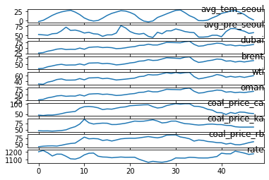
Figure 1: External factors affecting natural gas
4. Methodology
4.1. Min-Max scaling
In this project, all datasets are rescaled between 0 and 1 by Min-Max scaling, one of the most common normalization methods. If there is a feature with anonymous data, The maximum value(max(x)) of data is converted to 1, and the minimum value(min(x)) of data is converted to 0. The other values between the maximum value and the minimum value get converted to x', between 0 and 1.
4.2. Training
For forecasting the NG supply amount from the time series dataset, MLP with LSTM network model is designed by using Tensorflow. The first and second LSTM layers have 100 units, and a total of 3 layers of MLP follow it. Each MLP layer has 100 neurons instead of the final layer, where its neuron is 1. In addition, dropout was designated to prevent overfitting of data, the Adam is used as an optimizer, and the Rectified Linear Unit(ReLU) as an activation function.
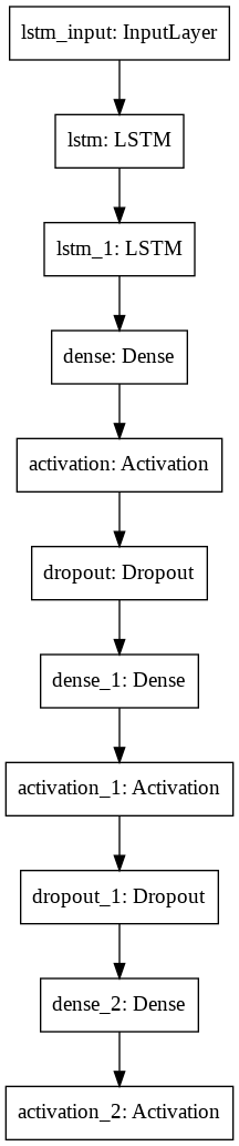
Figure 2: Structure of network model
4.3. Evaluation
Mean Absolute Error(MAE) and Root Mean Squared Error(RMSE) are applied for this time series dataset to evaluate this network model. The MAE measures the average magnitude of the errors and is presented by the formula as following, where n is the number of errors, is the
true value, and
is the
predicted value.
Also, The RMSE is used for observing the differences between the actual dataset and prediction values. The following is the formula of RMSE, and each value of this is the same for MAE.
4.4. Prediction
Since the datasets used for the training process are normalized between 0 and 1, they get converted to a range of the ground truth values again. From these rescaled datasets, it is possible to obtain the RMSE and compare the differences between the actual value and the predicted value.
5. Result
In all scenarios, main variables such as dropout, learning rate, and epochs are fixed under the same conditions and are 0.1, 0.0005, and 100 in order. In scenarios one, two, three, and five, the training set is applied as twelve months, and in scenario four, next month’s prediction comes from the previous two months dataset. For comparative analysis, the results are obtained by changing the size of the training set from twelve months to twenty-four months, and the effect is described. Each scenario shows individual results and is comprehensively compared at the end of this part.
5.1 Scenario one(regional dataset)
The final MAE of the train set is around 0.05, and the one of the test set is around 0.19. Also, the RMSE between actual data and predicted data is around 227018. The predictive graph tends to deviate a lot at the beginning of the part, but it shows a relatively similar shape at the end of the graph.
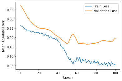
Figure 3: Loss for scenario one
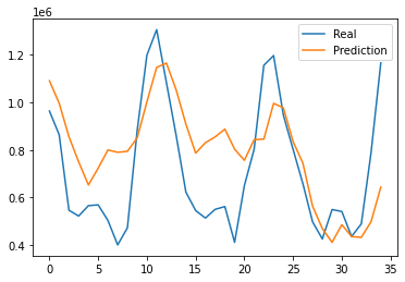
Figure 4: Prediction results for scenario one
5.2 Scenario two(regional climate dataset)
The final MAE of the train set is around 0.10, and the one of the test set is around 0.14. Also, the RMSE is around 185205. Although the predictive graph still differs compared to the actual graph, it shows similar trends in shape.
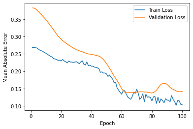
Figure 5: Loss for scenario two
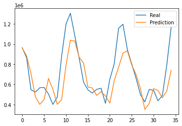
Figure 6: Prediction results for scenario two
5.3 Scenario three(regional temperature dataset)
The final MAE of the train set is around 0.13, and the one of the test set is around 0.14. Also, the RMSE is around 207585. While the tendency to follow high and low seems similar, but changes in the middle seem to be misleading.
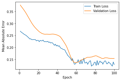
Figure 7: Loss for scenario three
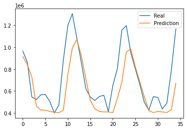
Figure 8: Prediction results for scenario three
5.4 Scenario four(applying timesteps)
The final MAE of the train set is around 0.06, and the one of the test set is around 0.30. Also, the RMSE is around 340843. Out of all scenarios, the predictive graph shows to have the most differences. However, in the last part, there is a somewhat akin tendency.
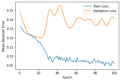
Figure 9: Loss for scenario four
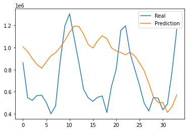
Figure 10: Prediction results for scenario four
5.5 Scenario five(national dataset)
The final MAE of the train set is around 0.03 and the one of test set is around 0.14. Also, the RMSE between real data and predicted data is around 587340. Tremendous RMSE value results, but direct comparisons are not possible because the baseline volume is different from other scenarios. Although the predictive graph shows discrepancy, it tends to be similar to the results in scenario two.
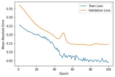
Figure 11: Loss for scenario five
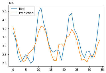
Figure 12: Prediction results for scenario five
5.6 Overall results
Out of the five scenarios in total, the second and third have smaller RMSE than others, and the graphs also show relatively similar results. The first and fourth show differences in the beginning and similar trends in the last part. However, it is noteworthy that the gap at the beginning of them is very large, but it tends to shrink together at the point of decline and stretch together at the point of increase.
In the first and fifth scenarios, all data are identical except that they differ in regional scale in temperature and precipitation. It is also the same that twelve months of data are used as the training set. From the subtle differences in the shape of the resulting graph, it can be seen that the national average data cannot represent the situation in a particular region, and the amount of NG supply differs depending on the circumstances in the region.
Figure 13: Total prediction results: 12 months training set
After changing the training set from twelve months to twenty-four months, the results are more clearly visible. The second and third prediction graphs have a more similar shape and the RMSE value decreases than the previous setting. The results of other scenarios show that the overall shape has improved; contrarily, the shape of the rapidly changing middle part is better in the previous condition.
Figure 14: Total prediction results: 24 months training set
6. Benchmarks
For a benchmark, the Cloudmesh StopWatch and Benchmark 15 is used to measure the program’s performance. The time spent on data load, data preprocessing, network model compile, training, and the prediction was separately measured, and the overall time for execution of all scenarios is around 77 seconds. It can be seen that The training time for the fourth scenario is the longest, and the one for the fifth scenario is the shortest.
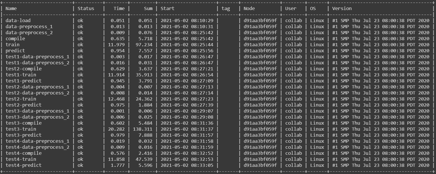
Figure 15: Benchmarks
7. Conclusion
From the results of this project, it can be seen that simplifying factors that have a significant impact shows better efficiency than combining various factors. For example, NG consumption tends to increase for heating in cold weather. In addition, there is much precipitation in warm or hot weather; on the contrary, there is relatively little precipitation in the cold weather. It can be seen that these seasonal elements show relatively high consistency for affecting prediction when those are used as training datasets. Also, the predictions are derived more effectively when the seasonal datasets are combined.
However, in training set with a duration of twelve months, the last part of the scenario tends to match the actual data despite using the dataset combined with various factors that appears to be seasonally unrelated. Furthermore, when the training set is doubled on the same dataset, it can be seen that the differences between the actual and prediction graph are decreased than the result of a smaller training set. Based on this, it can be expected that the results could vary if a large amount of dataset with a more extended period is used and the ratio of the training set is appropriately adjusted.
South Korea imports a large amount of its energy resources. Also, the plan for energy demand and supply is being made and operated through nation-led policies. Ironically, the government’s plan also shows a sharp change in direction with recent environmental issues, and the volatility of demand in the energy market is increasing than before. Therefore, methodologies for accurate forecasting of energy demand will need to be complemented and developed constantly to prepare for and overcome this variability.
In this project, Forecasting NG demand and supply was carried out using various data factors such as weather and price that is relatively easily obtained than the datasets which are complex economic indicators or classified as confidential. Nevertheless, state-of-the-art deep learning methods show that it has the flexibility and potential to forecast NG demand through the tendency of the results that indicate a relatively consistent with the actual data. From this point of view, it is thought that the research on NG in South Korea should be conducted in an advanced form by utilizing various data and more specialized analysis.
8. Acknowledgments
The author would like to thank Dr. Gregor von Laszewski for his invaluable feedback, continued assistance, and suggestions on this paper, and Dr. Geoffrey Fox for sharing his expertise in Deep Learning and Artificial Intelligence applications throughout this Deep Learning Application: AI-First Engineering course offered in the Spring 2021 semester at Indiana University, Bloomington.
9. Source code
The source code for all experiments and results can be found here as ipynb link and as pdf link.
10. References
-
2020 Monthly Energy Statistics, [Online resource] http://www.keei.re.kr/keei/download/MES2009.pdf, Sep. 2020 ↩︎
-
KOGAS profile, [Online resource] https://www.kogas.or.kr:9450/eng/contents.do?key=1498 ↩︎
-
LNG production phase, [Online resource] https://www.kogas.or.kr:9450/portal/contents.do?key=2014 ↩︎
-
NG wholesale charges, [Online resource] https://www.kogas.or.kr:9450/portal/contents.do?key=2026 ↩︎
-
Natural gas explained, [Online resource], https://www.eia.gov/energyexplained/natural-gas/factors-affecting-natural-gas-prices.php, Aug, 2020 ↩︎
-
A. Khotanzad and H. Elragal, “Natural gas load forecasting with combination of adaptive neural networks,” IJCNN'99. International Joint Conference on Neural Networks. Proceedings (Cat. No.99CH36339), 1999, pp. 4069-4072 vol.6, doi: 10.1109/IJCNN.1999.830812. ↩︎
-
A. Khotanzad, H. Elragal and T. . -L. Lu, “Combination of artificial neural-network forecasters for prediction of natural gas consumption,” in IEEE Transactions on Neural Networks, vol. 11, no. 2, pp. 464-473, March 2000, doi: 10.1109/72.839015. ↩︎
-
M. Akpinar, M. F. Adak and N. Yumusak, “Forecasting natural gas consumption with hybrid neural networks — Artificial bee colony,” 2016 2nd International Conference on Intelligent Energy and Power Systems (IEPS), 2016, pp. 1-6, doi: 10.1109/IEPS.2016.7521852. ↩︎
-
A. Anagnostis, E. Papageorgiou, V. Dafopoulos and D. Bochtis, “Applying Long Short-Term Memory Networks for natural gas demand prediction,” 2019 10th International Conference on Information, Intelligence, Systems and Applications (IISA), 2019, pp. 1-7, doi: 10.1109/IISA.2019.8900746. ↩︎
-
NG supply dataset, [Online resource], https://www.data.go.kr/data/15049904/fileData.do, Apr, 2020 ↩︎
-
Regional climate dataset, [Online resource] https://data.kma.go.kr/climate/RankState/selectRankStatisticsDivisionList.do?pgmNo=179 ↩︎
-
Crude oil orice dataset, [Online resource] https://www.petronet.co.kr/main2.jsp ↩︎
-
Bituminous coal price dataset, [Online resource] https://www.kores.net/komis/price/mineralprice/ironoreenergy/pricetrend/baseMetals.do?mc_seq=3030003&mnrl_pc_mc_seq=506 ↩︎
-
Won-Dollar exchange rate dateset, [Online resource] http://ecos.bok.or.kr/flex/EasySearch.jsp?langGubun=K&topCode=022Y013 ↩︎
-
Gregor von Laszewski, Cloudmesh StopWatch and Benchmark from the Cloudmesh Common Library, [GitHub] https://github.com/cloudmesh/cloudmesh-common ↩︎
33 - Big Data on Gesture Recognition and Machine Learning
![]()
![]() Status: final, Type: Report
Status: final, Type: Report
Sunny Xu, Peiran Zhao, Kris Zhang, fa20-523-315, Edit
Abstract
Since our technology is more and more advanced as time goes by, traditional human-computer interaction has become increasingly difficult to meet people’s demands. In this digital era, people need faster and more efficient methods to obtain information and data. Traditional and single input and output devices are not fast and convenient enough, it also requires users to learn their own methods of use, which is extremely inefficient and completely a waste of time. Therefore, artificial intelligence comes out, and its rise has followed the changeover times, and it satisfied people’s needs. At the same time, gesture is one of the most important way for human to deliver information. It is simple, efficient, convenient, and universally acceptable. Therefore, gesture recognition has become an emerging field in intelligent human-computer interaction field, with great potential and future.
Contents
Keywords: gesture recognition, human, technology, big data, artificial intelligence, body language, facial expression
1. Introduction
Technology is probably one of the most attracting things for people nowadays. Whether it is the new iPhone coming out or some random new technology that is bring into our life. It is a matter of fact that technology has become one of the essential parts of our life and our society. Simply, our life will change a lot without technology. As of today, since technology is improving so fast, there are many things that can be related to AI and machine learning. A lot of the ordinary things around our life becomes data. And the reason why they become data is because there is a need for them in having better technology to improve our life. For example, language was stored into data to produce technology like translator to provide convenience for people that does not speak the language. Another example is that roads were stored into data to produce GPS to guide direction for people. Nowadays, people values communication and interaction between others. Since gesture recognition is one of the most important ways to understand people and know their emotion, it becomes a popular field of study for many scientists. There are multiply field of study in gesture recognition and each require a lot of amount of time to know them well. For the report, we do research about hand gesture, body gesture and facial expression. Of course, there will be a lot of other fields related to gesture recognition, for example, like animal gestures. They all can be stored into data and get study in the research by scientists. Many people might have question about how gesture recognition are has anything to do with technology. They simply do not think that they can be related, but in fact, they are related. Companies like Intel and Microsoft have already created so many studies for new technology in that field. For example, Intel proposed combining facial recognition with device recognition to authenticate users. Studying gestures recognition will often reveal what the think. For example, when someone is lying, their eye will tend to look around and they tend to touch their nose with their hand, etc. So, studying gesture recognition will not only help people understand much more about human beings and it can also help our technology grow. For example, in AI and machine learning, studying gestures recognition will make or improve AI and machine learning to better understand humans and be more human-like.
2. Background
Nowadays, people are doing more and more high-tech research, which also makes various high-tech products appear in society. For people, electricity is as important as water and air. Can’t imagine life without electricity. We can realize that technology is changing everything about people from all aspects. People living in the high-tech era are also forced to learn and understand the usage of various high-tech products. As a representative of high technology, artificial intelligence has also attracted widespread attention from society. Due to the emergence of artificial intelligence, people have also begun to realize that maintaining human characteristics is also an important aspect of high technology.
People’s living environment is inseparable from high technology. As for the use of human body information, almost every high-tech has different usage 1. For example, face recognition is used in many places to check-in. This kind of technology enables the machine to store the information of the human face and determine whether it is indeed the right person by judging the five senses. We are most familiar with using this technology in airports, customs, and companies to check in at work. Not only that, but the smartphones we use every day are also unlocked through this face recognition technology. Another example is the game console that we are very familiar with. Game consoles such as Xbox and PS already have methods for identifying people’s bodies. They can identify several key points of people through the images received by their own cameras, thus inputting this line of action into the world of the game.
Many researchers are now studying other applications of human movements, gestures, and facial expressions. One of the most influential ones is that Google’s scientists have developed a new computer vision method for hand perception. Google researchers identified the movement of a hand through twenty-one 3D points on the hand. Research Engineers Valentin Bazarevsky and Fan Zhang stated that “The ability to perceive the shape and motion of hands can be a vital component in improving the user experience across a variety of technological domains and platforms 2.” This model can currently identify many common cultural features. gesture. They have done experiments. When people play a game of “rock, paper, scissors” in front of the camera, this model can also judge everyone’s win or loss by recognizing gestures.
More than that, many artificial intelligences can now understand people’s feelings and intentions by identifying people’s facial expressions. This also allows us to know how big a database is behind this to support the operation of these studies. But collecting these data about gesture recognition is not easy. Many times we need to worry about not only whether the data we input is correct, but also whether the target identified by artificial intelligence is clear and the output information is accurate.
3. Gesture Recognition
Gesture recognition is mainly divided into two categories, one is based on external device recognition, the specific application is data gloves, wearing it on user’s hand, to obtain and analysis information through sensors. This method has obvious shortcomings, though it is accurate and has excellent response speed, but it is costly and is not good for large-scale promotion. The other one is the use of computer vision. People do not need to wear gloves. As its name implies, this method collects and analyzes information through a computer. It is convenient, comfortable, and not so limited based on external device identification. In contrast, it has greater potential and is more in line with the trend of the times. Of course, this method needs more effective and accurate algorithms to support, because the gestures made by different people at different times, in different environments and at different angles also represent different meanings. So, if we want more accurate information feedback. Then the advancement of algorithms and technology is inevitable. The development of gesture recognition is also the development of artificial intelligence, a process of the development of various algorithms from data gloves to the development of computer vision-based optical technology plays a role in promoting it.
3.1 Hand Gesture
3.1.1 Hand Gesture Recognition and Big Data
Hand gesture recognition is commonly used in gesture recognition because fingers are the most flexible and it is able to create different angles that will represent different meanings. The hand gesture itself is also an easy but efficient way for us human beings to communicate and send messages to each other. The existence of hand gestures can be considered easy but powerful. However, if we are using the application of hand gesture recognition, it is a much more complicated process. In real life, we can just ben our finger or simply make a fist so that other people will understand our message. But when using hand gesture recognition there are many processes that are being involved. Hand gesture is commonly used in geesture recoginitaion As we did our research and based on our life experiences, hand gesture recognition is a very hot topic and has all the potential to be the next wave. Hand gesture recognition has recently achieved big success in many fields. The advancement and development of hand gesture recognition is also the development of other technology such as the advancement of computer chips, the advancement of algorithms, the advancement of machine learning even advancement of deep learning, and the advancement of cameras from 2D to 3D. The most important part of hand gesture recognition is big data and machine learning. Because of the development of big data and machine learning, data scientists are able to have better datasets, build a more accurate and successful model and be able to process the information and predict the most accurate results. Hand gesture recognition is a significant link in Gesture recognition.However gesture recognition is also not only about hand gesture recognition, it also includes other body parts such as facial expression recognition and body gesture recognition. With the help of the whole system of different gesture recognitions, the data can be recorded and processed by AIs. The results or predictions can be used currently or later on for different purposes in different areas 3.
3.1.2 Principles of Hand Gesture Recognition
Hand gesture recognition is a complicated process involving many steps. And in order to get the most accurate result, it will need a large amount of quality data and a scientific model with high performance. Hand gesture recognition is also at a developing stage simply because there are so many possible factors that can influence the result. Possible factors include skin color, background color, hand gesture angle, and Bending angle, etc. To simplify the process of gesture recognition, AIs will use 3-D cameras to capture images. After that, the data of the image will be collected and processed by programs and built models. And lastly, AIs will be able to use that model to get an accurate result in order to have a corresponding response or predict future actions. To explain all processes of hand gesture recognition in detail, it includes graphic gathering, retreatment, skin color segmentation, hand gesture segmentation, and finally hand gesture recognition. Hand Gesture Recognition can not achieve the best accuracy without all any of these steps. Within all these steps, skin color segmentation is the most crucial step in order to increase accuracy and this process will be explained in the next session 4.
3.1.3 Gesture Segmentation and Algorithm, The Biggest Difficulty of Gesture Recognition.
If someone actually asks us a question which is what kind of recognition is going to have the maximum potential in the future? We will have Hand Gesture recognition as my answer without a doubt. Because in my opinion, Hand Gesture Recognition is really the next wave, as our technology is getting better and better, it will be a much easier and more efficient type of recognition that could possibly change our lives. If you compare Hand Gesture Recognition with Voice Recognition, you will see the biggest difference because everyone is using Hand Gesture all over the world in different ways while Voice is limited to people that are unable to make a sound and sound is a much more complicated type of data that in my opinion is not efficient enough to deliver a message, at least with lots of evidence indicating it is not easier than Hand Gesture Recognition. However, it doesn’t mean hand gesture doesn’t have any limit. Instead, Hand Gesture Recognition is influenced by the color in many ways including skin colors and the colors of the background. But skin color is also a great characteristic of recognition at the same time. So if we could overcome this shortcoming or obstacle, the biggest disadvantage of Hand Gesture Recognition could also become its biggest advantage since skin color has so many amazing characteristics that could be used as a huge benefit for Hand Gesture Recognition. Firstly, skin color is a unique attribute which means it has a similar meaning all over the world. For example, Asian people mostly have yellow skins, Western people mostly have white skins while African American people mostly have black skins. People might form different regions from all over the world but since their skins are similar in many ways, they are most likely to have at least similar hand gesture meanings according to different scientific studies. However, you might ask another realistic question which is what about many people who have similar skin colors but are coming from different groups of people who have a completely different cultural background which results in different Hand Gestures and people who have similar Hands Gesture but have much different skin colors. These are all realistic Hand Gesture Recognition problems and these are the problems that Hand Gesture Recognition already solved or is going to solve in the future. Firstly, for people who have similar skin colors but are coming from different groups of people who have a completely different cultural background, this is when skin color comes to play its role. Even though those people have similar skin color, their skin color can’t be exactly the same. Most of the time, it will be either darker or lighter and we might say it’s all yellow or white, but the machine will see it as its data format so even if it is all white, the type of white is still completely different. And this is when gesture segmentation or more accurately skin color segmentation makes a difference. Overall, us human read skin colors as the simple color we have learned from different textbooks but the computer or machine see the different color in the different color spaces and the data they receive and going to process will be much more accurate. In addition to that, scientists will need to do more in-depth research and studies in order to get the most accurate result. And for people who have similar Hands Gesture but have many different skin colors, scientists will need to collect more accurate data not only about the color and about the size, angles, etc. This more detailed information will help the machine read Hand Gesture more accurately in order to get the most beneficial feedback. The background color will undoubtedly provide lots of useless information and potentially negatively influence the result. In this way, Hand Gesture Recognition has developed its own color and gesture recognition algorithm and method to remove the most useless data or color and leave the valid ones. Lighting in different background settings will have a huge influence to and in most ways, it will negatively influence the result too. There are five most important steps in Hand Gesture Recognition which are Graphic Gathering, Pretreatment, Skin Color Segmentation, Gesture Segmentation, and lastly Gesture Recognition. All these different steps are all very crucial in order to get the most accurate feedback or result. It is pretty similar to the most data treatment process especially the first two steps where you first build a model, gather different types of data, clean the data after that, and use skin color segmentation and gesture segmentation before the last Gesture Recognition process 5.
3.2 Body Gesture
3.2.1 Introduction to Body Gesture
Body gestures, which can also be called body language, refer to humans expressing their ideas through the coordinated activities of various body parts. In our lives, body language is ubiquitous. It is like a bridge for our human communication. Through body language expression, it is often easier for us to understand what the other person wants to express. At the same time, we can express ourselves better. The profession of an actor is a good example of body language. This is a compulsory course for every actor because actors can only use their performances to let us know what they are expressing 6. At this time, body language becomes extremely important. Different characters have different body movements in different situations, and actors need to make the right body language at a specific time to let the audience know their inner feelings. Yes, the most important point of body language is to convey mood through movement.
In many cases, certain actions will make people feel emotions. For us who communicate with all kinds of people every day, there are also many body languages that we are more familiar with. For example, when a person hangs his head, it means that he is unhappy, walking back and forth is a sign of a person’s anxiety, and body shaking is caused by nervousness, etc.
3.2.2 Body Gesture and Big Data
As a piece of big data, body language requires data collected by studying human movements. Scientists found that when a person wants to convey a complete message, body language accounts for half. And because body language belongs to a person’s actions subconsciously, it is rarely deceptive. All of your nonverbal behaviors—the gestures you make, your posture, your tone of voice, how many eyes contact you make—send strong messages 7. In many cases, these unconscious messages from our bodies allow the people who communicate with us to feel our intentions. Even when we stop talking, these messages will not stop. This also explains why scientists want to collect data to let artificial intelligence understand human behavior. In order for artificial intelligence to understand human mood or intention from people’s body postures and actions, scientists have collected a lot of human body actions that show intentions in different situations through research. The music gesture artificial intelligence developed by MIT-IBM Watson AI Lab is a good example 8. The music gesture artificial intelligence developed by MIT-IBM Watson AI Lab can enable artificial intelligence to judge and isolate the sounds of individual instruments through body and gesture movements. This success is undoubtedly created by the big data of the entire body and gestures. The research room collects a large number of human structure actions to provide artificial intelligence with a large amount of information so that the artificial intelligence can judge what melody the musician is playing through body gestures and key points of the face. This can improve its ability to distinguish and separate sounds when artificial intelligence listens to the entire piece of music.
Most of the artificial intelligence’s analysis of the human body requires facial expressions and body movements. This recognition cannot be achieved only by calculation. What is needed is the collection of the meaning of different body movements of the human body by a large database. The more situations are collected, the more accurate the analysis of human emotions and intentions by artificial intelligence will be. The easiest way is to include more. Just like humans, broadening your horizons is a way to better understand the world. The way of recording actions is not complicated. Just set several key movable joints of the human body to several points, and then connect the red dots with lines to get the approximate shape of the human body. At this time, the actions made by the human body will be included in the artificial intelligence. In the recording process, the upper body and lower body can be recorded separately. In order to avoid in some cases, the existence of obstructions will cause artificial intelligence to fail to recognize correctly.
3.2.3 Random Forest Algorithm in Body Gesture Recognition
Body gesture recognition is pretty useful but pretty hard to achieve because of its limitations and harsh requirements. Without the development of all kinds of 3D cameras, body gesture recognition is just an unrealistic dream. In order to get important and precise data for the body gesture recognition to process, different angles, light, background all needs to be captured 9. For body gestures, the biggest difficulty is that if you only capture data in the front, it will not give you the correct information and result in most of the time. In this way, you will need precise data from different angles. A Korean team has done an experiment using three 3D cameras and three stereo cameras to capture images and record data from different angles. The data were recorded in a large database that includes captured data both from outside and inside. One of the most popular algorithms used in body gesture recognition is the random forest algorithm. It is very famous and useful in all types of machine learning projects. It is a type of supervised learning algorithm. Because there are all types of data are needed to be a record and process. The random forest algorithm is perfect for that, the biggest advantage of this algorithm is that it can let each individual tree mainly focus on one part or one characteristic of body gesture data because of this algorithm’s ability to combine all weak classifiers into a strong one 10. It is simple but so powerful and efficient. In addition to that, it works really well with body gesture recognition. With the algorithm and advanced cameras, precise data could be collected and AIs will be able to get useful information at different levels.
3.3 Face Gesture
3.3.1 Introduction to Face Gesture (Facial Expression)
Body language is one of the ways that we can express ourselves without saying any words. It has been suggested that body language may account for between 60 to 65% of all communication 6. According to expert, body language is used every day for us to communicate with each other. During our communication, we not only use words but also use body gestures, hand gestures and most importantly, we use facial expression most. During communication with different people, our face communicate different thoughts, idea, and emotion and the reason why we use facial expression more than any other body gestures is that when we have certain emotion, it is express in our face automatically. Facial expression is often not under our control. That is why people often say that the word that come out of mouth cannot always be true, but their facial expression will reveal what those people are thinking about. So, what is facial expression exactly? According to Jason Matthew Harley, Facial expressions are configurations of different micromotor movements in the face that are used to infer a person’s discrete emotional state 9. Some example of common facial expression will be: Happiness, Sadness, Anger, Surprise, Disgust, Fear, etc 6. Each facial expression will have some deep meaning behind it. For example, A simple facial expression like smiling can be translated into a sign of approval, or it can be translated into a sign of friendly. If we put all those emotion into big data, it will help us to understand ourselves much better.
3.3.2 Sense Organs on The Face
The facial expression expresses our emotion during the communication by micro movement of our sense organs. The most used organs are the eyes and mouth and sometimes, the eyebrows.
3.3.2.1 Eye
The eyes are one of the most important communication tools in our ways of communication with each other. When we communicate with each other, the eye contact will be inevitable. The signal in your eye will tell people what you are think. Eye gaze is a sample of paying attention when communicating with others. When you are talking to a person and if his eye is directly on you and both of you keep having eye contact. In this situation, this mean that he is interested in what you say and is paying attention to what you say. On the other hand, if the action of breaking eye contact happens very frequently, it means that he is not interested, distracted, or not paying attention to you and what you are saying.
Blinking is another eye signal that is very often and will happen in communicating with other people. When talking to other people, blinking is very usual and will happen every time when you are going to communicate with different people. But the frequency of blanking can give away what are you feeling right now. People often blink more rapidly when they are feeling distressed or uncomfortable. Infrequent blinking may indicate that a person is intentionally trying to control his or her eye movements 6. For example, when A person is lying, he might try to control his blinking frequency to make other people feel like he is calm and saying the truth. In order to persuade other people that he is calm and telling the truth, he will need to blink less frequently.
Pupil size is a very important facial expression. Pupil size can be a very subtle nonverbal communication signal. While light levels in the environment control pupil dilation, sometimes emotions can also cause small changes in pupil size 6. For example, when you are surprised by something, your pupil size will become noticeably larger than before. When having a communication, dilated eyes can also mean that the person is interesting in the communication.
3.3.2.2 Mouth
Mouth expression and movement will also be a huge part in communicating with other and reading body language. The easiest example will be smiling. A micro movement of your mouth and lip will give signal to others about what do you think or how are you feeling. When you tighten your lips, it means that you either distaste, disapprove or distrust other people when having a conversation. When you bite your lips, it means that you are worried, anxious, or stressed. When someone tries to hide certain emotional reaction, they tend to cover their mouth in order not to display any facial expression through lip movement. For example, when you are laughing. The simple movement of turning up or down of the lip will also indicate what a person is feeling. When the mouth is slightly turn up, it might mean that the person is either feeling happy or optimistic. On the other hand, a slightly down-turned mouth can be an indicator of sadness, disapproval, or even an outright grimace 6.
3.3.3 Facial Expression and Big Data
Nowadays, since technology is so advance, everything around us can be turn into data and everything can be related to data. Facial expression is often study by different scientist in research because it allows us to understand more about human and communication between different people. One of the relatively new and promising trends in using facial expressions to classify learners' emotions is the development and use of software programs the automate the process of coding using advanced machine learning technologies. For example, FaceReader is a commercially available facial recognition program that uses an active appearance model to model participant faces and identifies their facial expression. The program further utilizes an artificial neural network, with seven outputs to classify learner’s emotions 11. Also, facial expression can be analyzed in other software programs like the Computer Expression Recognition Toolbox. Emotion is a huge study field in the technology field, and facial expression is one of the best ways to study and analyze people’s emotion. Emotion technology is becoming huge right now and will be even more popular in the future according to MIT Technology Review, Emotion recognition – or using technology to analyze facial expressions and infer feelings-is, by one estimate, set to be a $25 billion business by 2023 12. So back to the topic about big data and facial expression. Why are those things related? It is because, first everything is data around us. Your facial expression can be stored into data for other to learn and detect too. One of the examples is that, in 2003, The US Transportation Security Administration started training humans to spot potential terrorists by reading their facial expression. And by that, scientist believe that if human can do that, with data and AI technology, robot can detect facial expression more accurate than human.
3.3.4 The Problem with Detecting Emotion for Technology Nowadays
Even though facial expression can reveal people’s emotion and what they think, but there has been “growing pushback” against the statement. A group of scientists brought together a research after reviewing more than 1,000 paper on emotion detection. After the research, the conclusion of it is hard to use facial expressions alone to accurately tell how someone is feeling is made. Human’s mind is very hard to predict. People do not always cry when they feel down and smile when they feel happy. The facial expression can not always reveal the true feeling the person is feeling. Not only that, because there is not enough data for facial expression, people will often mistakenly categorize other’s facial expression. For example, Kairos, which is a facial biometrics company, promise retailers that it can use a emotion recognition technology to figure out how their customers are feeling. But when they are labeling the data to feed the algorithm, one big problem reveals. An observer might read a facial expression as “surprised,” but without asking the original person, it is hard to know what the real emotion was 12. So the problems with technology that involves around facial expression are first, there is not enough data. Second is that facial expression sometimes can not be always true.
3.3.5 Classification Algorithms
Nowadays, since technology is growing so fast, there are a lot of interaction between humans and computer. Facial expression plays an essential role in social interaction with other people. It is not arguably one of the best ways to understand human. “It is reported that facial expression constitutes 55% of the effect of a communicated message while language and voice constitute 7% and 38% respectively. With the rapid development of computer vision and artificial intelligence, facial expression recognition becomes the key technology of advanced human computer interaction 13.” This quote from the research shows that facial expression is one of the main tools that we are using to communicate with other people and interact with computer. So being able to recognize and identify the facial expression becomes relatively important. The main objective for facial expression recognitions is to use its conveying information automatically and correctly. As a result, feature extraction is very important to the facial expression recognition process. The process needs to be smooth and without any mistakes. So, algorithms are needed in the processes. Classification analysis is an important component of facial recognition, it is mainly used to find data distribution that is valuable and at the same time, find data models in the potential data. At present it has further study of the database, data mining, statistics, and other fields 13. In addition to that, one of the major obstacles and limitation of facial expression recognition is face detection. To detect the face, you will need to locate the faces in an image or a photograph. This is where scientists applicate classification algorithm, machine learning and deep learning. Recently, convolutional neural network model has become so successful that facial recognition is the next top wave 14.
4. Conclusion
With the development of artificial intelligence, human-computer interaction, big data, and machine learning even deep learning is getting more mature. Gesture Recognition including Hand Gesture Recognition, Body Gesture Recognition, and Face Gesture Recognition has finally come true into a real-life application and already achieved huge success in many areas. But it still has much more potential in all possible areas that could change people’s lives drastically in a good way. Gestures are the simplest and the most natural language of all human beings. It sends the clearest message for communicating between people, and even human and computers. Because of the more powerful cameras, better big data technology, and more efficient and effective algorithms from deep learning, Scientists are able to use color and the Gesture Segmentation method to remove useless color data in order to maximize the accuracy of the result. As we are doing our research, we also find out Hand Gesture Recognition is not the only Recognition in this area, Body Gesture Recognition and Face Gesture Recognition or facial expression are also very important, they can also deliver messages in the simplest way. They are also very effective when building relationships between humans and machines. Face Gesture or facial expression could not only deliver messages but even deliver emotions. Micromovements of facial expressions studied by different scientists could be very useful in predicting the emotions of humans. Body Gesture Recognition is also helpful as we did our research with the body gesture data scientists collected from different musicians with different instruments. They are able to predict the melodies or even the songs played by that musician. This is mind-blowing because with this type of technology and applications we are able to achieve more and use it in many possible fields. With all these combined, scientists could build a very successful and mature Gesture Recognition model to get the most accurate result or prediction. According to the research and our own analysis, we come up with a conclusion that Gesture Recognition will be the next hot trendy topic and are applicable in many possible areas including Security, AI, economics, manufacture, the game industry, and even medical services. With Gesture Recognition being applied, scientists are able to develop much smarter AIs and machines that can interact with humans more efficiently and more fluently. AIs will be able to receive and understand messages from humans more easily and will able to function better. This is also a great message for many handicapped people. With Hand Gesture Recognition being used, their life will also be easier and happier and that’s definitely something we are want to see because the overall goal of all the technologies is to make people’s life easier and bring the greatest amount of happiness to the greatest amount of people. However, the technology we have right now is not advanced enough yet, in order to get a more accurate result, we still need to develop better cameras, better algorithms, and better models. But we all believe that this era is the big data era, and everything could happen as big data and deep learning technology get more and more advanced and mature. We believe in and look forward to the beautiful future of Gesture Recognition. And we also think people should really pay more and closer attention to this field since Gesture Recognition is the next wave.
5. References
-
Srilatha, Poluka, and Tiruveedhula Saranya. “Advancements in Gesture Recognition Technology.” IOSR Journal of VLSI and Signal Processing, vol. 4, no. 4, 2014, pp. 01–07, iosrjournals.org/iosr-jvlsi/papers/vol4-issue4/Version-1/A04410107.pdf, 10.9790/4200-04410107. Accessed 25 Oct. 2020. ↩︎
-
Bazarevdsky, V., & Zhang, F. (2019, August 19). On-device, real-time hand tracking with MediaPipe. Google AI Blog. https://ai.googleblog.com/2019/08/on-device-real-time-hand-tracking-with.html ↩︎
-
F. Zhan, “Hand Gesture Recognition with Convolution Neural Networks,” 2019 IEEE 20th International Conference on Information Reuse and Integration for Data Science (IRI), Los Angeles, CA, USA, 2019, pp. 295-298, doi: 10.1109/IRI.2019.00054. ↩︎
-
Di Zhang, DZ.(2019) Research on Hand Gesture Recognition Technology Based on Machine Learning, Nanjing University of Posts and Telecommunications. ↩︎
-
A. Choudhury, A. K. Talukdar and K. K. Sarma, “A novel hand segmentation method for multiple-hand gesture recognition system under complex background,” 2014 International Conference on Signal Processing and Integrated Networks (SPIN), Noida, 2014, pp. 136-140, doi: 10.1109/SPIN.2014.6776936. ↩︎
-
Cherry, K. (2019, September 28). How to Read Body Language and Facial Expressions. Verywell Mind. Retrieved November 8, 2020, from https://www.verywellmind.com/understand-body-language-and-facial-expressions-4147228 ↩︎
-
Segal, J., Smith, M., Robinson, L., & Boose, G. (2020, October). Nonverbal Communication and Body Language. HelpGuide.org. https://www.helpguide.org/articles/relationships-communication/nonverbal-communication.htm ↩︎
-
Martineau, K. (2020, June 25). Identifying a melody by studying a musician’s body language. MIT News | Massachusetts Institute of Technology. https://news.mit.edu/2020/music-gesture-artificial-intelligence-identifies-melody-by-musician-body-language-0625 ↩︎
-
N. Normani et al., “A machine learning approach for gesture recognition with a lensless smart sensor system,” 2018 IEEE 15th International Conference on Wearable and Implantable Body Sensor Networks (BSN), Las Vegas, NV, 2018, pp. 136-139, doi: 10.1109/BSN.2018.8329677. ↩︎
-
Bon-Woo Hwang, Sungmin Kim and Seong-Whan Lee, “A full-body gesture database for automatic gesture recognition,” 7th International Conference on Automatic Face and Gesture Recognition (FGR06), Southampton, 2006, pp. 243-248, doi: 10.1109/FGR.2006.8. ↩︎
-
Harley, J. M. (2016). Facial Expression. ScienceDirect. https://www.sciencedirect.com/topics/computer-science/facial-expression ↩︎
-
Chen, A. (2019, July 26). Computers can’t tell if you’re happy when you smile. MIT Technology Review. https://www.technologyreview.com/2019/07/26/238782/emotion-recognition-technology-artifical-intelligence-inaccurate-psychology/ ↩︎
-
Ou, J. (2012). Classification algorithms research on facial expression recognition. Retrieved from https://www.sciencedirect.com/science/article/pii/S1875389212006438 ↩︎
-
Brownlee, J. (2020, August 24). How to perform face detection with deep learning. Retrieved from https://machinelearningmastery.com/how-to-perform-face-detection-with-classical-and-deep-learning-methods-in-python-with-keras/ ↩︎
34 - Big Data in the Healthcare Industry
Cristian Villanueva, Christina Colon
![]()
![]() Status: final, Type: Report
Status: final, Type: Report
Abstract
Healthcare is an organized provision of medical practices provided to individuals or a community. Over centuries the application of innovative healthcare has been needed increasingly as humans expand their life span and become more aware of better preventative care practices. The application of Big Data within the industry of Healthcare is of the utmost importance in order to quantify the effects of wide scale efficient and safe solutions. Pharmaceutical and Bio Data Research companies can use big data to intake large facets of patient record data and use this collected data to iterate how preventative care can be implemented before diseases actually present themselves in stages that are beyond the point of potential recovery. Data collected in laboratory settings and statistics collected from medical and state institutions of healthcare facilitate time, money, and life saving initiatives as deep learning can in certain instances perform better than the average doctor at detecting malignant cells. Big data within healthcare has proven great results for the advancement and diverse application of informed reasoning towards medical solutions.
Contents
Keywords: EHR, Healthcare, diagnosis, application, treatment, AI, network, records
1. Introduction
Healthcare is a multi-dimensional system established with the aim of the prevention, diagnosis, and treatment of health-related issues or impairments in human beings1. The many dimensions of Healthcare can be characterized by the influx of information coming and going from each level as there are multiple different applications of Healthcare. These applications can include but are not limited to vaccines, surgeries, x-rays, medicines/treatments. Big data plays a pivotal role in Healthcare diagnostics, predictions, and accelerated results/outcomes of these applications. Big Data has the ability to save millions of dollars through automating 40% of radiologist’s tasks, saving time on potential treatments through digital patients, and by providing improved outcomes1. With higher accuracy rates of diagnosis and advanced AI is able to transform hypothetical analysis into data driven diagnosis and treatment strategies.
2. Patient Records
EHR stands for ‘electronic health records’ and is a digital version of a patient’s paper chart.The Healthcare industry utilizes EHR for maintaining records of everything related in their institutions. EHR are real-time, patient centred records that make information available instantly and securely to authorized users2. EHR is capable of holding even more information as it is possible to include such information such as medical history, diagnoses, medications, treatment plans, immunization dates, allergies, radiology images, and laboratory and test results. According to Definitive Healthcare data from 2020, more than 89 percent of all hospitals have implemented inpatient or ambulatory EHR systems 3. A network of information surrounding a patient’s health record and medical data allows for the research and production of such progressive advancement in treatment. To underline the potential of the resources, more than 110 million EHRs around the continents were inspected for genetic disease research4. This is the capability of EHRs as it holds information capable of diagnosing, preventing and treating other patients for early detection of an ailment or disease. Through the application of neural networks in Deep Learning models, EHR’s could be compiled and analyzed to identify inconspicuous indicators of disease development of patients in early stages far before a human doctor would be able to make a clear diagnosis. The application has the ability to work far ahead for preventive measures as well as the allocation of resources to make sure that patients are paying for the care at minimum costs, the appropriate method of medical intervention is applied, and physicians’ workload can become less strenuous.
2.1 EHR Application: Detecting Error and Reducing Costs
In order to understand the impact that Big Data such as EHRs has on the Healthcare industry an example of research is presented in the form of collection before and after implementation of EHR. The research study collected data for the period of 1 year before EHR (pre-EHR) and 1 year after EHR (post-EHR) implementation. What was noticed in the analyzes of the data was in the area of ‘Medication errors and near misses’ the research stated ‘medication errors per 1000 hospital days decreased 14.0%-from 17.9% in the pre-EHR period to 15.4% in the 9 months after CPOE implementation’5. The research determined that with implementation of EHR with (CPOE) computerized provider order entry was able to reduce the costs of treatment and improvised upon the safety of their patients. Participants of the study mentioned that there was an increase in speed when it came to pharmacy, laboratory and radiology orders. The research also stated ‘our study demonstrated an 18% reduction in laboratory testing’. The study touched upon the rapidness that EHR can add to a process of treatment when orders are validated much quicker and hospitals and patients save money from the rapid diagnosis and treatment. This cuts out the middle-man of deliberate testing and examinations upon patients so they don’t have to cover the costs or undergo wasteful testing from their own EHR and other extensive EHR that it utilizes for comparison. Examples of models used in this example study include data mining through phenotyping and natural language processing. In this way data mining allows large sets of patient data to be aggregated in order to make inferences over a population or theories regarding how a disease will progress in any given patient. Phenotyping categorizes features of patients' health and their DNA and ultimately their overall health. Association rule data mining helps automated systems in their predictions in order to predict behavioral and health outcomes of patients’ circumstances.
3. AI Models in Cancer Detection
AI is modifying early detection of cancer as models are capable of being more accurate and precise with the analysis of mass and cell images. The difficulty of diagnosing cancer is because of the possibilities of either the mass being benign or malignant. The amount of time overlooking the cell nuclei and its features to either determine if it is malignant or benign can be staggering for oncologists. Utilizing the information of what’s known about cancer can train AI to be calibrated to scour through several images and screenings of cell nuclei to find the key indicators. These key indicators can also be whittled down even further as there is AI to determine which indicators have the highest correlation with malignant cancer. As a dataset from Kaggle consisting of 569 cases of malignant and benign breast cancer, it represented 357 cases of benign and 212 of malignant. With that information there were initially 33 features that may have indicated malignancy in these cases. The 33 features were reduced to 10 features as not all of them equally displayed the same level of contribution to the diagnosis. Across the 10 features there were 5 features that demonstrated the highest correlation to the malignancy. Several models were adapted to find the highest accuracy and precision. This form of AI detection improves upon the efficacy of early cancer detection.

Figure 1. Demonstrates how AI in this study used images to cross-analyze features of a patient’s results to verify what model is the most accurate and precise to determine which model can best serve a physician in their diagnostic report.
3.1 Early Detection Big Data Applications
‘An ounce of prevention is worth more than a pound of a cure’ is a common philosophy held by medical professionals. The meaning behind this ideology is found in that if one can prevent a disease from ever taking its final form through performing small routine tasks and check ups, a plethora of harm and suffering from trying to recage a disease can be avoided. Many medical solutions for diseases such as cancer or degenerative brain diseases rely on the idea that outside medical intervention will strengthen the patient enough for the human body to heal itself through existing biological principles 6. For example, vaccines work by injecting dead cells into a patient so that its antibodies can be learned and immunity can be built up by white blood cells naturally. Intervening before one is infected must be completed for these measures to be effective. If preventative care such as routine screenings on individuals with family history of diseases or those with general genetic predispositions then the power truly lies in having the discernment knowledge to catch the disease early. In many diseases once a patient is presenting symptoms, it is too late or survival/recovery probability percentages are slashed. This places immense pressures on patients themselves to work to have access to routine screenings and even more pressure on physicians to intake these patients and make preliminary diagnosis with little more than a visual analysis of the patient. Big data automates these tasks and gives physicians an incredible advantage and discernment as to what is truly happening within a patient’s circumstance.
3.2 Detecting Cervical Cancer
Cervical cancer in the past was one of the most common causes of cancer death for women in the United States. However preventive care in the form of pap test has been able to drop the death rate significantly. In the pap test images are taken of the women’s cervix to identify any changes that might indicate cancer is going to form. Cervical cancer has a much higher death rate without early detection as a cure is easier to take full effect in the early stages. Artificial Intelligence performs an algorithm and gives the computer the ability to act and reason based on a set of known information. Machine learning implements more data and allows the computer to work iteratively and make predictions and make decisions based on the massive amount of data provided. In this way, machines have had the ability to detect cervical cancer with greater precision and accuracy in some cases than gynecologists 7. Imaging of cervical screenings targeted by a convolution neural network is the key to unlocking correlations behind the large sum of images. By implementing further reasoning into the data set, the CNN is able to classify enhanced recognition of cancer as or before it forms. This study using this method of machine learning has been able to perform with 90-96% accuracy and save lives. The CNN is able to identify the colors, shapes, sizes, edges and other features pertaining to cancerous cells.
This is ground breaking for women in underdeveloped countries like India and Nigeria where the death rate for cervical cancer is much higher than the United States due to lack of access to routine pap smears. Women could get results on their cervical cancer status even if they do not get a pap smear every 3 years as recommended by doctors. For example if a woman in Nigeria has her first pap smear at the age of 40 when the recommended age to start pap smears is 21 she has gone unchecked for nearly 20 years and the early detection window is narrowed. However, if she is one of the 20% of women who get cervical cancer over the age of 65, a deep learning analysis of her pap smear at 40 could save her life and roadblock potential suffering. Early detection is key and big data optimizes early detection windows by providing a deeper analysis in the preventive care stages. From here doctors are able to implement the best care plan available on a case by case basis.
4. Artificial intelligence in Cardiovascular Disease
AI in cardiovascular disease models are innovating disease detection by segmenting different types of analysis together for more efficient and accurate results. Being that cardiovascular diseases typically agitate/involve the heart and lungs there are numerous dynamics surrounding why a person is experiencing certain symptoms or at risk for development of a more critical diagnosis. Immense amount of labor is included in the diagnosis and treatment of individuals with cardiovascular disease on behalf of general physicians, specialists, nurses, and several other medical professionals. Artificial intelligence has the capability to add a layer of ease and accuracy that is involved in analyzing a patient’s status or risk for cardiovascular disease. AI is able to overcome the challenges of low quality pixelated images from analyzes and draw clearer and more accurate conclusions at a stage where more prevention strategies can be implemented. AI in this sense is able to analyze the systems of the human body as a whole as opposed to a doctor which might have several appointments with a patient to determine results from evaluations on lungs, heart, etc. By segmenting x-rays from numerous patients AI is able to learn and grow its data set to produce increasingly accurate and precise results[^8]. By using a combination of recurrent neural networks and convolutional neural networks artificial intelligence is able to go beyond what currently exists in terms of medical analysis and provide optimum results for patients in need. Recurrent neural networks function by building upon past data in order to create new output in series. They work hand in hand with Convolutional Neural networks which focus on analyzing advanced imagery based on qualitative data and can weigh biases on potential prescriptive outcomes.
 [^10]
[^10]
Figure 2. Demonstrates a wireframe of how data is computed to draw relevant conclusions from thousands of images and pinpoint exact predictions of diagnosis. Risk analysis is crucial for heart attack prevention and understanding how suspeectable a person is to heart failure. Being that heart attacks can lead to strokes due to loss of blood and oxygen to the brain, these imaging tools serve as an invaluable life saving mechanism to help bring prevention to the forefront of these medical emergencies.
5. Deep Learning Techniques for Genomics
A digital patient is the idea that a patient’s health record can be compiled with live and exact biometrics for the purpose of testing. Through this method medical professionals will have the ability to propose new solutions to patients and monitor potential effects of operations or medicines over a period of time in a condensed/rapid results format. Essentially if a patient would be able to see how their body reacts to medical procedures before they are performed. The digital copy of a patient would receive simulated trial treatments to better understand what would happen over a period of time if the solution was adopted. For example, a patient would be able to verify with their physician what type of diuretics, beta inhibitors, or angiotensin receptor blocker medication would be the most effective solution to their hypertension regulatory needs[^11]. Physicians would be able to mitigate the risks and side effects associated with a certain solution given a patients expected behavior in response to what has been uploaded to the model. In order to produce deep learning results, models must be implemented by indicating genetic markers by which computational methods can traverse the genetics strands and draw relevant conclusions. In this way data can be processed to propose changes to disease carrying chains of DNA or fortify immune based responses in those who are immunocompromised[^9].

Figure 3. Illustrates how genes are analyzed through data collection methods such as EHR, personal biometric data, and family history in order to track what type of disease poses a threat and how to prevent, predict, and treat disease at the molecular level. Producing accurate methods of treatments, medications as well as predictions without having to put the patient through any trials.
6. Discussion
In considering the numerous innovations made possible by Big Data one can expect major impacts on society as we know it. Access to these types of data solutions should be made accessible to all those who are in need. Collectively an effort must be made to promote equitable access to life saving artificial intelligence discussed in this report. Processing power and lack of resources stand as a barrier to widespread access to proper testing. However, governments and industries in the private sector must work together to avoid monopolies and price gouging limitations to such valuable data and computing models. With further investment into deep learning models error margins can be narrowed and risk percentages and be slimmed pertaining to prescriptive analysis in specific use cases. The more access to information and examples are available, the better and more advanced a deep learning system can become. With the addition of electronic health records and past analysis artificial intelligence has the power to exponentially revolutionize the healthcare industry. By providing patients with services that could save their lives there is more incentive to stay involved in personal health as computation is optimized targeting patients for more results focused visits to the doctor. Doctors themselves are able to be relieved of a portion of the workload and foster a greater work life balance through cutting down on testing time and having more time to interact with patients for educational informative appointments. Legally medical professionals will be able to use prediction errors as alternative signals to further analyze a patient and justify treatment measures. Using data visualization of potential outcomes via a specific treatment method will empower patients and doctors to choose the pathway with the most favorable outcome.Convolutional Neural Networks within deep learning is one of the if not the most essential form of algorithm for AI in healthcare. CNN allows images to be input in a way that allows for learnable weights and biases to be calculated for and differentiate and match aspects of images that would go unknown to the human eye. Through identifying the edges, shape, size, color, amount of scarring CNN is able to identify cancerous and non-cancerous cells into five categories: normal, mild, moderate, severe, and carcinoma. Accuracy in this space is above 95% and creates a new opportunity space for medical professionals to provide their patients with a high level of accuracy and timely action planning for treatment and recovery[^13]. Beyond human healthcare CNN modeling has the potential to transfer into the realm of veterinary medicine, agricultural engineering, and sustainable environment initiatives to detect invasive species and similar disease development. Dogs or cats with cancer or heart worm could be analyzed in order to determine that with their heredity/breed and life span what are the chances and timeline for disease development. Crop production could be amplified with the processing of plant genomes in combination with soil to foresee what combination will produce the most abundant and profitable harvest. Lastly, ecosystems distrubed by global warming have the capability of being studied with CNN in order to factor in changes to the environment and what solutions could be on the horizon. With enough sample collection the power of CNN has the capability of securing a brighter future for tomorrow.
7. Conclusion
Healthcare is an essential resource to living a long life and without it we can see our lifespan slashed nearly in half or even more for those who are hindered by hereditary ailments. Healthcare has been around as long as medicine and such other treatments have been around and that was centuries ago. The field has expanded well beyond what could’ve been expected for any medical professional or institution. Where the information and resources are available to save and care for the life before them even when a lack of training can hinder them the resources are present. It’s come to be such an accomplishment to mesh the medical practices of many medical professionals and Big Data to develop the largest compendium of medical practices in the world. By the allowance of such an asset many are able to collaborate with new findings and reinforcing old findings as these prevalent results allow physicians to work without faltering over inconclusive findings. The goal for this area of Big Data is to continue making the EHR system more secure and friendly towards medical professionals in different areas of practice as well as allowing easy access for patients who seek out their own medical history. The more advancements in this area of Healthcare can be applicable to other fields that must reference the compendium that maintains individuals and their history going forward. Such a structure will continue to aid generations of physicians and patients alike and can aid technological advancements along the way.
8. Acknowledgements
We would like to thank Dr Gregor von Laszweski for allowing us to complete this report despite the delays there was as well as the lack of communication. We would also like to thank the AI team for their commitment to assisting in this class as even through a pandemic they continued to help the students complete the course. We would also like to thank Dr. Geoffrey Fox for teaching the course and making the class as informative as possible given his experience with the field of Big Data.
9. References
[^8] Arslan, M., Owais, M., & Mahmood, T. Artificial Intelligence-Based Diagnosis of Cardiac and Related Diseases (2020, March 23). Retrieved December 13, 2020 from https://www.mdpi.com/2077-0383/9/3/871/htm
[^9] Eraslan, G., Avsec, Z., Gagneur, J., & Theis, Fabian J.. Deep learning: new computational modelling techniques for genomics. (2019, April 10). Retrieved December 14, 2020 from https://www.nature.com/articles/s41576-019-0122-6
[^10] 1Regina. AI to Detect Cancer. (2019, November 22). Retrieved December 14, 2020 from https://towardsdatascience.com/ai-for-cancer-detection-cadb583ae1c5
[^11] Koumakis, L. Deep learning models in genomics; are we there yet? (2020). Retrieved December 14, 2020 from https://www.sciencedirect.com/science/article/pii/S2001037020303068
[^12] Ross, M.K., Wei, W., & Ohno-Machado, L., ‘Big Data’ and the Electronic Health Record (2014, August 15). Retrieved 15, 2020 from https://www.ncbi.nlm.nih.gov/pmc/articles/PMC4287068/
[^13] P, Shanthi. B., Faruqi, F., K, Hareesha, K., & Kudva, R., Deep Convolution Neural Network for Malignancy Detection and Classification in Microscopic Uterine Cervex Cell Images (2019, November 1). Retrieved December 15, 2020 from https://pubmed.ncbi.nlm.nih.gov/31759371/
-
Laney, D., AD. Mauro, M., Gubbi, J., Doyle-Lindrud, S., Gillum, R., Reiser, S., . . . Reardon, S. Big data in healthcare: Management, analysis and future prospects (2019, June 19). Retrieved December 10, 2020, from https://journalofbigdata.springeropen.com/articles/10.1186/s40537-019-0217-0 ↩︎
-
What is an electronic health record (EHR)? (2019, September 10). Retrieved December 10, 2020 from https://www.healthit.gov/faq/what-electronic-health-record-ehr ↩︎
-
Moriarty, A. Does Hospital EHR Adoption Actually Improve Data Sharing? (2020, October 23) Retrieved December 10, 2020 from https://blog.definitivehc.com/hospital-ehr-adoption ↩︎
-
Cruciana, Paula A. The Implications of Big Data in Healthcare (2019, November 21) Retrieved December 11, 2020 from https://ieeexplore.ieee.org/document/8970084 ↩︎
-
Zlabek, Jonathan A. Early cost and safety benefits of an inpatient electronic health record (2011, February 2) Retrieved December 10, 2020 from https://academic.oup.com/jamia/article/18/2/169/802487 ↩︎
-
Artificial Intelligence-Oppurtunities in Cancer Research. (2020, August 31). Retrieved December 11, 2020 from https://www.cancer.gov/research/areas/diagnosis/artificial-intelligence ↩︎
-
Zhang, R., Simon, G., & Yu, F. Advancing Alzheimer’s research: A review of big data promises. (2017, June 4) Retrieved December 11, 2020 from https://www.ncbi.nlm.nih.gov/pmc/articles/PMC5590222/ ↩︎
35 - Analysis of Various Machine Learning Classification Techniques in Detecting Heart Disease
![]()
![]() Status: final, Type: Project
Status: final, Type: Project
Ethan Nguyen, fa20-523-309, Edit
Abstract
As cardiovascular diseases are the number 1 cause of death in the United States, the study of the factors and early detection and treatment could improve quality of life and lifespans. From investigating how the variety of factors related to cardiovascular health relate to a general trend, it has resulted in general guidelines to reduce the risk of experiencing a cardiovascular disease. However, this is a rudimentary way of preventative care that allows for those who do not fall into these risk categories to fall through. By applying machine learning, one could develop a flexible solution to actively monitor, find trends, and flag patients at risk to be treated immediately. Solving not only the risk categories but has the potential to be expanded to annual checkup data revolutionizing health care.
Contents
Keywords: health, healthcare, cardiovascular disease, data analysis
1. Introduction
Since cardiovascular diseases are the number 1 cause of death in the United States, early prevention could help in extending one’s life span and possibly quality of life 1. Since there are cases where patients do not show any signs of cardiovascular trouble until an event occurs, having an algorithm predict from their medical history would help in picking up on early warning signs a physician may overlook. Or could also reveal additional risk factors and patterns for research on prevention and treatment. In turn this would be a great tool to apply in preventive care, which is the type of healthcare policy that focuses in diagnosing and preventing health issues that would otherwise require specialized treatment or is not treatable 2. This also has the potential to trickle down and increase the quality of life and lifespan of populations at a reduced cost as catching issues early most likely results in cheaper treatments 2.
This project will take a high-level overview of common, widely available classification algorithms and analyze their effectiveness for this specific use case. Notable ones include, Gaussian Naive Bayes, K-Nearest Neighbors, and Support Vector Machines. Additionally, two data sets that contain common features will be used to increase the training and test pool for evaluation. As well as to explore if additional feature types contribute to a better prediction. The goal of this project being a gateway to further research in data preprocessing, tuning, or development of specialized algorithms as well as further ideas on what data could be provided.
2. Datasets
- https://www.kaggle.com/johnsmith88/heart-disease-dataset
- https://www.kaggle.com/sulianova/cardiovascular-disease-dataset
The range of creation dates are 1988 and 2019 respectively with different features of which 4 are common between. This does bring up a small hiccup in preprocessing to consider. Namely the possibility of changing diet and culture trends resulting in significantly different trends/patterns within the same age group. As well as possible differences in measurement accuracy. However this large gap is within the scope of the project in exploring which features can help provide an accurate prediction.
This possible phenomenon may be of interest to explore closely if time allows. Whether a trend itself is even present or there is an overarching trend across different cultures and time periods. Or to consider if this difference is significant enough that the data from the various sets needs to be adjusted to normalize the ages to present day.
2.1 Dataset Cleaning
The datasets used have already been significantly cleaned from the raw data and has been provided as a csv file. These files were then imported into the python notebook as pandas dataframes for easy manipulation.
An initial check was made to ensure the integrity of the data matched the description from the source websites. Then some preprocessing was completed to normalize the common features between the datasets. These features were gender, age, and cholesterol levels. The first two adjustments were trivial in conversion however, in the case of cholesterol levels, the 2019 set is on a 1-3 scale while the 1988 dataset provided them as real measurements. A conversion of the 1988 dataset was done based on guidelines found online for the age range of the dataset 3.
2.2 Dataset Analysis
From this point on, the 1988 dataset will be referred to as dav_set and 2019 data set will be referred to as sav_set.
To provide further insight on what to expect and how a model would be applied, the population of the datasets was analysed first. As depicted in Figure 2.1 the population samples of both datasets of gender vs age show the majority of the data is centered around 60 years of age with a growing slope from 30 onwards.
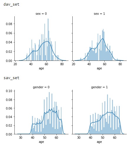
Figure 2.1: Age vs Gender distributions of the dav_set and sav_set.
This trend appears to signify that the datasets focused solely on an older population or general trend in society of not monitoring heart conditions as closely in the younger generation.
Moving on to Figure 2.2, we see an interesting trend with a significant growing trend in the sav_set in older population having more cardiovascular issues compared to the dav_set. While this cannot be seen in the dav_set. This may be caused by the additional life expectancy or a change in diet as noted in the introduction.
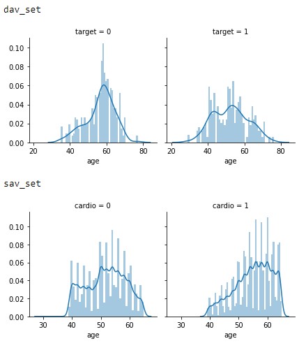
Figure 2.2: Age vs Target distributions of the dav_set and sav_set.
In Figure 2.3, the probability of having cardiovascular issues between the sets are interesting. In the dav_set the inequality of higher probability could be attributed to the larger female samples in the dataset. With the sav_set having a more equal probability between the genders.
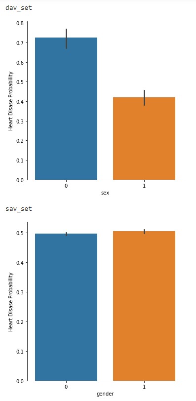
Figure 2.3: Gender vs Probability of cardiovascular issues of the dav_set and sav_set.
Finally, in Figure 2.4 is the probability vs cholesterol levels. This one is very interesting between the two datasets in terms of trend levels. With the dav_set having a higher risk at normal levels compared to the sav_set. This could be another hint of a societal change across the years or may in fact be due to the low sample size. Especially since the sav_set matches the general consensus of higher cholesterol levels increasing risk of cardiovascular issues 3.
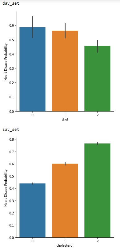
Figure 2.4: Cholesterol levels vs Probability of cardiovascular issues of the dav_set and sav_set.
To close out this initial analysis is the correlation map of each of the features. From Figure 2.5 and 2.6 it can be concluded that both of these datasets are viable to conduct machine learning as the correlation factor is below the recommended value of 0.8 4. Although we do see the signs of a low sample amount in the dav_set with a higher correlation factor compared to the sav_set.
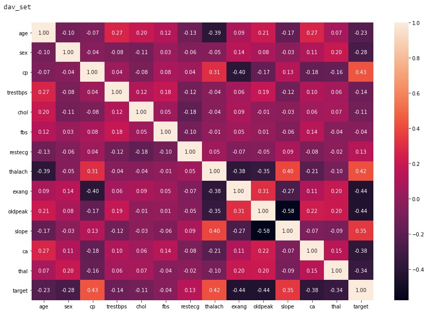
Figure 2.5: dav_set correlation matrix.
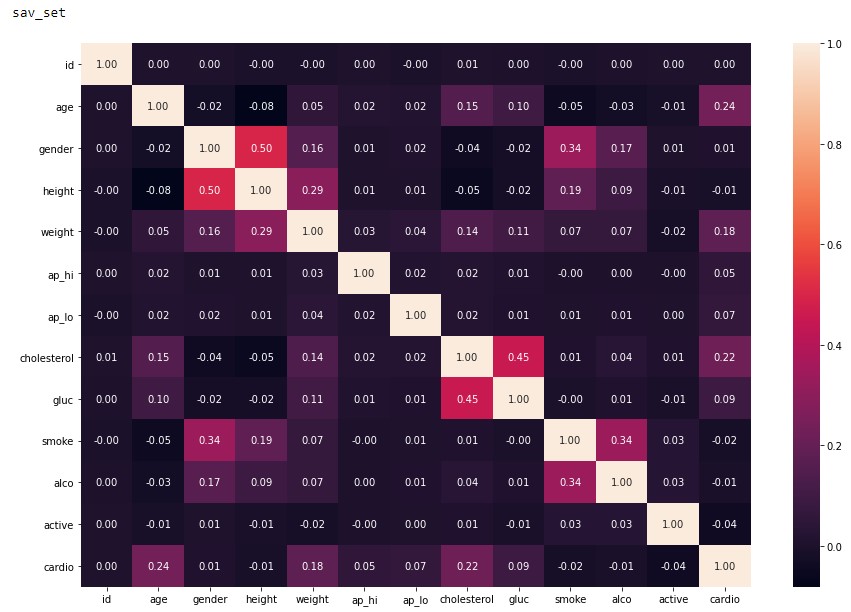
Figure 2.6: sav_set correlation matrix.
3. Machine Learning Algorithms and Implementation
With many machine learning algorithms already available and many more in development. Selecting the optimal one for an application can be a challenging balance since each algorithm has both its advantages and disadvantages. As mentioned in the introduction, we will explore applying the most common and established algorithms available to the public.
Starting off, is selecting a library from the most popular ones available. Namely Keras, Pytorch, Tensorflow, and Scikit-Learn. Upon further investigation it was determined that Scikit-Learn would be used for this project. The reason being Scikit-Learn is a great general machine learning library that also includes pre and post processing functions. While Keras, Pytorch, and Tensorflow are targeted for neural networks and other higher-level deep learning algorithms which are outside of the scope of this project at this time 5.
3.1 Scikit-Learn and Algorithm Types
Diving further into the Scikit-Learn library, its key strength appears to be the variety of algorithms available that are relatively easy to implement against a dataset. Of those available, they are classified under three different categories based on the approach each takes. They are as follows:
- Classification
- Applied to problems that require identifying the category an object belongs to.
- Regression
- For predicting or modeling continuous values.
- Clustering
- Grouping similar objects into groups.
For this project, we will be investigating the Classification and Clustering algorithms offered by the library due to the nature of our dataset. Since it is a binary answer, the continuous prediction capability of regression algorithms will not fair well. Compared to classification type algorithms which are well suited for determining binary and multi-class classification on datasets 6. Along with Clustering algorithms being capable of grouping unlabeled data which is one of the key problem points mentioned in the introduction 7.
3.2 Classification Algorithms
The following algorithms were determined to be candidates for this project based on the documentation available on the Scikit-learn for supervised learning 8.
3.2.1 Support Vector Machines
This algorithm was chosen because classification is one of the target types and has a decent list of advantages that appear to be applicable to this dataset 6.
- Effective in high dimensional spaces as well as if the number dimensions out number samples.
- Is very versatile.
3.2.2 K-Nearest Neighbors
This algorithm was selected due to being a non-parametric method that has been successful in classification applications 9. From the dataset analysis, it is appears that the decision boundary may be very irregular which is a strong point of this type of method.
3.2.3 Gaussian Naive Bayes
Is an implementation of the Naive Bayes theorem that has been targeted for classification. The advantages of this algorithm is its speed and requires a small training set compared to more advanced algorithms 10.
3.2.4 Decision Trees
This algorithm was chosen to investigate another non-parametric method to determine their efficacy against this dataset application. This algorithm also has some advantages over K-Nearest namely 11.
- Simple to interpret and visualize
- Requires little data preparation
- Handles numerical and categorical data instead of needing to normalize
- Can validate the model and is possible to audit from a liability standpoint.
3.3 Clustering Algorithms
The following algorithms were determined to be candidates for this project based on the table of clustering algorithms available on the Scikit-learn 7.
3.3.1 K-Means
The usecase for this algorithm is general purpose with even and low number of clusters 7. Of which the sav_set appears to have with the even distribution across most of the features.
3.3.2 Mean-shift
This algorithm was chosen for its strength in dealing with uneven cluster sizes and non-flat geometry 7. Though it is not easily scalable the application of our small dataset size might be of interest.
3.3.3 Spectral Clustering
As an inverse, this algorithm was chosen for its strength with fewer uneven clusters 7. In comparison to Mean-shift, this maybe the better algorithm for this application.
3.4 Implementation
The implementation of these algorithms were done under the direction of the documentation page for each respective algorithm. The jupyter notebook used for this project is available at https://github.com/cybertraining-dsc/fa20-523-309/blob/main/project/data_analysis/ml_algorithms.ipynb with each algorithm having a corresponding cell. A benchmarking library is also included to determine the efficiency of each algorithm in processing time. One thing of note is the lack of functions used for the classification compared to the clustering algorithms. The justification for this discrepancy is due to inexperience in creating optimal implementations as well as determining that not being implemented in a function would not have a significant impact on performance. Additionally, graphs representing the test data were included to help visualize the performance of the clustering algorithms utilizing example code from the documentation 12.
3.4.1 Dataset Preprocessing
Pre-processing of the cleaned datasets for the classification algorithms was done under guidance of the scikit learn documentation 13. Overall, each algorithm was trained and tested with the same split for each run. While the split data could have been passed directly to the algorithms, they were normalized further using the built-in fit_transform function for the best results possible.
Pre-processing of the cleaned datasets for the clustering algorithms was done under guidance of the scikit learn documentation 7. Compared to the classification algorithms, a dimensionality reduction was conducted using Principal component analysis (PCA). This step condenses the multiple features into a 2 feature array which the clustering algorithms were optimized for, increasing the odds for the best results possible. Another note is the dataset split was conducted during execution of the algorithm. Upon further investigation, it was determined that this does not have an effect on the ending results as the randomization was disabled due to setting the same random_state parameter for each call.
4. Results & Discussion
4.1 Algorithm Metrics
The metrics used to determine the viability of each of the algorithms are precision, recall, and f1-score. These are simple metrics based on the values from a confusion matrix which is a visualization of the False and True Positives and Negatives. Precision is essentially how accurate was the algorithm in classifying each data point. This however, is not a good metric to solely base performance as precision does not account for imbalanced distributions within a dataset 14.
This is where the recall metric comes in which is defined as how many samples were accurately classified by the algorithm. This is a more versatile metric as it can compensate for imbalanced datasets. While it may not be in our case as seen in the dataset analysis where we have a relatively balanced ratio. It still gives great insight on the performance for our application.
Finally is the f1-score which is the harmonic mean of the precision and recall metric 14. This will be the key metric we will mainly focus on as it strikes a good balance between the two more primitive metrics. Since one may think in medical applications one would want to maximize recall, it is at the cost of precision which ends up in more false predictions which is essentially an overfitting scenario 14. Something that reduces the viability of the model to the application especially since we have a relatively balanced dataset, more customized weighting is not as necessary.
The metrics for each algorithm implementation are as follows. The training time metric is provided by the cloudmesh.common benchmark library 15.
4.1.1 Support Vector Machines
Table 4.1: dav_set metrics
| Precision | Recall | f1-score | |
|---|---|---|---|
| No Disease | 0.99 | 0.94 | 0.96 |
| Has Disease | 0.95 | 0.99 | 0.97 |
| Training Time | 0.038 sec |
Table 4.2: sav_set metrics
| Precision | Recall | f1-score | |
|---|---|---|---|
| No Disease | 0.99 | 0.94 | 0.96 |
| Has Disease | 0.95 | 0.99 | 0.97 |
| Training Time | 167.897 sec |
4.1.2 K-Nearest Neighbors
Table 4.3: dav_set metrics
| Precision | Recall | f1-score | |
|---|---|---|---|
| No Disease | 0.88 | 0.86 | 0.87 |
| Has Disease | 0.87 | 0.90 | 0.88 |
| Training Time | 0.025 sec |
Table 4.4: sav_set metrics
| Precision | Recall | f1-score | |
|---|---|---|---|
| No Disease | 0.62 | 0.74 | 0.67 |
| Has Disease | 0.67 | 0.54 | 0.60 |
| Training Time | 10.116 sec |
4.1.3 Gaussian Naive Bayes
Table 4.5: dav_set metrics
| Precision | Recall | f1-score | |
|---|---|---|---|
| No Disease | 0.88 | 0.81 | 0.84 |
| Has Disease | 0.83 | 0.90 | 0.86 |
| Training Time | 0.011 sec |
Table 4.6: sav_set metrics
| Precision | Recall | f1-score | |
|---|---|---|---|
| No Disease | 0.56 | 0.90 | 0.69 |
| Has Disease | 0.72 | 0.28 | 0.40 |
| Training Time | 0.057 sec |
4.1.4 Decision Trees
Table 4.7: dav_set metrics
| Precision | Recall | f1-score | |
|---|---|---|---|
| No Disease | 0.92 | 0.97 | 0.95 |
| Has Disease | 0.97 | 0.93 | 0.95 |
| Training Time | 0.009 sec |
Table 4.8: sav_set metrics
| Precision | Recall | f1-score | |
|---|---|---|---|
| No Disease | 0.71 | 0.80 | 0.75 |
| Has Disease | 0.76 | 0.66 | 0.71 |
| Training Time | 0.272 sec |
4.1.5 K-Means
Figure 4.1: dav_set algorithm visualization. The axis have no corresponding unit due to the PCA operation.
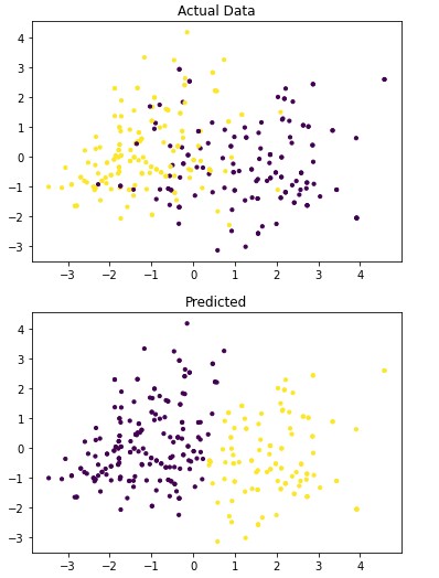
Table 4.9: dav_set metrics
| Precision | Recall | f1-score | |
|---|---|---|---|
| No Disease | 0.22 | 0.29 | 0.25 |
| Has Disease | 0.12 | 0.09 | 0.10 |
| Training Time | 0.376 sec |
Figure 4.2: sav_set algorithm visualization. The axis have no corresponding unit due to the PCA operation.
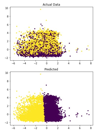
Table 4.10: sav_set metrics
| Precision | Recall | f1-score | |
|---|---|---|---|
| No Disease | 0.51 | 0.69 | 0.59 |
| Has Disease | 0.52 | 0.34 | 0.41 |
| Training Time | 1.429 sec |
4.1.6 Mean-shift
Figure 4.3: dav_set algorithm visualization. The axis have no corresponding unit due to the PCA operation.
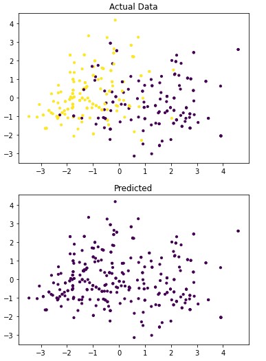
Table 4.11: dav_set metrics
| Precision | Recall | f1-score | |
|---|---|---|---|
| No Disease | 0.47 | 1.00 | 0.64 |
| Has Disease | 0.00 | 0.00 | 0.00 |
| Training Time | 0.461 sec |
Figure 4.4: sav_set algorithm visualization. The axis have no corresponding unit due to the PCA operation.
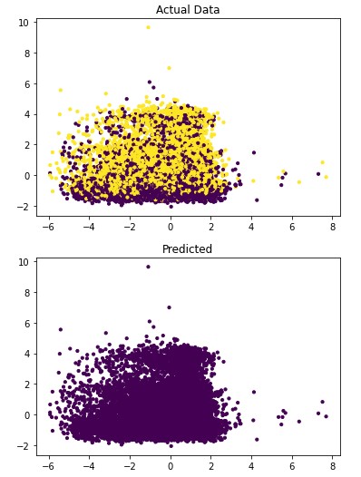
Table 4.12: sav_set metrics
| Precision | Recall | f1-score | |
|---|---|---|---|
| No Disease | 0.50 | 1.00 | 0.67 |
| Has Disease | 0.00 | 0.00 | 0.00 |
| Training Time | 193.93 sec |
4.1.7 Spectral Clustering
Figure 4.5: dav_set algorithm visualization. The axis have no corresponding unit due to the PCA operation.
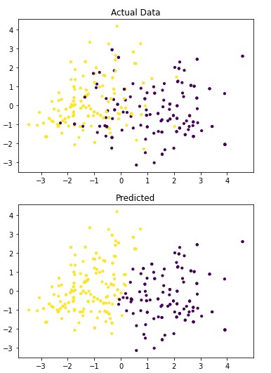
Table 4.13: dav_set metrics
| Precision | Recall | f1-score | |
|---|---|---|---|
| No Disease | 0.86 | 0.74 | 0.79 |
| Has Disease | 0.79 | 0.89 | 0.84 |
| Training Time | 0.628 sec |
Figure 4.6: sav_set algorithm visualization. The axis have no corresponding unit due to the PCA operation.
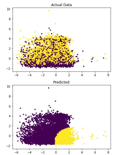
Table 4.14: sav_set metrics
| Precision | Recall | f1-score | |
|---|---|---|---|
| No Disease | 0.56 | 0.57 | 0.57 |
| Has Disease | 0.56 | 0.56 | 0.56 |
| Training Time | 208.822 sec |
4.2 System Information
Google Collab was used to train and evaluate the models selected. The specifications of the system in use is provided by the cloudmesh.common benchmark library and is listed in Table 4.15 15.
Table 4.15: Training and Evaluation System Specifications
| Attribute | Value |
|---|---|
| BUG_REPORT_URL | “https://bugs.launchpad.net/ubuntu/" |
| DISTRIB_CODENAME | bionic |
| DISTRIB_DESCRIPTION | “Ubuntu 18.04.5 LTS” |
| DISTRIB_ID | Ubuntu |
| DISTRIB_RELEASE | 18.04 |
| HOME_URL | “https://www.ubuntu.com/" |
| ID | ubuntu |
| ID_LIKE | debian |
| NAME | “Ubuntu” |
| PRETTY_NAME | “Ubuntu 18.04.5 LTS” |
| PRIVACY_POLICY_URL | “https://www.ubuntu.com/legal/terms-and-policies/privacy-policy" |
| SUPPORT_URL | “https://help.ubuntu.com/" |
| UBUNTU_CODENAME | bionic |
| VERSION | “18.04.5 LTS (Bionic Beaver)” |
| VERSION_CODENAME | bionic |
| VERSION_ID | “18.04” |
| cpu_count | 2 |
| mem.active | 698.5 MiB |
| mem.available | 11.9 GiB |
| mem.free | 9.2 GiB |
| mem.inactive | 2.6 GiB |
| mem.percent | 6.5 % |
| mem.total | 12.7 GiB |
| mem.used | 1.6 GiB |
| platform.version | #1 SMP Thu Jul 23 08:00:38 PDT 2020 |
| python | 3.6.9 (default, Oct 8 2020, 12:12:24) [GCC 8.4.0] |
| python.pip | 19.3.1 |
| python.version | 3.6.9 |
| sys.platform | linux |
| uname.machine | x86_64 |
| uname.node | bc15b46ebcf6 |
| uname.processor | x86_64 |
| uname.release | 4.19.112+ |
| uname.system | Linux |
| uname.version | #1 SMP Thu Jul 23 08:00:38 PDT 2020 |
| user | collab |
4.3 Discussion
In analyzing the resulting metrics in section 4.1, two major trends between the algorithms are apparent.
- The classification algorithms perform significantly better than the clustering algorithms.
- Significant signs of overfitting for the dav_set.
Addressing the first point, it is obvious from the metric performance where on average the classification algorithms were higher than the clustering algorithms. At a lower training time cost as well, which indicates that classification algorithms are well suited for this application than clustering. Especially when looking at the results for Mean-Shift in section 4.1.6 where the algorithm failed to identify any patient with a disease. This also illustrates the discussion on the metrics used to determine performance as the recall was 100% at the cost of missing every patient that would have required treatment illustrated by Figure 4.3 and 4.4. On this topic, comparing the actual data graphs for each of the clustering algorithms and comparing them to the example clustering figures within the scikit documentation, it solidifies that this is not the correct algorithm type for this dataset 7.
Moving on to the next point, it can be seen that overfitting is occurring for the dav_set in comparing the performance to the sav_set for the same algorithm which can be seen in the corresponding tables in sections 4.1.2, 4.1.3, and 4.1.4. Here the performance gap is at least 20% between the two compared to what one would assume should be relatively close to each other. While this could also illustrate the affect the various features have on the algorithm, it was determined that this is most likely due to the small dataset size having a larger influence than anticipated.
5. Conclusion
Reviewing these results, a clear conclusion cannot be accurately be determined due to the considerable amount of variables involved that were not able to be isolated to a desirable level. Namely the compromises that were mentioned in section 2.1 and general dataset availability. However, it was determined that the main goal of this project was accomplished where the Support Vector Machine algorithm was narrowed down as a viable candidate for future work. Due in part to the overall f1-score performance for both datasets, providing confidence that overfitting may not occur. While there is a downside in scalability due to the significant increase in training time between the smaller dav_set and larger sav_set. This could indicate that further research should be focused on either improving this algorithm or creating a new one based on the underlying mechanism.
In relation to the types of features, it could be interpreted from this project that further efforts require a more expansive and modern dataset to perform to a level suitable for real world applications. As possible factors affecting the performance are in the accuracy and granularity of the measurements and factors available to learn from. This however, is seen to be a difficult challenge due to the nature of privacy laws on health data but, as proposed in the introduction. It would be very interesting to apply this project’s findings on more general health data that is retrieved in annual visits.
6. Acknowledgements
The author would like to thank Dr. Gregor Von Laszewski, Dr. Geoffrey Fox, and the associate instructors in the FA20-BL-ENGR-E534-11530: Big Data Applications course (offered in the Fall 2020 semester at Indiana University, Bloomington) for their assistance and suggestions with regard to this project.
References
-
Centers for Disease Control and Prevention. 2020. Heart Disease Facts | Cdc.Gov. [online] Available at: https://www.cdc.gov/heartdisease/facts.htm [Accessed 16 November 2020]. ↩︎
-
Amadeo, K., 2020. Preventive Care: How It Lowers Healthcare Costs In America. [online] The Balance. Available at: https://www.thebalance.com/preventive-care-how-it-lowers-aca-costs-3306074 [Accessed 16 November 2020]. ↩︎
-
WebMD. 2020. Understanding Your Cholesterol Report. [online] Available at: https://www.webmd.com/cholesterol-management/understanding-your-cholesterol-report [Accessed 21 October 2020]. ↩︎
-
R, V., 2020. Feature Selection — Correlation And P-Value. [online] Medium. Available at: https://towardsdatascience.com/feature-selection-correlation-and-p-value-da8921bfb3cf [Accessed 21 October 2020]. ↩︎
-
Stack Overflow. 2020. Differences In Scikit Learn, Keras, Or Pytorch. [online] Available at: https://stackoverflow.com/questions/54527439/differences-in-scikit-learn-keras-or-pytorch [Accessed 27 October 2020]. ↩︎
-
Scikit-learn.org. 2020. 1.4. Support Vector Machines — Scikit-Learn 0.23.2 Documentation. [online] Available at: https://scikit-learn.org/stable/modules/svm.html#classification [Accessed 27 October 2020]. ↩︎
-
Scikit-learn.org. 2020. 2.3. Clustering — Scikit-Learn 0.23.2 Documentation. [online] Available at: https://scikit-learn.org/stable/modules/clustering.html#clustering [Accessed 27 October 2020]. ↩︎
-
Scikit-learn.org. 2020. 1. Supervised Learning — Scikit-Learn 0.23.2 Documentation. [online] Available at: https://scikit-learn.org/stable/supervised_learning.html#supervised-learning [Accessed 27 October 2020]. ↩︎
-
Scikit-learn.org. 2020. 1.6. Nearest Neighbors — Scikit-Learn 0.23.2 Documentation. [online] Available at: https://scikit-learn.org/stable/modules/neighbors.html [Accessed 27 October 2020]. ↩︎
-
Scikit-learn.org. 2020. 1.9. Naive Bayes — Scikit-Learn 0.23.2 Documentation. [online] Available at: https://scikit-learn.org/stable/modules/naive_bayes.html [Accessed 27 October 2020]. ↩︎
-
Scikit-learn.org. 2020. 1.10. Decision Trees — Scikit-Learn 0.23.2 Documentation. [online] Available at: https://scikit-learn.org/stable/modules/tree.html [Accessed 27 October 2020]. ↩︎
-
Scikit-learn.org. 2020. A Demo Of K-Means Clustering On The Handwritten Digits Data — Scikit-Learn 0.23.2 Documentation. [online] Available at: https://scikit-learn.org/stable/auto_examples/cluster/plot_kmeans_digits.html#sphx-glr-auto-examples-cluster-plot-kmeans-digits-py [Accessed 17 November 2020]. ↩︎
-
Scikit-learn.org. 2020. 6.3. Preprocessing Data — Scikit-Learn 0.23.2 Documentation. [online] Available at: https://scikit-learn.org/stable/modules/preprocessing.html#preprocessing [Accessed 17 November 2020]. ↩︎
-
Mianaee, S., 2020. 20 Popular Machine Learning Metrics. Part 1: Classification & Regression Evaluation Metrics. [online] Medium. Available at: https://towardsdatascience.com/20-popular-machine-learning-metrics-part-1-classification-regression-evaluation-metrics-1ca3e282a2ce [Accessed 10 November 2020]. ↩︎
-
Gregor von Laszewski, Cloudmesh StopWatch and Benchmark from the Cloudmesh Common Library, https://github.com/cloudmesh/cloudmesh-common ↩︎
36 - Predicting Hotel Reservation Cancellation Rates
![]()
![]() Status: final, Type: Project
Status: final, Type: Project
Anthony Tugman, fa20-523-323, Edit
Abstract
As a result of the Covid-19 pandemic all segments of the travel industry face financial struggle. The lodging segment, in particular, has had the financial records scrutinized revealing a glaring problem. Since the beginning of 2019, the lodging segment has seen reservation cancellation rates near 40%. At the directive of business and marketing experts, hotels have previously attempted to solve the problem through an increased focus on reservation retention, flexible booking policies, and targeted marketing. These attempts did not produce results, and continue to leave rooms un-rented which is detrimental to the bottom line. This document will explain the creation and testing of a novel process to combat the rising cancellation rate. By analyzing reservation data from a nationwide hotel chain, it is hoped that an algorithm may be developed capable of predicting the likeliness that a traveler is to cancel a reservation. The resulting algorithm will be evaluated for accuracy. If the resulting algorithm has a satisfactory accuracy, it would make clear to the hotel industry that the use of big data is key to solving this problem.
Contents
Keywords: travel, finance, hospitality, tourism, data analysis, environment, big data
1. Introduction
Big Data is a term that describes the large volume of data that is collected and stored by a business on a day-to-day basis. While the scale of this data is impressive, what is more interesting is what can be done by analyzing the data 1. Becoming more commonplace, companies are beginning to use Big Data to gain advantage in competing, innovating, and capturing customers. It is necessary for businesses to collaborate with Data Scientists to expose patterns and other insights that can be gained from inspection of the data. This collaboration is amongst software engineers, hardware engineers, and Data Scientists who develop powerful machine learning algorithms to efficiently analyze the data. Businesses have multiple benefits to gain from effectively utilizing Big Data including cost savings, time reductions, market condition insights, advertising insights, as well as driving innovation and product development 1.
The lodging industry takes a hit to the bottom line each year as the rate of room reservation cancellations continues to rise. In the instance that a guest cancels a room without adequate notice there are additional expenses the hotel faces to re-market the room as available. If the room is unable to be rented, the hotel loses the revenue 2. At the directive of business and marketing experts, hotels have attempted to solve this problem through an increased focus on reservation retention, flexible booking policies, and targeted marketing campaigns. However, even with these efforts, the reservation cancellation rate continues to rise unchecked reaching upwards of 40% in 2019 2. By analyzing the Big Data the lodging industry collects on its customers, it would be possible to form a model capable of predicting whether a customer is likely to cancel a reservation. To develop this model, a large data set was sourced that tracked anonymized reservation information for a chain of hotels over a three-year period. Machine learning techniques will be applied to the data set to form a model capable of producing the aforementioned predictions. If the model proves to be statistically significant, recommendations will be made to the lodging industry as to how the results should be interpreted.
2. Background Research and Previous Work
Room reservation completion rates are an important consideration for revenue management in the hotel industry. Unsurprisingly, there have been previous attempts at creating an algorithm capable of predicting room cancellation rates. However, these attempts seem to have taken a more general approach such as predicting cancellations by particular ranges of dates 3. Other attempts make broad claims about the accuracy of the resulting algorithm without reliably proving so through statistical analysis 4. Most importantly for the scope of this course, these previous attempts use subsets of the full data set available. This has the potential to lead to unpredictability in the performance of the algorithm.
To differentiate from and improve on the attempts previously mentioned, the algorithm produced as a result of the current effort will form a model capable of predicting if a reservation with cancel based on the reservation as a whole, rather than a subset of dates. Not predict the cancellation rate over general stipulations, but rather for a specific customer. Additionally, a special focus will be on proving that the created algorithm is statistically significant and can accurately be extrapolated to larger subsets of the data. Finally, for initial training and testing, larger subsets of the data sets will be utilized due to the increased processing power available from Google Colab. It is important to note that the first-mentioned previous work 3 appears to use a proprietary data set while the second-mentioned work 4 appears to utilize the same data set that this study will as well.
3. DataSets
Locating a data set appropriate for this task proved to be challenging. Privacy concerns and the desire to keep internal corporate information confidential adds difficulty in locating the necessary data. Ultimately, the following data repository was selected to train and test the reservation cancellation, prediction model:
The Hotel Booking Demand data set contains approximately 120,000 unique entries with 32 describing attributes. This data comes from a popular data science website, and previous analysis has occurred. This data set was featured as part of a small contest on the hosting website where the goal was to predict the likelihood of a guest making a reservation based on certain attributes while this study will instead attempt to predict the likelihood that a reservation is canceled. The 32 individual attributes of the data will be evaluated for their weight on the outcome of cancellation. Unlike previously mentioned studies, the attribute describing how the booking was made (in person, online) will be utilized. Researchers believe that the increase in reservations booked through online third-party platforms is contributing to the increase in cancellation 6. Considering this attribute may have a significant impact on the overall accuracy of the developed predictive algorithm. Finally, the data set provides information on reservations over the span of a three-year period. During the training and testing phase, an appropriate amount of data will be used from each year to account for trends in cancellations that may have occurred over time.
| Attribute | Description |
|---|---|
| hotel | hotel type (resort or city) |
| is_canceled | reservation canceled (true/false) |
| lead_time | number of days between booking and arrival |
| arrival_date_year | year of arrival date |
| arrival_date_month | month of arrival date |
| arrival_date_week_number | week number of year for arrival date |
| arrival_date_day_of_month | day of arrival date |
| stays_in_weekend_nights | number of weekend nights (Sat. and Sun.) booked |
| stays_in_week_nights | number of week nights (Mon. to Fri.) booked |
| adults | number of adults |
| children | number of children |
| babies | number of babies |
| meal | meal booked (multiple categories) |
| country | country of origin |
| market_segment | market segment (multiple categories) |
| distribution_channel | booking distribution channel (multiple categories) |
| is_repeated_guest | is repeat guest (true/false) |
| previous_cancellations | number of times customer has canceled previously |
| previous_bookings_not_canceled | number of times customer has completed a reservation |
| reserved_room_type | reserved room type |
| assigned_room_type | assigned room type |
| booking_changes | number of changes made to reservation from booking to arrival |
| deposit_type | deposit made (true/false) |
| agent | ID of the travel agent |
| company | ID of the company |
| days_in_waiting_list | how many days customer took to confirm reservation |
| customer_type | type of customer (multiple categories) |
| adr | average daily rate |
| required_car_parking_space | number of parking spaces required for reservation |
| total_of_special_requests | number of special requests made |
| reservation_status | status of reservation |
| reservation_status_date | date status was last updated |
4. Data Preprocessing
The raw data set 5 is imported directly from Kaggle into a Google Colab notebook 7. Data manipulation is handled using Pandas. Pandas was specifically written for data manipulation and analysis, and will make for a simple process preprocessing the data. The raw data set must be prepared before a model can be developed from it. Before preprocessing the data:
- shape: (119390, 32)
- duplicate entries: 31,994
The features of the data set, the categories other than what is being predicted, have varying levels of importance to the predictive model. By inspection, the following features are removed:
- country: in a format unsuitable for predictive model, unable to convert
- agent: the ID number of the booking agent will not affect reservation outcome
- babies: no reservation had babies
- children: no reservation had children
- company: the ID number of the booking company will not affect reservation outcome
- reservation_status_date: intermediate status of reservation is irrelevant
In addition, duplicates are removed. In the case of the features ‘reserved_room_type’ and ‘assigned_room_type’ what is of interest is if the guest was given the requested room type. As the room code system has been anonymized and is proprietary to the brand, it is impossible to make inferences other than this. To simplify the number of features, a Boolean comparison is performed on ‘reserved_room_type’ and ‘assigned_room_type’. ‘reserved_room_type’ and ‘assigned_room_type’ are deleted while the Boolean results are converted to integer values then placed in a new feature category, ‘room_correct’. As it stands, multiple data entries across various features are strings. In order to build a predictive model, the data entries are converted to integers.
#Convert to numerical values
df = df.replace(['City Hotel', 'HB', 'Online TA', 'TA/TO', 'No Deposit',
                'Transient', 'Check-Out'], '0')
df = df.replace(['Resort Hotel', 'January', 'BB', 'Ofline TA/TO', 'GDS',
                'Non Refund', 'Transient-Party', Canceled'], '1')
df = df.replace(['February', 'SC', 'Groups', 'Refundable', 'Group',
                'No-Show'], '2')
df = df.replace(['March', 'FB', 'Direct', 'Contract'], '3')
df = df.replace(['April', 'Undefined', 'Corporate'], '4')
df = df.replace(['May', 'Complementary'], '5')
df = df.replace(['June', 'Aviation'], '6')
df = df.replace(['July'], '7')
df = df.replace(['August'], '8')
df = df.replace(['September'], '9')
df = df.replace(['October'], '10')
df = df.replace(['November'], '11')
df = df.replace(['December'], '12')
After preprocessing the data:
- shape: (84938, 25)
- duplicate entries: 0

Figure 1: Snapshot of Data Set after Preprocessing
5. Model Creation
To form the predictive model a Random Forest Classifier will be used. With the use of the sklearn package, the Random Forest Classifier is simple to implement. The Random Forest Classifier is based on the concept of a decision tree. A decision tree is a series of yes/no question asked about the data which eventually leads to a predicted class or value 8. To start the creation of the model, the data must first be split into a training and testing set. Typically, this is a ratio that must be adjusted to determine which will result in the higher accuracy. Here are the accuracy outcomes for various ratios:
| Train/Test Ratio | Accuracy |
|---|---|
| 80/20 | 77.64% |
| 70/30 | 77.66% |
| 60/40 | 79.56% |
| 50/50 | 77.92% |
| 40/60 | 75.73% |
| 30/70 | 74.71% |
| 20/80 | 73.13% |
The train/test ratio of 60/40 had the best initial accuracy of 79.56% so this ratio will be used in the creation of the final model. For the initial test, all remaining features will be used to train the reservation cancellation outcome. To determine the accuracy of the resulting model, the number of predicted cancellations is compared to the number of actual cancellations. As the model stands, the accuracy is at 79.56%. This model relies on 23 features for the prediction. With this many features it is possible that some features have no effect on the cancellation outcome. It is also possible that some features are so closely related that calculating each individually hinders performance while having little effect on outcome. To evaluate the importance of features, Pearson’s correlation coefficent can be used. Correlation coefficients are used in statistics to measure how strong the relationship is between two variables. The calculation formula returns a value between -1 and 1 where a value of 1 indicates a strong positive relationship, -1 indicates a strong negative relationship, and 0 indicates that there is no relationship at all 9. Figure 2 shows the correlation between the remaining features.

Figure 2: Pearson’s Correlation Graph of Remaining Features
In Figure 2 it is straightforward to identify the correlation between the target variable ‘is_canceled’ and the remaining features. It does not appear than any variable has a strong positive or negative correlation, returning a value close to positive or negative 1. There does however appear to be a dominant correlation between ‘is_canceled’ and three features: ‘lead_time’, ‘adr’, and ‘room_correct’. The train/test ratio is again 60/40 and the baseline accuracy of the model is 79.56%. The remaining features ‘lead_time’, ‘adr’, and ‘room_correct’ are used to develop the new model. Accuracy is again determined by comparing the number of predicted cancellations to the number of actual cancellations. The updated model has an accuracy of 85.18%. Figure 3 shows the correlation between the remaining features. It is important to note that the relationship between the remaining features and target value does not appear to be strong, however there is a correlation nonetheless.

Figure 3: Pearson’s Correlation Graph of Updated Remaining Features
As a final visualization, Figure 4 shows a comparison between the predicted and actual cancellation instances. The graph reveals an interesting pattern, the model is over predicting early in the data set and under predicting as it proceeds through the data set. Further inspection and manipulation of the Random Forest parameters were unable to eliminate this pattern.

Figure 4: Model Results Predicted vs. Actual
6. Benchmark
To measure program performance in the Google Colab notebook, Cloudmesh Common 10 was used to create a benchmark. In this instance, performance was measured for overall code execution, data loading, preparation of the data, the creation of model one, and the creation of model two. The most important increase in performance was between the creation of models one and two. With 23 features, model one took 8.161 seconds to train while model 2, with 3 features, took 7.01 seconds to train. By reducing the number of features between the two models there is a 5.62% increase in accuracy and a 14.10% decrease in processing time. Figure 5 provides more insight into the parameters the benchmark tracked and returned. Additionally, the table provides an analysis of computation time:
| Train/Test Ratio | Accuracy |
|---|---|
| 80/20 | 77.64% |
| 70/30 | 77.66% |
| 60/40 | 79.56% |
| 50/50 | 77.92% |
| 40/60 | 75.73% |
| 30/70 | 74.71% |
| 20/80 | 73.13% |
 |
Figure 5: Cloudmesh Benchmark Results
7. Conclusion
From the results of the updated predictive model, it is apparent that the lodging industry should invest focus into the Big Data they keep on their customers. As each hotel chain is unique, it would be necessary for each to develop their own predictive model however it has been demonstrated that such a model would be effective in reducing the number of rooms going unoccupied from reservation cancellation. As the model is predicting at 85% accuracy, this is a 35% increase in the amount of reservation cancellations that can be accounted for over the current predictive techniques. To prevent further damage from reservation cancellations the hotel would have theoretically been able to overbook room reservations by 35% or less as they anticipated cancellations.
8. References
-
“Big Data - Definition, Importance, Examples & Tools”, RDA, 2020. [Online]. Available: https://www.rd-alliance.org/group/big-data-ig-data-development-ig/wiki/big-data-definition-importance-examples-tools#:~:text=Big%20data%20is%20a%20term,day%2Dto%2Dday%20basis.&text=It's%20what%20organizations%20do%20with,decisions%20and%20strategic%20business%20moves. [Accessed: 12- Nov- 2020]. ↩︎
-
“Predicting Hotel Booking Cancellations Using Machine Learning - Step by Step Guide with Real Data and Python”, Linkedin.com, 2020. [Online]. Available: https://www.linkedin.com/pulse/u-hotel-booking-cancellations-using-machine-learning-manuel-banza/. [Accessed: 08- Nov- 2020]. ↩︎
-
“(PDF) Predicting Hotel Booking Cancellation to Decrease Uncertainty and Increase Revenue”, ResearchGate, 2020. [Online]. Available: https://www.researchgate.net/publication/310504011_Predicting_Hotel_Booking_Cancellation_to_Decrease_Uncertainty_and_Increase_Revenue. [Accessed: 08- Nov- 2020. ↩︎
-
“Predicting Hotel Cancellations with Machine Learning”, Medium, 2020. [Online]. Available: https://towardsdatascience.com/predicting-hotel-cancellations-with-machine-learning-fa669f93e794. [Accessed: 08- Nov- 2020]. ↩︎
-
“Hotel booking demand”, Kaggle.com, 2020. [Online]. Available: https://www.kaggle.com/jessemostipak/hotel-booking-demand. [Accessed: 08- Nov- 2020]. ↩︎
-
“Global Cancellation Rate of Hotel Reservations Reaches 40% on Average”, Hospitality Technology, 2020. [Online]. Available: https://hospitalitytech.com/global-cancellation-rate-hotel-reservations-reaches-40-average. [Accessed: 08- Nov- 2020]. ↩︎
-
https://github.com/cybertraining-dsc/fa20-523-323/blob/main/project/colabnotebook/DataAnalysis.ipynb. ↩︎
-
“An Implementation and Explanation of the Random Forest in Python”, Medium, 2020. [Online]. Available: https://towardsdatascience.com/an-implementation-and-explanation-of-the-random-forest-in-python-77bf308a9b76. [Accessed: 12- Nov- 2020]. ↩︎
-
“Correlation Coefficient: Simple Definition, Formula, Easy Calculation Steps”, Statistics How To, 2020. [Online]. Available: https://www.statisticshowto.com/probability-and-statistics/correlation-coefficient-formula/. [Accessed: 12- Nov- 2020]. ↩︎
-
Gregor von Laszewski, Cloudmesh StopWatch and Benchmark from the Cloudmesh Common Library, https://github.com/cloudmesh/cloudmesh-common ↩︎
37 - Analysis of Future of Buffalo Breeds and Milk Production Growth in India
![]()
![]() Status: final, Type: Project
Status: final, Type: Project
Gangaprasad Shahapurkar, fa20-523-326, Edit Python Notebook
Abstract
Water buffalo (Bubalus bubalis) is also called Domestic Water Buffalo or Asian Water Buffalo. It is large bovid originating in Indian subcontinent, Southeast Asia, and China and today found in other regions of world - Europe, Australia, North America, South America and some African countries. There are two extant types recognized based on morphological and behavioral criteria:
- River Buffalo - Mostly found in Indian subcontinent and further west to the Balkans, Egypt, and Italy
- Swamp Buffalo - Found from west of Assam through Southeast Asia to the Yangtze valley of China in the east
India is the largest milk producer and consumer compared to other countries in the world and stands unique in terms of the largest share of milk being produced coming from buffaloes. The aim of this academic project is to study the livestock census data of buffalo breeds in India and their milk production using Empirical Benchmarking analysis method at state level. Looking at the small sample of data, our analysis indicates that we have been seeing increasing trends in past few years in livestock and milk production but there are considerable opportunities to increase production using combined interventions.
Contents
Keywords: hid 326, i532, buffalo, milk production, livestock, benchmarking, in-milk yield, agriculture, india, analysis
1. Introduction
Indian agriculture sector has been playing a vital role in overall contribution to Indian economy. Most of the rural community in the nation still make their livelihood on dairy farming or agriculture farming. Dairy farming itself has been on its progressive stage from past few years and it is contributing to almost more than 25% of agriculture Gross Domestic Product (GDP) 1. Livestock rearing has been integral part of the nation’s rural community and this sector is leveraging the economy in a big way considering the growth seen. It not only provides food, income, employment but also plays major role in life of farmers. It also does other contributions to the overall rural development of the nation. The output of livestock rearing such as milk, egg, meat, and wool provides everyday income to the farmers on daily basis, it provides nutrition to consumers and indirectly it helps in contributing to the overall economy and socio-economic development of the country.
The world buffalo population is estimated at 185.29 million, spread in some 42 countries, of which 179.75 million (97%) are in Asia (Source: Fao.org/stat 2008). Hence major share of buffalo milk production in world comes from Asia (see Figure 1). India has 105.1 million and they comprise approximately 56.7 percent of the total world buffalo population. During the last 10 years, the world buffalo population increased by approximately 1.49% annually, by 1.53% in India, 1.45% in Asia and 2.67% in the rest of the world. Figure 1 shows worldwide share of milk production from buffalo breed. Figure 2 highlights percentage contribution of Asia including other top 2 contributors to world milk production.

Figure 1: Production of Milk, whole fresh buffalo in World + (Total), Average 2013 - 2018 2

Figure 2: Production share of Milk, whole fresh buffalo by region, Average 2013 - 2018 2
2. Background Research and Previous Work
Production of milk and meat from buffaloes in Asian countries over the last decades has shown a varying pattern: in countries such as India, Sri Lanka, Pakistan and China. Buffaloes are known to be better at converting poor-quality roughage into milk and meat. They are reported to have 5% higher digestibility of crude fibre than high-yielding cows; and a 4% to 5% higher efficiency of utilization of metabolic energy for milk production 3, 4.
After studying literatures and researches it was noticed that there has been some research around to quantify livestock yield gaps. There is no standard methodology, but multiple methods were combined for research. Researchers were able to calculate relative yield gaps for the dairy production in India and Ethiopia 5. There was analysis based on attainable yields using Empirical Benchmarking, and Stochastic Frontier Analysis to evaluate possible interventions for increasing production (household modelling). It was noticed that large yield gaps exist for dairy production in both countries, and packages of interventions are required to bridge these gaps rather than single interventions. Part of the research was borrowed to analyze the limited dataset chosen as part of this project.
3. Choice of Datasets
Number of online literatures and datasets were checked to find out suitable dataset required for this project analysis. Below dataset were found promising:
The Animal Husbandry Statistics Division of the Department of Animal Husbandry & Dairying Division (DAHD) is responsible for the generation of animal husbandry statistics through the schemes of livestock census and integrated sample surveys 1. Survey is defined by Indian Agriculture Statistics Research Institute (IASRI) 10. This is the only scheme through which considerable data, particularly on the production estimate of major livestock products, is being generated for policy formulation in the livestock sector. It is mandate for this division to
- Conduct quinquennial livestock census
- Conduct annual sample survey through integrated sample survey
- Publish annual production estimates of milk, eggs, meat, wool and other related animal husbandry statistics based on survey
Food and Agriculture Organization (FAO) of United Nation publishes worldwide data on the aspects of dairy farming which can also be visualized online with the options provided. Some of the data from this source was used to extract useful summary needed in analysis.
- [UIDAI Data] (https://uidai.gov.in) 12
Unique Identification Authority of India (UIDAI) was created with the objective to issue Unique Identification numbers (UID), named as Aadhaar, to all residents of India. Projected population data of 2020 was extracted from this source.
In addition to above, other demographics information such as area of each state, district count was extracted from OpenStreetMap 13. Agricultural zone information was extracted from report of Food and Nutrition Security Analysis, India, 2019 14.
4. Methodology
4.1 Software Components
This project has been implemented in Python 3.7 version. Jupyter Notebook application was used to develop the code and produce a notebook document. Jupyter notebook is a Client-Server architecture-based application which allows modification and execution of code through web browser. Jupyter notebook can be installed locally and accessed through localhost browser or it can be installed on a remote machine and accessed via internet 15, 16.
Following python libraries were used in overall code development. Before running the code, one must make sure that these libraries are installed.
- Pandas This is a high performance and easy to use library. It was used for data cleaning, data analysis, & data preparation.
- NumPy NumPy is python core library used for scientific computing. Some of the basic functions were used in this project.
- Matplotlib This is a comprehensive library used for static, animated and interactive visualization.
- OS This is another standard library of Python which provides miscellaneous operating system interface functions.
- Scikit-learn (Sklearn) Robust library that provides efficient tools for machine learning and statistical modelling.
- Seaborn Python data visualization library based on matplotlib.
4.2 Data Processing
The raw data retrieved from various sources was in excel or report format. The data was pre-processed and stored back in csv format for the purpose of this project and to easily process it. This dataset was further processed through various stages via EDA, feature engineering and modelling.
4.2.1 EDA
Preprocessed dataset selected for this analysis contained information at the state level. There were two seperate pre-processed dataset used. Below was the nature of the attributes in the main dataset which had buffalo information:
- State Name: Name of each state in India. One record for each state.
- Buffalo count: Total number of male and female buffaloes. Data recorded for 14 types of buffalo breeds. One attribute for each type of female and male breeds.
- In Milk animals: Number of In-Milk animals per state (figures in 000 no’s) recorded each year from 2013 to 2019. One attribute per year
- Yield per In-Milk animal: Yield per In-Milk animals per state (figures in kg/day) recorded each year from 2013 to 2019. One attribute per year.
- Milk production: - Milk production per state (figures in 000 tones) recorded each year from 2013 to 2019. One attribute per year.
Below was the nature of the attributes in the secondary dataset which had demographic information:
- Geographic information: features captured at state level where each feature represented - projected population of 2020, total districts in each state, total villages in each state, official area of each state in square kilometer.
- Climatic information: One of attribute for each zone highlighted in Table 1
Table 1: Agro climatic regions in India
| Zones | Agro-Climatic Regions | States |
|---|---|---|
| Zone 1 | Western Himalayan Region | Jammu and Kashmir, Himachal Pradesh, Uttarakhand |
| Zone 2 | Eastern Himalayan Region | Assam, Sikkim, West Bengal, Manipur, Mizoram, Andhra Pradesh, Meghalaya, Tripura |
| Zone 3 | Lower Gangetic Plains Region | West Bengal |
| Zone 4 | Middle Gangetic Plains Region | Uttar Pradesh, Bihar, Jharkhand |
| Zone 5 | Upper Gangetic Plains Region | Uttar Pradesh |
| Zone 6 | Trans-Gangetic Plains Region | Punjab, Haryana, Delhi and Rajasthan |
| Zone 7 | Eastern Plateau and Hills Region | Maharashtra, Chhattisgarh, Jharkhand, Orissa and West Bengal |
| Zone 8 | Central Plateau and Hills Region | Madhya Pradesh, Rajasthan, Uttar Pradesh, Chhattisgarh |
| Zone 9 | Western Plateau and Hills Region | Maharashtra, Madhya Pradesh, Chhattisgarh and Rajasthan |
| Zone 10 | Southern Plateau and Hills Region | Andhra Pradesh, Karnataka, Tamil Nadu, Telangana, Chhattisgarh |
| Zone 11 | East Coast Plains and Hills Region | Orissa, Andhra Pradesh, Tamil Nadu and Pondicherry |
| Zone 12 | West Coast Plains and Ghat Region | Tamil Nadu, Kerala, Goa, Karnataka, Maharashtra, Gujarat |
| Zone 13 | Gujarat Plains and Hills Region | Gujarat, Madhya Pradesh, Rajasthan, Maharashtra |
| Zone 14 | Western Dry Region | Rajasthan |
| Zone 15 | The Islands Region | Andaman and Nicobar, Lakshadweep |
Figure 3 shows top 10 states from livestock census having total number of buffalo counts. Uttar Pradesh was the state which reported a greater number of buffaloes compared to any other states in the country.

Figure 3: Top 10 state by buffalo counts
There were greater number of female buffaloes reported in country (80%) compared to male buffalo breeds.

Figure 4: Buffalo breeds ratio by male and female
4.2.2 Feature Engineering
Murrah buffalo shown in Figure 5 is the most productive and globally famous breed 17, 18. This breed is resistant to diseases and can adjust to various Indian climate conditions.

Figure 5: Murrah buffalo (Bubalus bubalis), globally famous local breed of Haryana, were exported to many nations 19, 20
In feature engineering multiple attributes were derived needed for modelling or during analysis. Table 2 shows percentage share of Murrah buffalo breed in top 10 states having highest number of total buffaloes. Though Uttar Pradesh was top state in India in terms of total number of buffaloes but percentage share of Murrah buffalo was more in state of Punjab.
Table 2: Murrah buffalo percent share in top 10 state with buffalo count
| State Name | Murrah Buffalo Count | Total Buffalo Count | % Murrah Breed |
|---|---|---|---|
| UTTAR PRADESH | 20110852 | 30625334 | 65.67 |
| RAJASTHAN | 6448563 | 12976095 | 49.70 |
| ANDHRA PRADESH | 5227270 | 10622790 | 49.21 |
| HARYANA | 5011145 | 6085312 | 82.35 |
| PUNJAB | 4116508 | 5159734 | 79.78 |
| BIHAR | 2419952 | 7567233 | 31.98 |
| MADHYA PRADESH | 1446078 | 8187989 | 17.66 |
| MAHARASHTRA | 986981 | 5594392 | 17.64 |
| TAMIL NADU | 435634 | 780431 | 55.82 |
| UTTARAKHAND | 378917 | 987775 | 38.36 |
Survey dataset had three primary attributes reported at the state level. Data reported from 2013 to 2019 for in-milk animals, yield per in-milk animals and milk production per state were averaged for analysis purpose. Total number of buffaloes per breed type were calculated from the data provided in the dataset. Following list of breeds were identified from dataset 21.
- Banni
- Bhadawari
- Chilika
- Jaffarabadi
- Kalahandi
- Marathwadi
- Mehsana
- Murrah
- Nagpuri
- Nili Ravi
- Non-Descript
- Pandharpuri
- Surti
- Toda
Data showed that Uttar Pradesh had highest average milk production with in the top 10 states whereas Punjab state had highest average yield per in-milk animals. Figure 6 shows the share of top 3 breeds in both the state. Common attribute seen between two states was highest number of Murrah breed buffaloes compared to other breeds.

Figure 6: Top 3 types of buffalo breeds of Uttar Pradesh and Punjab
4.3 Modelling
4.3.1 Data Preperation
Data from main dataset and supplementary dataset which was demographics data was merged into one dataset. This dataset was not labelled and it was small dataset. We considered average milk production as our target label for analysis. The rest of the features were divided based on categorical and numerical nature. Our dataset did not had any categorical features except state name which was used as index column so no futher processing was considered for this attribute. All the features were of numerical nature and all the data points were not on same scale. Hence datapoints were normalized for further processing.
4.3.2 Empirical Benchmarking Model
There are two dominant approach of economic modelling to estimate the production behavior - Empirical Benchmarking and Stochastic Frontier Analysis 22, 23. Empirical Benchmarking is simple modelling method, and it is one of the two dominant approach. This method was used to analyze past 6 years of data points available in the livestock dataset. In this approach milk production data of past 6 years was averaged. Top 10 states with most milk production reported were compared with average of the whole sample. The problem analyzed as part of this project was relatively small. The comparison did not consider all possible characteristics for modelling.
Correlation of target variable with various demographics features available in the dataset was calculated. Table 3 and Table 4 shows the positive and negative coorelation with target variable average milk production respectively. We noticed from Table 3 that average milk production contribution was getting affected by number of in-milk animals reported in the particular year census data and their was also factor of climatic conditions affecting the milk production. India is divided into 15 Agro climate zones. Agro zone 6 is Trans-Gangetic Plains region. Indian states Chandigarh, Delhi, Haryana, Punjab, Rajasthan (some parts) falls under this zone. Agricultural development has shown phenomenal growth in overall productivity and in providing better environment for dairy farming in this zone 24.
Table 3: Positive coorelation of target with demographics features
| Feature | % |
|---|---|
| avg_milk_production | 1.00 |
| avg_in_milk | 0.95 |
| total_female | 0.90 |
| total_male | 0.71 |
| agro_climatic_zone6 | 0.50 |
Table 4: Negative coorelation of target with demographics features
| Feature | % |
|---|---|
| official_area_sqkm | -0.17 |
| agro_climatic_zone2 | -0.19 |
| avg_yield_in_milk | -0.23 |
| district_count | -0.34 |
| proj_population_2020 | -0.94 |
4.3.3 Linear Regression
Our target variable considered was a continous variable. In an attempt to perform dimension reduction, Principal Component Analysis (PCA) was applied to available limited dataset. In the example presented, an pipeline was constructed that had dimension reduction followed by Linear regression classifier. Grid search cross validation was applied (GridSearchCV) to find the best parameters and score. Linear regression was applied with default parameter settings whereas parameter range was passed for PCA. Below is snapshot of pipeline implemented.
# Define a pipeline to search for the best combination of PCA truncation
# and classifier regularization.
pca = PCA()

# Linear Regression without parameters
linear = LinearRegression()

full_pipeline_with_predictor = Pipeline([
        ("preparation", num_pipeline),
        ("pca",pca),
        ("linear", linear)
    ])

# Parameters of pipelines:
param_grid = {
    'pca__n_components': [5, 15, 30, 45, 64]
}
5. Results
Based on simple Empirical Benchmarking Analysis and trends noticed in data it appears that it is possible to increase production past currently attainable yields (see Figure 7). The current scale of the yield does indicate that, leading states have best breeds of buffaloes. Different methods of analyzing yield gaps can be combined to give estimates of attainable yields. It will also help to evaluate possible interventions to increase production and profits.

Figure 7: Average milk production in top 10 state with benchmark
The best parameter came out of the pipeline implemented are highlighted here. The results were not promising due the limited dataset so further experimentation was not attempted, but one thing was noticed that cross validated score came out to 0.28 and dimension reduction to 5 components.
Best parameter (CV score=0.282):
{'pca__n_components': 5}

PCA(copy=True, iterated_power='auto', n_components=None, random_state=None,
    svd_solver='auto', tol=0.0, whiten=False)

Figure 8: Covariance Heat Map
We were able to calculate correlation of census data with other socioeconomic factors like population information, climate information (see Figure 8). The biggest probable limitation here was availability of good quality data. It would have been possible to conduct the analysis at finer level if more granular level data would have been available. Our analysis had to be done state level rather than at district level or specific area.
6. Conclusion
The analysis done above with the limited dataset showed that there are considerable gaps in the average yield per in-milk buffalo of state Punjab and Uttar Pradesh, compared to other states in top 10 list. These states have larger share of Murrah breed buffaloes. Based on the data trends it appears that it is possible to increase the production past current attenable numbers. However, this would need to combine different methods and multiple strategies.
7. Acknowledgements
The author would like to thank Dr. Gregor von Laszewski, Dr. Geoffrey Fox, and the associate instructors in the FA20-BL-ENGR-E534-11530: Big Data Applications course (offered in the Fall 2020 semester at Indiana University, Bloomington) for their continued assistance and suggestions with regard to exploring this idea and also for their aid with preparing the various drafts of this article.
8. References
-
PIB Delhi. (2019). Department of Animal Husbandry & Dairying releases 20th Livestock Census, 16 (Oct 2019). https://pib.gov.in/PressReleasePage.aspx?PRID=1588304 ↩︎
-
FAO - Food and Agriculture Organization of United Nation, Accessed: Nov. 2020, http://www.fao.org/faostat/en/#data ↩︎
-
Mudgal, V.D. (1988). “Proc. of the Second World Buffalo Congress, New Delhi, India”, 12 to 17 Dec.:454. ↩︎
-
Alessandro, Nardone. (2010). “Buffalo Production and Research”. Italian Journal of Animal Science. 5. 10.4081/ijas.2006.203. ↩︎
-
Mayberry, Dianne (07/2017). Yield gap analyses to estimate attainable bovine milk yields and evaluate options to increase production in Ethiopia and India. Agricultural systems (0308-521X), 155 , p. 43. ↩︎
-
Department of Animal Husbandry and Dairying. http://dahd.nic.in/about-us/divisions/statistics ↩︎
-
Department of Animal Husbandry and Dairying, Accessed: Oct. 2020, http://dadf.gov.in/sites/default/filess/20th%20Livestock%20census-2019%20All%20India%20Report.pdf ↩︎
-
Department of Animal Husbandry and Dairying, Accessed: Oct. 2020, http://dadf.gov.in/sites/default/filess/Village%20and%20Ward%20Level%20Data%20%5BMale%20%26%20Female%5D.xlsx ↩︎
-
Department of Animal Husbandry and Dairying, Accessed: Oct. 2020, http://dadf.gov.in/sites/default/filess/District-wise%20buffalo%20population%202019_0.pdf ↩︎
-
IASRI - Indian Agriculture Statistics Research Institute. https://iasri.icar.gov.in/ ↩︎
-
F.A.O. (2008). Food and Agriculture Organization. Rome Italy. STAT http://database.www.fao.org ↩︎
-
Unique Identification Authority of India, Accessed: Nov. 2020, https://uidai.gov.in/images/state-wise-aadhaar-saturation.pdf ↩︎
-
OpenStreetMap, Accessed: Nov. 2020, https://wiki.openstreetmap.org/wiki/Main_Page ↩︎
-
Food and Nutrition Security Analysis, India, 2019, Accessed: Nov. 2020, http://mospi.nic.in/sites/default/files/publication_reports/document%281%29.pdf ↩︎
-
Corey Schafer. Jupyter Notebook Tutorial: Introduction, Setup, and Walkthrough. (Sep. 22, 2016). Accessed: Nov. 07, 2020. [Online Video]. Available: https://www.youtube.com/watch?v=HW29067qVWk ↩︎
-
The Jupyter Notebook. Jupyter Team. Accessed: Nov. 07, 2020. [Online]. Available: https://jupyter-notebook.readthedocs.io/en/stable/notebook.html ↩︎
-
Bharathi Dairy Farm. http://www.bharathidairyfarm.com/about-murrah.php ↩︎
-
Water Buffalo. Accessed: Oct 26, 2020. [Online]. Available: https://en.wikipedia.org/wiki/Water_buffalo ↩︎
-
Kleomarlo. Own work, CC BY-SA 3.0. [Online]. Available: https://commons.wikimedia.org/w/index.php?curid=4349862 ↩︎
-
ICAR - Central Institute for Research on Buffaloes. https://cirb.res.in/ ↩︎
-
List of Water Buffalo Breeds. Accessed: Oct 26, 2020. [Online]. Available: https://en.wikipedia.org/wiki/List_of_water_buffalo_breeds ↩︎
-
Bogetoft P., Otto L. (2011) Stochastic Frontier Analysis SFA. In: Benchmarking with DEA, SFA, and R. International Series in Operations Research & Management Science, vol 157. Springer, New York, NY. https://doi.org/10.1007/978-1-4419-7961-2_7 ↩︎
-
Aigner, Dennis (07/1977). “Formulation and estimation of stochastic frontier production function models”. Journal of econometrics (0304-4076), 6 (1), p. 21. https://doi.org/10.1016/0304-4076(77)90052-5 ↩︎
-
Farm Mechanization-Department of Agriculture and Cooperation, India, Accessed: Nov. 2020, http://farmech.gov.in/06035-04-ACZ6-15052006.pdf ↩︎
38 - Music Mood Classification
![]()
![]() Status: final, Type: Project
Status: final, Type: Project
Kunaal Shah, fa20-523-341, Edit
Abstract
Music analysis on an individual level is incredibly subjective. A particular song can leave polarizing impressions on the emotions of its listener. One person may find a sense of calm in a piece, while another feels energy. In this study we examine the audio and lyrical features of popular songs in order to find relationships in a song’s lyrics, audio features, and its valence. We take advantage of the audio data provided by Spotify for each song in their massive library, as well as lyrical data from popular music news and lyrics site, Genius.
Contents
Keywords: music, mood classification, audio, audio content analysis, lyrics, lyrical analysis, big data, spotify, emotion
1. Introduction
The overall mood of a musical piece is generally very difficult to decipher due to the highly subjective nature of music. One person might think a song is energetic and happy, while another may think it is quite sad. This can be attributed to varying interpretations of tone and lyrics in song between different listeners. In this project we study both the audio and lyrical patterns of a song through machine learning and natural language processing (NLP) to find a relationship between the song’s lyrics and its valence, or its overall positivity.
2. Related Work
Previous studies take three different ways in classifying the mood of a song according to various mood models by analyzing audio, analyzing lyrics, and analyzing lyrics and audio. Most of these studies have been successful in their goals but have uses a limited collection of songs/words for their analysis 1. Perhaps obviously, the best results come when combining audio and lyrics. A simple weighting is given by a study from the University of Illinois to categorize moods of a song by audio and lyrical content analysis, A simple weighting is given by a study from the University of Illinois to categorize moods of a song by audio and lyrical content analysis.
phybrid = \alpha plyrics + (1 - \alpha )paudio
When researching existing work, we found two applications that approach music recommendations based on mood, one is called ‘moooodify’, a free web application developed by an independent music enthusiast, Siddharth Ahuja 2. Another website, Organize Your Music, aims to organize a Spotify user’s music library based on mood, genre, popularity, style, and other categories 3. However, both of these applications do not seem to take into account any lyrical analysis of a song.
Lyrics of a song can be used to learn a lot about music from lexical pattern analysis to gender, genre, and mood analyses. For example, in an individual study a researcher found that female artists tend to mention girls, women, and friends a lot, while male artists sing about late Saturday Nights, play and love 4. Another popular project, SongSim, used repetition to visualize the parts of a song 5. Findings such as these can be used to uncover the gender of an artist based on their lyrics. Similarly, by use of NLP tools, lyrical text can be analyzed to elicit the mood and emotion of a song.
3. Datasets
For the audio content analysis portion of this project, we use Spotify’s Web API, which provides a great amount audio data for every song in Spotify’s song collection, including valence, energy, and danceability 6.
For the lyrical analysis portion of this project, we use Genius’s API to pull lyrics information for a song. Genius is a website where users submit lyrics and annotations to several popular songs 7. To perform sentiment analysis on a set of lyrics collected from Genius, we use the NLTK Vader library.
4. Analysis
For the purposes of this study, we analyze a track’s lyrics and assign them scores based on their positivity, negativity, and neutrality. We then append this data to the audio feature data we receive from Spotify. To compare and find relationships and meaningfulness in using lyrics and audio features to predict a song’s valence, we employ several statistical and machine learning approaches. We try linear regression and polynomial regression to find relationships between several features of a track and a song’s valence. Then we perform multivariate linear regression to find how accurately we can predict a song’s valence based on the audio and lyrical features available in our dataset.
4.1 Accumulation of audio features and lyrics
From our data sources, we collected data for roughly 10000 of the most popular songs released between 2017 and 2020, taking account of several audio and lyrical features present in the track. We gathered this data by hand, first querying the most popular 2000 newly released songs in each year between 2017 and 2020. We then sent requests to Genius to gather lyrics for each song. Some songs, even though they were popular, did not have lyrics present on Genius, these songs were excluded from our dataset. With BeautifulSoup, we extracted and cleaned up the lyrics, removing anything that is not a part of the song’s lyrics like annotations left by users, section headings (Chorus, Hook, etc), and empty lines. After exclusions our data covered 6551 Spotify tracks.
4.2 Performance of sentiment analysis on lyrics
With a song’s lyrics in hand, we used NLTK’s sentiment module, Vader, to read each line in the lyrics. NLTK Vader Sentiment Intensity Analyzer is a pretrained machine learning model that reads a line of text and assigns it scores of positivity, negativity, neutrality, and and overall compound score. We marked lines with a compound score greater than 0.5 as positive, less than -0.1 as negative, and anything in between as neutral. We then found the percentages of positive, negative, and neutral lines in a song’s composition and saved them to our dataset.
We performed a brief analysis of the legibility of the Vader module in determining sentiment on four separate strings. “I’m happy” and “I’m so happy” were used to compare two positive lines, “I’m happy” was expected to have a positive compound score, but slightly less positive than “I’m so happy”. Similarly, we used two negative lines “I’m sad” and the slightly more extreme, “I’m so sad” which were expected to result in negative compound scores with “I’m sad” being less negative than “I’m so sad”.
Scores for 'I'm happy': {
    'neg': 0.0,
    'neu': 0.213,
    'pos': 0.787,
    'compound': 0.5719
}

Scores for 'I'm so happy': {
    'neg': 0.0,
    'neu': 0.334,
    'pos': 0.666,
    'compound': 0.6115
}

Scores for 'I'm sad': {
    'neg': 0.756,
    'neu': 0.244,
    'pos': 0.0,
    'compound': -0.4767
}

Scores for 'I'm so sad': {
    'neg': 0.629,
    'neu': 0.371,
    'pos': 0.0,
    'compound': -0.5256
}
While these results confirmed our expectations, a few issues come to the table with our use of the Vader module. One is that Vader takes into consideration additional string features such as punctuation in its determination of score, meaning “I’m so sad!” will be more negative than “I’m so sad”. Since lyrics on Genius are contributed by the community, in most cases there is a lack of consistency using accurate punctuation. Additionally, in some cases there can be typos present in a line of lyrics, both of which can skew our data. However we determined that our method in using the Vader module is suitable for our project as we simply want to determine if a track is positive or negative without needing to be too specific. Another issue is that our implementation of Vader acts only on English words. Again, since lyrics on Genius are contributed by the community, there could be errors in our data from misspelled word contributions as well as sections or entire lyrics written in different languages.
In addition to performing sentiment analysis on the lyrics, we tokenized the lyrics, removing common words such as ‘a’, ‘the’,‘for’, etc. This was done to collect data on the number of meaningful and number of non-repeating words in each song. Albeit while this data was never used in our study, it could prove useful in future studies.
Table 1 displays a snapshot of the data we collected from seven tracks released in 2020. The dataset contains 27 fields, 12 of which describe the audio features of a track, and 8 of which describe the lyrics of the track. For the purpose of this study we exclude the use of audio features key, duration, and time signature.
Table 1: Snapshot of dataset containing tracks released in 2020
| danceability | energy | key | loudness | speechiness | acousticness | instrumentalness | liveness | valence | tempo | duration_ms | time_signature | name | artist | num_positive | num_negative | num_neutral | positivity | negativity | neutrality | word_count | unique_word_count |
|---|---|---|---|---|---|---|---|---|---|---|---|---|---|---|---|---|---|---|---|---|---|
| 0.709 | 0.548 | 10 | -8.493 | 0.353 | 0.65 | 1.59E-06 | 0.133 | 0.543 | 83.995 | 160000 | 4 | What You Know Bout Love | Pop Smoke | 7 | 2 | 33 | 0.166666667 | 0.047619048 | 0.785714286 | 209 | 130 |
| 0.799 | 0.66 | 1 | -6.153 | 0.079 | 0.256 | 0 | 0.111 | 0.471 | 140.04 | 195429 | 4 | Lemonade | Internet Money | 8 | 15 | 34 | 0.140350877 | 0.263157895 | 0.596491228 | 307 | 177 |
| 0.514 | 0.73 | 1 | -5.934 | 0.0598 | 0.00146 | 9.54E-05 | 0.0897 | 0.334 | 171.005 | 200040 | 4 | Blinding Lights | The Weeknd | 3 | 10 | 22 | 0.085714286 | 0.285714286 | 0.628571429 | 150 | 75 |
| 0.65 | 0.613 | 9 | -6.13 | 0.128 | 0.00336 | 0 | 0.267 | 0.0804 | 149.972 | 194621 | 4 | Wishing Well | Juice WRLD | 0 | 22 | 30 | 0 | 0.423076923 | 0.576923077 | 238 | 104 |
| 0.737 | 0.802 | 0 | -4.771 | 0.0878 | 0.468 | 0 | 0.0931 | 0.682 | 144.015 | 172325 | 4 | positions | Ariana Grande | 10 | 5 | 33 | 0.208333333 | 0.104166667 | 0.6875 | 178 | 73 |
| 0.357 | 0.425 | 5 | -7.301 | 0.0333 | 0.584 | 0 | 0.322 | 0.27 | 102.078 | 198040 | 3 | Heather | Conan Gray | 3 | 4 | 22 | 0.103448276 | 0.137931034 | 0.75862069 | 114 | 66 |
| 0.83 | 0.585 | 0 | -6.476 | 0.094 | 0.237 | 0 | 0.248 | 0.485 | 109.978 | 173711 | 4 | 34+35 | Ariana Grande | 3 | 13 | 52 | 0.044117647 | 0.191176471 | 0.764705882 | 249 | 127 |
4.3 Description of select data fields
The following terms defined are important in our analyses. In our data set most terms contain are represented by a value between 0 and 1, indicating least to most. For example, looking at the first two rows in Table 1, we can see that the track by the artist, Pop Smoke, has a greater speechiness score, indicating a greater percentage of that song contains spoken word.
- Danceability: uses several musical elements (tempo, stability, beat strength, regularity) to determine how suitable a given track is for dancing
- Energy: measures intensity of a song
- Loudness: a songs overall loudness measured in decibels
- Speechiness: identifies how much of a track contains spoken word
- Acousticness: confidence of a track being acoustic, or with physical instruments
- Instrumentalness: confidence of a track having no vocals
- Liveness: confidence of a track being a live recording
- Valence: predicts the overall happiness, or positivity of a track based on its musical features
- Tempo: the average beats per minute of a track
- Positivity: percentage of lines in a track’s lyrics determined to have a positive sentiment score
- Negativity: percentage of lines in a track’s lyrics determined to have a negative sentiment score
- Neutrality: percentage of lines in a track’s lyrics determined to have a neutral sentiment score
Out of these fields, we seek to find which audio features correlate to a song’s valence and if our positivity and negativity scores of a song’s lyrics provide any meaningfulness in determining a song’s positivity. For the purpose of this study we mainly focus on valence, energy, danceability, positivity, and negativity.
4.4 Preliminary Analysis of Data
When calculating averages of the feature fields captured in our dataset, we found it interesting that based on our lyrical interpretation, tracks between 2017 and 2020 tended to be more negative than positive. The average negativity score for a track in our dataset was 0.21 which means 21% of the lines in the track were deemed to have negative connotation, while having a 0.08 positivity score.

Figure 1: Heatmap of data with fields valence, energy, danceability, positivity, negativity
Backed by Figure 1, we find that track lyrics tend to be more negative than positive. However for the most part, even with tracks with negative lyrics, the valence, or overall happiness of the audio features hovers around 0.5; indicating that most songs tend to have neutral audio features. Looking at tracks with lyrics that are highly positive we find that the valence rises to about 0.7 to 0.8 and that songs with extremely high negatively also cause the valence to drop to the 0.3 range. These observations indicate that only extremes in lyrical sentiment correlate significantly in a song’s valence, as some songs with negative lyrics may also be fast-tempo and energetic, keeping the valence relatively high compared to lyrical composition. This is shown in our visualization, where both tracks with positive and negative lyricals have high energy and danceability values, indicating fast-tempos and high-pitches.
4.5 Scatterplot Analysis

Figure 2: Scatterplots showing relation of features danceability, energy, speechiness, positivity, negativity, and neutrality to valence.
Figure 2 describes the relation of several data fields we collected to a song’s valence, or its overall positivity. We find that the positivity and negativity plots reflect that of the speechiness plot in that there seems to be little correlation between the x and y axes. On the other hand neutrality seems to show a positive correlation between a song’s lyrical content and its respective valence. If a song is more neutral, it seems more likely to have a higher valence.

Figure 3: Distributions of field values across the Spotify music library 6.
Our scatterplots do show consistency with the expected distributions exemplified in the Spotify API documentation, as shown in Figure 3. In the top three plots, which use values for audio features obtained exclusively obtained from the audio features given by Spotify, we can see the these matching distributions which imply that most songs fall in the 0.4 to 0.8 range for danceability, energy, and valence, and 0 to 0.1 for speechiness. The low distribution in speechiness can be explained by music features being more dependant on instruments and sounds than spoken word. A track with higher than 0.33 speechiness score indicates that the track is very high in spoken word content over music, like a poetry recitation, talk show clip, etc 6.
4.6 Linear and Polynomial Regression Analyses
We performed a simple linear regression test against valence with the audio and lyrical features described in Figure 2 and Figure 3. Like the charts show, it was hard to find any linear correlation between the fields. Table 2 displays the r-squared results that we obtained when applying linear regression to find the relationship between a song’s feature and its valence. The only features that indicate potential relationships with a song’s valence are energy, and danceability, as definitions of energy and and danceability indicate some semblance of positivity as well.
Table 2: R-Squared results obtained from linear regression application on select fields against valence
| Feature | R-Squared |
|---|---|
| Positivity | -0.090859047 |
| Negativity | -0.039686828 |
| Neutrality | 0.093002783 |
| Energy | 0.367113611 |
| Danceability | 0.324412662 |
| Speechiness | 0.066492856 |
Since we found little relation between the selected features and valence, we tried applying polynomial regression with the same features as shown in Table 3. Again, we failed to find any relationship between a feature in our dataset and the song’s valence. Energy and danceability once again were found to have the highest relationship with valence. We speculate that some of the data we have is misleading the regression applications; as mentioned before, we found some issues in reading sentiment in the lyrics we collected due to misspelled words, inaccurate punctuations, and non-english words.
Table 3: R-Square results obtained from polynomial regression application on select data fields against valence
| Feature | R-Squared |
|---|---|
| Positivity | 0.013164307 |
| Negativity | 0.001588184 |
| Neutrality | 0.010308495 |
| Energy | 0.136822113 |
| Danceability | 0.113119545 |
| Speechiness | 0.008913925 |
4.7 Multivariate Regression Analysis
We performed multivariate regression tests to predict a song’s valence with a training set of 5500 tracks and a test set of 551 tracks. Our first test only included four independent variables: neutrality, energy, danceability, and speechiness. Our second test included all numerical fields available in our data, adding loudness, acousticness, liveness, instrumentalness, tempo, positivity, word count, and unique word count to the regression coefficient calculations. In both tests we calculated the relative mean squared error (RMSE) between our predicted values and the actual values of a song’s valence given several features. Our RMSEs were 0.1982 and 0.1905 respectively, indicating that as expected, adding additional pertinent independent variables gave slightly better results. However given that a song’s valence is captured between 0 and 1.0, and both our RSMEs were approximately 0.19, it is unclear how significant the results of these tests are. Figure 4 and Figure 5 show the calculated differences between the predicted and actual values for the first 50 tracks in our testing dataset for each regression test respectively.

Figure 4: Differences between expected and predicted values with application of multivariate regression model with 4 independent variables

Figure 5: Differences between expected and predicted values with application of multivariate regression model with 12 independent variables
5. Benchmarks
Table 4 displays the benchmarks we received from key parts of our analyses. As expected, creating our dataset took a longer amount of time relative to the rest of the benchmarks. This is because accumulating the data involved sending two requests to online sources, and running the sentiment intensity analyzer on the lyrics received from the Genius API calls. Getting the sentiment of a line of text itself did not take much time at all. We found it interesting that applying multivariate regression on our dataset was much quicker than calculating averages on our dataset with numpy, and that it was the fastest process to complete.
Table 4: Benchmark Results
| Name | Status | Time | Sum | Start | tag | Node | User | OS | Version |
|---|---|---|---|---|---|---|---|---|---|
| Create dataset of 10 tracks | ok | 12.971 | 168.523 | 2020-12-07 00:19:30 | 884e3d61f237 | collab | Linux | #1 SMP Thu Jul 23 08:00:38 PDT 2020 | |
| Sentiment Intensity Analyzer on a line of lyrical text | ok | 0.001 | 0.005 | 2020-12-07 00:19:49 | 884e3d61f237 | collab | Linux | #1 SMP Thu Jul 23 08:00:38 PDT 2020 | |
| Load dataset | ok | 0.109 | 1.08 | 2020-12-07 00:19:59 | 884e3d61f237 | collab | Linux | #1 SMP Thu Jul 23 08:00:38 PDT 2020 | |
| Calculate averages of values in dataset | ok | 0.275 | 0.597 | 2020-12-07 00:19:59 | 884e3d61f237 | collab | Linux | #1 SMP Thu Jul 23 08:00:38 PDT 2020 | |
| Multivariate Regression Analysis on dataset | ok | 0.03 | 0.151 | 2020-12-07 00:21:49 | 884e3d61f237 | collab | Linux | #1 SMP Thu Jul 23 08:00:38 PDT 2020 | |
| Generate and display heatmap of data | ok | 0.194 | 0.194 | 2020-12-07 00:20:03 | 884e3d61f237 | collab | Linux | #1 SMP Thu Jul 23 08:00:38 PDT 2020 | |
| Plot differences | ok | 0.504 | 1.473 | 2020-12-07 00:21:50 | 884e3d61f237 | collab | Linux | #1 SMP Thu Jul 23 08:00:38 PDT 2020 |
6. Conclusion
We received inconclusive results from our study. The linear and polynomial regression tests that we performed, showed little correlation between our lyrical features and a track’s valence. This was backed by our multivariate regression test which performed with a RSME score of about 0.19 on our dataset. Since valence is recorded on a scale from 0 to 1.0, this means that our predictions typically fall within 20% of the actual value, which is considerably inaccurate. As previous studies have shown massive improvements in combining lyrical and audio features for machine learning applications in music, we believe that the blame for our low scores falls heavily on our approach to assigning sentiment scores on our lyrics 81. Future studies should consider the presence of foreign lyrics and the potential inaccuracies of community submitted lyrics.
There are several other elements of this study that could be improved upon in future iterations. In this project we only worked with songs released after the beginning of 2017, but obviously, people would still enjoy listening to songs from previous years. The Spotiy API contains audio features data for every song in its library, so it would be worth collecting that data on every song for usage in the generation of song recommendations. Secondly, our data set excluded songs on Spotify, whose lyrics could not be found easily on Genius.com. We should have handled these cases by attempting to find the lyrics from other popular websites which store music lyrics. And lastly, we worked with a very small dataset relative to the total amount of songs that exist, or that are available on Spotify. There is great possibility in repeating this study quite easily with a greater selection of songs. We were surprised by how small the file sizes were of our dataset of 6551 songs, the aggregated data set being only 2.3 megabytes in size. Using that value, a set of one million songs can be estimated to only be around 350 megabytes.
7. Acknowledgements
We would like to give our thanks to Dr. Geoffrey Fox, Dr. Gregor von Laszewski, and the other associate instructors who taught FA20-BL-ENGR-E534-11530: Big Data Applications during the Fall 2020 semester at Indiana University, Bloomington for their suggestions and assistance in compiling this project report. Additionally we would like to thank the students who contributed to Piazza by either answering questions that we had ourselves, or giving their own suggestions and experiences in building projects. In taking this course we learned of several applications of and use cases for big data applications, and gained the knowledge to build our own big data projects.
8. References
-
Kashyap, N., Choudhury, T., Chaudhary, D. K., & Lal, R. (2016). Mood Based Classification of Music by Analyzing Lyrical Data Using Text Mining. 2016 International Conference on Micro-Electronics and Telecommunication Engineering (ICMETE). doi:10.1109/icmete.2016.65 ↩︎
-
Ahuja, S. (2019, September 25). Sort your music by any mood - Introducing moooodify. Retrieved November 17, 2020, from https://blog.usejournal.com/sort-your-music-by-any-mood-introducing-moooodify-41749e80faab ↩︎
-
Lamere, P. (2016, August 6). Organize Your Music. Retrieved November 17, 2020, from http://organizeyourmusic.playlistmachinery.com/ ↩︎
-
Jeong, J. (2019, January 19). What Songs Tell Us About: Text Mining with Lyrics. Retrieved November 17, 2020, from https://towardsdatascience.com/what-songs-tell-us-about-text-mining-with-lyrics-ca80f98b3829 ↩︎
-
Morris, C. (2016). SongSim. Retrieved November 17, 2020, from https://colinmorris.github.io/SongSim/ ↩︎
-
Get Audio Features for a Track. (2020). Retrieved November 17, 2020, from https://developer.spotify.com/documentation/web-api/reference/tracks/get-audio-features/ ↩︎
-
Genius API Documentation. (2020). Retrieved November 17, 2020, from https://docs.genius.com/ ↩︎
-
Hu, X., & Downie, J. S. (2010). Improving mood classification in music digital libraries by combining lyrics and audio. Proceedings of the 10th Annual Joint Conference on Digital Libraries - JCDL ‘10. doi:10.1145/1816123.1816146 ↩︎
39 - Does Modern Day Music Lack Uniqueness Compared to Music before the 21st Century
![]()
![]() Status: final, Type: Project
Status: final, Type: Project
- Raymond Adams, fa20-523-333
- Edit
Abstract
One of the most influential aspects of human culture is music. It has a way of changing as humans evolve themselves. Music has changed drastically over the last 100 years. Before the 21st century most people seemed to welcome the change. However, in the 2000’s people began stating that music seemed to be changing for the worse. Music, usually adults perspectives, has began lacking uniqueness. These statements come from interviews, speaking with family and friends, tv shows, and movies. This project looked at 99 years of spotify music data and determined that all features of most tracks have changed in different ways. Because uniqueness can be related to variation the variation of different features were used to determine if tracks did lack uniqueness. Through data analysis it was concluded that they did.
Contents
Keywords: music, spotify data, uniqueness, music evolution, 21st century music.
1. Introduction
Music is one of the most influential elements in the arts. It has a great impact on the way humans act and feel. Research, done by Nina Avramova, has shown that different genres of music bring about different emotions and feelings through the listener. Nonetheless, humans also have a major impact on the music itself. Music and humans are mutually dependent, therefore when one evolves, so does the other.
This scientific journal intends to progress the current understanding of how music has changed since the 21st century. It also aims to determine if this change in music has led to a lack of uniqueness amongst the common features of a song compared to music before the 21st century.
2. Data
The data is located on Kaggle and was collected by a data scientist named Yamac Eren Ay. He collected more than 160,000 songs from Spotify that ranged from 1921 to 2020. Some of the features that this data set includes and will be used to conduct an analysis are: danceability, energy, acousticness, instrumentalness, valence, tempo, key, and loudness. This data frame can be seen in Figure 1.

Figure 1: Dataframe of spotify data collected from Kaggle
Danceability describes how appropriate a track is for dancing by looking at multiple elements including tempo, rhythm stability, beat strength, and general regularity. The closer the value is to 0.0 the less danceable the song is and the closer it is to 1.0 the more danceable it is. Energy is a sensual measure of intensity and activity. Usually, energetic songs feel fast, loud, and noisy. Perceptual features contributing to this attribute include dynamic range, perceived loudness, timbre, onset rate, and general entropy 1. The closer this value is to 0.0 the less energetic the track is and the closer it is to 1.0 the more energetic the track is. Acoustic music refers to songs that are created using instruments and recorded in a natural environment as opposed to being recorded by electronic means. The closer the value is to 0.0 the less acoustic it is and the closer it is to 1.0 the more acoustic it is. Instrumentalness predicts how vocal a track is. Thus, songs that contain words other than “Oh” and “Ah” are considered vocal. The closer the value is to 0.0 the less likely the track contains vocals and the closer the value is to 1.0 the more likely it contains vocals. Valence describes the musical positiveness expressed through a song. Tracks with high valence (closer to 0.0) sound more positive (e.g. happy, cheerful, euphoric), while tracks with low valence (closer to 1.0) sound more negative (e.g. sad, depressed, angry) 1. The tempo is the overall pace of a track measured in BPM (beats per minute). The key is the overall approximated pitch that a song is played in. The possible keys and their integer values are: C = 0; C# = 1; D = 2; D#, Eb = 3; E = 4; F = 5; F#, Gb = 6; G = 7; G#, Ab = 8; A = 9; A#, Bb = 10; B, Cb = 11. The overall loudness of a track is measured in decibels (dB). Loudness values are averaged across the entire track and are useful for comparing the relative loudness of tracks. Loudness is the quality of a sound that is the primary psychological correlate of physical strength (amplitude). Values typically range between -60 and 0 dB, 0 being the most loud 1.
3. Methods
Data analysis was used to answer this paper’s research question. The data set was imported into Jupyter notebook using pandas, a software library built for data manipulation and analysis. The first step was cleaning the data. The data set contained 169,909 rows and 19 columns. After dropping rows where at least one column had NaN values, values that are undefined or unrepresentable, the data set still contained all 169,909 rows. Thus, the data set was cleaned by Yamac Ay prior to it being downloaded. The second step in the data analysis was editing the data. The objective of this research was to compare music tracks before the 21st century to tracks after the 21st century and see if, how, and why they differ. As well as do tracks after the 21st century lack uniqueness compared to tracks that were created before the 21st century.
When Yamac Ay collected the data he separated it into five comma-separated values (csv) files. The first file, titled data.csv, contained all the information that was needed to conduct data analysis. Although this file contained the feature “year” that was required to analyze the data based on the period of time, it still needed to be manipulated to distinguish what years were attributed to before and after the 21st century. A python script was built to create a new column titled “years_split” that sorted all rows into qualitative binary values. These values were defined as “before_21st_century” and “after_21st_century”. Rows, where the tracks feature “year” were between 0 and 2000 were assigned to “before_21st_century” and tracks where the feature “year” was between 2001 and 2020 were assigned to “after_21st_century”. It is important to note that over 76% of the rows were attributed to “before_21st_century”. Therefore, the majority of tracks collected in this dataset were released before 2001.
4. Results
The features that were analyzed were quantitative values. Thus, it was decided that histograms were the best plots for examining and comparing the data. The first feature that was analyzed is “danceability”. The visualization for danceability is seen in Figure 2.

Figure 2: Danceability shows how danceable a song is
The histogram assigned to “before_21st_century” resembles a normal distribution. The mean of the histogram is 0.52 while the mode is 0.57. The variance of the data is 0.02986. The histogram assigned to “after_21st_century” closely resembles a normal distribution. The mean is 0.59 and the mode is 0.61. The variance of the data is 0.02997. The bulk of the data before the 21st century lies between 0.2 and 0.8. However, when looking at the data after the 21st century the majority of it lies between 0.4 and 0.9. This implies that songs have become more danceable but the variation of less danceable to danceable is practically the same.
The second feature that was analyzed is “energy”. The visualization for energy is seen in Figure 3.

Figure 3: Energy shows how energetic a song is
The histogram assigned to “before_21st_century” does not resemble a normal distribution. The mean of the histogram is 0.44 while the mode is 0.25. The variance of the data is 0.06819. The histogram assigned to “after_21st_century” also does not resemble a normal distribution. The mean is 0.65 and the mode is 0.73. The variance of the data is 0.05030. The data before the 21st century is skewed right while the data after the 21st century is skewed left. This indicates that tracks have become much more energetic since the 21st century. Songs before 2001 on average have an energy level of 0.44 but there are still many songs with high energy levels. Where as, songs after 2001 on average have an energy level of 0.65 but there are very few songs with low energy levels.
The third feature that was analyzed was “acousticness”. The visualization for acousticness is seen in Figure 4.

Figure 4: Acousticness shows how acoustic (type of instrument as a collective) a song is
The mean of the histogram assigned to “before_21st_century” is 0.57 while the mode is 0.995. The variance of the data is 0.13687. The histogram assigned to “after_21st_century” has a mean of 0.26 and mode of 0.114. The variance of the data is 0.08445 . The graph shows that music made before the 21st century varied from non-acoustic to acoustic. However, when analyzing music after the 21st century the graph shows that most music is created using non-acoustic instruments. It is assumed that this change in outlet of sounds is due to music production transitioning from acoustic to analog to now digital. However, more in depth research would need to be completed to confirm this assumption.
The fourth histogram to be anaylzed was “instrumentalness”. The visualization for instrumentalness is seen in Figure 5.

Figure 5: Instrumentalness shows how instrumental a song is
The mean of the histogram assigned to “before_21st_century” is 0.19 while the mode is 0.0. The variance of the data is 0.10699. The histogram assigned to “after_21st_century” has a mean of 0.07 and mode of 0.0. The variance of the data is 0.04786 . By analyzing the graph it appears that the instrumentalness for before and after the 21st century are relatively similar. Both histograms are skewed right but the histogram attributed to after the 21st century has much less songs that are instrumental compared to songs before the 21st century. The variation of non-instrumental to instrumental tracks after the 21st century is all far less compared to tracks before the 21st century.
The fifth histogram that was analyzed is “valence”. The visualization for valence is seen in Figure 6.

Figure 6: Valence shows how positive a song is
The mean of the histogram assigned to “before_21st_century” is 0.54 while the mode is 0.961. The variance of the data is 0.07035. The histogram assigned to “after_21st_century” has a mean of 0.49 and mode of 0.961. The variance of the data is 0.06207. By analyzing the graph we can see that the valence before and after the 21st century has remained fairly the same in terms of shape. However, the average value of valence after the 21st century decreased by 0.05. Thus, songs have become less positive but there are still a good amount of positive songs being created.
The sixth histogram that was analyzed is “tempo”. The visualization for tempo is seen in Figure 7.

Figure 7: Tempo shows the speed a song is played in
The mean of the histogram attributed to “before_21st_century"is 115.66. The variance of the data is 933.57150. The histogram assigned to “after_21st_century” has a mean of 121.19. The variance of the data is 955.44287. This indicates that tracks after the 21st century have increased tempo by a little over 6 BPM. Tracks after the 21st century also have more variation than tracks before the 21st century.
The seventh histogram that was analyzed is “key”. The visualization for key is seen in Figure 8.

Figure 8: Key labels the overall pitch a song is in
The mean of the histogram assigned to “before_21st_century” is 5.19 The variance of the data is 12.22468. The histogram assigned to “after_21st_century” has a mean of 5.24. The variance of the data is 12.79017. This information implies that the key of songs have mostly stayed the same hoever, there are less songs after the 21st century being created in C, C#, and D compared to songs before the 21st century. The key of songs after 2001 are also more spread out compared to songs before 2001.
The eighth histogram that was analyzed is “loudness”. The visualization for loudness is seen in Figure 9.

Figure 9: Loudness shows the average decibels a track is played in
The mean of the histogram assigned to “before_21st_century” is -12.60 while the mode is -11.82. The variance of the data is 29.17625. The histogram assigned to “after_21st_century” has a mean of -7.32 and mode of -4.80. The variance of the data is 20.35049. The shapes of both histograms are the same, however the histogram attributed to after the 21st century shifted to the right by 5.28. This displays the increase in loudness of songs created after 2001. The variance of the data shows that songs after 2001 are mostly very loud. Wheres as, songs before 2001 had greater variation of less loud to more loud.
5. Conclusion
Music over the centuries has continuously changed. This change has typically been embraced by the masses. However, in the early 2000s adults who grew up on different styles of music began stating through word of mouth, interviews, tv shows, and movies that “music isn’t the same anymore”. They even claimed that most current songs sound the same and lack uniqueness. This scientific research set out to determine how music has changed and if in fact, modern music lacks uniqueness.
After analyzing the songs before and after the 21st century it was determined that all the features of a track have changed in some way. The danceability, energy, tempo, and loudness of a song have increased. While the acousticness, valence, and instrumentalness have decreased. The number of songs after the 21st century that was created in the key of C, C#, and D has decreased. The variation of energetic, acoustic, instrumental, valent, and loud songs have decreased since 2001. While the variation of tempo and key has increased since 2001.
The factor for determining whether music lacks uniqueness in this paper will be variance. If a feature has more than alpha = 0.01 difference of variability from before to after the 21st century then it will be determined that the feature is less unique after the 21st century. The difference in variances among the feature “energetic” is 0.01789, “acousticness” is 0.05242, “instrumentalness” is 0.05913, “valence” is 0.00828, and “loudness” is 8.82576. Thus, the only feature that does not lack uniqueness when compared to songs before the 21st century is “valence”. Based on this information music overall after the 21st century lacks uniqueness compared to music before the 21st century.
This lack of uniqueness did not start after the 21st century. It started during the Enlightenment period. During this period of time, classical music was the most popular genre of music. Before this era, Baroque music was extremely popular. Artists such as Johann Sebastian Bach created complex compositions that were played for the elite. This style of music “was filled with complex melodies and exaggerated ornamentation, music of the Enlightenment period was technically simpler.” 2 Instead of focusing on these complexities the new music focused on enjoyment, pleasure, and being memorable. People now wanted to be able to hum and play songs themselves. This desired feature has caused music to constantly become simpler. Thus, reducing songs variances amongst features.
A further step that could be taken in this research is predicting what these features will look like in the future. Machine learning could be used to make this prediction. This would give music enthusiasts and professionals a greater understanding of where music is headed and how to adapt.
5.1 Limitations
Initially this project was supposed to be conducted on Hip-Hop music. However, the way the data was collected and stored did not allow for this analysis to be done. In the future a more in depth analysis could be conducted on a specific genre.
7. References
-
Developer.spotify.com. 2020. Get Audio Features For A Track | Spotify For Developers. [online] Available at: https://developer.spotify.com/documentation/web-api/reference/tracks/get-audio-features/ [Accessed 6 November 2020]. ↩︎
-
Muscato, C. and Clayton, J., 2020. Music During The Enlightenment Period. [online] Study.com. Available at: https://study.com/academy/lesson/music-during-the-enlightenment-period.html [Accessed 5 November 2020]. ↩︎
40 - NBA Performance and Injury
![]()
![]() Status: final, Type: Project
Status: final, Type: Project
- Gavin Hemmerlein, fa20-523-301
- Chelsea Gorius, fa20-523-344
- Edit
Abstract
Sports Medicine will be a $7.2 billion dollar industry by 2025. The NBA has a vested interest in predicting performance of players as they return from injury. The authors evaluated datasets available to the public within the 2010 decade to build machine and deep learning models to expect results. The team utilized Gradient Based Regressor, Light GBM, and Keras Deep Learning models. The results showed that the coefficient of determination for the deep learning model was approximately 98.5%. The team recommends future work to predicting individual player performance utilizing the Keras model.
Contents
Keywords: basketball, NBA, injury, performance, salary, rehabilitation, artificial intelligence, convolutional neural network, lightGBM, deep learning, gradient based regressor.
1. Introduction
The topic to be investigated is basketball player performance as it relates to injury. The topic of injury and recovery is a multi-billion dollar industry. The Sports Medicine field is expected to reach $7.2 billion dollars by 2025 1. The scope of this effort is to explore National Basketball Association(NBA) teams, but the additional uses of a topic such as this could expand into other realms such as the National Football League, Major League Baseball, the Olympic Committees, and many other avenues. For leagues with salaries, projecting an expected return on the investment can assist in contract negotiations and cater expectations. Competing at such a high level of intensity puts these players at a greater risk to injury than the average athlete because of the intense and constant strain on their bodies. The overall valuation of the NBA in recent years is over 2 billion dollars, meaning each team is spending millions of dollars in the pursuit of a championship every season. Injuries to players can cost teams not only wins but also significant profits. Ticket sales alone for a single NBA finals game have reported greater than 10 million dollars in profit for the home team, if a team’s star player gets injured just before the playoffs and the team does not succeed, that is a lot of money lost. These injuries can have an effect no matter the time of year, regular season ticket sales have been known to fluctuate with injuries from the team’s top performers. Besides ticket sales these injuries can also influence viewership, TV or streaming, and potentially lead to a greater loss in profits. With the health of the players and so much money at stake NBA team organizations as a whole do their best to take care of their players and keep them injury free.
2. Background Research and Previous Work
The assumptions were made based on current literature as well. The injury return and limitations upon return of Anterior Cruciate Ligament (ACL) rupture (ACLR) are well documented and known. Interesting enough, forty percent of the players in the study occurred during the fourth quarter 2. This leads some credence to the idea that fatigue is a major factor in the occurrence of these injuries.
The current literature also shows that a second or third injury can occur more frequently due to minor injuries. “When an athlete is recovering from an injury or surgery, tissue is already compromised and thus requires far more attention despite the recovery of joint motion and strength. Moreover, injuries and surgical procedures can create detraining issues that increase the likelihood of further injury” 3.
3. Dataset
To compare performance and injury, a minimum of two datasets will be needed. The first is a dataset of injuries for players 4. This dataset created the samples necessary for review.
Once the controls for injuries were established, the next requirement was to establish pre-injury performance parameters and post-injury parameters. These areas were where the feature engineering took place. The datasets needed had to include appropriate basketball performance stats to establish a metric to encompass a player’s performance. One example that ESPN has tried in the past is the Player Efficiency Rating (PER). To accomplish this, it was important to review player performance within games such as in the NBA games data 5 dataset because of how it allowed the team to evaluate the player performance throughout the season, and not just the average stats across the year. In addition to that the data from the NBA games data 6 dataset was valuable in order to compare the calculated performance metrics just before an injury or after recovery to the player’s overall performance that season or in seasons prior. That comparison provided a solid baseline to understand how injuries can effect a player’s performance. With in depth information about each game of the season, and not just the teams and players aggregated stats, added to the data provided from the injury dataset 4 the team was be able to compose new metrics to understand how these injuries are actually affecting the players performance.
Along the way attempted to discover if there is also a causal relationship to the severity of some of the injuries, based on how the player was performing just before the injury. The term load management has become popular in recent years to describe players taking rest periodically throughout the season in order to prevent injury from overplaying. This new practice has received both support for the player safety it provides and also criticism around players taking too much time off. Of course not all injuries are entirely based on the recent strain under the players body, but a better understanding about how that affects the injury as a whole could give better insight into avoiding more injuries. It is important to remember though that any pattern identification would not lead to an elimination of all injuries, any contact sport will continue to have injuries, especially one as high impact as the NBA. There is value to learn from why some players are able to return from certain injuries more quickly and why some return to almost equivalent or better playing performance than before the injury. This comparison of performance was attempted by deriving metrics based on varying ranges of games immediately leading up to injury and then immediately after returning from injury. In addition to that performed comparisons to the players known peak performance to better understand how the injury affected them. Another factor that was important to include is the length of time recovering from the injury. Different players take differing amounts of time off, sometimes even with similar injuries. Something will be said about the player’s dedication to recovery and determination to remain at peak performance, even through injury, when looking at how severe their injury was, how much time was taken for recovery, and how they performed upon returning.
These datasets were chosen because they allow for a review of individual game performance, for each team, throughout each season in the recent decade. Aggregate statistics such as points per game (ppg) can be deceptive because duration of the metric is such a large period of time. The large sample of 82 games can lead to a perception issue when reviewing the data. These datasets include more variables to help the team determine effects to player injury, such as minutes per game (mpg) to understand how strenuous the pre-injury performance or how fatigue may have played a factor in the injury. Understanding more of the variables such as fouls given or drawn can help determine if the player or other team seemed to be the primary aggressor before any injury.
3.1 Data Transformations and Calculations
Using the Kaggle package the datasets were downloaded direct from the website and unzipped to a directory accessible by the ‘project_dateEngineering.ipynb’ notebook. The 7 unzipped datasets are then loaded into the notebook as pandas data frames using the ‘.read_csv()’ function. The data engineering performed in the notebook includes removal of excess data and data type transformations across almost all the data frames loaded. This data transformation includes transforming the games details column ‘MIN’, meaning minutes played, from a timestamp format to a numerical format that could have calculations like summation or average performed on it. This was a crucial transformation since minutes played have a direct correlation to player fatigue, which can increase a player’s chance of injury.
One of the more difficult tasks was transforming the Injury dataset into something that would provide more information through machine learning and analysis. The dataset is loaded as one data set where 2 columns ‘Relinquished’ and ‘Acquired’ defined if the row in questions was a player leaving the roster due to injury or returning from injury, respectively. In this case for each for one of those two columns contained a players name and the other was blank. Besides that the data frame contained information like the date, notes, and the team name. In order to appropriately understand each injury as whole the data frame needs to be transformed into one where each row contains the player, the start date of the injury, and the end date of the injury. In order to do this first the original Injury dataset was separated into rows marking the start of an injury and those marking the end of an injury. Data frames from the NBA games data 5 data set were used to join TeamID and PlayerID columns to the Injury datasets. An ‘iterrows():’ loop was then used on the data frame marking the start of an injury to specifically locate the corresponding row in the Injury End data frame with the same PlayerID and where the return date was the closest date after the injury date. As this new data frame was being transformed, it was noted that sometimes a Player would have multiple rows with the same Injury ending date but different injury start dates, this can happen if an injury worsens or the player did not play due to last minute decision. In order to solve this the table was grouped by the PlayerID and InjuryEnd Date while keeping the oldest Injury Start date, since the model will want to see the full length of the injury. From there it was simple to calculate the difference in days for each row between the Injury start and end dates. This data frame is called ‘df_Injury_length’ in the notebook and is much easier to use for improved understanding of NBA injuries than the original format of the Injury data set.
Once created, the ‘df_Injury_length’ data frame was copied and built upon. Using ‘iterrows():’ loop again to filter down the games details data frame rows with the same PlayerId, over 60 calculated columns are created to produce the ‘df_Injury_stats’ data frame. The data frame includes performance statistics specifically from the game the player was injured and the game the player returned from that injury. In addition to this aggregate performance metrics were calculated based on the 5 games prior to the injury and the 5 games post returning from injury. At this time the season of when the injury occurred and when the player returned is also stored in the dataframe. This will allow comparisons between the ‘df_Injury_stats’ data frame and the ‘df_Season_stats’ data frame which contains the players average performance metrics for entire seasons.
A few interesting figures were generated within the Exploratory Data Analysis (EDA) stage. Figure 1 gave a view of the load of the player returning from injury. The load to the player will show how recovered the player is upon completion of rehab. Many teams decide to slowly work a returning player in. Additionally, the amount of time for an injury can be seen on this graph. The longer the injury, the more unlikely the player will return to action.

Figure 1: Average Minutes Played in First Five Games Upon Return over Injury Length in Days*
Figure 2 shows the frequency in which a player is injured. The idea behind this graph is to see a relationship between the time leading up to the injury. Interesting enough, there is no key indication of where injury is more likely to occur. It can be assumed that there is a rarity of players who see playing time greater than 30 minutes. The histogram only shows a near flat relationship; which was surprising.

Figure 2: Frequency of Injuries by Average Minutes Played in Prior Five Games*
Figure 3 shows the length of injury over number of injuries. By reviewing this data, it can be seen that most injuries occur fewer rather than more often. A player that is deemed injury prone will be a lot more likely to be cut from the team. This data makes sense.

Figure 3: Injury Length in Days over Number of Injuries
Figure 4 shows the injury length over average minutes played in the five games before injury. This graph attempts to show all of the previous games and the impacts to the players injury. The data looks evenly distributed, but the majority of plaers do not play close to 40 minutes per game. By looking at this data, it shows that minutes played does likely contribute to the injury severity.

Figure 4: Injury Length in Days over Avg Minutes Played in Prior 5 Games
Figure 5 shows that in general the number of games played does not have a significant relationship to the length of the injury. There is a darker cluster between 500-1000 days injured that exists over the 40-82 games played, this could suggest that as more games are played there is likeliness for more severe injury.

Figure 5: Injury Length in Days over Player Games Played that Season
Figures 6, Figure 7, and Figure 8 attempt to demonstrate if any relationship exists visually between a player’s injury length and their age, weight, or height. For the most part Figure 6 shows most severe injuries occurring to younger players, which could make sense considering they can perform more difficult moves or have more stamina than older players. Some severe injuries still exist among the older players, this also makes sense considering their bodies have been under stress for many years and are more prone to injury. It should be noted that there are more players in the league that fall into the younger age bucket than the older ages. It is difficult to identify any pattern on Figure 7. If anything the graph is somewhat normally shaped similar to the heights of players across the league. Suprisingly the injuries on Figure 8 are clustered a bit towards the left, being the lighter players. This could be explained through the fact that the lighter players are often more athletic and perform more strenuous moves than heavier players. It is also somewhat surprising since the argument that heavier players are putting more strain on their bodies could be used as a reason why heavier players would have worse injuries. One possible explanation could be the musculature adding more of the dense body mass could add protection to weakened joints. More investigation would be needed to identify an exact reason.

Figure 6: Injury Length in Days over Player Age that Season

Figure 7: Injury Length in Days over Player Height in Inches

Figure 8: Injury Length in Days over Player Weight in Kilograms
Finally, the team decided to use the z-score to normalize all of the data. By using the Z-score from the individual data in a column of df_Injury_stats, the team was able to limit variability of multiple metrics across the dataframe. A player’s blocks and steals should be a miniscule amount compared to minutes or points of some players. The same can be said of assists, technical fouls, or any other statistic in the course of an NBA game. The Z-score, by nature of the metric from the mean, allows for much less variability across the columns.
4. Methodology
The objective of this project was to develop performance indicators for injured players returning to basketball in the NBA. It is unreasonable to expect a player to return to the same level of play post injury immediately upon starting back up after recovery. It often takes a player months if not years to return to the same level of play as pre-injury, especially considering the severity of the injuries. In order to successfully analyze this information from the datasets, a predictive model will need to be created using a large set of the data to train.
From this point, a test run was used to gauge the validity and accuracy of the model compared to some of the data set aside. The model created was able to provide feature importance to give a better understanding of which specific features are the most crucial when it comes to determining how bad the effects of an injury may or may not be on player performance. Feature engineering was performed prior to training the model in order to improve the chances of higher accuracy from the predictions. This model could be used to keep an eye out for how a player’s performance intensity and the engineered features could affect how long a player takes to recover from injury, if there are any warning signs prior to an injury, and even how well they perform when returning.
4.1 Development of Models
To help with review of the data, conditioned data was used to save resources on Google Colab. By conditioning the data and saving the files as a .CSV, the team was able to create a streamlined process. Additionally, the team found benefit by uploading these files to Google Drive to quickly import data near real time. After operating in this fashion for some time, the team was able to load the datasets into Github and utilize that feature. By loading the datasets up to Github, a url could be used to link the files directly to the files saved on Github without using a token like with Kaggle or Google Drive. The files saved were the following:
Table 1: Datasets Imported
| Dataframe | Title |
|---|---|
| 1. | df_Injury_stats |
| 2. | df_Injury_length |
| 3. | df_Season_stats |
| 4. | games |
| 5. | df_Games_gamesDetails |
| 6. | injuries_2010-2018 |
| 7. | players |
| 8. | ranking |
| 9. | teams |
Every time Google Colab loads data, it takes time and resources. The team was able to utilize the cross platform connectivity of the Google utilities. The team could then focus on building models as opposed to conditioning data every time the code was ran.
4.1.1 Evaluation Metrics
The metrics chosen were designed to give results on Mean Absolute Error (MAE), Root Mean Square Error (RMSE), and the Explained Variance (EV) Score. MAE is a measure of errors between paired observations experiencing the same expression. RMSE is the standard deviation of the prediction errors for our dataset. EV is the relationship between the train data and the test data. By using these metrics, the team is capable of reviewing the data in a statistical manner.
4.1.2 Gradient Boost Regression
The initial model that was used was a Gradient Boosting Regressor (GBR) model. This model produced the results shown in Table 2. The GBR model builds in a stage-wise fashion; similarly to other boosting methods. GBR also generalizes the data and attempts to optimize the results utilizing a loss function. An example of the algorithm can be seen in Figure 5.

Figure 5: Gradient Boosting Regressor 7
The team saw a relationship given the data. Table 2 shows the results of that model. The results were promising given the speed and utility of a GBR model. The team reviewed the data multiple times after multiple stages of conditioning the data.
Table 2: GBR Results
| Category | Value |
|---|---|
| MAE Mean | -10.787 |
| MAE STD | 0.687 |
| RMSE Mean | -115.929 |
| RMSE STD | 96.64 |
| EV Mean | 1.0 |
| EV STD | 0.0 |
After running a GBR model, the decision was made to try multiple models to see what gives the best results. The team settled on LightGBM and a Deep Learning model utilizing Keras built on the TensorFlow platform. These results will be seen in 4.1.2 and 4.1.3.
4.1.2 LightGBM Regression
Another algorithm chosen was a Light Gradient Boost Machine (LightGBM) model. LightGBM is known for its lightweight and resource sparse abilities. The model is built from decision tree algorithms and used for ranking, classification, and other machine learning tasks. By choosing LightGBM data scientists are able to analyze larger data a faster approach. LightGBM can often over fit a model if the data is too small, but fortunately for the purpose of this assignment the data available for NBA injuries and stats is extremely large. Availability of data allowed for smooth operation of the LightGBM model. Mandot explains the model really well in The Medium. Mandot said, “Light GBM can handle the large size of data and takes lower memory to run. Another reason of why Light GBM is popular is because it focuses on accuracy of results. LGBM also supports GPU learning and thus data scientists are widely using LGBM for data science application development” 8. There are a lot of benefits available to this algorithm.

Figure 6: LightGBM Algorithm: Leafwise searching 8
When running the model Table 3 was generated. This table uses the same metrics as the GBR Results Table (Table 2). After reviewing the results, the GBR model still appeared to be a viable avenue. The Keras model will be evaluated next to see most optimal model to use for repeatable fresults.
Table 3: LightGBM Results
| Category | Value |
|---|---|
| MAE Mean | -0.011 |
| MAE STD | 0.001 |
| RMSE Mean | -0.128 |
| RMSE STD | 0.046 |
| EV Mean | 0.982 |
| EV STD | 0.013 |
4.1.3 Keras Deep Learning Models
The final model attempted was a Deep Learning model. A few runs of different layers and epochs were chosen. They can be seen in Table 4 (shown later). The model was sequentially ran through the test layers to refine the model. When this is done, each predecessor layer acts as an input to the next layer’s input for the model. The results can produce accurate results while using unsupervised learning. The visualization for this model can be seen in the following figure:

Figure 7: Neural Network 9
When the team ran the Neural Networks, the data went through three layers. Each layer was built upon the previous similarly to the figure. This allowed for the team to capture information from the processing. Table 4 shows the results for the deep learning model.
Table 4: Epochs and Batch Sizes Chosen
| Number | Regressor Epoch | Regressor Batch Sizes | KFolds | Model Epochs | R2 |
|---|---|---|---|---|---|
| 1. | 25 | 25 | 10 | 10 | 0.985 |
| 2. | 40 | 25 | 20 | 10 | 0.894 |
| 3. | 20 | 25 | 20 | 10 | 0.966 |
| 4. | 20 | 20 | 10 | 10 | 0.707 |
| 5. | 25 | 25 | 10 | 5 | 0.611 |
| 6. | 25 | 25 | 10 | 20 | 0.982 |
The team has decided that the results for the Deep Learning are the most desirable. This model would be the one that the team would recommend based on the results from the metrics available. The parameters the team recommends are italicized in Line 1 of Table 4.
5. Inference
With the data available, some conclusions can be made. Not all injuries are of the same severity. By treating an ACL tear in the same manner as a bruise, the team doctors would take terrible approaches to rehab. The severity of the injury is a part of the approach to therapy. This detail is nearly impossible to capture in the model.
Another aspect to come to a conclusion is that not every player recovers in the same timetable as another. Genetics, diet, effort, and mental health can all harm or reinforce the efforts from the medical staff. These areas are hard to capture in the data and cannot be appropriately reviewed with this model.
It is also difficult to indicate where a previous injury may have contributed to a current injury. The kinetic chain is a structure of the musculoskeletal system that moves the body using the muscles and bones. If one portion of the chain is compromised, the entire chain will need to be modified to continue movement. This modification can result in more injuries. The data cannot provide this information. It is important to remember these possible confounding variables when interpreting the results of the model.
6. Conclusion
After reviewing the results, the team created a robust model to predict the performance of a player after an injury. The coefficient of determination for the deep learning model shows a strong relationship between the training and test sets. After conditioning the data, the results can be seen in Table 2, Table 3, and Table 5. The team had an objective to find this correlation and build it to the point where injury and performance can be modeled. The team was able to accomplish this goal.
Additionally, these results are consistent with the current scientific literature 2 3. The biological community has been able to record these results for decades. By leveraging this effort, the scientific community could move to a more proactive approach as opposed to reactive with respect to injury controls. This data will also allow for proper contract negotiations to take place in the NBA, considering potential decisions to avoid injury may include less playing time. The negotiations are pivotal to ensuring that expectations are met in the future seasons; especially when injury occurs in the final year of a player’s contract. Teams with an improved understanding of how players can or will return from injury have an opportunity to make the best of scenarios where other teams may be hesitant to sign an injured player. These different opportunities for a team’s front office could be the difference between a championship ring and missing the playoffs entirely.
6.1 Limitations
With respect to the current work, the models could be continued to be refined. Currently the results are to the original intentions of the team, but improvements can be made. Feature Engineering is always an area where the models can improve. Some valuable features to be created in the future are the calculations for the player’s efficiency overall, as well as offensinve and defensive efficiencies in each game. The team would also like to develop a model to use the stats of a player in pre-injury and apply that to the post-injury set of metrics. Also, the team would like to move to where the same could be applied given the length of the injury to the player while considering the severity of the injury. Longer and more severe injury will lead to different future results than say a long not severe injury, or a short injury that was somewhat severe. The number of varaibles that could provide more valuable information to the model are endless.
7. Acknowledgements
The authors would like to thank Dr. Gregor von Laszewski, Dr. Geoffrey Fox, and the associate instructors in the FA20-BL-ENGR-E534-11530: Big Data Applications course (offered in the Fall 2020 semester at Indiana University, Bloomington) for their continued assistance and suggestions with regard to exploring this idea and also for their aid with preparing the various drafts of this article. In addition to that the community of students from the FA20-BL-ENGR-E534-11530: Big Data Applications course also deserve a thanks from the author for the support, continued engagement, and valuable discussions through Piazza.
7.1 Work Breakdown
For the effort developed, the team split tasks between each other to cover more ground. The requirements for the investigation required a more extensive effort for the teams in the ENGR-E 534 class. To accomplish the requirements, the task was expanded by addressing multiple datasets within the semester and building in multiple models to display the results. The team members were responsible for committing in Github multiple times throughout the semester. The tasks were divided as follows:
- Chelsea Gorius
- Exploratory Data Analysis
- Feature Engineering
- Keras Deep Learning Model
- Gavin Hemmerlein
- Organization of Items
- Model Development
- Both
- Report
- All Outstanding Items
8. References
-
A. Mehra, Sports Medicine Market worth $7.2 billion by 2025, [online] Markets and Markets. https://www.marketsandmarkets.com/PressReleases/sports-medicine-devices.asp [Accessed Oct. 15, 2020]. ↩︎
-
J. Harris, B. Erickson, B. Bach Jr, G. Abrams, G. Cvetanovich, B. Forsythe, F. McCormick, A. Gupta, B. Cole, Return-to-Sport and Performance After Anterior Cruciate Ligament Reconstruction in National Basketball Association Players, Sports Health. 2013 Nov;5(6):562-8. doi: 10.1177/1941738113495788. [Online serial]. Available: https://pubmed.ncbi.nlm.nih.gov/24427434 [Accessed Oct. 24, 2020]. ↩︎
-
W. Kraemer, C. Denegar, and S. Flanagan, Recovery From Injury in Sport: Considerations in the Transition From Medical Care to Performance Care, Sports Health. 2009 Sep; 1(5): 392–395.[Online serial]. Available: https://www.ncbi.nlm.nih.gov/pmc/articles/PMC3445177 [Accessed Oct. 24, 2020]. ↩︎
-
R. Hopkins, NBA Injuries from 2010-2020, [online] Kaggle. https://www.kaggle.com/ghopkins/nba-injuries-2010-2018 [Accessed Oct. 9, 2020]. ↩︎
-
N. Lauga, NBA games data, [online] Kaggle. https://www.kaggle.com/nathanlauga/nba-games?select=games_details.csv [Accessed Oct. 9, 2020]. ↩︎
-
J. Cirtautas, NBA Players, [online] Kaggle. https://www.kaggle.com/justinas/nba-players-data [Accessed Oct. 9, 2020]. ↩︎
-
V. Aliyev, A hands-on explanation of Gradient Boosting Regression, [online] Medium. https://medium.com/@vagifaliyev/a-hands-on-explanation-of-gradient-boosting-regression-4cfe7cfdf9e [Accessed Nov., 9 2020]. ↩︎
-
P. Mandon, What is LightGBM, How to implement it? How to fine tune the parameters?, [online] Medium. https://medium.com/@pushkarmandot/https-medium-com-pushkarmandot-what-is-lightgbm-how-to-implement-it-how-to-fine-tune-the-parameters-60347819b7fc [Accessed Nov., 9 2020]. ↩︎
-
The Data Scientist, What deep learning is and isn’t, [online] The Data Scientist. https://thedatascientist.com/what-deep-learning-is-and-isnt [Accessed Nov., 9 2020]. ↩︎
41 - NFL Regular Season Skilled Position Player Performance as a Predictor of Playoff Appearance Overtime
![]()
![]() Status: final, Type: Project
Status: final, Type: Project
Travis Whitaker, fa20-523-308, Edit
Abstract
The present research investigates the value of in-game performance metrics for NFL skill position players (i.e., Quarterback, Wide Receiver, Tight End, Running Back and Full Back) in predicting post-season qualification. Utilizing nflscrapR-data that collects all regular season in-game performance metrics between 2009-2018, we are able to analyze the value of each of these in-game metrics by including them in a regression model that explores each variables strength in predicting post-season qualification. We also explore a comparative analysis between two time periods in the NFL (2009-2011 vs 2016-2018) to see if there is a shift in the critical metrics that predict post-season qualification for NFL teams. Theoretically, this could help inform the debate as to whether there has been a shift in the style of play in the NFL across the previous decade and where those changes may be taking place according to the data. Implications and future research are discussed.
Contents
Keywords: ANOVA, Comparative Analysis, Exploratory Analysis, Football, Sports, Metrics
1. Introduction
In the modern NFL the biggest negotiating tools for players in signing a new contract is their on-field performance. Many players choose to “hold-out” of pre-season practice or regular season games as a negotiating tool in their attempt to sign a more lucrative contract. In this situation players feel as though their exceptional performance on the field is not reflected in the monetary compensation structure of their contract. This is most often reflected in skill position players such as wide receivers or running backs whose play on the field is most often celebrated (e.g., touchdowns) and discussed by fans of the game. While these positions are no doubt important to a team’s success, the question remains how important is one players contribution to a team’s overall success? The current project will attempt to evaluate the importance of skill position players' (i.e., Quarterback (QB), Wide Receiver (WR), Running Back (RB), and Tight End (TE)) performance during the regular season and use in-game performance metrics as a predictive factor for their team making the playoffs. This is an attempt to answer the question can qualifying for the post-season be predicted by skill position metrics measured during the regular season? If so, then which metrics are most crucial to predicting post-season qualification?
A secondary analysis in this project will look at a comparison between 2009-2011 vs. 2016-2018 regular season metrics and build separate models for each three year span to investigate whether a shift in performance metric importance has occurred over the past decade. NFL insiders and journalists have noted the shift in play-calling over the past decade in the NFL as well as the change at the quarterback position to more “dual-threat” (running and throwing) quarterbacks that have transitioned the game to a more “aggressive” play-style 1. Yet punditry and reporting have not always been supported by performance metrics and this specific claim of a transition over the past decade needs some exploring. Therefore, we will be investigating whether there has been a shift in the performance metrics that are important in predicting team success. Again, team success will be measured by making the post-season.
2. Background Research and Previous Work
There are many playoff predictor models that focus on team performance or team wins vs losses as a predictor of making the playoffs 2. However, few take into consideration individual player performance as an indicator of their team making the post-season playoffs in the NFL. The most famous model that takes into consideration player performance is ELO rating 3. The first ELO rating was a straightforward model that took head-to-head results and player-vs-team model to predict win probability in an NFL game. However, in 2019 Silver and his team at FiveThirtyEight updated their ELO model to give a value rating to the quarterback position for each team. This quarterback value included metrics such as pass attempts, completions, passing yards, passing touchdowns, interceptions, sacks, rush attempts, rushing yards, and rushing touchdowns. Taking these metrics along with the defensive quality metrics, which is an adjustment of quarterback value based on the opposing defense ranking, gives you an overall value for your quarterback. Thus, this widely accepted model takes head-to-head team comparisons on a week-to-week basis and includes the quarterback value in predicting the winners of these head-to-head matchups. However, no model has taken just player performance and tried to predict team success for an entire regular season based on each of their individual players. These previous models primarily look at offensive vs. defensive units and try to predict win/loss records based off each of these units.
The goal of the present research is not to compare our model vs previous models, as these standing models are not meant for playoff prediction, rather these previous models are used for a game-by-game matchup comparison. The present research investigates whether looking at position players at each of the skilled positions, maps onto predicting the post-season qualifying teams. Further, how does this predictive model change over time? Looking at 2009-2011 NFL skill player performance vs 2016-2018 skill player performance we will investigate if there are differences in metrics that predict post-season appearance. This will show us whether there are shifts in skill position play that impact predicting post-season playoff appearance. Specifically, by comparing the two models which use two different periods of time (i.e., 2009-2011 vs 2016-2018) we will be able to better investigate specific metrics at each position that are important for predicting success. For example, if the wide receiver position is important, what is most important about that position, yards-after-catch or number of receptions? Further, how might the importance of those metrics shift over time? We hope to explore and understand better the impact of skill players and the metrics that they are measured on in terms of making the post-season.
3. Choice of Data-sets
The datasets used are in a github folder that holds nflscrapR-data that originates from NFL.com 4. The folder includes play-by-play data, including performance measures, for all regular season games from 2009 to 2019. This file was paired with week-by-week regular season roster data for each team in the NFL. This allowed us to track skilled position player performance during the regular season and then compare this regular season file with the files that contain playoff teams for each year from 2009-2019. Supplemental data was pulled from Pro-Football-Reference.com 5.
4. Methodology
The first step we took to understand the data was to use various slices of the data put into scatterplots and bar charts to find trends, as well as various time series charts. This was an exploratory step in understanding the data.
Then each metric from player performance during the regular season was included in the analysis or models that were built to predict post-season appearance. Post-season appearance is a designation for a team qualifying for the post-season or playoffs. We think it is important to engineer some new features to potentially provide insights. For instance, it is possible to determine whether a play was during the final two minutes of a half and if a play was in the red zone. During these critical points of a game a win or lose is often determined. Our thought is by weighing these moments and performance metrics with more importance the model will better predict a team’s likelihood of making the playoffs. Another secondary metric that may strengthen the predictive ability of the model would be to use Football Outsider’s Success Rate, which is a determination of a play’s success rate for the offense that is on the field 5. This can also provide me with the down and distance to go for the offense and players that are on the field. We will also use college position designations as way to normalize the positions performance across teams. Many NFL teams utilize different player sets. Thus, it is important to use a standard, which college football uses across all teams. Since we are only interested in skill position players this will include Wide Receiver (WR), Running Back (RB), Full Back (FB), Quarterback (QB), and Tight End (TE). These designations will allow the model to compare player performance by position.
After breaking down the data into key categorical variables to see if there was an impact for these performance variables in making the playoffs for the NFL teams. These individual position statistics were analyzed as a group and then separated into “Post Season” meaning the player’s team qualified for the playoffs, or “No Post” meaning the player’s team did not qualify for the playoffs. By doing this we were able to verify that a reasonable number of players fell into the “Post Season” group, as only 12 out of 32 teams qualify for the post-season. Further we were able to use these designations in the next step of modeling, where the data was analyzed in an ANOVA to see how important each metric was in predicting post-season appearance for each player.
Metric measurement needs to be consistent across years. A comparison of year-to-year metrics was completed comparing each years measurements from 2009-2011 and 2016-2018 in order to make sure that the measurement techniques were stable and do not vary across time. If there were changes in the way metrics are measured than either that year will need to be dropped from the model or adjustments will need to be made to the metric to balance it with the other years included in the model. Luckily, there were no variation in metric measurement across years, so all measurements initially included in the model were kept.
Finally, once all metrics were balanced and the team performance metrics had been aggregated. The ANOVA model was built to analyze metric measurement as a predictor of a player making post-season play. This ANOVA model was created twice, once for the 2009-2011 players and then again for the 2016-2018 players. Once this analysis was run, we were able to see the strength of the model in predicting playoff appearance by player, based on metric measurement.
5. Results
Inference
An individual player-performance model for NFL skill position players (i.e., quarterback, wide receiver, tight end, and running back) will perform better than chance level (50%) of identifying playoff teams from the NFL during the season’s of 2009-2011 and 2016-2018. Further, an exploratory analysis of time periods (2009-2011 vs 2016-2018) will expose differences in the key metrics that are used to predict playoff appearance over time. This will give us a better understanding of the shifts in performance in the NFL at each skill position.
Preliminary Results
The descriptive statistics for the player performance revealed no issues with normality or different metric standards across seasons for player performance measurements. Figure 1 represents a count check for players qualifying for the post-season in the seasons of 2009-2011. Based on the NFL post-season structure 12 out of 32 teams qualify for the post-season, or 37.5%. Figure 1 shows that roughly 1/3 of players qualify for the post season at each position. However, it is important to note that each team structure and roster is different. For example, one team may carry 7 receivers, 2 running backs, 2, quarter backs, 2 tight ends, and 0 full backs, where another team may carry 4 receivers, 4 running backs, 3 quarter backs, 4 tight ends, and 1 full back. This is an important distinction to make because the “Post Season” players shown in figure 1 are not at an equal percentage across position.
2009-2011 Skill Position Player Performance as Playoff Predictor

Figure 1: Breakdown of Players by Skill Position That Qualified for Post-Season Play (2009-2011)
We also wanted to investigate whether play-count at each position was balanced across post-season players and players who did not qualify for the post-season. Figure 2 shows that players on teams who did qualify for the post-season were involved in more plays at their position than players at their position who did not qualify for the playoffs. Thinking about this finding as a result of the regular season, players in skilled positions on post-season qualifying teams play on offenses that won more games than teams who did not qualify for the playoffs. While we did not look at time of possession for players by position, it seems fairly reasonable through logic and the results in figure 2 that play count is higher because these teams are more successful and the players on post-season qualifying teams are on the field more than teams with more losses who did not qualify for the post-season.

Figure 2: Count of Play-type by Post-Season Qualification category (2009-2011)
Figure 3 below is a reference table for the features included in the ANOVA regression model determining the key features that predict post-season qualification. These features are used for reference in figures 4 and 7.
Using the player performance metrics for the regular season, an ANOVA was run to see if these metrics placed together would be a successful predictor of post-season qualification. Figure 4 shows the top 10 metrics that had the highest f-values for predicting post-season qualification, all of which were all significant (p<.05) in the model. Reviewing the model, the most significant factors for predicting post-season qualification for teams in order were; 1. Successful Reception (wide receiver or tight end), 2. Total Receiving Yards (Wide Receiver or Tight End), 3. Yards After Catch (wide receiver or tight end), 4. Total Receiving Touchdowns (Wide Receiver or Tight End), 5. Total Touchdowns (All positions), 6. Receiver Plays (Wide Receiver), 7. Redzone Plays (All positions), 8. Successful Plays (All positions), 9. Yards Gained (All positions), 10. Total Offensive Plays in the 3rd Quarter (All positions). The model accounted for 78.2% of variance. The model successfully accounted for predicting post-season qualifying teams in 78.2% of instances.

Figure 3: Description for top features included in ANOVA regression model

Figure 4: ANOVA Table for Metrics Measured as Predictors for Teams Qualifying for Post-Season Play (2009-2011)
2016-2018 Skill Position Player Performance as Playoff Predictor
We paralleled our analysis from the 2009-2011 analysis above in completing the 2016-2018 analysis represented in Figures 5-7. Figure 5 represents the player count that qualified for post-season play (orange) and the non-post-season players (blue). Again, player count was compared to the roughly 37.5% rate that should be expected for 12 teams out of 32 qualifying for post-season play. However, the rates were a bit below the 37.5% rate. This can be explained by the number of injuries and roster changes that occur throughout the season. Teams shuffle in-and-out players at each position based on injury or performance. Teams will not have a static roster throughout the season, this includes post-season teams who cut players or put players on IR. These players, even though they played for post-season qualifying teams, would be in blue because they are not on the post-season rosters for the teams who qualify for post-season play. This along with the roster structure described for figure 1 explains the lower than 1/3 rate of players qualifying for post-season play.

Figure 5: Breakdown of Players by Skill Position That Qualified for Post-Season Play (2016-2018)
Figure 6 investigates play-count at each position, like figure 2, but this time for the seasons of 2016-2018. Again, the analysis was balanced across post-season players and players who did not qualify for the post-season. Figure 6 shows that players on teams who did qualify for the post-season were involved in more plays at their position than players at their position who did not qualify for the playoffs. Figure 6 shows a consistent pattern with figure 2. Descriptive statistic comparison between the 2009-2011 seasons and the 2016-2018 seasons will be revisited in the discussion section.

Figure 6: Count of Play-type by Post-Season Qualification category (20016-2018)
Using the player performance metrics for the regular season, an ANOVA was run to see if these metrics placed together would be a successful predictor of post-season qualification. Figure 7 shows the top 10 metrics that had the highest f-values for predicting post-season qualification, all of which were significant (p<.05) in the model. The model successfully accounted for predicting post-season qualifying teams in 77.8% of instances.

Figure 7: ANOVA Table for Metrics Measured as Predictors for Teams Qualifying for Post-Season Play (2016-2018)
Comparative Results
Comparing the 2016-2018 with the 2009-2011 season model, certain shifts have occurred from the 2009-2011 seasons model. Namely, yards-after-catch has become the strongest predictor of post-season qualification, flipping positions with successful reception in the 2009-2011 model. Another notable shift is the importance of number of plays run in the second quarter in the 2016-2018 model, overtaking number of plays run in the third quarter from the 2009-2011. The models themselves also shift in their strength of prediction. The 2009-2011 model shows stronger predictive capability (78.2% vs 77.8%), which is reflected in the f-values for the top 10 metrics of the model. The 2009-2011 model has four variables with f-values above 50 and one above 60. The 2016-2018 model only has one variable with an f-value above 50. These values represent the variance accounted for in the model by a variable. The higher the f-value the more variance accounted for in the model by that specific variable. Since the f-values were so high for many of the top 10 variables listed in each model, the p-values showed highly significant far exceeding the p=.05 level that was needed. The f-values were high because they accounted for so much of the variance in the model, meaning the predictive nature of the model was due in large part to many of the variables in the top 10. Another way to state this is that each of these top 10 variables were significantly better at predicting post-season qualification than would be expected due to chance.

Figure 8: ANOVA Chart for Metrics Measured as Predictors for Teams Qualifying for Post-Season Play (2009-2011)

Figure 9: ANOVA Chart for Metrics Measured as Predictors for Teams Qualifying for Post-Season Play (2016-2018)
Cloudmesh Comon 6 is used to create the benchmark.
6. Discussion
The first inference of this project was investigating the possibility of using in-game performance metrics as a competent and better-than-chance predictor of selecting skill position players making the NFL post-season. Both the 2009-2011 and the 2016-2018 season models were able to predict player post-season qualification at 78.2% and 77.8% levels of success, both above chance level. This success highlights the critical nature of skill performance players and provides confidence to the modern metric model of NFL players as a useful and qualified tool to evaluate player performance as a measure of success. This also gives clout to the skill position players who believe their contributions on the field are deserving of top dollar compensation in the NFL. According to our models, wide receivers are deserving of high compensation as their game play impacts the likelihood of their team making the playoff more than running backs. However, it is hard to discriminate whether quarterback play is also key to the success of wide receivers. It could well be that these two positions work hand-in-hand.
Investigating the second inference regarding changes in the predictive model across time. In comparing the descriptive statistic models (figs. 1, 2 vs. 5, 6). There are some noticeable, but not significant differences in the two-time ranges. First, there are more receivers in the 2016-2018 time range, which reflects the NFL’s shift towards a more pass prone league. Since there was not an increase in roster size between the two-time ranges, the increase in receivers lead to a decrease in the number of quarterbacks and fullbacks on a roster, but these additional receivers carried probably took the roster spots of non-skill positions players that are not accounted for here. Both models show the importance of pass plays, successful pass plays, receiving touchdowns and yards, yards after catch, and other passing variables that highlight the importance of wide receivers and tight ends. The NFL has shifted towards a more pass-friendly league 1, and the models built here highlight the reasons why that occurred. Receiver plays are significantly more important in predicting post-season qualification than any other skill position metrics. It is likely that the shift towards receivers and away from running backs has taken place over time. It is possible that we have pulled two time periods that are too close together to reflect the shift in NFL play, and if we had pulled data from the 1990’s or 1980’s (unfortunately this data is not available in the needed metrics) we would see more running back heavy metrics at the tops of our models and significant changes in the two time periods.
Limitations and Future Research
Metrics are not provided for non-skill position players who could be critical in predicting playoff qualification. For instance, if we could include offensive linemen metrics, we would have a stronger model that would be better able to predict post-season qualification. Further, the NFL data we had access to does not measure defensive player metrics that we believe are critical in being able to predict post-season qualification for NFL teams. Future work should look to include defensive player metrics into their model, as well as non-skill position players to improve on this model.
Though we were able to build a model to predict player qualification for the post-season, future research can build on this model by making a composite of players on a team to then predict a team making the playoffs. The present study is a nice first step in understanding the capabilities of game performance for predicting player success, but NFL teams are equally interested in a team’s success, not just individual skill players. Therefore, future research can build on this project by incorporating defensive player metrics, non-skill position offensive metrics, and composites of players on one team to predict a team’s projected chances of making the playoffs.
7. Conclusion
Utilizing skill position performance metrics shows to be a successful predictor of player post-season qualification above chance level (50%). Further, there are slight shifts in which metrics are best at predicting post-season qualification between the 2009-2011 and 2016-2018 time periods. However, the key metrics that were significant in both models from the two time periods (2009-2011 and 2016-2018) did not change. Therefore, we cannot say definitively that there has been a shift in style of play from 2009 to 2018.
8. Acknowledgements
Thank you to my friends and family who supported me through working on this project.
9. References
-
Seifert, K. (2020, June 18). How pro football has changed in the past 10 years: 12 ways the NFL evolved this decade. Retrieved November 17, 2020, from https://www.espn.com/nfl/story/_/id/28373283/how-pro-football-changed-10-years-12-ways-nfl-evolved-decade ↩︎
-
Zita, C. (2020, September 16). Improving a Famous NFL Prediction Model. Retrieved November 02, 2020, from https://towardsdatascience.com/improving-a-famous-nfl-prediction-model-1295a7022859 ↩︎
-
Silver, N. (2018, September 05). How Our NFL Predictions Work. Retrieved November 02, 2020, from https://fivethirtyeight.com/methodology/how-our-nfl-predictions-work/ ↩︎
-
Ryurko. Ryurko/NflscrapR-Data. 2 Mar. 2020, https://github.com/ryurko/nflscrapR-data. ↩︎
-
Sports Reference, LLC. Pro Football Statistics and History. Retrieved October 09, 2020. https://www.pro-football-reference.com/ ↩︎
-
Gregor von Laszewski, Cloudmesh StopWatch and Benchmark from the Cloudmesh Common Library, https://github.com/cloudmesh/cloudmesh-common ↩︎
42 - Project: Training A Vehicle Using Camera Feed from Vehicle Simulation
![]()
![]() Status: final, Type: Project
Status: final, Type: Project
Jesus Badillo, sp21-599-358, Edit
- Code:
Abstract
Deep Learning has become the main form of machine learning that has been used to train, test, and gather data for self-driving cars. The CARLA simulator has been developed from the ground up so that reasearchers who normally do not have the capital to generate their own data for self-driving vehicles can do so to fit their spcific model. CARLA provides many tools that can simulate many scenarios that an autonomous vehicle would run into. The benefit of CARLA is that it can simulate scenarios that may be too dangerous for a real vehicle to perform, such as a full self-driving car in a heavly populated area. CARLA has the backing of many companies who lead industry like Toyota who invested $100,000 dollars in 2018 [^6]. This project uses the CARLA simulator to visualize how a real camera system based self-driving car sees obstacles and objects.
Contents
Keywords: tensorflow, example.
1. Introduction
Making cars self driving has been a problem that many car companies have been trying to tackle in the 21st century. There are many different approaches that have been used which all involve deep learning. The approaches all train data that are gathered from a variety of sensors working together. Lidar and computer vision are the main sensors that are used by commercial companies. Tesla uses video gathered from multiple cameras to train their neural network 1 which is known as HydraNet. In this project, a simulation of a real driving vehicle with a camera feed will be used to see the objects that a car would need to see to train the vehicle to be self-driving
2. Using the CARLA Simulator
The CARLA simulator which uses the driver inputs and puts into a driving log which contains data of the trajectory and the surroundings of the simulated vehicle. The CARLA simulator uses the the steering angle and throttle to act much like the controllable inputs of a real vehicle. CARLA is an open-source and has been developed from the ground up to support development, training, and validation of autonomous driving systems. In addition to open-source code and protocols, CARLA provides open digital urban layouts, buildings, and vehicles that were created for this purpose and can be used freely. The simulation platform supports flexible specification of sensor suites, environmental conditions, full control of all static and dynamic actors, maps generation 2. The simulation will be created by driving the vehicle in the simulator and using the camera feed so that the neural network can be trained. Driving in the simulator looks much like Figure 1.

Figure 1 Driving in Carla Simulator 3
2.1 Existing Work on Carla
The tutorials over Carla from the youtuber SentDex provide a good introduction into projects that could use deep learning to train self-driving cars. His tutorials provide a good insight into the Carla Environment so that one could perform their own study 4.
3. Using the TensorFlow Object Detection API
The Tenserflow object detection API is used to classify objects with a specific level of confidence. Image recognition is useful for self-driving cars because it can provide known obstacles where the vehicle is prohibited from traveling. The API has been trained on the COCO dataset which is a dataset consisting of about 300,000 of 90 of the most commonly found objects. Google provided this API to improve the state of the Computer vision field. Figure2 shows how the bounding boxes classify images using the object detection API.

Figure 2 Obect Detection for Cars 5
4. Implementation
4.1 System Requirements
This project uses windows 10 along with visual studio code and python 3.7. Note that this project may work with other systems, but CARLA is a resource intensive program.
| OS Version | GPU | RAM |
|---|---|---|
| Windows 10.0.18363 Build 18363 | NVIDIA GTX 1660 Super | 32 GB |
In this study the CARLA version 0.9.9 is being used along with python 3.7 to control the simulated vehicle in the CARLA simulator.
4.2 Download and Install CARLA
Download for CARLA version 0.9.9
https://github.com/carla-simulator/carla/releases/tag/0.9.9 6
The file to download is shown below:
CARLA_0.9.9.zip
Make sure to download the compiled version for Windows. The Carla Simulator is around 25GB, so to replicate the study one must have 30-50GB of free disk space. Once the file is finished downloading, extract the content of the CARLA zip file into the Downloads folder.
4.3 Download and Install TensorFlow Object Detection API
From the Downloads folder clone the TensorFlow models git
git clone https://github.com/tensorflow/models.git
Make sure to clone this git repository into the Downloads folder of your windows machine
4.4 Download Protobuf
The link to the ProtoBuf repository download is shown below
https://github.com/protocolbuffers/protobuf/releases/download/v3.16.0/protoc-3.16.0-win64.zip 7
The Tensorflow Object Detection API uses Protobufs to configure model and training parameters. Before the framework can be used, the Protobuf libraries must be downloaded and compiled 8. Make sure that you extract the file to the Downloads folder. To configure the model within the directory structure run the commands below.
Run the pwd command from powershell and get the path from root to Downloads folder
pwd
When running the command make sure that you are in ‘~/Downloads/models-master/research’
'PathFromDownloads/Downloads'/protoc object_detection/protos/*.proto --python_out=.
The command shown above configures protobuf so that the object detection API could be used. Make sure you are in the Downloads/models-master/research path. Run the commands below to install all of the necessary packages to run the object detection API.
Make sure that you are in Downloads/models-master/research when running this command
cp object_detection/packages/tf2/setup.py .
python -m pip install .
After installing the packages test your installation from the Downloads/models-master/research path and run the command below.
Test Installation
python object_detection/builders/model_builder_tf2_test.py
Test Success
If the test was successful than you will a result similar to the one showed in Figure 3.

Figure 3
4.5 Running Carla With Object Detection
The directory structure for the CARLA for the project shoud have protobuf, the tensorflow models-master directory, and the CARLA_0.9.9 directory all in the Downloads folder. To correctly run this project one would need to open two powershell windows and run the CARLA client and the file which is providid in this git repository called tutorialEgo.py. The two code snippets below show how to both programs
Run CARLA Client
"your path"\Downloads\CARLA_0.9.9\WindowsNoEditor> .\CarlaUE4.exe
Run Carla Object Detection Program
#Make sure to place the tutorialEgo.py in the examples folder from the downloaded carla folder

"your path"\Downloads\CARLA_0.9.9\WindowsNoEditorPythonAPI\examples> py -3.7 .\tutorialEgo.py
5. Training Model
| Model Name | Speed | COCO mAP |
|---|---|---|
| ssd_mobilenet_v1_coco | fast | 21 |
| ssd_inception_v2_coco | fast | 24 |
| rfcn_resnet101_coco | medium | 30 |
| faster_rcnn_resnet101_coco | medium | 32 |
| faster_rcnn_inception_resnet_v2_astrous_coco | slow | 37 |
To perform the object detection in the Cara simulator this project uses the TensorFlow object detection API. The model uses the COCO dataset which contains five different models each with a different mean average precision. The mean average precison, or mAP, is the product of precision and recall on detecting bounding boxes. The higher the mAP score, the more accurate the network is but that slows down the speed of the model 8. In this project the ssd_mobilenet_v1_coco model was used because it is the fastest of the 5 models providie for the COCO dataset.
6. Results
The accuracy of the model was not very good at detecting other scenery, but it was able to detect the most important obstacles for self-driving cars such as other vehicles, pedestrians, and traffic signals. The video below shows a simulation in the Carla simulated vehicle with object detection.

Figure 4 Object Detection in CARLA
https://drive.google.com/file/d/13RXIy74APbwSqV_zBs_v59v4ZOnWdtrT/view?usp=sharing
7. Benchmark
The benchmark used for this project was the StopWatch function from the cloudmesh package 9. The function can see how long a particular section of code took compared to a different section in the program. In this project the section that took the longest was to setup pedestrian and traffic accross the simulated city. This makes sense because there are many vehicles and pedestrians that need to be spawned while also pre computing there trajectories.

Figure 5
8. Conclusion
The ssd_mobilenet_v1_coco model did not perform as well as it could have because it sometimes classified some objects wrong. For example, some pedestrians walking produced shadows which the object detection models perceived as ski’s. The mean average precision of the model was the lowest of the models trained by the COCO dataset which played a factor in the accuracy of the model. This caused issues in the vehicle’s detection of its surroundings. Overall, the model was good at classifying the main objects it needs to know to drive safely such as pedestrians and other vehicles. This project fulfilled its purpose by showcasing that it can use the object detection from the camera feed along with built in collison detector to be able to train a self-driving vehicle in CARLA.
9. Acknowledgments
The author if this project would like to thank Harrison Kinsley from the youtube channel SentDex for providing good resources for how to use deep learning using carla and tensorflow. The author would also like to thank Dr. Gregor von Laszewski for feedback on this report, and Dr. Geoffrey Fox for sharing his knowledge in Deep Learning and Artificial Intelligence throughout this course taught at Indiana University.
9. References
-
Explains architecture of Tesla’s Neural Network,[Online Resource] https://openaccess.thecvf.com/content_cvpr_2018/papers_backup/Mullapudi_HydraNets_Specialized_Dynamic_CVPR_2018_paper.pdf ↩︎
-
Link to Carla website, [Online Resource] http://carla.org/ ↩︎
-
Documentation Explaing Key Features of Carla, [Online Resource] https://carla.readthedocs.io/en/0.9.9/getting_started/ ↩︎
-
Introduction to Carla with Python, [Online Resource] https://pythonprogramming.net/introduction-self-driving-autonomous-cars-carla-python/ ↩︎
-
Object Detection Image, [Online Resource] https://www.researchgate.net/figure/Object-detection-in-a-dense-scene_fig4_329217107 ↩︎
-
Link to the Carla_0.9.9 github, [GitHub] https://github.com/carla-simulator/carla/releases/tag/0.9.9 ↩︎
-
Protobuf github download, [GitHub] https://github.com/protocolbuffers/protobuf/releases/download/v3.16.0/protoc-3.16.0-win64.zip ↩︎
-
Explains differences between models being used for Object Detection and performance, [Online Resource] https://towardsdatascience.com/is-google-tensorflow-object-detection-api-the-easiest-way-to-implement-image-recognition-a8bd1f500ea0 ↩︎
-
Gregor von Laszewski, Cloudmesh StopWatch and Benchmark from the Cloudmesh Common Library, [GitHub] https://github.com/cloudmesh/cloudmesh-common ↩︎
43 - Project: Structural Protein Sequences Classification
![]()
![]() Status: final, Type: Project
Status: final, Type: Project
Jiayu Li, sp21-599-357, Edit
- Code:
Abstract
The goal of this project is to predict the family of a protein based on the amino acid sequence of the protein. The structure and function of a protein are determined by the amino acid sequence that composes it. In the protein structure data set, each protein is classified according to its function. Categories include: HYDROLASE, OXYGEN TRANSPORT, VIRUS, SIGNALING PROTEIN, etc. dozens of kinds. In this project, we will use nucleic acid sequences to predict the type of protein.
Although there are already protein search engines such as BLAST[^1] that can directly query the known protein families. But for unknown proteins, it is still important to use deep learning algorithms to predict their functions.
Protein classification is a simpler problem than protein structure prediction[^7]. The latter requires the complete spatial structure of the protein, and the required deep learning model is extremely complex.
Contents
Keywords: Protein Sequences, Deep learning
1. Introduction
The structure and function of a protein are determined by the amino acid sequence that composes it. The amino acid sequence can be regarded as a language composed of 4 different characters. In recent years, due to the development of deep learning, the ability of deep neural networks to process natural language has reached or even surpassed humans in some areas. In this project, we tried to treat the amino acid sequence as a language and use the existing deep learning model to analyze it to achieve the purpose of inferring its function.
The data sets used in the project come from Research Collaboratory for Structural Bioinformatics (RCSB) and Protein Data Bank (PDB)1.
The data set contains approximately 400,000 amino acid sequences and has been labeled. The label is the family to which the protein belongs. The protein family includes HYDROLASE, HYDROLASE/HYDROLASE INHIBITOR, IMMUNE SYSTEM, LYASE, OXIDOREDUCTASE, etc. Therefore this problem can be regarded as a classification problem. The input of the model is a sequence, the length of the sequence is uncertain, and the output of the model is one of several categories. By comparing DNN, CNN, LSTM and other common models, we have achieved effective prediction of protein energy supply.
2. Dataset
PDB is a data set dedicated to the three-dimensional structure of proteins and nucleic acids. It has a very long history, dating back to 1971. In 2003, PDB developed into an international organization wwPDB. Other members of wwPDB, including PDBe (Europe), RCSB (United States), and PDBj (Japan) also provide PDB with a center for data accumulation, processing and release. Although PDB data is submitted by scientists from all over the world, each piece of data submitted will be reviewed and annotated by wwPDB staff, and whether the data is reasonable or not. The PDB and the software it provides are now free and open to the public. In the past few decades, the number of PDB structures has grown at an exponential rate.
Structural biologists around the world use methods such as X-ray crystallography, NMR spectroscopy, and cryo-electron microscopy to determine the position of each atom relative to each other in the molecule. Then they will submit this structural information, wwPDB will annotate it and publish it to the database publicly.
PDB supports searching for ribosomes, oncogenes, drug targets, and even the structure of the entire virus. However, the number of structures archived in the PDB is huge, and finding the information may be a difficult task.
The information in the PDB data set mainly includes: protein/nucleic acid source, protein/nucleic acid molecule composition, atomic coordinates, experimental methods used to determine the structure. Structural Protein Sequences Dataset: https://www.kaggle.com/shahir/protein-data-set/code
Protein dataset classification: https://www.kaggle.com/rafay12/anti-freeze-protein-classification
RCSB PDB: https://www.rcsb.org/
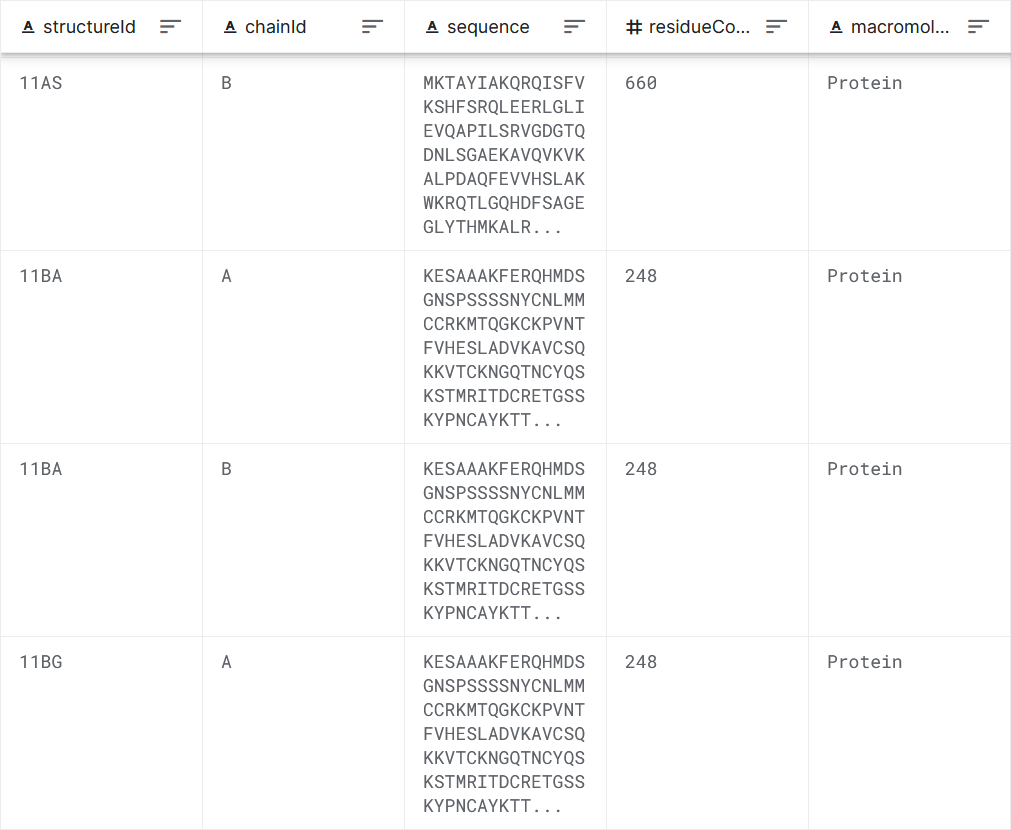
Figure 1: Data set sample.
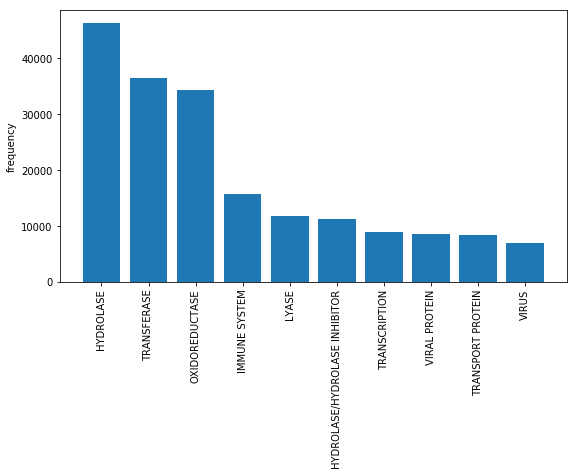
Figure 2: The frequency of appearance of different labels.
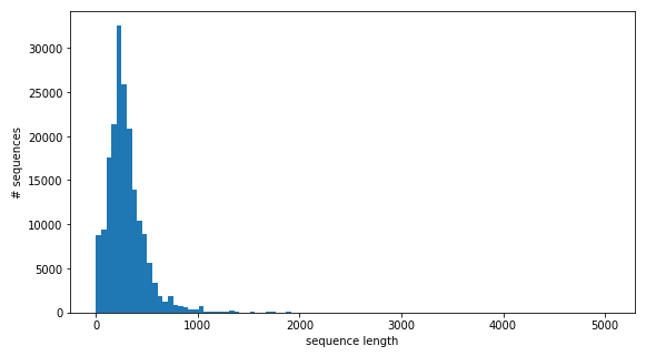
Figure 3: The length distribution of amino acid sequences.
3. Deep learning algorithm
Two deep learning models, CNN and LSTM2, are mainly used in this project. In addition, the Word Embedding algorithm is also used to preprocess the data.
Among these models, the CNN model comes from the Kaggle website3 and will be used as a test benchmark. We will try to build a simpler but more accurate model with an accuracy rate of at least not lower than the test benchmark.
3.1 Word Embedding
A word embedding is a class of approaches for representing words and documents using a dense vector representation.
Iin an embedding, words are represented by dense vectors where a vector represents the projection of the word into a continuous vector space.
The position of a word within the vector space is learned from text and is based on the words that surround the word when it is used.
The position of a word in the learned vector space is referred to as its embedding.
Two popular examples of methods of learning word embeddings from text include: Word2Vec4 and GloVe5.
Figure 4: Word2Vec and GloVe.
3.2 LSTM
Recurrent Neural Network (RNN) is a neural network used to process sequence data. Compared with the general neural network, it can process the data of sequence changes. For example, the meaning of a word will have different meanings because of the different content mentioned above, and RNN can solve this kind of problem well.
Long short-term memory (LSTM) is a special kind of RNN, mainly to solve the problem of gradient disappearance and gradient explosion during long sequence training. Compared to ordinary RNN, LSTM can perform better in longer sequences.
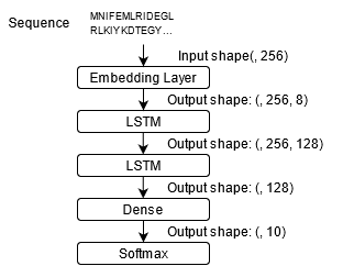
Figure 5: LSTM.
4. Benchmark
4.1 Compare with test benchmark
3 is a highly accurate model on the Kaggle website. It is currently one of the models with the highest accuracy on this data set. In this project, CNN model in 3 will be used as a test benchmark. We use categorical cross entropy as loss function.
| Model | CNN | LSTM |
|---|---|---|
| #parameters | 273,082 | 203,226 |
| Accuracy | 91.6% | 91.9% |
| Training time | 7ms/step | 58ms/step |
| Batch size | 128 | 256 |
| Loss | 0.4051 | 0.3292 |
Both the CNN model and the LSTM model use the word embedding layer for data dimensionality reduction. After testing, the result is that LSTM uses fewer parameters to achieve the same or even slightly higher accuracy than the benchmark. However, due to the relatively complex structure of LSTM, its training speed and guessing speed are slower.
In order to make a fair comparison with the test benchmark, we only selected the 10 most frequent samples as the data set, which is also the original author’s choice. Therefore, the accuracy of more than 90% here is only of relative significance, and does not mean that the same accuracy can be achieved in practical applications (the data set usually has more categories).
4.2 The impact of the number of labels on accuracy
In order to further test the performance of LSTM on different data sets, we further increased the number of labels, gradually increasing from 10 labels to 20 labels. Figure 6 shows the effect of the number of labels on accuracy.
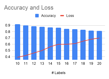
Figure 6: The impact of the number of labels on accuracy.
Note that due to the limitation of the data set, the number of samples belonging to different labels is different. If we want to balance different categories, we have to shrink the data set, which will affect the accuracy. This is one of the limitations of this test.
5. Conclusion
The deep learning model gives a prediction accuracy of more than 90% for the 10 most common protein types. If the number of label is increased to 20, the accuracy rate will drop to 80%. The traditional machine learning model is difficult to deal with string data of different lengths.
6. Acknowledgments
The author would like to thank Dr. Gregor von Laszewski for his invaluable feedback on this paper, and Dr. Geoffrey Fox for sharing his expertise in Big Data applications throughout this course.
7. References
-
Sussman, Joel L., et al. “Protein Data Bank (PDB): database of three-dimensional structural information of biological macromolecules.” Acta Crystallographica Section D: Biological Crystallography 54.6 (1998): 1078-1084. ↩︎
-
Sundermeyer, Martin, Ralf Schlüter, and Hermann Ney. “LSTM neural networks for language modeling.” Thirteenth annual conference of the international speech communication association. 2012. ↩︎
-
Kaggle, Protein Sequence Classification. https://www.kaggle.com/helmehelmuto/cnn-keras-and-innvestigate ↩︎
-
Church, Kenneth Ward. “Word2Vec.” Natural Language Engineering 23.1 (2017): 155-162. ↩︎
-
Pennington, Jeffrey, Richard Socher, and Christopher D. Manning. “Glove: Global vectors for word representation.” Proceedings of the 2014 conference on empirical methods in natural language processing (EMNLP). 2014. ↩︎
44 - How Big Data Can Eliminate Racial Bias and Structural Discrimination
![]()
![]() Status: final, Type: Report
Status: final, Type: Report
- Robert Neubauer, fa20-523-304
- Edit
Abstract
Healthcare is utilizing Big Data to to assist in creating systems that can be used to detect health risks, implement preventative care, and provide an overall better experience for patients. However, there are fundmental issues that exist in the creation and implementation of these systems. Medical algorithms and efforts in precision medicine often neglect the structural inequalities that already exist for minorities accessing healthcare and therefore perpetuate bias in the healthcare industry. The author examines current applications of these concepts, how they are affecting minority communities in the United States, and discusses improvements in order to achieve more equitable care in the industry.
Contents
Keywords: healthcare, machine learning, data science, racial bias, precision medicine, coronavirus, big data, telehealth, telemedicine, public health.
1. Introduction
Big Data is helping to reshape healthcare through major advancements in telehealth and precision medicine. Due to the swift increase in telehealth services due to the COVID-19 pandemic, researchers at the University of California San Francisco have found that black and hispanic patients use these services less frequently than white patients. Prior to the pandemic, research showed that racial and ethnic minorities were disadvantaged by the digital divide 1. These differences were attributed to disparities in access to technology and digital literacy 2. Studies like these highlight how racial bias in healthcare is getting detected more frequently; However, there are few attempts to eradicate it through the use of similar technology. This has implications in various areas of healthcare including major healthcare algorithms, telehealth, precision medicine, and overall care provision.
From the 1985 Report of the Secretary’s Task Force on Black and Minority Health, ‘Blacks, Hispanics, Native Americans and those of Asian/Pacific Islander heritage have not benefited fully or equitably from the fruits of science or from those systems responsible for translating and using health sciences technology’ 3. The utilization of big data in industries largely acts to automate a process that was carried out by a human. This makes the process quicker to accomplish and the outcomes more precise since human error can now be eliminated. However, whenever people create the algorithms that are implemented, it is common that these algorithms will align with the biases of the human, or system, that created it. An area where this is happening that is especially alarming is the healthcare industry. Structural discrimination has long caused discrepencies in healthcare between white patients and minority patients and, with the introduction of big data to determine who should receive certain kinds of care, the issue has not been resolved but automated. Studies have shown that minority groups that are often at higher risk than white patients receive less preventative care while spending almost equal amounts on healthcare 4. National data also indicates that racial and ethnic minorities also have poorer health outcomes from preventable and treatable diseases such as cardiovascular disease, cancer, asthma, and HIV/AIDS than those in the majority 5.
2. Bias in Medical Algorithms
In a research article published to Science in October of 2019, the researchers uncovered that one of the most used algorithms in healthcare, widely adopted by non- and for-profit medical centers and government agencies, less frequently identified black patients for preventative care than white patients. This algorithm is estimated to be applied to around 200 million people in the United States every year in order to target patients for high-risk care management. These programs seek to improve the care of patients with complex health needs by providing additional resources. The dataset used in the study contained the algorithms predictions, the underlying ingredients that formed the algorithm, and rich data outcomes which allowed for the ability to quantify racial disparities and isolate the mechanisms by which they arise. The sample consisted of 6,079 self-identified black patients and 43,539 self-identified white patients where 71.2% of all patients were enrolled in commercial insurance and 28.8% were on Medicare. On average, the patient age was 50.9 years old and 63% of patients were female. The patients enrolled in the study were classified among risk percentiles, where patients with scores at or above the 97th percentile were auto-enrolled and patients with scores over the 55th percentile were encouraged to enroll 4.
In order to measure health outcomes, they linked predictions to a wide range of outcomes in electronic health records, which included all diagnoses, and key quantitative laboratory studies and vital signs that captured the severity of chronic illnesses. When focusing on a point in the very-high-risk group, which would be patients in the 97th percentile, they were able to quantify the differences between white and black patients, where black patients had 26.3% more chronic illnesses than white patients4. To get a corrected health outcome measurement among white and black patients, the researchers set a specific risk threshold for health outcomes among all patients, and repeated the procedure to replace healthier white patients with sicker black patients. So, for a white patient with a health risk score above the threshold, their data was replaced with a black patient whose score fell below the threshold and this continued until the health risk scores for black and white patients were equal and the predictive gap between patients would be eliminated. The health scores were based on the number of chronic medical conditions. The researchers then compared the data from their corrected algorithm and the original and found that the fraction of black patients at all risk thresholds above the 50th percentile increased when using the corrected algorithm. At the 97th percentile, the fraction of black patients increased to 46.5% from the original 17.7% 4. Black patients are likely to have more severe hypertension, diabetes, renal failure, and anemia, and higher cholesterol. Using data from clinical trials and longitudinal studies, the researchers found that for mortality rates with hypertension and diabetes black patients had a 7.6% and 30% increase, respectively4.
In the original and corrected algorithms, black and white patients spent roughly the same amount on healthcare. However, black patients spent more on emergency care and dialysis while white patients spent more on inpatient surgery and outpatient specialist care4. In a study that tracked black patients with a black versus a white primary care provider, it found the occurrence of a black primary care provider recommending preventative care was significantly higher than recommendations from a white primary care provider. This conclusion sheds additional light on the disparities black patients face in the healthcare system and further adds to the lack of trust black people have in the healthcare system that has been heavily documented since the Tuskegee study 6. The change recommended by the researchers that would correct the gap in the predictive care model was rather simple, shifting from predictions from purely future cost to an index that combined future cost prediction with health prediction. The researchers were able to work with the distributor of the original algorithm in order to make a more equitable algorithm. Since the original and corrected models from the study were both equal in cost but varied significantly in health predictions, they reworked the cost prediction based on health predictions, conditional on the risk factor percentiles. Both of the models excluded race from the predictions, but the algorithm created with the researchers saw an 84% reduction in bias among black patients, reducing the number of excess active chronic conditions in black patients to 7,758.
3. Disparities Found with Data Dashboards
To relate this to a present health issue that is affecting everyone, more black patients are dying from the novel coronavirus than white patients. In the United States, in counties where more than 86% of residents are black, the COVID-19 death rates were 10 times higher than the national average 7. Considering how medical algorithms allocate resources to black patients, similar trends are expected for minorities, people who speak languages other than english, low-income residents, and people without insurance. At Brigham Health, a member of the not-for-profit Mass General Brigham health system, Karthik Sivashanker, Tam Duong, Shauna Ford, Cheryl Clark, and Sunil Eappen created data dashboards in order to assist staff and those in positions of leadership. The dashboards included rates of those who tested positive for COVID-19 sorted into different subgroups based on race, ethnicity, language, sex, insurance status, geographic location, health-care worker status, inpatient and ICU census, deaths, and discharges 7.
Through the use of these dashboards, the COVID-19 equity committee were able to identify emerging risks to incident command leaders, including the discovery that non-English speaking Hispanic patients had higher mortality rates when compared to English speaking Hispanic patients. This led to quality-improvement efforts to increase patient access to language interpreters. While attempting to implement these changes, it was discovered that efforts to reduce clinicians entering patient rooms to maintain social distancing guidelines was impacting the ability for interpreters to join at a patient’s bedside during clinician rounding. The incident command leadership expanded their virtual translation services by purchasing additional iPads to allow interpreters and patients to communicate through online software. The use of the geographic filter, when combined with a visual map of infection-rates by neighborhood, showed that people who lived in historically segregated and red-lined neighborhoods were tested less frequently but tested positive more frequently than those from affluent white neighborhoods 7. In a study conducted with survey data from the Pew Research Center on U.S. adults with internet access, black people were significantly more likely to report using telehealth services. In the same study, black and latino respondents had higher odds of using telehealth to report symptoms 8.
However, COVID-19 is not the only disease that researchers have found to be higher in historically segregated communities. In 1999, Laumann and Youm found that disparities segregation in social and sexual networks explained racial disparities in STDs which, they suggested, could also explain the disparities black people face in the spread of other diseases 3. Prior to 1999 researchers believed that some unexplained characteristic of black people described the spread of such diseases, which shows the pervasiveness of racism in healthcare and academia. Residential segregation may influence health by concentrating poverty, environmental pollutants, infectious agents, and other adverse conditions. In 2006, Morello-Frosch and Jesdale found that segregation increased the risk of cancer related to air pollution 3. Big Data can assess national and local public health for disease prevention. An example is how the National Health Interview Survey is being used to estimate insurance coverage in different areas of the U.S. population and clinical data is being used to measure access and quality-related outcomes. Community-level data can be linked with health care system data using visualization and network analysis techniques which would enable public health officials and clinicians to effectively allocate resources and assess whether all patients are getting the medical services they need 9. This would drastically improve the health of historically segregated and red-lined communities who are already seeing disparities during the COVID-19 pandemic.
4. Effect of Precision Medicine and Predictive Care
Public health experts established that the most important determinant of health throughout a person’s course of life is the environment where they live, learn, work, and play. There exists a discrepancy between electronic health record systems in well-resourced clinical practices and smaller clinical sites, leading to disparities in how they are able to support population health management. For Big Data technology, if patient, family, and community focus were implemented equally in both settings, it has shown that the social determinants of health information would both improve public health among minority communities and minimize the disparities that would arise. Geographic information systems are one way to locate social determinants of health. These help focus public health interventions on populations at greater risk of health disparities. Duke University used this type of system to visualize the distribution of individuals with diabetes across Durham County, NC in order to explore the gaps in access to care and self-management resources. This allowed them to identify areas of need and understand where to direct resources. A novel approach to identify place-based disparities in chronic diseases was used by Young, Rivers, and Lewis where they analyzed over 500 million tweets and found a significant association between the geographic location of HIV-related tweets and HIV prevalence, a disease which is known to predominantly affect the black community 9.
One of the ways researchers call for strengthening the health of the nation is through community-level engagement. This is often ignored when it comes to precision medicine, which is one of the latest ways that big data is influencing healthcare. It has the potential to benefit racial and ethnic minority populations since there is a lack of clinical trial data with adequate numbers of minority populations. It is because of this lack of clinical data that predictions in precision medicine are often made off risks associated with the majority which give preferential treatment to those in the majority while ignoring the risks of minority groups, further widening the gap in the allocation of preventative health resources. These predictive algorithms are rooted in cost/benefit tradeoffs, which were proven to limit resources to black patients from the science magazine article on medical algorithms 10. For the 13th Annual Texas Conference on Health Disparities, the overall theme was “Diversity in the Era of Precision Medicine.” Researchers at the event said diversity should be kept at the forefront when designing and implementing the study in order to increase participation by minority groups 6. Building a trusting relationship with the community is also necessary for increased participation, therefore the institution responsible for recruitment needs to be perceived as trustworthy by the community. Some barriers for participation shared among minority groups are hidden cost of participation, concern about misuse of research data, lack of understanding the consent form and research materials, language barrier, low perceived risk of disease, and fear of discrimination 6. As discussed previously, overall lack of distrust in the research process is rooted in the fact that research involving minority groups often overwhelmingly benefits the majority by comparison. Due to the lack of representation of minority communities, big clinical data can be generated for the means of conducting pragmatic trials with underserved populations and distribute the lack of benefits 9.
4.1 Precision Public Health
The benefit of the majority highlights the issue that one prevention strategy does not account for everyone. This is the motivation behind combining precision medicine and public health to create precision public health. The goal of this is to target populations that would benefit most from an intervention as well as identify which populations the intervention would not be suitable for. Machine learning applied to clinical data has been used to predict acute care use and cost of treatment for asthmatic patients and diagnose diabetes, both of which are known to affect black people at greater rates than white patients 9. This takes into account the aforementioned factors that contribute to a person’s health and combines it with genomic data. Useful information about diseases at the population level are attributed to advancements in genetic epidemiology, through increased genetic and genomic testing. Integration of genomic technologies with public health initiatives have already shown success in preventing diabetes and cancers for certain groups, both of which affect black patients at greater rates than white patients. Specifically, black men have the highest incidence and mortality rates of prostate cancer. The presence of Kaiso, a transcriptional repressors present in human genes, is abundant in those with prostate cancer and, in black populations, it has been shown to increase cancer aggressive and reduce survival rates 10. The greatest challenge affecting advancements made to precision public health is the involvement of all subpopulations required to get effective results. This demonstrates another area where there’s a need for the healthcare industry to prioritize building a stronger relationship with minority communities in order to assist in advancing healthcare.
Building a stronger relationship with patients begins with having an understanding of the patient’s needs and their backgrounds, requiring multicultural understanding on the physicians side. This can be facilitated by the technological advances in healthcare. Researchers from Johns Hopkins University lay out three strategic approaches to improve multicultural communications. The first is providing direct services to minimize the gap in language barriers through the use of interpreters and increased linguistic competency in health education materials. The second is the incorporation of cultural homophily in care through staff who share a cultural background, inclusion of holistic medical suggestions, and the use of community health workers. Lastly, they highlight the need for more institutional accommodation such as increasing the ability of professionals to interact effectively within the culture of the patient population, more flexible hours of operation, and clinic locations 11. These strategic approaches are much easier to incorporate into practice when used in telehealth monitoring, providing more equitable care to minority patients who are able to use these services. There are three main sections of telehealth monitoring which include synchronous, asynchronous, and remote monitoring. Synchronous would be any real-time interaction, whether it be over the telephone or through audio/visual communication via a tablet or smartphone. This could occur when the patient is at their home or they are present with a healthcare professional while consulting with a medical provider virtually. Asynchronous communication occurs when patients communicate with their provider through a secure messaging platform in their patient portal. Remote patient monitoring is the direct transmission of a patient’s clinical measurements to their healthcare provider. Remote access to healthcare would be the most beneficial to those who are medically and socially vulnerable or those without ready access to providers and could also help preserve the patient-provider relationship 12. Connecting a patient to a provider that is from a similar cultural or ethnic background becomes easier through a virtual consultation, a form of synchronous telehealth monitoring. A virtual consultation would also help eliminate the need for transportation and open up the flexibility of meeting times for both the patient and the provider. From this, a way to increase minority patient satisfaction in regards to healthcare during the shift to telehealth services due to COVID-19 restrictions would be a push to increase technology access to these groups by providing them with low-cost technology with remote-monitoring capabilities.
5. Telehealth and Telemedicine Applications
Telehealth monitoring is evolving the patient-provider relationship by extending care beyond the in-person clinical visit. This provides an excellent opportunity to build a more trusting and personal relationship with the patient, which would be critical for minority patients as it would likely increase their trust in the healthcare system. Also, with an increase in transparency and involvement with their healthcare, the patient will be more engaged in the management of their healthcare which will likely have more satisfactory outcomes. Implementing these types of services will create large amounts of new data for patients, requiring big data applications in order to manage it. Similar to the issue of inequality in the common medical algorithm for determination of preventative care, if the data collected from minority groups using this method is not accounted for properly, then the issue of structural discrimination will continue. The data used in healthcare decision-making often comes from a patient’s electronic health record. An issue that presents itself when considering the use of a patient’s electronic health record in the process of using big data to assist with the patient’s healthcare is missing data. In the scope of telehealth monitoring, since the visit and most of the patient monitoring would be done virtually, the electronic health record would need to be updated virtually as well 13.
For telehealth to be viable, the tools that accommodate it need to work seamlessly and be supported by the data streams that are integrated into the electronic health record. Most electronic health record systems are unable to be populated with remote self-monitoring patient-generated data 13. However, the American Telemedicine Association is advocating for remotely-monitored patient-generated data to be incorporated into electronic health records. The SMART Health IT platform is an approach that would allow clinical apps to run across health systems and integrate with electronic health records through the use of a standards-based open-source application programming interface (API) Fast Healthcare Interoperability Resources (FHIR). There are also advancements being made in technology that is capable of integrating data from electronic health records with claims, laboratory, imaging, and pharmacy data 13. There is also a push to include social determinants of health disparities including genomics and socioeconomic status in order to further research underlying causes of health disparities 9.
5.1 Limitations of Teleheath and Telemedicine
The issue of lack of access to the internet and devices that would be necessary for virtual health visits would limit the participation of those from lower socioeconomic backgrounds. From this arises the issue of representativeness in remotely-monitored studies where the participant must have access to a smartphone or tablet. However, much like the Brigham Health group providing iPads in order to assist with language interpretation, there should be an incentive to provide access to these devices for patients in high risk groups in order to boost trust and representation in this type of care. From the article that discussed the survey results that found black and latino patients to be more responsive to using telehealth, the researchers contrasted the findings with another study where 52,000 Mount Sinai patients were monitored between March and May of 2020 that found black patients were less likely to use telehealth than white patients 1. One reason for the discrepancy the researchers introduce is that the Pew survey, while including data from across the country, only focused on adults that had internet access. This brings up the need for expanding broadband access, which is backed by many telehealth experts 8.
The process of providing internet access and devices with internet capabilities to those without them should be similar to that from the science magazine study where patients whose risk scores are above a certain threshold should automatically qualify for technological assistance. Programs such as the Telehealth Network Grant Program would be beneficial for researchers conducting studies with a similar focus, as the grant emphasizes advancements in tele-behavioral health and tele-emergency medical services and providing access to these services to those who live in rural areas. Patients from rural areas are less likely to have access to technology that would enable them to participate in a study requiring remote monitoring. The grant proposal defines tele-emergency as an electronic, two-way, audio/visual communication service between a central emergency healthcare center, the tele-emergency hub, and a remote hospital emergency department designed to provide real-time emergency care consultation 14. This is especially important when considering that major medical algorithms show that black patients often spend more on emergency medical care.
6. Conclusion
Big Data is changing many areas of healthcare and all of the areas that it’s affecting can benefit from making structural changes in order to allow minorities to get equitable healthcare. This includes how the applications are put into place, since Big Data has the ability to demonstrate bias and reinforce structural discrimination in care. It should be commonplace to consider race or ethnicity, socioeconomic status, and other relevant social determinants of health in order to account for this. Several studies have displayed the need for different allocations of resources based on race and ethnicity. From the findings that black patients were often given more equitable treatment when matched with a primary care provider that was black and that COVID-19 has limited in-person resources, such as a bedside interpreter for non-English speaking patients, there should be a development of a resource that allows people to be matched with a primary care provider that aligns with their identity and to connect with them virtually. When considering the lack of trust black people and other minority populations have in the healthcare system, there are a variety of services that would help boost trust in the process of getting proper care. Given the circumstances surrounding COVID-19 pandemic, there is already an emphasis on making improvements within telehealth monitoring as barriers to telehealth have been significantly reduced. Several machine-learning based studies have highlighted the importance of geographic location’s impact on aspects of the social determinants of health, including the effects in segregated communities. Recent work has shown that black and other ethnic minority patients report having less involvement in medical decisions and lower levels of satisfaction of care. This should motivate researchers who are focused on improving big data applications in the healthcare sector to focus on these communities in order to eliminate disparities in care and increase the amount of minority healthcare workers in order to have accurate representation. From the survey data showing that minority populations were more likely to use telehealth services, there needs to be an effort to highlight these communities in future work surrounding telehealth and telemedicine. Several studies have prepared a foundation for what needs to be improved and have already paved the way for additional research. With the progress that these studies have made and continued reports of inadequacies in care, it is only a matter of time before substantial change is implemented and equitable care is available.
7. References
-
E. Weber, S. J. Miller, V. Astha, T. Janevic, and E. Benn, “Characteristics of telehealth users in NYC for COVID-related care during the coronavirus pandemic,” J. Am. Med. Inform. Assoc., Nov. 2020, doi: 10.1093/jamia/ocaa216. ↩︎
-
K. Senz, “Racial disparities in telemedicine: A research roundup,” Nov. 30, 2020. https://journalistsresource.org/studies/government/health-care/racial-disparities-telemedicine/ (accessed Dec. 07, 2020). ↩︎
-
C. L. F. Gilbert C. Gee, “STRUCTURAL RACISM AND HEALTH INEQUITIES: Old Issues, New Directions1,” Du Bois Rev., vol. 8, no. 1, p. 115, Apr. 2011, Accessed: Dec. 07, 2020. [Online]. ↩︎
-
Z. Obermeyer, B. Powers, C. Vogeli, and S. Mullainathan, “Dissecting racial bias in an algorithm used to manage the health of populations,” Science, vol. 366, no. 6464, pp. 447–453, Oct. 2019, Accessed: Dec. 07, 2020. [Online]. ↩︎
-
J. N. G. Chazeman S. Jackson, “Addressing Health and Health-Care Disparities: The Role of a Diverse Workforce and the Social Determinants of Health,” Public Health Rep., vol. 129, no. Suppl 2, p. 57, 2014, Accessed: Dec. 07, 2020. [Online]. ↩︎
-
A. Mamun et al., “Diversity in the Era of Precision Medicine - From Bench to Bedside Implementation,” Ethn. Dis., vol. 29, no. 3, p. 517, 2019, Accessed: Dec. 07, 2020. [Online]. ↩︎
-
“A Data-Driven Approach to Addressing Racial Disparities in Health Care Outcomes,” Jul. 21, 2020. https://hbr.org/2020/07/a-data-driven-approach-to-addressing-racial-disparities-in-health-care-outcomes (accessed Dec. 07, 2020). ↩︎
-
“Study: Black patients more likely than white patients to use telehealth because of pandemic,” Sep. 08, 2020. https://www.healthcareitnews.com/news/study-black-patients-more-likely-white-patients-use-telehealth-because-pandemic (accessed Dec. 07, 2020). ↩︎
-
X. Zhang et al., “Big Data Science: Opportunities and Challenges to Address Minority Health and Health Disparities in the 21st Century,” Ethn. Dis., vol. 27, no. 2, p. 95, 2017, Accessed: Dec. 07, 2020. [Online]. ↩︎
-
S. A. Ibrahim, M. E. Charlson, and D. B. Neill, “Big Data Analytics and the Struggle for Equity in Health Care: The Promise and Perils,” Health Equity, vol. 4, no. 1, p. 99, 2020, Accessed: Dec. 07, 2020. [Online]. ↩︎
-
Institute of Medicine (US) Committee on Understanding and Eliminating Racial and Ethnic Disparities, B. D. Smedley, A. Y. Stith, and A. R. Nelson, “PATIENT-PROVIDER COMMUNICATION: THE EFFECT OF RACE AND ETHNICITY ON PROCESS AND OUTCOMES OF HEALTHCARE,” in Unequal Treatment: Confronting Racial and Ethnic Disparities in Health Care, National Academies Press (US), 2003. ↩︎
-
CDC, “Using Telehealth to Expand Access to Essential Health Services during the COVID-19 Pandemic,” Sep. 10, 2020. https://www.cdc.gov/coronavirus/2019-ncov/hcp/telehealth.html (accessed Dec. 07, 2020). ↩︎
-
"[No title]." https://www.nejm.org/doi/full/10.1056/NEJMsr1503323 (accessed Dec. 07, 2020). ↩︎
-
“Telehealth Network Grant Program,” Feb. 12, 2020. https://www.hrsa.gov/grants/find-funding/hrsa-20-036 (accessed Dec. 07, 2020). ↩︎
45 - Online Store Customer Revenue Prediction
![]()
![]() Status: final, Type: Project
Status: final, Type: Project
Balaji Dhamodharan, bdhamodh@iu.edu, fa20-523-337 Anantha Janakiraman, ajanakir@iu.edu, fa20-523-351
Abstract
Situation The 80/20 rule has proven true for many businesses–only a small percentage of customers produce most of the revenue. As such, marketing teams are challenged to make appropriate investments in promotional strategies. The objective of this project is to explore different machine learning techniques and identify an optimized model that can help the marketing team understand customer behavior and make informed decisions.
Task The challenge is to analyze a Google Merchandise Store (also known as GStore, where Google swag is sold) customer dataset to predict revenue per customer. Hopefully this exploration will lead to actionable insights and help allocating marketing budgets for those companies who choose to use data analysis on top of GA data [^1].
Action This exploration is based on a Kaggle competition and there are two datasets available in Kaggle. One is the test dataset (test.csv) and the other one is the training dataset (train.csv) and together the datasets contain customer transaction information ranging from August 2016 to April 2018. The action plan for this project is to first conduct data exploration that includes but not limited to investigating the statistics of data, examining the target variable distribution and other data distributions visually, determining imputation strategy based on the nature of missing data, exploring different techniques to scale the data, identifying features that may not be needed - for example, columns with constant variance, exploring different encoding techniques to convert categorical data to numerical data and identifying features with high collinearity. The preprocessed data will then be trained using a linear regression model with basic parameter setting and K-Fold cross validation. Based on the outcome of this initial model further experimentation will be conducted to tune the hyper parameters including regularization and also add new derived features to improve the accuracy of the model. Apart from linear regression other machine learning techniques like ensemble methods will be explored and compared.
Result The best performing model determined based on the RMSE value will be used in the inference process to predict the revenue per customer. The Kaggle competition requires to predict the natural log of sum of all transactions per customer
Contents
Keywords: ecommerce, regression analysis, big data
1. Introduction
The objective of this exploration is to predict the natural log of total revenue per customer which is a real valued continuous output and an algorithm like linear regression will be ideal to predict the response variable that is continuous using a set of predictor variables given the basic assumption that there is a linear relationship between the predictor and response variables.
2. Datasets
As mentioned in the earlier sections, the dataset used in this model exploration was downloaded from Kaggle 1 and available in CSV file format. The training contains more than 872K observations and based on the size of the dataset it would be ideal to use mini-batch or gradient descent optimization techniques to identify the coefficients that best describe the model. The target variable as observed in the dataset is a continuous variable which implies that the use case is a regression problem. As mentioned earlier, there are several machine learning techniques that can be explored for this type of problem including regression and ensemble methods with different parameter settings. The sparsity of potential features in the datasets indicates that multiple experimentations will be required to determine the best performing model. Also based on initial review of the datasets, it also observed that some of the categorical features exhibit low to medium cardinality and if these features are going to be retained in the final dataset used for training then it is important to choose the right encoding technique.
- Train.csv User transactions from August 1st, 2016 to August 1st, 2017 2
- Test.csv User transactions from August 2nd, 2017 to April 30th, 2018 2
2.1 Metrics
The metrics used for evaluation in this analysis is the root mean squared error (RMSE). The root mean squared error function forms the objective/cost function which will be minimized to estimate optimal parameters for the linear function using Gradient Descent. The plan is to conduct multiple experiments with different iterations to obtain convergence and try different hyper-parameters (e.g. learning rate).
RMSE is defined as:

Figure 1: RMSE
where y-hat is the natural log of the predicted revenue for a customer and y is the natural log of the actual summed revenue value plus one as seen in Figure-1.
2.2 Source Code
Follow this link to the source code for subsequent sections in this report.
3. Methodology
The CRISP-DM process methodology was followed in this project. The high-level implementation steps are shown in Figure-2.

Figure 2: Project Methodology
3.1 Load Data
The data that was obtained from Kaggle was over 2.6 GB (for Train and Test). As the size of the dataset was significantly large, it was hosted onto a storage bucket in Google Cloud Platform and ingested into the modeling process through standard application API libraries. Also in this project from the available datasets, the Train dataset was used to build the models and test the results because the real end goal is to test the effectiveness of algorithm. Since the test set doesn’t contain the Target Variable (rightly so!), it will not be consumed during the testing and evaluation phase in this exploration.
3.2 Data Exploration
The dataset obtained for this project is large and it contains over 872k records. The dataset also contains 12 predictor variables and 1 target variable. The target Variable is totals.transactionRevenue and the objective of this exploration is to predict the total transaction revenue of an online store customer as accurately as possible.
Target Variable: The Target Variable is totals.transactionRevenue has the transaction value of each visit. But, this column contains 98.72% of missing values for revenue (no purchase). The Target variable had a skewed distribution originally and after performing a lognormal distribution on the target variable it has a normal distribution.

Figure 3: Target Variable
3.2.1 Exploratory Data Analysis
Browser: The most popular browser is Google Chrome. Also, it was observed during the analysis that second and third best users were using safari and firefox respectively.

Figure 4: Browser Variable
Device Category: Almost 70% of users were accessing online store via desktop

Figure 5: Device Category Variable
OperatingSystem: Windows is the popular operating system among the desktop users. However, among the mobile users, what’s interesting is, almost equal number of ios users (slightly lower) as android users accessed google play store. The reason why this is interesting is because, google play store is primarily used by android users and ios users almost always use Apple Store for downloading apps to their mobile devices. So it is interesting to know, almost equal number of ios users visit google store as well.

Figure 6: Operating System
GeoNetwork-City: Mountain View, California tops the cities list for the users who accessed online store. However in the top 10 cities, 4 cities are from California.

Figure 7: GeoNetwork City
GeoNetwork-Country: Customers from US are way ahead of other customers from different countries. May be this could be due to the fact that online store data that was provided was pulled from US Google Play Store (Possible BIAS!).

Figure 8: GeoNetwork Country
GeoNetwork-Region: It is already known that majority of the customers are from US, so America region tops the list.

Figure 9: GeoNetwork Region
GeoNetwork-Metro: SFO tops the list for all metro cities, followed by New York and then London.

Figure 10: GeoNetwork Region
Ad Sources: Google Merchandise and Google Online Store are the top sources where the traffic is coming from to the Online Store.

Figure 11: Ad Sources
3.3 Data Pre-Processing
Data Pre-Processing is an important step to build a Machine Learning Model. The data pre-processing step typically consists of data cleaning, transformation, standardization and feature selection, so only the most cleaner and accurate data is fed to a model. The dataset that was downloaded for this project contains several issues with formatting, lot of missing values, less to no variance (zero variance) in some of features and it was also observed the target variable does not have random distribution. The variables such as totals_newVisits, totals_bounces, trafficSource_adwordsClickInfo_page, trafficSource_isTrueDirect, totals_bounces, totals_newVisits had missing values. The missing values were imputed with zeroes, so the machine learning algorithm is able to execute without errors and there are no issues during categorical to numerical encoding. This is a very important step in building the Machine Learning Pipeline.
3.4 Feature Engineering
Feature Engineering is the process of extracting the hidden signals/features, so the model can use these features to increase the predictive power. This step is the fundamental difference between a good model and a bad model. Also, there is no one-size-fits all approach for Feature Engineering. It is extremely time consuming and requires a lot of domain knowledge as well. For this project, a set of sophisticated functions to extract date related values such as Month, Year, Data, Weekday, WeekofYear have been created. It was observed that browser and operating systems are redundant features and instead of removing them, they were merged to create a combined feature which will potentially increase the predictive power. Also as part of feature engineering several features were derived like mean, sum and count of pageviews and hits that should help increase the feature space and ultimately reduce the total error increasing the overall accuracy of the model.
3.4 Feature Selection
Feature Selection refers to selection of features in your data that would improve your machine learning model. There is subtle variation between Feature Selection and Feature Engineering. The Feature Engineering technique is designed to extract more feature from the dataset and the feature selection technique allows only relevant features into the dataset. Also, how does anyone know what are the relevant features? There are several methodologies and techniques that are developed over the years but there is no one-size-fits-all methodology.
Feature Selection like Feature Engineering is more of an art than science. There are several iterative procedure that uses Information Gain, Entropy and Correlation scores to decide which feature gets into the model. There are also advanced Deep learning models that can be built or tree based models that can help observe variables of high importance after the model is built. Similar to Feature Engineering, Feature Selection should also require domain specific knowledge to develop festure selection strategies.
In this project, the features that had constant variance in the data were dropped and also the features that had mostly null values with only one Non-null value were dropped too. These features do not possess any statistical significance and add very less value to the modeling process. Also, depending on the final result, different techniques and strategies can be explored to optimize and improve the performance of the model.
3.4.1 Data Preparation
Scikit learn has inbuilt libraries to handle Train/Test Split as part the model_selection package. The dataset was split randomly with 80% Training and 20% Testing datasets.
3.5 Model Algorithms and Optimization Methods
Different Machine Learning algorithms and techniques were explored in this project and the outcome of the exploration along with different parameter settings have been discussed in the following sections.
3.5.1 Linear Regression Model
Linear regression is a supervised learning model that follows a linear approach in that it assumes a linear relationship between one ore more predictor variables (x) and a single target or response variable (y). The target variable can be calculated as a linear combination of the predictors or in other words the target is the calculated by weighted sum of the inputs and bias where the weights are estimated through different optimization techniques. Linear regression is referred to as simple linear regression when there is only one predictor variable involved and referred to as multiple linear regression when there are more than one predictor variables involved. The error between the predicted output and the ground truth is generally calculated using RMSE (root mean squared error). This is one of the classic modeling techniques that was explored in this project because the target variable (revenue per customer) is a real valued continuous output and exhibits a significant linear relationship with the independent variables or the input variables 3.
In the exploration, SKLearn Linear Regression performed well overall. A 5 fold cross validation was performed and the best RMSE Score for this model observed was: 1.89. As shown in the Figure-12, the training and test RMSE error values are very close indicating that there is no overfitting the data.

Figure 12: Linear Regression Model
3.5.2 XGBoost Regressor
XGBoost regression is a gradient boosting regression technique and one of the popular gradient boosting frameworks that exists today. It follows the ensemble principle where a collection of weak learners improve the prediction accuracy. The prediction in the current step S is weighed based on the outcomes from the previous step S-1. Weak learning is slightly better than random learning and that is one of the key strengths of gradient boosting technique. The XGBoost algorithm was explored for this project for several reasons including it offers built-in regularization that helps avoid overfitting, it can handle missing values effectively and it also does cross validation automatically. The feature space for the dataset being used is sparse and believe the potential to overfit the data is high which is one of the primary reasons for exploring XGBoost 456.
XGBoost Regressor performed very well. It was the best performing model with the lowest RMSE score of 1.619. Also the training and test scores are reasonably close and it doesn’t look like there was the problem of over fitting the training data. Multiple training iterations of this model were explored with different parameters and most of the iterations resulted in significant error reduction compared to the other models making it the best performing model overall.

Figure 13: XGBoost Model
3.5.3 LightGBM Regressor
LightGBM is a popular gradient boosting framework similar to XGBoost and is gaining popularity in the recent days. The important difference between lightGBM and other gradient boosting frameworks is that LightGBM grows the tree vertically or in other words it grows the tree leaf-wise compared to other frameworks where the trees grow horizontally. In this project the lightGBM framework was experimented primarily because this framework works well on large dataset with more than 10K observations. The algorithm also has a high throughput while using reasonably less memory but there is one problem with overfitting the data which was controlled to a large extent in this exploration using appropriate hyper parameter setting and achieved optimal performance 78.
LightGBM Regression was the second best performing model in terms of RMSE scores. Also the training and test scores observed were slightly different indicating a potential problem of overfitting as discussed earlier. As in other experiments, multiple training iterations of this model were explored with different parameter settings and although it achieved reasonable error reduction compared to most of the other models that were explored, it still did not outperform the XGBoost regressor making it the second best performing model.

Figure 14: LightGBM Model
3.5.4 Lasso Regression
Lasso is a regression technique that uses L1 regularization. In statistics, lasso regression is a method to do automatic variable selection and regularization to improve prediction accuracy and performance of the statistical model. Lasso regression by nature makes the coefficient for some of the variables zero meaning these variables are automatically eliminated from the modeling process. The L1 regularization parameter helps control overfitting and will need to be explored for a range of values for a specific problem. When the regularization penalty tends to be zero there is no regularization, and the loss function is mostly influenced by the squared loss and in contrary if the regularization penalty tends to be closer to infinity then the objective function is mostly influenced by the regularization part. It is always ideal to explore a range of values for the regularization penalty to improve the accuracy and avoid overfitting 910.
In this project, Lasso is one of the important techniques that was explored primarily because the problem being solved is a regression problem and there is possibility to overfit the data due to the number of observations and feature space. During the model training phase different ranges for regularization penalty were explored and the appropriate value that helped achieve maximum reduction in the total RMSE score was identified.
Lasso performed slightly better than baseline model. However, it did not outperform lightGBM or XGBoost or tree based models in general.

Figure 15: Lasso Model
3.5.5 Ridge Regressor
Ridge is a regression technique that uses L2 regularization. Ridge regression does not offer automatic variable selection in the sense that it is not make the weights zero on any of the variable used in the model and the regularization term in a ridge regression is slightly different than the lasso regression. The regularization term is the sum of the square of coefficients multiplied by the penalty whereas in lasso it is the sum of the absolute value of the coefficients. The regularization term is a gentle trade-off between fitting the model and overfitting the model and like in lasso it helps improve prediction accuracy as well as performance of the statistical model. The L2 regularization parameter helps control overfitting and will need to be explored for a range of values for a specific problem similar to Lasso. The regularization parameter also helps reduce multicollinearity in the model. Similar to Lasso, when the regularization penalty tends to be zero there is no regularization, and the loss function is mostly influenced by the squared loss and in contrary if the regularization penalty tends to be closer to infinity then the objective function is mostly influenced by the regularization part. As in the case of Lasso, it is always ideal to explore a range of values for the regularization penalty to improve the accuracy and avoid overfitting 910.
In this project, Ridge regression is one of the important techniques that was explored again primarily because the problem being solved is a regression problem and there is possibility to overfit the data due to the number of observations and feature space. During the model training phase different ranges for regularization penalty were explored and the appropriate value that helped achieve maximum reduction in the total RMSE score was identified. Ridge performed slightly better than baseline model. However like Lasso, it did not outperform lightGBM or XGBoost or tree based models in general.

Figure 16: Ridge Model
4. Benchmark Results
There are some interesting observations from the benchmark results seen in Figure-17. As expected, the data exploration and pre-processing performed very well and the data load and flattening of JSON took only a few hundred milliseconds on a platform like Google Colab compared to more than a minute running the same code locally on a desktop. The grid search for linear regression as expected took more time than the grid search for regularization techniques which is an interesting finding. The model training phase using ridge regression took only half the time approximately 250 seconds compared to 811 seconds for lasso regression. The highest training time of approximately 1800 seconds was recorded with XGBoost regressor and although the original assumption was that this modeling technique would consume time and significant system resources to complete the training process, the total time of 1800 seconds was certainly in the higher end. But, considering the fact that random forest regressor took more than 90 minutes to complete the training process during the experimentation phase, XGBoost performed much better than random forest. The other interesting observation was between LightGBM and XGBoost where LightGBM took significantly less time than XGBoost regressor and if performance and high availability are key considerations during operationalization with slight compromise on model performance then LightGBM would be an ideal candidate for real time operationalization.

Figure 17: Benchmark Results
5. Software Technologies
In this project tools like Python and Google Colab Jupyter Notebook were used. Also several Python packages were employed in this exploration such as Pandas, Numpy, Matplotlib, sklearn
6. Conclusion
As a project team the intention was to create a template that can be utilized for any ML project. The dataset that was used for this project was challenging in a way that it required a lot of data cleaning, flattening and transformation to get the data into the required format.
6.1 Model Pipeline
In this project, multiple regression and tree based models from scikit learn library were explored with various hyper parameter setting and other methods like the lightGBM. The goal of the model pipeline was to explore and examine data, identify data pre-processing methods, imputation strategies, derive features and try different feature extraction methods was to perform different experiments with different parameter setting and identify the optimized with low RMSE that can be operationalized in Production. The parameters were explored within the boundary of this problem setting using different techniques.
6.2 Feature Exploration and Pre-Processing
As part of this project a few features were engineered and included in the training dataset. The feature importance visualizations that were generated after the model training process indicate that these engineered features were part of the top 30% of high impact features and they contributed reasonably to improving the overall accuracy of the model. During additional experimentation phase, the possibility of including few other potential features that could be derived from the dataset was explored and those additional features were included in the final dataset that was used during model training. Although these features did not contribute largely to reducing the error it gave an opportunity to share ideas and methods to develop these new features. Also during feature exploration phase other imputation strategies were evaluated, attempted to identify more outliers and tried different encoding techniques for categorical variables and ultimately determined that label encoder or ordinal encoder is the best way forward. Also some of the low importance features were excluded and the model was retrained to validate if the same or better RMSE value could be achieved.
6.3 Outcome of Experiments
Multiple modeling techniques were explored as part of this project like Linear regression, gradient boosting algorithms and linear regression regularization techniques. The techniques were explored with basic parameter setting and based on the outcome of those experiments, the hyper parameters were tuned using grid search to obtain the best estimator evaluated on RMSE. Also, during grid search K-Fold cross validation of training data was used and the cross validated results were examined through a results table. The fit_intercept flag played a significant role resulting in an optimal error. As part of the different experimentations that were performed, random forest algorithm was also explored but it suffered performance issues and it seemed like it would require more iterations to converge which is why it was dropped from our results and further exploration. Although random forest was not explored, gradient boosting techniques were part of the experimentations and the best RMSE from XGBoost. The LightGBM regressor was also explored with different parameter settings but it did not produce better RMSE score than XGBoost.
In the case of XGBoost, there was improvement to the RMSE score as different tree depths, feature fraction, learning rate, number of children, bagging fraction, sub-sample were explored. There was significant improvement to the error metric when these parameters were adjusted in an intuitive way. Also, linear regression with regularization techniques were explored and although there was some improvement to the error metric compared to the basic linear regression model they did not perform better than the gradient boosting method that was explored. So, based on different explorations and experimentations a reasonably conclusion can be made that gradient boosting technique performed better for the given problem setting and generated the best RMSE score. Based on the evaluation results of XGBoost on the dataset used, the recommendation would be to test the XGBoost model with real time data and the performance of the model can be evaluated in real-time scenario too and additionally, if needed, hyper parameter tuning can be performed on the XGBoost model specifically for the real-time scenario 6. The feature engineering process on the dataset helped derive features with additional predictive value and a pipeline was built to reuse the same process in different modeling techniques. Five different models were tested including Linear Regression, XGBoost, Light GBM, Lasso and Ridge. The summary of all the models can be seen in Figure-17.

Figure 18: Model Results Summary
6.4 Limitations
Due to the limited capacity of our Colab Notebook setup, there was difficulty in performing cross Validation for XGBoost and LightGBM. The KFold cross validation with different parameter settings would have helped identify the best estimator for these models, helped achieve even better rmse scores and potentially avoid overfitting, if any. The tree based models performed well in this dataset and it would be beneficial to explore other tree based models like Random Forest in the future and evaluate/compare the performance.
7. Previous Explorations
The Online GStore customer revenue prediction problem is a Kaggle competition with more than 4100 entries. It is one of the popular challenges in Kaggle with a prize money of $45,000. Although the goal was not to make it to the top in the leader board, the challenge gave a huge opportunity to explore different methods, techniques, tools and resources. The one important difference between many of the previous of explorations versus what has been achieved in this exploration is the number of different machine learning algorithms that was explored and the performance for each of those different techniques were examined. Based on review of several submissions in Kaggle there were only a very few kernel entries that explored different parameter settings and making intuitive adjustments to them to make the model perform at an optimum level like what has been accomplished in this project. The other uniqueness that was brought to this submission was identifying techniques that offered good performance and consumed less system resources in terms of operationalization. There is lot of scope to continue exploration and attempt other techniques to identify the best performing model.
8. Acknowlegements
The team would like to thank Dr. Gregor Von Laszewski, Dr. Geoffrey Fox, and the other instructors in the Big Data Applications course for their guidance and support through the course of this project and advise on documenting the results of various explorations.
9. References
-
Kaggle Competition,2019,Predict the Online Store Revenue,[online] Available at: https://www.kaggle.com/c/ga-customer-revenue-prediction/rules ↩︎
-
Kaggle Competition,2019,Predict the Online Store Revenue, Data, [online] Available at: https://www.kaggle.com/c/ga-customer-revenue-prediction/data ↩︎
-
Machine Learning Mastery,2016,Brownlee, Linear Regression Model, [online] Available at: https://machinelearningmastery.com/linear-regression-for-machine-learning ↩︎
-
XGBoost 2020,xgboost developers, XGBoost, [online] Available at: https://xgboost.readthedocs.io ↩︎
-
Datacamp,2019,Pathak, Using XGBoost in Python, [online] Available at: https://www.datacamp.com/community/tutorials/xgboost-in-python ↩︎
-
Towards Datascience,2017,Lutins, Ensemble Methods in Machine Learning, [online] Available at: https://towardsdatascience.com/ensemble-methods-in-machine-learning-what-are-they-and-why-use-them-68ec3f9fef5f ↩︎
-
Medium 2017,Mandot, What is LightGBM,[online] Available at: https://medium.com/@pushkarmandot/https-medium-com-pushkarmandot-what-is-lightgbm-how-to-implement-it-how-to-fine-tune-the-parameters-60347819b7fc ↩︎
-
Kaggle 2018,Daniel, Google Analytics Customer Revenue Prediction, [online] Available at: https://www.kaggle.com/fabiendaniel/lgbm-starter ↩︎
-
Towards Datascience,2018,Bhattacharya, Ridge and Lasso regression, [online] Available at: https://towardsdatascience.com/ridge-and-lasso-regression-a-complete-guide-with-python-scikit-learn-e20e34bcbf0b ↩︎
-
Datacamp,2019,Oleszak, Regularization: Ridge, Lasso and Elastic Net, [online] Available at: https://www.datacamp.com/community/tutorials/tutorial-ridge-lasso-elastic-net ↩︎
46 - Sentiment Analysis and Visualization using a US-election dataset for the 2020 Election
![]()
![]() Status: final, Type: Project
Status: final, Type: Project
Sudheer Alluri, Indiana University, fa20-523-316, ngsudheer@gmail.com
Vishwanadham Mandala, Indiana University, fa20-523-325, vishwandh.mandala@gmail.com
Abstract
Sentiment analysis is an evaluation of the opinion of the speaker, writer, or other subjects about some topic. We are going to use the US-elections dataset and combining the tweets of people’s opinions for leading presidential candidates. We have various datasets from Kaggle and combining tweets and NY times datasets, by combining all data prediction will be derived.
Contents
Keywords: sentiment, US-election
1. Introduction
For our final project, we are focusing on the upcoming U.S. presidential elections. More specifically, we are attempting to predict the winner of the 2020’s U.S. elections. As many people across the world know, the United States Presidential election is a very grand and important political event for the people and government of the United States of America. Not only that, the results of this election will impact the world as a whole. This year, there were many candidates. However, the election boiled down to the Democrat candidate, Joe Biden, fighting against the current Republican President of the United States of America, Donald J. Trump. There are many problems that we can run into while predicting the winner. We run into problems like finding an unbiased source or handling the size of the data. However, we believe that we found a pathway that solves all problems and effectively predicts the results of this year’s presidential election. We plan to use a US-elections dataset to predict the votes each contestant will attain, by area. With growing data, the prediction will be changing constantly. We are making the difference by selecting the latest dataset available and previous election data to predict the number of votes each contestant will get to the closest figure. A feature we are introducing to enhance the quality is predicting various area types like counties, towns, and/or big cities. One might argue that these kinds of predictions will only be helping organizations and not individuals. We assure you that this project will be helping the general public in many ways. The most evident being, an individual knowing which contestant his/her community or the general public around him/her prefer. This project is strictly statistical and does not have a goal to sway the elections in any way or to pressure an individual into picking a candidate. Overall, this is just a small step towards a future that might hold an environment where the next president of the United States of America could be accurately guessed based on previous data and innovative Big Data Technologies.
2. Background Research and Previous Work
After reading wiki/Sentiment_analysis came with a concrete idea of sentimental analysis and choose the election topic since it is the latest ongoing trend in the USA and the dataset can be easily refreshed. Social media use is at an all-time historic high for the United States, so we considered one popular social media platform, Twitter, and tried to see if we could predict how a group of people felt about an issue by only using posts from social media. For our research, we looked at tweets that focused on the 2020United States presidential election. Using these tweets, we tried to find a correlation between tweet sentiment and the election results. We wrote a program to collect tweets that mentioned one of the two candidates along with selected vice presidents, then sorted the tweets by state and developed a sentiment algorithm to see which candidate the tweet favored, or if it was neutral.
3. DataSets
By using the dataset 1 and filets are based on location. If needed, we may download Twitter data from posts on and by Donald Trump, Joe Biden, and their associates. Which leads us to our objective for the project, based on the data we collected, we should be able to predict the winner of the 2020 United States of America’s presidential elections.
All of the data will be location-based and if required we will download real-time campaigning and debate analysis data, giving us a live and updated prediction every time increment. To strengthen the prediction, even more, we may reuse some code from the 2016 election’s analysis, however, our main focus will be using the latest data we readily acquire during the time leading up to the 2020 election. In conclusion, to make our predictions as realistic and as strong as we can get, selected multiple data sets to integrate between the previous election and Twitter data to predict the number of votes each candidate will acquire. Therefore, we are predicting the winner of the 2020 presidential elections. One thing we are going to avoiding is the use of polls as source material. Many problems will arise with the use of polls. The benefits are questionable and outweighed. For one thing, the result of a poll is not concrete. One can just select a random candidate or purposely vote a candidate for an unjustified reason. One of the bigger problems is impartiality. The problem arises with the concept of an internet website, where most if not all polls are being conducted. The internet is designed so people with common interests end up at the same website. Therefore, if a poll conducting website has an audience of voters that favor one of the candidates, the results will be biased, impartial, and won’t represent the true feelings of the public. There are also thousands of these polls. Even if there are non-biased polls, one may not be able to identify them and interpret them before the end of the elections. Even if we assume that there are more unbiased polls, the sheer number will be impossible to use, and losing any might decrease the number of unbiased and raise the number of biased polls. The results of some polls are even meaningless. This can occur due to small voting numbers. If only 15 people vote, the results will not represent the mass public. The fact is that it is very hard for polls to attract voters. Without a poll achieving all these requirements and more, it will not be considered legitimate or be taken seriously. Even the actual elections require mass advertisement for people to show up. During October of an election year, there are thousands of advertisements and endorsements with the sole purpose of acquiring voters. Now the elections have government funding for these ads. Polls do not have the time or funding to attract these masses to vote. They have to suffice with the number and demographics of their voters. Which is the biggest reason why most polls are useless. Even mega corporations that conduct polls fall to more than one of these mistakes. Rendering them nugatory.
4. Methodology/Process
There are more than approximately 80 million active users of Twitter in the United States of America and Twitter makes an ideal case study of social media usage in political discourse. Our project has two main sections of data sets in it. The primary section contains candidate information and previous presidential election data, and the second containing twitter data. We believed the second needed more time because the first dataset contained straightforward facts while the twitter dataset is more susceptible to different perspectives and viewpoints. In this project, we are analyzing Twitter data of key presidential candidates and other key supporters. We gathered the data from Kaggle datasets. Data is mainly divided into 3 subcategories. Tweets made by key personnel.Twitter profiles of the two candidates(all info including followers, following, number of tweets, etc.).The final category involves graphs for visualization purposes. A problem with Twitter data is the fact that it is huge. We are using google drive and with it comes the problem of storage. To combat this we are only using 4 twitter data sets. The datasets of Donald J. Trump, Joe Biden, Kamala Harris, and Mike Pence. We also downloaded these data sets to use them locally. There are mainly 3 types of formats used in everyday twitter use: images, text, and video. Only text will be used in this project because others are not useful for the experiment. Our project mostly uses Twitter data as support to the primary dataset. It is there to strengthen the already predicted result. The reason why we cannot make the twitter data set our primary data set is that the data(tweets) are mostly opinion based with only some exceptions. So we cannot predict with the Twitter data, however, it can be used to show public support which will be vital in supporting the prediction derived from the primary data set. So, we found many twitter data sets on Kaggle and used certain parts from each to make our final four. The difference between the background sets and our final four datasets is the fact that they used Twitter data as their primary dataset while we are using Twitter data as our secondary dataset. We realized that twitter data is best used as secondary data that supports the primary dataset, which is more fact-based. We can use three of the four OSoMe tools available: trends, networking, and maps. Trends and networking can be combined to find a group that involves every user that is taking part in the elections in some way. Mapping can show these users and their location. Giving us the area based result that we seek. However, this method is already a part of our project. Because all this data is in Kaggle in a wider array. Which gave us the option to condense into four large data sets.
Our methodology comprised of following steps:
- Use of search terms “Trump”, “Pence”, “Biden”, “Kamala”, “Gender”, “Words” and “Election2020” to gather Twitter data for our period of interest.
- Data Cleaning and extraction.
- Sentiment tagging and classification of gathered tweets.
- Development of user behavioral model, formulate hypotheses, and find proof of hypotheses.
Used Python to load Twitter data which is gathered from Kaggle, used Pandas library for data cleaning and extraction of each tweet’s associated metadata. Seaborn library has been used for data visualization.
5. Development of Models
Our approach to finding the information of candidates and get the age, tweets information, and what are the keywords used and what words are liked more. Based on liked tweets and buzz words used, we are predicting the winner.
Candidates information collected are: Age of Democratic primaries candidates For some candidates it is very important to mention Women, but not for all. Added Country for reference. Where are the Democratic Candidates coming from Twitter Engagement, likes and retweets Buzzwords for each candidate By using Pandas: Used to extract the data and clean the tweets. Seaborn and Matlab, used to represent the status of elections in the graphs.
5.1 Removing Noise from Data
To increase accuracy of our analysis, the next step is to remove noise from our dataset. Presence of spam on Twitter is a well known phenomenon. Although Twitter tries hard to idntify and remove automated accounts, not everything are easily identifiable. In order to identify and remove spam present in our dataset, we removed tweets belonigng to accounts having abnormally high tweet rates. We have also filted our dataset by replaced the existing words with keywords and assigned the tweet id.
6. Technologies used
In this project Python 3 and Google Colab Jupyter Notebook were used to build the notebook. Also several Python packages were employed in this exploration such as Pandas, Numpy, Matplotlib, sklearn, wget.
7. Analysis Of User Behavior
Data is sanitized as metnioned in [^5.1], we then proceed in data mining and analysis techniques to perform data analytics and find useful information. We tried to find evidence supporting some of our beliefs that by reviewing Twitter data for insights into user behavior and tweeting patterns.
Hypothesis 1: Twitter users are commenting on the elections and retweeting the Presidential tweets.
Activity-based on following and usage: Research has been conducted on message framing behavior of users on Twitter as a function of various characteristics including the number of followers and level of activity. Adding hashtag(#) to the preceding keywords allowing users to search with the word. The use of hashtag become part of Twitter trends and also enables them to reach a large audience.
Similarly, we believe that a similar trend will be discovered in our election dataset. Users with a large following and heavy usage will be more concerned about making their tweets searchable and then those having fewer followers and less number of tweets. By framing the keyword with hashtag(#), large users are able to reach a broader audience.
Hypothesis 2: Users in the context of elections do not use Twitter only to voice their opinions but also use the platform to interact with other users on political issues.
A single tweet will be retweeted by multiple users and it reaches to a larger audience. Twitter became a platform for addressing a person directly. Direct messaging also creates complexities for users in having to handle multiplicity and one-to-one conversations at the same time.
Based on the above discussion, we assume similar behavior amongst the users of our dataset and believe that there will be a high number of one-to-one messaging indicating interactive political dialogue.
Hypothesis 3: Popular terms in Twitter discussion are significant real-world events and plays major role in elections.
Several studies have been conducted to conclude Twitter is used as a real-time latest news identification tool and studies have claimed that based on trending topics active period of tweets showed that as many as 85% of topics are headlines or persistent in real-world news.
Analysis of daily tweets during the US- election 2020 provides us current news events taking place in the real world. We analyzed high-frequency terms to justify our hypothesis.
8. Results
In this section, we present the results of the data analysis performed throughout the study. With the help of some prefatory findings, we understood the sentiment of the data, found the numerical statistics of the positive and negative tweets, and set a trend that successfully predicted the results of the 2020 U.S. presidential elections. Through the help of profound data analysis, we validated our hypotheses presented in the previous section.
The initial step of the analysis involves analyzing the data in two methods: individual candidate analysis and combined candidate analysis. Both the methods involved assigning tweets with individual sentiment scores and averaging these scores accordingly. Performing these steps, we will achieve positive and negative sentimental scores towards the candidates and get to compare these scores with each other. This way, we see an overall opinion about the candidates. We also get to monitor the conversations taking place over the topic of the election. The attitude towards the candidates is strongly positive from their inner circles. When it came to the general public, however, both candidates received negative feedback.
The mentality of the whole public can never be properly depicted by a single dataset. Furthermore, you cannot assume that the data recorded and analyzed from Twitter will be genuine in all regions. However, it can be a good representation due to its ability to empower users by allowing them to freely share their views and opinions. The consensus of an average American citizen is currently divided due to two factors. The first factor is the existence of a previous or a new affiliation with a specific political party. This is not surprising since political affiliation is a phenomenon that has existed since the conception of a democratic government. However, it does make a huge difference. Since the start of the concept, the American population has always changed their opinion. More recently, however, the general American population has dedicated its supporting two main political parties: the Democratic party and the Republican party. The population is almost split evenly throughout the country. However, the location of these specific groups has changed in recent years. The change is very interesting as it shows major trends towards the individual parties and their followers. Democratic followers, shown by twitter information of Biden supporters, tend to live in cities and are generally younger or work white-collar jobs. Republican followers, shown by twitter information of Trump supporters, tend to live in suburbs, small towns, and in the countryside. They are also generally older and have blue-collar jobs. Due to this reason, there are fewer republicans active on Twitter, however, we know that there are many more republicans outside of Twitter from the results of the previous elections. This would make our use of Twitter data nugatory. If that is the truth, why have we decided to use the Twitter data? There are indeed more Democratic Twitter users than Republican ones, however, there are many more neutral citizens that are not affiliated with any party. The second factor affects this group of neutral citizens. The second factor is the individual opinion of the person in question. The general view held in the minds of these neutral citizens, showed by many tweets from these groups of people, is that they have to choose the best option from two subpar choices. The truth of the fact is that the candidates are strongly advertising to their party supporters first and then to the supporters of the other parties and non-affiliates to any party. This leads to the neutral group not preferring the two candidates as their first choices. However, they have to choose one of the two and the decision, like all other decisions, will be heavily based on their livelihoods. Therefore, the results, based solely on Twitter data and previous presidential elections data that we have looked at, will depend on the lively hood of these neutral citizens. This will not be the perfect representation of the entire country by any means, however, the sample size is wide and large enough to be a good representation of the American public.
After all the data was collected, we have formatted the candidate’s information and cleaned the Twitter data. After closely watching the Twitter data with the graphical representation, we predicted the results. The analysis’ prediction favored Joe Biden to win this year’s election. However, President Trump was close behind. The predicted race included a very tight race, ending with Joe Biden breaking through. The actual presidential race this November seemed to be following the predicted trend, with Joe Biden taking a lead at the start and President Trump catching up by the first day’s end. The race continued to be tight for a couple of days, matching the general trend of the prediction. However, on November 7th, Biden broke through the stalemate and secured the elections. The prediction was close for most of the race, but the trend broke when Joe Biden won by a convincing lead.
Figure 1: Predicted results of US Elections 2020
Figure 2: Liked Tweets of US Elections 2020
Reference image: https://www.kaggle.com/radustoicescu/2020-united-states-presidential-election/notebooks and edited it from our program.
Below is the example of extracting tweets and forming them into a graph to represent the data.
Among the most frequent words in tweets dedicated to Donald Trump (excluding candidates' proper nouns) occur both popular election words: “vote”, “election”, “president”, “people”, “Election Day”, etc., and specific, like “MAGA” (Trump’s tagline “Make America Great Again”) or “die” (a word with negative sense). Specific words of tweets dedicated to Joe Biden: “Kamala Harris” (Vice President-elect of the United States), “BidenHarris”, “win” (a word that is more frequent regarding Joe Biden than Donald Trump). Let’s look at Bi and Tri n-grams of words.
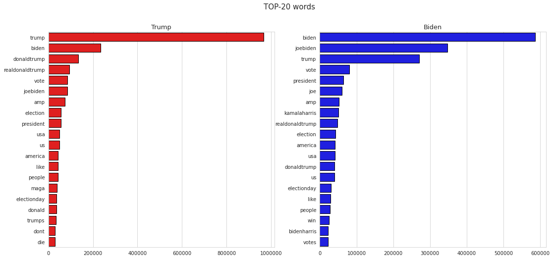
Figure 4: Retweeted of US Elections 2020 With Trump
Reference image: https://www.kaggle.com/radustoicescu/2020-united-states-presidential-election/notebooks and edited it form our program.
Figure 5: Retweeted of US Elections 2020 Without Trump
Reference image: https://www.kaggle.com/radustoicescu/2020-united-states-presidential-election/notebooks and edited it from our program.
9. Conclusion
So, we’ve taken a quick look at the sentiment of tweets. There are a lot of analysis variants. It looks great to study the tweets by each Twitter account and therefore don’t cover the actual situation since restriction to data. Based on the visualization analysis with predicted tweets from Twitter the predicted winner is projected. The sentiment analysis was performed only on data that had geo-data originating from the “United States of America” to try to ascertain the sentiment in each respective dataset and therefore each presidential candidate.
10. Acknowledgments
Would like to thank Dr. Gregor von Laszewski, Dr. Geoffrey Fox, and the associate instructors for providing continuous guidance and feedback for this final project.
11. References
-
Taken election dataset https://www.kaggle.com/kerneler/starter-2020-united-states-e6a4facf-a ↩︎
47 - Estimating Soil Moisture Content Using Weather Data
![]()
![]() Status: final, Type: Project
Status: final, Type: Project
Cody Harris, harrcody@iu.edu, fa20-523-305, Edit
Code: ml_pipeline.ipynb Data: data
Abstract
As the world is gripped with finding solutions to problems such as food and water shortages, the study of agriculture could improve where we stand with both of these problems. By integrating weather and sensor data, a model could be created to estimate soil moisture based on weather data that is easily accessible. While some farmers could afford to have many moisture sensors and monitor them, many would not have the funds or resources to keep track of the soil moisture long term. A solution would be to allow farmers to contract out a limited study of their land using sensors and then this model would be able to predict soil moistures from weather data. This collection of data, and predictions could be used on their own or as a part of a larger agricultural solution.
Contents
Keywords: agriculture, soil moisture, IoT, machine learning, regression, sklearn
1. Introduction
Maintaining correct soil moisture throughout the plant growing process can result in better yields, and less overall problems with the crop. Water deficiencies or surplus at various stages of growth have different effects, or even negligible effects 1. It is important to have an idea of how your land consumes and stores water, which could be very different based on the plants being used, and variation of elevation and geography.
For hundreds of years, farmers have done something similar to this model. The difference is the precision that we can gain by using real data. For the past few hundred years, farmers had to rely on mostly experience and touch to know the moisture of their soil. While many farmers were successful, in the sense that they produced crops, there were ways they could have better optimized their crops to produce better. The water available to the plants is not the only variable that effects yields, but this project seeks to create an accessible model to which farmers can have predicted values of soil moisture without needing to buy and deploy expensive sensors.
The model created could be used in various ways. The first main use is to be able to monitor what is currently happening in the soil so that changes can be made to correct the issue if there is one. Secondly, a farmer could evaluate historical data and compare it to yields or other results of the harvest and use this analytical information to inform future decisions. For example, a corn farmer might only care about the predicted conditions to make sure that they are within reasonable ranges. A grape farmer in a wine vineyard might use this data, along with other data, to predict the quality of wine or even the recipe of wine that would best used grapes farmed under these conditions. Again, this model is just the starting point of a theoretical complex agricultural data analysis suite.
This project specifically seeks to see the effect of weather on a particular piece of land in Washington state. This process could be done all over the world to obtain benchmarks. These benchmarks could be a cheap option for a farmer that does not have the funds to support a full study of water usage on their land to use as training data. Instead, they could look for a model that has land that has similar soil and or geographical features, and then use their own weather data to estimate their soil moisture content. A major goal of this project is to create the best tool that is cheap enough for widespread adoption.
2. Background
Understanding how weather impacts soil moisture is something that has been studied in various ways, all because it is a driving factor in crop success. Multiple studies have sought to apply a deterministic approach to calculating soil moisture based on observational weather data.
One such study, was motivated by trying to predict dust storms in China, in which soil moisture plays a large role in. This prediction used multiple-linear regression, and focused on predictions that dealt with the top 10 cm of soil. Two key takeaways can be derived from this work that are beneficial for carrying out this project.
- “The influence of precipitation on surface soil moisture content does not last more than 16 days.”
- “The compound effect of the ratio of precipitation to evaporation, which is nonlinearly summed, can be used to calculate the surface soil moisture content in China” 2.
Moving forward, this project will assume that precipitation from the prior 16 days is relevant. In the case that for the specific data being fit, less days are relevant, then their coefficients in the model will likely become small enough to not affect the model. Secondly, soil moisture is influenced by a ratio or precipitation to evaporation. While this project might not seek to evaluate this relationship directly, it will seek to include data that would influence these ratios such as temperature, time of year, and wind speeds.
Multiple publications have sought to come up with complete hydrological models to determine soil moisture from a variety of factors. These models are generally stochastic in nature and are reliable predictors when many parameters of the model are available. One such cited model requires a minimum or 19 variables or measured coefficients 3. The authors of another study note the aforementioned study, as well as other similar studies, and make a point that these methods might not be the best models when it comes to practical applications. Their solution was to create a generalize model that relied mostly on soil moisture as “a function of the time-weighted average of previous cumulative rainfall over a period” 4. Such a model is closer in terms to simplicity and generalization to what is hoped to be accomplished in this project.
The relationship between soil moisture and weather patterns is one with a rich history of study. Both of these measures affect each other in various ways. Most studies that sought to quantify this relationship were conducted at a time in which large scale sensor arrays could not have been implemented in the field. With the prevalence of IoT and improved sensing technologies, it seems as though there might not be a need to use predictive models for soil moisture, but instead just use sensor data. While this could be true in some applications, a wide array of challenges occur when trying to maintain these sensor arrays. Problems such as charging or replacing batteries, sensor and relay equipment not working if completely buried, but are in the way of farming if mounted above ground, sensors failing, etc. These were real challenges faced by the farm in which the soil moisture data was collected 5. The objective of this project is to create predictive models based on limited training data so that farmers would not need to deal with sensor arrays indefinitely.
3. Datasets
The first data set comes from NOAA and contains daily summary data in regards to various measurements such as temperature, precipitation, wind speed, etc. For this project, only data that came from the closest station to the field will be used 6. In this case, that is the Pullman station at the Pullman-Moscow airport. Below is an image showing the weather data collection location, and the red pin is at the longitude and latitude of one of the sensors in the field. This data is in csv format (see Figure 1).
Figure 1: Estimated distance from weather reports to the crop fields. Distance is calculated using Google Maps
The second dataset comes from the USDA. This dataset consists of “hourly and daily measurements of volumetric water content, soil temperature, and bulk electrical conductivity, collected at 42 monitoring locations and 5 depths (30, 60, 90, 120, and 150 cm)” at a farm in Washington state 7. Mainly, the daily temperature and water content are the measurements of interest. There are multiple files that have data that corresponds to what plants are being grown in specific places, and the makeup of the soil at each sensor cite. This auxilary information could be used in later models once the base model has been completed. This data is in tab delimited files.
Within the data, there are GIS file types that can be imported into Google Maps desktop to visualize the locations of the sensors and other geographical information. Below is an example of the sensor locations plotted on the satellite image (see Figure 2).
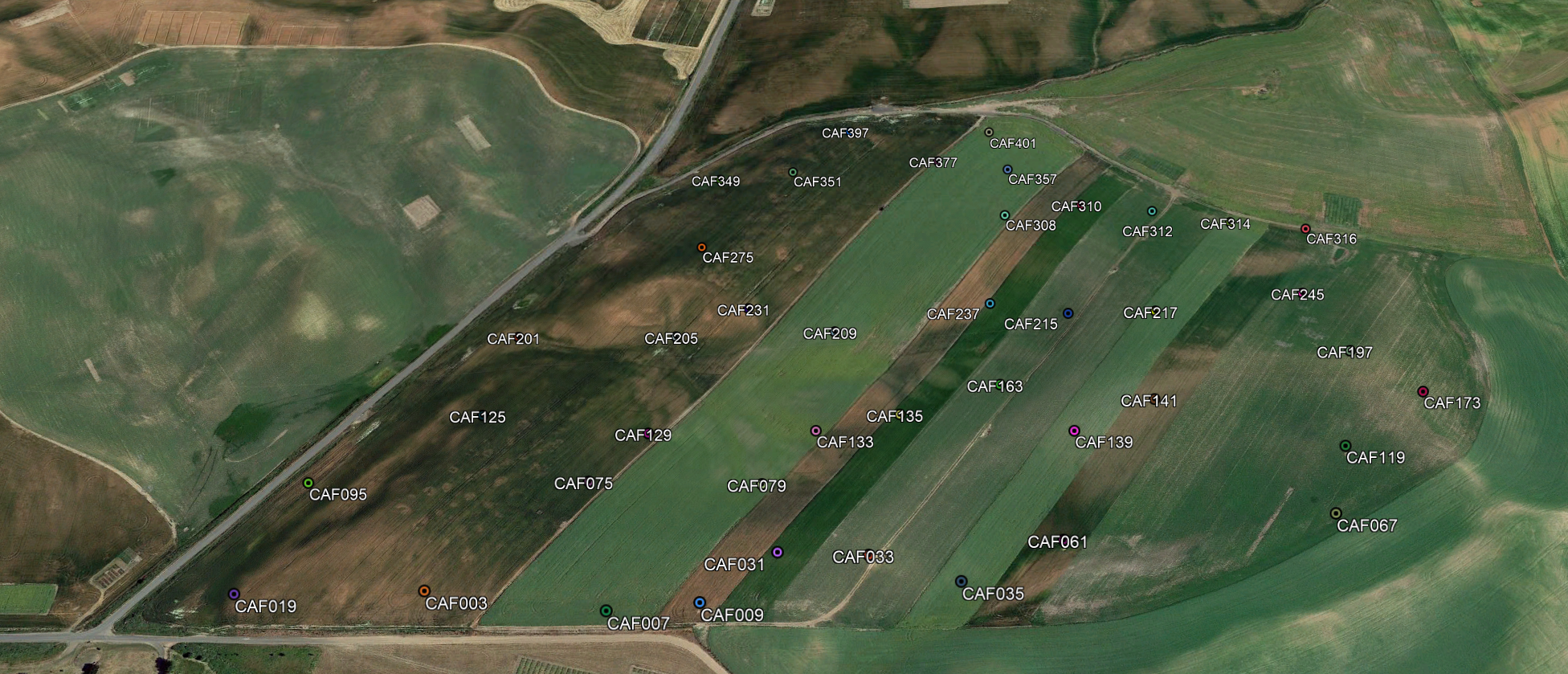
Figure 2: Location of sensors within the test field
4. Data Cleaning and Aggregation
The first step is to get the soil moisture data into a combined format, currently it is in one file per sensor, and there are 42 sensors. See the ml_pipeline.ipynb file to see how this was done, specifically the section titled “Data Processing”. After aggregation, some basic information can be checked about the data. For instance, there is quite a bit of NAs in the data. These NAs are just instances where there was no measurement on that day. There is about 45% NAs in the measurement columns. To further clean the data, any row that has only NAs for the measurements will be removed.
Next, the weather data needs some small adjustments. This is mostly in the form of removing columns that either are empty or have redundant data such as elevation, which is the same for every row.
Once the data is sufficiently clean, some choices have to be made on joining the data. The simplest route would be to join the weather measurements directly with the same day the soil measurement, however, the previous days weather is likely to also have an impact on the moisture. As evaluated in section 2 above, it is believed that the prior 16 days weather data is what is needed for a good prediction.
5. Pipeline for Preprocessing
Before feeding the data through a machine learning algorithm, the data needs to be manipulated in such a way that it is ready to be directly fed into an algorithm. This includes joining the two data sets, feature engineering, and other tasks that prepare the data. This will need to be done every time a new dataset is being used, so this must be built in a repeatable way. The machine learning library scikit-learn incorporates something called “pipelines” that can allow processed to be sequentially done to a dataframe. For purposes of this project two pipelines will be built, one will be used for feature engineering and joining the data, the other will be used to handle preparation of numerical, categorical, and date data. See sections: “Data Processing Pipeline” in ml_pipeline.ipynb.
5.1 Loading and Joining Data
This is the first step of the entire pipeline. This is where both the weather, and the soil moisture data are read in from csv files in their raw format. The soil moisture data is found in many different files, and these all need to be combined. After combining the files, any lines that are full of NAs for the measurements are dropped. Next the weather data is loaded in. Both files have a date field which is the field they will be joined on. To make things consistent, both of these fields need to set be date format.
When it comes to joining the data, each row should include the moisture content at various depths, as well as the weather information from the past ten days. While this creates a great deal of redundant data, the data is small enough that this is not an issue. Experiments will be done to evaluate just how many days of prior weather data are needed to form accurate results, while trying to minimize the number of the days.
5.2 Feature Engineering
Currently only two features are added, the first is a boolean flag that says whether it rained or not on a certain day. The thought behind this is, that for some days prior to the current measurement, the amount of rain might be needed, but for other days, such as 10 days prior, it might be more important to just know if there was rain or not. This feature is engineered within the pipeline.
The next feature is a categorical feature that is the month of the year. It isn’t very import to know the exact date of a measurement, but the month might be helpful in a model. This simplifies the model by not using date as a predictor, while still being able to capture this potentially important feature.
An excerpt of the code used to create these two features, this comes from ml_pipeline.ipynb.
soil['Month'] = pd.DatetimeIndex(soil['Date']).month

for i in range(17):
    col_name = 'PRCP_' + str(i)
    rain_y_n_name = 'RAIN_Y_N_' + str(i)
    X[rain_y_n_name] = np.nan
    X[rain_y_n_name].loc[X[col_name] > 0] = 1
    X[rain_y_n_name].loc[X[col_name] == 0] = 0
    X[rain_y_n_name] = X[rain_y_n_name].astype('object')
5.3 Generic Pipeline
After doing operations that are specific to the current dataset, some built in processors from sklearn are used to make sure the data can be used in a machine learning model. This means that for numerical data types, the pipeline will fill in missing values with 0 instead of leaving them as NaN. Also, the various numerical fields must be standardized, this is important for models such as linear regression so one large variable isn’t dominating the model.
As far as text and categorical features, the imputer will be used to fill in missing data as well. Then a process called one hot encoding will be used to handle the categorical variables so that they can be read into sklearns estimators. Lastly, these two main processes will be put together to make a single pipeline step. Then this pipeline step will be added to a regressor of some sort to create the entire process.
6. Multiple Models for Multiple Soil Depths
There are a few different approaches for modeling for this particular problem. The issue is that we have multiple things we would like to predict with the same predictors. It is unlikely that the model that predicts for a depth of 30 cm, would accurately predict for a depth of 150 cm. In order to adjust the models, a separate model will be created for each depth, with that said, the predictors are all the same for each depth, but the trained output is different. To accomplish this, five different datasets were constructed, each one representing a depth. All rows in which the predicted value is not available for that depth were pruned from the dataset.
In each experiment, there will be 5 different models created. Initially, these 5 models will use the same hyper-parameters for all the depths. It might turn out that all the models will need the same hyper-parameters, or each soil depth could be different. This will be examined through experimentation.
7. Splitting Data into Train and Test
In order to test any model created, there must be a split between test and training data. This is done by using a function in sklearn. In this case, there are about 76k rows in the data set. For the training data, 80% of the total data will be used, or about 60.8k records. The split is done after shuffling the rows so that it does not just pick the top 80% every time. Lastly the data is split using a stratified method. As we want to have models that take the specific area of the field into account, that means that we need to have the different areas of the field represented equally in both the training and testing dataset. This means that if 10% of the data came from sensor CAF0003, then roughly 10% of the training data will come from CAF0003 as well as 10% of the test data will be from this location.
8. Preliminary Analysis and EDA
Before building a machine learning model, it is important to get a general idea of how the data looks, to see if any insights can be made right away. The actual visualizations were built using a python package called Altair. This created the visualizations well, but the actual notebook that would contain these images was too large to include in their entirety.
The first two visualizations (viz_1, viz_2) are grids that show the entire distribution of measurements across each sensor. The first grid is the volume of water at 30 cm, and the second grid is the water volume at 150 cm. Each chart could be looked at and examined on it’s own, but what is most important to note is the variability of the measures from location to location. These different sensors are not that far away, but show that different areas of the farm do retain water in different ways. See Figure 3 for a small section of the grid from the visualization on the sensors at 30cm.
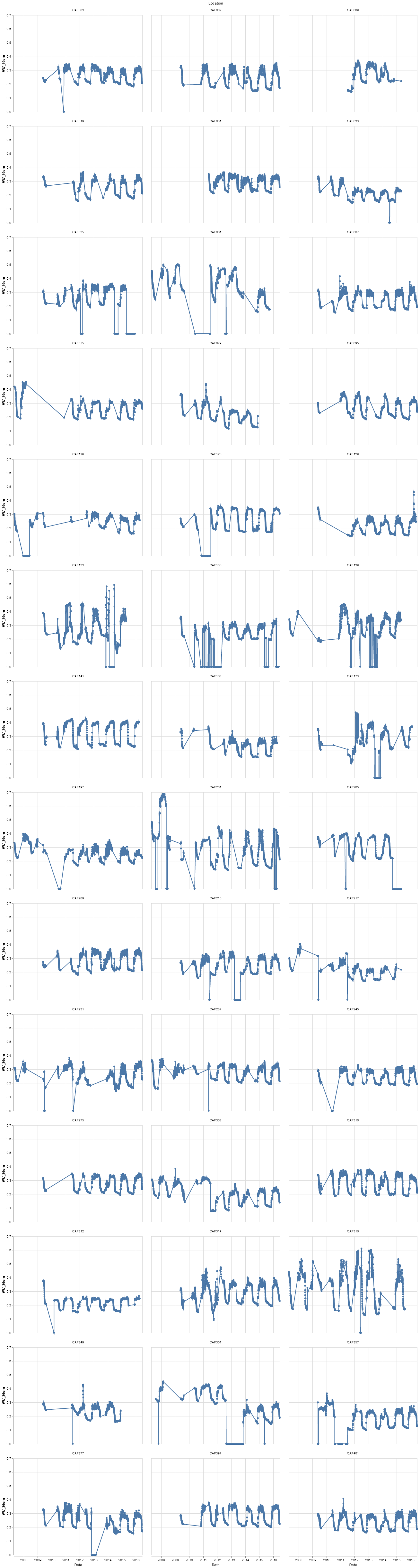
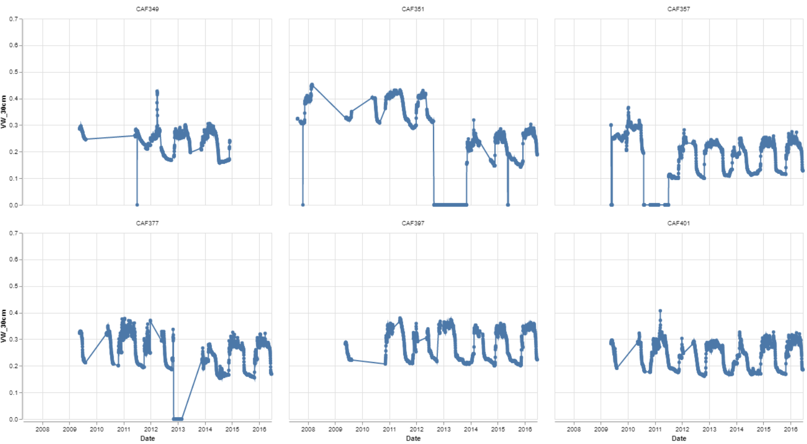
Figure 3: Six locations soil moisture level over time at 30 cm depth
The third and fourth grid shows the temperature at 150 cm, the results are what would logically be expected. The different sensors do not show much variance from location to location.
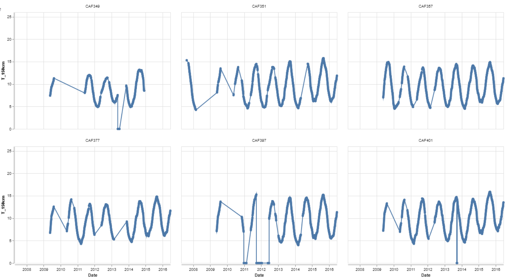
Figure 4: Six locations soil temperature over time at 150 cm depth
9. Initial Model Testing (Regressor)
Once the pipelines were setup, the first model could be tested for accuracy. As the output data is continuous in nature, the easiest machine learning algorithm to test to make sure everything is correct, was a linear regression model. It seems fairly likely that a linear regression model would do rather well with this data. The weather is the driving factor in soil moisture in a non-irrigated field, so this test is a litmus test to make sure that the data is good and provide a baseline measurement for future models. The experiment log below shows the returned values from the test that was run. Over the course of experimentation, a log such as this will be kept.
The results are as follows:
| Experiment | Depth | Fit_Time | Pred_Time | r2_score |
|---|---|---|---|---|
| First Linear Reg | 30cm | 2.029387 | 0.169824 | 9.16E-01 |
| First Linear Reg | 60cm | 2.002373 | 0.17377 | -1.42E+15 |
| First Linear Reg | 90cm | 2.080393 | 0.162992 | 9.49E-01 |
| First Linear Reg | 120cm | 2.299457 | 0.18056 | 9.46E-01 |
| First Linear Reg | 150cm | 2.573193 | 0.186042 | 9.43E-01 |
Figure 5: Baseline experiment results
These results show that the data is pretty well correlated and that there is reason to believe that we could predict soil moisture from weather alone. Although an r^2 of around 0.916-0.949 are pretty good, with such highly related predictors, there is definitely room for model improvement. Also for a depth of 60 cm, something is not predicting correctly and is resulting in a small negative r^2
10. Classifier vs. Regressor
While the output is continuous, there is an argument to use a categorical classifier model. For a specific plant, an optimal moisture range could be studied. For examples sake, the range could be 0.2-0.4 units. Then it would not matter if the soil is 0.2 or 0.3, both would be in the acceptable range. With this in mind, certain levels could be created to alert the farmer of which category they could be experiencing. For example there might be five levels: too dry, acceptable dryness, optimal, acceptable wetness, and too wet. The training data could be adjusted to fit into these categories.
Code to create a categorical variable for each of the depth measurements can be found in the section “Make Classifier Label” in the file: ml_pipeline.ipynb.
In the end, the decision to not use classifier methods was made. After using a regressor, the output could be converted to a categorical feature if the user or application so desired this. As our output is continuous in nature, precision would be lost.
11. Various Other Linear Regression Model Experiments
The next set of experiments came up with the results in the following table. This was a test to see if baseline Lasso or Ridge Regression would improve on the basic linear regression model. Results and code for this portion can be found in ml_pipeline.ipynb under the “Linear Regression Tests” section.
| Experiment | Depth | Fit_Time | Pred_Time | r2_score |
|---|---|---|---|---|
| Ridge Reg, Alpha = 1 | 30cm | 1.321553 | 0.173714 | 0.916211 |
| Ridge Reg, Alpha = 1 | 60cm | 1.29167 | 0.187392 | 0.942757 |
| Ridge Reg, Alpha = 1 | 90cm | 1.393526 | 0.197152 | 0.94879 |
| Ridge Reg, Alpha = 1 | 120cm | 1.307926 | 0.176656 | 0.946032 |
| Ridge Reg, Alpha = 1 | 150cm | 1.33738 | 0.179585 | 0.94332 |
| Lasso Reg, Alpha = 1 | 30cm | 1.45102 | 0.170752 | -0.00018 |
| Lasso Reg, Alpha = 1 | 60cm | 1.419546 | 0.174177 | -4.6E-05 |
| Lasso Reg, Alpha = 1 | 90cm | 1.4632 | 0.176657 | -5.7E-06 |
| Lasso Reg, Alpha = 1 | 120cm | 1.553091 | 0.182349 | -1.1E-06 |
| Lasso Reg, Alpha = 1 | 150cm | 1.437419 | 0.163967 | -0.00018 |
| Ridge Reg - GSCV | 30cm | 3.914718 | 0.203007 | 0.916235 |
| Ridge Reg - GSCV | 60cm | 3.726651 | 0.172752 | 0.942757 |
| Ridge Reg - GSCV | 90cm | 4.135154 | 0.200589 | 0.948796 |
| Ridge Reg - GSCV | 120cm | 4.03203 | 0.193512 | 0.946032 |
| Ridge Reg - GSCV | 150cm | 4.361977 | 0.191296 | 0.943328 |
Figure 6: Further Linear Regression Experiment Results
For the first two experiments, an alpha of 1 was used for both ridge and lasso regression. The third experiment used a special regressor that uses cross validation to try to find the best alpha value and then fit the model based on that. The best alpha value seemed to not have much effect at all on the results. Still the ridge regression so far was the best performing model.
12. Other Models
While there were great results in the different linear regression models, other models should be evaluated to make sure that something is not missed. Three models were chosen to check, Stochastic Gradient Descent, Support Vector Machine, and Random Forest. All of these models were tested with default parameters and their results are shown below in Figure 7, and the code can be found in the section called “Other Regressors Tests”.
| Experiment | Depth | Fit_Time | Pred_Time | r2_score |
|---|---|---|---|---|
| Random Forest | 30cm | 60.06952 | 0.250543 | 0.977118 |
| Random Forest | 60cm | 62.17435 | 0.216641 | 0.989113 |
| Random Forest | 90cm | 62.29475 | 0.243051 | 0.99158 |
| Random Forest | 120cm | 64.48227 | 0.256666 | 0.991274 |
| Random Forest | 150cm | 68.47001 | 0.240149 | 0.991748 |
| SVM | 30cm | 38.83822 | 5.712513 | 0.676934 |
| SVM | 60cm | 106.2816 | 7.897556 | 0.766008 |
| SVM | 90cm | 102.9438 | 7.763206 | 0.788833 |
| SVM | 120cm | 79.76476 | 6.985236 | 0.760895 |
| SVM | 150cm | 96.46352 | 7.548365 | 0.760936 |
| SGD | 30cm | 1.382992 | 0.171777 | 0.89019 |
| SGD | 60cm | 1.392753 | 0.15128 | 0.931394 |
| SGD | 90cm | 1.399587 | 0.142493 | 0.941092 |
| SGD | 120cm | 1.438626 | 0.150302 | 0.936692 |
| SGD | 150cm | 1.403488 | 0.14933 | 0.92957 |
Figure 7: Further Linear Regression Experiment Results
The random forest regressor performed amazingly in predicting the soil moisture. While the lower depths of soil did perform better than the depth of 30 cm. As random forests performed so well out of the box, some attempts were made to tune the hyperparameters, but most experiments turned out to be computationally expensive.
13. Conclusion
The end results of all experimentation was a process in which two datasets could be joined and fed into a model to predict the soil moisture with great accuracy, an r^2 score of between 0.977 and 0.991 depending on the depth using a Random Forest Regressor with default settings. This process could be a repeatable process in which a farmer contracts a company to gather training data on their land specifically for a growing season. As the collection of the sensor data could be cumbersome and expensive to deal with as a farmer, so this is an alternative that is cheaper and still gives nearly the same results as having sensors constantly running. Alternatively, this process could be a subprocess in a larger suite of software that farmers could use for predictive analysis or even to have data on soil moisture from a grow season to use in post season analysis of their crop produced. As long as large scale AI programs are still expensive and cumbersome for farmers to deal with, there will be a low rate of adoption. This project has shown that a solution for large scale soil moisture prediction software could be done with relatively low computational cost.
14. Acknowledgements
The author would like to thank Dr. Gregor Von Laszewski, Dr. Geoffrey Fox, and the associate instructors in the FA20-BL-ENGR-E534-11530: Big Data Applications course (offered in the Fall 2020 semester at Indiana University, Bloomington) for their continued assistance and suggestions with regard to exploring this idea and also for their aid with preparing the various drafts of this article.
15. References
-
O. Denmead and R. Shaw, “The Effects of Soil Moisture Stress at Different Stages of Growth on the Development and Yield of Corn 1”, Agronomy Journal, vol. 52, no. 5, pp. 272-274, 1960. Available: 10.2134/agronj1960.00021962005200050010x. ↩︎
-
K. Shang, S. Wang, Y. Ma, Z. Zhou, J. Wang, H. Liu and Y. Wang, “A scheme for calculating soil moisture content by using routine weather data”, Atmospheric Chemistry and Physics, vol. 7, no. 19, pp. 5197-5206, 2007 [Online]. Available: https://hal.archives-ouvertes.fr/hal-00302825/document ↩︎
-
W. Capehart and T. Carlson, “Estimating near-surface soil moisture availability using a meteorologically driven soil-water profile model”, Journal of Hydrology, vol. 160, no. 1-4, pp. 1-20, 1994 [Online]. Available: https://tinyurl.com/yxjyuy5x ↩︎
-
F. Pan, C. Peters-Lidard and M. Sale, “An analytical method for predicting surface soil moisture from rainfall observations”, Water Resources Research, vol. 39, no. 11, 2003 [Online]. Available: https://agupubs.onlinelibrary.wiley.com/doi/pdf/10.1029/2003WR002142. [Accessed: 08- Nov- 2020] ↩︎
-
C. Gasch, D. Brown, C. Campbell, D. Cobos, E. Brooks, M. Chahal and M. Poggio, “A Field-Scale Sensor Network Data Set for Monitoring and Modeling the Spatial and Temporal Variation of Soil Water Content in a Dryland Agricultural Field”, Water Resources Research, vol. 53, no. 12, pp. 10878-10887, 2017 [Online]. Available: https://agupubs.onlinelibrary.wiley.com/doi/full/10.1002/2017WR021307. [Accessed: 08- Nov- 2020] ↩︎
-
N. (NCEI), “Climate Data Online (CDO) - The National Climatic Data Center’s (NCDC) Climate Data Online (CDO) provides free access to NCDC’s archive of historical weather and climate data in addition to station history information. | National Climatic Data Center (NCDC)”, Ncdc.noaa.gov, 2020. [Online]. Available: https://www.ncdc.noaa.gov/cdo-web/. [Accessed: 19- Oct- 2020]. ↩︎
-
“Data from: A field-scale sensor network data set for monitoring and modeling the spatial and temporal variation of soil moisture in a dryland agricultural field”, USDA: Ag Data Commons, 2020. [Online]. Available: https://data.nal.usda.gov/dataset/data-field-scale-sensor-network-data-set-monitoring-and-modeling-spatial-and-temporal-variation-soil-moisture-dryland-agricultural-field. [Accessed: 19- Oct- 2020]. ↩︎
48 - Big Data in Sports Game Predictions and How It is Used in Sports Gambling
![]()
![]() Status: final, Type: Report
Status: final, Type: Report
Mansukh Kandhari, fa20-523-331, Edit
Abstract
Big data in sports is being used more and more as technology advances and this has a very big impact, especially when it comes to sports gambling. Sports gambling has been around for a while and it is gaining popularity with it being legalized in more places across the world. It is a very lucrative industry and the bookmakers use everything they can to make sure the overall odds are in their favor so they can reduce the risk of paying out to the betters and ensure a steady return. Sports statistics and data is more important than ever for bookmakers to come up with the odds they put out to the public. Odds are no longer just determined by expert analyzers for a specific sport. The compilation of odds uses a lot of historical data about team and player performance and looks at the most intricate details in order to ensure accuracy. Bookmakers spend a lot of money to employ the best statisticians and the best algorithms. There are also many companies that solely focus on sports data analysis, who often work with bookmakers around the world. On the other hand, big data for sports game analysis is also used by gamblers to gain a competitive edge. Many different algorithms have been created by researchers and gamblers to try to beat the bookmakers, some more successful than others. Oftentimes these not only involve examining sports data, but also analysing data from different bookmakers odds in order to determine the best bets to place. Overall, big data is very important in this field and this research paper aims to show the various techniques that are used by different stakeholders.
Contents
Keywords: sports, sportsbook, betting, gambling, data analysis, machine learning, punter(British word for gambler)
1. Introduction
Big Data in sports has been used for years by various stakeholders in this industry to do everything from predicting game outcomes to injury prevention. It is also becoming very prevalent in the area of sports gambling. Ever since the Supreme court decision in Murphy v. National Collegiate Athletic Association that overturned a ban on sports betting, the majority of states in the US have passed legislation to allow sports gambling 1. In 2019, the global sports betting market was valued at 85.047 US Dollars so this is an already very big industry that is expanding 2. There are various platforms that allow betting in this industry including tangible sports books, casinos, racetracks, and many online and mobile gambling apps. The interesting thing about big data in sports betting is that it is being used on both sides in this market. It is used by bookmakers to create game models and come up with different spreads and odds, but big data analysis is also being used by gamblers to gain a competetive advantage and place more accurate bets. Various prediction models using machine learning and big data analytics have been created and they can sometimes be very accurate. For example, Google correctly predicted 14 out of the 16 matches in the 2014 world cup and Microsoft did even better by correctly predicting 15 out of the 16 matches during that year 3. Many big companies have spent a lot of time gathering lots of data and creating prediction algorithms, inlcuding ESPN’s Football Power index that gives the probility of one team beating another, Analytics Powerhouse 538 that determines scores of games using their ELO method, and Accuscore which runs Mone Carlo Simulations on worldwide sporting events 4. Bookmakers use all their possible tools and algorithms to put out the best odds that will give them a return. They often employ teams of statisticians that use the most advanced prediction models and information from data analysis companies to come up with their odds. If sports data analysis is vastly being used by people other than bookies and prediction models can often be very accurate, one might wonder how people haven’t made millions off sports betting and how bookmakers are still in business? This report analyzes how big data analytics are used by bookmakers to come up with the odds they put out for games while also examining how it is used on the gamblers side. It aims to analysize various prediction models created by sports betters, researchers, and AI companies, and see how they compare to the way big data is used by bookmakers. Besides giving an analysis of how big data is used in this field, it will show if betting guided by prediction models can give a consistent return.
2. Background
Many people with an interest in sports betting prediction have created models, some that involve machine learning and AI. A few of these projects have had some very interesting results using different types of data and analysis techniques. Jordan Bailey created an NBA prediction model based on the over under bets 5. For context, bookmakers will set a point total for a game and bettors can bet on whether the actual score will be over or under the point total set by the book. This type of betting is offered for many types of sports. Using NBA box scores for 5 previous seasons and data on historical betting lines created by various bookmakers, Bailey created a logistical regression model that would return a prediction on if the score was over or under a point total set by a bookmaker. Two models were created, one that predicted if a game would be over a set line and one that predicted if it would be under a set line. The datasets for these models were structured in a way where each specific game was represented as the box scores for the 3 previous games for each team, so 6 previous games 5. When creating the model, the first four seasons were used as the training set and the fifth season was used as the testing data to make predictions on 6. In order to determine the significance of results, Bailey set up a “confidence threshold” of 62 percent for the probability his model returned on a game being over or under. The prediction was “confident” if the probability of the prediction was above the set threshold. When testing the models, the over model predicted 88 games confidently and 52 games correctly, with an accuracy of 59.09 percent. The under model predicted 96 games confidently and correctly predicted 52 games with an accuracy of 54.16 percent 5. To simulate how the model would perform on betting with 10,000 dollars, a bet was made every time the model predicted a confident bet for the 2018 NBA season. The accuracy on the bets were 52.52 percent and the total after the simulation was 11,880 dollars.
3. How bookmakes Determine odds
It is no secret that bookmakers use a lot of data and apply various statistical techniques to come up with betting odds. The statistical techniques used and the data that bookmakers look at vary from sport to sport, for example, a popular method for modeling soccer uses the Poisson distribution since it can be very accurate but also because it makes it easy to add time decay to the inputs 7. Big data and data accuracy plays such a big part for bookmakers that many companies in the sports betting market have multi million dollar contracts with big leagues like the NFL 8. The NBA also recently extended their contracts with Sportradar and Genius Sports group that will have the rights to distribute official NBA data to licenced sports betting operators in the United States 9. Companies like Sportradar collect and analyze official data and provide services to various bookmakers. The accuracy of data can be very important, a difference of something as little as one yard can make such a big difference; therefore, the industry values the accuracy of data that the leagues itself can provide. Bookmakers employ various mathematicians to analyze historical sports data to come up with odds; however, sports data isn’t the only thing that bookmakers look at when determining how they will make odds for a game. At the end of the day, the gambling industry is a numbers game that thrives on ensuring the probability is in the houses favor. Bookmakers use various techniques involving big data and factors such as public opinion to do so.
Big data is being used more and more in various industries, and in the gambling industry, it isn’t just used to come up with odds. One major way it is used is by gathering data about user demographics 10. When using an online sportsbook, the casino can gather data about a users age, location, gender, excetera which can provide valuable insights that can be used for product development and marketing purposes. By using user demographic data to provide targeted advertising, casinos and bookmakers can attract more betters which will increase revenue. As said by former odds compiler Matthew Trenhaile, “Their [bookmakers] product is entertainment and not the selling of an intellectual contest between punter and bookmaker. It is foolish to think this has ever been the product that bookmakers have sold.They sell an adrenaline rush and anyone who thinks great characters pitting themselves against the punters and taking anyone on in horse racing betting rings is what betting used to be about is kidding himself or herself.” Due to the probability of making money in sports betting, and really every type of gambling, being in the houses favor, online casinos and sportsbooks use big data to increase the number of bets placed by customers; nevertheless, using models to come up with odds is the heart of this industry which makes it the most important way big data analytics is used by bookmakers.
When odds are being made for a sports book, a lot of things are taken into consideration in the process. Bookmakers have teams of statisticians that analyze historical data of the teams in order to come up with game prediction models, often using machine learning based algorithms11. When bookmakers are actually making the odds, these statistical models created from large amounts of data aren’t the only thing they use. When bookmakers are creating odds, their goal isn’t to come up with an accurate game prediction, it is to have the lowest probability of paying out, so they will add a margin in order to statistically ensure a profit regardless of the outcome. Some times public opinion is used by bookmakers to sway their odds. For example, if a team has been on an unexpected winning streak, the bookmakers will often overestimate their odds, even against a team that will statistically do better than them, since people will be more inclined to take that bet resulting in the bookmaker reducing their probability of paying out 12. Furthermore, bookmakers will often “hedge” bets to cover potential losses if an unexpected outcome occurs. For example, if a large amount of people are betting on a team regardless of the odds, the bookmakers will have a large payout if that outcome occurs, so they will start offering more favorable odds on the opposite outcome so they can bring in bets that would cover their losses 11. At the end of the day, when bookmakers set out their odds they will always make sure they are statistically in their favor. Even though bookmakers heavily analyze sports data in order to come up with prediction models, the odds put out don’t exactly reflect the true probability of a game outcome. Game prediction models is used to come up with the most probable event occurring but bookmakers add a margin that is skews the actual probability in order to statistically ensure a profit 13. An example of a coin toss can show how these margins work 13. If one were to bet on a coin toss, there is a 50 percent change of heads winning and a 50 percent change of tails winning so that means neither side is favored and the market of this bet is 100 percent. As a bookmaker is trying to ensure a profit, they will add a margin to the actual game winning probability in order to mitigate risk and ensure that the odds are in their favor. The margins that the bookmakers put on the actual probability is determined by many factors such as public opinion and perception of a team 14. Gamblers are actually able to calculate the margins that the bookmakers put on a bet using a relatively simple formula. This formula varies for the type of sports the gambler is trying to calculate the odds for. In a two way market such as tennis or basketball, a person can figure out the bookmakers margin using the decimal odds places for both sides 13. This formula is 100(1/decimal odds) + 1000(1/other decimal odds). The amount the market percentage is over 100 is the margin the bookmaker has on the better; therefore, the margin percentage the bookmaker has over the gambler can be determined by subtracting 100 from that formula.
5. Poisson Model
One of the most popular models for soccer game predictions is the Poisson distribution model. According to former odds compiler Matthew Trenhaile, the Poisson distribution model for soccer prediction can be very accurate and is very useful since it is easy to add time decay to the inputs 7. Refinements can easily be made as a game progresses and goal input changes to easily re calculate the odds, which is useful for bookmakers. The Poisson distribution for soccer game predictions is not only used on a large scale by bookmakers to calculate odds, but it is also often used by even small time bettors to determine how they will bet. A Poisson model for soccer games can even be created on Excel for betters who want to place their bets more accurately. This process works by using historical data of how many goals a team scored and how many goals they let in and comparing it to a leagues average in order to determine the number of goals each team is likely to score in a game. It starts with calculating the average number of goals scored for home games and away games for the whole league and determining a team’s “attack strength” and “defense strength” 15. The attack strength is a team’s average number of goals per game divided by the league average of goals per game. Similarly, a teams defense strength is determined by dividing a teams average number of goals conceded by the leagues average number of goals conceded. The goal expectancy for the home team is calculated by multiplying the team’s attack strength with the away team’s defense strength and the league’s average number of home goals. The goal expectancy for the away team is calculated by multiplying the away teams attack strength with the home teams defense strength and multiplying it by the leagues average number of away goals 15. With this information, one can determine the probability for the range of goal outcomes on both sides using a formula created by the French mathematician Simeon Denis Poisson. The Poisson distribution indicates the probability of a given number of events occurring over a fixed interval, so it can be used to determine the probability of the number of goals scored in a soccer game. The formula for this for soccer prediction is P(x events in interval) = (e-μ) (μx) / x! . This formula determines the probability of the number of goals being scored (x) using Euler’s number (e) and the goal expectancy (μ). With this formula, we can see the probability each team has for scoring a number of goals in a game. Usually the distribution is done for 0-5 goals to see the percentages of each team scoring on the goal interval. This can be used by bookmakers to determine odds and by gamblers to make well educated bets.
6. Algorithms and prediction models
Gamblers often use various models, driven by big data, in order to help them place more accurate bets. Many different models have been created in the sports field that use factors such as historical sports data in order to come up with game prediction models. A lot of people who have come up with good prediction models will not share how they work and sometimes offer a subscription service where eager gamblers can pay to receive game picks. When it comes to making the best sports betting algorithms, it isn’t just about the amount of data a person can acquire. Creating algorithms that predict well takes understanding the sport and the meaning behind each type of data. In regards to creating sports prediction algorithms and the data that goes behind it, Micheal Beuoy, an actuary and popular sports data analyst said, “I think it takes discipline combined with a solid understanding of the sport you’re trying to analyze. If you don’t understand the context behind your numbers, no amount of advanced analysis and complicated algorithms is going to help you make sense of them. You need discipline because it is very easy to lock in on a particular theory and only pay attention to the data points that confirm that theory. A good practice is to always set aside a portion of your data before you start analysing. Once you’ve built what you think is your “best” model or theory, you can then test it against this alternative dataset.” Creating sports prediction algorithms requires a lot of different types of analysis and the methods that yield the best results are always changing.
Creating good models requires understanding the sport well and using specific types of data in the algorithms. A creator of an NBA game prediction algorithm who runs a website called Fast Break Bets, which sells a game prediction service, primarily uses NBA game statistics known as efficiency metrics to come up with his model 16. As the creator of the algorithm is profiting off eager gamblers, the exacts of how it works have not been released but the creator explains the type of data he uses to make his algorithm work. The NBA is a game of efficiency since there is a shot clock and possessions are changed very quickly, so the score total of games can greatly vary by how fast or slow paced a team is. The creator of this algorithm uses an offensive and defensive rating that measures how many points a team scores and allows per 100 possessions, since 100 possessions is close to the NBA average of possessions per game 16. The algorithm also uses effective field goal percentage, turnover rate, and rebounding rate with offensive and defensive rating to optimize the efficiency metrics. Another major factor that this creator uses in the algorithm is the NBA season schedule and how often a team plays games in a time span 16. This is due to the fact that players get fatigued playing games close to each other and coaches will therefore limit the amount of time some of the players will be on the court in order to give them a rest. This is important since player statistics can greatly vary from person to person on a team. Using this information of efficiency metrics, player performance, and the frequency of games played, the creator was able to create a prediction model that works well enough for people to pay for his game picks.
In research done by Manuel Silvero, he studied 5 famous algorithms that used Neural Network and Machine learning and concluded that their accuracy varies from 50-70 percent, depending on the sport 17. Purucker in 1996 was one of the first computational sports prediction model and used an Artificial Neural Network with backward propagation 18. It was 61 percent accurate. In 2003, Khan expanded Puruckers work and was more acurate. Data on 208 matches was collected and the elements used were total yardage differential, rushing yardage differential, turnover differential, away team indicator and home team indicator 18. The first 192 matches of the season were used as the training data set for the model. When tested on the remaining games of the season, the models predicted at a 75 percent accuracy. This was compared to predictions created by 8 ESPN sportscasters for the same games and they only predicted 63 percent of those matches correctly.
One of the most accurate models created, in terms of receiving a good return on a bet, was created by Lisandro Kaunitz of the University of Tokyo, and relied on data from odds that bookmakers put out rather than historical game data 12. When it comes to statistical models for sports, big data from historical sports games are often analyzed in order to come up with game predictions and to gain insight on things like team, player, and position performance. In the market of sports betting, these models are used to come up with odds and also by bettors to place bets. Gamblers have came up with different game prediction models in order to beat the books, mainly comprising of historical sports data while sometimes also using historical betting data 12. Kaunitz created a model that mainly focused on analysing data of the odds created by bookmakers, rather than sports team data, to predict good bets to place. The basis of his model relied on a technique bookmakers use to reduce their payout risk, known as hedging. This concept and the way bookmakers use it to reduce their risk of payout is covered in section 3. Kaunitz betting model worked by gathering the odds for a game created by various bookmakers and determining the average odds available. Using statistical analysis of odds offered, Kaunitz was able to determine any outliers from the average odds for a game 12. Using these outliers, Kaunitz could determine if a bet would favor them or not. After various simulations and models, Kaunitz’s and his team took their strategy into the real world, and their bets payed out 47.2 percent of the time. They received an 8.5 percent return and profited $957.50 in 265 bets 12. Due to their impressive returns, bookmakers caught on and started to limit the amount that they could bet
7. Conclusion
Overall, big data plays a very important role in the sports betting industry and it is used by various stakeholders. Bookmakers use it to come up with odds and gamblers use it for a competitive advantage. Although data analysis is very important on both ends, this research shows that it is very hard to receive a consistent return as a gambler. From 1989 to 2000 for NFl betting, the bookmakers favorite won 66.7 percent of the time and from 2001 and 2012, the bookmakers favorite won 66.9 percent of the time 19. Even though technology has advanced and people use the most sophisticated algorithms to come up with prediction models, the bookmaker seems to have the advantage. This is due to the fact that bookmakers spend tons of money gathering the most accurate data and employ some of the best statisticians and sports analysing firms, but also due to the way they hedge bets and use public opinion to modify odds in order prevent potential losses. Bookmakers adjust for a margin when they are compiling their odds, because just like everything in the gambling industry, the probability is set up so that the house will always win in the long run. Gamblers have created various algorithms in order to make the most educated sports bet. These use historical team data but sometimes also use data from betting odds. Some of the best betting algorithms work by analyzing bookmakers' odds and determining where the odds are significantly different from the expected outcome of the game. As seen with Lisandro Kaunitz from the University of Tokyo, when bookmakers see that gamblers are beating the system they can start to limit a person’s bets. Overall, big data plays a huge role in the sports gambling industry. Even though what happens on the field or the court is often based on chance, there are significant trends that can be seen when statistically analyzing sports data. At the end of the day, big data plays a big role in this industry for bookmakers and gamblers alike.
8. References
-
INSIGHT: Sports Betting in States Races on a Year After SCOTUS Overturns Ban," Bloomberg Law, 04-Jun-2019. [Online]. Available: https://news.bloomberglaw.com/us-law-week/insight-sports-betting-in-states-races-on-a-year-after-scotus-overturns-ban. ↩︎
-
Research and Markets, “Global Sports Betting Market Worth $85 Billion in 2019 - Industry Assessment and Forecasts Throughout 2020-2025,” GlobeNewswire News Room, 31-Aug-2020. [Online]. Available: https://www.globenewswire.com/news-release/2020/08/31/2086041/0/en/Global-Sports-Betting-Market-Worth-85-Billion-in-2019-Industry-Assessment-and-Forecasts-Throughout-2020-2025.html. ↩︎
-
R. Delgado, “How Big Data is Changing the Gambling World: Articles: Chief Data Officer,” Articles | Chief Data Officer | Innovation Enterprise, 01-Sep-2016. [Online]. Available: https://channels.theinnovationenterprise.com/articles/how-big-data-is-changing-the-gambling-world. [Accessed: 29-Nov-2020]. ↩︎
-
J. Zalcman, “HOW TO CREATE A SPORTS BETTING ALGORITHM,” Oddsfactory, 16-Nov-2020. [Online]. Available: https://theoddsfactory.com/how-to-create-a-sports-betting-algorithm/. [Accessed: 2020]. ↩︎
-
J. Bailey, “Applying Data Science to Sports Betting,” Medium, 18-Sep-2018. [Online]. Available: https://medium.com/@jxbailey23/applying-data-science-to-sports-betting-1856ac0b2cab. [Accessed: 2020]. ↩︎
-
J. Bailey, “Jordan-Bailey/DSI_Capstone_Project,” DSI_Capstone_Project, 14-Sep-2018. [Online]. Available: https://github.com/Jordan-Bailey/DSI_Capstone_Project/blob/master/Technical_Report.md. [Accessed: 01-Dec-2020]. ↩︎
-
M. Trenhaile, “How Bookmakers Create their Odds, from a Former Odds Compiler,” Medium, 29-Jun-2017. [Online]. Available: https://medium.com/@TrademateSports/how-bookmakers-create-their-odds-from-a-former-odds-compiler-5b36b4937439. [Accessed: Nov-2020]. ↩︎
-
K. J. Brooks, “The new game in town for pro sports leagues: Selling stats,” CBS News, 09-Jan-2020. [Online]. Available: https://www.cbsnews.com/news/nba-nfl-sports-nascar-leagues-selling-stats-to-gambling-companies/. [Accessed: 2020]. ↩︎
-
C. Murphy, “NBA extends data partnerships with Sportradar and Genius Sports Group,” SBC Americas, 29-Oct-2020. [Online]. Available: https://sbcamericas.com/2020/10/29/nba-extends-data-partnerships-with-sportradar-and-genius-sports-group/. [Accessed: 2020]. ↩︎
-
“How Big Data Analytics Are Transforming the Global Gambling Industry,” Analytics Insight, 17-Jan-2020. [Online]. Available: https://www.analyticsinsight.net/how-big-data-analytics-are-transforming-the-global-gambling-industry/. [Accessed: Oct-2020]. ↩︎
-
arXiv, “The Secret Betting Strategy That Beats Online Bookmakers,” MIT Technology Review, 19-Oct-2017. [Online]. Available: https://www.technologyreview.com/2017/10/19/67760/the-secret-betting-strategy-that-beats-online-bookmakers/. [Accessed: 2020]. ↩︎
-
A. Dörr, “How to apply predictive analytics to Premiership football to beat the bookies,” Dataconomy, 19-Mar-2019. [Online]. Available: https://dataconomy.com/2019/03/how-to-apply-predictive-analytics-to-premiership-football-to-beat-the-bookies%EF%BB%BF/. [Accessed: 2020]. ↩︎
-
S. Hubbard, “Betting Margins Explained: How to Calculate Sports Margins,” BettingLounge, 24-Sep-2020. [Online]. Available: https://bettinglounge.co.uk/guides/sports-betting-explained/betting-margins/. [Accessed: 2020]. ↩︎
-
“Sportsbook Profit Margins,” Sports Insights, 18-Sep-2015. [Online]. Available: https://www.sportsinsights.com/betting-tools/sportsbook-profit-margins/. [Accessed: 2020]. ↩︎
-
B. Cronin, “Poisson Distribution: Predict the score in soccer betting,” Pinnacle, 27-Apr-2017. [Online]. Available: https://www.pinnacle.com/en/betting-articles/Soccer/how-to-calculate-poisson-distribution/MD62MLXUMKMXZ6A8. [Accessed: 2020]. ↩︎
-
Stephen, “NBA Betting Model Explained: Sports Betting Picks, Tips, and Blog,” FAST BREAK BETS, 11-Nov-2017. [Online]. Available: https://www.fastbreakbets.com/nba-picks/nba-betting-model-explained/. [Accessed: 05-Dec-2020]. ↩︎
-
M. Silverio, “My findings on using machine learning for sports betting: Do bookmakers always win?,” Medium, 26-Aug-2020. [Online]. Available: https://towardsdatascience.com/my-findings-on-using-machine-learning-for-sports-betting-do-bookmakers-always-win-6bc8684baa8c. [Accessed: 2020]. ↩︎
-
R. P. Bunker and F. Thabtah, “A machine learning framework for sport result prediction,” Applied Computing and Informatics, 19-Sep-2017. [Online]. Available: https://www.sciencedirect.com/science/article/pii/S2210832717301485. [Accessed: 2020]. ↩︎
-
M. Beouy, “BGO - The Casino of the Future,” bgo Online Casino. [Online]. Available: <https://www.bgo.com/casino-of-the-future/the-future-of-sports-betting/. [Accessed: 05-Dec-2020]>. ↩︎
49 - Analyzing LSTM Performance on Predicting the Stock Market for Multiple Time Steps
![]()
![]() Status: final Type: Project
Status: final Type: Project
Fauzan Isnaini, fa20-523-313, Edit
Abstract
Predicting the stock market has been an attractive field of research for a long time because it promises big wealth for anyone who can find the secret. For a long time, traders around the world have been relying on fundamental analysis and technical analysis to predict the market. Now with the advancement of big data, some financial institutions are beginning to predict the market by creating a model of the market using machine learning. While some researches produce promising results, most of them are directed at predicting the next day’s market behavior. In this study, we created an LSTM model to predict the market for multiple time frames. We then analyzed the performance of the model for some different time periods. From our observations, LSTM is good at predicting 30 time steps ahead, but the RMSE became larger as the time frame gets longer.
Contents
Keywords: stock, market, predictive analytics, LSTM, random forest, regression, technical analysis
1. Introduction
Stock market prediction is a fascinating field of study for many analysts and researchers becauseof the significant amount of money circulating in the market. While there are numerous studies conducted in this field, predicting the stock market remains a challenging task, because of its noisy and non-stationary nature 1. The stock market is “noisy” because it is sensitive to mass psychology. The trends and patterns in the stock market can also change abruptly because of bad news, natural disasters, and some unforeseen circumstances, thus it is considered non-stationary.
The efficient market hypothesis even suggests that predicting or forecasting the financial market is unrealistic because price changes in the real world are unpredictable. All the changes in prices of the financial market are based on immediate economic events or news. Investors are profit-oriented, their buying or selling decisions are made according to the most recent events regardless of past analysis or plans. The argument about this Efficient Market Hypothesis has never been ended. So far, there is no strong proof that can verify if the efficient market hypothesis is proper or not 2.
However, as Mostafa 3 claims, financial markets are predictable to a certain extent. The past experience of many price changes over a certain period of time in the financial market and the undiscounted serial correlations among vital economic events affecting the future financial market are two main pieces of evidence opposing the Efficient Market Hypothesis.
The most popular methods in predicting the stock markets are technical and fundamental analysis. Fundamental analysis is mainly based on three essential aspects 4: (i) macroeconomic analysis such as Gross Domestic Products and Consumer Price Index (CPI) which analyses the effect of the macroeconomic environment on the future profit of a company, (ii) industry analysis which estimates the value of the company based on industry status and prospect, and (iii) company analysis which analyses the current operation and financial status of a company to evaluate its internal value.
On the other hand, technical analysis is grouped into eight domains 4: sentiment, flow-of-funds, raw data, trend, momentum, volume, cycle, and volatility. Sentiment represents the behaviors of various market participants. Flow-of-funds is a type of indicator used to investigate the financial status of various investors to pre-evaluate their strength in terms of buying and selling stocks, then, corresponding strategies, such as short squeeze can be adopted. Raw data include stock price series and price patterns such as K-line diagrams and bar charts. Trend and momentum are examples of price-based indicators, trend is used for tracing the stock price trends while momentum is used to evaluate the velocity of the price change and judge whether a trend reversal in stock price is about to occur. Volume is an indicator that reflects the enthusiasm of both buyers and sellers for investing, it is also a basis for predicting stock price movements. The cycle is based on the theory that stock prices vary periodically in the form of a long cycle of more than 10 years containing short cycles of a few days or weeks. Finally, volatility is often used to investigate the fluctuation range of stock prices and to evaluate risk and identify the level of support and resistance.
While those two are still the most popular approaches, the age of big data has brought a new method to predict the stock market: quantitative analysis. In this new method, the stock market is captured into a mathematical model, and machine learning is used to predict its behavior. Research by Alzazah and Cheng 2 analyzed more than 50 articles to compare various machine learning (ML) and deep learning (DL) methods used to find which method could be more effective in prediction and for which types and amount of data. This research has proven that quantitative analysis with LSTM gives a promising result as the predictor of a stock market.
In this study, we analyzed the performance of LSTM in predicting the stock market for multiple time frames. LSTM model is used because it is designed to forecast, predict, and classify time series data 2. Despite the promising result in LSTM, most of the previous studies are conducted in building a model to predict the next day’s price. Thus, we wanted to know how accurate the LSTM model in predicting the stock market for a longer time frame (i.e. from daily to monthly time frame). We also chose to incorporate technical analysis rather than fundamental analysis in our model, because while fundamental analysis tends to be accurate in the yearly period, it could not predict the fluctuation in the given time frame.
2. Background Research and Previous Work
2.1 MACD in Technical Analysis
MACD 5 is an acronym for moving average convergence/divergence. It is a widely used technical indicator to confirm either the bullish or bearish phase of the market. In essence, the MACD indicator shows the perceived strength of a downward or upward movement in price. Technically, it’s an oscillator, which is a term used for indicators that fluctuate between two extreme values, for example, from 0 to 100. MACD evolved from the exponential moving average (EMA), which was proposed by Gerald Appel in the 1970s. The standard MACD is the 12-day EMA subtracted by the 26-day EMA, which is also called the DIF. The MACD histogram, which was developed by T. Aspray in 1986, measures the signed distance between the MACD and its signal line calculated using the 9-day EMA of the MACD, which is called the DEA. Similar to the MACD, the MACD histogram is an oscillator that fluctuates above and below the zero line. The construction formula of MACD is given in figure 1.

Figure 1: MACD formula 5
The number of the MACD histogram is usually called the MACD bar or OSC. The analysis process of the cross and deviation strategy of DIF and DEA includes the following three steps: (i) Calculate the values of DIF and DEA, (ii)When DIF and DEA are positive, the MACD line cuts the signal line in the uptrend, and the divergence is positive, there is a buy signal confirmation, and (iii)When DIF and DEA are negative, the signal line cuts the MACD line in the downtrend, and the divergence is negative, there is a sell signal confirmation.
2.2 Time Series Forecasting
Time series analysis and dynamic modeling 6 is an interesting research area with a great number of applications in business, economics, finance, and computer science. The aim of time series analysis is to study the path observations of time series and build a model to describe the structure of data and then predict the future values of time series. Due to the importance of time series forecasting in many branches of applied sciences, it is essential to build an effective model with the aim of improving the forecasting accuracy. A variety of time series forecasting models have been evolved in the literature.
Time series forecasting is traditionally performed in econometric using ARIMA models, which is generalized by Box and Jenkins. ARIMA has been a standard method for time series forecasting for a long time. Even though ARIMA models are very prevalent in modeling economical and financial time series, they have some major limitations. For instance, in a simple ARIMA model, it is hard to model the non-linear relationships between variables. Furthermore, it is assumed that there is a constant standard deviation in errors in ARIMA model, which is in practice may not be satisfied. When an ARIMA model is integrated with a Generalized Auto-regressive Conditional Heteroskedasticity(GARCH) model, this assumption can be relaxed. On the other hand, the optimization of a GARCH model and its parameters might be challenging and problematic. There are several other applications of ARIMA for modeling short and long-run effects of economics parameters.
Recently, new techniques in deep learning have been developed to address the challenges related to the forecasting models. LSTM (Long Short-Term Memory) is a special case of the Recurrent Neural Network (RNN) method that was initially introduced by Hochreiter and Schmidhuber. Even though it is a relatively new approach to address prediction problems. Deep learning-based approaches have gained popularity among researchers.
LSTM is designed to forecast, predict, and classify time series data even long time lags between vital events that happened before. LSTMs have been applied to solve several problems; among those, handwriting Recognition and speech recognition made LSTM famous. LSTM has copious advantages compared with traditional back-propagation neural networks and normal recurrent neural networks. The constant error backpropagation inside memory blocks enables LSTM ability to overcome long time lags in case of problems similar to those discussed above; LSTM can handle noise, distributed representations, and continuous values; LSTM requires no need for parameter fine-tuning, it works well over a broad range of parameters such as learning rate, input gate bias, and output gate bias 2.
2.3 Using LSTM in Stock Prediction and Quantitative Trading
During the pre-deep learning era, Financial Time Series modeling has mainly concentrated in the field of ARIMA and any modifications on this, and the result has proved that the traditional time series model does provide decent predictive power to a limit. More recently, deep learning methods have demonstrated better performances thanks to improved computational power and the ability to learn non-linear relationships enclosed in various financial features.
The direction of the financial market is always stochastic and volatile and the return of the security return is deemed to be unpredictable. Analysts now are trying to apply the modeling techniques from Natural Language Processing into the field of Finance as the similarity of having the sequential property in the data. Zhou 7 has constructed and applied the Long Short Term Memory Model (LSTM) and the traditional ARIMA model, into the prediction of stock prices on the next day. It was proven that the LSTM model performed better than the ARIMA model.
3. Choice of Data-sets
This project used the historical data of the Jakarta Composite Index (JKSE) from Yahoo Finance 8. The JKSE is a national stock index of Indonesia, which consists of 700 companies. We choose to incorporate the composite index because it has a beta value of 1, which means it has neutral volatility compared to an individual stock to be incorporated into a model. The dataset contains the Open, High, Low, Close, and Volume data for daily time period on the stock index. The daily data is taken from January 1st, 2013 until November 17th, 2020. We choose the daily data over the monthly data because it offers a more complete pattern. Figure 2 and 3 provides a snapshot of the first few rows of the daily and monthly data respectively.

Figure 2: Snapshot of the first rows of the daily data

Figure 3: Snapshot of the first rows of the monthly data
We also used the MACD technical indicator as an input to our model. The MACD parameters are generated using the ta-lib library 9 based on the Yahoo Finance data. Figure 4 and 5 provides a snapshot of the first few rows of the daily and monthly data respectively after incorporating the MACD technical indicator.

Figure 4: MACD on the daily data

Figure 5: MACD on the monthly data
4. Methodology
4.1 Technology
Python 10 was the language of choice for this project. This was an easy decision for these reasons 9:
- Python as a language has an enormous community behind it. Any problems that might be encountered can be easily solved with a trip to Stack Overflow. Python is among the most popular languages on the site which makes it very likely there will be a direct answer to any query.
- Python has an abundance of powerful tools ready for scientific computing. Packages such as Numpy, Pandas, and SciPy are freely available and well documented. Packages such as these can dramatically reduce, and simplify the code needed to write a given program. This makes iteration quick.
- Python as a language is forgiving and allows for programs that look like pseudo code. This is useful when pseudocode given in academic papers needs to be implemented and tested. Using Python, this step is usually reasonably trivial.
In building the LSTM model, Keras 11 library is used. It contains numerous implementations of commonly used neural network building blocks such as layers, objectives, activation functions, optimizers, and a host of tools to make working with image and text data easier. The code is hosted on GitHub, and community support forums include the GitHub issues page, a Gitter channel, and a Slack channel.
4.2 Data Preprocessing
After downloading the historical datasets from Yahoo Finance, the MACD technical indicator is generated using the ta-lib library. Because MACD needs to capture data from the previous time period, the MACD values on the first rows of the data are missing. These rows are then removed before being split into 8:2 proportions for training and testing purposes in the LSTM model.
4.3 The LSTM Model
A multivariate LSTM model with two hidden layers is used, with a dropout parameter of 0.2. Adam is used as the optimization algorithm. The model uses 90 days time steps, which means it uses the past 90 days of data to predict the output. It has 8 features, which are the Close, Low, High, Open, Volume, MACD, MACD Signal, and MACD Histogram. It then gives one output, which is the open price for the given time frame. We then analyze the performance of our model for each of the time frames.
5. Results
We used callback function to find the best number of epochs in the model. Figure 6 gives the mean squared error (MSE) curve of the prediction in the training dataset for each given epoch. It shows that the MSE converges after 20 epochs, with a value of 0.0243.

Figure 6: MSE on the training data for each given epoch
Figure 7 shows the root mean squared error (RMSE) on the testing dataset for each time frame. It clearly shows that the RMSE becomes bigger on a longer time frame. When predicting the next day period, the RMSE is 323.41, while when predicting 30 days ahead, the RMSE increase to 481.32. But overall, these values are still acceptable because they are smaller than the standard deviation of the actual dataset of 667.31.

Figure 7: RMSE on the training data for each time frame
Figure 8 and Figure 9 compare the predicted values on the training data for 1 day and 30 days time frames respectively, while Figure 10 and 11 give the comparison on the test data. It can be seen that the model cannot predict steep ramps in the price change, thus it is lagged from the actual price. The predicted price becomes further lagged when predicting for a longer time frame, thus resulting in a bigger RMSE.

Figure 8: Comparison between the next day prediction and its actual values based on the training data

Figure 9: Comparison between the 30 days time frame prediction and its actual values based on the training data

Figure 10: Comparison between the next day prediction and its actual values based on the testing data

Figure 11: Comparison between the 30 days time frame prediction and its actual values based on the testing data
We also found that a longer training dataset does not always give a better prediction because the model might overfit with the training data. In fact, when we used historical market data from January 2000, the RMSE became close to 3,000. This might be due to overall the stock market tends to always get higher every year. When the data is too old, the model needs to compensate for the time when the price is still very low.
We also capture the time needed to run each critical process using cloudmesh-common benchmark and stopwatch framework 5. The stopwatch recordings are shown in Table 1. The table shows that training the model took the longest time. It also highlights the system’s specification used in running the program.
Table 1: Benchmark results


6. Conclusion and Future Works
We have analyzed the performance of LSTM in predicting the stock price for different time frames. While it gives a promising result in predicting the next day’s price, the prediction becomes less accurate for a longer time frame. This might be due to the non-stationarity nature of the stock market. The stock market trends can change abruptly because of a sudden change in the political and economic conditions. Using the daily market data, our model gives promising results within 30 days time frame. This project has analyzed the performance of LSTM using RMSE, but further research may measure the performance based on the potential financial gain. After all, the stock market is a place to make money, thus financial gain is a better metric of performance. Further improvement may also be done on our model. We only used price data and MACD technical indicator for the prediction. Further research may utilize other technical indicators, such as RSI and Stochastics to get a better prediction.
7. Acknowledgements
The author would like to thank Dr. Geoffrey Fox, Dr. Gregor von Laszewski, and the associate instructors in the FA20-BL-ENGR-E534-11530: Big Data Applications course (offered in the Fall 2020 semester at Indiana University, Bloomington) for their continued assistance and suggestions concerning exploring this idea and also for their aid with preparing the various drafts of this article.
8. References
-
D. Shah, H. Isah, and F. Zulkernine, “Stock Market Analysis: A Review and Taxonomy of Prediction Techniques,” International Journal of Financial Studies, vol. 7, no. 2, p. 26, 2019. ↩︎
-
F. S. Alzazah and X. Cheng, “Recent Advances in Stock Market Prediction Using Text Mining: A Survey,” E-Business [Working Title], 2020. ↩︎
-
A. Mostafa and Y. S., “Introduction to financial forecasting. Applied Intelligence,” Applied Intelligence, 1996. ↩︎
-
S. Siami-Namini, N. Tavakoli, and A. S. Namin, “A Comparison of ARIMA and LSTM in Forecasting Time Series,” 2018 17th IEEE International Conference on Machine Learning and Applications (ICMLA), 2018. ↩︎
-
G. von Laszewski, “cloudmesh/cloudmesh-common,” GitHub, 2020. [Online]. Available: https://github.com/cloudmesh/cloudmesh-common. [Accessed: 08-Dec-2020]. ↩︎
-
J. Wang and J. Kim, “Predicting Stock Price Trend Using MACD Optimized by Historical Volatility.” ↩︎
-
V. Bielinskas, “Multivariate Time Series Prediction with LSTM and Multiple features (Predict Google Stock Price),” Youtube, 2020. [Online]. Available: https://www.youtube.com/watch?v=gSYiKKoREFI. [Accessed: 08-Dec-2020]. ↩︎
-
“Composite Index (JKSE) Charts, Data & News,” Yahoo! Finance, 08-Dec-2020. [Online]. Available: https://finance.yahoo.com/quote/^JKSE/. [Accessed: 08-Dec-2020]. ↩︎
-
J. Bosco and F. Khan, Stock Market Prediction and Efficiency Analysis using Recurrent Neural Network. Berlin, Germany: 2018, 2018. ↩︎
-
F. Isnaini, “cybertraining-dsc/fa20-523-313,” GitHub, 08-Dec-2020. [Online]. Available: https://github.com/cybertraining-dsc/fa20-523-313/blob/main/project/code/multivariate.ipynb. [Accessed: 08-Dec-2020]. ↩︎
-
TA-Lib. [Online]. Available: https://mrjbq7.github.io/ta-lib/func_groups/momentum_indicators.html. [Accessed: 08-Dec-2020]. ↩︎
50 - Stock Price Reactions to Earnings Announcements
![]()
![]() Status: final, Type: Project
Status: final, Type: Project
Matthew Frechette, fa20-523-336, Edit
Abstract
On average the US stock market sees a total of $192 billion a day trading hands. Massive companies, hedge funds, and other high level institutions use the markets to capitalize on companies potential and growth over time. The authors used Financial Modeling Prep to gather over 20 years of historical stock data and earnings calls to understand better what happens during company’s earnings annoucements. The results showed that over a large sample size of companies, identifying a strong coorelation was rather difficult, yet companies with strong price trend tendencies were more predictable to beat earnings expectations.
Contents
Keywords: stocks, stock, finance, earnings, company, market, stock market, revenue, eps
1. Introduction
For the final project a topic was picked that is wildly popular in today’s world. The stock markets. Mathematicians and data scientists, for decades upon decades, have dedicated billions of dollars to study market patterns, movements, and company predictions. With the stock market providing so much potential for riches, it is no doubt that it has gained the attention and spending dollars of some of the most influential and richest companies in the world. Although this project comes nowhere near to what some hedge funds and data scientists are currently doing, my idea for the project was thought of in hopes to get a slightly better understanding on the ways the prices move after a company releases their earnings reports. Earnings reports are issued by companies after each fiscal quarter (4 months) and provide some interesting insight into how the company is doing, if they have improved, and whether or not they have reached their goals. Earnings also provide great opportunities for investors as they can find companies with good or bad earnings to profit off of (either short or long). For this final project, a report along with a software component was picked to better understand the topic as a whole. Sitting down to write software for a project would allow for a better grasp of the topic and to understand the data at hand better.
2. Background And Previous Work
After reviewing other data studies and public ideas on the topic, it was concluded that there weren’t any major studies done specifically on the price reaction during earnings. The studies that are currently out there didn’t cover quiet the amount of data that was wanted to be seen, nor did they covered all of the calculation points that should have been in a full study. Additionally, most of the studies that were done focused more on the technical side of price movements and price patterns, but not a lot on the fundamental earnings of a company. Back testing, is the act of testing a strategy in the past to see how it would perform. (Finding the success rate, return on investment, investment hold time, etc.) Since this study was not particularly looking to find the best investment strategy, but simply to find how price and earnings announcements interact with one another, it was chosen not to incorporate a back testing strategy into the software, but use percentage test analysis and evaluate multiple areas of price changes during the earnings day. These tests were dependent on the trend of the stock price and the earnings results from the announcement. In addition to determining the price reaction from these announcements, it would also provide and insight into how buyer sentiment changes during these times as a price drop usually indicates negative buyer/investor interest in the security.
3. The Data
For this project data from Financial Modeling Prep is used, or FMP as it refer to in the code and report. Financial Modeling Prep is a three-year-old internet company headquartered in France that provides financial data to other organizations around the world. Their data is reliable and has a fast pull speed which allowed the software to capture company data quickly and efficiently. FMP supported all of the data requirements that were needed for this project: Company Historical Prices, Earnings Dates, Earnings per share, and company expected earnings.
4. The Idea
Going into this project, it was wanted to find a way to best measure and capture buyer / investor sentiment about a company but wasn’t sure exactly where to start. There were a wide range of ideas that included evaluating price changes due to executive staff changes, price changes during days of the week/month/year, and even price changes based on the weather that day. Although some ideas may have been more intricate and harder to calculate than others, it was thought that the best idea to capture the sentiment of investors was to further investigate price changes in stocks around their earning dates. Many investors are hesitant to invest in companies in the short term during these periods as it is sometimes cause for uncertainty and harsh volatility in the stock’s price. For this project, the studies planned to look at markets as a whole and had the ability to access over 7000 US based stock’s data to get more broad and hopefully accurate results. However, to only get better and more know/verifiable stock data, only stocks from the S&P500 list were picked. The idea for the software included finding the historical stock price on the days that earnings were being released and capturing how the actual earnings per share (EPS) compared to the predicted earnings per share. If the actual EPS is equal to or greater than the predicted EPS that advisors publish, which is all public data, the stock price is thought to increase during the trading day. The program developed tested this theory. Additionally, it was wanted to see how these stock prices were affected by stocks in certain trends. A stock is typically said to be in an uptrend if it is making higher highs, and high lows, and also above the 20 period and 50 period moving averages. A stock making lower lows and lower highs it said to be in a downtrend. The software was able to capture this by comparing the stock’s historical price data and moving averages at the time of the earnings release. My original prediction was that stocks in an uptrend that underperformed on earnings would recover faster / have a lower loss% than that of stocks in a downtrend that underperformed on earnings. All of the resulting data is shown in the results section of this report.
5. The Process
5.1. Data Collection
The first and simplest part of the project was to gather the data from FMP. As this is a generally routine task and would need to be completed for every stock that was needed to be accessed, a function was created to more effectively gather this data. FMPgetStockHistoricalData(ticker, apiKey). The function took in a stock ticker and API key. The stock ticker must be reflective of a currently listed company on one of the US stock-exchanges. For example, entering a company that has been delisted (STGC: Startech Global) would result in an invalid result. The function also requires an FMP API key which can be purchased with unlimited pull requests for less than $20/month. This function returns a list of OHLC objects which store the stock’s open, high, low and close prices for the day, in addition to the month day and year of the price data. This is incredibly valuable data as it allows the software quick access to specific days in the company’s history.
5.2. Finding Earnings Data
Secondly, the earnings data from the company must be gathered, FMP has the ability to pull earnings results going back roughly 20 years depending on the company, this is more than adequate for this software as the calculations will not solely be using the earnings reports from one company or industry. After the earnings dates, eps, and expected eps is pulled from the API call, it is stored in an earningsData object which possessed the date, eps, expected eps, revenue, and expected revenue for that specific earning call. A function in the software called FMPfindStockEarningData() returns a list of all earningsData object for further analysis.
5.3. Calculations And Results
The final and most complex area of the software’s processes include the calculations and results formulations functions. This is where all of the company’s stock data is computed to better understand the price action after the company exhibits an earnings call. This function formulates 10 main calculations listed in Table 1.
The first set of calculation would be used to identify stocks that are projected to beat earnings based off the historical trend. Using a strategy like this is not recommended and most likely will not be very accurate as a trend does not always correlate to the company actually being profitable.
Table 1: Table shows the calculations that are to be performed on the SP500 dataset.
| Calculation | Description |
|---|---|
| A. | % of (+) beat earnings when the stock is in an uptrend |
| B. | % of (-) missed earnings when the stock is in a downtrend |
These calculations find the likelihood of a stock’s price movement based on the company’s earnings results. Stocks that perform well (or beat earnings) are typically looked at by investors as buying opportunities, and thus the security’s price increases. This is not always the case however, and the results of this will be shown later in the report. Sometimes, investors project the stock to beat earnings by more than others and in turn find even some positive earnings results bearish. This can cause major stockholder to sell their shares and bring the price down.
| Calculation | Description |
|---|---|
| C. | % of (+) beat earnings, where price increases from open |
| D. | % of (+) beat earnings, where price increase from the previous day’s close |
| E. | % of (-) missed earnings, where price decreases from open |
| F. | % of (-) missed earnings, where price decreases from the previous day’s close |
The final set of calculations the software is performing, looks at all parts of the stock and its trend. It identifies the likelihood of a stock price increasing due to (+) beat or (-) missed earnings, while it is in a specific type of trend reflective of the earnings direction. This can be used by investors to find stocks in an uptrend or downtrend, who also want to play the earnings direction and try to profit from it.
| Calculation | Description |
|---|---|
| G. | % of (+) beat earnings, where price increases from open and is in a current uptrend |
| H. | % of (+) beat earnings, where price increases from the previous day’s close and is in an uptrend |
| I. | % of (-) missed earnings, where price decreases from open and is in a current downtrend |
| J. | % of (-) missed earnings, where price decreases from the previous day’s close and is in a downtrend |
6. The Results
The results here are caclulated based on the data gathered and calculated during SP500 companyies' earnings.
6.1 Test Results - Calculation 1
Table 2: Table shows the results of the calculation on AAPL stock price going back 20 years.
Stock Scanned: AAPL
Caclulated using the code on: https://github.com/cybertraining-dsc/fa20-523-336/blob/main/project/project.py API key required.
- Total Data Points Evaluated: 10,000
- Total Beat Earnings: 64 (84.2%)
- Total Missed Earnings: 12 (15.8%)
- Calculation Total in Seconds: 1
| Calculation | Description | Result |
|---|---|---|
| A. | % of (+) beat earnings when the stock is in an uptrend | 84% |
| B. | % of (-) missed earnings when the stock is in a downtrend | 0% |
| C. | % of (+) beat earnings, where price increases from open | 40.63% |
| D. | % of (+) beat earnings, where price increase from the previous day’s close | 67.19% |
| E. | % of (-) missed earnings, where price decreases from open | 50% |
| F. | % of (-) missed earnings, where price decreases from the previous day’s close | 75% |
| G. | % of (+) beat earnings, where price increases from open and is in a current uptrend | 39.68% |
| H. | % of (+) beat earnings, where price increases from the previous day’s close and is in an uptrend | 66.67% |
| I. | % of (-) missed earnings, where price decreases from open and is in a current downtrend | 0% |
| J. | % of (-) missed earnings, where price decreases from the previous day’s close and is in a downtrend | 0% |
6.2 Test Results - Calculation 2
Table 3: Table shows the results of the calculation on AAPL, MSFT, TWLO, GE, and NVDA’s stock price going back to their IPO. This caclulation gathers more data.
Stocks Scanned: AAPL, MSFT, TWLO, GE, NVDA
For the second results scan, 5 popular companies within the S&P500 were picked, in the technology and energy sector. This first test was meant to get a baseline of calculations of strong stocks in this index and get an estimated calculation time for the operation. After running the first calculation, the results were as followed. The total calculation time clocked in at just over 8 seconds for the 5 stock calculations (1.6 seconds/stock). At this rate, calculating all 500 stocks from the S&P500 should take around 13:20 minutes.
From the 5 stocks scanned, there were over 36,170 data points evaluated, 222 earnings beats, and 98 earnings misses. When stocks are in a current uptrend, the company is expected to beat earnings expectations 78.6% of the time, and when the stock is in a current downtrend the company is expected to miss earnings 59.7% of the time. This means that if the stock is in an uptrend, investors predicting a company will beat earnings would be correct more than 3/4 of the time. Of the stocks evaluated, if the company beat earnings, the price would increase from the open 42.3% of the time, and increase from the past close 61.3% of the time. Additionally, if a company missed earnings expectations, the stock price closed below the open 59% of the time, and below the previous close 60% of the time. This leads to the prediction that investors are more concerned about the company missing earnings, rather than the company beating earnings. The company missing earning expectations is more detrimental to the stock price than the company beating earnings predictions. Lastly, of these 5 stocks, the price increases from open, when earnings have been beat and the stock is in an uptrend, 43.5% of the time. Notice since we added the uptrend filter on this scan, it results a higher calculation than calculation C but only slightly. Stocks that are in an uptrend and beat earnings, increase from the previous close 63.9% of the time. Again, these results are only slightly higher than calculation D. If the stock is in a downtrend and the company misses earnings, the stock price will decrease from the open 60.1% of the time and will decrease from the previous close 54.3% of the time. This means that stocks that are in a downtrend and miss earnings, tend to actually have a spike up in premarket hours (before open 9:30amET) and then crash further throughout the day, since the decrease from open % is greater than the decrease from past close %.
Caclulated using the code on: https://github.com/cybertraining-dsc/fa20-523-336/blob/main/project/project.py API key required.
- Total Data Points Evaluated: 36,170
- Total Beat Earnings: 222 (69.38%)
- Total Missed Earnings: 98 (30.62%)
- Calculation Total in Seconds: 8
| Calculation | Description | Result |
|---|---|---|
| A. | % of (+) beat earnings when the stock is in an uptrend | 78.60% |
| B. | % of (-) missed earnings when the stock is in a downtrend | 59.74% |
| C. | % of (+) beat earnings, where price increases from open | 42.34% |
| D. | % of (+) beat earnings, where price increase from the previous day’s close | 61.26% |
| E. | % of (-) missed earnings, where price decreases from open | 59.18% |
| F. | % of (-) missed earnings, where price decreases from the previous day’s close | 60.2% |
| G. | % of (+) beat earnings, where price increases from open and is in a current uptrend | 43.46% |
| H. | % of (+) beat earnings, where price increases from the previous day’s close and is in an uptrend | 63.87% |
| I. | % of (-) missed earnings, where price decreases from open and is in a current downtrend | 60.87% |
| J. | % of (-) missed earnings, where price decreases from the previous day’s close and is in a downtrend | 54.35% |
6.3 Full Results - Calculation 3
This calculation find the test results based all stocks in the SP500.
The final results scanned all stocks in the S&P500 and took roughly 17 minutes (1023 seconds in total) to complete. This was one of the things that originally was surprising as the first scan pointed toward the full calculations taking less time than it did. The total data points scanned totaled 3.7 million. From the results gathered on the full results pull, the changes between the first test scan and the full scan were identified. The calculation result percentages seemed to average out and begin to navigate towards the 50% (random) mark, although there were a few scan results that yielded some potential advantage across the board.
Caclulated using the code on: https://github.com/cybertraining-dsc/fa20-523-336/blob/main/project/project.py API key required.
- Total Data Points Evaluated: 3,704,001
- Total Beat Earnings: 20,789 (62.3%)
- Total Missed Earnings: 12,577 (37.7%)
- Calculation Total in Seconds: 1023 (17 minutes)
| Calculation | Description | Result |
|---|---|---|
| A. | % of (+) beat earnings when the stock is in an uptrend | 61.6% (-17% difference) |
| B. | % of (-) missed earnings when the stock is in a downtrend | 34.54% (-25.2% difference) |
| C. | % of (+) beat earnings, where price increases from open | 51.8% (+9.46% difference) |
| D. | % of (+) beat earnings, where price increase from the previous day’s close | 56.74% (-4.52% difference) |
| E. | % of (-) missed earnings, where price decreases from open | 50.92% (-8.26% difference) |
| F. | % of (-) missed earnings, where price decreases from the previous day’s close | 56.92% (-3.28% difference) |
| G. | % of (+) beat earnings, where price increases from open and is in a current uptrend | 52.84% (+9.38% difference) |
| H. | % of (+) beat earnings, where price increases from the previous day’s close and is in an uptrend | 57.68% (-6.19% difference) |
| I. | % of (-) missed earnings, where price decreases from open and is in a current downtrend | 53.76% (-7.11% difference) |
| J. | % of (-) missed earnings, where price decreases from the previous day’s close and is in a downtrend | 58.48% (-4.13% difference) |
Although these results tend to show more randomness than the 5 scanned in the results of Calculation 1 in Section 6.1, there are a few scans that could yield a profitable and predictive strategy for investors, and/or provide some insight into what the price of a security may do. One area where the software is still able to predict events is in scan A, where we are evaluating the probability that the company will beat earning solely based on what the stock price trend is doing. If we only looked while investing in S&P500 stocks, an investor would be able to assume the company will beat earnings 61.6% of the time if the stock is above the 20 and 50 period moving averages. Of these times, the stock price will increase from the past close 57.68% of the time.
7. Conclusion
To conclude, as more and more companies are evaluated in the software’s calculations, the chance of unusual and unique events increase. Theoretically, if a company outperforms their expected earnings and shows number better than what financial advisors predict the company to earn, investors should be encouraged to buy more shares in the company and in turn drive the price of the security higher. Sometimes however, stock prices act in the opposite effect during earnings times as large hedge funds and corporations sell off large volume shares of stock to fear other investors into selling. This can snowball the stock price down to where large institutions can repurchase massive amount of those shares again. This is usually refered to as market manipulation. (In a sort of dollar cost averaging method) Because of this, and many other market manipulation activities that occur on stock markets across the globe, positive earnings announcements do not always yield positive buyer sentiment and a price increase. Concluded from this research, it can be said that the strongest correlation to a stock beating earnings estimates, is the price trend of the security. If the stock is in a current uptrend, the chance of that security beating earnings is over 60% (based on SP500 Stock Calculations) With this, earnings announcements are something that many investors should and could look at while investing both short term and long term in companies, however, to develop a truly profitable trading strategy, more work and analysis would need to be conducted. The market moves in ways that few can acurately explain, and as more stocks are scanned and analyzed, the randomness and factor of luck began to show.
8. Acknowledgements
Thank you to Dr. Gregor Von Laszewski, Dr. Geoffrey Fox and all other AI staff that helped with the planning and teaching of the I423 class during the COVID-19 pandemic through the fall 2020 semester. This class helped to better understand areas of big data and the science behind it. Additionally, the class gave participants the ability to learn more about their own chosen topic. Thank you.
9. References
51 - Project: Stock level prediction
![]()
![]() Status: final, Type: Project
Status: final, Type: Project
Rishabh Agrawal, sp21-599-353, Edit
Abstract
This project includes a deep learning model for stock prediction. It uses LSTM, RNN which is the standart for time series prediction. It seems to be the right approach. The author really loved this project since he loves stocks. He invests often, and is also in love with tech, so he finds ways to combine both of them. Most existing models for stock prediction dont include the volume, and Rishabh intendede to use that as an input, but it didn’t go exactly as planned.
Contents
Keywords: tensorflow, LSTM, Time Series prediction, transformers.
1. Introduction
Using deep learning for stock level prediction is not a new concept, but this project is trying to address a different issue her. Volume. Almost no model actually uses volume, daily volume or weekly volume. People that are experts in this field and do a technical analysis(TA) of stocks use volume for their prediction extensively, so why not use it in the model? It could be ground breaking.
LSTM is the obvious match for this kind of problem, but this project will also try to incorporate transformers in the model. The data set used will be from Yahoo Finance1.
2. Existing LSTM Models
There are quite a few models out there for stock prediction. But what exactly is LSTM? How does it work, and how is it the obvious option here? There are other models too. Why the current LSTM models aren’t that great? How good/bad do they perform?
2.1. What is LSTM?
LSTM is short for Long Short Term Memory networks. It comes under the branch of Recurrant Nueral Networks. LSTMs are explicitly designed to avoid the long-term dependency problem. Remembering information for long periods of time is practically their default behavior, not something they struggle to learn! All recurrent neural networks have the form of a chain of repeating modules of neural network. In standard RNNs, this repeating module will have a very simple structure, such as a single tanh layer2. LSTM is also used for other time series forecasting such as weather and climate. It is an area of deep learning that works on considering the last few instances of the time series instead of the entire time series as a whole. A recurrent neural network can be thought of as multiple copies of the same network, each passing a message to a successor3.

Fig 1 LSTM
This chain-like nature reveals that recurrent neural networks are intimately related to sequences and lists. They’re the natural architecture of neural network to use for such data. LSTMs are explicitly designed to avoid the long-term dependency problem. Remembering information for long periods of time is practically their default behavior, not something they struggle to learn.
2.2. Existing LSTM models and why they don’t do great
This data corroborates what we can see from Figure 4. The low values in RMSE and decent values in R2 show that the LSTM may be good at predicting the next values for the time series in consideration.
Figure 5 shows a sample of 100 actual prices compared to predicted ones, from August 13, 2018 to January 4, 2019.

Fig 5 LSTM Prediction 1 Image Source
This figure makes us draw a different conclusion. While in aggregate it seemed that the LSTM is effective at predicting the next day values, in reality the prediction made for the next day is very close to the actual value of the previous day. This can be further seen by Figure 6, which shows the actual prices lagged by 1 day compared to the predicted price4.

Fig 6 LSTM Prediction 2 Image Source
In one other model on Google Colab we see an output like this

Fig 7 LSTM Prediction 3 Image Source
Here we can see that clearly the model did not do well. In this model, the LSTM didn’t even get the trends correctly. There is definitely need for some changes in the layers, and droupout coeffecient. My guess is that this model was really overfitted since the first half of the prediction did reletively well5.
3. Datasets
As mentioned above, the Yahoo finance Data set will be used. It is really easy to get. Data can be download from any time stamp to as new as today. There is a download csv button to do so. Here is an example of AAPL stock on Yahoo Finance1.
For this project the Amazon stock was chosen. The all time max historic data was downloaded from Yahoo Finance in csv format. Here is the link
4. Results
Fig 8 shows the result of my model. The results weren’t as expected. This project was meant to be for adding volume to the input layer. We tried to do that in the model, but it failed. It gave a straight
line for the prediction. This project did find a unique way to use the LSTM. It played around with the layers, number of layers, the droupout coeffecient to find the most accurate balance. The output shows a more
reliable and believable output, and that is some progress. There might be ways to incorporate volume. Later, maybe it needs better scaling. But the prediction did get the trends pretty accurately, even
though it might not have gotten the exact price correctly. Amazon stock alse soared unbelievabley this year due to COVID-19 and many other external factors that were not incorporated in the model at
all, so it is really common to see an undervalued prediction.

Fig 8
6. Benchmark
Cloudmesh was used for the benchmark for this project. According to the documentaion6, I used the StopWatch.start() and StopWatch.stop() functions. Fig 9 shows the output. Loading the dataset or prediction of the data doesn’t take long at all. The majority of the time is taken for the training
wihch is expected. Google Colab was the tool used and utilized the GPU which is why each epoch just took about 2 seconds. When a personal CPU or the default CPU provided by Google Colab was used,
it took about 30-40 seconds for each epoch. You can see the system configuration in Fig 9 too.

Fig 9 Cloudmesh Benchmark Results
7. Conclusion
Even though the model did not do as expected, we were not able to add volume as an input, we were still able to find some success with changing the number layers and the coeffecient values. We can see that the model can successfully predict the trend of the stock prices, even with the external factors affecting the prices a little. The next step for this project would be to try to scale the volume and add it as an input to the model. One other, but rather difficult add-on could be to try to add some external factors as inputs. For an aggregate input of external factors, we could use sentiment analysis through Twitter tweets as an input to the model too.
9. References
Your report must include at least 6 references. Please use customary academic citation and not just URLs. As we will at one point automatically change the references from superscript to square brackets it is best to introduce a space before the first square bracket.
-
Using dataset for stocks, [Online resource] https://finance.yahoo.com/ ↩︎
-
Understanding LSTM Networks, [Online Resource] https://colah.github.io/posts/2015-08-Understanding-LSTMs/ ↩︎
-
AI stock market forecast, [Online resource] http://ai-marketers.com/ai-stock-market-forecast/ ↩︎
-
Why You Should Not Use LSTM’s to Predict the Stock Market, [Online resource] https://www.blueskycapitalmanagement.com/machine-learning-in-finance-why-you-should-not-use-lstms-to-predict-the-stock-market/ ↩︎
-
Google Stock Price Prediction RNN, [Google Colab] https://colab.research.google.com/github/Mishaall/Geodemographic-Segmentation-ANN/blob/master/Google_Stock_Price_Prediction_RNN.ipynb#scrollTo=skhdvmCywHrr ↩︎
-
Cloudmesh, [Documentation] https://cloudmesh.github.io/cloudmesh-manual/autoapi/cloudmeshcommon/cloudmesh/common/StopWatch/index.html#module-cloudmesh-common.cloudmesh.common.StopWatch ↩︎
52 - Review of Text-to-Voice Synthesis Technologies
![]()
![]() Status: final
Status: final
Eugene Wang, fa20-523-350, Edit
Abstract
The paper is about the most popular and most successful voice synthesis methods in the recent 5 years. Area of examples that would be explored in order to produce such a review paper would consist of both academic research papers and examples real world successful applications. For each specific example examined, its dataset, theory/model, training algorithms, and the purpose and use for that specific method/technology would be examined and reviewed. Overall, the paper will compare the similarities and differences between these methods and explore how big data enabled these new voice-synthesis technologies. And last, the changes these technologies will bring to our world in the future is discussed and both positive and negatives implications are explored in depth. This paper is meant to be informative to the both general audience and professionals about the how voice-synthesizing techniques has been transformed by big data, most important developments in the academic research of this field, and how these technologies are adopted to create innovation and value. But also to explain the logic and other technicalities behind these algorithms created by academia and applied to real world purposes. Codes and datasets of voices will be supplemented as for the purpose of demonstrations of these technologies in working.
Contents
Keywords: Text-to-Speech Synthesis, Speech Synthesis, Artificial Voice
1. Introduction
The idea of making machines talk has be around for many over 200 years. For example, in as early as 1779, a scientist called Christian Gottlieb Kratzenstein built models of the human vocal tract (the cavity in human beings where voice is produced in) that can produce the sound of long vowels (a, e, i , o, u)1. From then till the 1950s, there have been many successful studies and attempts to make physical models that mechanically imitate the human voice. In the late 1960s, the people trying to synthesize human voice started to do it electronically. In 1961, by utilizing the IBM 704 (one of the first mass produced computers), John Larry Kelly Jr and Louis Gerstman, made a voice recorder synthesizer (aka. vocoder). Their system was able to recreate the song "Daisy Bell"2. Before the current deep neural network trend, modern systems for text-to-Speech (TTS) or speech synthesis has been dominated by concatenative methods and then statistical parametric methods. Creating the ability for humans to converse with computers or any machines is a one of those age-old dreams of humans. A human-computer interaction technology that provides the computers to comprehend raw human speech has been revolutionized in last couple of years by the amount of big data we have now and the implementation, mainly deep neural networks, that feeds on big data.
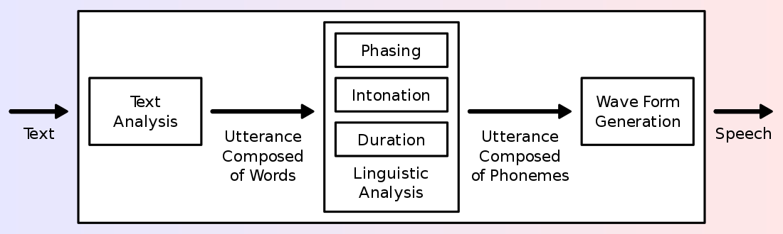
Figure 1: Illustration of a typical TTS system
2. Overview of the Technology
Concatenative methods work by stringing together segments of prerecorded speech segments. The best of concatenative methods is the Unit Selection. The recorded voice segments in unit selection is categorized into individual phones, diphones, half-phones, morphemes, syllable, words, and phrases. Unit selection divides a sentence into segmented units by a speech recognizer, then these units are filled in with recorded voice segments based on parameters like frequency, duration, syllable position, as well as these parameters of its neighboring units 3. The output of this system can be undistinguishable from natural voice, but only in very specific context that it is being tuned for and provided that the system has a very large database of speeches, usually in the range of dozens of hours of speech. This system suffers from boundary artifacts, which are unnatural connections between the sewed-together speech segments.
What came after concatenative methods are the statistical parametric methods, it solved many of the concatenative method’s boundary artifact problems. Statistical Parametric methods are also called Hidden-Markov-Models-based (HHM-based) methods, because HMM are often the choice to model the probability distribution of speech parameters. The HH model selects the most likely speech parameters like frequency spectrum, fundamental frequency, and duration (prosody), given the word sequence and trained model parameters. Last, these speech parameters are combined to construct a final speech wave form. Statistical parametric synthesis can be described as /“generating the average of some sets of similarly sounding speech segment” 4. The advantage that statistical parametric methods have over concatenative methods is the ability to modify aspects of the speech such as the gender of speaker, or the emotion and emphasis of the speech. The use of statistical parametric methods marks the beginning of the transition from a knowledge-based system to a data-based system for speech synthesis.
From a high-level point of view, a text-to-speech system is composed of two components. The first component starts with text normalization, also called preprocessing or tokenization. Text normalization converts symbols, numbers, and abbreviations into normal dictionary words. After text normalization, the first components end with text-to-phenome. Text-to-phenome is the process of dividing the text into units like words, phrases, and sentences; then converting these units into target phonetic representations, or target prosody (frequency contour, durations, etc.) The second component, often called the synthesizer or vocoder, takes the symbolic phonetic representations and converts them into the final sound.
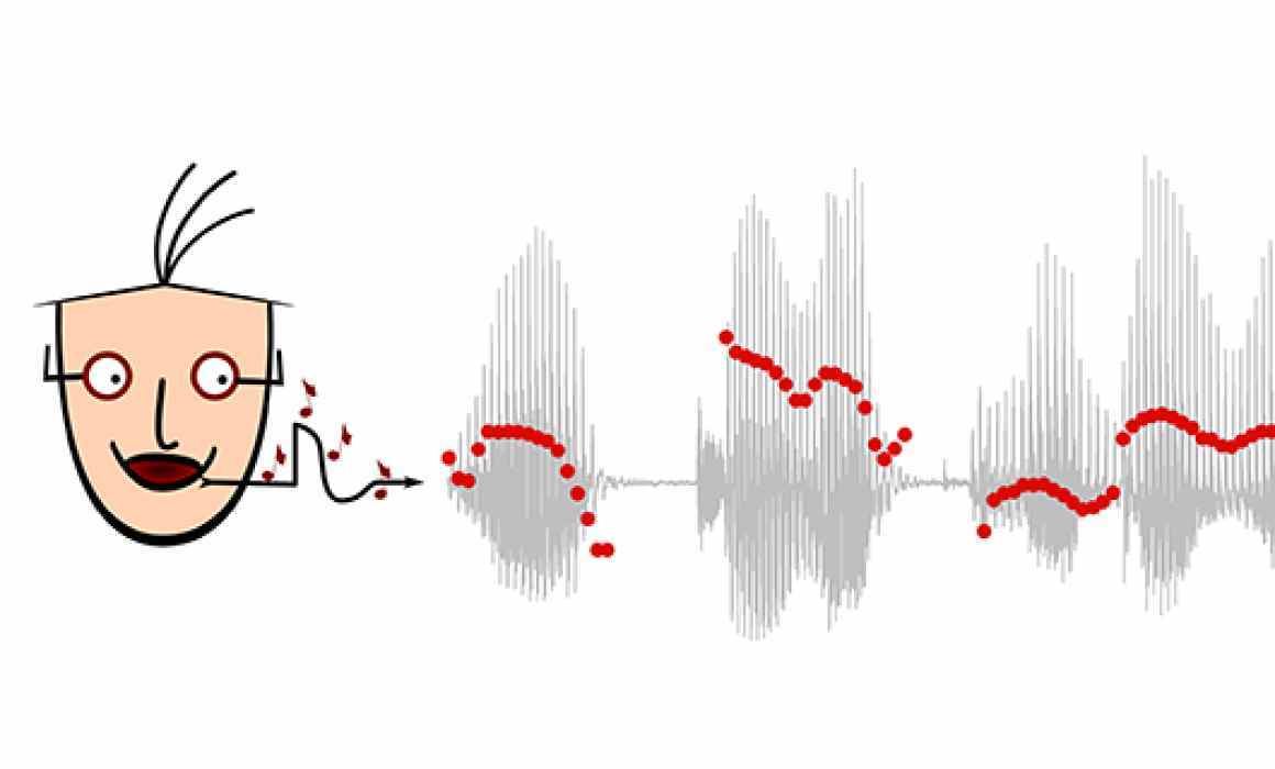
Figure 2: Illustration of prosody
3. Main Example: Tacotron 1 & 2 and WaveNet for Voice Synthesis
The Tacotron a TTS system that begin by using a sequence to sequence architecture implemented with neural network to produce magnitude spectrograms with a given string of text. The first component of Tacotron is one single neural network that was trained from 24.6 hours of speech audio recorded by a professional female speaker. The effectiveness of a neural network in speech synthesis shows how big data approaches are improving and changing up the speech synthesis methodologies. Tacotron uses the Giffin-Lim algorithm for its second component, the vocoder. The authors note that their choice of approach for the second component is only used as a placeholder at that time, and they anticipated that the Tacotron is be more advanced with alternative approaches for the second component, the vocoder, in the future 5. And Tacotron 2 is what the authors of the original Tacotron might have envisioned.
Tacotron 2 is a TTS system built entirely using neural network architectures for both its first and second component. Tacotron 2 combines the original tacotron’s first component and combine it with Google’s WaveNet that serves as the second component. The tacotron-style first component responsible for preprocessing and text-to-phenome, produces mel spectrograms given the original text input. Mel spectrograms are representations of frequencies in mel scale as it varies over different time. The mel spectrograms are then fed into WaveNet, a vocoder that serves as the second component, which outputs the final sound 6.
WaveNet is a deep neural network model that can generate raw audio. What is different about WaveNet is that it can model and generate the raw audio form. Typically, audio is digitized by sampling a single data point for every very small-time interval. A raw audio wave form typically contains 16,000 sample point in every second of audio. With that many sample points per second, an audio clip of a simple speech would contain millions and billions of data points. To make a generative model for these sample audio points, the model needs to be autoregressive, meaning every sample point generated by the model is influenced by its earlier sample points that is also generated by the model itself 7. A very difficult challenge that DeepMind solved. Before DeepMind came up with WaveNet, they made pixelRNN and pixel CNN. Which proved that it is possible to generate a complicated image one pixel at a time given a large amount of quality training data. This time instead of an image generated a pixel at a time, an audio clip is generated one sample point at a time.
WaveNet is trained with audio recordings, or wave forms, from real human speech. After training the model, WaveNet can generate synthetic utterances of human speech that does not actually mean anything. WaveNet would be fed a random audio sample point, and it will predict the next audio sample point and feed it back to itself and generating the next one, so on and so forth, producing complex realistic speech wave form. To apply WaveNet to TTS systems, it would have to be trained not only the human speech but also each training sample’s corresponding linguistic and phonetic features. This way, WaveNet would be conditioned on both the previous audio sample points and the words we want WaveNet to say. In a real working TTS system, these linguistic and phonetic features are the product of the first component, which is responsible for text-to-phenome 7.
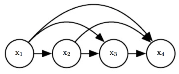
Figure 3: Illustration of an Autoregressive Model
3.1 Application and Implications of a lifelike TTS system like Tacotron 2
The powerful and lifelike TTS system by Tacotron 2 and Wavenet enhances many real-life applications that relies on having a machine talk, but most predominantly in human-computer interaction like smart phone voice assistant. And naturally, with a TTS system so lifelike, there are some concerns it would be used for nefarious purposes; but it also enables great enhancements to current applications of TTS systems. In one example researchers are able to build system that adds a speech encoder system on top of Tacotron 2 and Wavenet, and make it so it would be able to clone anyone’s voice signature and produce any speech wave forms with that person’s voice with just a few seconds of his or her original speech recording 8. The objective of the speaker encoder network added on to Tacotron 2 and Wavenet is to learn a high quality representation of a target speaker’s voice. In other words, the speaker encoder network is made to learn the “essence” and intricacies of human voices. The theory is that with this speech embeddings (representations) of a particular voice signature, Tacotron 2 and Wavenet would be able to use that to generate brand new speeches with the same voice signature. The most importance reason why this system is able to work with and extrapolate from an unseen and small amount of audio recording of the target speaker is a large and diverse amount of data of different speakers used to train the speaker encoder network 8. This demonstrates that not only big data contributed to the success of this network but that the big data also has to be the right data, with “right” being having a diverse amount of different variations in speakers.
One possible benefit of such a system can provide is in speech to speech translation across different languages. Because the system only requires couple seconds of un-transcribed reference audio recorded from the target speaker, this system can be used to enhance current, top of the line, speech to speech translation system like Google Translate by generating the output speech that is in another language with the original speaker’s voice. This makes the generated speech more natural and realistic sounding for the intended listener of the translated speech in a real world setting 8. An example of a fun implementation of such a system is the option to choose celebrity’s voices, like John Legend’s voice, as the voice of your Google Assistant in your smart phone or your Google Home 9. But a different and potentially dangerous implication of a system being misused and abused is not hard to imagine as well, especially that sometimes the artificially synthesized speech by these latest TTS systems are rated as indistinguishable from real human speech 7. According to a study, our brain does not register significant differences between a morphed voice and a real voice 10. In other words, while we can still somewhat distinguish between a genuine and artificial voice, we probably will be fooled most of the time if we are not particularly paying attention and on the look out for it. For example, people can be fooled into believing or doing certain things, because the voice that they talked too belongs to someone who that trust or someone who they believe holds a certain type of authority. While there are people coming up with technical solutions to safeguard us, the first step is to raise awareness about the existence of this technology and how sophisticated it can be 9.
4. Other Example A: Deep Voice: Baidu’s Real Time Neural Text-to-Speech System
Just like Google’s Tacotron and Wavenet, this paper’s authors from Baidu, a Google competitor, also elected to use neural networks and big data to train and implement every component of a TTS system, called Deep Voice. This further demonstrates the effectiveness of the approach of using big data to train deep neural networks. Baidu’s Deep Voice TTS system is consisted of five components, in their respective order they are: grapheme-to-phoneme model, segmentation model, phoneme duration model, fundamental frequency model, and audio synthesis model. The first grapheme-to-phoneme model is self explanatory, it is referred to as the “first component” of a TTS system in a two-component view. Grapheme-to-phoneme model converts text into phonemes. The second segmentation model is used to draw the boundaries between each phoneme (or each utterance) in the audio file given the audio file’s transcription. The third phoneme duration model predicts the time or duration of each phoneme. The forth fundamental frequency model predicts whether or not each phoneme is “silent”, as sometimes a part of a word is spelled but not voiced; if it is voiced, the model predicts its fundamental frequency. The fifth and final model, the audio synthesis model, combines the output of the prior four models and synthesize the final finished output audio. Baidu’s audio synthesis model is a modified version of DeepMind’s WaveNet 11.
All five models that compose Baidu’s Deep Voice are implemented with neural networks, making Deep Voice also an truly end to end “neural speech” synthesis model, also serving as a proof that the deep learning with big data approaches can be applied to every part and component of a TTS system. As to making it real time, the TTS system needs to be optimized to near instantaneous speeds. Baidu’s researchers experimented with various hyperparameter configurations, also including changing the amount of detail (and size) of the training data, data type, size/type of computational medium (CPU, GPU), amount of nonlinearities in the model, different memory cache techniques, and the overall size (computational requirements) of the models. They timed each of these configurations and scored the quality (MOS, Mean Opinion Scores) of each of their synthesized speech. The result shows a trade off between speech quality and synthesis speed. Without sacrificing too much audio quality, Deep Voice is able to produce a sufficient quality, 16 kHz audio, at 400 time faster that WaveNet and achieving the goal of making Deep Voice real-time or faster than real-time 11.
5. Other Example B: Siri’s Hybrid Mixture Density Network Based Approach to TTS
Siri is Apple’s virtual assistant that is communicated through the use of natural language user interface, predominantly through speech. Siri is capable of perform user instructed actions, make recommendations, and more by delegating requests to other internet services. Apple’s three operating systems: iOS, iPadOS, watchOS, tvOS, and macOS all come with Siri. Siri was first released with iOS in iPhones in 2011, after Apple acquired it a year before. Within the components that make up Siri is a TTS system that is used to generate a spoken, verbal response to user’s input. Throughout the years, different techniques and technologies have been used to implement the TTS system of Siri in order to make it better.
The old Siri uses predominantly a unit selection approach to its TTS system. Within predictable and narrow usage applications, older unit selection speech synthesis method still shines, because it can still produce adequately good speeches given that the system contains a very large amount of quality speech recordings. But the out performance of deep learning approaches over traditional methods had become more and more clear. Apple gave Siri a new and more natural voice by switching their old TTS system to one implement with a hybrid mixture density network based unit selection TTS system 12.
This hybrid mixture density network based unit selection approach first uses a function to pick the most probable audio units for each speech segments, then uses a second function to find the most optimal (natural sounding) combination of the selected candidates for each broken down segment of the entire speech. The role of the mixture density network here in Siri is to serve as these two functions mentioned: a unified target model and concatenation model that is able to predict distributions of the target features of a speech and the cost of concatenation between the sample audio units. The function that models the distributions of target features used to be commonly implemented with hidden Markov models in a statistical parametric approaches of TTS. But it has since been replaced by the better deep learning approaches. The concatenation cost function is used to measure the acoustic difference between two units for the purpose of guaging their sound’s naturalness when concatenated. Hence the concatenation cost function is what is used during the search for the optimal sequence (or combinations) of units in the unit audio speech space 12.
Starting in iOS 10 in 2017 until this moment, Siri’s TTS system had been upgraded with neural network approaches, and the new Siri’s voice is demonstrated to be massively preferred over the old one in controlled A/B testing 12.
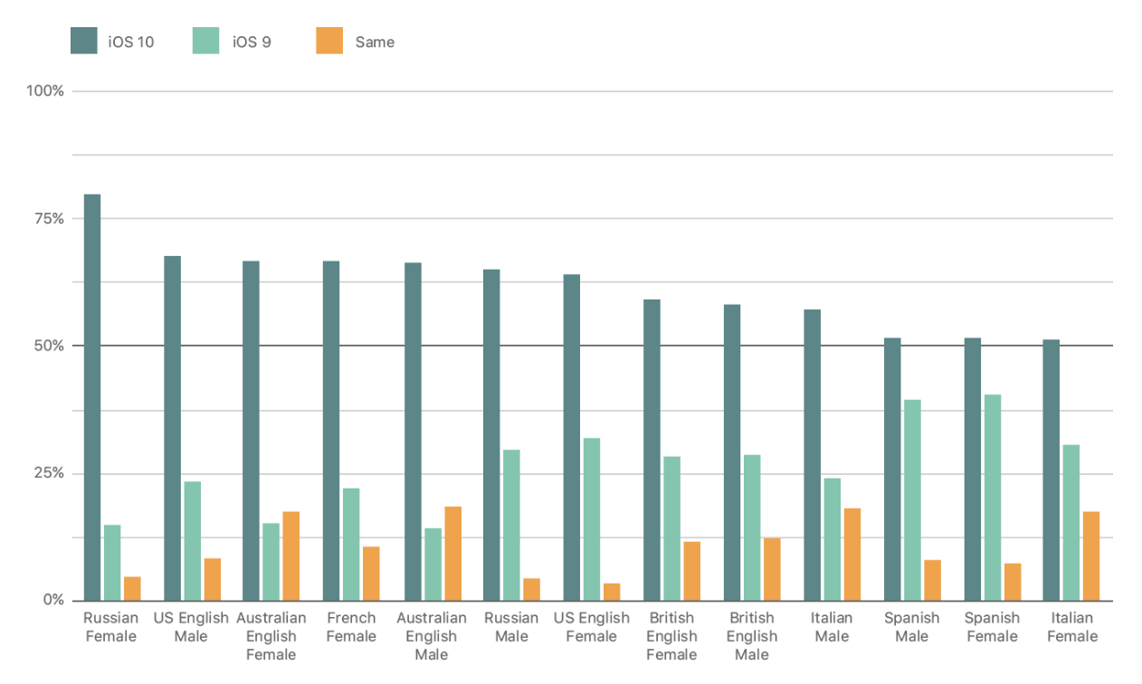
Figure 4: Results of AB Pairwise Testing of Old and New Voices of Siri
6. Conclusion
The Tacotron, Deep Voice, and Siri’s TTS system are the three advance cutting edge TTS technologies. All of them are designed with deep neural networks as the main work horse with big data simultaneously acting as their food and their vitamins. With the knowledge of the history of TTS systems and its how its basic theoretical components, and through these three examples, we can see how big data and neural networks have revolutionized the speech synthesis technology field. Although, these advancements open potential dangers of it being used to exploit trust between people by the means of impersonation, they do provide us with even more real life benefits ranging from language translation to personal virtual assistants.
7. References
-
J. Ohala, “Christian Gottlieb Kratzenstein: Pioneer in Speech Synthesis”, ICPhS. (2011) https://www.internationalphoneticassociation.org/icphs-proceedings/ICPhS2011/OnlineProceedings/SpecialSession/Session7/Ohala/Ohala.pdf ↩︎
-
J. Mullennix and S. Stern, “Synthesized Speech Technologies: Tools for Aiding Impairment”, University of Pittsburh at Johnsonstown (2010) https://books.google.com/books?id=ZISTvI4vVPsC&pg=PA11&lpg=PA11&dq=bell+labs+Carol+Lockbaum&hl=en#v=onepage&q=bell%20labs%20Carol%20Lockbaum&f=false ↩︎
-
A. Hunt and A. W. Black, “Unit Selection in a Concatenative Speech Synthesis System Using a Large Speech Database”, ATR Interpreting Telecommunications Research Labs. (1996) https://www.ee.columbia.edu/~dpwe/e6820/papers/HuntB96-speechsynth.pdf ↩︎
-
A. W. Black, H. Zen and K. Tokuda, “Statistical Parametric Speech Synthesis”, Language Technologies Institute, Carnegie Mellon University (2009) https://doi.org/10.1016/j.specom.2009.04.004 ↩︎
-
Wang, Yuxuan, et al. “Tacotron: Towards End-to-End Speech Synthesis”, Google Inc, (2017) https://arxiv.org/pdf/1703.10135.pdf ↩︎
-
Shen, Jonathan, et al. “Natural TTS Synthesis by Conditioning WaveNet on Mel Spectrogram Predictions”, Google Inc, (2018) https://arxiv.org/abs/1712.05884.pdf ↩︎
-
Oord, Aaron van den, et al. “WaveNet: a Generative Model for Raw Audio”, Deepmind (2016) https://arxiv.org/pdf/1609.03499.pdf ↩︎
-
Jia, Ye et al. “Transfer Learning from Speaker Verification to Multispeaker Text-To-Speech Synthesis”, Google Inc., (2019) https://arxiv.org/abs/1806.04558 ↩︎
-
Marr, Bernard, “Artificial Intelligence Can Now Copy Your Voice: What Does That Mean For Humans?”, Forbes, (2019) https://www.forbes.com/sites/bernardmarr/2019/05/06/artificial-intelligence-can-now-copy-your-voice-what-does-that-mean-for-humans/ ↩︎
-
Neupane, Ajaya, et al. “The Crux of Voice (In)Security: A Brain Study of Speaker Legitimacy Detection”, NDSS Symposium, (2019) https://www.ndss-symposium.org/wp-content/uploads/2019/02/ndss2019_08-3_Neupane_paper.pdf ↩︎
-
O. A. Sercan, et al. “Deep Voice: Real-time Neural Text-to-Speech”, Baidu Silicon Valley Artificial Intelligence Lab, (2017) https://arxiv.org/abs/1702.07825 ↩︎
-
Siri Team, “Deep Learning for Siri’s Voice: On-device Deep Mixture Density Networks for Hybrid Unit Selection Synthesis”, Apple Inc, (2017) https://machinelearning.apple.com/research/siri-voices ↩︎
53 - Analysis of Financial Markets based on President Trump's Tweets
![]()
![]() Status: final, Type: Project
Status: final, Type: Project
Alex Baker, fa20-523-307, Edit
Abstract
President Trump has utilized the social media platform Twitter as a way to convey his message to the American people. The tweets he has published during his presidency cover a vast array of topics and issues from MAGA rallies to impeachment. This analysis investigates the relationship of the NASDAQ and the sentiment of President Trump’s tweets during key events in his presidency. NASDAQ data was gathered though Yahoo Finance’s API while President Trump’s tweets were gathered from Kaggle. The results observed show that during certain events, a correlation emerges of the NASDAQ data and the sentiment of President Trump’s tweets.
Contents
Keywords: analysis, finance, stock markets, twitter, politics
1. Introduction
Financial markets have been an area of research in both academia and business. Analysis and predictions has been growing in its accuracy with an every increasing amount of data used to test these models. “The Efficient Market Hypothesis (EMH) states that stock market prices are largely driven by new information and follow a random walk pattern”1. This shows that prices will follow news rather than previous and present prices. Information is unpredictable in terms of its release/publication showing market prices will follow a random walk pattern and the prediction can not be high.
There are some problems that arise with EMH. One problem is that “stock prices does not follow a random walk pattern and can be predicted to a certain degree”2. Another problem associated with EMH is with the information’s unpredictability, the unpredictability is called into question with the introduction of social media (Facebook, Twitter, blogs). The rise of social media can be a early indicator for news before it is released/published. This project will analyze the market based on how the President tweets during certain events.
2. DataSets
In this project, two datasets will be used -
-
The NASDAQ values from November 2016 to January 2020. This data was obtained through Yahoo! Finance and includes Date, Open, High, Low, Close, Adj Close, and Volume for a given day.
-
President Trump’s tweets during the periods of November 2016 to January 2020 is over 41,000 tweets. The data includes id, link, content, date, retweets, favorites, mentions, hashtags, and geo for every tweet in the time frame. Since the performance of the analysis is on a daily basis, tweets will be split up by Date. This data is available on Kaggle (https://www.kaggle.com/austinreese/trump-tweets?select=trumptweets.csv).
To strengthen the analysis, even more, some code from the 2016 election’s analysis of markets may be utilized but the focus will be on the markets during the Trump administration. Rally data maybe introduced in order to have a deeper sense of some of the tweets when it comes to important news that is announces at President Trump’s rallies. In order to have a realistic and strong analysis, the financial data needs to be aligned with the timing of tweets but news that has already started to affect the markets before a tweet has been sent out needs to be taken into account.
3. Data Cleaning and Preprocessing
The data required for this project is stock market data and Twitter data from President Trump. Stock market data was collected from Yahoo Finance’s API. This data was saved to a CSV file then imported using Pandas. The Twitter data was collected by a Kaggle user and is imported though Kaggle’s API or through the use of a local copy saved from the site. The data obtained needs to be cleaned and pre-processed in order to make it reliable for analysis through the use of Pandas, Regex, and Matplotlib.
3.1 Twitter Data
When importing the Twitter data, there are several things that are noticed when printing the first five rows. Three of the columns mention, hashtags, and geo are currently showing NaN. After calculating the missing values, all the values in these columns are missing or are zero so we can drop these columns from the dataframe.
The tweets are one of the last columns needed to be cleaned. The text of the tweets needs to be uniformed in order to conduct analysis. Removing punctuations was the first step followed by removing content specifically seen in tweets. These could be the word retweet, the hashtag symbol(#), the @ symbol followed by a username, and any hyperlinks that could be in a tweet.
3.2 Stock Data
Stock data has a unique set of challenges when it comes to cleaning. Unlike tweets, stock data is only available Monday through Friday and is not available for holidays that the market is closed. In order to have a complete dataset, several options are available. One option is to drop the tweets that fall on a weekend. This would not be useful since markets can react to news that happens on the weekend. Another option is that “if the NASDAQ value on a given day is x and the next available data point is y with n days missing in between, we approximate the missing data by estimating the first day after x to be (y+x)/2 and then following the same method recursively till all gaps are filled” 1.
4. Methodology/Process
The collection of finance and Twitter data will be used to visualize the results. Some of Twitter or dataset data will need to be cleaned and classified to build the model. The methodology is composed of the following steps:
- Use data from President Trump’s personal twitter and data from Yahoo Finance API to help visualize
- Data cleaning and extraction
- Sentiment Analysis
Sentiment analysis is a key component to categorize President Trump’s tweets. Polarity and subjectivity are the two metrics that are used to classify each tweet. Polarity measures the opinion or emotion expressed in a piece of text; the value is returned as a float within the range of -1.0 to 1.0. Subjectivity, on the other hand, reflects the feelings or beliefs in a piece of text; the value is returned as a float within the range 0.0 to 1.0 where 0.0 is very objective and 1.0 is very subjective. TextBlob is the library utilized for processing the tweet’s polarity and subjectivity. The sentiment method is called along with the methods for polarity and subjectivity in their own functions. The returned values are added into two columns in the dataframe.
The plot used for the sentiment analysis is a scatter plot. This will allow for each tweet to be plotted with their respected polarity and subjectivity. A line plot is the best plot to used in order to easily visualize market price verses the sentiment of the tweets. In plotting the line for the sentiment of tweets, several issues arise. The first major issues is that multiple tweets are published on a given day with varying degrees of sentiment. The line graph will display a vertical line for all the points represented. One solution is to take the average of the days tweets and use this new value on the graph. This method can be aligned on the same axes as the stock market data.
5. Preliminary Analysis and EDA
5.1 Twitter Data
When starting to conduct preliminary analysis and exploratory data analysis (EDA), it is helpful to first check for any null values in the data and there are no null values in the twitter data.
The date column is a column that is needed to track the amount of tweets per month and year. In the column, the timestamp and the date are combined so this need to be separated in several ways. The first being separating the date from the timestamp into its own column. This is followed up by separating the date into 4 columns for day, month, year and month-year in order to track tweets based on specified criteria.
After graphing the amount of tweets per year, the observation is that 2016 and 2020 have a low tweet count. The reminder is that the data starts in November 2016 making 2016 have two months of data compared to 2020 with only one month being January. From 2017 through 2019, we can see that the amount of tweets increases by almost a thousand every year. The tweets per month tell a different story. The amount varies greatly over the years with the greatest amount being near the end of 2016 and the beginning of 2017. The sentiment of the tweets show that a majority of the tweets are a little skewed to the right of the graph. This shows that may of the President tweets are positive in some aspect as well as have a personal opinion, emotion or judgement.
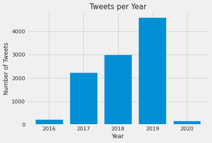
Figure 1: Number of Tweets per Year
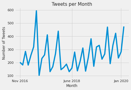
Figure 2: Number of Tweets per Month
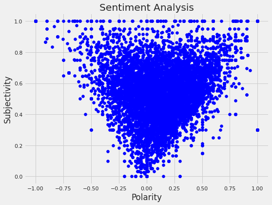
Figure 3: Sentiment Analysis of Tweets
5.2 Stock Data
Similar to the twitter data, checking for null values is important but since the data is from Yahoo! Finance there are no missing values on the days that the markets are opened.
Once graphing the open and closed prices of the NASDAQ, there seems to be an general upwards trend in the market over the time period.
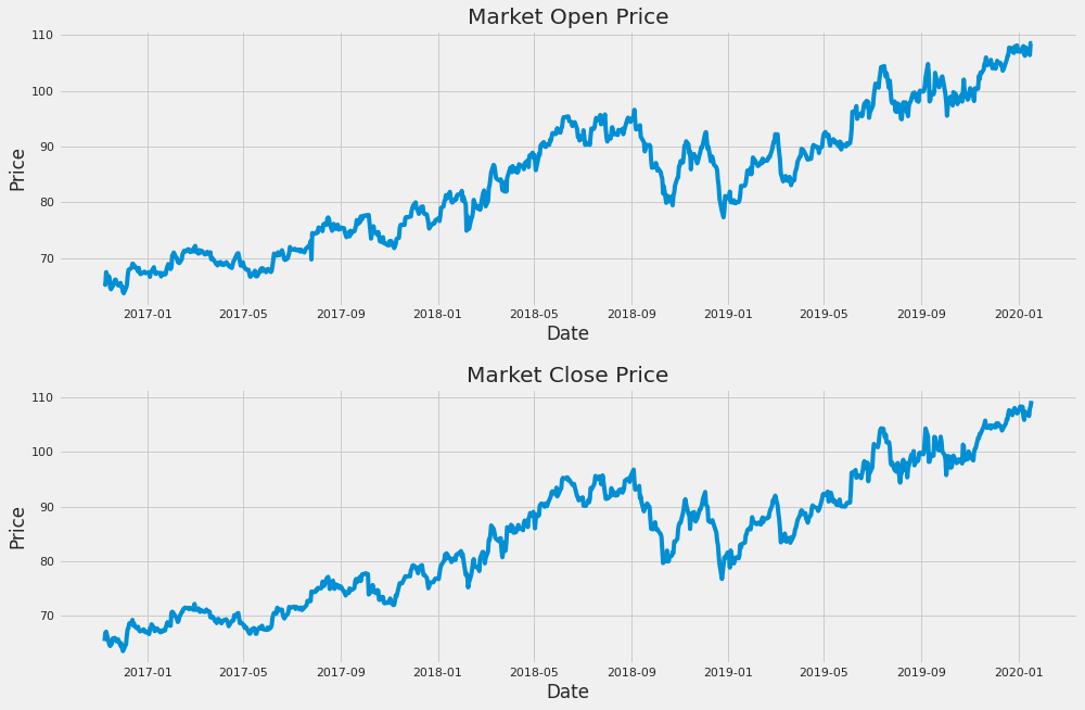
Figure 4: Open and Close Price of the NASDAQ
6. Defining events during Trump’s presidency
6.1 The Impeachment of President Trump
After weeks of talks among Congress, the House of Representatives have voted to impeach President Trump on two charges: abuse of power and obstruction of Congress on December 18, 2019. Since the country’s founding in 1776, only three presidents have faced impeachment from Congress: Andrew Johnson, Bill Clinton and now Donald Trump. This move has been widely advocated for since his election in 2016. “In September 2019, news leaked of a phone call between President Trump and Ukrainian President Volodymyr Zelensky regarding an investigation into Hunter Biden, son of then Democratic candidate Joe Biden, for his dealings in Ukraine” 3. The sentiment analysis preformed on tweets that are published at the start of November though the end of 2019. The graph shows a steady amount of subjectivity and polarity through much of November. In the final week of November, when the House Intelligence Committee’s public hearings were concluding, a large spike in subjectivity as well as polarity shows that President Trump was trying to discredit the individuals testifying, declaring the whole impeachment a witch hunt, or making a case of all the good he has done for teh country. The NASDAQ shows that the opening price went down when the Articles of Impeachment were announced but when the House voted to approve the articles started in mid December, the stock price is on an upward trend. The daily change points out that the price of the stock was fluctuating quite a bit during the initial stages of the impeachment hearing as well as the House vote on the Articles of Impeachment.
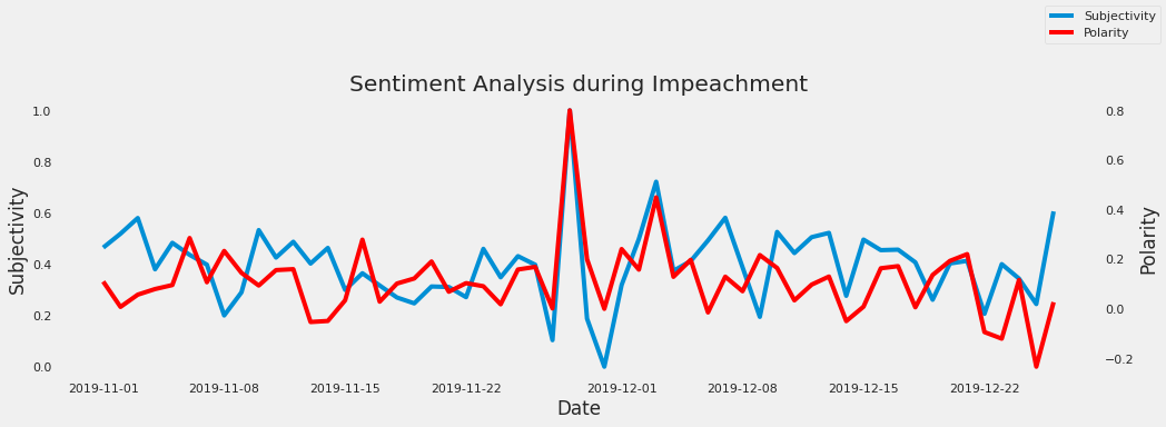
Figure 5: Sentiment Analysis during Impeachment
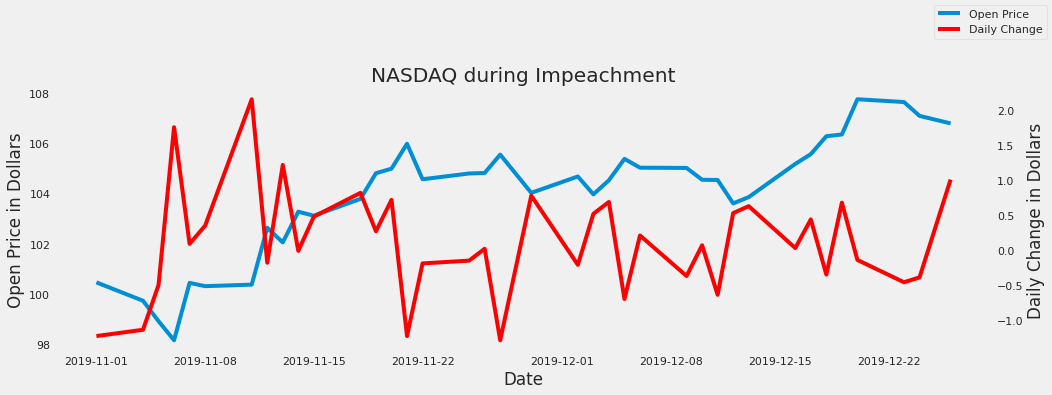
Figure 6: Open and Daily Change Price during Impeachment
6.2 The Dakota Access and Keystone XL pipelines approval
One of the first moves President Trump made when arriving into office was to approve the Dakota Access and Keystone XL pipelines. “Both of the pipelines were blocked by the Obama administration due to environmental concerns, but President Trump has questioned climate change and promised to expand energy infrastructure and create jobs”4. The Keystone pipeline would span 1,200 miles across six states, moving over 800,000 barrels of oil daily from Canada to the Gulf coast. The Dakota Access pipeline would move oil from North Dakota all the way to Illinois. “The Standing Rock Sioux tribe, whose reservation is adjacent to the pipeline, staged protests that drew thousands of climate change activists to the rural area of Cannon Ball, North Dakota” 4. The sentiment analysis shows a high polarity and subjectivity three days before the signing of the presidential memorandum but drops sharply during the event. Subjectivity has a quick resurgence but polarity stays low as time goes on. In the days leading up to the signing of the pipelines on January 24th, the opening price has an upward trend and stays fairly consistent in the following days. Daily change has a big jump at the end of January but falls dramatically and does not reach the level it was once at, this could be due to the protests that followed the approval or companies reevaluating their positions on the pipeline.
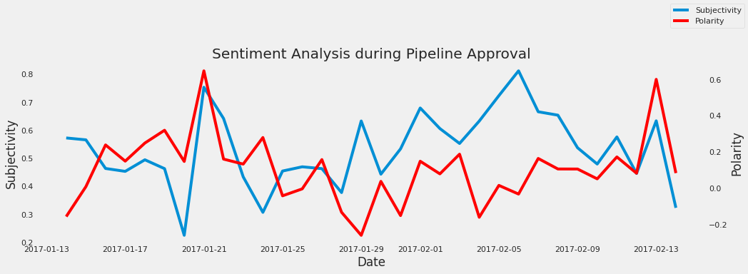
Figure 7: Sentiment Analysis during Dakota Approval
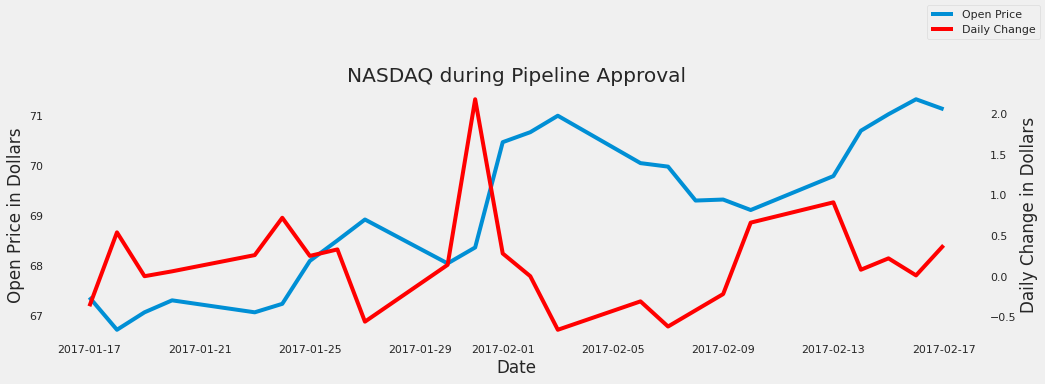
Figure 8: Open and Daily Change Price during Dakota Approval
6.3 The Government Shutdown
On December 21, 2018 the United States Government shutdown. “At the heart of the dispute is Trump’s demand for just over $5 billion toward a long-promised wall along the US-Mexico border” 5. The shutdown affected a part of the federal government such as homeland security, transportation, and agriculture. “The problems caused by the shutdown are wide-ranging, from waste piling up in national parks to uncertainty for 800,000 federal workers about when their next paycheck will come” 5. This shutdown was the longest shutdown in the modern era coming to an end on January 25, 2019 after 35 days. The sentiment analysis tells that the tweets shared during the shutdown are lower in terms of polarity with a majority of tweets being higher in subjectivity. A interesting note is that subjectivity on the day of the shutdown dropped to zero but shot up quickly the next day. There was no significant movement during the whole shutdown until the start of February when polarity soared and subjectivity dropped. A potential reason why there was no significant movement in the analysis was that the president wanted to get his piece of legislation through Congress but Congress was not going to approve his legislation. Prior to the government shutdown, the opening prices fell by 10 dollars with the lowest being around the time the shutdown began. The new year shows stock on a steady increase during the month of January, when the shutdown was lifted. Daily change was on the rise when the shutdown began but swiftly dropped at the start of the new year but recovered and stayed relatively stabled throughout the shutdown.
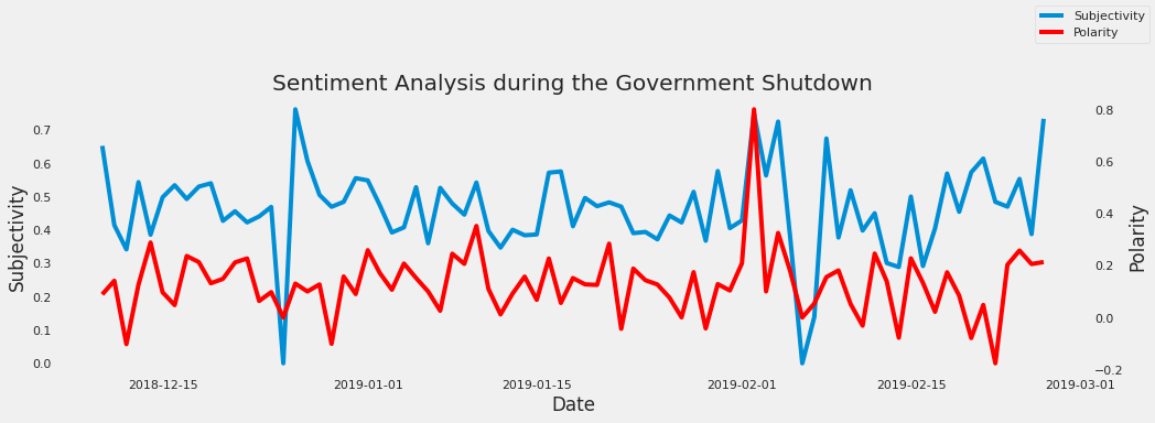
Figure 9: Sentiment Analysis during the Government Shutdown
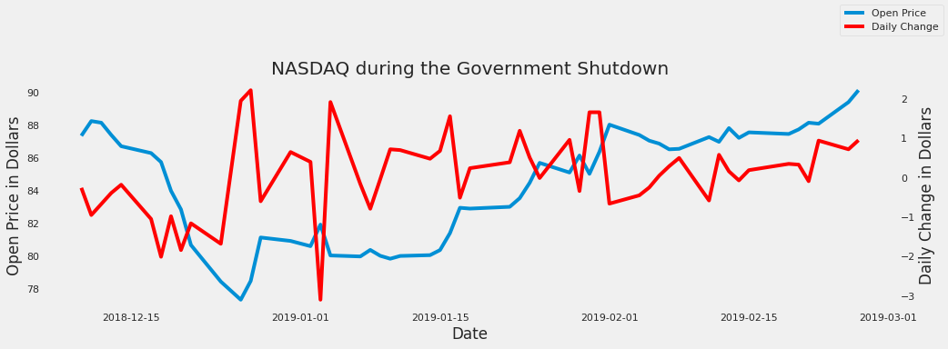
Figure 10: Open and Close Price during the Government Shutdown
7. Conclusion
The investigation showed the relation between President Trump’s tweets and the NASDAQ during certain events. The results pointed that a majority of tweets were positive in polarity with subjectivity being higher or sometimes lower depending on the event. The NASDAQ had some interesting reactions based on the events. In highly important events, the stock price tended to have an upward trajectory but leading up to the event the price would go down. These results show that the content of the President’s tweets have some impact in terms of the market movements, but many factors go into the price of the market such as foreign relations and how companies are preforming. Finally, it is worth mentioning that the analysis doesn’t take into account some factors. Weekends were a factor that was not included into the stock market data. Tweets from the President’s official account were not taken into account in this analysis. All of these remaining areas can be added in future research.
8. References
-
Goel, A. and Mittal, A., 2011. Stock Prediction Using Twitter Sentiment Analysis. [online] cs229.stanford.edu. Available at: http://cs229.stanford.edu/proj2011/GoelMittal-StockMarketPredictionUsingTwitterSentimentAnalysis.pdf. ↩︎
-
J. Bollen, H. Mao, and X. Zeng, Twitter mood predicts the stock market. Journal of Computational Science, vol. 2, no. 1, pp. 1–8, 2011. ↩︎
-
President Donald Trump impeached, History.com, 05-Feb-2020. [online]. Available at: https://www.history.com/this-day-in-history/president-trump-impeached-house-of-representatives. ↩︎
-
D. Smith and A. Kassam, Trump orders revival of Keystone XL and Dakota Access pipelines, The Guardian, 24-Jan-2017. [online]. Available at: https://www.theguardian.com/us-news/2017/jan/24/keystone-xl-dakota-access-pipelines-revived-trump-administration. ↩︎
-
Bryan, B., The government shutdown is now the longest on record and the fight between Trump and Democrats is only getting uglier. Here’s everything you missed. 21-Jan-2019. [online]. Available at: https://www.businessinsider.com/government-shutdown-timeline-deadline-trump-democrats-2019-1. ↩︎
54 - Trending Youtube Videos Analysis
![]()
![]() Status: final, Type: Project
Status: final, Type: Project
Adam Chai, fa20-523-327 Edit
Abstract
The internet has created a revolution for how people connect, understand topics, and consume information. Today, the consumption of the media is easier than ever. Going onto the internet and finding interesting content takes less than a minute to do. In the already growing industry of amateur or professional video production, Youtube is one of many go-to platforms for viewers and creators to collide. Social media creates an avenue for Youtubers to help promote their videos and reach a wider audience. For hours on end, viewers can watch nearly any type of content uploaded onto the site. However, it is harder for video creators to make an interesting video any person can enjoy than a viewer to find one of those videos. In the congested mass of videos, how can a Youtuber create a unique identity allowing their videos to go viral? This report will address this issue by creating a prediction of how Youtube popularizes a video and a solution to help a video go viral.
Contents
Keywords: youtube, videos, trending, popular, big data, viral, content creation, entertainment, lifestyle
1. Introduction
Youtube has two billion monthly active users making it the second-largest social network behind Facebook 1. This statistic only accounts for users that login into their Google account while they watch a Youtube video. Hinting, there can be hundreds of millions of more people watching Youtube. Youtube’s primary feature during release was to allow anyone to upload videos so the world can watch it. This function has changed drastically throughout the years and turned Youtube into the epicenter for anything to upload a video. Businesses, schools, and even governments are fully invested in Youtube to help promote their content for their respective benefits. Today, being a Youtuber is a respected profession allowing anyone the opportunity to showcase their talent in content production. Youtube is changing the world by exposing their users to the content they would have never experience in person.
This report will investigate trending Youtube videos. Specifically, the report will be using a trending Youtube videos dataset (US only) and will be used to predict how a video will trend on Youtube. Trending videos on Youtube are aimed to surface videos to a wide range of audience who will find interesting. Some content inherently cannot be added to the trending section such as videos primarily containing guns, drugs, etc. There are a lot of hypothesis people created to understand the Youtube algorithm, and the Google Staff has hinted what will make a video trend,
-
Are appealing to a wide range of viewers
-
Are not misleading, cickbaity, or sensational
-
Capture the breadth of what’s happening on YouTube and in the world
-
Showcase a diversity of creators
-
Ideally, are surprising or novel
but these criteria Youtube has set are not well defined2. Meaning, the determinants, and weights for how a Youtube video will trend will not be explicitly stated and it is up for Youtubers to interpret what exactly will allow their video to trend. In fact, Youtubers have argued the loose standard Youtube created is not true at all. Youtubers are constantly attempting to crack this code, evolving and purposely tailoring their videos in hopes it will go viral. Creating Youtube videos appealing to a wide audience is difficult. It takes enormous creativity and dedication for a random person to enjoy a video found online. Most people on Youtube have specific interests and follow certain industries, however; anyone can appreciate an entertaining video.
2. Background Research and Previous Work
After reviewing other background literature and works from other authors within this field, many people have ventured into how a video will be popular on Youtube. Most findings online consist of analysis or unique findings for popular videos. Several people have researched to predict if a video will be popular (views) on Youtube but do not cover the scope if it will reach the trending section on Youtube. Other analysis includes likes/dislikes predictor, comment creator, title scorer, and many more. Additionally, there has been analysis done on topics that are similar to Youtube which can be applied in this instance. A combination of these findings can be helpful and lead this research in the right direction.
3. Choice of Data-set
To understand what determines if a video will trend on Youtube the dataset chosen for this project is a trending Youtube videos dataset (US)3. Meaning all videos within the dataset are uploaded from the US and reached the trending section on Youtube. The dataset was retrieved from the popular data science website, Kaggle. The dataset chosen is one of the most popular datasets available on Kaggle and many people have analyzed it. The dataset is known for being readable and having a high usability score.
The Trending Youtube dataset contains 40,949 entries and 16 labels covering the basic information of a trending Youtube video.
| Label | Description |
|---|---|
| video_id | unique video id |
| trending_date | the date when a video trended on Youtube |
| title | title of the video |
| channel_title | name of the channel that created the video |
| category_id | category of video |
| publish_time | time and date when the video was uploaded |
| tags | keywords associated with the video |
| views | the number of views a video has |
| likes | the number of likes a video has |
| dislikes | the number of dislikes a video has |
| comment_count | the amount of comments commented |
| thumbnail_link | link to thumbnail picture |
| comments_disabled | boolean variable for allowing comments |
| ratings_disabled | boolean variable for allowing ratings (likes, dislikes) |
| video_error_or_removed | boolean variable if a video is still available |
| description | the description of the video |
A combination of these labels will be used in creating a model to discover how a video will trend on Youtube. The drawbacks of using this dataset are various labels are not covered such as the number of subscribers a channel has or the likelihood of someone that sees the video will click on it and older data is being used (all videos were uploaded and trended between 2017 and 2018).
4.Data Preprocessing
All work done on this project was completed through Google Colab. Once the dataset is imported from Kaggle onto Google Colab data preprocessing is necessary to translate the raw data into a readable format. Pandas and Datetime are used for data preprocessing.
To begin there are several labels which can be taken out of the model as they do not appear relevant or cannot be run through the model:
- video_id: this label is a unique identifier for each video not necessary to use
- title: could not be translated into a numerical value
- channel_title: could not be translated into a numerical value
- tags: many tags appear to be irrelevant to the actual video therefore this will be taken out
- thumbnail_link: cannot be run through the model
- description: irrelevant for most videos, does not add value descriptions it appears to promote their channel and sponsors
To address duplicates within the dataset after checking all records there are no duplicates within the dataset, except for empty descriptions. After removing descriptions from the dataset duplicates will no longer be an issue.
Several labels need to be converted into an integer so they can be run through the model:
-
trending_date
-
publish_time
-
comments_disabled
-
ratings_disabled
-
video_error_or_removed
Pandas reads the trending_date and publish_time labels as objects which need to be changed to integer values. To convert date columns the data type first needs to be converted into datetime. After conversion, another datetime function will be used to separate the month, day, and year into their columns.

Figure 1: Converting into Dates
Next, the comments disabled, ratings disbaled, and video error or removed can be easily converted with an easy function from their boolean values into 1 or 0 values.

Figure 2: Converting boolean variables into 1 or 0
5. Model Creation and Methodology
There are various ways this model can be built but this project follows the documentation on Scikit-learn. After researching successful methods the model built for this project will be using Scikit-learn Decision Tree and Random Forest. Decision Tree can be used as a multiple regression with a tree-like structure since there is an unlimited number of layers, the decision tree can achieve high accuracy and cause an overfitting problem. Random Forest will randomly select samples and features to train different trees and averages the score of different trees therefore reducing overfitting 4.
To begin model creation the 80/20, Train/Test Ratio will be used to create the model. In computing, the Pareto Principle is a safe and common approach for model creation5. To determine the accuracy of the model an explained variance score will be applied to determine accuracy. Explained variance is the measure of discrepancy between a model and actual data 6. The best possible score is 1.0 meaning there is a stronger strength of association. When creating the model it is important to check if there are highly correlated predictors in the model or else the possibility of multicollinearity can occur. To find highly correlated variables Pearson’s correlation coefficient can be used. Correlation coefficients are used to measure how strong a relationship is between two variables 7. A value of one indicates a strong positive relationship whereas a negative one indicates a strong negative relationship.

Figure 3: Pearson’s Correlation Graph
When looking at the model it is clear there is a high correlation between likes, dislikes, category_id, and comment_count. Other highly correlated variables to each other include comments_disabled and ratings_disabled, and dates. What this means are videos that disable comments are also likely to disable ratings. The correlation between dates can infer how quickly popular videos will likely trend on Youtube. Assuming the rest of the labels were not necessary or are not optimal the first decision tree and random forest model created consists of the labels likes, dislikes, and comment_count. After scoring the explained variance score the model fell scores around .9.
After going through combinations of labels, when the models had every label it produced the highest explained variance score of around .96. This score is a good result and could mean the models created are very accurate. The reason for a higher explained variance score can be the dates are important if a video will trend. For the visualization, Figure 4 illustrates the relationship between predicted and actual values for views. When examining the image the predicted values are nearly overlapping the actual values. It is very hard to tell any differences. Several discrepancies shown in the image are an over-prediction early within the model and near the end. Although there are over predictions it still closely follows actual values.

Figure 4: Predicted vs. Actual Values Graph
6. Insights
Looking back at Youtube’s trending section dividing the dataset into category ids is necessary to discover what content Youtube defines as widely appealing. The figures below show the count of videos in each category and the top 10 categories.
| Figure 5: Count of videos in each Category | Figure 6: Top 10 Categories |
|---|---|
 |
 |
Category ID List
| Category ID | Description |
|---|---|
| 1 | Film & Animation |
| 10 | Music |
| 17 | Pets & Animals |
| 22 | People & Blogs |
| 23 | Comedy |
| 24 | Entertainment |
| 25 | News & Politics |
| 26 | Howto & Style |
| 27 | Education |
| 28 | Science & Technology |
The full list of category IDs can be found HERE 8
When diving deeper into the dataset there are clear preferences for videos under certain categories. Entertainment, Music, and Howto & Style categories dominate the trend for categories. This can be an indicator of Youtube’s preference for the type of content they want to mainstream on the website.
| Figure 8: Entertainment Videos |  |
|---|---|
| Figure 9: Music Videos | |
| :————————: | :————————-: |
| Figure 10: Howto & Style Videos! |  |
The figures shown are the first three results of a video within their category. Taking a look at the title and comparing them to their category description several videos appear to not fit within their category. The guidelines for the entertainment and howto & style categories do not have set criteria. However, the music category explicitly shows videos based on music most videos under music are music videos from popular artists.
An important task to understand how Youtube picks videos to trend on Youtube is to discover how many channels have trended on Youtube.
| Channel Title | Number of trended videos |
|---|---|
| ESPN | 203 |
| The Tonight Show Starring Jimmy Fallon | 197 |
| Vox | 193 |
| TheEllenShow | 193 |
| Netflix | 193 |
| The Late Show with Stephen Colbert | 187 |
| Jimmy Kimmel Live | 186 |
| Late Night with Seth Meyers | 183 |
| Screen Junkies | 182 |
| NBA | 181 |
Many channels can consistently reach the trending section on a weekly basis. There were 2207 unique channels within the dataset that trended on Youtube. The number of unique channels trending on shows Youtube tries to diversify and promote unique channels on the trending section.
Other insights discovered are the average ratio between likes to dislikes for a trending Youtube video is 20:1. This means for every dislike there are twenty likes. A ratio this skewed is important to consider for a popular video because it is hard to reach this ratio. Additionally, the average views for a trending video are about 2.3 million views while the average number of comments for a video is 8.4 thousand. A combination of weights of these three statistics can contribute if a video will reach the trending section.
To discover if these insights hold truth comparison of a random video will be selected.

Figure 11: Randomly Selected Video
The amount of views the video has does not surpass the two million mark but the ratio of likes and dislikes holds at 32:1. The category for the video is music and the amount of comments is far below the average threshold at 1690. Although this video is not reaching certain criteria the ratio of likes to dislikes seems to outweigh the other averages. This signifies a combination of all requirements is important but if any indicator far exceeds the average for the other categories Youtube will allow the video to reach the trending section.
7. Benchmarks
The performance measures for this program were done through Cloudmesh StopWatch and Benchmark9. The instances where the benchmark was measured include loading the dataset, data preparation, timing each model, and the overral code execution. To clarify the performance measures for the program will time how fast sections of code are running through the system.

Figure 7: Benchmarks
When inspecting the results for the tests, Model 1 took 15 seconds to complete while the final model took 24 seconds. Model 1 contained 4 labels while the final model had 13. By increasing the number of labels there are in the model there is a 62.5% increase in time for execution. The overral code execution took 50 seconds to run which shows the models are RAM intensive meaning it takes a lot of time for the calculations to execute.
8. Conclusion
The results indicate engagement from viewers is vital for a video to trend on Youtube. For any video to trend viewers need to like, comment, and even dislike allowing more people to become aware of a video. Videos featuring obscure or illicit content, ie. drugs, guns, nudity, etc., cannot reach the trending section on Youtube because it cannot appeal to a wide range of audiences. Youtube promotes and encourages content any viewer can watch. Several categories such as entertainment, music, and howto & style are some of the most popular categories on Youtube allowing most videos to upload through these categories. Many Youtube channels once they reach the trending section can stay consistent allowing their other videos to have a higher chance of trending. Many Youtube channels adapted to this model producing video content in a similar manner to help reach the trending section. This brings up a flaw within the model of the Youtube trending section. Youtubers are continuously producing content that had success within the past contradicting an important aspect of the trending section stating videos are, “Ideally, are surprising or novel.” Various successful channels like ESPN, The Tonight Show, or Netflix are producing videos that are unique but individually are very similar to each other. If a Youtuber is seeking consistent views, producing unique videos until one is successful will help other videos if the content is similar to the successful one. Ultimately, engaging viewer interaction and producing generally accepting content for a Youtuber can increase the likelihood their videos will reach the trending section.
8.1 Limitations
Although this current work brings substantial analysis and understanding of this topic the model could be improved in several ways. First, the dataset being used is missing various fields that can impact the likelihood a video will trend such as the number of subscribers a channel has, the number of people that see the video but do not click on the video, and does that channel promote ads on Youtube for viewers to check out the channel. The number of subscribers is available to scrape but the other two fields are sensitive information not accessible to the public. It can be important to have this information because Youtube can prioritize channels uploading content under categories they want to surface or if they pay Youtube to surface their channel. Youtube might be giving private information to help Youtubers become successful. As stated earlier the dataset being used is a couple of years old and the way Youtube promotes videos could have changed within the time frame. Within several years generally accepting content can change. Another limiting factor is the dataset being used only contains videos uploaded within the US meaning it does not account for videos uploaded worldwide. Youtube can prioritize certain content through select regions or this could be meaningless if Youtube promotes the same content throughout the world. The final limitation of this report was not being able to score Youtube video titles and thumbnails. Within Youtube’s criteria for popular videos that appear as clickbait will not trend on Youtube. This entails titles and/or thumbnails must have ratings Youtube scores so it does not allow clickbait to surface. Other limitations can include incorrect scrapping and videos that were about to trend. These are various limitations this report faces, however; once this class is over these will be addressed.
9. Acknowledgments
Adam Chai would like to thank Dr. Gregor Von Laszewski, Dr. Geoffrey Fox, and the associate instructors in the FA20-BL-ENGR-E534-11530: Big Data Applications course (offered in the Fall 2020 semester at Indiana University, Bloomington) for their continued assistance and suggestions with regard to exploring this idea and also for their aid with preparing the various drafts of this article.
10. References
-
Moshin, Maryam. 10 Youtube Statistics, Oberlo https://www.oberlo.com/blog/youtube-statistics#:~:text=YouTube%20has%202%20billion%20users,users%20than%20YouTube%20is%20Facebook.[Accessed Dec 7, 2020] ↩︎
-
Google Staff, Trending on Youtube, Google. https://support.google.com/youtube/answer/7239739?hl=en#:~:text=Trending%20helps%20viewers%20see%20what's,surprising%2C%20like%20a%20viral%20video. [Accessed Oct 15, 2020] ↩︎
-
Jolly. Mitchell, Trending YouTube Video Statistics, Kaggle. https://www.kaggle.com/datasnaek/youtube-new [Accessed Oct 15, 2020] ↩︎
-
Li. Yuping, Eng. Kent, Zhang. Liqian, YouTube Videos Prediction: Will this video be popular?, Stanford http://cs229.stanford.edu/proj2019aut/data/assignment_308832_raw/26647615.pdf [Accessed Oct 20, 2020] ↩︎
-
Pradeep, Gulipalli, The Pareto Principle for Data Scientist, KDnuggets. https://www.kdnuggets.com/2019/03/pareto-principle-data-scientists.html [Accessed Dec 5, 2020] ↩︎
-
Statistics How Staff, Explained Variance Variation, StatisticsHowTo. https://www.statisticshowto.com/explained-variance-variation/ [Accessed Dec 5, 2020] ↩︎
-
Statistics How Staff, Correlation Coefficient Formula, StatsticsHowTo. https://www.statisticshowto.com/probability-and-statistics/correlation-coefficient-formula/ [Accessed Dec 6, 2020] ↩︎
-
Prathap, Dinesh. Youtube api video category list, Github. https://gist.github.com/dgp/1b24bf2961521bd75d6c [Accessed Dec 7, 2020] ↩︎
-
Gregor von Laszewski, Cloudmesh StopWatch and Benchmark from the Cloudmesh Common Library, https://github.com/cloudmesh/cloudmesh-common ↩︎
55 - Review of the Use of Wearables in Personalized Medicine
![]()
![]() Status: final, Type: Project
Status: final, Type: Project
Adam Martin, fa20-523-302, Edit
Abstract
Wearable devices offer an abundant source of data on wearer activity and health metrics. Smartphones and smartwatches have become increasingly ubiquitous, and provide high-quality motion sensor data. This research attempts to classify movement types, including running, walking, sitting, standing, and going up and down stairs, to establish the practicality of sharing this raw data with healthcare workers. It also addresses the existing research regarding the use of wearable data in clinical settings and discusses shortcomings in making this data available.
Contents
Keywords: Wearables, Classification, Descriptive Analysis, Healthcare, Movement Tracking, Precision Health, LSTM
1. Introduction
Wearables have been on the market for years now, gradually improving and providing increasingly insightful data on user health metrics. Most wearables contain an array of sensors allowing the user to track aspects of their physical health. This includes heart rate, motion, calories burned, and some devices now support ECG and BMI measurements. This vast trove of data is valuable to consumers, as it allows for the measurement and gamification of key health metrics. But can this data also be useful for health professionals in determining a patient’s activity levels and tracing important events in their health history?
2. Background Research and Previous Work
Previous work exists on the use of sensors and wearables in assisted living environments. Consumer wearables are commonplace and have been used primarily for tracking individual activity metrics. This research attempts to establish the efficacy of these devices in providing useful data for user activity, and how this information could be useful for healthcare workers. This paper examines the roadblocks in making this information available to healthcare professionals and examines what wearable information is currently being used in healthcare.
2.1 Existing Devices
Existing research focuses on a wide variety of inputs 12. Sensors including electrodes, chemical probes, microphones, optical detectors, and blood glucose sensors are referenced as devices used for gathering healthcare information. This research will focus on data that can be gathered with a modern smartphone or smartwatch. Most of the sensors described are not as ubiquitous as consumer items like FitBits or Apple Watches. Furthermore, many users report diminished enthusiasm towards wearables due to complex sensors and pairing processes 3. Focusing on devices that are already successful in the consumer market ensures that the impact of this study will not be confined to specific users and use cases. Apple has released a suite of tools for interfacing with device sensors, and recently launched ResearchKit and CareKit, providing a framework for researchers and healthcare workers to collect and analyze user data 2. There are several apps available that utilize these tools, including Johns Hopkins' CorrieHealth app, which helps users manage their heart health care and shares data with their doctors. This is an encouraging step towards streamlining the sharing of wearable data between patients and healthcare professionals, as Apple provides standards for privacy, consent, and data quality.
2.2 Need for Wearable Data in Healthcare
Previous studies have indicated the significance of precision health and the need for patient-specific data from wearables to be integrated into a patient’s care strategy 4. Wearable data outlining a patient’s sleep, motion habits, heart rate, and other metrics can be invaluable in diagnosing or predicting conditions. Increased sedentary activity could indicate depression, and could predict future heart problems. A patient’s health could be graphed and historical trends could be useful in determining factors that contribute to the patient’s condition. It is often asserted that a person’s environmental factors are better predictors for their health than their genetic makeup 4. Linking behavioral and social determinants with biomedical data would allow professionals to better target certain conditions.
3. Choice of Dataset
The dataset used for this project contains labeled movement data from wearable devices. The goal is to establish the potential for wearable devices to provide high-quality data to users and healthcare professionals.
A dataset gathered from 24 individuals with Apple devices measuring attitude, gravity, and acceleration was used to determine user states. The dataset is labeled with six states (walking downstairs, walking upstairs, sitting, standing, walking and jogging) and each sensor has several attributes describing its motion. The attitude, gravity, and acceleration readings each have three components corresponding to each axis of freedom. Many smartphones and wearables already offer comprehensive sleep tracking features, so sleep motion data will not be considered for this study. The CrowdSense iOS application was used to record user movements. Each sensor was configured to sample at 50hz, and each user was instructed to start the recording, and begin their assigned activity.
4. Methodology and Code
The IPython notebook used for this analysis is available on the GitHub repository.
The analysis of relevant wearable data is undertaken to determine the accuracy of activity information. This analysis will consist of a brief descriptive analysis of the motion tracking data, and will proceed with attempts to classify the labeled data.
First, the data has to be downloaded from the MotionSense project on GitHub. A basic descriptive analysis will be performed, visualizing the sensor values for each movement class over time. During the data acquisition, the sensors are sampled at a 50hz rate. Since the dataset is a timeseries, classification methods that take advantage of historical datapoints will be the most effective. The Keras Long Short Term Memory classifier implementation is used for this task. The dataset is first split into its various classes of motion using the one-hot-encoded matrix to filter out each class. Each class is then subdivided into one-second ‘windows’, each with 50 entries. Each window is offset by 10 entries from the previous window. The use of windows allows the model to remain small in size, while still gathering enough information to make accurate classifications. The hyperparameters that can be tuned include:
- Window size (50)
- Window offset (10)
- LSTM size (50)
- Dense layer size (50)
- Batch size (64)
- Epochs (15)
- Dropout ratio (0.5)
The resulting data structure is a 3-dimensional array of shape (107434, 12, 50) for the training set and (32439, 12, 50) for the testing set. The dimensions correspond to the number of windows, the number of movement features, and the number of samples per window, respectively. These windows are then paired with their corresponding movement classifications and fed into a Keras LSTM workflow. This workflow is executed on a standard (non-gpu) Google Colab instance and benchmarked. The workflow consists of the following:
- A Long Short Term Memory layer with the cell count matching the size of the input window (50)
- A Dropout layer to minimize overfitting
- A fully connected layer with relu activation to help learn the weights of the LSTM output
- A fully connected output layer with a softmax activation to return the final classifications
The model is trained in 15 epochs, and uses a batch size of 64 for each backpropagation.
If a classification strategy of sufficient accuracy is possible, it will be determined that wearable data can potentially serve as a useful supplementary source of information to aid in establishing a patient’s medical history.
Reviewing relevant literature is important to determine the current state of wearables research regarding usefulness to healthcare workers and user well-being. Much of this research will be focused on determining the state of wearables in the healthcare industry and determining if there is a need for streamlined data transfer to healthcare professionals.
5. Discussion
The dataset is comprised of six discrete classes of movement. There are 12 parameters describing the readouts of the sensors over time.
5.1 Descriptive Analysis
There is an imbalance in the number of datapoints for each class, which could lead to classification errors.
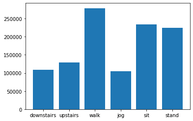
Figure 1: Data distribution per movement class.
Only roll, pitch, and yaw are shown for clarity and to illustrate the quality of the readings obtained by the sensors. Figures 2-7 illustrate sensor readouts over time for each class of movement.
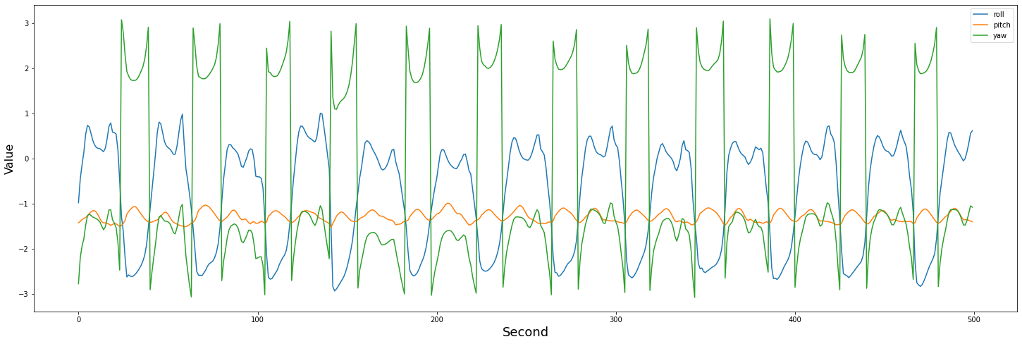
Figure 2: 10 second sensor readout of a jogging male.
Figure 3: 20 second sensor readout of a female going downstairs.
Figure 4: 20 second sensor readout of a male going upstairs.
Figure 5: 10 second sensor readout of a female walking.
Figure 6: 10 second sensor readout of a male sitting.
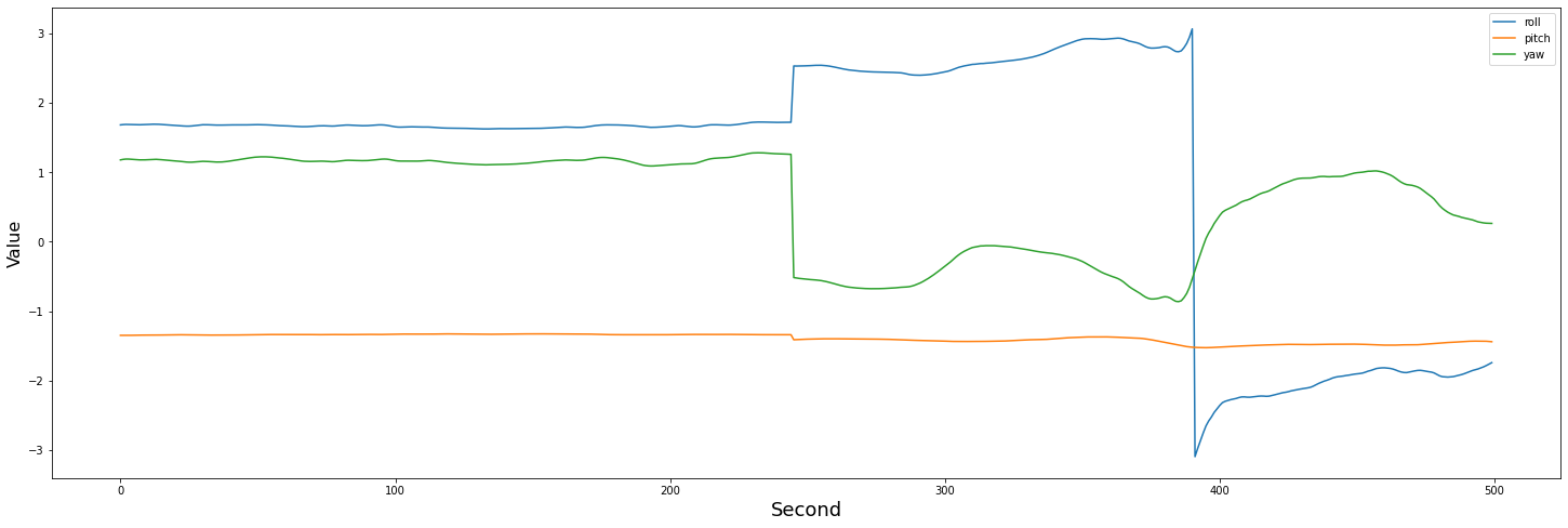
Figure 7: 10 second sensor readout of a female standing.
Interestingly, initial classification attempts involving random forests and knn methods performed fairly well despite their inherent lack of awareness of historical data.
5.2 Results
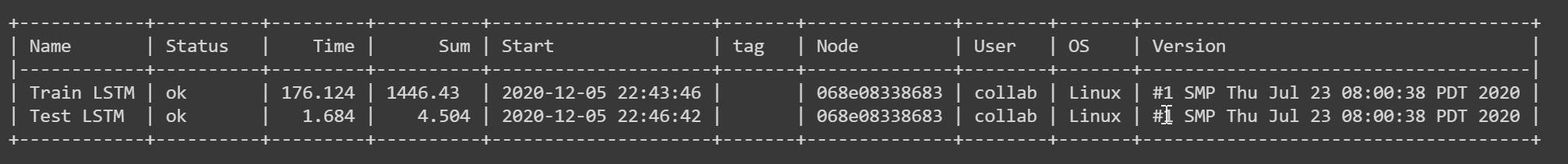
Figure 8: Cloudmesh benchmark for LSTM train and test.
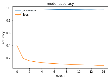
Figure 9 LSTM training and loss curves.
The final accuracy measurement for the LSTM was %95.42. This proves that discrete movement classes can be determined through the analysis of basic sensor data regarding device movement.
6. Conclusion
6.1 Results
Using relatively basic machine learning methods, it is possible to determine with a high level of accuracy the type of movement being performed at a given moment. Viewing the benchmarks, the inference time is rapid, taking only 3 seconds to validate results for the entire testing dataset. This model could be distilled for a production environment, and the rapid inference speed would allow for faster analyses for end users.
6.2 Limitations
The classes of movement considered for this study were limited. For more precise movements, or movement combinations, more data and a more complex model would be required. For example; classifying the type of activity being done while a user is seated, if they are typing or eating. Future research could involve a wider review of timeseries classifiers, including transformers convolutional neural networks, and recurrent neural networks, in order to establish what classification strategy would be best suited for this data. Privacy is also important to consider; raw sensor data could provide malicious actors with information regarding a users daily habits, their gender, their location, and other sensitive data.
Existing research highlights some of the issues with the adoption of wearable devices in healthcare. Inconsistent reporting, usage, and data quality are the most common concerns 25. Addressing these issues through an analysis of data quality and device usage could contribute towards the robustness of this study.
6.3 Impact
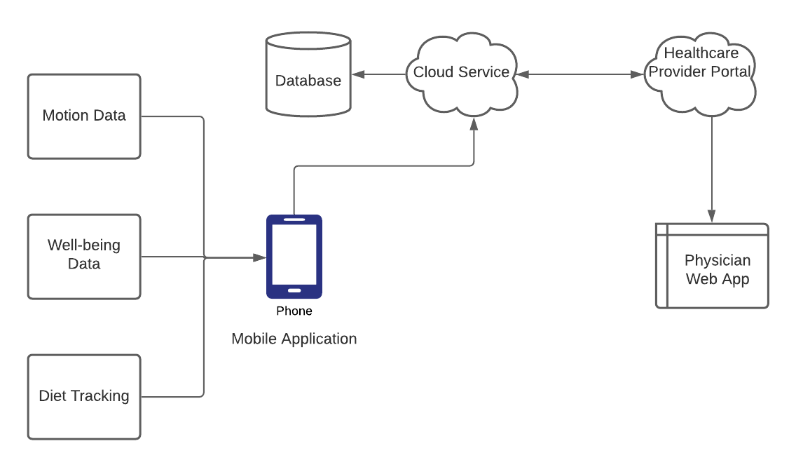
Figure 10 Proposal for integration of wearables data with other data sources and healthcare portals.
Frameworks like Apple CareKit and Google Fit are emerging to address the increasing demand for health tracking applications. There is a need for a more effective pipeline for sharing this information securely with doctors and researchers, and these frameworks are a step in the right direction. Furthermore, this research can be applied towards finding correlations between a patient’s condition and their activity history, or helping a patient reach certain goals towards their overall well-being. Comprehensive movement history can be combined with device usage patterns, eating habit data, self-reported well-being data, and other relevant sources to establish a more holistic perspective of a patient’s health. Giving users and healthcare workers access to and insights on the data that they generate every day can promote healthier habits, increase physician efficacy, and promote overall well-being. The author proposes the idea of a centralized system for user data tracking. This could support cross-platform devices, and tie into other fitness and well-being apps to provide a centralized and holistic view of a user’s health. A system of this nature could also tie in information from patient portals, including test results, checkup info, and prescription information.
7. Acknowledgements
The author would like to thank Dr. Gregor von Laszewski for his invaluable feedback on this paper, and Dr. Geoffrey Fox for sharing his expertise in Big Data applications throughout this course.
8. References
-
Yetisen, Ali K. (2018, August 16). I Retrieved November 15, 2020 from https://www.ncbi.nlm.nih.gov/pmc/articles/PMC6541866/ ↩︎
-
Piwek L, Ellis DA, Andrews S, Joinson A. The Rise of Consumer Health Wearables: Promises and Barriers (2016, February 02). I Retrieved November 11, 2020 from https://journals.plos.org/plosmedicine/article?id=10.1371/journal.pmed.1001953 ↩︎
-
Loncar-Turukalo, Tatjana. Literature on Wearable Technology for Connected Health: Scoping Review of Research Trends, Advances, and Barriers (2019, September 21). I Retrieved December 1st from https://www.ncbi.nlm.nih.gov/pmc/articles/PMC6818529/ ↩︎
-
Glasgow, Russell E. Realizing the full potential of precision health: The need to include patient-reported health behavior, mental health, social determinants, and patient preferences data (2018, September 13). I Retrieved November 15, 2020 from https://www.ncbi.nlm.nih.gov/pmc/articles/PMC6202010/ ↩︎
-
Malekzadeh, Mohammad. Mobile Sensor Data Anonymization (2018). I Retrieved September 18, 2020 from http://doi.acm.org/10.1145/3302505.3310068 ↩︎
56 - Project: Identifying Agricultural Weeds with CNN
![]()
![]() Status: final, Type: Project
Status: final, Type: Project
Paula Madetzke, sp21-599-354, Edit
Code:
Abstract
Weed identification is an important component of agriculture, and can affect the way farmers utilize herbicide. When unable to locate weeds in a large field, farmers are forced to blanket utilize herbicide for weed control. However, this method is bad for the environment, as the herbicide can leech into the water, and bad for the farmer, because they then must pay for far more fertilizer than they really need to control weeds. This project utilizes images from the Aarhus University [^1] dataset to train a CNN to identify images of 12 species of plants. To better simulate actual rows of crops, a subset of the images for testing will be arranged in a list representing a crop row, with weeds being distributed in known locations. Then, the AI is tested on the row, and should be able to determine where in the row the weeds are located.
Contents
Keywords: Agriculture, CNN.
1. Introduction
With a growing global population, and a changing climate that can make farm work hostile, it is increasingly important for farms to be efficient food producers. Fertilizers, pesticides, and herbicides have allowed modern farms to produce far higher yields than they would otherwise be able to. However, the environmental impact from the runoff of these chemicals when they leave the farm can be incredibly detrimental to both human and natural wellbeing. This is why agriculture is a field that is ripe for improvement from AI. There are opportunities for AI to be used in the harvesting of crops, predictive analytics, and field monitoring. In this project, AI is used in the field monitoring application. This is helpful for farmers because spot detection of weeds will help them avoid using as much herbicide. This project will explore how pictures of plants can be used to detect weeds in crop fields. The AI has been trained with a CNN on pictures of 12 seedling species including 960 individual plants representing both weeds desired crops 1. Although 12 species are available, only 3 will be studied in this project: black grass, shepherd’s purse, and sugar beet. These plants were chosen because their seedlings look different enough to give the AI a better chance at successfully detecting differences. Then, the AI is tested to determine the accuracy of the model. First this is accomplished by reserving a subset of the training data to be tested by the AI in order to get a base-line test of accuracy. Next, the test data will be arranged in a list to mimic a row of crops with a desired crop, and several weeds. Then the AI would go through the images and a program would display where a farmer would need to apply the herbicide, according to the AI. The true test would be to see if the program can produce a helpful map to narrow down where herbicide should be applied.
Previous similar work has been done with this dataset 2 in Keras with CNN image recognition, while this project is implemented in pytorch. Similar agricultural image recognition with plant disease 3 is also available to be studied.
2. Pre-Processing The Data
The plant dataset 1 has three sets of image options to choose from. The first has large images of trays with multiple plants of the same species, the second has cropped images of individual seedings from the larger picture (non-segmented), while the third is both cropped, and has the background replaced with black pixels such that only the leaves remain in the picture (segmented). To train the data, the segmented data is used. This is because it is important for the AI to train such that it detects patterns only for the most important features of the image. If the AI were to train on the images in the background, it might learn features of the sand or border instead of the leaves.


Figure 1 Dataset Image options 1: Large image with multiple plants (top), non-segmented (middle), segmented (bottom)
The next component to consider is the image size to be used. The CNN requires all images to be a uniform size to run correctly, while the original segmented data contains images of different sizes, ranging from a few 10s of pixels wide to over 4000. In order to get a sense a balance between having a broad enough dataset to have a large enough representation of the plant pictures to draw meaningful conclusions and the need to have reasonable file sizes, the image’s width or height, whichever is larger, was recorded and loaded into a histogram for each plant species. From a visual examination, 300x300 pixels was selected. An additional 100 pixels of padding were added to the final image size to prevent the images from being cut off when rotated. For each image in the segmented dataset, it is expanded to 400x400 pixels, and added to the straight image folder. Then, each image is rotated and versions are saved to a rotation folder. An ideal rotation would allow a fine grain of rotation. However, some resource limitations were met with the GPU used for the neural net. At first, the images were rotated by 10 degrees each before being saved, then 30, then 60, and finally 90. Finally, a csv file with ids and labels is needed to identify the images, and separate the training and the test data. A preprocessing python script can be used to achieve all of these goals.
 |
|  |
| 
Figure 2 Histograms of the max(width, height) of each of the plant species in the full dataset
3. Running the CNN
The implementation of the CNN is heavily based upon the tutorial on MINST fashion identification 4 where the CNN identifies 28x28 pixel images of clothing. It is a 2 layer CNN implemented in pytorch. In the original neural net, there are 70000 of these small images and 9 clothing designations. In this dataset, there are only 3 types of labels, but much larger images. The tutorial had a train image set, a validation set, and a test set. After preprocessing, there were 420 suitable 400x400 unrotated images. Without any changes besides adjusting the file paths and image size parameters, the CNN could inconsistently get approximately 50 percent accuracy with the test data, with the highest accuracy at 15 epochs. Because this implementation has relatively few images compared to the MINST clothing dataset, the next test was to remove the validation set of images, in order to use more of the prepared images for training. The result was a maximum of 79 percent accuracy at 25 epochs.

Figure 3 Examples of prepared training images
The testing accuracy of the neural net on the test data tracked closely with the prediction accuracy when train accuracy was around 30 to 50 percent, lagging by only a few percent. However, when the training dataset reached the 70 percent accuracy range, the test set accuracy remained at only around 50 percent. Part of this could be due to the small size of the test set, or the fact each plant species had a slightly different number of suitable test images.
An interesting observation is that although the model was able to consistently reach 60 percent accuracy, it would sometimes fall into a pattern where it would categorize all or almost all of the test set as just one of the plants. There was no consistency in which plant it defaulted to, but in between runs where the model reached decent accuracy, it would repeat this behavior. Because the test set was evenly distributed between the three plants, this would cause the accuracy to go to around 30 percent.
In order to see if a visualization could help a human easily see where the hypothetical herbicide would need to be placed, a chart was created with tiles. The first row is the true layout of the three types of plants in the dataset, where each plant is assigned a color. The second row is the AI prediction of which type of plant the test set is. Even with the 79 percent test accuracy rate, it was not as clear as it could be from the image how accurate the model was. One way of making the visualization both easier to visually determine accuracy and more realistic is to have one type of plant be the dominant crop, and have patches of weeds throughout the row. The major obstacle to this was the fact that there were not enough suitable images to have a dominant plant in the test group. Too many images used in testing would have a detrimental impact on training the model.

Figure 4 The top row 0 shows the actual species distribution of the plants, while the bottom row 1 shows the AI prediction
4. Benchmarking
The longest operation by far was the first time reading in the images. This had a timed tqdm built in, so the stopwatch function was not used here. Subsequent running of the CNN training program must cache some of the results, so the image loading takes much less time. An initial loading of the 420 images took approximately 10 minutes. WIth the GPU accelarator enabled, the training of 25 epochs got to 6.809s while the test only took .015s.
5. Possible Extension
The rotated images of the plants were ultimately not explored. This is due to the fact that the implementation that was followed required GPU resources on Google Colab. With only 420 images to feed into the model, the GPU was not strained. However, even with 90 degree rotations, it appeared that the GPU memory limit for running the entire notebook was reached before even the first epoch. If this project were to be attempted again, the images would either need to be smaller, or fewer straight images should be loaded so that their rotations would not exhaust GPU allocation. One way to go about this would be to have a rotation set with fewer images of individual plants, but to rotate them such that the rotated dataset is still around 420 images. Then, a comparison could be made between the training accuracy of 420 separate examples of each species vs fewer individual plants at a wider range of angles.
6. Conclusion
With 420 non-rotated plant images, a maximum accuracy of 79 percent was able to be reached in part by using the entire training dataset for training rather than validation, as the project this was based on did. With a significantly smaller number of images for the neural net to train on, even a 10 percent change in the available training images mattered in its implementation. Another main conclusion is the importance of resource use and choice in running CNNs. Although in theory there could only be benefits to adding more images to train, with large enough datasets, practical computing limitations become increasingly apparent. Future work would involve choosing a model that either did not require GUP allocation, or modifying the chosen images to take fewer computing resources.
7. Acknowledgments
Dr. Geoffrey Fox
Dr. Greggor von Laszewski
8. References
-
Aarhus University https://vision.eng.au.dk/plant-seedlings-dataset/ ↩︎
-
Plant Seedling Classification https://becominghuman.ai/plant-seedlings-classification-using-cnns-ea7474416e65 ↩︎
-
Oluwafemi Tairu https://towardsdatascience.com/plant-ai-plant-disease-detection-using-convolutional-neural-network-9b58a96f2289 ↩︎
-
Pulkit Sharma https://www.analyticsvidhya.com/blog/2019/10/building-image-classification-models-cnn-pytorch/ ↩︎
57 - Detect and classify pathologies in chest X-rays using PyTorch library
![]()
![]() Status: final
Status: final
Rama Asuri, fa20-523-319, Edit
Code: project.ipynb
Abstract
Chest X-rays reveal many diseases. Early detection of disease often improves the survival chance for Patients. It is one of the important tools for Radiologists to detect and identify underlying health conditions. However, they are two major drawbacks. First, it takes time to analyze a radiograph. Second, Radiologists make errors. Whether it is an error in diagnosis or delay in diagnosis, both outcomes result in a loss of life. With the technological advances in AI, Deep Learning models address these drawbacks. The Deep Learning models analyze the X-rays like a Radiologist and accurately predict much better than the Radiologists. In our project, first, we develop a Deep Learning model and train our model to use the labels for Atelectasis, Cardiomegaly, Consolidation, Edema, and Pleural Effusion that corresponds to 5 different diseases, respectively. Second, we test our model’s performance: how well our model predicts the diseases. Finally, we visualize our model’s performance using the AUC-ROC curve.
Contents
Keywords: PyTorch, CheXpert
1. Introduction
Radiologists widely use chest X-Rays to identify and detect underlying conditions. However, analyzing Chest X-Rays takes too much time, and accurately diagnosing without errors requires considerable experience. On the one hand, if the analyzing process is expedited, it might result in misdiagnosis, but on the other hand, lack of experience means long analysis time and/or errors; even with the correct diagnosis, it might be too late to prescribe a treatment. Radiologists are up against time and experience. With the advancements in AI, Deep Learning can easily solve this problem quickly and efficiently.
Deep Learning methods are becoming very reliable at achieving expert-level performance using large labeled datasets. Deep learning is a technique to extract and transform data using multiple layers of neural networks. Each layer takes inputs from previous layers and incrementally refines it. An algorithm is used to train these layers to minimize errors and improve these layers' overall accuracy 1. It enables the network to learn to perform a specified task and gain an expert level performance by training on large datasets. The scope of this project is to identify and detect the following 5 pathologies using an image classification algorithm: Atelectasis, Cardiomegaly, Consolidation, Edema, and Pleural Effusion. We use the CheXpert dataset, which consists of Chest X-rays. CheXpert dataset contains 224,316 chest Radiographs of 65,240 patients. The dataset has 14 observations in radiology reports and captures uncertainties inherent in radiograph interpretation using uncertainty labels. Our focus is on 5 observations (Atelectasis, Cardiomegaly, Consolidation, Edema, and Pleural Effusion). We impute uncertainty labels with randomly selected Boolean values. Our Deep Learning models are developed using the PyTorch library, enabling fast, flexible experimentation and efficient production through a user-friendly front-end, distributed training, and ecosystem of tools and libraries 2. It was primarily developed by Facebook’s AI Research lab (FAIR) and used for Computer Vision and NLP applications. PyTorch supports Python and C++ interfaces. There are popular Deep Learning applications built using PyTorch, including Tesla Autopilot, Uber’s Pyro 3.
In this analysis, first, we begin with an overview of the PyTorch library and DenseNet. We cover DenseNet architecture and advantages over ResNet for Multi-Image classification problems. Second, we explain the CheXpert dataset and how the classifiers are labeled, including uncertainties. Next, we cover the AUC-ROC curve’s basic definitions and how it measures a model’s performance. Finally, we explain how our Deep Learning model classifies pathologies and conclude with our model’s performance and results.
2. Overview Of PyTorch Library
The PyTorch library is based on Python and is used for developing Python deep learning models. Many of the early adopters of the PyTorch are from the research community. It grew into one of the most popular libraries for deep learning projects. PyTorch provides great insight into Deep Learning. PyTorch is widely used in real-world applications. PyTorch makes an excellent choice for introducing deep learning because of clear syntax, streamlined API, and easy debugging. PyTorch provides a core data structure, the tensor, a multidimensional array similar to NumPy arrays. It performs accelerated mathematical operations on dedicated hardware, making it convenient to design neural network architectures and train them on individual machines or parallel computing resources 4.
3. Overview of DenseNet
We use a pre-trained DenseNet model, which classifies the images. DenseNet is new Convolutional Neural Network architecture which is efficient on image classification benchmarks as compared to ResNet 5. RestNets, Highway networks, and deep and wide neural networks add more inter-layer connections than the direct connection in adjacent layers to boost information flow and layers. Similar to ResNet, DenseNet adds shortcuts among layers. Different from ResNet, a layer in dense receives all the outputs of previous layers and concatenate them in the depth dimension. In ResNet, a layer only receives outputs from the last two layers, and the outputs are added together on the individual same depth. Therefore it will not change the depth by adding shortcuts. In other words, in ResNet the output of layer of k is x[k] = f(w * x[k-1] + x[k-2]), while in DenseNet it is x[k] = f(w * H(x[k-1], x[k-2], … x[1])) where H means stacking over the depth dimension. Besides, ResNet makes learn the identity function easy, while DenseNet directly adds an identity function 5.
Figure 1 shows the DenseNet architecture.

Figure 1: DenseNet Architecture 6
As shown in Figure 1, DenseNet contains a feature layer (convolutional layer) capturing low-level features from images, several dense blocks, and transition layers between adjacent dense blocks 5.
3.1 Dense blocks
Dense block contains several dense layers. The depth of a dense layer output is called growth_rate. Every dense layer receives all the output of its previous layers. The input depth for the kth layer is (k-1)*growth_rate + input_depth_of_first_layer. By adding more layers in a dense block, the depth will grow linearly. For example, if the growth rate is 30 and after 100 layers, the depth will be over 3000. However, this could lead to a computational explosion. It is addressed by introducing a transition layer to reduce and abstract the features after a dense block with a limited number of dense layers to circumvent this problem 7. A 1x1 convolutional layer (bottleneck layer) is added to reduce the computation, which makes the second convolutional layer always has a fixed input depth. It is also easy to see the size (width and height) of the feature maps keeps the same through the dense layer, making it easy to stack any number of dense layers together to build a dense block. For example, densenet121 has four dense blocks with 6, 12, 24, and 16 dense layers. With repetition, it is not that difficult to make 112 layers 7.
3.2 Transition layers
In general, the size of every layer’s output in Convolutional Neural Network decreases to abstract higher-level features. In DenseNet, the transition layers take this responsibility while the dense blocks keep the size and depth. Every transition layer contains a 1x1 convolutional layer and a 2x2 average pooling layer to reduce the size to half. However, transition layers also receive all the output from all the last dense block layers. So the 1*1 convolutional layer reduces the depth to a fixed number, while the average pooling reduces the size.
4. Overview of CheXpert Dataset
CheXpert is a large public dataset. It contains an interpreted chest radiograph consisting of 224,316 chest radiographs of 65,240 patients labeled for the presence of 14 observations as positive, negative, or uncertain 8.
Figure 2 shows the CheXpert 14 labels and the Probability 9. Our analysis is to predict the probability of 5 different observations (Atelectasis, Cardiomegaly, Consolidation, Edema, and Pleural Effusion) from multi-view chest radiographs shown in Figure 2

Figure 2: Probability of different observations 9.
4.1 Data Collection
CheXpert dataset is a collection of chest radiographic studies from Stanford Hospital, performed between October 2002 and July 2017 in inpatient and outpatient centers, along with their associated radiology reports. Based on studies, a sampled set of 1000 reports were created for manual review by a board-certified radiologist to determine the feasibility for extraction of observations. The final set consists of 14 observations based on the prevalence in the reports and clinical relevance, conforming to the Fleischner Society’s recommended glossary. Pneumonia, despite being a clinical diagnosis, Pneumonia was included as a label to represent the images that suggested primary infection as the diagnosis. The No Finding observation was intended to capture the absence of all pathologies 8.
4.2 Data Labelling
Labels developed using an automated, rule-based labeler to extract observations from the free text radiology reports to be used as structured labels for the images 8.
4.3 Label Extraction
The labeler extracts the pathologies mentioned in the list of observations from the Impression section of radiology reports, summarizing the key findings in the radiographic study. Multiple board-certified radiologists manually curated a large list of phrases to match various observations mentioned in the reports 8.
4.4 Label Classification
Labeler extracts the mentions of observations and classify them as negative (“no evidence of pulmonary edema, pleural effusions or pneumothorax”), uncertain (“diffuse reticular pattern may represent mild interstitial pulmonary edema”), or positive (“moderate bilateral effusions and bibasilar opacities”). The ‘uncertain’ label can capture both the uncertainty of a radiologist in the diagnosis as well as the ambiguity inherent in the report (“heart size is stable”). The mention classification stage is a 3-phase pipeline consisting of pre-negation uncertainty, negation, and post-negation uncertainty. Each phase consists of rules that are matched against the mention; if a match is found, the mention is classified accordingly (as uncertain in the first or third phase and as negative in the second phase). If a mention is not matched in any of the phases, it is classified as positive 8.
4.5 Label Aggregation
CheXpert dataset use the classification for each mention of observations to arrive at a final label for 14 observations that consist of 12 pathologies and the “Support Devices” and “No Finding” observations. Observations with at least one mention positively classified in the report are assigned a positive (1) label. An observation is assigned an uncertain (u) label if it has no positively classified mentions and at least one uncertain mention, and a negative label if there is at least one negatively classified mention. We assign (blank) if there is no mention of an observation. The “No Finding” observation is assigned a positive label (1) if there is no pathology classified as positive or uncertain 8.
5. Overview Of AUC-ROC Curve
AUC-ROC stands for Area Under Curve - Receiver Operating Characteristics. It visualizes how well a machine learning classifier is performing. However, it works for only binary classification problems 10. In our project, we extend it to evaluate Multi-Image classification problem. AUC-ROC curve is a performance measurement for classification problems at various threshold settings. ROC is a probability curve, and AUC represents the degree or measure of separability. Higher the AUC, the better the model is at predicting 0s as 0s and 1s as 1s. By analogy, the Higher the AUC, the model distinguishes between patients with the disease and no disease 11.
Figure 3 shows Confusion Matrix. We use Confusion Matrix to explain Sensitivity and Specificity.

Figure 3: Confusion Matrix
5.1 Sensitivity/True Positive Rate (TPR)
Sensitivity/True Positive Rate (TPR) explains what proportion of the positive class got correctly classified. A simple example would be determining what proportion of the actual sick people are correctly detected by the model 10.

5.2 False Negative Rate (FNR)
False Negative Rate (FNR) explains what proportion of the positive class is incorrectly classified by the classifier. A higher TPR and a lower FNR means correctly classify the positive class 10.

5.3 Specificity/True Negative Rate (TNR)
Specificity/True Negative Rate (TNR) indicates what proportion of the negative class is classified correctly. For example, Specificity determines what proportion of actual healthy people are correctly classified as healthy by the model 10.

5.4 False Positive Rate (FPR)
False Positive Rate (FPR) indicates what proportion of the negative class got incorrectly classified by the classifier. A higher TNR and a lower FPR means the model correctly classifies the negative class10.

5.5 Purpose of AUC-ROC curve
A machine learning classification model can predict the actual class of the data point directly or predict its probability of belonging to different classes. The example for the former case is where a model can classify whether a patient is healthy or not healthy. In the latter case, a model can predict a patient’s probability of being healthy or not healthy and provide more control over the result by enabling a way to tune the model’s behavior by changing the threshold values. This is powerful because it eliminates the possibility of building a completely new model to achieve a different range of results 10. A threshold value helps to interpret the probability and map the probability to a class label. For example, a threshold value such as 0.5, where all values equal to or greater than the threshold, is mapped to one class and rests to another class 12.
Introducing different thresholds for classifying positive class for data points will inadvertently change the Sensitivity and Specificity of the model. Furthermore, one of these thresholds will probably give a better result than the others, depending on whether we aim to lower the number of False Negatives or False Positives 10. As seen in Figure 8, the metrics change with the changing threshold values. We can generate different confusion matrices and compare the various metrics. However, it is very inefficient. Instead, we can generate a plot between some of these metrics so that we can easily visualize which threshold is giving us a better result. The AUC-ROC curve solves just that 10.

Figure 8: Probability of prediction and metrics 10.
5.6 Definition of AUC-ROC
The Receiver Operator Characteristic (ROC) curve is an evaluation metric for binary classification problems. It is a probability curve that plots the TPR against FPR at various threshold values and essentially separates the signal from the noise. The Area Under the Curve (AUC) is the measure of a classifier’s ability to distinguish between classes and is used as a summary of the ROC curve. The higher the AUC, the better the model’s performance at distinguishing between the positive and negative classes. When AUC = 1, the classifier can perfectly distinguish between all the Positive and the Negative class points correctly. If, however, the AUC had been 0, then the classifier would be predicting all Negatives as Positives and all Positives as Negatives. When 0.5<AUC<1, there is a high chance that the classifier will be able to distinguish the positive class values from the negative class values. This is because the classifier can detect more True positives and True negatives than False negatives and False positives. When AUC=0.5, then the classifier is not able to distinguish between Positive and Negative class points. It means either the classifier is predicting random class or constant class for all the data points. Therefore, the higher the AUC value for a classifier, the better its ability to distinguish between positive and negative classes. In the AUC-ROC curve, a higher X-axis value indicates a higher number of False positives than True negatives. Simultaneously, a higher Y-axis value indicates a higher number of True positives than False negatives. So, the choice of the threshold depends on balancing between False positives and False negatives 10.
6. Chest X-Rays - Multi-Image Classification Using Deep Learning Model
Our Deep Learning model loads and processes the raw data files and implement a Python class to represent data by converting it into a format usable by PyTorch. We then, visualize the training and validation data.
Our approach to predicting pathologies will have 5 steps.
- Load and split Chest X-rays Dataset
- Build and train baseline Deep Learning model
- Evaluate the model
- Predict the pathologies
- Calculate the AUC-ROC score
6.1 Load and split Chest X-rays Dataset
We load and split the dataset to 90% for training and 10% for validation randomly.
6.2 Build and train baseline Deep Learning model
We use the PyTorch library to implement and train DenseNet CNN as a baseline model. With initial weights from ImageNet, we retrain all layers. In PyTorch, we implement a subclass for the PyTorch to transform CheXpert Dataset and create a custom data loading process. The Image Augmentation is executed within this subclass. Additionally, a DataLoader also needs to be created. We shuffle the dataset for the training dataloader. We also create a validation dataloader, which is different from the training dataloader and does not require shuffling. In the baseline model, we use DenseNet pre-trained on the ImageNet dataset. The model’s classifier is replaced with a new dense layer and use the CheXpert labels to train 11. The number of trainable parameters 6968206 (~7 million).
6.3 Evaluate the model
To evaluate the model, we implement a function to validate the model on the validation dataset.
6.4 Predict the pathologies
We use our model to predict 1 of the 5 pathologies - Atelectasis, Cardiomegaly, Consolidation, Edema, and Pleural Effusion. Our model uses a test dataset.
6.5 Calculate the AUC-ROC score
We have multiple labels, and we need to calculate the AUCROC-score for each class against the rest of the classifiers.
7. Results and Analysis
Figure 9 shows training loss, Validation loss and validation AUC-ROC score after training our Deep Learning model for 7 hours.

Figure 9: Training loss, Validation loss and validation AUC-ROC score
Figure 10 shows model predicts False Positives. Below is AUCROC table.

Figure 10: AUC - ROC data
This graph is taken from Stanford CheXpert dataset. Based on Figure 11 13, our AUCROC value is around 85%.

Figure 11: AUC - ROC Curve 13
8. Conclusion
Our model achieves the best AUC on Edema (0.89) and the worst on Plural(0.65). The AUC of all other observations is around 0.78. Our model achieves above 0.65 overall predictions.
9. Future Plans
As the next steps, we will work to improve the model’s algorithm and leverage DenseNet architecture to train using smaller dataset.
10. Acknowledgements
The author would like to thank Dr. Gregor Von Laszewski, Dr. Geoffrey Fox, and the associate instructors for providing continuous guidance and feedback for this final project.
11. References
12. Appendix
12.1 Project Plan
- October 26, 2020
- Test train and validate functionality on PyTorch Dataset
- Update Project.md with project plan
- November 02, 2020
- Test train and validate functionality on manual uploaded CheXpert Dataset
- Update project.md with specific details about Deep learning models
- November 09, 2020
- Test train and validate functionality on downloaded CheXpert Dataset using “wget”
- Update project.md with details about train and validation data set
- Capture improvements to loss function
- November 16, 2020
- Self review - code and project.md
- December 02, 2020
- Review with TA/Professor - code and project.md
- December 07, 2020
- Final submission - code and project.md
-
Howard, Jeremy; Gugger, Sylvain. Deep Learning for Coders with fastai and PyTorch . O’Reilly Media. Kindle Edition https://www.amazon.com/Deep-Learning-Coders-fastai-PyTorch/dp/1492045527/ref=sr_1_5?dchild=1&keywords=pytorch&qid=1606487426&sr=8-5 ↩︎
-
An open source machine learning framework that accelerates the path from research prototyping to production deployment https://pytorch.org/ ↩︎
-
Overview of PyTorch Library https://en.wikipedia.org/wiki/PyTorch ↩︎
-
Introduction to PyTorch and documentation https://pytorch.org/deep-learning-with-pytorch ↩︎
-
The efficiency of densenet121 https://medium.com/@smallfishbigsea/densenet-2b0889854a92 ↩︎
-
Densetnet architecture https://miro.medium.com/max/1050/1*znemMaROmOd1CzMJlcI0aA.png ↩︎
-
Densely Connected Convolutional Networks https://arxiv.org/pdf/1608.06993.pdf ↩︎
-
Whitepaper - CheXpert Dataset and Labelling https://arxiv.org/pdf/1901.07031.pdf ↩︎
-
Chest X-ray Dataset https://stanfordmlgroup.github.io/competitions/chexpert/ ↩︎
-
Overview of AUC-ROC Curve in Machine Learning https://www.analyticsvidhya.com/blog/2020/06/auc-roc-curve-machine-learning/ ↩︎
-
PyTorch Deep Learning Model for CheXpert Dataset https://www.kaggle.com/hmchuong/chexpert-pytorch-densenet121 ↩︎
-
Definition of Threshold https://machinelearningmastery.com/threshold-moving-for-imbalanced-classification/#:~:text=The%20decision%20for%20converting%20a,in%20the%20range%20between%200 ↩︎
-
AUCROC curves from CheXpert <> ↩︎
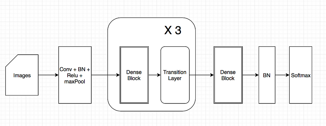
58 -
Assignment 6
Health and Medicine – Artificial Intelligence Influence on Ischemic Stroke Imaging
- Gavin Hemmerlein, fa20-523-301
- Edit
Keywords: convolutional neural network, random forest learning, Computer Tomography Scan, CT Scan, stroke, artificial intelligence, deep learning, machine learning, large vessel occlusions
1. Introduction
The Computer Tomography Scan (CT Scan) is a medical procedure that involves multiple x-rays analyzed using computer aided techniques. The CT Scan’s creation was credited to Allan M. Cormack and Godfrey N. Hounsfield for which both individuals were awarded the 1979 Nobel Prize in Physiology or Medicine 1. The OECD estimates that there are a total of 42.64 million scanners located in the United States; the fourth most of any country 2. This prevalence is extremely important when discussing a diagnosis for stroke victims. In the 1980s, the identification techniques were generally done through a process called computer-aided diagnosis (CAD). “CAD usually relies on a combination of interpretation of medical images through computational algorithms and the physicians’ evaluation of the medical images 3”.
The goal of researchers and medical practitioners is to improve upon detection rates to ensure that more lives are saved by early detection. According to Johns Hopkins Medical Department the faster medical precautions can be given to a victim, the better the prognosis is for the individual 4. The brain requires a constant supply of blood and oxygen. When it is starved of these nutrients, the brain tissue begins to die.
2. Assisting Researchers with Artificial Intelligence
According to an article in Radiology Business, automated detection of stroke anomalies is improving. As stated in a review in the article, “the team found convolutional neural networks beat random forest learning (RFL) on sensitivity, 85% to 68% 5.” This improvement is an excellent improvement by switching the algorithm that is used to train the model. A convolutional neural network (CNN) is a deep learning technique while a random forest is a modified decision tree. By modifying approaches from a decision tree to a deep learning technique, there is a very high likelihood that more lives could be saved. Strokes account for nearly 140,000 deaths a year and are one of the leading causes of permanent disability in the United States 6.
A RFL algorithm is a form of decision tree supervised learning. Decision trees are unique because they can also be used to solve regression and classification problems; which is unique to supervised learning methods. The RFL uses many decision trees that build upon one another. Where the CNN algorithm differs is that it is a form of deep learning that performs unsupervised learning. Each layer in the CNN understands its inputs and outputs while passing the output on to the next layer. A CNN can pass this information forward through a number of layers, but there is also a diminishing return given the amount of processing needed for each layer.
After reviewing the literature from the Radiology Business article, the most common avenue for early detection appears to be the RFL as stated above. A meta analysis reviewing PubMed articles from January 2014 to February 2019 found that the RFL was the highest performer for predictive measures 7. For large vessel occlusions (LVO), the best approach was to use a CNN. CNN’s use little pre-processing and rely moreso on the filters with the data. This results in a more dynamic approach to the data as opposed to the harder developed structure of a decision tree.
3. Future Work
Upon examining the cited sources, there are some future areas to look research. To improve on current understanding, a standardization of metrics for to evaluate the fidelity of the models 5, continued development of automative image analysis software 3, and leveraging emerging techniques to develop even more effective algorithms to detect large vessel occlusion 8. As of 2019, the advantage of CNN’s over conventional detection methods was only 7.6% 9. The percentage may seem marginal, but when expanded out to the 140,000 strokes per year the amount of strokes identified could be as much as 10,000 individuals.
These areas are only a few of the many improvements that could be made in the world of stroke detection. It is not a far stretch to imagine detecting vessels that are becoming clogged or brittle. If detection of these medical issues could become prevalent, even more lives could be saved by predicting strokes before they even occur.
4. References
-
Nobel Prizes & Laureates, “The Nobel Prize in Physiology or Medicine 1979,” The Nobel Prize, [Online]. Available: https://www.nobelprize.org/prizes/medicine/1979/summary/ [Accessed Oct. 16, 2020]. ↩︎
-
OECD, “Computed tomography (CT) scanners,” OECD Data, [Online]. Available: https://data.oecd.org/healtheqt/computed-tomography-ct-scanners.htm [Accessed Oct. 16, 2020]. ↩︎
-
Y. Mokli, J. Pfaff, D. Pinto dos Santos, C. Herweh, and S. Nagel “Computer-aided imaging analysis in acute ischemic stroke – background and clinical applications”, Neurological Research and Practice, p. 1-13. 2020 [Online serial]. Available: https://neurolrespract.biomedcentral.com/track/pdf/10.1186/s42466-019-0028-y [Accessed Oct. 13, 2020]. ↩︎
-
A. Pruski, “Stroke Recovery Timeline,” John Hopkins Medical, [Online]. Available: https://www.hopkinsmedicine.org/health/conditions-and-diseases/stroke/stroke-recovery-timeline [Accessed Oct. 16, 2020]. ↩︎
-
D. Pearson, “AI helps bust stroke, identify occlusions,” Radiology Business, [Online]. Available: https://www.radiologybusiness.com/topics/artificial-intelligence/ai-helps-bust-stroke-identify-occlusions [Accessed Oct. 13, 2020]. ↩︎
-
The Internet Stroke Center, “About Strokes,” Stroke Statistics, [Online]. Available: http://www.strokecenter.org/patients/about-stroke/stroke-statistics/#:~:text=More%20than%20140%2C000%20people%20die,and%20185%2C000%20are%20recurrent%20attacks [Accessed Oct. 16, 2020]. ↩︎
-
N. Murray, “Artificial intelligence to diagnose ischemic stroke and identify large vessel occlusions: a systematic review,” Journal of NeuroInterventional Surgery, vol. 12, no. 2, p. 156-164. 2020 [Online serial]. Available: https://jnis.bmj.com/content/12/2/156 [Accessed Oct. 13, 2020]. ↩︎
-
M. Stib, J. Vasquez, M. Dong, Y. Kim, S. Subzwari, H. Triedman, A. Wang, H. Wang, A. Yao, M. Jayaraman, J. Boxerman, C. Eickhoff, U. Cetintemel, G. Baird, and R. McTaggart, “Detecting Large Vessel Occlusion at Multiphase CT Angiography by Using a Deep Convolutional Neural Network”, Original Research Neuroradiology, Sep 29, 2020. [Online serial]. Available: https://pubs.rsna.org/doi/full/10.1148/radiol.2020200334 [Accessed Oct. 13, 2020]. ↩︎
-
J. Tuan, “How AI is able to Predict and Detect a Stroke”, Referral MD. [Online]. Available: https://getreferralmd.com/2019/10/how-ai-is-able-to-predict-and-detect-a-stroke/ [Accessed Oct. 13, 2020]. ↩︎
59 -
Blank
60 -
EE 534: BIG DATA
CHELSEA GORIUS
GAVIN HEMMERLEIN
CLASS 11530
FALL 2020
NBA PERFORMANCE AND INJURY
1. Team
Our team will consist of Chelsea Gorius (cgorius - fa20-523-344) and Gavin Hemmerlein (ghemmer - fa20-523-301). Both members are students in the ENGR E534 course. Chelsea and Gavin are also IU Masters students pursuing a degree in Data Science.
2. Topic
The topic to be investigated is basketball player performance as it relates to injury. The topic of injury and recovery is a multi-billion dollar industry. The Sports Medicine field is expected to reach $7.2 billion dollars by 2025 1. The scope of this effort is to explore National Basketball Association(NBA) teams, but the additional uses of a topic such as this could expand into other realms such as the National Football League, Major League Baseball, the Olympic Committees, and many other avenues. For leagues with salaries, projecting an expected return on the investment can assist in contract negotiations and cater expectations.
3. Dataset
To compare performance and injury, a minimum of two datasets will be needed. The first is a dataset of injuries for players 2. This dataset will create the samples necessary for review.
Once the controls for injuries are established, the next requirement will be to establish pre-injury performance parameters and post-injury parameters. These areas will be where the feature engineering will take place. The datasets needed must dive into appropriate basketball performance stats to establish a metric to encompass a player’s performance. One example that ESPN has tried in the past is the Player Efficiency Rating (PER). To accomplish this, it will be important to review player performance within games such as in the “NBA games data” 3 dataset. There is a potential to pull more data from other datasets such as the “NBA Enhanced Box Score and Standings (2012 - 2018)” 4. It is important to use the in depth data from the “NBA games data” 2 dataset because of how it will allow us to see how the player was performing throughout the season, and not just their average stats across the year. With in depth information about each game of the season, and not just the teams and players aggregated stats, added to the data provided from the injury dataset 2 we will be able to compose new metrics to understand how these injuries are actually affecting the players performance.
Along the way we look forward to discovering if there is also a causal relationship to the severity of some of the injuries, based on how the player was performing just before the injury. The term “load management” has become popular in recent years to describe players taking rest periodically throughout the season in order to prevent injury from overplaying. This new practice has received both support for the player safety it provides and also criticism around players taking too much time off. Of course not all injuries are entirely based on the recent strain under the players body, but a better understanding about how that affects the injury as a whole could give better insight into avoiding more injuries. It is important to remember though that any pattern identification would not lead to an elimination of all injuries, any contact sport will continue to have injuries, especially one as high impact as the NBA. There is value to learn from why some players are able to return from certain injuries more quickly and why some return to almost equivalent or better playing performance than before the injury. This comparison of performance will be made by deriving metrics based on varying ranges of games immediately leading up to injury and then immediately after returning from injury. In addition to that we will perform comparisons to the players known peak performance to better understand how the injury affected them. Another factor it will be important to include is the length of time recovering from the injury. Different players take differing amounts of time off, sometimes even with similar injuries. Something will be said about the player’s dedication to recovery and determination to remain at peak performance, even through injury, when looking at how severe their injury was, how much time was taken for recovery, and how they performed upon returning.
These datasets were chosen because they allow for a review of individual game performance, for each team, throughout each season in the recent decade. Aggregate statistics such as points per game (ppg) can be deceptive because duration of the metric is such a large period of time. The large sample of 82 games can lead to a perception issue when reviewing the data. These datasets include more variables to help us determine effects to player injury, such as minutes per game (mpg) to understand how strenuous the pre-injury performance or how fatigue may have played a factor in the injury. Understanding more of the variables such as fouls given or drawn can help determine if the player or other team seemed to be the primary aggressor before any injury.
4. Objective
The objective of this project is to develop performance indicators for injured players returning to basketball in the NBA. It is unreasonable to expect a player to return to the same level of play post injury immediately upon starting back up after recovery. It often takes a player months if not years to return to the same level of play as pre-injury, especially considering the severity of the injuries. In order to successfully analyse this information from the datasets, a predictive model will need to be created using a large set of the data to train.
From this point, a test run will be used to gauge the validity and accuracy of the model compared to some of the data set aside. The model created will be able to provide feature importance to give a better understanding of which specific features are the most crucial when it comes to determining how bad the effects of an injury may or may not be on player performance. Feature engineering will be performed prior to training the model in order to improve the chances of higher accuracy from the predictions. This model could be used to keep an eye out for how a player’s performance intensity and the engineered features could affect how long a player takes to recover from injury, if there are any warning signs prior to an injury, and even how well they perform when returning.
Sources
-
A. Mehra, Sports Medicine Market worth $7.2 billion by 2025, Markets and Markets. https://www.marketsandmarkets.com/PressReleases/sports-medicine-devices.asp ↩︎
-
R. Hopkins, NBA Injuries from 2010-2020, Kaggle. https://www.kaggle.com/ghopkins/nba-injuries-2010-2018 ↩︎
-
N. Lauga, NBA games data, Kaggle. https://www.kaggle.com/nathanlauga/nba-games?select=games_details.csv ↩︎
-
P. Rossotti, NBA Enhanced Box Score and Standings (2012 - 2018), Kaggle. https://www.kaggle.com/pablote/nba-enhanced-stats ↩︎
61 -
Gavin Hemmerlein
ghemmer
ENGR-E 534
This is a test MarkDown file to ensure I have write privileges.
Test Typing
This appears to be working.
Table
| Col1 | Col2 | |
|---|---|---|
| Row 1 | 11 | 12 |
| Row 2 | 21 | 22 |
Images

62 -
Wearables and Personalized Medicine
Adam Martin
Wearables have been on the market for years now, gradually improving and providing increasingly insightful data on user health metrics. Most wearables contain an array of sensors allowing the user to track aspects of their physical health. This includes heart rate, motion, calories burned, and some devices now support ECG and BMI measurements. This vast trove of data is valuable to consumers, as it allows for the measurement and gamification of key health metrics. But can this data also be useful for health professionals in determining a patient’s activity levels and tracing important events in their health history?
Many wearable devices, predominantly smartwatches, provide high-granularity data to the various apps that consume it. The Apple Watch Core Motion API provides accelerometer, gyroscope, pedometer, magnetometer, altitude, and other measurements at a rate of 50hz. This is in addition to the heart rate data that is sampled throughout the day. Apple also provides a Movement Disorder Manager interface for the analysis of Parkinson’s disease symptoms. FitBit and Pebble devices provide similar tracking capabilities. Beyond existing consumer smartwatches, there is hope for smart tattoos, VR displays, footwear, and fabrics. These wearables could measure a user’s electrolyte and metabolite levels in their perspiration. They could measure abnormal gaits or detect bacteria (Yetisen, 2018).
This high-fidelity data describing a wide variety of user activities could be invaluable to a healthcare professional hoping to find some insight in a patient’s condition. However, the process for extraction, transformation, and transfer of this data is unclear. With different device protocols and APIs providing information of varying quality and quantity, there is a need for a centralized, structured database for collection and analysis. Along with this, there is a potential for the application of AI on the analysis of wearable data. Raw sensor values will likely be incomprehensible to most analysts, so clustering of movement types and fuzzy logic on various parameters can allow a healthcare professional to better understand the meaning behind the data. Furthermore, this data can be used to feed into a system of “predictive preventative diagnosis”. Patients suffering from a variety of psychological or physical ailments can provide valuable data that highlights periods of symptom expression and also predicts prognosis (Piwek, 2016). When something is measured, it is easier to begin to act towards fixing it.
The artificial intelligence algorithms employed in the processing of collected data can be as diverse and complex as the systems they attempt to understand. Time series analysis for oscillating signals involving Fourier transforms. Feature extraction analysis through PCA. Noise reduction and motion clustering. These applications ignore the extra layer of abstraction, which involves the diagnosis and prediction aspects of wearable data. The field of wearables devices is growing, along with the promise of better digital representations, or ‘digital twins’, of patients. While there are still are matters to consider, including patient well-being and data privacy, the prognosis of wearables changing the healthcare industry looks good.
Works Cited
Piwek, L. (2016). The Rise of Consumer Health Wearables: Promises and Barriers. PLOS MEDICINE.
Yetisen, A. K. (2018). Wearables in Medicine. Wiley Online Library.
63 -
Wearables and Personalized Medicine Adam Martin
Wearables have been on the market for years now, gradually improving and providing increasingly insightful data on user health metrics. Most wearables contain an array of sensors allowing the user to track aspects of their physical health. This includes heart rate, motion, calories burned, and some devices now support ECG and BMI measurements. This vast trove of data is valuable to consumers, as it allows for the measurement and gamification of key health metrics. But can this data also be useful for health professionals in determining a patient’s activity levels and tracing important events in their health history?
Many wearable devices, predominantly smartwatches, provide high-granularity data to the various apps that consume it. The Apple Watch Core Motion API provides accelerometer, gyroscope, pedometer, magnetometer, altitude, and other measurements at a rate of 50hz. This is in addition to the heart rate data that is sampled throughout the day. Apple also provides a Movement Disorder Manager interface for the analysis of Parkinson’s disease symptoms. FitBit and Pebble devices provide similar tracking capabilities. Beyond existing consumer smartwatches, there is hope for smart tattoos, VR displays, footwear, and fabrics. These wearables could measure a user’s electrolyte and metabolite levels in their perspiration. They could measure abnormal gaits or detect bacteria (Yetisen, 2018).
This high-fidelity data describing a wide variety of user activities could be invaluable to a healthcare professional hoping to find some insight in a patient’s condition. However, the process for extraction, transformation, and transfer of this data is unclear. With different device protocols and APIs providing information of varying quality and quantity, there is a need for a centralized, structured database for collection and analysis. Along with this, there is a potential for the application of AI on the analysis of wearable data. Raw sensor values will likely be incomprehensible to most analysts, so clustering of movement types and fuzzy logic on various parameters can allow a healthcare professional to better understand the meaning behind the data. Furthermore, this data can be used to feed into a system of “predictive preventative diagnosis”. Patients suffering from a variety of psychological or physical ailments can provide valuable data that highlights periods of symptom expression and also predicts prognosis (Piwek, 2016). When something is measured, it is easier to begin to act towards fixing it.
The artificial intelligence algorithms employed in the processing of collected data can be as diverse and complex as the systems they attempt to understand. Time series analysis for oscillating signals involving Fourier transforms. Feature extraction analysis through PCA. Noise reduction and motion clustering. These applications ignore the extra layer of abstraction, which involves the diagnosis and prediction aspects of wearable data. The field of wearables devices is growing, along with the promise of better digital representations, or ‘digital twins’, of patients. While there are still are matters to consider, including patient well-being and data privacy, the prognosis of wearables changing the healthcare industry looks good.
Works Cited Piwek, L. (2016). The Rise of Consumer Health Wearables: Promises and Barriers. PLOS MEDICINE. Yetisen, A. K. (2018). Wearables in Medicine. Wiley Online Library.
64 -
#How Big Data Can Eliminate Racial Bias and Structural Discrimination
![]()
![]() Status: final, Type: Report
Status: final, Type: Report
- Robert Neubauer, fa20-523-304
- Edit
Abstract
Healthcare is utilizing Big Data to to assist in creating systems that can be used to detect health risks, implement preventative care, and provide an overall better experience for patients. However, there are fundmental issues that exist in the creation and implementation of these systems. Medical algorithms and efforts in precision medicine often neglect the structural inequalities that already exist for minorities accessing healthcare and therefore perpetuate bias in the healthcare industry. The author examines current applications of these concepts, how they are affecting minority communities in the United States, and discusses improvements in order to achieve more equitable care in the industry.
Contents
Keywords: healthcare, machine learning, data science, racial bias, precision medicine, coronavirus, big data, telehealth, telemedicine, public health.
1. Introduction
Big Data is helping to reshape healthcare through major advancements in telehealth and precision medicine. Due to the swift increase in telehealth services due to the COVID-19 pandemic, researchers at the University of California San Francisco have found that black and hispanic patients use these services less frequently than white patients. Prior to the pandemic, research showed that racial and ethnic minorities were disadvantaged by the digital divide 1. These differences were attributed to disparities in access to technology and digital literacy 2. Studies like these highlight how racial bias in healthcare is getting detected more frequently; However, there are few attempts to eradicate it through the use of similar technology. This has implications in various areas of healthcare including major healthcare algorithms, telehealth, precision medicine, and overall care provision.
From the 1985 Report of the Secretary’s Task Force on Black and Minority Health, ‘Blacks, Hispanics, Native Americans and those of Asian/Pacific Islander heritage have not benefited fully or equitably from the fruits of science or from those systems responsible for translating and using health sciences technology’ 3. The utilization of big data in industries largely acts to automate a process that was carried out by a human. This makes the process quicker to accomplish and the outcomes more precise since human error can now be eliminated. However, whenever people create the algorithms that are implemented, it is common that these algorithms will align with the biases of the human, or system, that created it. An area where this is happening that is especially alarming is the healthcare industry. Structural discrimination has long caused discrepencies in healthcare between white patients and minority patients and, with the introduction of big data to determine who should receive certain kinds of care, the issue has not been resolved but automated. Studies have shown that minority groups that are often at higher risk than white patients receive less preventative care while spending almost equal amounts on healthcare 4. National data also indicates that racial and ethnic minorities also have poorer health outcomes from preventable and treatable diseases such as cardiovascular disease, cancer, asthma, and HIV/AIDS than those in the majority 5.
2. Bias in Medical Algorithms
In a research article published to Science in October of 2019, the researchers uncovered that one of the most used algorithms in healthcare, widely adopted by non- and for-profit medical centers and government agencies, less frequently identified black patients for preventative care than white patients. This algorithm is estimated to be applied to around 200 million people in the United States every year in order to target patients for high-risk care management. These programs seek to improve the care of patients with complex health needs by providing additional resources. The dataset used in the study contained the algorithms predictions, the underlying ingredients that formed the algorithm, and rich data outcomes which allowed for the ability to quantify racial disparities and isolate the mechanisms by which they arise. The sample consisted of 6,079 self-identified black patients and 43,539 self-identified white patients where 71.2% of all patients were enrolled in commercial insurance and 28.8% were on Medicare. On average, the patient age was 50.9 years old and 63% of patients were female. The patients enrolled in the study were classified among risk percentiles, where patients with scores at or above the 97th percentile were auto-enrolled and patients with scores over the 55th percentile were encouraged to enroll 4.
In order to measure health outcomes, they linked predictions to a wide range of outcomes in electronic health records, which included all diagnoses, and key quantitative laboratory studies and vital signs that captured the severity of chronic illnesses. When focusing on a point in the very-high-risk group, which would be patients in the 97th percentile, they were able to quantify the differences between white and black patients, where black patients had 26.3% more chronic illnesses than white patients4. To get a corrected health outcome measurement among white and black patients, the researchers set a specific risk threshold for health outcomes among all patients, and repeated the procedure to replace healthier white patients with sicker black patients. So, for a white patient with a health risk score above the threshold, their data was replaced with a black patient whose score fell below the threshold and this continued until the health risk scores for black and white patients were equal and the predictive gap between patients would be eliminated. The health scores were based on the number of chronic medical conditions. The researchers then compared the data from their corrected algorithm and the original and found that the fraction of black patients at all risk thresholds above the 50th percentile increased when using the corrected algorithm. At the 97th percentile, the fraction of black patients increased to 46.5% from the original 17.7% 4. Black patients are likely to have more severe hypertension, diabetes, renal failure, and anemia, and higher cholesterol. Using data from clinical trials and longitudinal studies, the researchers found that for mortality rates with hypertension and diabetes black patients had a 7.6% and 30% increase, respectively4.
In the original and corrected algorithms, black and white patients spent roughly the same amount on healthcare. However, black patients spent more on emergency care and dialysis while white patients spent more on inpatient surgery and outpatient specialist care4. In a study that tracked black patients with a black versus a white primary care provider, it found the occurrence of a black primary care provider recommending preventative care was significantly higher than recommendations from a white primary care provider. This conclusion sheds additional light on the disparities black patients face in the healthcare system and further adds to the lack of trust black people have in the healthcare system that has been heavily documented since the Tuskegee study 6. The change recommended by the researchers that would correct the gap in the predictive care model was rather simple, shifting from predictions from purely future cost to an index that combined future cost prediction with health prediction. The researchers were able to work with the distributor of the original algorithm in order to make a more equitable algorithm. Since the original and corrected models from the study were both equal in cost but varied significantly in health predictions, they reworked the cost prediction based on health predictions, conditional on the risk factor percentiles. Both of the models excluded race from the predictions, but the algorithm created with the researchers saw an 84% reduction in bias among black patients, reducing the number of excess active chronic conditions in black patients to 7,758.
3. Disparities Found with Data Dashboards
To relate this to a present health issue that is affecting everyone, more black patients are dying from the novel coronavirus than white patients. In the United States, in counties where more than 86% of residents are black, the COVID-19 death rates were 10 times higher than the national average 7. Considering how medical algorithms allocate resources to black patients, similar trends are expected for minorities, people who speak languages other than english, low-income residents, and people without insurance. At Brigham Health, a member of the not-for-profit Mass General Brigham health system, Karthik Sivashanker, Tam Duong, Shauna Ford, Cheryl Clark, and Sunil Eappen created data dashboards in order to assist staff and those in positions of leadership. The dashboards included rates of those who tested positive for COVID-19 sorted into different subgroups based on race, ethnicity, language, sex, insurance status, geographic location, health-care worker status, inpatient and ICU census, deaths, and discharges 7.
Through the use of these dashboards, the COVID-19 equity committee were able to identify emerging risks to incident command leaders, including the discovery that non-English speaking Hispanic patients had higher mortality rates when compared to English speaking Hispanic patients. This led to quality-improvement efforts to increase patient access to language interpreters. While attempting to implement these changes, it was discovered that efforts to reduce clinicians entering patient rooms to maintain social distancing guidelines was impacting the ability for interpreters to join at a patient’s bedside during clinician rounding. The incident command leadership expanded their virtual translation services by purchasing additional iPads to allow interpreters and patients to communicate through online software. The use of the geographic filter, when combined with a visual map of infection-rates by neighborhood, showed that people who lived in historically segregated and red-lined neighborhoods were tested less frequently but tested positive more frequently than those from affluent white neighborhoods 7. In a study conducted with survey data from the Pew Research Center on U.S. adults with internet access, black people were significantly more likely to report using telehealth services. In the same study, black and latino respondents had higher odds of using telehealth to report symptoms 8.
However, COVID-19 is not the only disease that researchers have found to be higher in historically segregated communities. In 1999, Laumann and Youm found that disparities segregation in social and sexual networks explained racial disparities in STDs which, they suggested, could also explain the disparities black people face in the spread of other diseases 3. Prior to 1999 researchers believed that some unexplained characteristic of black people described the spread of such diseases, which shows the pervasiveness of racism in healthcare and academia. Residential segregation may influence health by concentrating poverty, environmental pollutants, infectious agents, and other adverse conditions. In 2006, Morello-Frosch and Jesdale found that segregation increased the risk of cancer related to air pollution 3. Big Data can assess national and local public health for disease prevention. An example is how the National Health Interview Survey is being used to estimate insurance coverage in different areas of the U.S. population and clinical data is being used to measure access and quality-related outcomes. Community-level data can be linked with health care system data using visualization and network analysis techniques which would enable public health officials and clinicians to effectively allocate resources and assess whether all patients are getting the medical services they need 9. This would drastically improve the health of historically segregated and red-lined communities who are already seeing disparities during the COVID-19 pandemic.
4. Effect of Precision Medicine and Predictive Care
Public health experts established that the most important determinant of health throughout a person’s course of life is the environment where they live, learn, work, and play. There exists a discrepancy between electronic health record systems in well-resourced clinical practices and smaller clinical sites, leading to disparities in how they are able to support population health management. For Big Data technology, if patient, family, and community focus were implemented equally in both settings, it has shown that the social determinants of health information would both improve public health among minority communities and minimize the disparities that would arise. Geographic information systems are one way to locate social determinants of health. These help focus public health interventions on populations at greater risk of health disparities. Duke University used this type of system to visualize the distribution of individuals with diabetes across Durham County, NC in order to explore the gaps in access to care and self-management resources. This allowed them to identify areas of need and understand where to direct resources. A novel approach to identify place-based disparities in chronic diseases was used by Young, Rivers, and Lewis where they analyzed over 500 million tweets and found a significant association between the geographic location of HIV-related tweets and HIV prevalence, a disease which is known to predominantly affect the black community 9.
One of the ways researchers call for strengthening the health of the nation is through community-level engagement. This is often ignored when it comes to precision medicine, which is one of the latest ways that big data is influencing healthcare. It has the potential to benefit racial and ethnic minority populations since there is a lack of clinical trial data with adequate numbers of minority populations. It is because of this lack of clinical data that predictions in precision medicine are often made off risks associated with the majority which give preferential treatment to those in the majority while ignoring the risks of minority groups, further widening the gap in the allocation of preventative health resources. These predictive algorithms are rooted in cost/benefit tradeoffs, which were proven to limit resources to black patients from the science magazine article on medical algorithms 10. For the 13th Annual Texas Conference on Health Disparities, the overall theme was “Diversity in the Era of Precision Medicine.” Researchers at the event said diversity should be kept at the forefront when designing and implementing the study in order to increase participation by minority groups 6. Building a trusting relationship with the community is also necessary for increased participation, therefore the institution responsible for recruitment needs to be perceived as trustworthy by the community. Some barriers for participation shared among minority groups are hidden cost of participation, concern about misuse of research data, lack of understanding the consent form and research materials, language barrier, low perceived risk of disease, and fear of discrimination 6. As discussed previously, overall lack of distrust in the research process is rooted in the fact that research involving minority groups often overwhelmingly benefits the majority by comparison. Due to the lack of representation of minority communities, big clinical data can be generated for the means of conducting pragmatic trials with underserved populations and distribute the lack of benefits 9.
4.1 Precision Public Health
The benefit of the majority highlights the issue that one prevention strategy does not account for everyone. This is the motivation behind combining precision medicine and public health to create precision public health. The goal of this is to target populations that would benefit most from an intervention as well as identify which populations the intervention would not be suitable for. Machine learning applied to clinical data has been used to predict acute care use and cost of treatment for asthmatic patients and diagnose diabetes, both of which are known to affect black people at greater rates than white patients 9. This takes into account the aforementioned factors that contribute to a person’s health and combines it with genomic data. Useful information about diseases at the population level are attributed to advancements in genetic epidemiology, through increased genetic and genomic testing. Integration of genomic technologies with public health initiatives have already shown success in preventing diabetes and cancers for certain groups, both of which affect black patients at greater rates than white patients. Specifically, black men have the highest incidence and mortality rates of prostate cancer. The presence of Kaiso, a transcriptional repressors present in human genes, is abundant in those with prostate cancer and, in black populations, it has been shown to increase cancer aggressive and reduce survival rates 10. The greatest challenge affecting advancements made to precision public health is the involvement of all subpopulations required to get effective results. This demonstrates another area where there’s a need for the healthcare industry to prioritize building a stronger relationship with minority communities in order to assist in advancing healthcare.
Building a stronger relationship with patients begins with having an understanding of the patient’s needs and their backgrounds, requiring multicultural understanding on the physicians side. This can be facilitated by the technological advances in healthcare. Researchers from Johns Hopkins University lay out three strategic approaches to improve multicultural communications. The first is providing direct services to minimize the gap in language barriers through the use of interpreters and increased linguistic competency in health education materials. The second is the incorporation of cultural homophily in care through staff who share a cultural background, inclusion of holistic medical suggestions, and the use of community health workers. Lastly, they highlight the need for more institutional accommodation such as increasing the ability of professionals to interact effectively within the culture of the patient population, more flexible hours of operation, and clinic locations 11. These strategic approaches are much easier to incorporate into practice when used in telehealth monitoring, providing more equitable care to minority patients who are able to use these services. There are three main sections of telehealth monitoring which include synchronous, asynchronous, and remote monitoring. Synchronous would be any real-time interaction, whether it be over the telephone or through audio/visual communication via a tablet or smartphone. This could occur when the patient is at their home or they are present with a healthcare professional while consulting with a medical provider virtually. Asynchronous communication occurs when patients communicate with their provider through a secure messaging platform in their patient portal. Remote patient monitoring is the direct transmission of a patient’s clinical measurements to their healthcare provider. Remote access to healthcare would be the most beneficial to those who are medically and socially vulnerable or those without ready access to providers and could also help preserve the patient-provider relationship 12. Connecting a patient to a provider that is from a similar cultural or ethnic background becomes easier through a virtual consultation, a form of synchronous telehealth monitoring. A virtual consultation would also help eliminate the need for transportation and open up the flexibility of meeting times for both the patient and the provider. From this, a way to increase minority patient satisfaction in regards to healthcare during the shift to telehealth services due to COVID-19 restrictions would be a push to increase technology access to these groups by providing them with low-cost technology with remote-monitoring capabilities.
5. Telehealth and Telemedicine Applications
Telehealth monitoring is evolving the patient-provider relationship by extending care beyond the in-person clinical visit. This provides an excellent opportunity to build a more trusting and personal relationship with the patient, which would be critical for minority patients as it would likely increase their trust in the healthcare system. Also, with an increase in transparency and involvement with their healthcare, the patient will be more engaged in the management of their healthcare which will likely have more satisfactory outcomes. Implementing these types of services will create large amounts of new data for patients, requiring big data applications in order to manage it. Similar to the issue of inequality in the common medical algorithm for determination of preventative care, if the data collected from minority groups using this method is not accounted for properly, then the issue of structural discrimination will continue. The data used in healthcare decision-making often comes from a patient’s electronic health record. An issue that presents itself when considering the use of a patient’s electronic health record in the process of using big data to assist with the patient’s healthcare is missing data. In the scope of telehealth monitoring, since the visit and most of the patient monitoring would be done virtually, the electronic health record would need to be updated virtually as well 13.
For telehealth to be viable, the tools that accommodate it need to work seamlessly and be supported by the data streams that are integrated into the electronic health record. Most electronic health record systems are unable to be populated with remote self-monitoring patient-generated data 13. However, the American Telemedicine Association is advocating for remotely-monitored patient-generated data to be incorporated into electronic health records. The SMART Health IT platform is an approach that would allow clinical apps to run across health systems and integrate with electronic health records through the use of a standards-based open-source application programming interface (API) Fast Healthcare Interoperability Resources (FHIR). There are also advancements being made in technology that is capable of integrating data from electronic health records with claims, laboratory, imaging, and pharmacy data 13. There is also a push to include social determinants of health disparities including genomics and socioeconomic status in order to further research underlying causes of health disparities 9.
5.1 Limitations of Teleheath and Telemedicine
The issue of lack of access to the internet and devices that would be necessary for virtual health visits would limit the participation of those from lower socioeconomic backgrounds. From this arises the issue of representativeness in remotely-monitored studies where the participant must have access to a smartphone or tablet. However, much like the Brigham Health group providing iPads in order to assist with language interpretation, there should be an incentive to provide access to these devices for patients in high risk groups in order to boost trust and representation in this type of care. From the article that discussed the survey results that found black and latino patients to be more responsive to using telehealth, the researchers contrasted the findings with another study where 52,000 Mount Sinai patients were monitored between March and May of 2020 that found black patients were less likely to use telehealth than white patients 1. One reason for the discrepancy the researchers introduce is that the Pew survey, while including data from across the country, only focused on adults that had internet access. This brings up the need for expanding broadband access, which is backed by many telehealth experts 8.
The process of providing internet access and devices with internet capabilities to those without them should be similar to that from the science magazine study where patients whose risk scores are above a certain threshold should automatically qualify for technological assistance. Programs such as the Telehealth Network Grant Program would be beneficial for researchers conducting studies with a similar focus, as the grant emphasizes advancements in tele-behavioral health and tele-emergency medical services and providing access to these services to those who live in rural areas. Patients from rural areas are less likely to have access to technology that would enable them to participate in a study requiring remote monitoring. The grant proposal defines tele-emergency as an electronic, two-way, audio/visual communication service between a central emergency healthcare center, the tele-emergency hub, and a remote hospital emergency department designed to provide real-time emergency care consultation 14. This is especially important when considering that major medical algorithms show that black patients often spend more on emergency medical care.
6. Conclusion
Big Data is changing many areas of healthcare and all of the areas that it’s affecting can benefit from making structural changes in order to allow minorities to get equitable healthcare. This includes how the applications are put into place, since Big Data has the ability to demonstrate bias and reinforce structural discrimination in care. It should be commonplace to consider race or ethnicity, socioeconomic status, and other relevant social determinants of health in order to account for this. Several studies have displayed the need for different allocations of resources based on race and ethnicity. From the findings that black patients were often given more equitable treatment when matched with a primary care provider that was black and that COVID-19 has limited in-person resources, such as a bedside interpreter for non-English speaking patients, there should be a development of a resource that allows people to be matched with a primary care provider that aligns with their identity and to connect with them virtually. When considering the lack of trust black people and other minority populations have in the healthcare system, there are a variety of services that would help boost trust in the process of getting proper care. Given the circumstances surrounding COVID-19 pandemic, there is already an emphasis on making improvements within telehealth monitoring as barriers to telehealth have been significantly reduced. Several machine-learning based studies have highlighted the importance of geographic location’s impact on aspects of the social determinants of health, including the effects in segregated communities. Recent work has shown that black and other ethnic minority patients report having less involvement in medical decisions and lower levels of satisfaction of care. This should motivate researchers who are focused on improving big data applications in the healthcare sector to focus on these communities in order to eliminate disparities in care and increase the amount of minority healthcare workers in order to have accurate representation. From the survey data showing that minority populations were more likely to use telehealth services, there needs to be an effort to highlight these communities in future work surrounding telehealth and telemedicine. Several studies have prepared a foundation for what needs to be improved and have already paved the way for additional research. With the progress that these studies have made and continued reports of inadequacies in care, it is only a matter of time before substantial change is implemented and equitable care is available.
7. References
-
E. Weber, S. J. Miller, V. Astha, T. Janevic, and E. Benn, “Characteristics of telehealth users in NYC for COVID-related care during the coronavirus pandemic,” J. Am. Med. Inform. Assoc., Nov. 2020, doi: 10.1093/jamia/ocaa216. ↩︎
-
K. Senz, “Racial disparities in telemedicine: A research roundup,” Nov. 30, 2020. https://journalistsresource.org/studies/government/health-care/racial-disparities-telemedicine/ (accessed Dec. 07, 2020). ↩︎
-
C. L. F. Gilbert C. Gee, “STRUCTURAL RACISM AND HEALTH INEQUITIES: Old Issues, New Directions1,” Du Bois Rev., vol. 8, no. 1, p. 115, Apr. 2011, Accessed: Dec. 07, 2020. [Online]. ↩︎
-
Z. Obermeyer, B. Powers, C. Vogeli, and S. Mullainathan, “Dissecting racial bias in an algorithm used to manage the health of populations,” Science, vol. 366, no. 6464, pp. 447–453, Oct. 2019, Accessed: Dec. 07, 2020. [Online]. ↩︎
-
J. N. G. Chazeman S. Jackson, “Addressing Health and Health-Care Disparities: The Role of a Diverse Workforce and the Social Determinants of Health,” Public Health Rep., vol. 129, no. Suppl 2, p. 57, 2014, Accessed: Dec. 07, 2020. [Online]. ↩︎
-
A. Mamun et al., “Diversity in the Era of Precision Medicine - From Bench to Bedside Implementation,” Ethn. Dis., vol. 29, no. 3, p. 517, 2019, Accessed: Dec. 07, 2020. [Online]. ↩︎
-
“A Data-Driven Approach to Addressing Racial Disparities in Health Care Outcomes,” Jul. 21, 2020. https://hbr.org/2020/07/a-data-driven-approach-to-addressing-racial-disparities-in-health-care-outcomes (accessed Dec. 07, 2020). ↩︎
-
“Study: Black patients more likely than white patients to use telehealth because of pandemic,” Sep. 08, 2020. https://www.healthcareitnews.com/news/study-black-patients-more-likely-white-patients-use-telehealth-because-pandemic (accessed Dec. 07, 2020). ↩︎
-
X. Zhang et al., “Big Data Science: Opportunities and Challenges to Address Minority Health and Health Disparities in the 21st Century,” Ethn. Dis., vol. 27, no. 2, p. 95, 2017, Accessed: Dec. 07, 2020. [Online]. ↩︎
-
S. A. Ibrahim, M. E. Charlson, and D. B. Neill, “Big Data Analytics and the Struggle for Equity in Health Care: The Promise and Perils,” Health Equity, vol. 4, no. 1, p. 99, 2020, Accessed: Dec. 07, 2020. [Online]. ↩︎
-
Institute of Medicine (US) Committee on Understanding and Eliminating Racial and Ethnic Disparities, B. D. Smedley, A. Y. Stith, and A. R. Nelson, “PATIENT-PROVIDER COMMUNICATION: THE EFFECT OF RACE AND ETHNICITY ON PROCESS AND OUTCOMES OF HEALTHCARE,” in Unequal Treatment: Confronting Racial and Ethnic Disparities in Health Care, National Academies Press (US), 2003. ↩︎
-
CDC, “Using Telehealth to Expand Access to Essential Health Services during the COVID-19 Pandemic,” Sep. 10, 2020. https://www.cdc.gov/coronavirus/2019-ncov/hcp/telehealth.html (accessed Dec. 07, 2020). ↩︎
-
"[No title]." https://www.nejm.org/doi/full/10.1056/NEJMsr1503323 (accessed Dec. 07, 2020). ↩︎
-
“Telehealth Network Grant Program,” Feb. 12, 2020. https://www.hrsa.gov/grants/find-funding/hrsa-20-036 (accessed Dec. 07, 2020). ↩︎
65 -
Header
Sub Header with
- Bulleted
- lists
Sub Header with
- Numbered
- Lists
66 -
Square Kilometer Array (SKA) Use Case
The SKA is an unprecedented, international, engineering endeavor to create the largest radio telescope in the world. Completion of this project requires the use of state-of-the-art technologies to facilitate the massive amount of data that will be captured [1]. Once this data is captured, it will require advanced high-performance computing centers to make sense of the data and gain valuable insight. While there are many innovative ideas involved with the SKA, this use case will only examine the technologies and processes involved with the solutions directly related to the SKA’s big data needs.
What is a radio telescope?
Before understanding the data needs of the SKA, it is important to understand what a radio telescope is. Many people are familiar with a regular telescope that uses a series of lenses to amplify light waves from distant places to create an image. A radio telescope is similar in the fact that it collects weak electromagnetic radiation from far distances, and then amplifies it so that it can be analyzed. Another application could be to send radio waves towards a direction and then record the reflection off celestial bodies. In any case, the signal’s that astronomers are interested in are extremely weak. Many earthly sources of electro-magnetic radiation are many times greater in strength. There are multiple ways to combat this noise from earth-based radiation, and some of it could be done using hardware, or software, but there are also other ways to combat this that the SKA is utilizing. Modern radio telescopes accept a wide range of radio frequencies, and then computationally split the frequencies into up to many thousands of channels. To further complicate things, while increasing the efficacy of the radio telescopes, generally more than one telescope is used. This allows multiple positions on the ground to receive the same radio signal, but at slightly different times and slightly different phases of the waveform. This variation allows for more complex analysis of the radio signal. Obviously, this adds another step in the computational work, but having a large array of radio telescopes is imperative to accomplish most modern astronomical research goals [2].
Science Goals
The vast size of the SKA project allows the exploration of a variety of burning questions that not only intrigue astrophysicists, but nearly everyone on the planet. One overreaching design goal of the SKA is to have a design flexible enough that it can be used as a “discovery machine” for the “exploration of the unknown”. With that said, there are five broad research goals of the SKA [3].
Galaxy Evolution and Dark Energy
As a central goal of the SKA, this is quite a broad question that requires a great deal of study to fully understand. With the data gathered, researchers how to understand fundamental questions about how galaxies change over the course of their lifetimes. One problem with studying this, is that most galaxies nearest to us are so far along in their evolution that it is hard to know what happens in the early years of the galaxy. We can overcome this challenge with SKA, due to its “sensitivity and resolution”. The SKA will be able to focus on younger galaxies that are much earlier in their evolution to study what our galaxy was like shortly after the big bang. To gain an understanding of the creation and evolution of galaxies, a study of dark energy must be done. While this mysterious energy has made headlines in the past decade, it is still the subject of a lot of speculation. As gravity is a main driving factor in the evolution of cosmic objects, understanding dark energy is needed to gain a full picture of what is happening in galactical evolution. Currently our fundamental physical theories, derived by Einstein, suggest that universal expansion should be slowing, but it is not. This is where dark energy plays a part in the formation of our universe [4].
Was Einstein’s theory of relativity, correct?
It is a tall order to question the most influential physicist in history. Technology is catching up with our theoretical understanding of physics so that we can test fundamental theories that we have held true for many years. The SKA hopes to use its incredible sensitivity to investigate gravitational waves from extremely powerful sources of gravity such as black holes. While Einstein’s theories are very likely to be mostly true, they might not be fully complete and that is what SKA hopes to find out [1].
What are the sources of large magnetic fields in space?
We know that our earth creates a magnetic field that is imperative for life to exist. For the most part we understand that this is due to the composition and actions of the core of the planet. When it comes to the origin of magnetic fields in space, we are not completely sure what creates all the fields. The study of these magnetic fields will allow further study of the evolution of galaxies and our universe [5].
What are the origins of our universe?
This is a burning question that we have some theories about, but still have a great deal of exploration to do on the topic. The prevailing theory relies on the big bang, but the SKA hopes to further study the eras shortly after the big bang to gain insight into the origins of our universe. The SKA hopes to do this by once again using its sensitivity to give the most accurate measurements of the initial light sources in our universe [6]. As long this question remains unsolved, humans will always want to understand where we all came from.
As living beings, are we alone in the universe?
Using Drake’s equation, and new exoplanet information, scientists are extremely optimistic that life exists somewhere in our universe. In some estimates, what has happened on our planet, could have happened about “10 billion other times over in cosmic history!” [7]. One way that SKA can look for extraterrestrial life is by searching for radio signals sent out by advanced civilizations such as ours. Another way that SKA could look for extraterrestrial life is by looking for signs of the building blocks of life. One of these building blocks are amino acids, which can be identified by the SKA.
Current Progress
The SKA telescopes reside in two separate locations. One location is in Western Australia and will be focused on low frequencies. The second location is in South Africa and will have two arrays, one for mid frequencies, and one for mid to high frequency [8].
South Africa
Design and preparations for the final SKA implementation are still on-going. Currently there are two arrays named KAT7 and MeerKAT that are installed and functioning and will be the precursor to the SKA arrays in South Africa.
Australia
This site also has a precursor to SKA already operating named ASKAP. It is currently located in the same location that the SKA’s major components will eventually occupy, so this will give insights into the performance of this location for radio telescopes. Also, in Australia, as recent as in the past year, prototype antennas are being setup in smaller arrays to capture data and run tests before the design is used in the final array [10].
Big Data Challenges and Solutions
The SKA presents many big data challenges, from preprocessing to long-term storage of data. The estimated output of all the telescopes is around 700 PB per year [12].
Raw Data and Preprocessing
The data comes in the form of an analog radio signals that are collected over a vast geographical area. At some point, to do analytics on the data, the data needs to be converted from analog to digital. While this is usually done via hardware, and is not on computational machines, this is still a data processing step that must be done at scale. There is also some preprocessing of the data, that must happen constantly as data is collected. While this could be done once reaching the supercomputer, it is a repetitive task that could be done using FPGAs. The benefit of using a FGPA is that it can parallel process in many more threads and do repetitive algorithms faster and with less power as normal CPUs [12].
Storage and Access
As mentioned previously, the estimated data output of the telescope at peak is 700 PB. The initiative also hopes to save all data for the lifetime of the project which is around 50 years. This ends up being in the realm of needing to eventually store 35 EB of data. For more immediate storage, the SKA team plans to use a buffer system. The way this works is by having a large array of fast read and write storage devices such as SSDs and NVMe (a specialized SSD). This buffer will immediately take in the data as it is coming in at rates that require write speeds that are not as prevalent with traditional spinning disks. After being written to this buffer, they will slowly move the data onto more affordable solutions, that have slower read/write speeds. While the team could use SSDs for the entire storage, the cost would be enormous. It is much more cost effective to have most of the data stored on hard disk. When it comes to long-term storage of data, even cheaper sources of data such as tape drives could be utilized. After a certain time from data collection, the data will be opened up to the public, this means that the data will likely not end up in a cold storage system [12].
Processing of data
Currently, the processing of data will be done at a large network of sites that will be made up of a variety of technologies. Mostly, no new high-performance computing centers will be created. Existing infrastructures, including public clouds will be used for the processing of data. Along with using FPGAs for pre-processing and possibly more processing afterwards, the SKA team plans to use GPU accelerators to allow for efficient processing. Each team of researchers will have various goals that they will want from the data. This means that they will have a variety of processing needs, which will be carried out in SKA Regional Centers (SRCs). This might mean machine learning programs to get insights from the data, all the way to other mathematical operations to make the data ready for study. In any case, it is the expectation that this additional data is preserved as well, leading to even more data needing to be managed [12].
Other Challenges
While this data is not the most sensitive data on the planet, it is important that security is considered. The SKA team is planning on creating a sort of firewall between users and the actual HPC centers by using an AAAI (authorization, access, authentication, and identification) system. Security of proprietary data will be a concern that will have to be addressed. As there is a large team working on the project, as well as many external actors, security becomes extremely complex, especially the more access points there are to the data [12]. A project this large and versatile requires the use of many software tools. These software tools generally need some level or automatic communication if they are used together in a project. With a large number of tools, there becomes a complex IT infrastructure that needs to be managed, and constantly monitored. It is possible for one tool to receive a critical update, and then cause issues with integration of other software systems.
References
[1] “Square Kilometre Array - ICRAR”, ICRAR, 2020. [Online]. Available: https://www.icrar.org/our-research/ska/. [Accessed: 23- Sep- 2020].
[2] “What are Radio Telescopes? - National Radio Astronomy Observatory”, National Radio Astronomy Observatory, 2020. [Online]. Available: https://public.nrao.edu/telescopes/radio-telescopes/. [Accessed: 23- Sep- 2020].
[3] “SKA Science - Public Website”, SQUARE KILOMETRE ARRAY, 2020. [Online]. Available: https://www.skatelescope.org/science/. [Accessed: 24- Sep- 2020].
[4] “Galaxy Evolution, Cosmology and Dark Energy - Public Website”, SQUARE KILOMETRE ARRAY, 2020. [Online]. Available: https://www.skatelescope.org/galaxyevolution/. [Accessed: 24- Sep- 2020].
[5] “Cosmic Magnetism - Public Website”, SQUARE KILOMETRE ARRAY, 2020. [Online]. Available: https://www.skatelescope.org/magnetism/. [Accessed: 24- Sep- 2020].
[6] “Probing the Cosmic Dawn - Public Website”, SQUARE KILOMETRE ARRAY, 2020. [Online]. Available: https://www.skatelescope.org/cosmicdawn/. [Accessed: 24- Sep- 2020].
[7] L. Sierra, “Are we alone in the universe? Revisiting the Drake equation”, Exoplanet Exploration: Planets Beyond our Solar System, 2020. [Online]. Available: https://exoplanets.nasa.gov/news/1350/are-we-alone-in-the-universe-revisiting-the-drake-equation/. [Accessed: 24- Sep- 2020].
[8] “Design - ICRAR”, ICRAR, 2020. [Online]. Available: https://www.icrar.org/our-research/ska/design/. [Accessed: 24- Sep- 2020].
[9] “Africa - Public Website”, SQUARE KILOMETRE ARRAY, 2020. [Online]. Available: https://www.skatelescope.org/africa/. [Accessed: 24- Sep- 2020].
[10] Square Kilometre Array, Building a giant telescope in the outback - part 2. 2020.
[11] “Australia - Public Website”, SQUARE KILOMETRE ARRAY, 2020. [Online]. Available: https://www.skatelescope.org/australia/. [Accessed: 24- Sep- 2020].
[12] Filled in Use Case Survey for SKA
67 -
Applying Computer Vision to Medical Imaging
Computer vision technology has made great strides in the past decade. The most obvious proof of this statement comes from looking at early consumer image classification programs. Early programs from the early 2010s struggled to find the difference between a cat and a person. Now, consumer image classification programs can accurately tell the difference between two cats. With these improvements, there are great applications for computer vision to aid with radiology.
Specific Application Areas
The five most common modalities of medical imaging are: X-Rays, CT scans, MRI, ultrasound, and PET scan [1]. Within these major modalities, there are various special types of each imaging technique such as an fMRI, which is called a functional MRI. Then there are the more niche imaging techniques that are used. For example, Diffusion Tensor Imaging (DTI) is a technique that allows visualization of the white matter in the brain. One application of this imaging technique is coming up with a way to diagnose certain mental illness from imaging [2]. Seeing as mental health issues are typically tougher to diagnose, this would be a major breakthrough.
Oncology seems to be a major area of study for computer vision in medical imaging. Logically this makes sense as cancers seems to create anomalies that can be seen in medical imaging. Thoracic imaging focuses on looking at the lungs, and computer vision could aid with finding anomalies that could lead to the early detection of cancer which in turn creates a better prognosis. An application that is only based on analyzing normal images or video, is analyzing a colonoscopy. Certain structures in the colon can create colorectal cancer if not correctly identified and classified as benign or malignant. Another imaging technique that can be rather difficult to analyze correctly are mammograms, and correctly identifying the various anomalies that are present as either malignant or benign [3].
How Computer Vision can be used in Medical Imaging
In a perfect world, a sufficiently advanced AI could be the only entity to ever examine a certain medical image before providing a prognosis. In reality our technology is far from achieving this lofty goal. In the meantime, AI can still be used to improve radiologist workflows. In some studies, it was found that a radiologist would have to look at one image every three to four seconds to stay caught up with their workload in an 8-hour day. It is obvious why this could cause issues with accuracy. Now think about having the same time to look at an image, but instead of a raw image, the image comes with suggestions of diagnosis, and points to specific areas for the radiologist to focus on. This would improve the effectiveness of radiologists without relying completely on the AI model to be 100% accurate [3].
Modeling Techniques
There are two main techniques that are currently being employed to work with computer vision and medical imaging. The first technique is extra certain features from the image based on qualifications that are input to the system. For example, the user of the system might put in to extract the texture and shape of anomalies in the lower left lobe of the lungs as one of the features. Once all of these features are collected, they are fed into an expert system that selects the most promising features that could help with diagnosis. These selected features are fed into a machine learning classifier system that then sends its insights along with the image to the radiologist [3]. This system has it’s draw backs that are typical of expert systems. First off, setting the system up and giving it the parameters for the expert system is extremely complicated, and incorrect parameters in the system could heavily affect the output.
The second technique employs deep learning. Over the years, deep learning has become a widely used method to gain insights from data, and computer vision is no exception. The deep learning models have the benefit of not requiring any setup or expert systems. Really the biggest challenge is getting a good enough training data such that the deep learning model accurately predicts in the same way that a radiologist would. Some studies have been done on testing the accuracy of such methods and they found that “deep learning technologies are on par with radiologists’ performance for both detection and segmentation tasks in ultrasonography and MRI, respectively” [3].
Special Considerations
While deep learning seems to be the best method to create these systems, experts still need to be involved with the creation of these systems. One example of this is having expert radiologists evaluate training data. Just because there might be 30 years worth of data, that doesn’t mean it all can be used. The medical field is constantly evolving and making sure that the data you train your model is relevant is an important part of creating any model. Also using radiologists to shape the software that is used by radiologists would always improve the end product [4]. Too often software is built by software engineers and data scientists and doesn’t use enough advice from experts in the field, and this almost always is a detriment to the software.
Radiologists using these deep learning tools, will require a great deal of training with these tools. They know that the AI model is not always going to be correct, and it is important that the radiologists understand how the software works so that they can make a determination of whether their opinion should be trusted over the output from the software, especially early on with newer technology [4].
References
[1] “Different Imaging Tests Explained | UVA Radiology”, UVA Radiology and Medical Imaging Blog for Patients, 2019. [Online]. Available: https://blog.radiology.virginia.edu/different-imaging-tests-explained/. [Accessed: 20- Oct- 2020].
[2] “Diffusion Tensor Imaging (DTI) | Psychiatry Neuroimaging Laboratory”, Pnl.bwh.harvard.edu, 2020. [Online]. Available: http://pnl.bwh.harvard.edu/portfolio-item/diffusion-tensor-imaging-dti/. [Accessed: 20- Oct- 2020].
[3] A. Hosny, C. Parmar, J. Quackenbush, L. Schwartz and H. Aerts, “Artificial intelligence in radiology”, Nature Reviews Cancer, vol. 18, no. 8, pp. 500-510, 2018. Available: 10.1038/s41568-018-0016-5 [Accessed 20 October 2020].
[4] “AI and the Future of Radiology”, Diagnostic Imaging, 2020. [Online]. Available: https://www.diagnosticimaging.com/view/ai-and-future-radiology. [Accessed: 20- Oct- 2020].
68 -
Testing if I have write access to this repo.
69 -
AI in Precision Medicine
In recent years, precision medicine has started to become the new standard when it comes to healthcare. This is moving us from a one size fits all approach to a more personal, data-driven approach that allows hospitals and treatment centers to spend more efficiently and have a higher patient outcome. Precision medicine is using knowledge that is specific to one patient, such as biomarkers, rather than the generic approach to an issue. The overall goal is to "design and optimize the pathway for diagnosis and prognosis through the use of large multidimensional biological datasets that capture different variables such as genes" [1].
Artificial intelligence (AI) has been increasingly growing in business, society and now is emerging in healthcare. The potential that AI has can completely transform patient care. These technologies can perform to or exceed human capability when it comes to different medical tasks such as cancer diagnosis or disease diagnosis as well as patient engagement and administration tasks. AI has the potential to offer automated care to individuals by providing precision medicine.
Precision medicine enables patients to not only recover from illnesses faster but to also stay healthy longer. However, with the increased use of precision medicine new challenges arise such as the increasing amount of data, a lack of specialists and ever increasing drug development costs. "Healthcare data is projected to grow by 43 percent by 2020, to roughly 2.3 zettabytes. The size of the data is not the only problem; it's the kind of data as well. Eighty percent of it is unstructured and mostly unlabeled, making it hard to extract value from the datasets" [2].
Artificial intelligence (AI) has helped reshape how precision medicine is distributed. AI is able to solve many of the problems that have arisen. For big data challenges, AI methods are able to clear up obstacles that large and unstructured data present. In medical imaging, machine learning can be introduced to help classify what type of issue is present by training a model over thousands of images and predicting on the patient's image. Neural networks have also been able to make predictions when it comes to precision medicine.
Neural networks are a more advanced form of AI. The uses in precision medicine is for categorisation applications such as the likelihood of a patient developing a disease. Neural networks look at problems from inputs, outputs, and weights of features to try and associate inputs with the corresponding outputs. "It has been likened to the way that neurons process signals, but the analogy to the brain's function is relatively weak" [3].
Deep learning is one of the most complex forms of AI. This involves hundreds or thousands of models with numerous levels of features that are needed to predict the outcomes. Precision medicine takes advantage of this technology through the "recognition of potentially cancerous lesions in radiology images" [4]. Deep learning is able to be applied to fields such as radiomics. This is the practice of detecting features in image data that cannot be detected with the human eye. "Their combination appears to promise greater accuracy in diagnosis than the previous generation of automated tools for image analysis, known as computer-aided detection or CAD" [4].
AI plays a pivotal role in the future of healthcare. In the development of precision medicine, it is one of the primary components in order to advance care for patients. Efforts to help classify medical imagery more quickly and accurately have proven more effective with the amount of data used to train such models. A big challenge that AI is facing in precision medicine is whether or not this technology will be widely adopted. These systems will need to have some regulations in order to have a universal standard. This will allow doctors and medical personnel to train with this technology so they will be able to provide the care their patients deserve. AI will never replace the human aspect of precision medicine but over time AI will be able to make the jobs and lives of the doctors and patients better and healthier.
References
[1] M. Uddin, Y. Wang, and M. Woodbury-Smith, "Artificial intelligence for precision medicine in neurodevelopmental disorders," Nature News, 21-Nov-2019. [Online]. Available: https://www.nature.com/articles/s41746-019-0191-0. [Accessed: 11-Oct-2020].
[2] H. Chamraj, "Powering Precision Medicine with Artificial Intelligence," Intel. [Online]. Available: https://www.intel.com/content/www/us/en/artificial-intelligence/posts/powering-precision-medicine-artificial-intelligence.html. [Accessed: 12-Oct-2020].
[3] T. Davenport and R. Kalakota, "The potential for artificial intelligence in healthcare," Future healthcare journal, Jun-2019. [Online]. Available: https://www.ncbi.nlm.nih.gov/pmc/articles/PMC6616181/. [Accessed: 12-Oct-2020].
70 -
Next Steps
I am still not 100% that this is the project I want to complete. As the instructions for HW 5 laid out, we do not have to fully commit at this point to the project. I may try to work on a basic deep learning project that can introduce me to that type of work. Next steps for the project I have started here would be to complete the basic descriptive data modeling in charts. Then would be to model the data and pull in the playoff teams from 2009-2019 to compare the model output with the playoff team that qualified for the playoffs. I want to work on this over the next month before moving onto the writing portion of the project.
71 -
ENGR-E 534 Assignment 6: AI in Health and Medicine
AI-enabled COVID-19 diagnostic framework utilizing Smartphone-based Embedded Sensors
Saptarshi Sinha, fa20-523-312, Edit
Keywords: smartphone, neural networks, CNN, RNN, embedded sensors, symptom detection, cloud computing
1. Background: The need for smarter and more pervasive COVID-19 monitoring
As mankind grapples with the menacing threat of an ongoing pandemic involving the novel COVID-19 (coronavirus infection), researchers and clinicians across the board have tirelessly involved themselves in myriad efforts for controlling the relentless proliferation of this virus so as to check the viral-driven casualties across the globe. It might seem that for the very first time, science and technology have been put to its greatest test ever. It seems that only time can tell if our scientific valor is indeed powerful enough to succeed in such a test, or if the virus would instead claim a major portion of the world’s population as its unfortunate casualty.
Numerous scientific approaches have been fielded in a relatively short amount of time to deal with the current problem. Many approaches involve novel technologies such as remote video surveillance using assistive robots that monitor virus-inflicted patients, while also protecting those healthcare workers by not involving them in such in-person diagnostic processes. Other approaches involve using machine learning based methodologies for sorting out patents with the virus from those without it simply by using an efficient algorithmic procedure of analyzing different aspects of patients’ CT scans. Major companies have also stepped in to assist in a war-footing format. As an example, Amazon Care is providing pick-up and delivery-based services of test-kits in particular virus-prone locations. Apple’s Siri is now able to provide symptom-based guidance in relation to COVID-19. Microsoft helped creating the Adaptive Biotechnologies platform that studies how our immune system responds to the virus which can provide insights for establishing drug development procedures. Finally, various biotechnological companies all across the world have started conducting extensive research into vaccine development and drug development procedures to combat this novel strain of the virus.
As amazing these techniques might seem at a superficial glance, the major setback the world is suffering from is with the extent of the viral spread that is amplified due to the lack of testing capabilities. They are either inadequate or cannot handle an entire nation’s population. Although proactive actions have been employed in many nations, testing kits are still being produced slowly. This gives the virus an unfair advantage as time is of the essence. People (esp. asymptomatic individuals) with the virus remain undiagnosed for a greater length of time during which they can inadvertently aid with the proliferation of the viral disease. In this particular context, a very novel strategy for COVID-19 testing and diagnosis will be discussed that utilizes something that we all possess – a smartphone device.
2. Design & Working Principle: AI-based diagnostic framework for COVID-19 utilizing Smartphone-based Embedded Sensors and Artificial Neural Networks
Cornell University’s archive on Human Computer Interaction (HCI) features a recent article that discusses a strategy involving COVID-19 diagnosis with smartphone-based sensors. In its simplest form, the framework includes the smartphone, and its accompanying sensors and algorithms. External hardware accessories with high-power consumption, or access to specialized equipment is not required for this design 1. Since the application framework involves something that common people use on a daily basis, no tutorials or expert assistance is required to work with such an application. To understand the framework better, we must first note the various symptom types that are exhibited by COVID-19 patients which include high fever, tiredness, dry cough, intense headache, shortness of breath, nausea, etc. To efficiently capture the symptoms, an essential piece of information to keep in mind here is that modern smartphone devices come equipped with various in-built sensors viz. camera sensor, inertial sensor, temperature sensor, accelerometer sensor, microphones, etc. Many previous endeavors utilized such sensors to detect symptoms for other diseases 1. For instance, temperature-fingerprint sensor was used previously for measuring fever-levels; camera sensors (with accelerometers) were utilized earlier to analyze fatigue levels via pattern-recognition algorithms for human-gait analysis; camera sensor (with inertial sensor) were also used for analyzing neck posture to evaluate the headache severities; and, even the microphone was utilized previously for analyzing a patient’s cough-noise in a diagnostic process 1.
The research article describes a strategy which uses these various smartphone sensors and their respective algorithms. This is followed up by creating a dataset record comprising predicted levels of the different symptoms which are collected from different patients and studied using deep learning approaches 1. Chiefly, it uses Convolutional Neural Networks (CNN) to analyze spatial data (viz. imaging data from the camera sensor), and Recurrent Neural Networks (RNN) for temporal data (viz. signal or text-based measurements) 1. The entire prediction-based framework can be summarized as follows:

Figure 1: Smartphone-based framework for COVID-19 testing; Source: Adapted from [^1]
The above framework can be sub-divided into four important layers which provides further insights into the different procedures going on in the background while the system makes the disease predictions.
i. Reading
The first layer involves reading based functionalities for the data coming from different smartphone sensors. This could refer to arrays of different types of data coming from different sources (viz. CT scan imageries, accelerometer readings, microphone sound signals, etc.).
ii. Configurations
The second layer deals with configuring onboard sensors for varied metrics such as time intervals, image resolution, etc. Readings from these first two steps are fed as inputs for the “symptoms algorithm” that can be executed as a smartphone application.
iii. Symptoms Prediction
The third layer deals with symptoms-level evaluation. The result is stored as a record that can be fed as an input for the next layer.
iv. COVID-19 Prediction
Finally, the last layer involves the application of deep learning (DL) based algorithms to the input data for predicting whether the patient has been afflicted with the virus. A CNN and RNN based combined process is utilized here such that the system can analyze both the spatial data (viz. image pixels) as well as the temporal data (viz. text/signal information) [1].
3. Discussions: Augmentation with Cloud-Comuputing capabilities
To enhance the performance of this framework, the recorded data and predicted results can be uploaded to cloud-computing servers. This can help researchers and medical professionals from all around the globe in exchanging information and insights involving accurate patient diagnosis. Such applications are already developing. For instance, IBM recently launched the COVID-19 High Performance Computing Consortium 2. As the name suggests, this consortium has been explicitly designed to tackle the threat of COVID-19 by harnessing enormous computing power for streamlining the search for more information, aiding the hunt of possible treatment paths, and creating drug-and-disease based informational repositories that are made available to appropriate and eligible researchers and institutions strewn all across the globe 2.
All in all, it is indeed very commendable on the part of these researchers to facilitate the design of such a low-cost yet effective method of diagnosing COVID-19 when testing capacities are severely limited. If used appropriately, it can stem the spread of this virus by making it possible to diagnose patients sooner and quarantining them. Of course, the strategy does not focus on the treatment itself. But in the current scenario, where we have arrived at a breaking point with this disease, it would greatly assist healthcare personnel with locating and quarantining patients, that would indirectly help saving scores of other lives.
References:
-
Maghdid, Halgurd S., et al. “A Novel AI-Enabled Framework to Diagnose Coronavirus COVID 19 Using Smartphone Embedded Sensors: Design Study.” ArXiv:2003.07434 [Cs, q-Bio], May 2020. arXiv.org, http://arxiv.org/abs/2003.07434 ↩︎
-
D. Gil, “IBM Releases Novel AI-Powered Technologies to Help Health and Research Community Accelerate the Discovery of Medical Insights and Treatments for COVID-19”, ibm.com, Apr. 3, 2020. [Online]. Available: https://www.ibm.com/blogs/research/2020/04/ai-powered-technologies-accelerate-discovery-covid-19/ [Accessed Oct. 17, 2020] ↩︎
72 -
Homework 5
Student Name: Fauzan Isnaini
Predicting Stock Market Recovery in Indonesia after COVID-19 Crash
Team
I will conduct this study by myself.
Topic
The COVID-19 Pandemic is not just a crisis in the public health sector. It also impacts unemployment rates, business revenues, and mass psychology, which in the end lead to crashes in global stock markets. While some stock indexes like the Dow Jones Industrial Average (DJIA) and NASDAQ Composite already recovered, the Indonesian Stock Market Index (IDX Composite) is still far below its price before the pandemic. Some of the possible causes are: 1. Foreign investments represent about 50% of the total fund in the IDX stock exchange. In a pandemic situation, foreign investors might choose to withdraw their stocks and find another safer country to invest in. 2. Unpredictability of the pandemic situation drives investors to reallocate their funds in safer assets, such as cash, gold, or USD. 3. Changes in the macroeconomic situation, such as unemployment rate, Indonesian Rupiah (IDR) exchange rate, and interest rate. 4. Changes in the consumer buying power also change the business revenues, thus changing fundamental data. 5. Mass psychology of investors that the stock market is not safe in this pandemic situation, holding them from returning to the stock market To predict the time needed for IDX Composite to recover, there are two indicators that can be utilized: 1. Fundamental indicators, which represent the financial aspect. This can be in the form of macroeconomic data and a company financial report 2. Technical indicators, which represent the mass psychology of investors. This can be obtained from news, social media, or statistical analysis of how the stock market moves
Dataset
In predicting the outcome, I will utilize these datasets: 1. Yahoo Finance (finance.yahoo.com). Yahoo Finance contains a lot of both fundamental and technical data, and they are free of charge. 2. Twitter (twitter.com). I can conduct a content analysis on Twitter to represent the mass psychology regarding the economic condition in Indonesia 3. News channel. I can also utilize data crawler software to conduct content analysis to compare positive and negative news in Indonesia. 4. Third party stock data feeder. There are some third parties who provide more comprehensive stock data on a subscription basis. This is another option if the above datasets are not sufficient
What needs to be done to get a great grade
I will build a Python program to learn these data and generate a prediction on when the IDX Composite will recover. I will also consider the recovery rate of each of these sectors: 1. Mining 2. Agriculture 3. Finance 4. Infrastructure 5. Miscellaneous Industries 6. Consumers' Goods 7. Property 8. Trading 9. Basic Industry While they are incorporated in the IDX Composite, the recovery rate of each sector may be different because of their respective nature of the industry. For example, consumer’s goods may be impacted less in this COVID-19 pandemic, thus resulting in a faster recovery. On the other hand, the property sector might be the most impacted sector in this pandemic, thus resulting in a long time to recover. The program will be able to learn continuously, so if new data is available, it can renew the analysis and give a more accurate prediction.
73 -
Homework 6
Student Name: Fauzan Isnaini
How AI Helps Diagnosis and Decision Making in Health Care Facilities
Radiology Assistant
Radiology is a branch of medicine that uses imaging technology to diagnose and treat disease. Diagnostic radiology helps health care providers see structures inside your body. Using the diagnostic images, the radiologist or other physicians can often [3]:
- Diagnose the cause of your symptoms
- Monitor how well your body is responding to a treatment you are receiving for your disease or condition
- Screen for different illnesses, such as breast cancer, colon cancer, or heart disease Within radiology, trained physicians visually assess medical images and report findings to detect, characterize and monitor diseases. Such assessment is often based on education and experience and can be, at times, subjective. In contrast to such qualitative reasoning, AI excels at recognizing complex patterns in imaging data and can provide a quantitative assessment in an automated fashion. More accurate and reproducible radiology assessments can then be made when AI is integrated into the clinical workflow as a tool to assist physicians.[1] Some examples of AI’s clinical application in radiology are [1]:
- Thoracic imaging AI can help in identifying pulmonary nodules, which can be applied in early detection of lung cancer
- Abdominal and pelvic imaging AI can help in detecting lesions in abdominal and pelvic. For example, AI can analyze data from computed topography (CT) and magnetic resonance imaging (MRI) to detect liver lesions, and characterize these lesions as benign or malignant. Furthermore, AI can also help in suggesting the follow-up actions for the patient.
- Colonoscopy Colonic polyps that are undetected or misclassified pose a potential risk of colorectal cancer. AI can help in making an early detection and consistent monitoring of this risk.
- Mammography Analyzing mammography is technically challenging, even for a trained expert. AI can assist in interpreting the image. For example, AI can identify and characterize microcalcifications. Microcalcifications are tiny deposits of calcium salts that are too small to be felt but can be detected by imaging, and can be an early sign of breast cancer. They can be scattered throughout the mammary gland, or occur in clusters. [4]
- Brain imaging AI can help in making diagnostic prediction of brain tumors, which are characterized by abnormal growth of brain tissue.
- Radiation oncology Radiation treatment planning can be automated by segmenting tumours for radiation dose optimization. Furthermore, assessing response to treatment by monitoring over time is essential for evaluating the success of radiation therapy efforts. AI is able to perform these assessments, thereby improving accuracy and speed.
AI in Clinical Decision Support
Other than analyzing radiology images, AI can also digest data from blood tests, electrocardiogram (EKG), genomics, and patient medical history do give a better treatment to the patient. AI-enabled clinical decision support includes diagnosis and prognosis, and involves classification or regression algorithms that can predict the probability of a medical outcome or the risk for a certain disease.[5] Here are some examples of how AI helps clinical decision [6]:
- Accumulation of medical histories from birth alongside linked maternal electronic health record (HER) information in a healthcare facility, enabled the prediction of high obesity risk children as early as two years after birth, possibly allowing life-altering preventative interventions.
- The Advanced Alert Monitoring system developed and deployed by Kaiser Permanente uses Intensive Care Unit (ICU) data to predict fatally deteriorating cases and alert staff to the need of life-saving interventions.
References
74 -
This is Test.md
75 -
Artificial Intelligence in Health
Artificial Intelligence has influenced most of the sectors in the world like health, agriculture, sports and so much more. In the last decade, one of the most influenced sector is healthcare. In the beginning, AI was considered only a technology to help in the medical decision-making. Little were we aware that it will bring a tremendous transition in the healthcare industry. From simple decision-making, it advanced to autonomous surgical robots, image diagnosis, virtual nursing assistants etc. Most of the websites/apps are now offering symptom checkers which enable the patients to reduce the number of hospital visits drastically.
AI in Cancer Prognosis and Diagnosis
Chronic health conditions like cancer, diabetics, heart diseases etc. are mostly benefited from artificial intelligence as shown in Figure 1.

Figure 1: Chronic health conditions that benefit most from AI/ML1
Cancer is an aggressive disease with high mortality rate. But if the disease is diagnosed in early stages some of the cancers like lung cancer, breast cancer, thyroid cancer etc can be cured or controlled. A decade ago, doctors spent hours just for diagnosing cancer but still lacked accuracy. Now with the introduction of AI, the time for diagnosis has reduced considerably with much more precision.
AI model can be trained with vast amount of image data from tests like Ultrasound scanning, sonography, Endoscopy etc. Integrative processing and extraction of these images will result in more efficient diagnosis. A set of computer algorithms used to process medical images and extract details are refered to as DL. It can be used to inform doctors on prognosis, molecular status or treatment sensitivity.
Integration of AI technology in cancer care has increased the survival rate of patients. Research is being conducted on introducing AI to provide a customized care to people according to their genes and history.
References
76 -
This is to test markdown
- bullet
77 -
Sunny Xu
Geoffrey Fox
INFO-I423, Section 11530
October 20, 2020
Assignment 6
The topic I chose regarding artificial intelligence in Health and Medicine is artificial intelligence medical devices. In recent years, with the advancement of science and technology, there have been many successful cases of artificial intelligence in the medical and health field. More and more hospitals have also begun testing and using artificial intelligence medical devices. The popularity of artificial intelligence has also greatly facilitated and improved human life. Even though artificial intelligence brings great convenience to people’s lives, many people are still struggling with the question of whether such artificial intelligence brings people good or bad.
The benefits of artificial intelligence medical devices:
- Drug development
- The development of drugs has always been a big problem for scientists. Many times the success rate is too low, causing people to spend a lot of money but get nothing. Artificial intelligence has played a great role in this regard. It can quickly discover the effects of drugs and accurately predict the safety and side effects of drugs. In this way, artificial intelligence has made great progress in drug research for many diseases that have not been breakthroughs.
- Diagnosis of disease
- In diagnosing disease conditions, humans have been transmitting various disease conditions and data to artificial intelligence, which also makes a large amount of information in the artificial intelligence database. Usually, doctors make their own judgments by understanding the condition, but sometimes there are cases of wrong judgments. At this time, artificial intelligence will be more accurate and precise in the diagnosis of the disease than human beings. Artificial intelligence has been instilled with data on various conditions and changes in the human body when it is being developed so that they can analyze the conditions through machine learning and make their judgments more accurate than normal people.
- Adjuvant therapy process
- Artificial intelligence technology is also used to assist clinical doctors and nurses. In many cases, they can effectively help doctors to determine and formulate appropriate treatment plans and drug use. For the adjuvant therapy process, the best example is the application of IBM Watson in tumor research. Watson provided decision-making after learning many studies in the oncology treatment plan. Although it was not perfect yet, it was very useful for the medical team studying at the time.
- Arrange health management
- Artificial intelligence can form health management that is most suitable for the user through the data from the user’s mobile phone. At the same time, through the current advanced technology, many smartphones already have a certain judgment on the heartbeat and the length of time they look at the phone and the user’s physical habits. In this way, artificial intelligence can give users a healthy diet plan through the judgment of data.
- Internet medical consultation
- In recent years, the place where artificial intelligence has been used most is the intelligent answering system to users on various websites. In many cases, it is not an easy task for people to contact their family doctor or a nearby hospital when they want. In this case, if there is something unexpected, people don’t know how to deal with it. At this time, artificial intelligence also reflects its convenience and usefulness. They can use some keywords in people’s questions to judge the knowledge points people want to know in order to answer people’s questions.
- Biomedical Research
- For medical research, artificial intelligence has also contributed a lot of important knowledge points. The artificial intelligence system can tell scientists important points and establish many hypotheses by reading various research articles. At the same time, scientists can also use artificial intelligence to test the possibilities of various hypotheses. In this way, the research of scientists will become much more convenient.
The disadvantages of artificial intelligence medical devices:
- Although artificial intelligence brings various conveniences to human beings, it still has some potential and needs to be improved. For example, some artificial intelligence ventilators, so far, artificial intelligence ventilators cannot fully sense people’s breathing. Therefore, there will be a situation that when the person has regained the ability to breathe, the ventilator does not accurately sense it, and thus continues to provide breathing to the patient. Such a situation may be fatal. There are also some artificial intelligence. When they absorb information and data, there will be some studies that have not been 100% confirmed, and they may be absorbed by artificial intelligence. Such misinformation may also lead to artificial intelligence’s misjudgment of the condition, leading to the misdiagnosis of the patient.
In general, artificial intelligence medical devices have both good and bad aspects. In the future, if artificial intelligence will be better improved and improved, its impact on medicine will become greater and greater. In this way, people will be better diagnosed and treated. When using artificial intelligence, it can also reduce people’s medical expenses, so that people can be treated.
Reference:
- Johner, Christian. “Artificial Intelligence in Medical Devices.” Johner Institut, 1 Feb. 2019, www.johner-institute.com/articles/software-iec-62304/and-more/artificial-intelligence/. Accessed 20 Oct. 2020.
- Suarez, Anna. “How IBM Watson Is Revolutionizing Cancer Research.” Healthcare Technology, 14 Aug. 2018, www.healthtechzone.com/topics/healthcare/articles/2018/08/14/439124-how-ibm-watson-revolutionizing-cancer-research.htm. Accessed 20 Oct. 2020.
78 -
Team member: Peiran Zhao, Sunny Xu, Kris Zhang
Geoffrey Fox
INFO-I423, Section 11530
October 09, 2020
**Project Plan**
- Team
- We are a three members team all having informatics majors.
- Peiran Zhao:
- I am currently a senior with an informatics major and a game design minor. I have a great interest in big data and deep learning, I think it is going to be a field with great potential and lots of opportunities.
- Sunny Xu:
- I am a senior majoring in Informatics and having a cognate which is Computer Art. I have three dogs, they are all Pomeranian. I usually like to walk the dog, listen to music, and play computer games.
- Kris Zhang:
- I am a senior student who is majoring in Informatics with a cognate of game design. My hobbies are playing video games and having fun with my friends when I have free time. I believe that technology can change the lifestyle of people and society, that’s why I think this class is important.
- Topic
- Gesture recognition and machine learning.
- Machine learning and especially deep learning has been really hot these years. With the help of technology, our lives are more and convenient and much easier than before. In this way, machine learning and deep learning has been a really hot topic and is undoubtedly our future. Gesture Recognition is also very trendy and has been working on for many years. However, it is not even close to its peak. And because gesture recognition is so useful in all fields, we are thinking about doing projects on this topic. We are going to cover some major features of gesture recognition as our research goes on. In this way, we are going to do lots of research on this area and use the dataset we get from online resources to demonstrate the effectiveness and efficiency of gesture recognition.
- Dataset
- We are planning to search and collect some datasets on the website.
- Our current dataset is directly coming from IBM Research and it is a really trustworthy dataset website. We are planning on using this dataset for our gesture recognition project. However, it is possible that we might change our mind as our project goes through. In that case, if the dataset we plan on using right is not working the best with our project, we will find some other related dataset later.
- What needs to be done to get a great grade
- We need to unite and cooperate friendly.
- We set up a chatting room for us to chat with each other, therefore if there is any problem that one of us wants to discuss with, we get the chat room to communicate with the team.
- We set up a google drive folder that is shared with the whole team. In this way, we can do the work together and check each other’s works.
- If a team member has any questions or comments on the team or project, he or she should say that out honestly.
- All team members should do some research and share it with everyone.
- We need to set up a specific meeting time every week in order for all the people in our group to not fall behind.
- We need to check the rubric as we move on and make sure that we meet all the requirements for the project.
- Go to office hours for the class and check with the AI and professor about our project details to ensure that everything is running smoothly.
- We can check other team members’ works and correct them if any of us find out the problem with it. In this way, we can also know what we get wrong and how we can make it better.
- We will need to practice the ability to use Github and open resources programs since we don’t have much past experience of it.
- We will follow directions on the rubric about writing project reports with the IEEE format, this is something we haven’t tried before, but we will try our best to make sure we are doing it correctly.
- Processing data is also a sort of new field for all of us, but we are going to do lots of research, and watching some tutorials online to get the result we want.
79 -
DO NOT USE MASTER: Sentiment Analysis and Visualization using an US-election dataset for the 2020 Election
![]()
- please use proper refernce citations, they must be cited in text not cited:
- Add more description to the technology used section. Explain how you have used the mentioned technologies.
- please move your data into a project/data and make corrections to your programs if needed
Sudheer Alluri, Indiana University, fa20-523-316, ngsudheer@gmail.com
Vishwanadham Mandala, Indiana University, fa20-523-325, vishwandh.mandala@gmail.com
Abstract
Sentiment analysis is an evaluation of the opinion of the speaker, writer or other subject with regard to some topic.We are going to use US-elections dataset and combining the tweets of people opninon for leading presidential candidates. We have various datasets from kallage and combining tweets and NY times datasets, by combining all data predication will be dervied.
Contents
Keywords: sentiment, US-election
1. Introduction
For our final project, we will be focusing on the upcoming U.S. presidential elections. We plan to use a US-elections dataset to predict the votes each contestant will attain, by area. With growing data, the prediction will be changing constantly. We are making the difference by selecting the latest dataset available and previous election data to predict the number of votes each contestant will get to the closest figure. A feature we are introducing to enhance the quality is predicting various area types like counties, towns, and/or big cities. One might argue that these kinds of predictions will only be helping organizations and not individuals. We assure you that this project will be helping the general public in many ways. The most evident being, an individual knowing which contestant his/her community or the general public around him/her prefer. This project is strictly statistical and does not have a goal to sway the elections in any way or to pressure an individual
into picking a candidate. Overall, this is just a small step towards a future that might hold an environment where the next president of the United States of America could be accurately guessed based on previous data and innovative Big Data Technologies.
2. DataSets
We will be going to use the dataset, https://www.kaggle.com/tunguz/us-elections-dataset https://www.kaggle.com/radustoicescu/2020-united-states-presidential-election Will create the filets based on location. If needed, we may download Twitter data from posts on and by Donald Trump, Joe Biden, and their associates. Which leads us to our objective for the project, based on the data we collected, we should be able to predict the winner of the 2020 United States of America’s presidential elections.
All of the data will be location-based and if required we will download realtime campaigning and debate analysis data, giving us a live and updated prediction every time increment. To strengthen the prediction, even more, we may reuse some code from the 2016 election’s analysis, however, our main focus will be using the latest data we readily acquire during the time leading up to the 2020 election. In conclusion, to make our predictions as realistic and as strong as we can get, we will be going to choose multiple data sets to integrate between the previous election and twitter data to predict the number of votes each candidate will acquire. Therefore, we will be predicting the winner of the 2020 presidential elections.
3. Methodology/Process
Our project has two main sections of data sets in it. The first and primary one containing candidate information and previous presidential election data and the second containing twitter data. We believed the second needed more time because the first dataset contained straightforward facts while the twitter dataset is more susceptible to different perspectives and viewpoints. In this project we are analyzing twitter data of key presidential candidates and other key supporters.We gathered the data from kaggle datasets. Data is mainly divided into 3 sub categories. Tweets made by key personnel.Twitter profiles of the two candidates(all info including followers, following, number of tweets,etc.).The final category involves graphs for visualization purposes.A problem with twitter data is the fact that it is huge. We are using google drive and with it comes the problem of storage. To combat this we are only using 4 twitter data sets. The datasets of Donald J. Trump, Joe Biden, Kamala Harris, and Mike Pence. We also downloaded these data sets to use them locally.There are mainly 3 types of formats used in everyday twitter use: images, text, and video. Only text will be used in this project because the others are not useful for the purpose of the experiment. Our project mostly uses twitter data as support to the primary dataset.It is there to strengthen the already predicted result. The reason why we cannot make the twitter data set our primary data set is because the data(tweets) are mostly opinion based with only some exceptions. So we cannot predict with the twitter data,however, it can be used to show public support which will be vital in supporting the prediction derived from the primary data set.So, we found many twitter data sets on keggle and used certain parts from each to make our final four. The difference between the background sets and our final four datasets is the fact that their primary dataset was the twitter data while we used twitter data as our secondary dataset. We realized that twitter data is best used as secondary data that supports the primary dataset, which is more fact based.We can use three of the four OSoMe tools available: trends, networking, and maps. Trends and networking can be combined to find a group that involves every user that is taking part in the elections in some way. Mapping can show these users and their location. Giving us the area based result that we seek. However this method is already a part of our project .Due to the fact that all this data is in keggle in a wider array. Which gave us the option to condense into four large data sets.
Have used the python lib pandas to get tweets and clean it in required format. Used libary seaborn to represent the details in graph and taken the screenshots from it.
We will collect election data and twitter information and integrate both to predict the results. A lot of twitter or dataset data will be trimmed and parsed to build the model. We will calculate Our data-gathering and preparation methodology is composed of the following steps:
-
Use the latest election dataset-2020, we will be creating the model.
-
Data cleaning and extraction.
-
We will try to download the latest data from twitter and campaigning.
4. Development of Models
Candident info
Age of Democratic primaries candidates
For some candidates it is very important to mention Women, but not for all. Added Country for reference.
Where are the Democratic Candidates coming from
Twitter Engagement, likes and retweets
Buzzwords for each candidate
Pandas:
Used to extract the data and clean the tweets.
Seaboarn and matlab, used to represent the status of elections in the graphs.
5. Technologies used
Python, Jupyter notebook or collab, Pandas, seaborn
6. Results
After all the data was collected, we ran the data analysis and arrived at these results. The analysis’ prediction favored Joe Biden to win this year’s election. However, President Trump was close behind. The predicted race included a very tight race, ending with Joe Biden breaking through. The actual presidential race this November seemed to be following the predicted trend, with Joe Biden taking a lead at the start and President Trump catching up by the first day’s end. The race continued to be tight for a couple of days, matching the general trend of the prediction. However, on November 7th, Biden broke through the stalemate and secured the elections. The prediction was close for most of the race, but the trend broke when Joe Biden won by a convincing lead.

Figure 1: Predicted results of US Elections 2020

Figure 2: Liked Tweets of US Elections 2020
Reference image: https://www.kaggle.com/radustoicescu/2020-united-states-presidential-election/notebooks and edited it form our program.
Below is the example of extracing tweets and forming into graph to represent the data. Among the most frequent words in tweets dedicated to Donald Trump (excluding candidates' proper nouns) occur both popular election words: “vote”, “election”, “president”,“people”, “Election Day”, etc., and specific, like “MAGA” (Trump’s tagline “Make America Great Again”) or “die” (a word with negative sense). Specific words of tweets dedicated to Joe Biden: “Kamala Harris” (Vice President-elect of the United States), “BidenHarris”, “win” (a word that is more frequent regarding Joe Biden than Donald Trump). Let’s look at Bi and Tri n-grams of words.

Figure 3: Words used in US Elections 2020
Reference image: https://www.kaggle.com/radustoicescu/2020-united-states-presidential-election/notebooks
7.Conclusion
So, we’ve taken a quick look at the sentiment of tweets. There are a lot of analysis variants. It looks great to study the tweets by each twitter account, for instance, but these features have a lot of NaN values, and therefore don’t cover the actual situation. Based on the analysis from the twitter the predicted winner is projected.The sentiment analysis was performed only on data that had geo-data originating from the “United States of America” to try to ascertain the sentiment in each respective dataset and therefore each presidential candidate.
8. Plan for the rest of the Semseter
October 26:
- Furthur looking into new datasets and getting new twitter data.
- Brainstrom ideas for future engineering and build features
- update the report.
November 2:
- Working on creating function to download the content. Remove the spaces in the project.
November 9: Completed major part of the notebook, uploaded only neccessary files and modified the code.
November 16:
- Theoretical results were derived and compared with actual results, posted at sub section 6.
9. Refernces
-
Taken election dataset https://www.kaggle.com/kerneler/starter-2020-united-states-e6a4facf-a ↩︎
-
referred notebook https://www.kaggle.com/radustoicescu/2020-united-states-presidential-election/notebooks ↩︎
80 -
Robotic Nurses
Abstract
Throughout history, innovation and technology has drastically changed the way humans have lived their lives and how long humans live as well. This can be shown in innovations like the plow and what it did for agriculture, electricity and what it did for way of life, or even something like automobiles which defined how humans travel and interact. These examples show how a creation not only betters the lives of the individual but helps evolves our species in its totality.
Contents
- Introduction
- Robotic Nurse
- Nursing Homes
- Ethics
- References
1. Introduction
In accordance to advancing changes in technology and medicine, we’ve seen life expectancy improve as a parallel. This is directly due to improvements in technologies such as MRI, ECG, X-Rays and a wide range of detection tools that can either prevent or slow diseases, broken bones or cancers which are commonly known to cause chronic issues or even kill people on a frequent basis.
Now as we continue to improve on technologies more and more issues are getting solved ever faster and more efficient. Robotic Nurses are a development to improve the speed at which tasks such as these are accomplished. Even now, getting tests or care from healthcare providers take a lot of time and is a long process. So, things like robotic nurses can be a gamechanger in healthcare treatments.
2. Robotic Nurse
There was a clinical trial that was performed to measure how a robot was able to perform drawing blood samples from humans. This would be equivalent to someone getting blood drawn to check their cholesterol. The difficult part of this would be finding the vein on an individual and accurately placing the needle to draw the blood. The robots in use would theoretically be controlled utilizing ultrasound imaging in order to understand where to go and place the needle.
According to Rutgers University (where the first clinical trial was done), “the ultrasound image-guided robot had an overall success rate of 87% for the 31 participants who had their blood drawn, while the success rate was 97% among the 25 participants with easy-to-locate veins, according to Forbes.” Through this data, the success overall is extremely high and very encouraging. If there is concern for the 13% that didn’t work, most human nurses aren’t able to draw blood from most individuals because of the lack of the vein showing up. So, in that sense the difference in performance from human to robot is not huge and doesn’t create a discrepancy in that sense. [2]
3. Nursing Homes
In addition to using robotic nurses to perform tasks such as blood work and administration, there could also be a market for robotic nurses caring for the elderly. In places in regions such as Japan where the life expectancy is high and birth rate is low, this could be especially useful. According to Stanford, over 30% of the Japanese population is over the age of 65 years old and there is an average of 1.2 births per woman. [1] Consequently, the number of caretakers for this older generation is limited and is in need of a boost. That’s where our previous need for robotic nurses would come in. When it comes to situations where there is a need for a home caretaker, if the robotic nurse experiment were to work, these robots could be assigned to certain homes or can aid in health treatments where there aren’t enough nurses to undertake a particular task. This not only applies for Japan but can be said here as well. There are many individuals who are reluctant to go to a nursing home or even have to wait long hours for healthcare treatment. So, adding these nurses would enhance efficiency of time and work for patients involved.
4. Ethics
With anything involving robots, there will always almost be a question of ethicality in terms of actions and decision making by that particular AI powered system. In order to install a robot to a particular healthcare or homecare function, that robot would have to make daily decisions on things to do in terms of situations or actions performed by the patient that would warrant a response. As pointed out by Stanford an example is if there was a situation where the robot engages in conversation with a patient by asking them to take their medication. In the case that the patient refuses the robot would need to first show the patient respect but also deduce why the patient refused the medication [1]. This grey area is ultimately the difference between the human and robotic nurse. A human nurse would find ways to understand the reason behind the patient’s refusal and they could empathize with that patient as well. As Stanford points out, there is no morally just or empathetical gesture to a robot’s thinking or responses so for now that is the issue that lies with them [1]. Another thing is privacy issues that could occur especially when in situations that involve homecare tasks. Having the robot understand when or when not to invade privacy during certain times is an issue that would have to be resolved as well.
5. References
[1]: Cs.stanford.edu. 2020. Robotic Nurses | Computers And Robots: Decision-Makers In An Automated World. [online] Available at: https://cs.stanford.edu/people/eroberts/cs201/projects/2010-11/ComputersMakingDecisions/robotic-nurses/index.html#:~:text=Today%2C%20robotic%20nurses%20are%20robots,distances%20to%20communicate%20with%20patients. [Accessed 20 October 2020].
[2]: Class Slides
81 -
Rama Asuri - Homework 3 (choice 1): Square Kilometre Array (SKA) usecase
Science goals
According to 2, here are the science goals -
- Galaxy Evolution, Cosmology And Dark Energy
- Strong-field tests of gravity using pulsars and black holes
- Probing the Cosmic Dawn
- The cradle of life
- Flexible design to enable exploration of the unknown
Galaxy Evolution, Cosmology And Dark Energy
Universe is expanding but not at a constant rate. It is accelerating. We don’t know the reason why it is expanding in the first place. We could understand the reasons for this expansion, if we can learn more about Hydrogen and dark matter.
Hydrogen is abundant throughout the Universe. It is considered to be the fuel for a star formation inside a galaxy. Seventy percent of the Sun is Hydrogen and Hydrogen atoms emit radio waves which makes the Sun and other stars some of the brightest objects in the cosmos.
SKA will help understand how galaxies form and evolve by detecting the Hydrogen across the Universe. As of today, we don’t have this kind of technology to detect farthest distance like edge of the Universe. SKA can detect new galaxy formations at the edge of the Universe 2.
Strong-field tests of gravity using pulsars and black holes
Einstein’s theory of relativity still holds true. SKA will test relativity principles where no exiting technology has ever accessed the regions of the Universe that is dark and far 1. Astronomers found quasars with the help of radio data 6.
The origin and evolution of cosmic magnetism
According to 3, cosmic magnetism is everywhere in the Space. Learning about magnetic fields help us understand the electric fields. The question is, where does the cosmic magnetism come from? We don’t know this but understanding cosmic magnetism definitely helps us learn more about the Universe from the time of Big Bang. Besides gravity, magnetism shapes the massive structures in the Universe 4.
Probing the Cosmic Dawn
SKA is the most sensitive radio telescope. It will go beyond the distance of 13 billion light years. Optical and infrared telescopes captured galaxies at a distance of 13 billion light years from earth. Even before that, there was a time where the Universe was dark up until the formation of the first galaxy. Radio Telescopes reach even when there is no light or light is being blocked9. SKA will provide insight into this early Universe before the formation of the first galaxy 1.
The cradle of life
There are two ways SKA can help find the extraterrestrial life. One way is to detect weak extraterrestrial radio signals if they were to exist. This will expand on the capabilities of projects such as search for extraterrestrial intelligence (SETI). Other way is to search for organic molecules in the outer space 5.
Flexible design to enable exploration of the unknown
We don’t know what we will be stumbling on while exploring the space. SKA is a high sensitivity radio detection. Optical and infrared has limitations due to dust or poor visibility. But Radio waves can be detected even without the light. Astronomers stumbled on asteroids hunting grounds in archived Hubble images 10.
Current status
There are 3 phases. Phase 1 provides ~10% of the total collecting area at low and mid frequencies by 2023 (SKA1). Phase 2 provides full array (SKA2) at low and mid frequencies by 2030 and Phase 3 will extend the frequency range up to 50Ghz [7].
Late last year, SKA successfully completed its System Critical Design Review. It also under went two additional reviews related to Operations and Management 8. At the of reviews, there were 250 observations and questions raised which resulted in 40 recommendations. SKAO accepted all 40 of those recommendations and currently being implemented. SKAO team fully understand the issues and challenges. It helped them quickly move to implementation stage. After successful completion of the reviews, decision makers approved the construction to start later this year(2020). Initially, COVID-19 threatened the review process but the reviews have completed on time as planned. This puts the SKA project on track with no delays. Based on the reviews outcome, SKAO team finalized the SKA’s Construction Proposal and Observatory Establishment and Delivery Plan [2].
SKAO team is putting together new governance structure and planning for the establishment of the Observatory later this year and for the commencement of SKA1 construction activities as early in 2021 as possible. According to Philip Diamond (SKA Director-General), they are taking various risk mitigation steps as a precautionary measure by laying down various failure scenarios. He also mentioned that this world’s major scientific endeavor will bring employment, innovation and scientific exploration to benefit partner countries [2].
Big data challenges of the SKA
The data is huge and storage will be a problem. To tackle this problem, data size must be reduced in real time. Only capture or filter relevant data and save it. Raw data generated would be around an exabyte a day and after compression, it will reduce to 10 petabytes per day. An Tao, head of the SKA group of the Shanghai Astronomical Observatory stated, “It will generate data streams far beyond the total Internet traffic worldwide.” [7].
Raw data is coming from everything that is being observed by SKA. This data is collected by an array of dish receivers located across different geographical locations around the world. In case of pulsars, this data is reduced to form astronomical images or temporal data [1].
Initially, the data is ran through quality checks and good data, free of radio frequency interference, is stored in the long term preservation system. Multiple copies of this data is save at different location as a backup. Later, post processing and data analysis is performed. Once the data analysis is done, it can be visualized. All of this data is also preserved for the long term. Every year, it is expected to generate 600 PB and store this data for the observatory lifetime which is projected to be 50 years. This is just for the phase 1 of the project. Phase 2 and phase 3 will increase the size of the day to even bigger scale. As the data gets processed, the velocity of the data goes down from Petabytes to Terabytes. There is also data that is coming from logs, calibrations, configurations, managing archival, simulation models related to the SKA itself. This data is used to run the SKA without failures or downtime. Images are stored into databases of sources and time series data [1].
Footnotes
82 -
Rama Asuri - Homework 6 AI in Health and Medicine
AI in health and medicine is achieving expert-level performance. In this paper, we examine two different examples where AI could detect and predict the malign tumors 1.
In the first example, we will cover Cervical cancer. Cervical cancer kills more women in India than in any other country. It is a preventable disease that kills 67000 women in India. Screening and detection can help reduce the number of deaths, but the challenge is the testing process, which takes enormous time. SRL diagnostics partnered with Microsoft to co-create an AI Network of Pathology to reduce cytopathologists and histopathologists' burden. Cytopathologists at SRL Diagnostics manually marked their observations. These observations were used as training data for Cervical Cancer Image Detection. However, there was a different challenge, the way cytopathologists examine different elements are unique even though they all have come to the same conclusion. This was because these experts may approach a problem from a different direction. The Manish Gupta, Principal Applied Researcher at Microsoft Azure Global Engineering, who worked closely with the team at SRL Diagnostics, said the idea was to create an AI algorithm that could identify areas that everybody was looking at and “create a consensus on the areas assessed.” Cytopathologists across multiple labs and locations annotated thousands of tile images of a cervical smear. They created discordant and concordant notes on each sample image. “The images for which annotations were found to be discordant — that is if they were viewed differently by three team members — were sent to senior cytopathologists for final analysis”. SRL Diagnostics has started an internal preview to use Cervical Cancer Image Detection API. The Cervical Cancer Image Detection API, which runs on Microsoft’s Azure, can quickly screen liquid-based cytology slide images to detect cervical cancer in the early stages and return insights to pathologists in labs. The AI model can now differentiate between normal and abnormal smear slides with accuracy and is currently under validation in labs. It can also classify smear slides based on the seven-subtypes of cervical cytopathological scale 1. Artificial intelligence can spot subtle patterns that can easily be missed by humans 2.
The second example is about detecting lung cancer. The survival rate is really high if lung cancer is detected during the early stages. Nevertheless, the problem is that it is difficult to do it manually when there are millions of 3D X-rays. Reviewing scans is done by a highly trained specialist, and a majority of the reviews result in no detection. Moreover, this is also monotonous work, which might lead to errors by the reviewers. The LUNA Grand Challenge is an open dataset with high-quality labels of patient CT scans. The gLUNA Grand Challenge encourages improvements in nodule detection by making it easy for teams to compete for high positions on the leader board. A project team can test the efficacy of their detection methods against standardized criteria 3.
Challenges and future of AI in Medical
AI models can do complex nonlinear relationships, fault tolerance, parallel distributed processing, and learning. With its ability to self-learn, concurrent processing of quantitative and qualitative knowledge, and validate the output from several clinical studies from many different fields, AI is used in different clinical medicine. It takes full advantage of the different aspects of clinical diversity and speaks to the current lack of objectivity and completeness. The application of AI helps train fresh out of school physicians in clinical diagnosis and decision-making. An increasing number of research papers report the accurate diagnosis and prognosis performance of the Machine Learning algorithm. Deep Learning techniques are transforming how radiologists interpret imaging data. These results may increase sensitivity and assure less number of false positives than radiologists. However, they drive the risk of overfitting the training data, resulting in a degradation in certain settings. Machine Learning involves a tradeoff between precision and intelligibility. More accurate models, such as boosted trees, random forests, and neural nets, are usually not intelligible, whereas more intelligible models, such as logistic regression, naive-Bayes, and single decision trees, often provide significantly worse accuracy. Recent advancements in vivo imaging, computational modeling, and animal modeling have identified barriers in the tumor microenvironment that interrupt therapy and promote tumor progression. Other risk factors identified from blood counts, red cell distribution width were used in a Machine Learning-based approach to generate a clinical data-driven prediction model capable of predicting acute myeloid leukemia 6–12 months before diagnosis with high specificity (98.2%) but low sensitivity (25.7%). Therefore, the application of AI in clinical cancer is likely to increase; the following challenges should be met in order for it to remain viable. AI technology faces remarkable challenges that must be resolved to guarantee its cancer diagnosis and prognosis. For example, medical imaging data must be transformed before it is used. It is crucial to extract features from the imaging data and process them. Medical interpretation needs further research because the models are tested based on weights and predict the output. Interdisciplinary personnel training and collaboration gaps must be filled through academic coursework and orgnizational trainings. A shift to Machine Learning statistical tools is critical for anyone practicing medicine in the 21st century 4.
References
83 -
Rama Asuri - Homework 6 AI in Health and Medicine
AI in health and medicine is achieving expert level performance. In this paper, we examine two different examples where AI was able to detect cancer and explore current status of AI in cancer diagnosis 1.
In the first example, we will cover Cervical cancer. Cervical cancer kills more women in India than in any other country. It is a preventable disease which kills 67000 women in India. Screening and detection can help reduce the number of deaths but the challenge is the testing process which takes enormous time. SRL diagnostics partnered with Microsoft to co create an AI Network of Pathology to reduce the burden of cytopathologists and histopathologists. Cytopathologists at SRL Diagnostics manually marked their observations. These observations were used as training data for Cervical Cancer Image Detection. But there was a different challenge, the way cytopathologists examine different elements are very unique even though they all have come to the same conclusion. This was because of these experts may approach a problem from a different direction. The AI model able to differentiate between normal and abnormal smear slides with accuracy 1.
The second example is about detecting lung cancer. The survival rate is really high if lung cancer is detected during the early stages. but the problem is that is difficult to do it manually when there millions of 3D X-rays. Reviewing scans is done by highly trained specialist and majority of the reviews results in no detection. Moreover this is also monotonous work which might lead to errors by the reviewers. The LUNA Grand Challenge is an open dataset with high-quality labels of patient CT scans. The gLUNA Grand Challenge encourages improvements in nodule detection by making it easy for teams to compete for high positions on the leader board. A project team can test the efficacy of their detection methods against standardized criteria 3.
Emerging AI Applications in Oncology
Improving Cancer Screening and Diagnosis
The MRI-guided biopsy was developed by National Cancer Institute (NCI) researchers works without a need for clinics because of the AI tool 4.
Aiding the Genomic Characterization of Tumors
Identifying mutations using noninvasive techniques is a particularly challenging problem when it comes to brain tumors 4. NCI and other partners concluded that AI could help identify gene mutations in innovative ways.
Accelerating Drug Discovery
Using AI, scientists were able to target mutations in the KRAS gene, one of the most frequently mutated oncogenes in tumors 4.
Improving Cancer Surveillance
AI will help predicting treatment response, recurrence and survival based on the detection from the images.
References
84 -
Test
Rama Asuri
85 -
Anthony Tugman
E534
9/7/20
Assignment 1
America is an incredibly diverse community, a vast pool of individuals from various backgrounds, experiences, and beliefs striving towards the elusive American dream. In stark contrast, the cities of America are one in the same. Not in the sense of architecture, food, and culture but rather in the way that they are run. Policy makers always seem to be playing “catch up” whether it be in reacting to environmental disasters, managing services for ever shifting populations, or even attempting to respond to crime. What if our cities were smarter? Imagine being alerted in real time to hotspots of pollution, being able to visualize traffic patterns throughout the day, and being able to identify large gatherings calling for an increase in police presence. By implementing big data and analytics into our cities this, and more, is possible.
By definition a smart city is “an urban area that uses different types of electronic sensors to collect data” [1]1. This data is then analyzed and insights gained from the analysis are used to manage the city more efficiently, or to recognize patterns that would not be realized by typical human observation. This application relies on big data although physical in nature at its heart. What I mean by this is that the sensors themselves are physical, and a wide variety must be used to truly understand what is occurring in the environment. The data itself is a side effect of the sensors, but this is where the heart of the benefit is held. With the technology readily available, and the potential benefit from the investment of deployment unlimited, it is surprising to me that we do not see such systems deployed across cities around the world. One such project, The Array of Things, has slowly been implemented across parts of Chicago over the last four years.
The Array of Things is self described as an experimental urban measurement project comprising a network of interactive, modular devices, to collect real-time data on the city’s environment, infrastructure, and activity [2]2. With the goal of providing this data to the public as well as various engineers, policy makers, and residents, The Array of Things now features a network of 150 sensor locations strategically placed across the city [2]2. It is important to note that the creators of this project claim this to be an experiment, which answers my earlier question of why more cities do not follow suit. It seems that many issues arise from collecting such data including integrity, privacy, and usability. This seems to be a common concern across all areas of big data and finding solutions to these concerns will make individuals use the technology more often. If The Array of Things is able to ultimately solve the above problems, I do not see why this technology would not be a template for applying across the world.
Although the hardware behind the nodes is fascinating, it is more applicable to focus on the data they produce for the scope of this course. At the current iteration the devices collect information on pollution, traffic, and other ambient information. The collected information is publicly available and the team behind The Array of things has done its best to mitigate privacy concerns.
In reflection, I believe that The Array of Things has immense potential to become life changing in the way our cities are managed. However, this does not come without its downfalls. The way collected data is currently being published is not appropriate for the target audience. In fact, it seems that an advanced degree would be required to make sense of any of the data. For The Array of Things to gain the public’s trust as well as be used by various industries it must become more user friendly. For widespread adoption I propose the information be available in two forms. Firstly in a way that the technically inclined can analyze the data in ways the creators did not imagine possible. Second, the data should be available in an easy to digest, visual format that the common man can decipher. In any case, I see The Array of Things as the forefront of implementing big data into cities around the world and will continue to monitor updates to the project in hopes of sifting through the data myself one day and informing policy decision with my results.
-
“Smart city” Wikipedia, 11-Sep-2020. [Online]. Available: https://en.wikipedia.org/wiki/Smart_city. [Accessed: 12-Sep-2020]. ↩︎
-
Array of Things. [Online]. Available: https://arrayofthings.github.io/index.html. [Accessed: 12-Sep-2020]. ↩︎
86 -
Anthony Tugman
E534
9/21/20
Assignment 3
The Square Kilometer Array (SKA) is a global, cross-disciplinary partnership striving to produce the world’s largest radio telescope. As the name correctly describes, the field of sensors will stretch across a full square kilometer and be located across western Australia and south Africa which are considered to be some of the most remote areas in the world [1]1. As proposed in 2018 the SKA’s goals include studying the various types of energy that exist in the universe, deepening the understanding of gravitational waves, studying the birth of the universe, and searching for extraterrestrial communication. The developers of SKA have also made clear that this radio telescope will not only be larger than any in existence, it will also collect, analyze, and store data in speed and quantity that has not been seen before. The project is in the design phase and is constantly evolving to overcome technological and legislative barriers. As of September 2020 the SKA had received final approval and is preparing to enter the construction phase [2]2.
The future achievement of this project is highlighted by the amount of the data processed, as well as how the data is being processed. While still in the design phase the global collaboration is attempting to predict any problems that may occur and plan accordingly. SKA must use custom designed hardware to handle the amount and speed of data processing necessary for this project to be successful. The matter in which this data is to be processed is entirely different then existing systems. Instead of storing the data collected for processing, the SKA will process data in real time and only store the results. In doing so, the intermediate data is disposed of after the processing process has been completed. Even in doing so the SKA will produce 700PB of usable data annually between the two telescope arrays. This scale processing will require 2 supercomputers each 25% more powerful than what was available in 2019, as well as broadband capabilities 100,000 times faster than what is expected to be available in 2022 [1]1.
In the scope of this course the big data challenges this systems construction creates is most important to focus on. Undoubtedly a custom software and computing system must be developed. Although the data storage pipeline was previously described, it is important to note that small research stations across the globe will communicate with the large data center for each field of telescopes. To accomplish this task the designers expect to use various computer systems including custom PCBs, FPGAs, and commodity servers. The SKA team hopes to piggyback on existing infrastructure in the host countries to avoid starting from the ground up [3]3. The first big data challenge stems from the volume of the data that will be collected and stored. In the use case data was to be collected at 700 petabytes per year, stored indefinitely (approximately 50 years) [3]3. The velocity of the data being transferred is staggering as well. In this application the data is time dependent and needed at a constant pace for computation and refining. As proposed, data will be transferred at approximately 1TB/sec [3]3. According to the use case, there is not much variety in the type of data that will be transferred. In most cases the data will be in the form of images produced by the telescope with attached time data. If the researchers at the satellite office need access to other types of data, or more raw data, they will be able to do so through a virtual protocol as the data will not be stored on site [3]3. The project designers seemed less sure in the variability of the data. In this case variability differs from variety as it refers to variation in the rate and nature of the data gathered. Here the variability was described as occasional, most often in the case when the telescope is changing the type of observation it is performing. It is also noted that there may be variability when the system is subject to certain strains, such as during system maintenance [3]3.
Additionally, the project designers stressed maintaining the quality of the data as well as building a troubleshooting pipeline for when errors occurred. All systems of the SKA will store remnants of data and proper logs to insure the integrity of the data. This concept is true not only for the raw data being collected, but also for all other processes including the telescope equipment, sensors, and transmission equipment. Overall, the data will be verified by a combination of physical human checks and automated checks by the computer [3]3. Unlike the previous sections the project designers did not make entirely clear the type of data they expect to receive after all collection and processing has been complete. Out of curiosity I did a quick web search to see what data is typically generated by radio telescopes and it is a variety. In any case, the project designers are confident that their system will be able to handle any requests/queries the researchers make. As a final consideration, the quality and security of the data must be preserved. In this situation the SKA governing board seems most likely and appropriate to manage the data generated. The project designers point out that the data is initially available only to member agencies for the first 18 months, after the data is released to the general science community. In certain situations or countries however, the data is subject to ruling by the local governing board, and the SKA governing board will comply appropriately [3]3. In conclusion of the analysis of big data problems faced by the SKA project, it seems apparent that they are common to most projects involving big data. Primary concerns arise from data collection, storage, integrity, and security. Through analysis of the provided use case it is clear that the SKA project understands many of the roadblocks that they must overcome, however in many situations they did not spell out a clear plan or solution. Many of their provided responses were vague but I am confident that with a coalition of scientists across the international community in support, the team will be able to reach their goals.
The science goals of the SKA project were briefly mentioned, but it is worth looking into each in more detail. The first use case is research into the evolution of the galaxy, dark energy, and the rapid acceleration in size of the universe. To accomplish this goal, the SKA will monitor hydrogen distribution throughout the galaxy, specifically at the edge of the known galaxy in hopes of watching new ones be born. Initially discovered in 1930 by Karl Jansky, hydrogen can be monitored as it returns a specific frequency back to the radio telescope. The SKA has the added feature of being able to see further and more precisely to gather a better understanding of what is occurring in the galaxy [4]4. In this section, the project designers make a careful clarification into what is meant by the sensitivity and resolution of the SKA. Sensitivity is defined as the measure of the minimum signal that a telescope can distinguish above background noise. The SKA sensitivity comes from the combination of radio receivers at the low, mid, and high range frequencies combined to effectively create a single radio telescope 1km wide. Resolution is the measure of the minimum size that a telescope can distinguish, or the cutoff when the telescope produces a blurry image compared to a clear image. The receivers of the SKA are relatively spread out which helps to increase the telescope’s resolution [4]4.
The second use case is further exploring the magnetic field that exists in our galaxy. Magnetic fields are entirely invisible, even to the largest telescopes, so instead the researchers look at various concentrations of radiation. In this section the researchers make an interesting note, they can anticipate the performance of the telescope in studying the known world however they expect that the SKA will open new research questions never before considered. As in the previous use case, the SKA’s resolution will allow researchers a view not previously achieved. The overall goal is to develop a map of the magnetic field through the known universe [5]5.
The third use case is to study the cosmic dawn. With our current technology, such as the hubble telescope, researchers have only been able to study the first 300,000 years after the big bang. By studying the cosmic microwave background of this time period they are able to get a better understanding of how the universe developed. However the next half billion years gives an even better insight into the scale of the structures created as well as how they began to form and collapse under gravity. The SKA will allow researchers to see into this time period. For this use case, the sensitivity of the SKA is most important [6]6.
-
]“The SKA Project - Public Website”, Public Website, 2020. [Online]. Available: https://www.skatelescope.org/the-ska-project/. [Accessed: 24- Sep- 2020]. ↩︎
-
“SKA completes final reviews ahead of construction - Public Website”, Public Website, 2020. [Online]. Available: https://www.skatelescope.org/news/ska-completes-final-reviews-ahead-of-construction/. [Accessed: 24- Sep- 2020]. ↩︎
-
“Use Case Survey_SKA”, Google Docs, 2020. [Online]. Available: https://docs.google.com/document/d/1ZMrga5R_idBcFlhvvhlcOP9aX--bpqhJg4XSS3Qi3ws/edit. [Accessed: 24- Sep- 2020]. ↩︎
-
“Galaxy Evolution, Cosmology and Dark Energy - Public Website”, Public Website, 2020. [Online]. Available: https://www.skatelescope.org/galaxyevolution/. [Accessed: 24- Sep- 2020]. ↩︎
-
“Cosmic Magnetism - Public Website”, Public Website, 2020. [Online]. Available: https://www.skatelescope.org/magnetism/. [Accessed: 24- Sep- 2020]. ↩︎
-
“Probing the Cosmic Dawn - Public Website”, Public Website, 2020. [Online]. Available: https://www.skatelescope.org/cosmicdawn/. [Accessed: 24- Sep- 2020]. ↩︎
87 -
Anthony Tugman
E534
9/30/20
Assignment 6
The Covid-19 pandemic has brought a focus to tele-health due to its ability to promote social distancing as well as its ability to handle the sheer number of patients. The focus on tele-health is most often in its use of connecting patients virtually with healthcare providers. While this task is accomplished successfully, largely due to the high quality cameras and internet that are widely available, the increased use of tele-health and implementation of big data can bring further benefits. In fact, it is already making large contributions in the healthcare industry improving care, accuracy, and efficiency for both patients and healthcare providers. Prior to Covid-19 tele-health adoption was at 11%, increasing to 45% during the pandemic 1. The increase in adoption has led to a flood in big data. Through the use of AI analytics, this data can provide countless meaningful insights.
The technology surrounding tele-health has been under development and deployment for many years, however the pandemic increased adoption and provided a catalyst for this industry. The overall goal of tele-health is to provide healthcare to underserved individuals through increased connectivity. With the increase in connectivity comes the increase in big data and connected monitoring devices. The information and insights produced by these monitoring devices is an untapped trove of medical patterns, statistics, and associated information that can inform healthcare and policymakers in their decisions. The most important outcome from this is the newly sourced data that can be used in a variety of ways.
To explore how this technology is being applied to tele-health an example use case of photo recognition for skin conditions will be described. In itself, the creation of an algorithm to detect skin conditions is nothing novel. But when the algorithm is making potentially life or death decisions there are some additional intricacies built in. Google has created an algorithm that is able to identify 26 skin conditions with as much accuracy as trained dermatologists 2. To achieve such accuracy the AI system was designed to mimic human dermatologist behaviors. This means using associated metadata such as region, race, gender, health history, etc. as well as the image itself to make an informed list of possible conditions, just as a dermatologist would. That is, an actual diagnosis is not being made, but rather suggestions as to how to narrow down lab tests for result determination 2. And while the success rate is impressive, this system has drawbacks predicting rare or undertrained conditions. These drawbacks arise from the limited training datasets available. In fact HIPAA and additional privacy protections have made it difficult for tele-health with AI to become more mainstream 3.
It seems that the patient privacy protections laws are standing in the way between tele-health and its true potential. While the technology is ready to go, as it has been developed for other fields and would be easy to transfer, time needs to be taken to stand back and establish trust with the public. To establish public trust, especially concerning sensitive health information, standards, transparency, and accountability must be established. With the increased adoption of tele-health, now is a better time than ever to gain the public’s trust. Once this has been accomplished it will be possible to amass larger, more organic datasets that contain even the rarest ailments making diagnoses more accurate.
Although not a goal of the discussed algorithm, one of the most interesting facets of this form of data collection is the patterns that can be observed. If suddenly all health information was available to researchers it would be possible to see where certain diseases are concentrated, what factors may be contributing, as well as how resources should be distributed. With the addition of an exponential amount of datasets, these AI systems could even become predictive in use. That is, they could be used to monitor conditions against a standard to alert of certain abnormalities in the healthcare system such as an incoming pandemic.
-
“How intelligent data transforms health in the time of COVID-19”, MobiHealthNews, 2020. [Online]. Available: https://www.mobihealthnews.com/news/how-intelligent-data-transforms-health-time-covid. [Accessed: 15- Oct- 2020]. ↩︎
-
K. Wiggers, “Google says its AI detects 26 skin conditions as accurately as dermatologists”, VentureBeat, 2020. [Online]. Available: https://venturebeat.com/2019/09/13/googles-ai-detects-26-skin-conditions-as-accurately-as-dermatologists/. [Accessed: 15- Oct- 2020]. ↩︎
-
“How HIPAA Is Undermining IT and AI’s Potential To Make Healthcare Better - Electronic Health Reporter”, Electronichealthreporter.com, 2020. [Online]. Available: https://electronichealthreporter.com/how-hipaa-is-undermining-it-and-ais-potential-to-make-healthcare-better/. [Accessed: 19- Oct- 2020]. ↩︎
88 -
Project Proposal
Team
For the final project I will be working independently. I have made this decision based on my previous experience with an earlier iteration of this course during my undergraduate career. In this iteration it seemed that it was much more manageable to work independently on a project such as this.
Topic
The focus of my project will be big data in demographics. The area of demographics in itself is massive datasets of countries populations and various aspects of them. With continuing advancements in analytics technology, data engineers are now able to expose patterns and trends that were previously invisible. The necessity to apply big data to demographics further reinforces how large and complex the data is coming to be. The analysis of this data is full of valuable information that can help us to understand the changing world around ourselves. However, while it is simple to make a blanket statement that patterns can be recognized it must be determined which of these patterns are of most interest. In my opinion the most important patterns involve physical population shifts, number of housing units, income, and employment status. While focusing on these data points, we are able to come to much more important conclusions. When considering this topic, it was necessary to determine what exactly I wanted to analyze. Based on available data sets I believe that it would be interesting to attempt to predict income based on demographic data by region. As an extension, it would be interesting to analyze the effectiveness of this algorithm across multiple regions, or even attempting to build a single algorithm able to predict all regions. An alternative analysis, although I struggled to find supporting data sets, would be to attempt to analyze and predict population shifts based on contributing factors such as natural disasters, economic events, or political events. A final alternative would be to perform a slightly different type of analysis, to determine if different populations “self-segregate” based on various factors such as age, race, religion, occupation, income, and education. The data, in this case, would be represented visually as a map with a color key. I am not sure if this would qualify for the project. On one hand this would require the analysis of large datasets with multiple factors, but would not require algorithmic analysis as much.
Dataset
For the analysis of demographics the most obvious datasets to come to mind are those of the Census Bureau. I found multiple datasets on Kaggle that would be appropriate. These datasets are in the form of CSV files which are simple and familiar to work with in Python. Quickly taking a look at these datasets, it seems they typically have about 30k data points. However, it also seems that many of these different datasets are segmentations of more complete sets of data that have the possibility of being combined into larger sets. Additionally, this data is typically self response and certain entries may be missing data points. Because of this, it will be necessary to spend extra time being sure the data has been appropriately prepared so that the algorithm may be as precise as possible. https://www.kaggle.com/econdata/predicting-earnings-from-census-data
Get a Good Grade
I understand that there are a few ground rules in order to get a great grade. Firstly, the final report must be submitted as a markdown file as well as following proper submission requirements to github. Also, because I am taking the graduate course I understand that I must submit a software component with the report in order to get a great grade. Additionally, I understand that the analysis on the dataset should be unique and bring about a new point of conversation. As I mentioned in the topic section of this writeup, I have not committed to the task I would like to attempt. If you could please offer guidance to any suggestions you may have in the area of demographics to create a project that is original. Also, if you could please comment on my proposal of more of a scientific visualization final product over a statistical analysis. This path would still require significant analysis of the data to prepare it for presentation.
89 -
Github Write Test
Anthony Tugman
Testing if I am able to write to the repo.
90 -
Report on Nursing Robots
Abstract
Robotic technology has gradually penetrated both personal and professional life of human lives. This is very extensive field. Robotics is an interdisciplinary branch of engineering and science that includes mechanical engineering, electrical engineering, and computer science. Artificial intelligence (AI) is playing fundamental role in robotics as this technological advanced field is dealing with connecting perception to action.
Robots are already being used in industries like manufacturing, places were dangerous work needs to be carried out not possible by human, or some places where human cannot survive. Robotics currently has lot of professional and non-professional applications. They are being used in non-professional applications like room cleaning, food preservation, lawn mowing, playing with kids. Professional applications are mainly public transport systems including the undergrounds, over grounds, and metro services.
At present, there are rising incidences of lifestyle diseases and growing demand for affordable healthcare. There has been increased role of government in healthcare investment space and emergence of technologies such as artificial learning (AI), machine learning (ML) and robotics have been driving healthcare industry across the world. AI & ML is becoming increasingly sophisticated at doing what humans do, but more efficiently, quickly and at a lower cost
Japan is currently leading the world in advanced robotics, where usage of service robot has been recently growing in nursing or care homes. Many Japanese corporations are planning to exploit the great potentials of nursing-care robots manufacturing especially where aimed at taking care of older adults. There are about 5,000 nursing-care homes testing robots for use in nursing care due to declining number of human nurses to care for aged people (above 65 years of age) who are more than a quarter of the population (the highest in OECD countries).
Problem statement
Census bureau estimates that nearly 25 % of population will be aged 65 or older by 2060. According to the World Bank population estimates and projections, whilst Japan currently has some 126.3 million inhabitants of which 34.7 million are aged 65 and above, representing 27.38% of the overall population, in 2050 the total population of Japan will shrink to 108 million with 39 million people that will be aged 65 and above, which will represent 36% of the overall population. There will be more demand on care. This could cause a significant shortage of nurses in health care to care for elderly.
Nurses spends time in doing multiple every day routine activities which can be delegated to a different person. Researches around the globe have observed and are of opinion that certain nursing function such as ambulation services, patient vital signs measurement, medication administration, infectious diseases protocols can be delegated to robots. As robots learn to perform these duties role of nurses in delivery care will change.
Research suggests that 8% to 16% nursing time is spent on non-nursing activities. As robots learns to perform non-nursing activities, nurses with robot support will have ability to take back the time spent on non-nursing activities and spend more of it with patients. The robots are being viewed as assistants to help nurses at bedside or in community.
Current Status of AI solution
Robotics is well on its way in many roles and procedure in health care. Robotic engineers are advancing what robots can do and how they emotionally respond to circumstances. Below are some of the AI solutions used in nursing profession and carries out non-nursing activities
1. Patients vital sign measurement and repetitive task(s)
While every country is fighting with COVID situation, front line works are being under tremendous pressure, especially doctors/nurses. AI solution has come to rescue, with a robot-based solution that helps to collect samples for testing.
2. Humanoid Robot
PALRO is a humanoid type robot which can communicate with human 1. It has ability to remember up to 100 faces and communicate through voice. It has proven effective when applied with some senior patients with Dementia.
3. Patient Caretaker
Japan introduced an experimental robot in 2015 “ROBEAR” 2. With its rapidly increasing elderly population, Japan faces an urgent need for new approaches to assist care-giving personnel. One of the most strenuous tasks for such personnel, carried out an average of 40 times every day, is that of lifting a patient from a bed into a wheelchair, and this is a major cause of lower back pain. Robots are well-suited to this task, yet none have yet been deployed in care-giving facilities 3.
Improvement opportunities
Communication
Humans are known to be intelligent creatures and has ability to adapt, behave, and respond to any situation. Though Robots are developed by humans they are still far away to mimic these human features. Studies have shown that communication between human and robot has resulted in worse outcomes when robots were involved in area like surgery. These are high stress situation like operation room where we need to improvise robots in terms of behavior, communication, and response
Movement
Technology is moving fast paced where devices have started transitioning from smart speakers to robots with ability to move. Articulation and mobility will be the key features to personal/social robots that can move and face the home user. Adding robotic functions to existing voice control front-end devices will deliver confirmation of activation and engagement through physical movement or simulated facial expressions. Aging-in-place or Ambient Assisted Living (AAL) end-users may be one consumer segment that would welcome greater robotic capabilities in a voice control device.
Human-Bot Interaction
Today’s robots available can perform basic tasks that require no emotional decision-making or empathy. In addition to ability to perform basic task, they need to be able to interact with human co-workers better so that they help to alleviate staff shortages.
References
-
Inoue K., Sakuma N., Okada M., Sasaki C., Nakamura M., Wada K. (2014) Effective Application of PALRO: A Humanoid Type Robot for People with Dementia. In: Miesenberger K., Fels D., Archambault D., Peňáz P., Zagler W. (eds) Computers Helping People with Special Needs. ICCHP 2014. Lecture Notes in Computer Science, vol 8547. Springer, Cham. https://doi.org/10.1007/978-3-319-08596-8_70 ↩︎
-
Ohio University. The Rise of the Robot Nurse.[Online]. https://onlinemasters.ohio.edu/blog/the-rise-of-the-robot-nurse/> ↩︎
-
Jens Wilkinson. (Feb. 23, 2015). The strong robot with the gentle touch. [Online]. https://www.riken.jp/en/news_pubs/research_news/pr/2015/20150223_2/ ↩︎
91 -
Test Data 1
92 -
Adam Chai Professor Fox INFO-I423 October 19, 2020 Internet of Medical Things
Without technology, many common healthcare visits would not exist and the quality of treatment a person can receive will greatly diminish. Today, the Internet of medical things, or IoMT, are embedded within our healthcare system greatly reducing costs, increasing effectiveness, and creating unique solutions. Specifically, the internet of medical things is a network of medical device connected to a provider’s computer system (“Sciencedirect.”) The IoMT is a growing market currently valued at, $44.5 billion in 2018 and is projected to grow to $254.2 billion in 2026 (“Healthmagazine”). As the IoMT grows throughout the world more issues arise from inherent issues within the system such as cloud attacks, straining existing networks, and managing large volumes of data (“Dzone”). The IoMT has brought a lot of great change to the healthcare industry but there are still many problems this system has to solve.
Devices within the IoMT is bringing a big change to the quality of healthcare patients are receiving. Some devices that are at the forefront of this movement are consumer health wearables and clinical-grade wearables (“AABME”). Consumer health wearables include, “…consumer-grade devices for personal wellness or fitness, such as activity trackers, bands, wristbands, sports watches, and smart garments,” most of these devices are not approved by health authorities but are endorsed by experts (“AABME”). Typically, the functions of these wearables range from are tracking and analyzing movements during the day such as heart rates, pedometer, and sleep rates. A recent example of an IoMT device that has been breaking the news is the Oura smart ring. Due to Covid-19 the NBA was shut down for several months but was able to restart within a bubble setting within Disney World. One condition the NBA was able to restart was all players had to wear the Oura smart ring. The Oura smart ring can predict Covid-19 symptoms within 3 days in advance with a 90% accuracy. This ring functions similarly to other health wearables various functions include measuring temperature, respiratory functions and heart rate, and personalized insights. The Oura ring can function this way due to its infrared light photoplethysmography which is better than green light LEDs within other wearables (“Oura”). Devices such as the Oura smart ring are great advancements for IoMT and will improve within the future.
By utilizing IoMT healthcare providers are switching their storage to cloud-based storage. Data retrieved from IoMT devices and systems are a cause for concern. In 2018, 15 million patient records were affected by hackers and are predicted to increase in the following years (“getrefferralmd”). In fact, 25% of all data breaches within a year are related to hospitals and healthcare facilities (“getrefferalmd”). Hackers are targeting healthcare facilities because of a lack of security and untrained staff. Outside of hacking attacks, another issue from IoMT systems are straining existing networks. Since more data about patients is increasingly becoming greater storing this data is causing various issues. Besides security concerns having a lot of data within the patient’s database it is causing bottlenecks that make it take longer to retrieve data about the patient. Bottlenecks within processes are the slowest part within a critical path that needs to be completed to finish the process. Having larger than before bottlenecks it can be more dangerous for patients when they need to have their records promptly. With larger amounts of data, there also needs to be a way to process the information within the system. Several approaches to solving this issue are creating new machine learning and advanced algorithms that can solve these issues. Although many issues are facing the IoMT the advancements and quality of treatment patients can receive now and in the future is worth the costs.
Currently, the IoMT still needs many improvements before it can be an industry-wide standard. The IoMT has many benefits ranging from receiving more data from patients, treating complicated issues, and detecting diseases in real-time. NBA players wearing the Oura smart ring is a practical usage for the new technology and when these devices can become cheaper many more people will start using them. If everyone had advanced technology that can detect many different health problems our healthcare system will be a lot safer and there will be fewer problems. Sadly, there are still many security issues and data hospitals cannot handle yet. The status of the IoMT is it is not safe enough to use yet but in the future, it will be used in every hospital.
Works Cited: Al-Turjman, Fadi, et al. “Intelligence in the Internet of Medical Things Era: A Systematic Review of Current and Future Trends.” Computer Communications, Elsevier, 19 Dec. 2019, www.sciencedirect.com/science/article/abs/pii/S0140366419313337. Andrew, Steger.” Technology Solutions That Drive Healthcare, 1 May 2019, healthtechmagazine.net/article/2020/01/how-internet-medical-things-impacting-healthcare-perfcon. Bunnell, Randolph. “Top Issues Facing Internet of Medical Things and How to Solve Them - DZone IoT.” Dzone.com, DZone, 10 July 2019, dzone.com/articles/main-issues-of-internet-of-medical-things-and-how. “Internet of Medical Things Revolutionizing Healthcare.” The Alliance of Advanced BioMedical Engineering, aabme.asme.org/posts/internet-of-medical-things-revolutionizing-healthcare. “Why Are Hackers Targeting Hospitals?” ReferralMD, 9 Oct. 2019, getreferralmd.com/2019/10/why-are-hackers-targeting-hospitals/.
93 -
Wanru Li INFO-I423 Geoffrey Fox Oct 19, 2020
Internet of Medical Things Applications from Watches to Toothbrushes An electronic toothbrush is a popular good during the current life. It’s better to use when brushing the teeth. Electronic toothbrushes are accepted by most people. Nowadays, electronic toothbrushes are also linked to the internet of medical things applications. The application can notify the user where they didn’t brush. The applications also can tell the users what inflammation they have and notify them to visit the dentist. Dr. Vinati Kamani mentioned that the number of connected devices currently available is rising rapidly, widely referred to as smart devices on the market. The list of gadgets varies from smartphones to intelligent homes and there are no limitations on future implementations. In medicine, mobile systems not only revolutionize auto-health monitoring as part of the internet of medical devices but also improve healthcare by offering telehealth and remote control. You all communicate directly or indirectly with some servers hosted online via your phone or Wi-Fi router (Kamani, para 5). He also mentioned that in the field of traditional medicine, IoMT structures have already found a foundation. The equipment has many uses in human health, from fitness-wearable to therapeutic and hospital wearables. Dentist practice will come shortly. The relation between the IoMT devices and the health-related IT system does not only help patients who use the facilities, it also promotes practitioners' lives (para 6-7). With this knowledge endorsed, the grooming practitioners and dentists will prescribe a transition to brushing methods, brushing time, and pressure thresholds during brushing of the patient’s teeth. Analyzing the techniques of brushing is just the tip of the iceberg that IoMT powered toothbubbles can do. Advanced linked brushes that make a detailed intraoral inspection without the patient needing to visit the dentist are very soon feasible. This would be very great in situations where the patient is subject to a dentist appointment phobia and can also be seen as an alternative to regular monitoring. Intraoral images will be sent to the server in the brush. These pictures will be processed by artificial intelligence software to look up the symptoms of crack, caries or other misnomers involving specialist treatment. In the case of any issues with the preliminary scans, both the patient and clinician would be contacted by smartphone applications and the patient would be encouraged to make an appointment at the dental clinic. These instruments promise the preventive dentistry section a much-needed improvement, which strengthens the dentists in the preliminary stage with the potential to detect the signs of alarm until too late. Research is now underway on creating smart tooth roots with HD cameras, which is already on the pre-order stage and will connect wirelessly via Bluetooth and a wireless Internet link to the smartphone apps. The project is now in progress (para 10-13). In the world of dentistry, the developments of intelligent technologies are just scratching the face of their genuine potential. Dental practice in the coming years will be changed by the influx of artificial intelligence algorithms, machine learning, large-scale analysis, and cloud computing. The dental practice offers resource tracking tools, but the use of artificial intelligence improves the way you treat the job. With voice commands, you can create patient appointments and material orders. You can get an overview of all your cases on your smartphone or smartwatch with the Internet of Medical Things. There are countless possibilities, and while it might sound like a science-fiction story, research is still ongoing along the same lines.
Work Cited Kamani, Vinati. IoMT and the Future of Dentistry. 18 Mar. 2019, www.dentalproductsreport.com/view/iomt-and-future-dentistry.
94 -
test test test
95 -
The plan for this report was to analyze the various ways big data is used in the sports betting industry both by bookmakers to determine the odds and by gamblers to gain a competitive edge while betting. It was started by examining the way big data is used by the bookmakers. Many of the algorithms and methods bookmakers use are not available for the public to see (for obvious reasons) but there is still a lot of information about the type of data that bookmakers use and where they get it. There are also various companies dedicated to gathering and analyzing sports data that work in collaboration with bookmakers. With the research, it was found that odds compiling starts with game prediction models that use historical sports data. Both player and team data is analyzed to come up with game predictions about the score of the game and player performance. After finding out the big data methods bookmakers use to come up with game predictions, research was done about different algorithms and models that gamblers and researchers use to predict winnings bets. One of the first ones found was an algorithm made by a researcher at the university of tokyo that used the odds available by different bookmakers as the primary data used for the algorithm. From this paper, information was found that the odds put out by bookmakers do not reflect the exact probability predicted for the game, and there is more to the way bookmakers determine their odds rather than just game prediction models. This led back to doing more research on how bookmakers come up with their odds. Research showed that game prediction probabilities are the basis of odds compiling, but it isn’t just the prediction models that determine the odds. In order for the expected return to always be in the favor of the bookmaker, bookmakers add a margin to the actual predicted probability of an outcome, often based on public opinion. This method is used to reduce risk and ensure a positive expected return for bookmakers.
After this, more research into different prediction models for betting occurred which led to looking into a lot of different algorithms and projects. Finding details for the algorithms big companies have created proved to be challenging since these companies try to keep their methods private. An article from a former odds compiler guided the direction of looking into the Poisson distribution for soccer predictions. This was a very popular game prediction method for soccer, used by both bookmakers and gamblers. The original plan was to take premier league data and create a Poisson distribution model on R using one year’s worth of data and compare how it did to actual games. This did not end up happening so this project was changed to a report since there was not a programming aspect to it. Further research was done into different betting models, some that proved to be more accurate than others. A lot of them used artificial intelligence and machine learning neural networks.
96 -
Report will be added soon.
97 -
API Usage
URL - <https://crypto-project-api.herokuapp.com/>
/get_data/single/market/index/date
Type - GET
Sample Request -
https://crypto-project-api.herokuapp.com/get_data/single/crypto/bitcoin/2020-12-05
Sample Respose -
{
  "data":
  [
    {
      "close":19154.23046875,
      "date":"2020-12-05",
      "high":19160.44921875,
      "low":18590.193359375,
      "open":18698.384765625
    }
  ],
  "status":"Success"
}
/get_data/multiple/market/index/start_date/end_date
Type - GET
Sample Request -
https://crypto-project-api.herokuapp.com/get_data/multiple/crypto/bitcoin/2020-12-02/2020-12-05
Sample Respose -
{
  "data":
  [
    {
      "close":"19201.091796875",
      "date":"2020-12-02",
      "high":"19308.330078125",
      "low":"18347.71875",
      "open":"18801.744140625"
    },
    {
      "close":"19371.041015625",
      "date":"2020-12-03",
      "high":"19430.89453125",
      "low":"18937.4296875",
      "open":"18949.251953125"
    },
    {
      "close":19154.23046875,
      "date":"2020-12-05",
      "high":19160.44921875,
      "low":18590.193359375,
      "open":18698.384765625
    }
  ],
  "status":"Success"
}
/get_predictions/date
Type - GET
Sample Request -
https://crypto-project-api.herokuapp.com/get_predictions/2020-12-05
Sample Respose -
{
  "data":
    [
      {
        "bitcoin":"16204.04",
        "dash":"24.148237",
        "date":"2020-12-05",
        "ethereum":"503.43005",
        "litecoin":"66.6938",
        "monero":"120.718414",
        "ripple":"0.55850273"
      }
    ],
  "status":"Success"
}
98 -
Deployed on Heroku
99 -
Raymond Adams
Using AI to Efficiently Diagnose and Reduce Error
Artificial intelligence is taking over the healthcare industry. Although it is known that AI will take many jobs away from workers in many different fields, healthcare is one field where it may be most beneficial. AI has been able to efficiently diagnose and reduce error. An article from Managed Healthcare Executive states, “Human error is the determining factor in 70% to 80% of industrial accidents, as well as in a large percentage of errors and adverse events experienced in healthcare.” In fact, according to built-in, misdiagnosing patients and medical error “accounted for 10% of all US deaths” in 2015.
There are several factors for why human error occurs in healthcare. The first factor is that workers in the industry cannot keep up with the vast amount of new research and recommendations that are regularly being released. According to Managed Healthcare Executive, “In 2010, a new journal article was published to the National Library of Medicine every 40 seconds” and this rate has probably increased since then. The issue here is that no healthcare provider can keep up with the new information that is continuously being written and discovered. Another factor is that humans are prone to cognitive biases that affect the way we solve problems accurately, efficiently, and reliably. Humans also are susceptible to factors such as stress, distraction, and sleep deprivation which all can contribute to human errors.
Artificial intelligence can reduce all of these issues and can efficiently diagnose patients with diseases at rates that humans could never. For example, built-in states, “an AI model using algorithms and deep learning diagnosed breast cancer at a higher rate than 11 pathologists.” Many existing and new companies have begun creating AI software to help resolve these issues that humans just aren’t capable of fixing. PathAI is a company that is developing algorithms to help pathologists produce more accurate diagnoses. Buoy Health is another company that is using AI to check people’s symptoms and provide cures. Buoy has become so useful and reliable that Harvard Medical School is one of the many hospitals that use the AI-based symptom and cure checker.
Zebra Medical Vision is an AI-powered radiology assistant that according to Zebra, “is empowering radiologists with its revolutionary AI1 offering which helps health providers manage the ever increasing workload without compromising quality.” Their goal is to provide radiologists with the tools they need to make the next big improvement in patient care. The need for medical imaging services is constantly growing. Like most fields in healthcare, humans just can’t keep up. The number of radiology reports is out numbering the workers that are able to analyze the reports.
Zebra Medical Vision is solving this problem by having their imagining analytics engine take-in imaging scans from numerous approaches and automatically analyzes the images for multitude of clinical findings. Zebra-Med works by using a large database that contains millions of imaging scans as well as machine learning and deep learning to develop software that according to Zebra-Med, “analyzes data in real time with human level accuracy.”
100 -
Not a valid md file, all md files mus have ad least on section heading
- please follow markdown template we posted in piazza
- please follow tips we posted in piazza
- decalring that a report will include 3000-4000 words is not needed.
- please use proper markdown swith sections
- please do not use : in section titles
- please convert this from “I” to a formal report.
Raymond Adams
09 October 2020
Geoffrey Fox
Final Project Plan
Using Spotify Data To Determine If Popular Modern-day Songs Lack Uniqueness Compared To Popular Songs Before The 21st Century
Topic :
I will be looking at Spotify data, a music streaming service, to answer my research question, "Do popular modern-day songs lack uniqueness compared to popular songs before the year 2000?" Music has always been a way to express oneself. Before the new era of music began most songs seemed to have a unique sound and feel that brought the listener back for more. However, nowadays it seems that most songs that become popular have similar characteristics. The goal of this research is to study whether popular modern-day songs lack the uniqueness that songs had before January 1, 2001.
Data :
The dataset that I will be using was created by Yamaç Eren Ay. He is a data scientist at EYU from İstanbul, İstanbul, Turkey. This data set was collected from Spotify's web API. It contains data on songs from 1921-2019.
The variables include:
Numerical values [acousticness (Ranges from 0 to 1), danceability (Ranges from 0 to 1), energy (Ranges from 0 to 1), duration_ms (Integer typically ranging from 200k to 300k), instrumentalness (Ranges from 0 to 1), valence (Ranges from 0 to 1), popularity (Ranges from 0 to 100), tempo (Float typically ranging from 50 to 150), liveness (Ranges from 0 to 1), loudness (Float typically ranging from -60 to 0), speechiness (Ranges from 0 to 1), year (Ranges from 1921 to 2020)]
Dummy values [mode (0 = Minor, 1 = Major), explicit (0 = No explicit content, 1 = Explicit content)]
Categorical [key (All keys on octave encoded as values ranging from 0 to 11, starting on C as 0, C# as 1 and so on…), artists (List of artists mentioned), release_date (Date of release mostly in yyyy-mm-dd format, however precision of date may vary), name (Name of the song)]
What needs to be done to get a great grade :
In order to complete the project and receive a good grade I will need complete a couple steps. First, I will import my data set through Google collab or Jupyter Notebook and create code to visualize and analyze the data. Next I will create markdown cells to explain the code and data used throughout the project. Lastly, I will create a paper report explaining my findings from the software component of my project. This report will be 3000-4000 words long. The most important part of this project is stating my hypothesis and answering my research question. My hypothesis is that songs after 2012 that have a popular score greater than x will have similar features such as, liveliness, loudness, tempo, and key. Whereas I suspect that popular songs before the 21st century are more differentiable.
101 -
Using Spotify Data To Determine If Popular Modern-day Songs Lack Uniqueness Compared To Popular Songs Before The 21st Century
![]()
![]() Status: in progress, Type: Project
Status: in progress, Type: Project
- please follow our template
- please remove first person
- do not use I
- what is progress?
- Refernces missing
Raymond Adams, fa20-523-333, Edit
Abstract
MISSING.
Contents
Keywords: missing
1. Introduction
I will be looking at Spotify data, a music streaming service, to answer my research question, “Do popular modern-day songs lack uniqueness compared to popular songs before the year 2000?” Music has always been a way to express oneself. Before the new era of music began most songs seemed to have a unique sound and feel that brought the listener back for more. However, nowadays it seems that most songs that become popular have similar characteristics. The goal of this research is to study whether popular modern-day songs lack the uniqueness that songs had before January 1, 2001.
2. Data
The dataset that I will be using was created by Yamaç Eren Ay. He is a data scientist at EYU from İstanbul, İstanbul, Turkey. This data set was collected from Spotify’s web API. It contains data on songs from 1921-2019.
The variables include:
Numerical values [acousticness (Ranges from 0 to 1), danceability (Ranges from 0 to 1), energy (Ranges from 0 to 1), duration_ms (Integer typically ranging from 200k to 300k), instrumentalness (Ranges from 0 to 1), valence (Ranges from 0 to 1), popularity (Ranges from 0 to 100), tempo (Float typically ranging from 50 to 150), liveness (Ranges from 0 to 1), loudness (Float typically ranging from -60 to 0), speechiness (Ranges from 0 to 1), year (Ranges from 1921 to 2020)]
Dummy values [mode (0 = Minor, 1 = Major), explicit (0 = No explicit content, 1 = Explicit content)]
Categorical [key (All keys on octave encoded as values ranging from 0 to 11, starting on C as 0, C# as 1 and so on…), artists (List of artists mentioned), release_date (Date of release mostly in yyyy-mm-dd format, however precision of date may vary), name (Name of the song)]
3. What needs to be done to get a great grade
In order to complete the project and receive a good grade I will need complete a couple steps. First, I will import my data set through Google collab or Jupyter Notebook and create code to visualize and analyze the data. Next I will create markdown cells to explain the code and data used throughout the project. Lastly, I will create a paper report explaining my findings from the software component of my project. The most important part of this project is stating my hypothesis and answering my research question. My hypothesis is that songs after 2012 that have a popular score greater than x will have similar features such as, liveliness, loudness, tempo, and key. Whereas I suspect that popular songs before the 21st century are more differentiable among these features.
102 -
Does Modern Day Music Lack Uniqueness Compared to Music before the 21st Century
- please use our template
- please inform gregor if this is your final report and if you swiotched from project to report only
- markdown requieres you to do the figure on a new line
- reprots require figures to be numbered and referede to with umbers in the text
- headlines must be having empty line before and after
- a report with no programming is in reprot/report.md a project with programming is in project/project.md where you have your project.
Introduction
Music is one of the most influential elements in the arts. It has a great impact on the way humans act and feel. Research, done by Nina Avramova, has shown that different genres of music bring about different emotions and feelings through the listener. Nonetheless, humans also have a major impact on the music itself. Music and humans are mutually dependent, therefore when one evolves, so does the other.
This scientific journal intends to progress the current understanding of how music has changed since the 21st century. It also aims to determine if this change in music has led to a lack of uniqueness amongst the common features of a song compared to music before the 21st century.
Data
The data is located on Kaggle and was collected by a data scientist named Yamac Eren Ay. He collected more than 160,000 songs from Spotify that ranged from 1921 to 2020. Some of the features that this data set includes and will be used to conduct an analysis are: danceability, energy, acousticness, instrumentalness, valence, tempo, key, and loudness.

Danceability describes how appropriate a track is for dancing by looking at multiple elements including tempo, rhythm stability, beat strength, and general regularity. The closer the value is to 0.0 the less danceable the song is and the closer it is to 1.0 the more danceable it is. Energy is a sensual measure of intensity and activity. Usually, energetic songs feel fast, loud, and noisy. Perceptual features contributing to this attribute include dynamic range, perceived loudness, timbre, onset rate, and general entropy [5]. The closer this value is to 0.0 the less energetic the track is and the closer it is to 1.0 the more energetic the track is. Acoustic music refers to songs that are created using instruments and recorded in a natural environment as opposed to being recorded by electronic means. The closer the value is to 0.0 the less acoustic it is and the closer it is to 1.0 the more acoustic it is. Instrumentalness predicts how vocal a track is. Thus, songs that contain words other than “Oh” and “Ah” are considered vocal. The closer the value is to 0.0 the less likely the track contains vocals and the closer the value is to 1.0 the more likely it contains vocals. Valence describes the musical positiveness expressed through a song. Tracks with high valence (closer to 0.0) sound more positive (e.g. happy, cheerful, euphoric), while tracks with low valence (closer to 1.0) sound more negative (e.g. sad, depressed, angry) [5]. The tempo is the overall pace of a track measured in BPM (beats per minute). The key is the overall approximated pitch that a song is played in. The possible keys and their integer values are: C = 0; C# = 1; D = 2; D#, Eb = 3; E = 4; F = 5; F#, Gb = 6; G = 7; G#, Ab = 8; A = 9; A#, Bb = 10; B, Cb = 11. The overall loudness of a track is measured in decibels (dB). Loudness values are averaged across the entire track and are useful for comparing the relative loudness of tracks. Loudness is the quality of a sound that is the primary psychological correlate of physical strength (amplitude). Values typically range between -60 and 0 dB, 0 being the most loud [5].
Methods
Data analysis was used to answer this paper’s research question. The data set was imported into Jupyter notebook using pandas, a software library built for data manipulation and analysis. The first step was cleaning the data. The data set contained 169,909 rows and 19 columns. After dropping rows where at least one column had NaN values, values that are undefined or unrepresentable, the data set still contained all 169,909 rows. Thus, the data set was cleaned by Yamac Ay prior to it being downloaded. The second step in the data analysis was editing the data. The objective of this research was to compare music tracks before the 21st century to tracks after the 21st century and see if, how, and why they differ. As well as do tracks after the 21st century lack uniqueness compared to tracks that were created before the 21st century.
When Yamac Ay collected the data he separated it into five comma-separated values (csv) files. The first file, titled data.csv, contained all the information that was needed to conduct data analysis. Although this file contained the feature “year” that was required to analyze the data based on the period of time, it still needed to be manipulated to distinguish what years were attributed to before and after the 21st century. A python script was built to create a new column titled “years_split” that sorted all rows into qualitative binary values. These values were defined as “before_21st_century” and “after_21st_century”. Rows, where the tracks feature “year” were between 0 and 2000 were assigned to “before_21st_century” and tracks where the feature “year” was between 2001 and 2020 were assigned to “after_21st_century”. It is important to note that over 76% of the rows were attributed to “before_21st_century”. Therefore, the majority of tracks collected in this dataset were released before 2001.
Results
The features that were analyzed were quantitative values. Thus, it was decided that histograms were the best plots for examining and comparing the data. The first feature that was analyzed is “danceability”. 
The histogram assigned to “before_21st_century” resembles a normal distribution. The mean of the histogram is 0.52 while the mode is 0.57. The variance of the data is 0.02986. The histogram assigned to “after_21st_century” closely resembles a normal distribution. The mean is 0.59 and the mode is 0.61. The variance of the data is 0.02997. The bulk of the data before the 21st century lies between 0.2 and 0.8. However, when looking at the data after the 21st century the majority of it lies between 0.4 and 0.9. This implies that songs have become more danceable but the variation of less danceable to danceable is practically the same.
The second feature that was analyzed is “energy”. 
The histogram assigned to “before_21st_century” does not resemble a normal distribution. The mean of the histogram is 0.44 while the mode is 0.25. The variance of the data is 0.06819. The histogram assigned to “after_21st_century” also does not resemble a normal distribution. The mean is 0.65 and the mode is 0.73. The variance of the data is 0.05030. The data before the 21st century is skewed right while the data after the 21st century is skewed left. This indicates that tracks have become much more energetic since the 21st century. Songs before 2001 on average have an energy level of 0.44 but there are still many songs with high energy levels. Where as, songs after 2001 on average have an energy level of 0.65 but there are very few songs with low energy levels.
The third feature that was analyzed was “acousticness”. 
The mean of the histogram assigned to “before_21st_century” is 0.57 while the mode is 0.995. The variance of the data is 0.13687. The histogram assigned to “after_21st_century” has a mean of 0.26 and mode of 0.114. The variance of the data is 0.08445 . The graph shows that music made before the 21st century varied from non-acoustic to acoustic. However, when analyzing music after the 21st century the graph shows that most music is created using non-acoustic instruments. It is assumed that this change in outlet of sounds is due to music production transitioning from acoustic to analog to now digital. However, more in depth research would need to be completed to confirm this assumption.
The fourth histogram to be anaylzed was “instrumentalness”. 
The mean of the histogram assigned to “before_21st_century” is 0.19 while the mode is 0.0. The variance of the data is 0.10699. The histogram assigned to “after_21st_century” has a mean of 0.07 and mode of 0.0. The variance of the data is 0.04786 . By analyzing the graph it appears that the instrumentalness for before and after the 21st century are relatively similar. Both histograms are skewed right but the histogram attributed to after the 21st century has much less songs that are instrumental compared to songs before the 21st century. The variation of non-instrumental to instrumental tracks after the 21st century is all far less compared to tracks before the 21st century.
The fifth histogram that was analyzed is “valence”

The mean of the histogram assigned to “before_21st_century” is 0.54 while the mode is 0.961. The variance of the data is 0.07035. The histogram assigned to “after_21st_century” has a mean of 0.49 and mode of 0.961. The variance of the data is 0.06207. By analyzing the graph we can see that the valence before and after the 21st century has remained fairly the same in terms of shape. However, the average value of valence after the 21st century decreased by 0.05. Thus, songs have become less positive but there are still a good amount of positive songs being created.
The sixth histogram that was analyzed is “tempo”.

The mean of the histogram attributed to “before_21st_century"is 115.66. The variance of the data is 933.57150. The histogram assigned to “after_21st_century” has a mean of 121.19. The variance of the data is 955.44287. This indicates that tracks after the 21st century have increased tempo by a little over 6 BPM. Tracks after the 21st century also have more variation than tracks before the 21st century.
The seventh histogram that was analyzed is “key”.

The mean of the histogram assigned to “before_21st_century” is 5.19 The variance of the data is 12.22468. The histogram assigned to “after_21st_century” has a mean of 5.24. The variance of the data is 12.79017. This information implies that the key of songs have mostly stayed the same hoever, there are less songs after the 21st century being created in C, C#, and D compared to songs before the 21st century. The key of songs after 2001 are also more spread out compared to songs before 2001.
The eighth histogram that was analyzed is “loudness”.

The mean of the histogram assigned to “before_21st_century” is -12.60 while the mode is -11.82. The variance of the data is 29.17625. The histogram assigned to “after_21st_century” has a mean of -7.32 and mode of -4.80. The variance of the data is 20.35049. The shapes of both histograms are the same, however the histogram attributed to after the 21st century shifted to the right by 5.28. This displays the increase in loudness of songs created after 2001. The variance of the data shows that songs after 2001 are mostly very loud. Wheres as, songs before 2001 had greater variation of less loud to more loud.
Conclusion
Music over the centuries has continuously changed. This change has typically been embraced by the masses. However, in the early 2000s adults who grew up on different styles of music began stating through word of mouth that “music isn’t the same anymore”. They even claimed that most current songs sound the same and lack uniqueness. This scientific research set out to determine how music has changed and if in fact, modern music lacks uniqueness.
After analyzing the songs before and after the 21st century it was determined that all the features of a track have changed in some way. The danceability, energy, tempo, and loudness of a song have increased. While the acousticness, valence, and instrumentalness have decreased. The number of songs after the 21st century that was created in the key of C, C#, and D has decreased. The variation of energetic, acoustic, instrumental, valent, and loud songs have decreased since 2001. While the variation of tempo and key has increased since 2001.
The factor for determining whether music lacks uniqueness in this paper will be variance. If a feature has more than alpha = 0.01 difference of variability from before to after the 21st century then it will be determined that the feature is less unique after the 21st century. The difference in variances among the feature “energetic” is 0.01789, “acousticness” is 0.05242, “instrumentalness” is 0.05913, “valence” is 0.00828, and “loudness” is 8.82576. Thus, the only feature that does not lack uniqueness when compared to songs before the 21st century is “valence”. Based on this information music overall after the 21st century lacks uniqueness compared to music before the 21st century.
This lack of uniqueness did not start after the 21st century. It started during the Enlightenment period. During this period of time, classical music was the most popular genre of music. Before this era, Baroque music was extremely popular. Artists such as Johann Sebastian Bach created complex compositions that were played for the elite. This style of music “was filled with complex melodies and exaggerated ornamentation, music of the Enlightenment period was technically simpler.” [3] Instead of focusing on these complexities the new music focused on enjoyment, pleasure, and being memorable. People now wanted to be able to hum and play songs themselves. This desired feature has caused music to constantly become simpler. Thus, reducing songs variances amongst features.
A further step that could be taken in this research is predicting what these features will look like in the future. Machine learning could be used to make this prediction. This would give music enthusiasts and professionals a greater understanding of where music is headed and how to adapt.
References
[1] Nina Avramova, C., 2020. How Music Can Change The Way You Feel And Act. [online] CNN. Available at: https://www.cnn.com/2019/02/08/health/music-brain-behavior-intl/index.html [Accessed 5 November 2020].
[2] Savage, P., 2019. Cultural evolution of music. Palgrave Communications, 5(1).
[3] Muscato, C. and Clayton, J., 2020. Music During The Enlightenment Period. [online] Study.com. Available at: https://study.com/academy/lesson/music-during-the-enlightenment-period.html [Accessed 5 November 2020].
[4] Percino, G., Klimek, P. and Thurner, S., 2014. Instrumentational Complexity of Music Genres and Why Simplicity Sells. PLoS ONE, 9(12), p.e115255.
[5] Developer.spotify.com. 2020. Get Audio Features For A Track | Spotify For Developers. [online] Available at: https://developer.spotify.com/documentation/web-api/reference/tracks/get-audio-features/ [Accessed 6 November 2020].
[6] dzone.com. 2020. What Is P-Value (In Layman Terms)? - Dzone Big Data. [online] Available at: https://dzone.com/articles/what-is-p-value-in-layman-terms [Accessed 8 November 2020].
103 -
#Planned Work I wanted to create an actual project but do to limitations in my knowledge of coding and being behind I was not able to do that. I instead wrote a report on the trends and anlysis of the internet and how differnet countries are in better standings than others.
##Planned work for future Look at the data and create an actual project within this dataset. Analyze the % change in different regions and why those changes happend.
104 -
Matthew Frechette I423 – Assignment 5 10/05/2020
Team Currently, for this project I am planning on conducting the research and experiment by myself instead of a team. The reason I am doing this will be to reduce time introducing someone else to the data set and coding specific to the data set’s API that I have used. However, if someone else is familiar with the data and interested in the topic, I would not be opposed to collaborating with someone else on the project. Ideally, if there are people in the class that would like to work on the project with me, a small team size of 2-3 would be acceptable.
Topic For my final project I am planning on doing something related to stock market information and how different stocks perform under different circumstances. Although I’m not sure the exact parameters yet, some ideas that I have are correlating stock changes with the weather, news within a company, change of CEOS, earning reports, etc. These types of events with a company generally always produce some sort of price change event. What I am going to be looking for in this project is to identify better the extent of the changes and why certain events have greater influence in price changes. Another correlation and test I plan on doing is looking at stocks in different sectors, times of the year, employee growth: price growth ratios, and more.
Dataset I will be gathering most of the data through FinancialModelingPrep.com. Their API can assess tons of different fundamental and technical stock data that can be used for the final I423 project. After the collection of the data via their API, I will be running my own tests and experiments with the data. Right now, there are roughly 8000 stocks on the main US exchanges (Nasdaq & NYSE) and FMP has data that has the potential to go back 30 years.
What Needs to Be Done To achieve a great grade for this project I will need to come up will multiple experiments and tests with the dataset that will help the researcher(s) better understand how stocks move in certain situations. Additionally, to get a good grade on this project and to provide the viewers with appropriate and readable information, I will be providing stock charts and graphs that not only show those prices, but also different correlation and visuals to help better understand the data. Also providing a detailed description of the project will be a requirement to get a grade, because some people may not fully understanding what some stock market and company terms are and I want the viewer of my research to understand it to the best of their ability.
105 -
Here is the link to the assignment6 on Canvas. This is a test and was not required per the instructions.
106 -
Project Title:
Online Store Customer Revenue Prediction
Project Abstract:
-
The dataset for this project is obtained from Kaggle. The link to the dataset is provided below: https://www.kaggle.com/c/ga-customer-revenue-prediction
-
Problem Statement:
- The 80/20 rule has proven true for many businesses–only a small percentage of customers produce most of the revenue. As such, marketing teams are challenged to make appropriate investments in promotional strategies.
- In this competition, you’re challenged to analyze a Google Merchandise Store (also known as GStore, where Google swag is sold) customer dataset to predict revenue per customer. Hopefully, the outcome will be more actionable operational changes and a better use of marketing budgets for those companies who choose to use data analysis on top of GA data.
-
Dataset Explanation:
- Two datasets are provided (train.csv and test.csv)
- Train.csv User transactions from August 1st, 2016 to August 1st, 2017
- Test.csv User transactions from August 2nd, 2017 to April 30th, 2018
-
Team Members:
- Anantha Janakiraman – Machine Learning Engineer
- Balaji Dhamodharan – Data Scientist - Github Repo Owner
Problem Setting and Model Development
Our objective is to predict the natural log of total revenue per customer which is a real valued continuous output and linear regression would be an ideal algorithm in such a setting to predict the response variable that is continuous using a set of predictor variables given the basic assumption that there is a linear relationship between the predictor and response variables.
The training dataset contains 872214 records and considering the size of the training dataset, we will plan to use mini-batch or stochastic gradient descent methods to obtain optimized estimates of the coefficients for our linear function that best describes the input variables. After cleaning and pre-processing the data, we will build a basic linear regression model using basic parameter setting and based on outcome of this initial model, we will perform further experimentation to tune the hyper-parameters including regularization and additional feature engineering to derive more features from the provided input data to improve the parameter estimates for our model and reduce the error.
Metrics
The metrics we will use for this project is root mean squared error (RMSE). The root mean squared error function forms our objective/cost function which will be minimized to estimate the optimal parameters for our linear function through Gradient Descent. We will conduct multiple experiments to obtain convergence using different “number of iterations” value and other hyper-parameters (e.g. learning rate).
RMSE is defined as:

where y-hat is the natural log of the predicted revenue for a customer and y is the natural log of the actual summed revenue value plus one as seen below.
Model Pipeline Steps
The high-level representation of the implementation steps is shown below. The below steps are subject to change as we understand more about the data and various pre-processing, feature engineering or model development steps may vary accordingly.

107 -
Next Steps
The dataset we identified has ~903.6k records. Based on our initial analysis, we identifed ~19% of the dataset contains NULL Values. So, we are planning to perform data cleaning, data pre-processing to check for Outliers, distributions etc. Based on the findings we will decide on the features that needs to be used for the models.THe anove mentioned steps are mostly the immediate next steps.
Overall, from the project perspective, we would be exploring different models, check for the RMSE errors. Pick the best performing model and check the predicted RMSE scores and report accordingly.
108 -
Online Store Customer Revenue Prediction
![]()
- please follow our template
- Please add references
- Please correct the images with correct markdown syntax.
Balaji Dhamodharan, bdhamodh@iu.edu, fa20-523-337 Anantha Janakiraman, ajanakir@iu.edu, fa20-523-337
Abstract
The 80/20 rule has proven true for many businesses–only a small percentage of customers produce most of the revenue. As such, marketing teams are challenged to make appropriate investments in promotional strategies. We’re challenged to analyze a Google Merchandise Store (also known as GStore, where Google swag is sold) customer dataset to predict revenue per customer. Hopefully, the outcome will be more actionable operational changes and a better use of marketing budgets for those companies who choose to use data analysis on top of GA data.
Contents
Keywords: ecommerce, regression analysis, big data
1. Introduction
Our objective is to predict the natural log of total revenue per customer which is a real valued continuous output and linear regression would be an ideal algorithm in such a setting to predict the response variable that is continuous using a set of predictor variables given the basic assumption that there is a linear relationship between the predictor and response variables.
2. Datasets
The dataset for this project is obtained from Kaggle. The link to the dataset is provided below: https://www.kaggle.com/c/ga-customer-revenue-prediction
-
Dataset Explanation:
- Two datasets are provided (train.csv and test.csv)
- Train.csv User transactions from August 1st, 2016 to August 1st, 2017
- Test.csv User transactions from August 2nd, 2017 to April 30th, 2018
-
The training dataset contains 872214 records and considering the size of the training dataset, we will plan to use mini-batch or stochastic gradient descent methods to obtain optimized estimates of the coefficients for our linear function that best describes the input variables. After cleaning and pre-processing the data, we will build a basic linear regression model using basic parameter setting and based on outcome of this initial model, we will perform further experimentation to tune the hyper-parameters including regularization and additional feature engineering to derive more features from the provided input data to improve the parameter estimates for our model and reduce the error.
3. Metrics
The metrics we will use for this project is root mean squared error (RMSE). The root mean squared error function forms our objective/cost function which will be minimized to estimate the optimal parameters for our linear function through Gradient Descent. We will conduct multiple experiments to obtain convergence using different “number of iterations” value and other hyper-parameters (e.g. learning rate).
RMSE is defined as:
where y-hat is the natural log of the predicted revenue for a customer and y is the natural log of the actual summed revenue value plus one as seen below.
4. Methodology
The high-level representation of the implementation steps is shown below. The below steps are subject to change as we understand more about the data and various pre-processing, feature engineering or model development steps may vary accordingly.
- Data Exploration
- Data Pre-Processing
- Feature Engineering
- Build the data pipeline
- Model Algorithms and Optimization Methods
We are planning to explore different algorithms as shown below:
- Linear Regression Model
- Random Forest Regressor
- XGBoost Regressor
- XGBoost Regressor
- LightGBM Regressor
- Lasso Regression
- Ridge Regressor
- Keras Deep Learning Model
- Feature Importance
- Random Forest Regressor
- Xgboost Regressor
- LightGBM Regressor
- Lasso Regressor Regressor
- Ridge Regressor
- Significance Test
- Results Validation
- Summary
5. Technologies
- Python
- Jupyter Notebook (Google Colab)
- Packages: Pandas, Numpy, Matplotlib, sklearn
6. Project Timeline
October 16
- Explore the data set
- Explore ML Framework
- Perform Basic EDA
November 2
- The dataset was large. Identified the problem was a regression problem
- Explored different variables and their distributions
- Build base line model
November 9
- Build ML models using LR, XGBoost, LightGBM
- Review Results
November 16
- Report and document findings
7. References
109 -
| Activity | Resource |
|---|---|
| Data Ingestion | |
| Initial exploration in Kaggle to choose a problem and gather the dataset | Balaji & Anantha |
| Download dataset and push the files to GCS bucket | Balaji |
| Explore different methods to flatten JSON and perform data type conversions | Balaji |
| Ingest data into Notebook runtime using Pandas | Balaji |
| Exploratory Data Analysis | |
| Investigate basic statistics of data | Balaji |
| Basic data exploration on the full dataset | Balaji |
| Sweetviz exploratory analysis on the full dataset | Balaji |
| Target variable distribution | Anantha |
| Device groups distribution | Anantha |
| Geo Network groups distribution | Anantha |
| Channel grouping distribution | Anantha |
| Visit Number distribution | Anantha |
| Dates distribution | Anantha |
| Total Bounces distribution | Anantha |
| Total New visits distribution | Anantha |
| Total Hits distribution | Anantha |
| Total Page views distribution | Anantha |
| Traffic sources distribution (Adcontent, Medium) | Anantha |
| Data Pre-processing | |
| Impute missing values (6 features) | Anantha |
| Dropping columns with constant variance | Anantha |
| Dropping columns with mostly null values and only one not null value | Anantha |
| Prepare target variable | Anantha |
| Build Dataframe Selector class | Anantha |
| Build Attributes Pre-process class | Anantha |
| Feature Engineering | |
| Build Categorical Encoder Class | Anantha |
| Extract date related features | Anantha |
| Fix data format for few feature variables | Anantha |
| Combine feature variables for enhanced predictive power | Anantha |
| Create mean, sum, max, min and variance for web statistics grouped by day | Anantha |
| Create mean, sum, max, min and variance for web statistics grouped by n/w domain | Anantha |
| Model Training and Evaluation | |
| Building the full sklearn pipeline | Balaji |
| Linear Regression model - Cross validation using Grid Search | Balaji |
| Linear Regression model testing and evaluation | Balaji |
| Lasso Regression model - Cross validation using Grid Search | Balaji |
| Lasso Regression model testing and evaluation | Balaji |
| Ridge Regression model - Cross validation using Grid Search | Balaji |
| Ridge Regression model testing and evaluation | Balaji |
| XGBoost Regressor model training | Anantha |
| XGBoost Regressor model testing and evaluation | Anantha |
| Benchmarking throughout the code | Balaji |
| Documenting results and the format for displaying results | Anantha & Balaji |
| Feature Importance visualization and Additional fine tuning | |
| Feature importance XGBoost Regressor | Anantha |
| Feature importance LightGBM Regressor | Balaji |
| Hyperparameter tuning and additional experimentation | Anantha & Balaji |
| (Did discussions via Zoom calls & explored different approaches) | |
| Project Report | |
| Project Abstract | Anantha |
| Introduction | Balaji |
| Datasets & Metrics | Anantha |
| Methodology - Load Data | Balaji |
| Methodology - Data Exploration (all sub-sections) | Balaji |
| Data Pre-processing | Balaji |
| Feature Engineering | Balaji |
| Feature Selection | Balaji |
| Model Algo & Optimization methods - Linear Regression model description | Anantha |
| Model Algo & Optimization methods - Linear Regression model results | Balaji |
| Model Algo & Optimization methods - Lasso Regression model description | Anantha |
| Model Algo & Optimization methods - Lasso Regression model results | Balaji |
| Model Algo & Optimization methods - Ridge Regression model description | Anantha |
| Model Algo & Optimization methods - Ridge Regression model results | Balaji |
| Model Algo & Optimization methods - XGBoost Regression model description | Anantha |
| Model Algo & Optimization methods - XGBoost Regression model results | Balaji |
| Model Algo & Optimization methods - LightGBM Regression model description | Anantha |
| Model Algo & Optimization methods - LightGBM Regression model results | Balaji |
| Conclusion - Model Pipeline | Anantha |
| Conclusion - Feature Exploration & Pre-processing | Anantha |
| Conclusion - Outcome of Experiments | Anantha |
| Conclusion - Limitations | Anantha |
| Previous Explorations | Anantha |
| Benchmarking (In progress) | Balaji |
| References | Anantha & Balaji |
110 -
| Project Phases | Estimated Start Date |
|---|---|
| Kaggle research and defining the problem | 10/09/2020 |
| Data Ingestion | 10/16/2020 |
| Exploratory Data Analysis | 10/23/2020 |
| Data Pre-processing | 11/02/2020 |
| Feature Engineering | 11/02/2020 |
| Model Training and Evaluation | 11/06/2020 |
| Feature importance visualization and Additional fine tuning | 11/13/2020 |
| Project Report | 11/16/2020 |
111 -
Here is the submission for assignment 6, AI in health and medical. For the convienence for your viewing, I had also submitted a copy in the canvas.
112 -
Step 1 DATA COLLECTION -DONE Step 2 Data anlysis -due date 11/1 Step 3 Analyze the result and give recommendation -due date 11/7 Step 4 writing report and finished 11/20
113 -
#head this a test for the assignment happened in Sep.25th.
114 -
This is a test readme.md file
115 -
I am still working on it and I should finish it Tuesday.
116 -
This folder contains code and CSV files.
117 -
put images in this folder
118 -
AI For Efficient Diagnostics and Reduced Error
Artificial intelligence is transforming the medical field. This type of computing has helped save the live as many as doctors are now able to diagnose patients more accurately. By using AI, doctors are also able to make predictions about their patients’ future health and provide better treatments. The process of using AI to improve the diagnostic process is important to healthcare because in 2015, the “misdiagnosis illness and medical error account for 10% of all US deaths” [1].
Doctors have large caseloads and are not always able to complete medical records of their patients. And these incomplete records can lead to the misdiagnosis of their patients in the future. Which was the main reason behind the 10% of all US deaths. Because of this, doctors and scientists have come together to reduce this number by introducing AI to healthcare. AI is immune to making these types of errors and can predict and diagnose patients at a faster rate than medical professionals by using medical data in algorithms and deep learning designed specifically for healthcare [1].
AI Technologies
There are many different AI technologies that are being used to reduce errors and save lives. Some of these technologies are:
- Pathai is a deep learning technology that assists pathologists in making more accurate diagnoses regarding cancer [2].
- Buoy Health is a chatbot that uses algorithms to diagnose illnesses and recommend treatment [3].
- Enlitic is another deep learning technology that uses data to make medical diagnostics. This technology gives doctors a “better insight into a patient’s real-time data” [1] by pairing doctors with data scientists and engineers to make diagnostics sooner and more accurate [4].
- Freenome is a biotechnology company that uses AI to detect cancer in its earliest stages. They do this by using algorithms that look at medical screenings and blood work to help detect patterns in cancer patients [5].
Artificial intelligence is a powerful tool that is providing more accurate diagnostics at a faster rate with less error than the previous ways.
References
[1] Delay, Sam. “32 Examples of AI In Healtchare That Will Make You Feel Better About The Future” (July 29, 2020). https://builtin.com/artificial-intelligence/artificial-intelligence-healthcare
[2] “What we do” (2020). https://www.pathai.com/what-we-do/
[3] “Here’s how Buoy works” (2020). https://www.buoyhealth.com/how-it-works
[4] “Who we are” (2019). https://www.enlitic.com/
[5] “Decoding the means to cancer’s end” (2019). https://www.freenome.com/about-f
119 -
Analysis of 2020 MLB Season Statistics
- Please use our template
- Please improve the missing content in the topics and add references. (Vibhatha)
Edward Hribal edhribal@iu.edu INFO-I 423
Abstract
The 2020 Major League Baseball season was abridged due to the COVID-19 pandemic and labor strife interrupting plans to resume play. Due to these factors, the regular season only consisted of 60 games, compared to 162 games in a typical regular season. This sudden change in the length of the season could potentially disrupt player evaluation and projection systems, as a sample size being reduced by nearly 63% could result in a misinterpretation of player ability based on an aberrant performance in a small sample. This season’s statistics need to be analyzed to determine their reliability against a full 162 game season.
Contents
1. Introduction
TBD
2. Datasets
The data I will be using for this analysis comes from the Lahman database, Fangraphs, Baseball Reference, the Chadwick Bureau, Retrosheet, and Baseball Savant. These datasets can be easily utilized in Python by installing ‘pybaseball’ via pip. At the moment I do not know precisely what data I will be utilizing from each source, but this library contains more than enough data for me to conduct my analyses.
3. Preliminary Analysis
One test I wanted to do was determine if certain statistics had the same predictive power that they had in previous years. To start, I assigned a player name and OPS for the years 2018, 2019, and 2020 in different data frames, then calculated the correlation between their OPS in 2018-2019 and 2019-2020. The initial results show that this years statistics were less predictable based on conventional measures than in previous years. The correlation for 2018-2019 was .495, and the correlation for 2019-2020 was .376.
4. Next Steps
I want to do this test for the last 25 years of statistics to get the average correlation between different predictive stats, then compare them to this year’s correlation to last year. I also want to test if different projection system’s predictions for this year were unusually worse compared to previous years. Afterwards, I hope to come to a conclusion on how to normalize these stats so they can be compared more easily to previous and future seasons. I will look into the variability that players have in 60 game intervals as one route for this.
120 -
121 -
Benchmarking Multi-Cloud Auto Generated AI Services Deprecated
NOTE:
The location of this paper is a temporary location. These notes will be at one point integrated into
The branch in which the documentation is done is going to be the master. During the development the code is managed in a branch
benchmark. However, the team members must frequently stay in sync withmasteras new developments are integrated there frequently. We want to make sure that a merge with master is any time possible.At this time a draft with additional information is available at
The team has yet to merge the main document into a single document to avoid that 3 documents are used.
At this time the plan is to have the document always in the master branch
Gregor von Laszewski, Richard Otten, Anthony Orlowski, fa20-523-310, Caleb Wilson, fa20-523-348, Vishwanadham Mandala, fa20-523-325
Abstract
In this wor we are benchmarking auto generated cloud REST services on various clouds. In todays application scientist want to share their services with a wide number of collegues while not only offereing the services as bare metal programs, but exposing the functionality as a software as a service. For this reason a tool has been debveloped that takes a regular python function and converts it automatically into a secure REST service. We will create a number of AI REST services while using examples from ScikitLearn and benchmark the execution of the resulting REST services on various clouds. The code will be accompanied by benchmark enhanced unit tests as to allow replication of the test on the users computer. A comparative study of the results is included in our evaluation.
Contents
Keywords: cloudmesh, AI service, REST, multi-cloud
Introduction
We will develop benchmark tests that are pytest replications of Sklearn artificial intelligent alogrithms. These pytests will then be ran on different cloud services to benchmark different statistics on how they run and how the cloud performs. The team will obtain cloud service accounts from AWS, Azure, Google, and OpenStack. To deploy the pytests, the team will use Cloudmesh and its Openapi based REST services to benchmark the performance on different cloud services. Benchmarks will include components like data transfer time, model train time, model prediction time, and more. The final project will include scripts and code for others to use and replicate our tests. The team will also make a report consisting of research and findings. So far, we have installed the Cloudmesh OpenAPI Service Generator on our local machines. We have tested some microservices, and even replicated a Pipeline Anova SVM example on our local machines. We will repeat these processes, but with pytests that we build and with cloud accounts.
Cloudmesh
Cloudmesh is a service that enables users to access multi-cloud environments easily. Cloudmesh is an evolution of previous tools that have been used by thousands of users. Cloudmesh makes interacting with clouds easy by creating a service mashup to access common cloud services across numerous cloud platforms. Documentation for Cloudmesh can be found at:
Code for cloud mesh can be found at:
Examples in this paper came from the cloudmesh openapi manual which is located here:
Information about cloudmesh can be found here:
Various cloudmesh installations for various needs can be found here:
Algorithms and Datasets
This project uses a number of simple example algorithms and datasets. We have chosen to use the once included in Scikit Learn as they are widel known and can be used by others to replicate our benchmarks easily. Nevertheless, it will be possible to integrate easily other data sources, as well as algorithms due to the generative nature of our base code for creating REST services.
Within Skikit Learn we have chosen the following examples:
- Pipelined ANOVA SVM: A code thet shows a pipeline running successively a univariate feature selection with anova and then a SVM of the selected features 6.
aSklearn algorithms replicated and pytests. How the pytests perform on various cloud environments.
Deployment
The project is easy to replicate with our detailed instructions. First you must install Cloudmesh OpenAPI whihch can be done by the follwoing steps:
python -m venv ~/ENV3
source ~/ENV3/bin/activate
mkdir cm
cd cm
pip install cloudmesh-installer
cloudmesh-installer get openapi
cms help
cms gui quick
#fill out mongo variables
#make sure autinstall is True
cms config set cloudmesh.data.mongo.MONGO_AUTOINSTALL=True
cms admin mongo install --force
#Restart a new terminal to make sure mongod is in your path
cms init
As a first example we like to test if the deployment works by using a number of simple commands we execute in a terminal.
cd ~/cm/cloudmesh-openapi

cms openapi generate get_processor_name \
    --filename=./tests/server-cpu/cpu.py

cms openapi server start ./tests/server-cpu/cpu.yaml

curl -X GET "http://localhost:8080/cloudmesh/get_processor_name" \
     -H "accept: text/plain"
cms openapi server list

cms openapi server stop cpu
The output will be a string containing your computer.
TODO: how does the string look like
Next you can test a more sophiticated example. Here we generate from a python function a rest servive. We consider the following function definition in which a float is returned as a simple integer
def add(x: float, y: float) -> float:
    """
    adding float and float.
    :param x: x value
    :type x: float
    :param y: y value
    :type y: float
    :return: result
    :return type: float
    """
    result = x + y

    return result
Once we execute the following lines in a terminal, the result of the addition will be calculated in the REST service and it is returned as a string.
cms openapi generate add --filename=./tests/add-float/add.py
cms openapi server start ./tests/add-float/add.yaml
curl -X GET "http://localhost:8080/cloudmesh/add?x=1&y=2" -H  "accept: text/plain"
#This command returns
> 3.0
cms openapi server stop add
As we often also need the information as a REST service, we provide in our next example a jsonified object specification.
from flask import jsonify

def add(x: float, y: float) -> str:
    """
    adding float and float.
    :param x: x value
    :type x: float
    :param y: y value
    :type y: float
    :return: result
    :return type: float
    """
    result = {"result": x + y}

    return jsonify(result)
The result will include a json string returned by the service.
cms openapi generate add --filename=./tests/add-json/add.py
cms openapi server start ./tests/add-json/add.yaml
curl -X GET "http://localhost:8080/cloudmesh/add?x=1&y=2" -H  "accept: text/plain"
#This command returns
> {"result":3.0}
cms openapi server stop add
These examples are used to demonstrate the ease of use as well as the functionality for those that want to replicate our work.
Pipiline ANOVA SVM
Next we demonstrate how oto run the Pipeline ANOVA example.
$ pwd
~/cm/cloudmesh-openapi

$ cms openapi generate PipelineAnovaSVM \
      --filename=./tests/Scikitlearn-experimental/sklearn_svm.py \
      --import_class --enable_upload

$ cms openapi server start ./tests/Scikitlearn-experimental/sklearn_svm.yaml
After running these commands, we opened a web user interface. In the user interface, we uploaded the file iris data located in ~/cm/cloudmesh-openapi/tests/ Scikitlearn-experimental/iris.data
We then trained the model on this data set by inserting the name of the file we uploaded iris.data. Next, we tested the model by clicking on make_prediction and giving it the name of the file iris.data and the parameters 5.1, 3.5, 1.4, 0.2
The response we received was Classification: ['Iris-setosa']
Lastly, we close the server:
$ cms openapi server stop sklearn_svm
This process can easily be replicated when we create more service examples that we derive from existing sklearn examples. We benchmark these tests while wrapping them into pytests and run them on various cloud services.
Using unit tests for Benchmarking
TODO: This section will be expanded upon
-
Describe why we can unit tests
-
Describe how we access multiple clouds
cms set cloud=aws # run test cms set cloud=azure # run test -
Describe the Benchmark class from cloudmesh in one sentence and how we use it
Limitations
Azure has updated their libraries and discontinued the version 4.0 Azure libraries. We have not yet identified if code changes in Azure need to be conducted to execute our code on Azure
References
-
Cloudmesh Manual, https://cloudmesh.github.io/cloudmesh-manual/ ↩︎
-
Cloudmesh Repositories, https://github.com/cloudmesh/ ↩︎
-
Cloudmesh OpenAPI Repository for automatically generated REST services from Python functions https://github.com/cloudmesh/cloudmesh-openapi. ↩︎
-
Cloudmesh Manaual Preface for cloudmesh, https://cloudmesh.github.io/cloudmesh-manual/preface/about.html ↩︎
-
Cloudmesh Manual, Instalation instryctions for cloudmesh https://cloudmesh.github.io/cloudmesh-manual/installation/install.html ↩︎
-
Scikit Learn, Pipeline Anova SVM, https://scikit-learn.org/stable/auto_examples/feature_selection/plot_feature_selection_pipeline.html ↩︎
122 -
TEST
This is Caleb Wilson verifying I have write access to the project fa20-523-348.
123 -
Eugene Wang ENGR-E 434 Oct. 20, 2020
AI in Drug Discovery Process from company Atomwise
A long time ago, most drugs are discovered by either identifying the active ingredients used in traditional remedies, or accidental discovery by rando chance. In the modern era, the commonly used approach to discovery new drugs has been to use the knowledge and understanding of how diseases operates at the molecular level in the body and try to target the specific areas in the disease or body. The entire drug development process can be broadly split into non-human testing, human testing (clinical trials), then FDA review. The non-human part can also be characterized as the in-vitro and in-vivo testing. And of course, in-vitro/in-vivo testing comes before clinical trials. This part consists of discovery and development of a drug, and preclinical research about the safeness of the drug.[^1] Here we will see how AI can increase the speed and efficiency of the 1) discovery of potential drug candidates and 2) the in-vitro testing of those potential drug candidates.
AtomNet is a AI technology built by Atomwise. This technology is based on a type of deep neural network called deep convolutional neural network. This type of neural network is well suited to learn data that contains hierarchical structures, which is why it has been enormously successful in image recognition. Turns out, the strengths of convolutional models in localizing features and hierarchical composition can also be applied to the modeling of bioactivity and chemical interactions. AtomNet is trained on 3 dimensional images that digitally represents atoms like carbon, hydrogen, and oxygen, and the bonds formed between them. AtomNet, on its own, learns about the laws and rules governing molecular binding and the degree of affinity between molecules. AtomNet learns about things like how spatial arrangement, angle, and proximity affect the strength of repulsion or attraction between molecules. AtomNet has the ability to screen billions of molecules and pick out the subset of promising molecules with the desired effects.[^2]
Finding the molecules that can deliver the desired properties is incredibly time consuming and tedious. Because the amount of these tests is easily in the ranges of millions of tests. These tests include genetic, pharmacological, and chemical tests. These tests help identify active ingredients that affect molecules on the human body. Long time ago, scientists and pharmacists have to do them be hand, which takes a mindboggling amount of time, money, and effort. But nowadays, these tests are often automated with laboratory robots who do all the work with liquid handling, data gathering, and using sensors, etc. This step can often take years even with robotic automation.[^1] But with AI technology, AtomNet, this process can be massively accelerated and shortened into a matter of weeks. If any molecules with desired effects are found, they are further tested than optimized to increase potency and reduce side effects.[^2]
There are a total of around twenty thousand proteins in the human genome and only around 750 have FDA-approved drugs. And about four thousand proteins have evidence that they are linked to some kind of disease. So the remaining sixteen thousand (80%) of gene targets are quite unknown to us and not really studied. AtomNet can help scientists advance into these unchartered zones. AtomNet is able to screen fourteen thousand (out of total of twenty thousand) gene target even without complete structural data. AtomNet can also screen over sixteen billion synthesizable molecules for their reactions against biological compounds in the short time of only two days.[^3] This task in the past has been painstakingly labor and money intensive. This task is like finding the needle in a haystack; with the haystack representing the entire complex chemical space. With AtomNet, this task is now automated by machine learning and AI.
Drug discovery and development has always been expensive and time consuming. With heavy regulation to ensure safety and the amount of investment capital needed, drug discovery and development related industry hasn’t seen the explosive growth in industries like information technology. The good thing is, the growth and emergence of AI and machine learning technology in the IT industry has found great applications in the pharmaceutical industry. Here we review one of the problem, drug discovery and testing, and compared its traditional solution and the new, AI-accelerated solution that promises faster and cheaper drug discovery for the future.
Citations
124 -
Review of Text-to-Voice Synthesis Technologies
- Please use the template
- use numbered sections.
- This shoudl no longer be a proposal
- what is prohgress?
Eugene Wang, fa20-523-350, Edit
Abstract
Missing
Contents
Keywords: missing
Project Proposal
- I plan to study about the most popular and most successful voice synthesis methods in the recent 5-10 years. Area of examples that would be explored in order to produce such a review paper would consist of both academic research papers and real world successful applications. For each specific example examined, I will focus my main points on the dataset, theory/model, training algorithms, and the purpose and use for that specific technique/technology. Overall, I will compare the similarities and differences between these examples and explore how voice-synthesis technology has evolved in the big data revolution. And last, the changes these technologies will bring to our world in the future will be discussed by presenting both the positive and negatives implications. The first and main goal (80%) of this paper is to be informative to the both general audience and professionals about the how voice-synthesizing techniques has been transformed by big data, most important developments in the academic research of this field, and how these technologies are adopted to create innovation and value. The second and smaller goal (20%) of this paper is to explain the logic and other technicalities behind these algorithms created by academia and applied to real world purposes. Codes and datasets of voices will be supplemented as for the purpose of demonstrations of these technologies in working. To get a good grade I need to be achieve the stated main goal and second goal. The main goal requires me to find, read, and understand relevant papers and articles pertaining to topic and the second goal requires be to acquire enough technical knowledge to be able to produce a working example code to showcase the technology discussed.
Structure of the Final Paper
- Introduction to the topic
- History and Real-World Motivations
- Overview of the technology
- Main Principles of Text-to-Speech Synthesis System Link
- Example 1: Google’s WaveNet for Voice Synthesis
- WaveNet: A Generative Model for Raw Audio Link
- Application of Example 1: Utilizing WaveNet to clone anyone’s voice
- Transfer Learning from Speaker Verification to Multispeaker Text-To-Speech Synthesis Link
- Discussion of Example 1: Implications of ability to clone anyone’s voice
- “Artificial Intelligence Can Now Copy Your Voice: What Does That Mean For Humans?” Link
- Example 2: “Neural Text to Speech” TTS by Neural Network: Mixture Density Network
- Deep Voice: Real-time Neural Text-to-Speech Link
- Application and Discussion of Example 2: How Apple made Siri Sound more natural in iOS 13
- Deep Learning for Siri’s Voice: On-device Deep Mixture Density Networks for Hybrid Unit Selection Synthesis Link
Resource and Dataset for Demonstrations
125 -
126 -
Assignment 1 (use proper title, Assignment 1 is just a placeholder)
Author: Gregor von Laszewski
Problem
What is the assignment about
Solution
What is your solution 1.
References
-
Google Web Page, http://www.Google.com, Mar. 2021 ↩︎
127 -
hid-example
An example hid repo
Setup Git
YOU MUST NOT FORGET THIS ON ALL MACHINES THAT YOU COMMIT FROM OR YOU WILL NOT GET CREDIT
$ git config --global user.name "John Doe"
$ git config --global user.email johndoe@example.com
$ git config --global core.editor emacs
Replace your name and chose an editor of your choice. It is up to you which one you chose. emacs is one of the bets once but you should look at our cheat sheats, alternatives are vi, vim, nano, pico and more. Even if you use pycharm or VSCode we recommend that you also have the option to check in from the commandline
Clone
# git clone https://github.com/cybertraining-dsc/hid-example.git
Replace the hid-example with your hid number
commit
$ git commit -a
Github Worst Practice and Tip
One of the worst tips that we have seen from teachers, students and on the internet is to use the
git add .
E.g. git add all what you have in the current directory. This may introduce VERY NASTY SIDEFFECTS in case you are not careful. Lets assume you have some secret file or data in the dire, you used it and committed. There are people actively mining GitHub for such mistakes. Instead use for each file a separate git add, so you can make sure you want to add it.
git add filename1.py
git add filename2.py
....
you can also use the interactive
git commit -a
If you see something that should not be committed exit the editor without saving.
File and Directory names
Capitalization
Please be aware that on some operating systems there is no distinction between capital and lower case letters. While on others there is. To make your files accessible to all it is usually frounwd upon to name files and directories with capital letters, if the programming language you chose does not encourag this. All markdown files and images should be lower case. This is especially true for some MAC users.
So when you name a file “ThisIsMyRealBadFilename.py” It translated to the same name as “thisismyrealbadfilename.py” on some systems. Be a GitHub expert and avoid capitalization all together if reasonable.
Spaces and other starnke things in filenames.
They shall not use spaces and other special charaters in filenames. Allowed charaters are
a-z A-Z 0-9 . _-
nothing else.
128 -
An Interesting transition driven by AI
Author: Rishabh Agrawal
AI and machine learning is taking over the world. It has gotten his hands into Cloud computing, space and energy, banking, medicine, transport, commerce, and its rapidly spreading in other fields as well. AI can be practically used in every field in some or the other manner. One of these fields that is really interesting is the field of time series prediction of the stock market. I think it’s really interesting to see how a computer AI can predict something as volatile as a stock price.
The uses of stock level prediction are very vast. The most obvious one being, making some money and betting your money as per the prediction after you are pretty convinced by it. The second one, which is probably not that direct is to use it to see when the market can really take a toll in the country as per previous years. Every country has their market crashes and booms almost recurring every few years. With this AI prediction, it is going to be much easier to realize when that is going to happen for a pircticular country or a huge company. Since these AI predictions can get accurate for long term prediction more the short term, the second use case seems more useful and accurate, however you can also invest in the market for the long term gains which will also be valuable.
Stock market prediction is a relatively new concept but is coming in really hot in the year 2021. This is mainly because of COVID-19 which has caused a lot of people to start a side hustle such as entering in stocks and other businesses. This year a lot of new people have entered the stock market through online stock brokers such as (Robinhood, WeBull, etc). In fact Robinhood increased 13 million users in 2020.
Currently stocks can be predicted using Recurrent Neural Network – Long Short-Term Memory. LSTM is also used for other time series forecasting such as weather and climate. It is an area of deep learning that works on considering the last few instances of the time series instead of the entire time series as a whole. A recurrent neural network can be thought of as multiple copies of the same network, each passing a message to a successor.

This chain-like nature reveals that recurrent neural networks are intimately related to sequences and lists. They’re the natural architecture of neural network to use for such data. LSTMs are explicitly designed to avoid the long-term dependency problem. Remembering information for long periods of time is practically their default behavior, not something they struggle to learn.

FinBrain Stock Forecasting Technology
FinBrain Technologies is the service most traders are interested in. IT offers Artificial Intelligence enabled financial prediction technologies. They serve stock, commodities, forex and cryptocurrency markets.
They use models that learn using artificial neural networks, advanced deep learning algorithms, non-linear data, analyze historic data, deploying self-learning and self-adapting algorithms, study market sentiment factors, and technical indicators to forecast prices.

I Know First
I Know Firstclaims in a report that it achieved 97% accuracy in its AI based predictions of the SandP 500 (^GSPC) and Nasdaq (^IXIC) indices, as well as their respective ETFs (SPY and QQQ).
The company said that during 2019, its ETF tracking of the S&P 500 was 87% accurate of the time for the 3-month prediction time horizon. They claim they can predict the 3-day time horizon at 65%, 7-day time horizon at 69%, and 14-day time horizon at 79%. They offer online artificial intelligence stock trading accounts starting at $169 per month to $349 per month. At that very low price, it seems worth a try. Check them out here:I Know First.

So we can see how the stock prediction works and how it is now increasing on a really rapid rate.
References: http://ai-marketers.com/ai-stock-market-forecast/ https://colah.github.io/posts/2015-08-Understanding-LSTMs/
129 -
HW 6
Author: Rishabh Agrawal
I am going to continue with what I had with stock level prediction in homework 3.
With stocks, almost all the date is pretty much open source. I can use yahoo finance to get the data. For example if I want Apple’s stock price, I can use this website to download the excel for the open, close, high, low and volume for a day for the past how many ever days I would like. Ideally I am looking for about 5-6 years since I will have more data to work with and the model will be more accurate. (https://finance.yahoo.com/quote/aapl/history?ltr=1)[https://finance.yahoo.com/quote/aapl/history?ltr=1]
The paper I found on this was this: (https://arxiv.org/pdf/2004.10178v1.pdf)[https://arxiv.org/pdf/2004.10178v1.pdf] They use LSTM and random forest to make the prediction, which is said to be one of the best for any time series data. They also used different error checking methods to see how accurate they were. It wasn’t that accurate, otherwise it would have been broken, but it was pretty accurate for a lot of them. I also managed to find the GitHub code for it. They used Tensor flow for that. They had a intraday and a next day trading code. In the results section they compared how it was compared to the actual values in a bar and a line graph which a thought was really useful (https://github.com/pushpendughosh/Stock-market-forecastings)[https://github.com/pushpendughosh/Stock-market-forecastings]
130 -
:o2: assignments not in markdown, can not review
131 -
AI Transition in Agriculture
Paula Madetzke
When I was looking into AI driven transitions for energy, I came across another field that was interesting and would like to explore further: agriculture. As the world population grows while the climate changes and makes farming more unpredictable, the need for smarter agriculture could not be greater. Agriculture production tripled between 1960 and 2015 (Intel), but along with this steep increase in production, came deforestation, intense pesticide usage, and other environmental problems that can not be sustained for the next wave of production. Luckily, AI can be used to solve many of the emerging challenges of the future of farming by reducing the number of human farmers, increasing yield efficiency, and minimizing the negative environmental impacts of agriculture.
Agricultural work can be back breaking and difficult to make a living. As nations industrialize and more opportunities outside of farm labor become available to more people, there will be fewer people who want to harvest and maintain crops. AI can both eliminate the need for as much human labor on farms, and make the remaining work less physically taxing on those who remain. One area of transition is with smart harvesters of non-cereal crops. In the case of strawberries for example, it would take a human examining a plant, knowing whether the berry is ripe, and picking it without harming the rest of the plant. With RGB cameras and trained AI, the harvester is able to make the determination of how ripe the berry is by color and where the robotic arm should reach to pick it. Existing forms of these technologies are less accurate than humans at the moment, but can go through fields much faster and reduce the need for human labor. However with continued research and development, these harvesters are likely to become more viable replacements for human labor.
Perhaps the most important area of advancement of AI in agriculture is with yield efficiency. As the climate changes, there will be less arable land and more destructive weather, all while the global population grows and requires more food. One major example of increasing efficiency is with predictive analytics. From year to year, predictions of weather patterns from AI can help farmers make timing decisions and prevent yield loss from inclement weather patterns. In the longer term, entire growing zones will change. Predictive climate models in addition to soil information could help farmers adapt what they grow and how to a new set of weather patterns. Another way to improve efficiency is to use drones AI that is able to detect problems to monitor the crops. On large farms, this would not only reduce the need for as many humans to monitor the fields for problems, but an aerial drone could scan the fields much more quickly than humans on foot. This would allow farmers to address problems when they are presumably still small, thus preventing a significant loss of yield. The AI aided surveillance would not only help with efficiency, but also the environmental impacts of farms.
Fertilizers and pesticides have allowed modern farms to produce far higher yields than they would otherwise be able to. However, the environmental impact from the runoff of these chemicals when they leave the farm can be incredibly detrimental to both human and natural wellbeing. Not only that, but farming continues to be one of the largest consumers of fresh water. AI assisted diagnostics can help reduce the need for blanket uses of chemicals and water so that less runoff is released into the environment, and less clean water is taken from it. AI trained to monitor crops can detect pests, disease, and weeds. This allows farmers to be able to “spot-treat” problem areas of their fields rather than needing to blanket the entire field with chemicals that could harm humans or the larger environment. AI powered soil monitoring could help farmers know exactly what and how much fertilizer is needed to produce maximum yields while reducing runoff. Soil, plant and predictive weather analytics could also help farmers determine how much additional water is needed for their crops to grow and when, so that they are able to have a minimum impact on reservoirs without sacrificing yield.
The incoming challenges to farming in an era of climate change, a growing population, and avoiding further damage to the environment from runoff are formidable, but AI can be a powerful tool for meeting these challenges. For the purposes of this class, there are a fair number of open source datasets for agriculture with a wide range of specific applications. I am excited to delve deeper into this important and exciting subject.
Resources
132 -
Transitions in Green Energy Driven by AI
Paula Madetzke
Powering the world in a sustainable way will be an increasingly important endeavor astime goes on, and green energy will need to be a core component of this transition. However,relying on fluctuating sources such as wind and solar, in addition to our current lack ofubiquitous battery storage of the energy results in some structural difficulty. However, theseissues largely boil down to a matter of predicting the supply and demand of energy. This task ofpattern recognition makes the problem an opportune one for artificial intelligence to solve, andmany strides have already been taken in the field.
In order to predict the supply of wind and solar, one must first predict the weather. Dueto the notorious difficulty of this task with human made models, AI which can create the modelfrom observations of data is well suited to the tasks. Currently, Nnergix and Xcel are bothprojects implemented to aid weather forecasting, They harness weather data that is alreadybeing recorded at weather stations, wind farms, and local satellites to train and feed to the AI.The clearer weather predictions enable managers of power grids to make better decisions aboutwhen natural energy will be abundant, vs when energy will be scarce.
The knowledge of when energy is abundant makes it possible to schedule non-urgentbut energy intensive tasks to occur when energy is the most abundant, and presumablycheaper. AI could be employed to use the predictions of the weather forecasting AI in addition topredictions about power usage optimize the scheduling of tasks such as running a washingmachine or even energy intensive commercial tasks at a larger scale. With the double task offorecasting weather patterns and their effects on energy supply in addition to predictingconsumer demand over time, it is difficult to imagine this kind of energy adaptation beingpossible without AI.
Another important task of AI in green energy has less to do with prediction supply anddemand, and more to do with simply reducing demand with increased power efficiency. Oneexample of this is Google’s DeepMind, which was able to significantly reduce the energy costsof cooling large data servers by a whopping 40%. This was achieved by training the AI with datafrom sensors that were attached to the servers over the course of two years. As countriesdevelop and the demand for industry increases globally, being more efficient with energy usewill become increasingly important. Not only will this increased efficiency increase the supply ofpower in the short term, it will help slow the growth of the power demands as it becomes morefreely available to use.
Another useful application of AI for green energy is the problem of storage. One of themain roadblocks to AI becoming more prominent is the fact that we do not currently have thesorts of massive batteries needed to store the total amount of energy required to get throughperiods of scarce energy in centralized locations like power plants. However, as more electriccars become part of the power grid, there are more opportunities to form “micro-grids.” Thiswould involve a grid that is able to tap into edge devices such as parked electric car batterieswhen power from solar or wind is scarce and transfer the power to the devices that require thepower more. This would reduce the pressure on utility companies to have and maintain suchlarge battery stores. However, it introduces a new level of grid complexity that could onlyrealistically be managed properly by AI.
Before having a closer look, I was not aware how prominent or promising AI was in thefield of green energy. Previously, I had only heard about how the complexity of the variability inweather and the problem of battery storage would be what prevents green energy frombecoming the standard for power. AI not only seems promising for the future of green energy,but it appears to be a significant portion of the solution to the roadblocks that have long plaguedthe field.
Resources
[^3] Online Resource https://www.weforum.org/agenda/2018/05/how-ai-can-help-meet-global-energy-demand
133 -
Using AI to Detect Plants and Weeds
Paula Madetzke
Problem
Weed identification is an important component of agriculture, and can effect the way utilize herbicide. When unable to locate weeds in a large field, farmers are forced to blanket utilize herbicide for weed control. However, this method is bad for the environment, as the herbicide can leech into the water, and bad for the farmer, because they then must pay for far more fertilizer than they really need to control weeds.
Dataset and Algorithm
This project utilizes images from the Aarhus University 1 dataset to train a CNN to identify images of 12 species of plants. To better simulate actual rows of crops, a subset of the images for testing will be arranged in a list representing a crop row, with weeds being distributed in known locations. Then, the AI will be tested on the row, and should be able to determine where in the row the weeds are located.
Existing Efforts
Previous similar work has been done with this dataset 2 in Keras with CNN image recogniton, while this project is implemented in pytorch. Similar agricultural image recognition with plant disease 3 is also available to be studied.
Estimated Timeline
- Week 1: Compile, organize and clean data
- Week 2-3: Implement CNN to train AI with majority of data/test subset of it
- Week 3-4: Create and test designed crop “rows”, visualize results
- Week 5: Write Report
Resources
-
Aarhus University https://vision.eng.au.dk/plant-seedlings-dataset/ ↩︎
-
Plant Seedling Classification https://becominghuman.ai/plant-seedlings-classification-using-cnns-ea7474416e65 ↩︎
-
Oluwafemi Tairu https://towardsdatascience.com/plant-ai-plant-disease-detection-using-convolutional-neural-network-9b58a96f2289 ↩︎
134 -
:o2: permissions are denied :o2: notebook should be checked in
Link to the Google Colab: https://colab.research.google.com/drive/1htOCu7Mpi5SYxJcedv9fZcPAFVv-xCMp#scrollTo=c3o_k-adkOy4
The accuracy of the runs were fairly consistent throughout all combinations of batch size and epochs. The lowest accuracy run I had was 91.5% with a batch size of 4 and 5 epochs, while the highest accuracy run was 92.6%. 92.6% was achieved with three batch/epoch combinations: 32/50, 65/20, and 128/20. To test these combinations further, I ran each of them three times again. None of them reached 92.6% accuracy again, but the 128/20 combination consistently got 92.4% accuracy for all three runs. Although there were certainly fluctuations, the general trend was that for more epochs and larger batches, the accuracy slightly improved.
135 -
Using Colab Write-Up
Paula Madetzke
The accuracy of the runs were fairly consistent throughout all combinations of batch size and epochs. The lowest accuracy run I had was 91.5% with a batch size of 4 and 5 epochs, while the highest accuracy run was 92.6%. 92.6% was achieved with three batch/epoch combinations: 32/50, 65/20, and 128/20. To test these combinations further, I ran each of them three times again. None of them reached 92.6% accuracy again, but the 128/20 combination consistently got 92.4% accuracy for all three runs. Although there were certainly fluctuations, the general trend was that for more epochs and larger batches, the accuracy slightly improved.
136 -
AI Transitions in Consumer Marketing
:o2: PDF not needed
Anna Everett
Artificial intelligence in customer service is a slowly integrating operation. One thing that has already seen an impact is how companies market to customers. Based on consumer purchases and data collected from internet browsing, AI allows companies to find patterns in the habits of its users and tailor their platforms and services to certain subgroups based on their online behavior.
The nature of this transition comes with the rise and recent advancements in technology. With Artificial Neural Networks, ANNs, being a common tool in modern AI. Artificial neural networks are commonly used for classification prediction based on existing data and are useful for finding commonalities throughout subgroups of a company’s consumers. The process of clustering smaller groups from a larger population is called " Market segmentation " 1. This process allows marketers to broaden their reach for services while still being useful to as many people as possible. It can also help identify particular needs within a specific subgroup to ensure they are met to the same standard.
A widely common marketing practice is the collection of data to show targeted content to users. This ranges from targeted ads on social media to aiding content generation. Based on what websites and media users choose to interact with, along with their demographics, a website is able to show them content that is personalized to the user based on what others like them have found useful or entertaining. The goal is to maximize the probability of a positive experience for the user so that they will continue to use that service. A well-known example of this in popular media would be the Netflix recommendation algorithm. Depending on content that has been watched in the past, stored in a watch list, or searched, Netflix is able to suggest content you might enjoy based on what others with similar habits have enjoyed and even change thumbnails to pique interest. Going even further, some websites go beyond targeted content, some websites use AI to provide personalized interactions with each specific individual. An increasing number of websites have online chatbots that prompt people when entering their page, AI is being used to enhance their experience, increasing engagement with the website by giving instant access to customer support at any time 2 and allows the AI to collect more data and suggest content specific to the individual directly. 3
Although the goal of AI usage is to increase a personalized experience to consumers theres a question about whether personalized content is actually better than general widespread content. In addition to this, the increase in AI-consumer interaction means there is bound to be oversights. for instance, perhaps the AI works too well at predicting customer habits. A popular story from 2012 notes that a target algorithm was able to “Figure out a Teen Girl was Pregnant Before Her Father Did” 4. A Forbes article from 2012 tells the story of a man going into a target and complaining about his teen aged daughter receiving coupons and advertisements in the mail, seemingly targeted towards a pregnant woman. It’s later found that the Target algorithm was doing its job and making predictions about the consumer based on previous purchases and the man’s daughter was indeed pregnant. While this incident’s authenticity is questionable, it brings up the topic of data collection, the use of AI in marketing and if personalization is worth the cost of privacy.
A benchmark study report from 2016 by Demand Metric covers the effectiveness of personalized content in general. The study showed that when measuring content consumption, engagement, and value of financial opportunities from personalization, participants that had been exposed to personalized marketing rated it more effective than those without. In continuation, after the study over 75% of participants said they were likely to increase the use of content personalization 5
Refernces
-
Maanojit Chattopadhyay et al, Application of neural network in market segmentation: A review on recent trends, [Online Resource] https://papers.ssrn.com/sol3/papers.cfm?abstract_id=2073339 ↩︎
-
Korola Karlson, 8 Ways Intelligent Marketers Use Artificial Intelligence, [Online Resource] https://contentmarketinginstitute.com/2017/08/marketers-use-artificial-intelligence/ ↩︎
-
Orinna Weaver, Chatbot marketing: the marketer that’s always on, [Online Resource] https://www.intercom.com/blog/chatbot-marketing/ ↩︎
-
Kashmir Hill, Forbes: How Target Figured Out A Teen Girl Was Pregnant Before Her Father Did, https://www.forbes.com/sites/kashmirhill/2012/02/16/how-target-figured-out-a-teen-girl-was-pregnant-before-her-father-did/?sh=32f5ea4b6668 ↩︎
-
EWorkshop: 2016 Content Personalization Benchmark Report Webinar, [Online Resource] htps://www.demandmetric.com/content/eworkshop-2016-content-personalization-benchmark-report-webinar ↩︎
137 -
Add onto Homework3
:o2: headlines not consitent
:o2: empty lines are missing
:o2: item indentation wrong
To find (guided by hw6)
- problem proposal
[Some study its in the links somewhere] found that customer satisfaction is generally higher when a more personalized website experience is given. The retention rate was [in that same link], with [some number] of surveyed participants saying they project themselves using [personalized webstes?] in the future.
Due to the rise of automation in buisnesses a lot of what is being seen by the general publc is their use of chat bots in customer service. A chatbot is a (software? ) that is able to communicate with humans in real time in response to quesitons or scentences.
(chat bots are great bc they reduce the need for actual human resources in customer service, you dont have to pay them and the actual humans can be used for something else).
However a concern for companies using chatbots is the comunication and interaction with the humans on the other end of the bot. While bots are convieneint because they don’t need to have off hours, making cusomer service available 24/7, most bots are limited to answering simple questions with general answers or solutions.
Not only that, few chat bots have the communication capabilites needed to give a personalized customer experience that a human agent can.
In comparison, live chat services allow for easier communication and are deemed better equipped to handle more complex pnd in depth problems or questions. Both factors contributing to the personalized customer experience.
-
dataset
-
deep learning algorithm
-
pre existing efforts
-
timeline
- TODO
-
Still doing chatbots.
-
Related links
-
[Chat Bot stats] (https://www.superoffice.com/blog/live-chat-statistics/)
-
[Chat bot stats] (https://acquire.io/blog/chatbot-vs-live-chat/)
-
[Stats for chat bots] (https://www.forbes.com/sites/gilpress/2019/10/02/ai-stats-news-86-of-consumers-prefer-to-interact-with-a-human-agent-rather-than-a-chatbot/?sh=1f41f4662d3b)
-
- philosophy of stuff
-
- simple chat bot- github code
-
- code
- mlp
-
rnn
-
info
-
- datasets
-
-
Lectures
- Health and Medicine
- AI in banking
138 -
Make a plan
-
Problem
-
Dataset
-
Deep learning algorithm
-
Existing efforts
-
Timeline
-
TODO - I don’t know how to make a reasonable timeline.
- 5 weeks from this submission the whole thing is due
- I’m going to be really confused for most of it
- A working neural network should exist by 4/25
- Completed report should exist by 5/2
-
I am using a recurrent neural network and encoder to create a customer service chat bot. The goal of this project is that once trained the neural network will be able to intelligently respond to questions given to it with robustness in its ability to recognize common spelling errors and slang.
The dataset I am using is from Kaggle as linked below. The dataset is from a variety of companies that provide support via twitter and contains the following: Tweet id, authorid, if the tweet is “inbound” to a company, time sent, content, ids of tweets that are responses, the id of the tweet that it is in response to.
-
twitter support dataset There are a lot of “how-to” articles about making chat bots and users of datasets on kaggle can upload code using that dataset, so that will be a good place to start.
139 -
An Interesting transition driven by AI
Area: Industry (Self-driving mobility/Demand forecasting) Baekeun Park
:o2: make sure to do FAQ with your corrections
The AI-Driven transition is an indispensable phenomenon in an industrial field. It can be said that the effects that can occur when classical industry merges with AI are endless. In this article, I would like to introduce some special operating status and briefly explain where AI is needed.
1. Smart Patrol – Self-driving vehicles or drones
The Korea Gas Corporation is mainly responsible for importing natural gas from natural gas producing countries/importing countries, regasifying it at LNG production bases (acquisition bases), and supplying it to local customers (city gas companies and power plants) through natural gas supply pipelines. Therefore, the pipeline network is operated from production bases to local customers and is 4,945 kilometers long. Also, there are 413 supply management stations in certain sections. It is patrolled twice a day by an internal combustion engine human-crewed vehicle to secure the above section’s stability. It is a group of two people per team, which is performed through outsourcing.
Such patrol duties may be performed by using autonomous vehicles or drones. If self- driving cars and drones are used, AI technologies such as sensor technology and mapping technology should be incorporated. AI technologies that can replace humans, such as communication technology and video/signal processing technology, will also be needed.
Through these methods, it is possible to overcome the time constraints of patrol twice a day and can also be expected to save costs on outsourcing. Besides, assuming that drones can be used, environmental problems with internal combustion engines can be improved.
2.Artificial Intelligence pigging
In-Line-Inspection pigging (ILI pigging) is a technology that runs an inspection “pig” in the pipeline network to conduct an abnormal diagnosis of physical defects and corrosion inside the pipe and can be diagnosed inside the pipeline without interruption in gas supply. Pig cleans the pipelines in a long and narrow tube. It generally refers to maintenance equipment usually inserted inside a pipe and moved by internal fluids as an inspection and repair equipment. Currently, it is operated by performing pigging using various types of pigs and then checking the collected data to determine whether to repair the pipes. Suppose multiple AI technologies such as video/signal recognition/analysis technology, sensor technology, communication technology, and robot control technology are combined. In that case, intelligent pigs can be efficiently operated through learning/cognition-based manipulation, and economic effects are expected from the overall decision-making system improvement and simplification of inspection procedures.
3. Forecasting natural gas demand
Korea’s natural gas charges are divided into wholesale and retail charges, and wholesale charges consist of raw material costs (LNG introduction and incidental costs) and gas supply costs through the main pipeline, and retail charges consist of wholesale and retail city gas supply costs. LNG storage tanks at LNG acquisition bases store LNG during the season when city gas demand is low and replenish LNG during the winter when demand is higher than supply, with operating costs included in wholesale charges and reflected in retail charges. Therefore, it is crucial to properly predict natural gas demand because it also affects natural gas charges by enhancing LNG storage tank operations' efficiency.
Demand forecasting may not be included as an industry category in a narrow sense, but it could be classified as a category of the gas industry in a broad sense. Modeling natural gas demand forecasting using AI can be said to be an AI-Driven transition. Through systematic and active supply and demand management using modeling, mid-to long-term plans can be established, and stable natural gas supply in Korea can be expected by securing timely supplies.
More precise demand forecasting will lead to optimized operational improvements in LNG introduction/transportation/storage/supply, which can eventually affect raw material costs and introductory incidental costs, so economic effects can be expected.
140 -
An Interesting transition driven by AI
Area: Industry (Self-driving mobility/Demand forecasting)
Author: Baekeun Park
:oe: references are missing
The AI-Driven transition is an indispensable phenomenon in an industrial field. It can be said that the effects that can occur when classical industry merges with AI are endless. In this article, I would like to introduce some special operating status and briefly explain where AI is needed.
1. Smart Patrol – Self-driving vehicles or drones
The Korea Gas Corporation is mainly responsible for importing natural gas from natural gas producing countries/importing countries, regasifying it at LNG production bases (acquisition bases), and supplying it to local customers (city gas companies and power plants) through natural gas supply pipelines. Therefore, the pipeline network is operated from production bases to local customers and is 4,945 kilometers long. Also, there are 413 supply management stations in certain sections. It is patrolled twice a day by an internal combustion engine human-crewed vehicle to secure the above section’s stability. It is a group of two people per team, which is performed through outsourcing 1.
Such patrol duties may be performed by using autonomous vehicles or drones. If self- driving cars and drones are used, AI technologies such as sensor technology and mapping technology should be incorporated. AI technologies that can replace humans, such as communication technology and video/signal processing technology, will also be needed.
Through these methods, it is possible to overcome the time constraints of patrol twice a day and can also be expected to save costs on outsourcing. Besides, assuming that drones can be used, environmental problems with internal combustion engines can be improved.
2. Artificial Intelligence pigging
In-Line-Inspection pigging (ILI pigging) is a technology that runs an inspection “pig” in the pipeline network to conduct an abnormal diagnosis of physical defects and corrosion inside the pipe and can be diagnosed inside the pipeline without interruption in gas supply. Pig cleans the pipelines in a long and narrow tube. It generally refers to maintenance equipment usually inserted inside a pipe and moved by internal fluids as an inspection and repair equipment. Currently, it is operated by performing pigging using various types of pigs and then checking the collected data to determine whether to repair the pipes 2. Suppose multiple AI technologies such as video/signal recognition/analysis technology, sensor technology, communication technology, and robot control technology are combined. In that case, intelligent pigs can be efficiently operated through learning/cognition-based manipulation, and economic effects are expected from the overall decision-making system improvement and simplification of inspection procedures.
3. Forecasting natural gas demand
Korea’s natural gas charges are divided into wholesale and retail charges, and wholesale charges consist of raw material costs (LNG introduction and incidental costs) and gas supply costs through the main pipeline, and retail charges consist of wholesale and retail city gas supply costs. LNG storage tanks at LNG acquisition bases store LNG during the season when city gas demand is low and replenish LNG during the winter when demand is higher than supply, with operating costs included in wholesale charges and reflected in retail charges 3, 4. Therefore, it is crucial to properly predict natural gas demand because it also affects natural gas charges by enhancing LNG storage tank operations' efficiency.
Demand forecasting may not be included as an industry category in a narrow sense, but it could be classified as a category of the gas industry in a broad sense. Modeling natural gas demand forecasting using AI can be said to be an AI-Driven transition. Through systematic and active supply and demand management using modeling, mid-to long-term plans can be established, and stable natural gas supply in Korea can be expected by securing timely supplies.
More precise demand forecasting will lead to optimized operational improvements in LNG introduction/transportation/storage/supply, which can eventually affect raw material costs and introductory incidental costs, so economic effects can be expected.
Reference
-
Online Resource https://www.kogas.or.kr:9450/portal/contents.do?key=1964 ↩︎
-
Online Resource https://www.kogas.or.kr:9450/portal/contents.do?key=1981 ↩︎
-
Online Resource https://www.kogas.or.kr:9450/portal/contents.do?key=2024 ↩︎
-
Online Resource https://www.kogas.or.kr:9450/portal/contents.do?key=2014 ↩︎
141 -
Forecasting Natural Gas Demand/Supply
:o2: this is not proper markdown
Author: Baekeun Park
Problem
South Korea relies on foreign imports for 92.8 percent of its energy resources as of the first half of 2020 1. Among the energy resources, the Korea Gas Corporation imports Liquified Natural Gas(LNG) from around world and supplies it to power generation plants, gas-utility companies and city gas companies throughout the country 2. It produces and supplies Natural Gas(NG), in order to ensure stable gas supply for the nation. And it operates LNG storage tanks at LNG acquisition bases which can store LNG during the season when city gas demand is low and replenish LNG during winter when demand is higher than supply 3.
The wholesale charges consist of raw material costs (LNG introduction and incidental costs) and gas supply costs 4. Therefore, the forecasting NG demand/supply will not only help establish an optimized mid-to-long-term plan for the introduction of LNG, but also stable NG supply and economic effects.
Solution
There are many factors related to Gas demand/supply. Climate data such as temperature and humidity will be closely related. Also, data on other fossil fuels, such as oil and coal, which are used as power generation, can be used to forecast.
Data preprocessing can be essential to make training data, because each data is from other area. Also, various AI algorithms such as deep learning, optimization and validation can be used in combination.
Open-Source Data
[Natural Gas Supply] https://www.data.go.kr/data/15049904/fileData.do
[Regional Climate] https://data.kma.go.kr/climate/RankState/selectRankStatisticsDivisionList.do?pgmNo=179
[Crude Oil Price] https://www.petronet.co.kr/main2.jsp
[Bituminous Coal Price and Nations] https://www.kigam.re.kr/menu.es?mid=a30102030203
Data Preprocessing
[Pandas] (https://github.com/pandas-dev/pandas)
[One-Hot Encoding] (https://towardsdatascience.com/what-is-one-hot-encoding-and-how-to-use-pandas-get-dummies-function-922eb9bd4970)
Deep-Learning Framework
[Tensorflow] (https://github.com/tensorflow/tensorflow)
[Keras] (https://github.com/keras-team/keras)
References
-
2020 Monthly Energy Statistics, http://www.keei.re.kr/keei/download/MES2009.pdf, Sep. 2020 ↩︎
-
Online Resource, https://www.kogas.or.kr:9450/eng/contents.do?key=1498 ↩︎
-
Online Resource, https://www.kogas.or.kr:9450/portal/contents.do?key=2014 ↩︎
-
Online Resource, https://www.kogas.or.kr:9450/portal/contents.do?key=2026 ↩︎
142 -
Forecasting Natural Gas Demand/Supply
Author: Baekeun Park
Problem
South Korea relies on foreign imports for 92.8 percent of its energy resources as of the first half of 2020 1. Among the energy resources, the Korea Gas Corporation imports Liquified Natural Gas(LNG) from around world and supplies it to power generation plants, gas-utility companies and city gas companies throughout the country 2. It produces and supplies Natural Gas(NG), in order to ensure stable gas supply for the nation. And it operates LNG storage tanks at LNG acquisition bases which can store LNG during the season when city gas demand is low and replenish LNG during winter when demand is higher than supply 3.
The wholesale charges consist of raw material costs (LNG introduction and incidental costs) and gas supply costs 4. Therefore, the forecasting NG demand/supply will not only help establish an optimized mid-to-long-term plan for the introduction of LNG, but also stable NG supply and economic effects.
Dataset
There is a NG supply dataset5 from public data portal in South Korea. It includes four years of regional(nine different cities) monthly NG supply in South Korea. In addition, climate data6 for the same period can be obtained from the Korea Meteorological Administration. Similarly, data on the price of four types of oil7 and various types of coal price dataset per month8 are also available through corresponding agencies.
Data Preprocessing
Python has a famous package, Pandas9, which can be used for the data preprocessing to deal with various type and shape of data. There may also be situations in which one-hot encoding10 is used, where some transformation can be performed to better train the network.
Deep Learning Algorithm
Tensorflow11 is an end-to-end open source platform for machine learning and deep learning. It can be combined with Keras12 to develop the model.
Timeline
Week1: Find more related dataset, AI algorithms and works
Week2: Perform data preprocessing
Week3: Design network model
Week4-Week5: Forecast NG demand/supply and Complite project
References
-
2020 Monthly Energy Statistics, http://www.keei.re.kr/keei/download/MES2009.pdf, Sep. 2020 ↩︎
-
Online Resource, https://www.kogas.or.kr:9450/eng/contents.do?key=1498 ↩︎
-
Online Resource, https://www.kogas.or.kr:9450/portal/contents.do?key=2014 ↩︎
-
Online Resource, https://www.kogas.or.kr:9450/portal/contents.do?key=2026 ↩︎
-
Natural Gas Supply dataset, https://www.data.go.kr/data/15049904/fileData.do ↩︎
-
Regional Climate dataset, https://data.kma.go.kr/climate/RankState/selectRankStatisticsDivisionList.do?pgmNo=179 ↩︎
-
Crude Oil Price dataset, https://www.petronet.co.kr/main2.jsp ↩︎
-
Bituminous Coal Price dataset, https://www.kores.net/komis/price/mineralprice/ironoreenergy/pricetrend/baseMetals.do?mc_seq=3030003&mnrl_pc_mc_seq=506 ↩︎
-
One-Hot Encoding, https://towardsdatascience.com/what-is-one-hot-encoding-and-how-to-use-pandas-get-dummies-function-922eb9bd4970 ↩︎
-
Tensorflow, https://github.com/tensorflow/tensorflow ↩︎
143 -
:o2: titel section missing
:o2: pdf not needed
:o2: assignment 5 is not in md
An Interesting transition driven by AI
Jiayu Li February 25, 2021
Listed in the course are various recordings on AI-Driven transition in areas such as transporta- tion/mobility, commerce, space, banking, health (click on the menu at the left of https://cybertraining- dsc.github.io/modules/ai-first/2021/course_lectures/ (Links to an external site.). We also discussed this in the introduction to the course (week one lecture). Choose one area from industry, or medicine, or scientific research, or consumer activities where AI is driving a transition. This could self-driving cars (industry), the design of Covid vaccines (medicine), Deep Mind’s work on protein structure (science), or interpersonal interactions (consumer), giving a “random” example from four categories. Your choice does not need to be in my lectures, but it can be. Describe in 2-3 pages the nature of transition and the AI needed. This could become a final class project but needn’t be! Submit descriptions to Canvas and GitHub.
1. The Protein structure prediction problem
The problem of protein structure prediction, i.e., given amino acid sequences, calculate the three-dimensional structure of a protein composed of these amino acids. Previous studies include Professor David Baker of the University of Washington, who de- veloped a program called Rosetta [^2] to predict protein structures. However, due to limited computational power, it is impossible to calculate the energy states of all molecules precisely. Therefore, these computational programs make many compromises; they can only calculate proteins with a small number of amino acids and a relatively simple arrangement.
2. Alpha Fold 2
On November 30, 2020, AlphaFold2 [^1], a program developed by DeepMind, an artificial in- telligence company owned by google, scored amazingly well in CASP 14, a protein structure prediction competition in 2020. This is the first time in history that people have protein structure prediction software that is close to the level of use. The advantage of AlphaFold is that it learns a model that reproduces the real world (protein folding) to a large extent, combining the digital world in the computer with the complex real world.
This overlap then makes the search process, which would otherwise be inching along in the real world, thousands of times faster, and not only that, it can easily introduce various search algorithms that are already in the AI to further improve the efficiency of the search. And this can all be done on a computer, without the need to operate instruments or go into a laboratory. This is something that occurs not only in biology, but also in other so-called sinkhole professions. Finding a good combination to obtain a material with a particular property, for example, again requires a lot of repetitive experiments and then a human search for better results through the years of experience of the scientists.
If a very accurate model exists, then the number of experiments in reality, can be reduced substantially, and the efficiency of the whole iteration will be a qualitative leap. And AI may be able to find some unimaginable combinations to obtain unexpected performance and also broaden the horizons of researchers. Of course the prerequisite for reaching this ideal situation is that the model should be accurate enough, and it is better not to have the loopholes of misclassification. Otherwise, once the model is used to start a search according to a certain criterion, it is entirely possible that the optimal protein sequence it gives will have an actual folding scheme that is completely different from the prediction.
I believe that the partners who do model-based RL have experience with this: look at the average error of the model is quite low, but in some states the error can be so large that the strategy trained with the learned model exploits the model’s loopholes and leads to complete invalidation. So there is actually still a long way to go, but no matter what, there is only one real world, and the model will only get better and better.
3. Conclusion
There is no doubt that the predictions of AlphaFold 2 are very impressive. But it is not a substitute for human research work. Protein structure prediction", “protein folding” and, abstracting the protein folding problem as a combinatorial optimization problem, are three completely different problems. It is a common misconception that AlphaFold 2 solves the “protein folding” problem, but we are still far from solving the real protein folding problem (including folding path, folding energy surface, folding rate, etc.). In my opinion, AlphaFold 2 will be an important tool for structural biologists rather than a replacement for structural biologists.
References
[^1] M. AlQuraishi. Alphafold at casp13. Bioinformatics, 35(22):4862–4865, 2019.
[^2] C. A. Rohl, C. E. Strauss, K. M. Misura, and D. Baker. Protein structure prediction using rosetta. Methods in enzymology, 383:66–93, 2004.
144 -
Assignment:6
Jiayu Li February 25, 2021
Build on homework 5 and make a plan that defines your final project. This plan should have items many of which you should have gotten in homework 5.
- A problem
- A dataset
- A deep learning algorithm
- Possibly some existing efforts that can be helpful to your work
- A Timeline
1. Structural Protein Sequences Classification
In the protein structure data set, each protein is classified according to its function. Categories include: HYDROLASE, OXYGEN TRANSPORT, VIRUS, SIGNALING PROTEIN, etc. dozens of kinds. In this project, we will use nucleic acid sequences to predict the type of protein.
2. Dataset
Structural Protein Sequences Dataset: https://www.kaggle.com/shahir/protein-data-set/code
Protein dataset classification: https://www.kaggle.com/rafay12/anti-freeze-protein-classification
RCSB PDB: https://www.rcsb.org/
3. Deep learning algorithm
Possible candidate algorithms include LSTM, CNN, SVM, etc. In actual problems, it may be necessary to combine multiple algorithms to achieve higher accuracy.
Timeline
- Week 1: Collect data, understand the data.
- Week 2: Data preprocessing, data visualization.
- Week 3: Find related works and test existing algorithms.
- Week 4: Protein structure prediction or classification based on existing work.
- Week 5: Continue the previous experiment. Complete project report
145 -
:o2: sections not used in order
:o2: empty lines missing
:o2: refernces missing
Jesus Badillo
Geoffrey Fox
Deep Learning Applications
February 24, 2021
The Transformation of the Automotive Industry
Traditional transportation has begun to change, particularly because of the electrification of the automotive industry. Gas powered cars have run the market for years because of the amount of research that has been put into the internal combustion engine. However, this has changed due to the limits of gas as an energy source. This is because gas powered vehicles have a lower efficiency than electric motors. This happens because gas powered vehicles create little explosions to move each of the pistons on an engine to control the movement of the car. The problem with this system is that most of the energy, around 65 percent, is lost as heat due to the nature of the power source. Electric motors can exceed up to 90 percent efficiency so there is more potential to increase the range and horsepower of these vehicles. Note that the rate of transition from gas powered cars to electric cars depends on the increase of energy density of batteries, which is one of the more important problems being tackled in the electrification of the automotive industry.
Traditional carmakers have previously neglected to take the electric vehicle seriously because it was considered to be inferior to gas powered cars due to factors such as the limited range, lower performance, and the overall lack of popularity. This changed once Tesla began to develop high performance electric motors that could compete with some of the best gas-powered cars. Tesla has reinvented the electric car and has made it a luxury vehicle that many consider to be a high-quality vehicle. The automotive industry is also transitioning from traditional vehicle manufacturing because of the self-driving features that many companies are trying to achieve. The industry is being forced to transition because of the disruption that the Tesla electric vehicle company has brought with its reasonably priced EV’s that can compete with many of the specifications of vehicles from other companies. Self-driving is being driven by the advancement of deep learning which uses matrix multiplication to learn patterns from a given dataset. Deep learning has transformed more than just self-driving cars, it has changed many machine learning models because it eliminates the need for the person building the model to tune the hyperparameters. The main problem with deep learning is the amount of time that it takes for a model to train itself to a reasonable accuracy. This problem is being solved by companies like NVIDIA that make specialized hardware that can accelerate the amount of computations the system can perform.
Artificial intelligence is affecting all industries because of its ability to automate processes due to its continuous learning. This has enabled companies like NVIDIA and intel to thrive and provide products that can be used to train the models that companies need to innovate. The products that computer hardware companies have made have increased the amount of data that is created and the speed at which we can collect and use that data. Companies like Uber take advantage of these technologies by redefining the transportation model. Ride hailing services are transforming the transportation model because more consumers are beginning to prefer to use these services rather than own a vehicle. Uber uses big data to make decisions that will make the customer experience better. Electric vehicle companies are taking advantage of the ride hailing model because they know that the transportation is shifting from a product-based industry to a service-based industry.
Traditional auto manufacturers like General Motors and Ford are now in trouble because their company structure is too big to be able to change the way that they have operated for years. The electric vehicle has become too disruptive for them to be able to compete without directly changing up their whole business model. For example, General Motors had 180,000 employees in 2018 and Tesla had 42,000 employees. In 2021, Tesla had a market cap of $783 billion and GM has a market cap of $72 billion. This shows that people are now valuing the electric vehicle more than gas-powered vehicles. AI is helping to drive this innovation because it is now being used in all stages of the car design and manufacturing process, hence why Tesla has less employees. AI is also one of the main reasons as to why there is a lot more people interested in electric vehicles and their self-driving capabilities.
146 -
Network Exexcution Time
Jesus Badillo, sp21-599-358, Edit
:o2: explenation missing
:o2: no need th bf first column
:o2: first comon not wide enough
Execution Time Performance (CPU)
| Networks | Data-Load | Compile | Train | Test | Total |
|---|---|---|---|---|---|
| MLP | 0.438s | 0.124s | 68.099s | 0.885s | 69.546s |
| CNN | 0.412s | 0.018s | 1187.64s | 5.025s | 1193.095s |
| RNN | 0.607s | 0.944s | 124.32s | 6.728s | 132.599s |
| LSTM | 0.62s | 1.523s | 373.997s | 21.902s | 398.042s |
| Autoencoder | 0.521s | 0.875s | 146.194s | 6.035s | 153.625s |
Execution Time Performance (GPU)
| Networks | Data-Load | Compile | Train | Test | Total |
|---|---|---|---|---|---|
| MLP | 0.608s | 0.111s | 11.099s | 0.349s | 12.167s |
| CNN | 0.577s | 0.013s | 67.221s | 0.596s | 68.407s |
| RNN | 0.455s | 5.706s | 42.82s | 1.067s | 50.048s |
| LSTM | 0.404s | 6.225s | 41.686s | 1.446s | 49.761s |
| Autoencoder | 0.296s | 5.686s | 12s | 1.292s | 19.274s |
Execution Time Performance (TPU)
| Networks | Data-Load | Compile | Train | Test | Total |
|---|---|---|---|---|---|
| MLP | 0.361s | 0.012s | 45.546s | 1.425s | 47.344s |
| CNN | 0.597s | 0.022s | 123.921s | 1.556s | 126.096s |
| RNN | 0.351s | 0.335s | 41.394s | 3.937s | 46.017s |
| LSTM | 0.572s | 1.304s | 112.691s | 10.036s | 124.603s |
| Autoencoder | 0.355s | 0.563s | 38.689s | 2.28s | 41.887s |
Execution Time Performance (All Hardware Totals)
| Networks | Data-Load | Compile | Train |
|---|---|---|---|
| MLP | 69.546s | 12.167s | 47.344s |
| CNN | 1193.095s | 68.407s | 126.096s |
| RNN | 132.599s | 50.048s | 46.017s |
| LSTM | 398.042s | 49.761s | 124.603s |
| Autoencoder | 153.625s | 19.274s | 41.887s |
147 -
Assignment 5
Jesus Badillo, sp21-599-358, Edit
1. AI Algorithm and Tools
I plan to use the a convolutional neural network to train a neural network that can tune the velocity and steering angle of a vehicle simulation so that the vechicle will be able to drive itself. The data will come from the CARLA simulator which uses the driver inputs and puts into a driving log which contains data of the trajectory and the surroundings of the simulated vehicle. The CARLA simulator uses the the steering angle and throttle to act much like the controllable inputs of a real vehicle. CARLA is an open-source CARLA has been developed from the ground up to support development, training, and validation of autonomous driving systems. In addition to open-source code and protocols, CARLA provides open digital urban layouts, buildings, and vehicles that were created for this purpose and can be used freely. The simulation platform supports flexible specification of sensor suites, environmental conditions, full control of all static and dynamic actors, maps generation.
2. Open-Source GitHub
To use the CARLA Simulator in google colab we can use the open-souce github below which allows one to use a fully functioning version of CARLA, which requires a good GPU.
CARLA Simulator

A link to the CARLA Simulator’s website is given below
References
148 -
Assignment 6
Jesus Badillo, sp21-599-358, Edit
Training A Vehicle Using Camera Feed from Vehicle Simulation
Making cars self driving has been a problem that many car companies have been trying to tackle in the 21st century. There are many different approaches that have been used which all involve deep learning. The approaches all train data that are gathered from a variety of sensors working together. Lidar and computer vision are the main sensors that are used by commercial companies. Tesla uses video gathered from multiple cameras to train their neural network 1 which is known as HydraNet. In this project, a simulation of a real driving vehicle with a camera feed will be used to train a neural network that will attempt to make the car drive itself.
Using the CARLA Simulator
The data will come from the CARLA simulator which uses the driver inputs and puts into a driving log which contains data of the trajectory and the surroundings of the simulated vehicle. The CARLA simulator uses the the steering angle and throttle to act much like the controllable inputs of a real vehicle. CARLA is an open-source CARLA has been developed from the ground up to support development, training, and validation of autonomous driving systems. In addition to open-source code and protocols, CARLA provides open digital urban layouts, buildings, and vehicles that were created for this purpose and can be used freely. The simulation platform supports flexible specification of sensor suites, environmental conditions, full control of all static and dynamic actors, maps generation 2. The data gathered will be created by driving the vehicle in the simulator and using the camera feed so that the neural network can be trained. The driving in the simulator looks like the image below.
Driving in CARLA
Running CARLA in Google Colab
To use the CARLA Simulator in google colab we can use the open-souce github below which allows one to use a fully functioning version of CARLA, which requires a good GPU. Note that using this requires one to download TurboVNC and Cloudfared to be able to run CARLA remotely. The link to the GitHub repository below provides more instructions on how to use this notebook to run CARLA.
Deep Learning Algorithm for Self Driving Cars
To train the neural network for the self driving car I will be using a neural network that can learn from its previous iterations much like q-learning. This class of neural network is called deep Q-Learning and it uses reinforcement learning to map the actions and Q-values transitions to the input states 5. This approach replaces the Q-table from traditional reinforcement learning with neural networks which train the decision making process of the vehicle.
Existing Efforts
An effort by a youtuber named Siraj Raval shows the process of training a vehicle to run autonomously using NVIDIA’s end to end learning network. A link to the video is shown below
Timeline

References
149 -
AI in Drug Discovery
Anesu Chaora
Artificial intelligence (AI) is driving transitions in healthcare. A major area where it is driving this transition is in Precision Medicine, where the goal is to enhance efficacies by improving the accuracy of predicting treatment and prevention strategies - based on the characteristics of particular maladies, drug physiochemical properties, and the genetic, environmental and lifestyle factors of individuals or groups of people [^9]. An important component to precision medicine is the facility to generate drug profiles that are adapted to the variability in disease and patient profiles. AI-driven approaches are finding and fueling success in this area.
Bioactivity prediction
Compuatational methods have been used in drug development for decades [^4]. The emergence of high-throughput screening (HTS), in which automated equipment is used to conduct large assays of scientific experiments on molecular compounds in parallel, has resulted in generation of enormous amounts of data that require processing. Quantitative structure activity relationship (QSAR) models for predicting the biological activity responses to physiochemical properties of predictor chemicals, regularly use machine learning models like support vector machines (SVM) and random decision forests (RF) for this processing [^12] [^2].
While deep learning (DL) approaches have an advantage over single-layer machine learning methods, when predicting biological activity responses to properties of predictor chemicals, they have only recently been used for this [^12]. The need to interpret how predictions are made through computationally-oriented drug discovery, is seen - in part - as a factor to why DL approaches have not been adopted as quickly in this area [^3]. However, because DL models can learn complex non-linear data patterns, using their multiple hidden layers to capture patterns in data, they are better suited for processing complex life sciences data than other machine learning approaches [^3].
For example, DL models were found to perform better than standard RF models [^6] in predicting the biological activities of molecular compounds, using datasets from the Merck Molecular Activity Challenge on Kaggle [^7]. Deep neural networks were also used in models that won NIH’s Toxi21 Challenge [^11] on using chemical structure data only to predict compounds of concern to human health [^1].
Their applications have included profiling tumors at molecular level, and predicting drug response based on pharmacological and biological molecular structures, functions and dynamics. This is attributed to their ability to handle high dimensionality in data features, making them appealing for use in predicting drug response [^2].
De novo molecular design
DL is also finding new uses in developing novel chemical structures. Methods that employ variational autoencoders (VAE) have been used to generate new chemical structures by 1) encoding input string molecule structures, 2) reparametrizing the underlying latent variables and then 3) searching for viable solutions in the latent space, by using methods such as Bayesian optimizations. The final step involves decoding the results back into simplified molecular-input line-entry system (SMILES) notation, for recovery of molecular descriptors. A variation to this involves using generative adversarial networks (GAN), as a subnetwork in the architecture, to generate the new chemical structures [^12].
Other methods for developing new chemical structures include use of recurrent neural networks (RNN) to generate new valid SMILES strings, after training the RNNs on large quantities of known SMILES datasets. The RNNs use probability distributions learned from training sets, to generate new strings that correspond to new molecular structures [^8]. A variation to this approach incorporates reinforcement learning to reward models for new chemical structures, while punishing them for undesirable results [^10].
The promise of precision medicine, and gains demonstrated through the infusion of AI approaches in drug discovery, will likely continue to fuel growth in this area of transition.
References
[^1]. Andreas Mayr, G. K. (2016). Deeptox: Toxicity Prediction using Deep Learning. Frontiers in Environmental Science.
[^2]. Delora Baptista, P. G. (2020). Deep learning for drug response prediction in cancer. Briefings in Bioinformatics, 22, 2021, 360–379.
[^3]. Erik Gawehn, J. A. (2016). Deep Learning in Drug Discovery. Molecular Informatics, 3 - 14.
[^4]. Gregory Sliwoski, S. K. (2014). Computational Methods in Drug Discovery. Pharmacol Rev, 334 - 395. Hongming Chen, O. E. (2018). The rise of deep learning in drug discovery. Elsevier.
[^5]. Jacobs, V. S. (2019). Deep learning and radiomics in precision medicine, Expert Review of Precision Medicine and Drug Development. In Expert Review of Precision Medicine and Drug Development: Personalized medicine in drug development and clinical practice (pp. 59 - 72). Informa UK Limited, trading as Taylor & Francis Group.
[^6]. Junshui Ma, R. P. (2015). Deep Neural Nets as a Method for Quantitative Structure-Activity Relationships. Journal of Chemical Information and Modeling, 263-274.
[^7]. Kaggle. (n.d.). Merck Molecular Activity Challenge. Retrieved from Kaggle.com: https://www.kaggle.com/c/MerckActivity
[^8]. Marwin H. S. Segler, T. K. (2018). Generating Focused Molecule Libraries for Drug Discovery with Recurrent Neural Networks. America Chemical Society.
[^9]. MedlinePlus. (2020, September 22). What is precision medicine? Retrieved from https://medlineplus.gov/: https://medlineplus.gov/genetics/understanding/precisionmedicine/definition/
[^10]. N Jaques, S. G. (2017). Sequence Tutor: Conservative Fine-Tuning of Sequence Generation Models with KL-control. Proceedings of the 34th International Conference on Machine Learning, PMLR (pp. 1645-1654). MLResearchPress.
[^11]. National Institute of Health. (2014, November 14). Tox21 Data Challenge 2014. Retrieved from tripod.nih.gov: https://tripod.nih.gov/tox21/challenge/
[^12]. Hongming Chen, O. E. (2018). The rise of deep learning in drug discovery. Elsevier.
150 -
Execution-Time Performance of Deep Learning Networks on CPU, GPU and TPU Runtime Environments
:o2: avoid using images, instaed use tables from markdown. Performabnce tables can be copied as is.
Summary
A performance review of execution times on Google Colab, for five deep learning network examples, was conducted on CPU, GPU and TPU runtime environments using the MNIST dataset. The networks were 1) a multi-layer perceptron (MLP) network, 2) a convolutional neural network (CNN), 3) a recurrent neural network (RNN), 4) a long short-term memory network (LSTM), and 5) an autoencoder.
General findings
Training times (Table 1) for all five network exemplars were significantly better on the GPU runtime environment than on Google Colab’s CPU environment. Of the networks, the CNN had the greatest performance improvement on GPUs than CPUs only, with a speedup of over 33 times (3332%). This was followed by the LSTM, which had a speedup of over 22 times (2257%), while speed ups for the autoencoder, MLP and RNN were 1464%, 697% and 229% respectively.
Execution time performance for model testing was also significantly better on GPUs than CPUs, for the exemplars. Speedups for the LSTM, CNN, RNN, autoencoder and MLP where 1113%, 915%, 601%, 326%, and 177% respectively.
The TPU runtime environment performed worse than the CPU environment, on training times for the autoencoder, RNN and CNN. Performance time declines were most significant for the autoencoder (-10%). TPU training times were nevertheless significantly better for the LSTM (+9%), and marginally better for the MLP (+1%), than on CPU runtime. All model exemplars performed worse on model evaluation times, on TPUs than on CPUs.
Discussion
To leverage advantages of using TPUs, optimizations could have been applied to the code used for the performance evaluations [^1]. Nevertheless, no customizations were made to the code used, for a head-to-head comparison in the environments. The network code examples were simply run under the three runtime environment options by changing the relevant Colab notebook settings.
Appendix:
Table 1: Summary of CPU, GPU, TPU Performance

Multi-Layer Perceptron (MLP) Example using MNIST Dataset
Table 2: MLP using CPUs only

Table 3: MLP using GPUs

Table 4: MLP using TPUs

Convolutional Neural Networks (CNN) Example using MNIST Dataset
Table 5: CNN using CPUs only

Table 6: CNN using GPUs

Table 7: CNN using TPUs

Recurrent Neural Networks (RNN) Example using MNIST Dataset
Table 8: RNN using CPUs only

Table 9: RNN using GPUs

Table 10: RNN using TPUs

Long Short-Term Memory (LSTM) Example using MNIST Dataset
Table 11: LSTM using CPUs only

Table 12: LSTM using GPUs

Table 13: LSTM using TPUs

Autoencoder Example using MNIST Dataset
Table 14: Autoencoder using CPUs only

Table 15: Autoencoder using GPUs

Table 16: Autoencoder using TPUs

References
[^1]. Google. (2021, 03 26). TPUs in Colab. Retrieved from [https://colab.research.google.com/:] (https://colab.research.google.com/notebooks/tpu.ipynb#scrollTo=kvPXiovhi3ZZ)
151 -
Deep Learning in Drug Discovery
![]()
![]() Status: planning, Type: Project
Status: planning, Type: Project
Anesu Chaora, sp21-599-359
Abstract
Machine learning has been a mainstay in drug discovery for decades. Artificial neural networks have been used in computational approaches to drug discovery since the 1990s 1. Under the traditional approaches, emphasis in drug discovery was placed on understanding chemical molecular fingerprints to predict biological activity. More recently, however, deep learning approaches have been adopted instead of computational methods. This paper outlines work conducted on predicting drug molecular activity using deep learning approaches.
1. Introduction
1.1. De novo molecular design
Deep learning (DL) is finding new uses in developing novel chemical structures. Methods that employ variational autoencoders (VAE) have been used to generate new chemical structures by 1) encoding input string molecule structures, 2) reparametrizing the underlying latent variables and then 3) searching for viable solutions in the latent space, by using methods such as Bayesian optimizations. An ultimate step involves decoding the results back into simplified molecular-input line-entry system (SMILES) notation, for recovery of molecular descriptors. Variations to this involve using generative adversarial networks (GAN), as subnetworks in the architecture, to generate the new chemical structures 2.
Other methods for developing new chemical structures include use of recurrent neural networks (RNN) to generate new valid SMILES strings, after training the RNNs on copious quantities of known SMILES datasets. The RNNs use probability distributions learned from training sets, to generate new strings that correspond to new molecular structures 3. Variations to this approach incorporate reinforcement learning to reward models for new chemical structures, while punishing them for undesirable results 4.
1.2. Bioactivity prediction
Computational methods have been used in drug development for decades 5. The emergence of high-throughput screening (HTS), in which automated equipment is used to conduct large assays of scientific experiments on molecular compounds in parallel, has resulted in generation of enormous amounts of data that require processing. Quantitative structure activity relationship (QSAR) models for predicting the biological activity responses to physiochemical properties of predictor chemicals, extensively use machine learning models like support vector machines (SVM) and random decision forests (RF) for this processing 2, 6.
While deep learning (DL) approaches have an advantage over single-layer machine learning methods, when predicting biological activity responses to properties of predictor chemicals, they have only recently been used for this 2. The need to interpret how predictions are made through computationally oriented drug discovery, is seen - in part - as a factor to why DL approaches have not been adopted as quickly in this area 7. However, because DL models can learn complex non-linear data patterns, using their multiple hidden layers to capture patterns in data, they are better suited for processing complex life sciences data than other machine learning approaches 7.
Their applications have included profiling tumors at molecular level and predicting drug response based on pharmacological and biological molecular structures, functions, and dynamics. This is attributed to their ability to handle high dimensionality in data features, making them appealing for use in predicting drug response 6.
For example, deep neural networks were used in models that won NIH’s Toxi21 Challenge 8 on using chemical structure data only to predict compounds of concern to human health 9. DL models were also found to perform better than standard RF models 1 in predicting the biological activities of molecular compounds in the Merck Molecular Activity Challenge on Kaggle 10. Details of the challenge follow.
2. Related Work
2.1. Merck Molecular Activity Challenge on Kaggle
A challenge to identify the best statistical techniques for predicting molecular activity was issued by Merck & Co Pharmaceutical, through Kaggle in October of 2012. The stated goal of the challenge was to ‘help develop safe and effective medicines by predicting molecular activity’ for effects that were both on and off target 10.
2.2. The Dataset
A dataset was provided for the challenge 10. It consisted of 15 molecular activity datasets. Each dataset contained rows corresponding to assays of biological activity for chemical compounds. The datasets were subdivided into training and test set files. The training and test dataset split was done by dates of testing 10, with test set dates consisting of assays conducted after the training set assays.
The training set files each had a column with molecular descriptors that were formulated from chemical molecular structures. A second column in the files contained numeric values, corresponding to raw activity measures. These were not normalized and indicated measures in different units.
The remainder of the columns in each training dataset file indicated disguised substructures of molecules. Values in each row, under the substructure (atom pair and donor-acceptor pair) codes, corresponded to the frequencies at which each of the substructures appeared in each compound. Figure 1 shows part of the head row for one of the training datasets files, and the first 5 records in the file.
Figure 1: Head Row of 1 of 15 Training Dataset files
The test dataset files were similar (Figure 2) to the training files, except they did not include the column for activity measures. The challenge presented was to predict the activity measures for the test dataset.
Figure 2: Head Row of 1 of 15 Test Dataset files
2.3. A Deep Learning Algorithm
The entry that won the Merck Molecular Activity Challenge on Kaggle used an ensemble of methods that included a fully connected neural network as the main contributor to the high accuracy in predicting molecular activity 1. Evaluations of predictions for molecular activity for the test set assays were then determined using the mean of the correlation coefficient (R2) of the 15 data sets. Sample code in R was provided for evaluating the correlation coefficient. The code, and formula for R2 are appended in Appendix 1.
The approach of employing convolutional networks on substructures of molecules, to concentrate learning on localized features, while reducing the number of parameters in the overall network, holds promise in improving the molecular activity predictions. This methodology of identifying molecular substructures as graph convolutions, prior to further processing, is proposed by several authors 11, 12.
An ensemble of networks for predicting molecular activity will be built, using the Merck dataset and the approaches listed above. Hyperparameter choices that were found optimal by the cited authors, and recognized optimal activation functions, for different neural network types and prediction types 13, will also be used.
3. Project Timeline
The timeline for execution of the above is as follows:
- A working fully connected network solution will be developed by April 9th, 2021.TODO
- This will be followed by an ensemble version that employs a convolutional neural network with the fully connected network. This is scheduled to be complete by April 23rd.TODO
- A full report of the work done will be completed by May 2nd , 2021.TODO
Appendix 1
Correlation Coefficient (R2) Formula:
Sample R2 Code in the R Programming Language:
Rsquared <- function(x,y) {
  # Returns R-squared.
  # R2 = \frac{[\sum_i(x_i-\bar x)(y_i-\bar y)]^2}{\sum_i(x_i-\bar x)^2 \sum_j(y_j-\bar y)^2}
  # Arugments: x = solution activities
  #            y = predicted activities

  if ( length(x) != length(y) ) {
    warning("Input vectors must be same length!")
  }
  else {
    avx <- mean(x)
    avy <- mean(y)
    num <- sum( (x-avx)*(y-avy) )
    num <- num*num
    denom <- sum( (x-avx)*(x-avx) ) * sum( (y-avy)*(y-avy) )
    return(num/denom)
  }
}
References
-
Junshui Ma, R. P. (2015). Deep Neural Nets as a Method for Quantitative Structure-Activity Relationships. Journal of Chemical Information and Modeling, 263-274. ↩︎
-
Hongming Chen, O. E. (2018). The rise of deep learning in drug discovery. Elsevier. ↩︎
-
Marwin H. S. Segler, T. K. (2018). Generating Focused Molecule Libraries for Drug Discovery with Recurrent Neural Networks. America Chemical Society. ↩︎
-
N Jaques, S. G. (2017). Sequence Tutor: Conservative Fine-Tuning of Sequence Generation Models with KL-control. Proceedings of the 34th International Conference on Machine Learning, PMLR (pp. 1645-1654). MLResearchPress. ↩︎
-
Gregory Sliwoski, S. K. (2014). Computational Methods in Drug Discovery. Pharmacol Rev, 334 - 395. ↩︎
-
Delora Baptista, P. G. (2020). Deep learning for drug response prediction in cancer. Briefings in Bioinformatics, 22, 2021, 360–379. ↩︎
-
Erik Gawehn, J. A. (2016). Deep Learning in Drug Discovery. Molecular Informatics, 3 - 14. ↩︎
-
National Institute of Health. (2014, November 14). Tox21 Data Challenge 2014. Retrieved from [tripod.nih.gov:] https://tripod.nih.gov/tox21/challenge/ ↩︎
-
Andreas Mayr, G. K. (2016). Deeptox: Toxicity Prediction using Deep Learning. Frontiers in Environmental Science. ↩︎
-
Kaggle. (n.d.). Merck Molecular Activity Challenge. Retrieved from [Kaggle.com:] https://www.kaggle.com/c/MerckActivity ↩︎
-
Kearnes, S., McCloskey, K., Berndl, M., Pande, V., & Riley, P. (2016). Molecular graph convolutions: moving beyond fingerprints. Switzerland: Springer International Publishing . ↩︎
-
Mikael Henaff, J. B. (2015). Deep Convolutional Networks on Graph-Structured Data. ↩︎
-
Bronlee, J. (2021, January 22). How to Choose an Activation Function for Deep Learning. Retrieved from [https://machinelearningmastery.com:] https://machinelearningmastery.com/choose-an-activation-function-for-deep-learning/ ↩︎